
typography
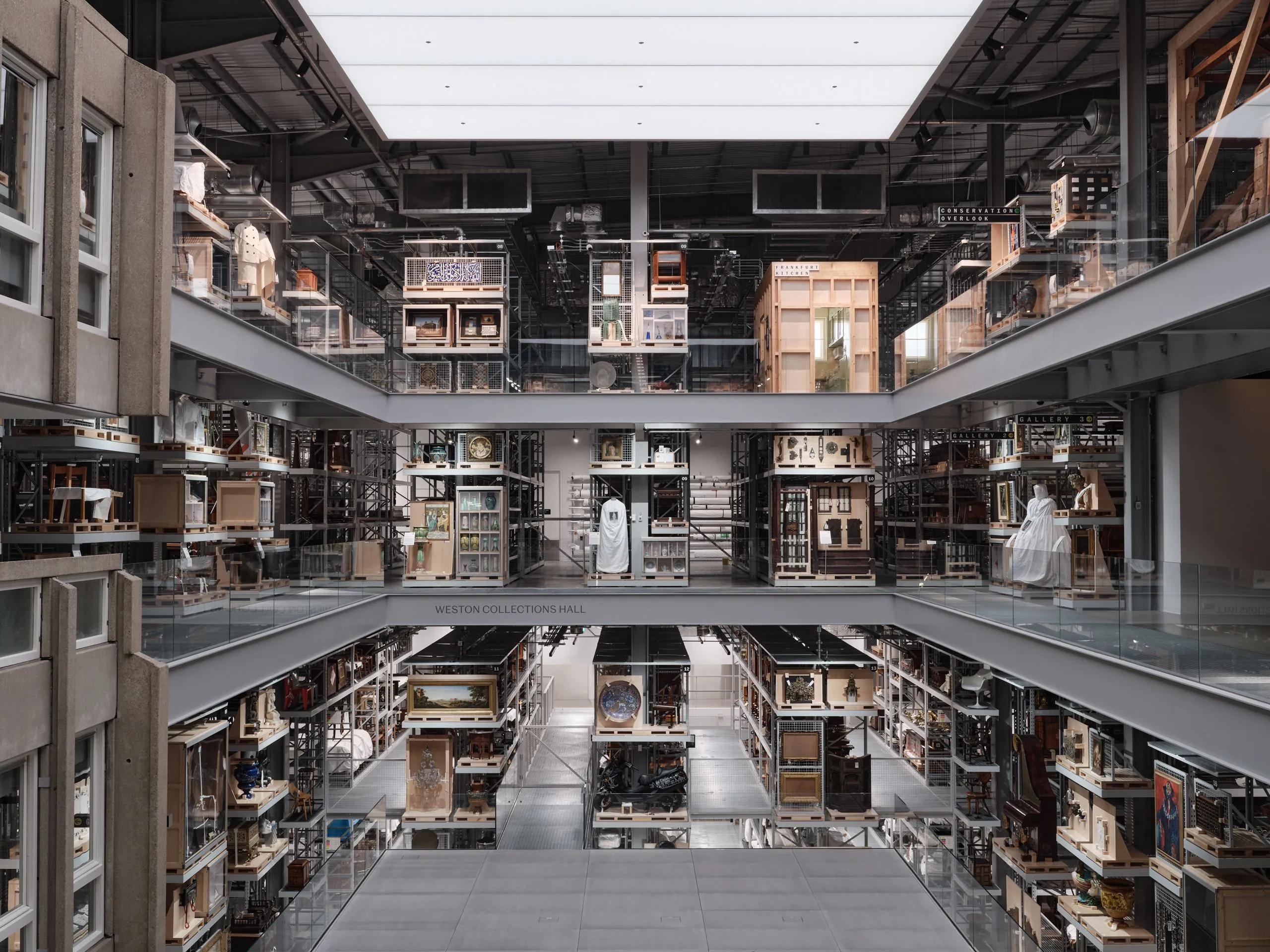
Fieldwork Facility Turns V&A East Storehouse Wayfinding into an Analogue Operating System
V&A East Storehouse Wayfinding: When Signage Acts Like Software Instead of sticking to traditional museum signage, Fieldwork Facility took a fresh angle by treating the V&A East Storehouse project like physical software—a flexible, low-emission system that is effortless to update. The real standout here is Spiller Mono, a custom monospace font crafted by Commercial Type…
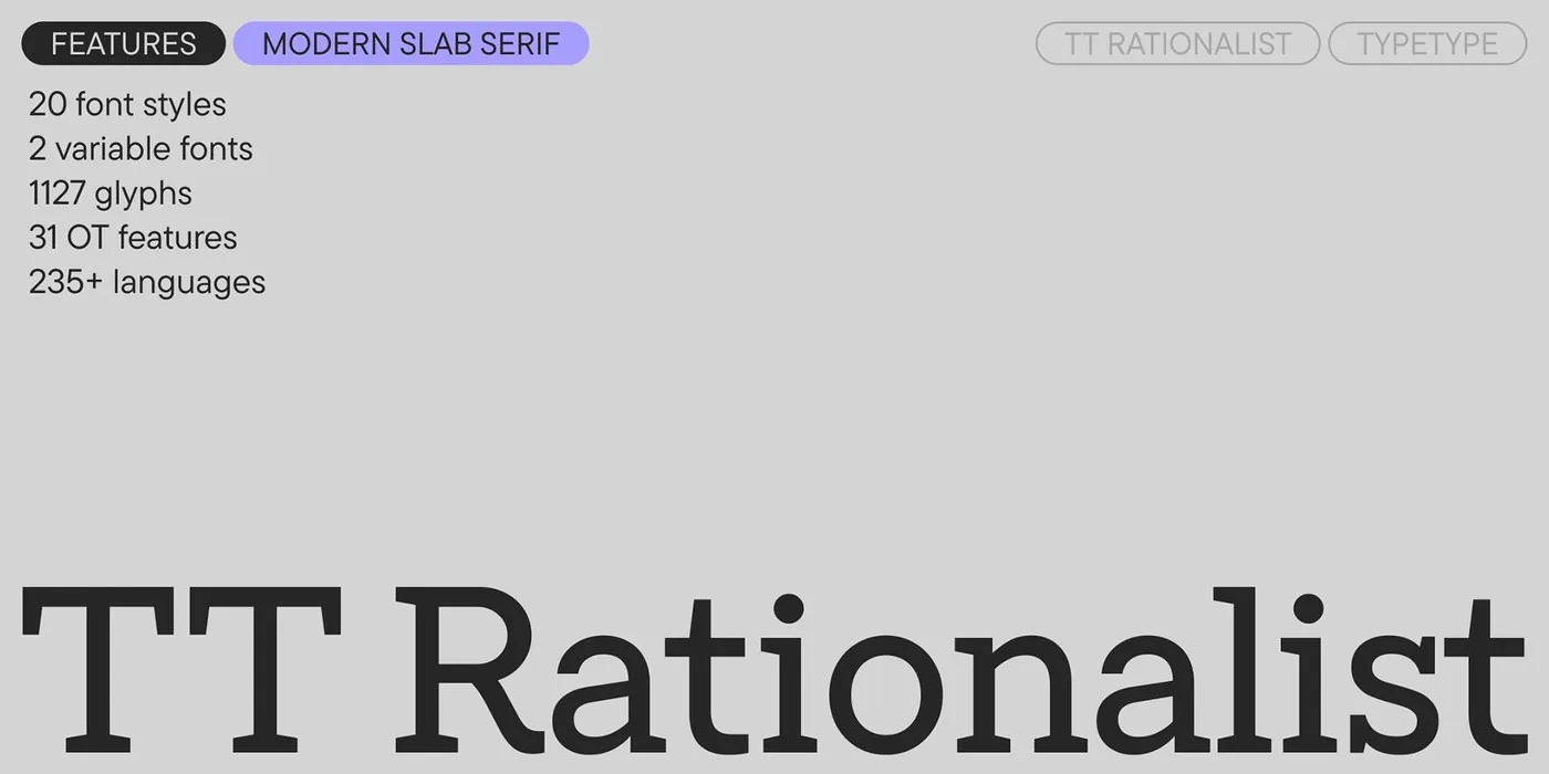
TypeType Refines Slab Serif Design with TT Rationalist v1.100
TypeType Freshens Up TT Rationalist v1.100 with Sleek Trapezoidal Serifs The crew at TypeType Foundry just dropped the TT Rationalist 1.100 update, smoothing out that bulky vibe traditional slab serifs often carry. Out with heavy rectangular blocks, and in with refined trapezoidal serifs that instantly elevate the layout. Softening the stroke contrast creates a smooth…
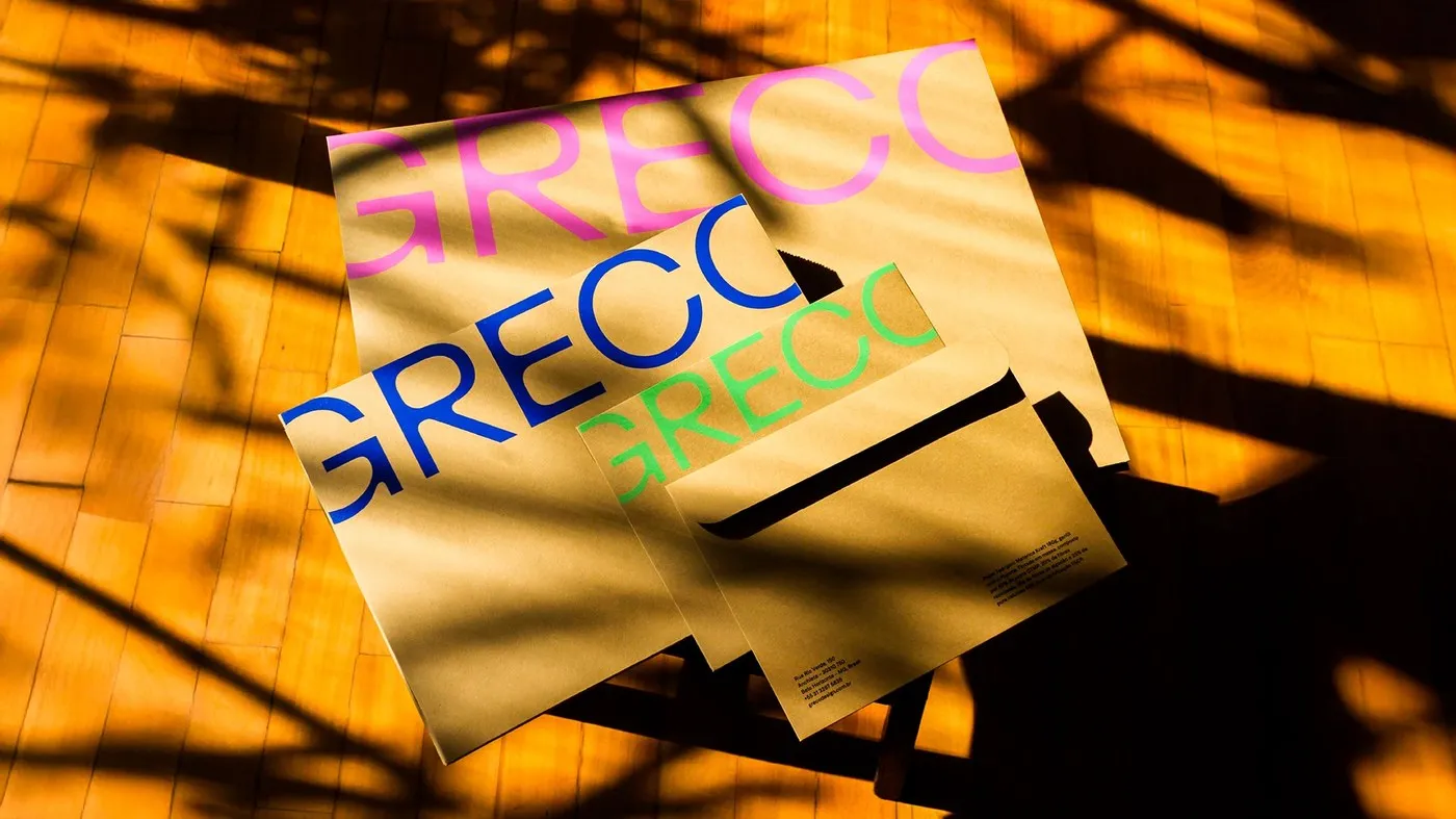
How Plau Design and Greco Created the 32-Font Family Grecotipo
Plau Design and Greco Drop Grecotipo, a Super Versatile 32-Font Superfamily When Brazilian design studio Greco needed a unified voice that could rock both physical spaces and digital screens, they teamed up with Rio-based type foundry Plau Design to craft Grecotipo. Led by typographers Rodrigo Saiani and Carlos Mignot, this project sets out to hit…
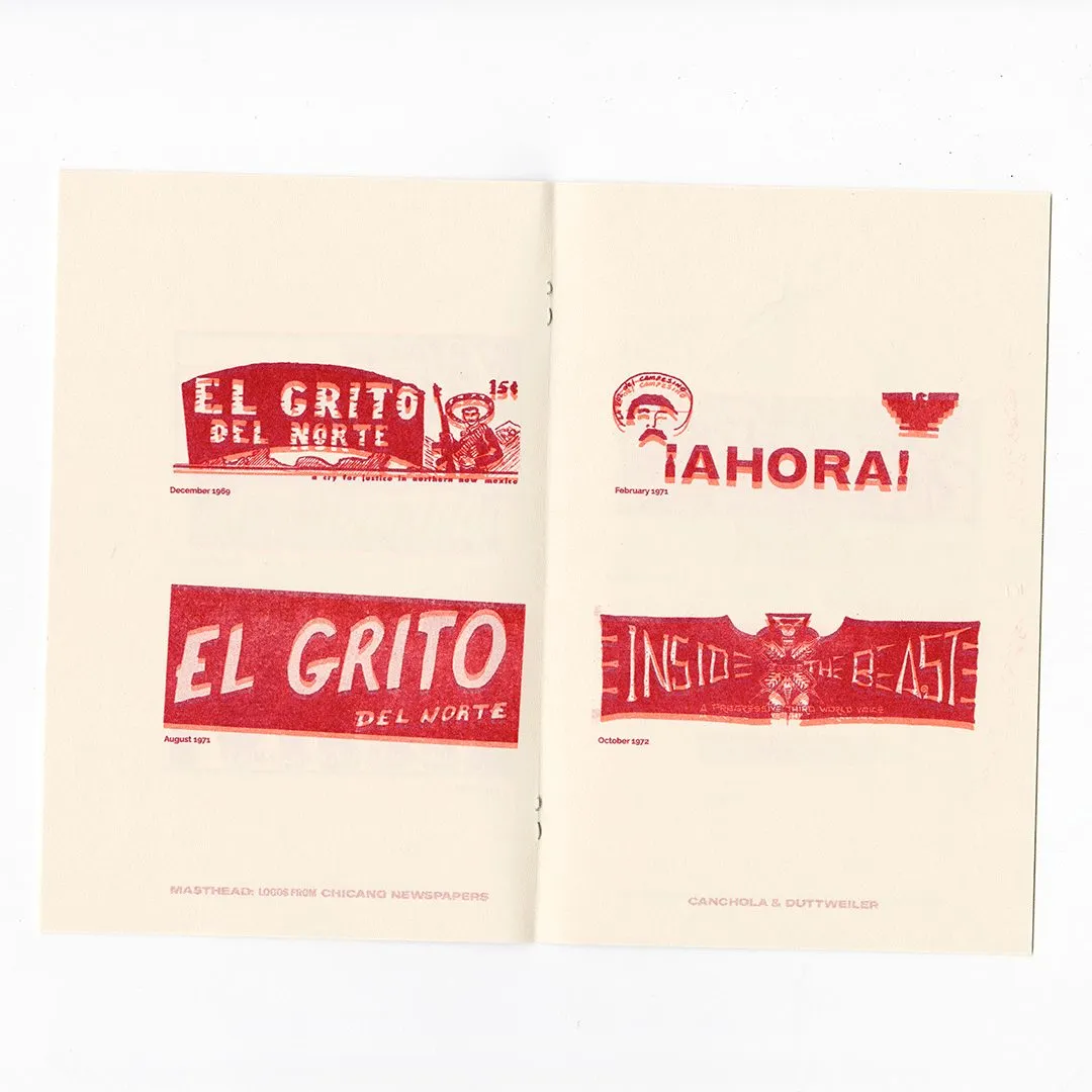
Masthead Zine: A Typography Masterclass by Alexandria Canchola and Joshua Duttweiler
Masthead Zine: A Typography Masterclass in 1960s–70s Chicano Newspaper Logos The very first thing that jumps out about this zine is its incredible restraint. Printed in a single striking shade of vermilion red on warm cream paper, the design lets pure typography take center stage. Right on the cover, the letters M-A-S-T-H-E-A-D stack together in…
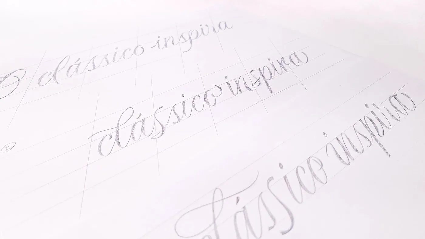
Reserva Script: How Plau Blended Copperplate Calligraphy with Sharp Modern Cuts
Reserva Script: Classic Calligraphy Meets Sharp Modern Cuts Fashion brand Reserva has always made an impression with a visual identity blending warm Brazilian flavor with a free-spirited, rebellious edge. Even with a solid type lineup featuring Reserva Sans, Reserva Serif, and Reserva Display, something tactile and intimate was still missing. To fill that gap, designers…
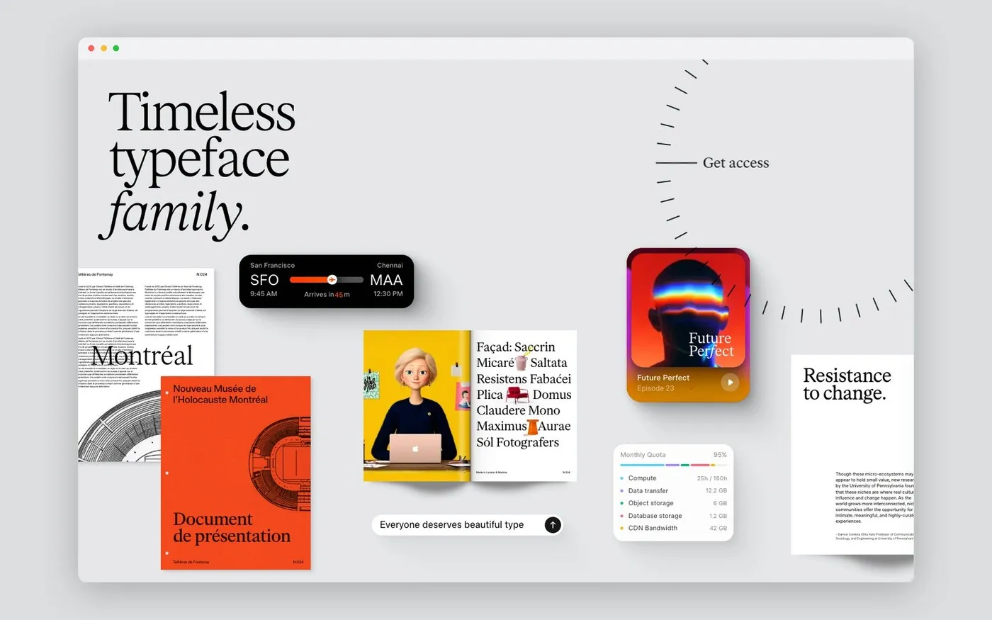
Timeless Type: Interactive Web Design for a Variable Font System
Timeless Type: A Fresh, Interactive Way to Experience Variable Fonts Most type specimen sites stick to the same old routine, relying on stacked text lines and static character grids. Shaking things up, Chennai-based independent studio Timeless took a totally fresh angle when launching the Timeless Type system. Instead of a passive layout, the website turns…
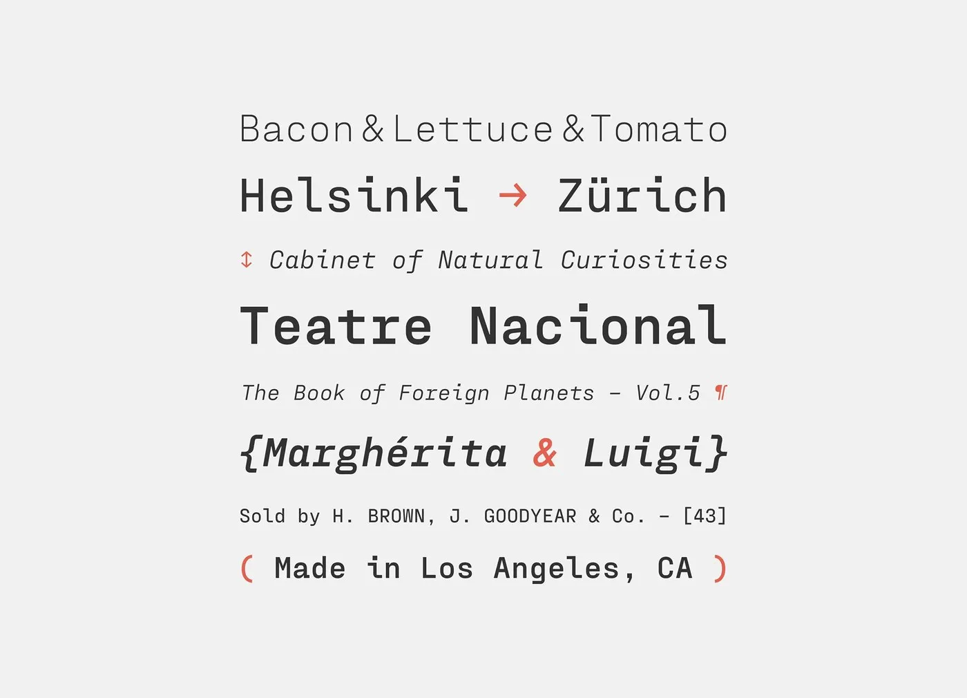
Juri Zaech Unveils Fraktion Mono: Combining Monospace Discipline with Grotesque Aesthetics
Fraktion Mono: Blending Monospaced Discipline with Smooth Grotesque Curves Monospaced fonts can often feel a bit rigid since every character is locked into a fixed grid. To break free from those limits, type designer Juri Zaech created Fraktion Mono—a semi-technical type system that cleverly blends monospaced precision with the inviting rhythm of neo-grotesque design. Serving…
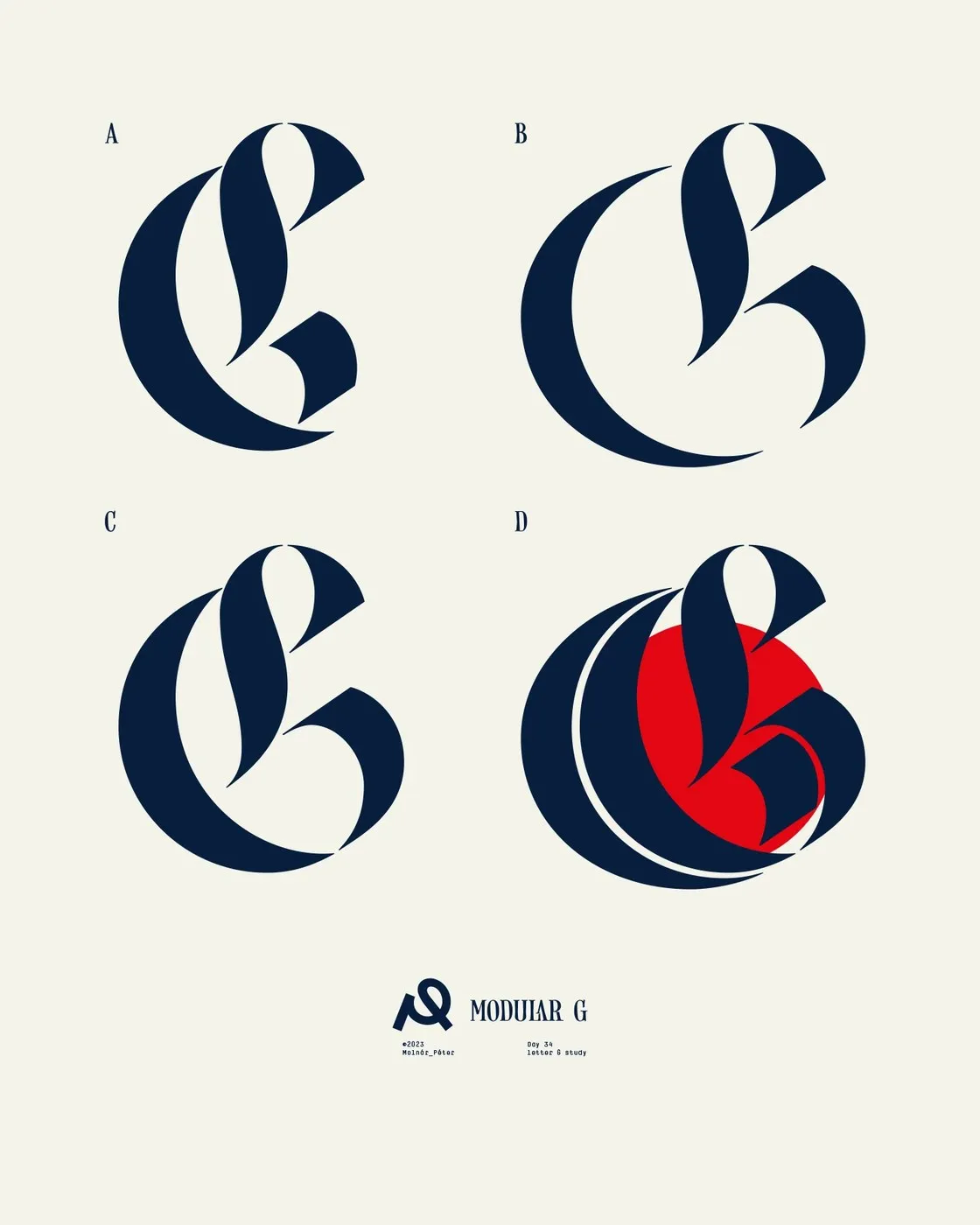
Geometric Tension and Modular Calligraphy in Molnár Péter’s “Follow the Dot”
“Follow the Dot”: Molnár Péter’s Playful Experiment with Classic Letterforms and Pure Geometry Designer Molnár Péter’s experimental poster collection, “Follow the Dot,” is an exciting creative space where classic calligraphy effortlessly meets pure geometric shapes. The visual focal point running through the entire project is a striking monochrome graphic circle—a vibrant red dot or a…
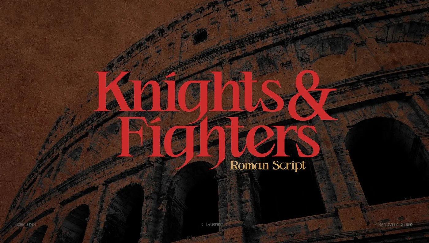
Knights & Fighters Typeface by Noodle Wang: Blending Roman Geometry with Gothic Edge
Knights & Fighters: Noodle Wang’s Bold, Edgy Spin on Roman Typography Straight out of the Noodlemaker creative lab, type designer Noodle Wang has just dropped Knights & Fighters—a super cool project that blends classic geometric proportions with fresh, modern subculture vibes. Taking inspiration from the iconic 113 AD Trajan Column inscriptions, this isn’t just another…
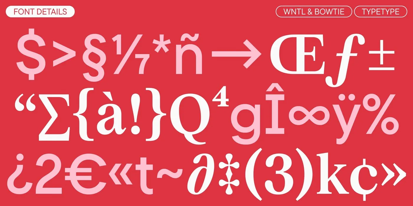
Rocket Type System: Custom Dual-Family Typography by TypeType Foundry
TypeType Foundry’s Rocket Dual-Type System: Digital Precision Meets Deep Meaning TypeType Foundry recently rolled out a custom dual-font system for Rocket, bringing together two distinct type families—the geometric sans WNTL and the transitional serif Bowtie. It’s a super seamless blend of two completely different design styles that come together into one beautifully cohesive brand identity.…
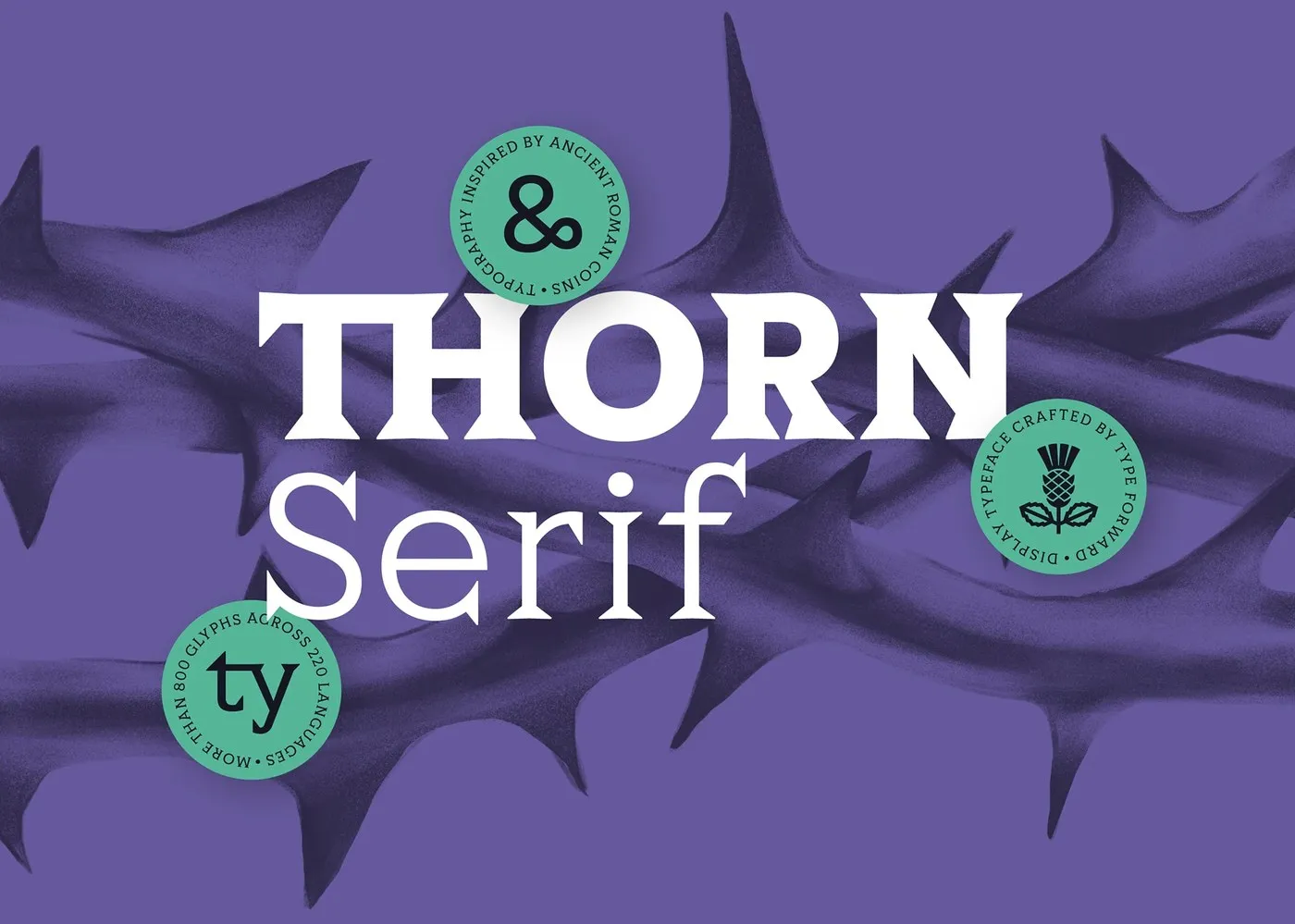
Thorn Serif: How Ancient Roman Coins Inspired a Modern Variable Font
Thorn Serif: Type Forward’s Roman Coin-Inspired Typeface Inspired by ancient Roman coinage, designers Stan Partalev and Mirela Belova from studio Type Forward have released Thorn Serif—a high-impact variable font built for bold, memorable designs. Rather than relying on soft curves, Thorn Serif takes a raw, tactile approach with sharp, thorn-like serifs and solid proportions. A…
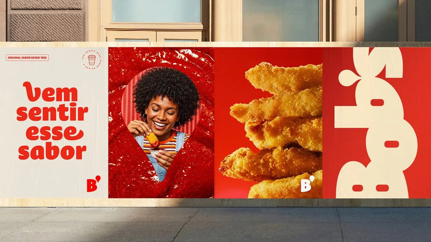
Bob’s Display: How Plau Design Crafted a Custom Typeface for Brazil’s Iconic Fast-Food Chain
Bob’s Display: A Fast-Food-Inspired Typeface by Plau Design Bob’s is Brazil’s very first fast-food chain, founded back in 1952 and now boasting over 1,000 locations nationwide. Its iconic script logo and signature milkshakes are legendary staples of local food culture. To give the brand’s identity a fresh spin, agency Artplan teamed up with Rio-based studio…
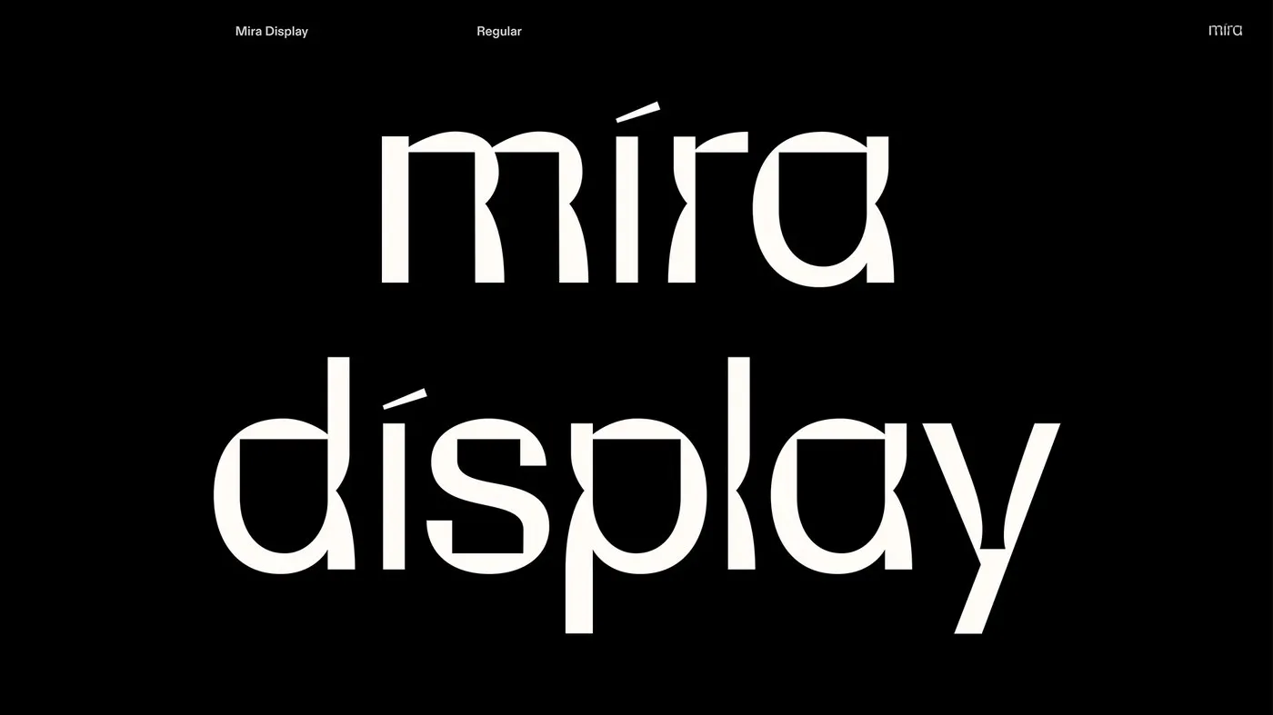
Mira Display by Mira Mayne: Exploring Subtractive Lens Geometry in Type Design
Mira Display by Mira Mayne: How Subtractive Lens Geometry Shapes Typography Starting with a captivating question about how human eyes perceive the surrounding world, designer Mira Mayne created the display typeface Mira Display. In Spanish, “mira” means “look” or “see”. The design builds directly on this concept, exploring how visual forms reveal letter shapes. Optical…
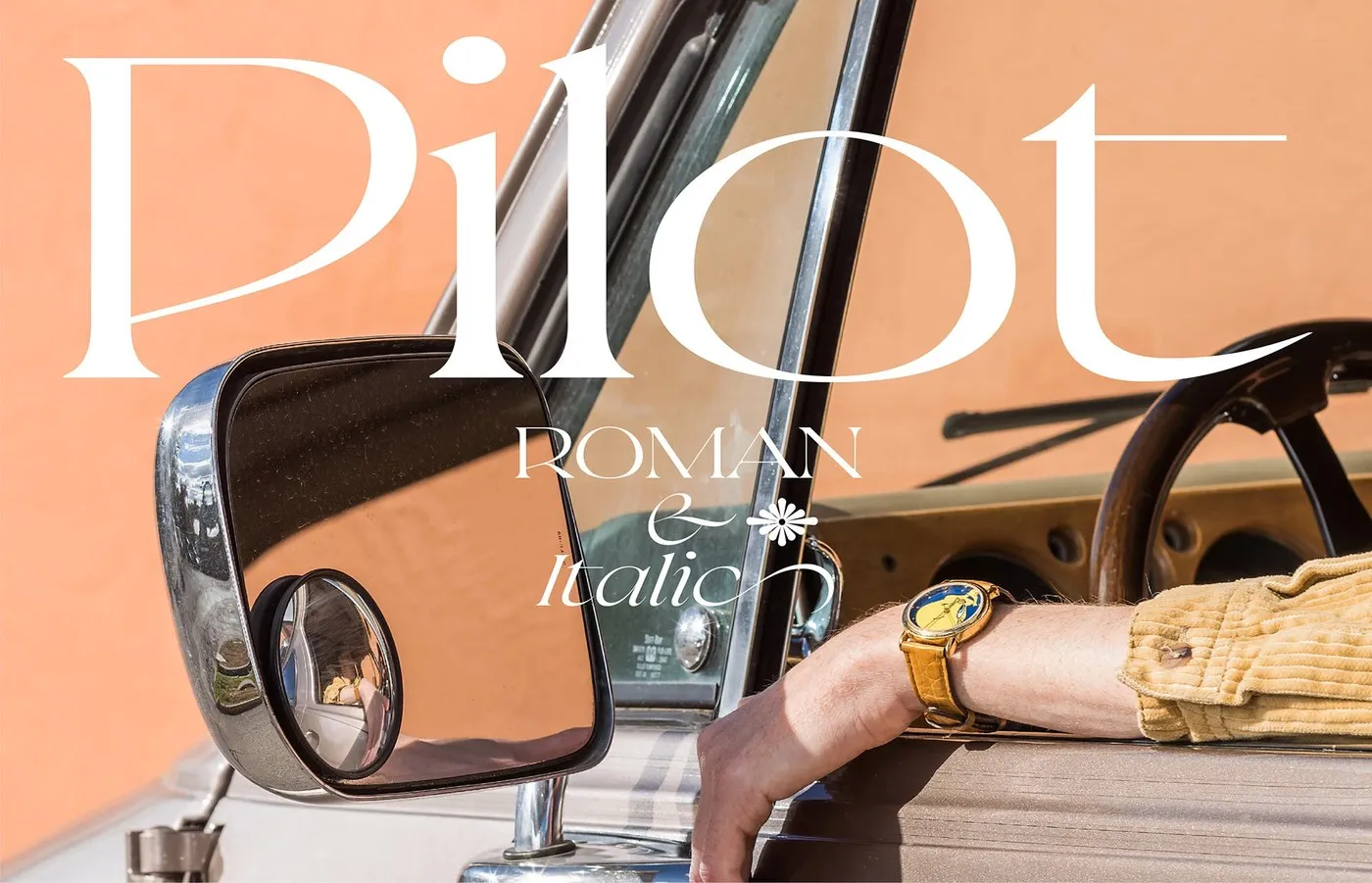
Pilot Typeface by Violaine & Jeremy: Sharp Angles and Aeronautical Precision
Pilot Typeface by Violaine & Jérémy: A Sharp Serif Inspired by Aviation Gear Parisian design studio VJ-Type just rolled out Pilot—a stunning display serif packed with personality, bringing together razor-sharp angles and speedy calligraphic strokes. Designed by the creative duo Violaine & Jérémy alongside talented designers Antoine Brun, Liana Korios, and Julie Senné, this project…
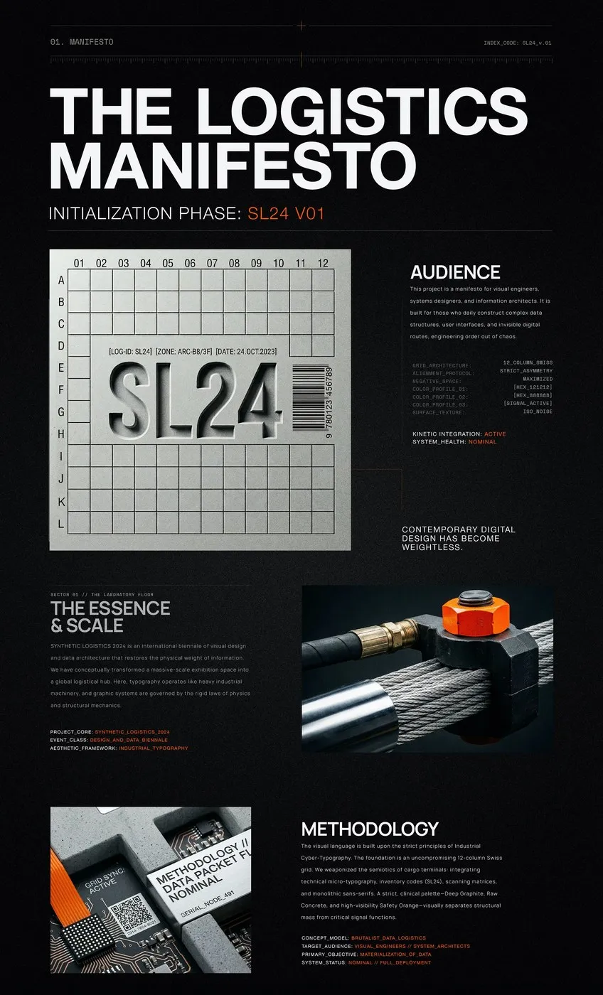
SL24: Industrial Data Logistics Meets Brutalist Typography by Kseniya Artman
Brutalist Typography in Kseniya Artman’s SL24 Project Dry digital data streams get a massive, heavy-duty transformation in Berlin-based designer Kseniya Artman’s Synthetic Logistics 2024 (SL24) project. SL24 is a biennial exhibition dedicated to visual engineering and data architecture. Instead of taking the usual path of sleek, lightweight UI trends, Kseniya reimagines the exhibition space as…
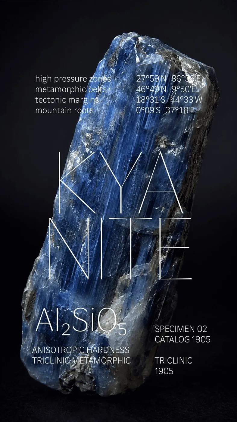
Fluxetype: A Variable Typeface System by Nikita Kanarev
Blending the crisp structure of a humanist sans with the classic proportions of a serifless roman takes some serious craft. Type designer Nikita Kanarev created Fluxetype to tackle this challenge head-on, delivering a unified visual system built for digital screens, motion graphics, and large-format print alike. With support for over 300 Latin and Cyrillic languages,…
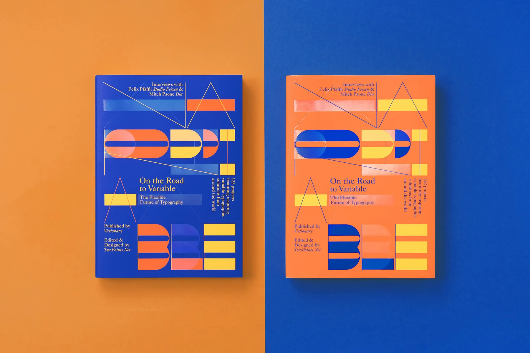
On the Road to Variable, Captures the Future of Type
On the Road to Variable: Shaping the Future of Variable Typography Looking back at the journey behind On the Road to Variable, it becomes clear this is way more than just another design book—it’s the result of a major mindset evolution driven by design studio twopoints.net. The story kicks off back in 2009, when twopoints.net…
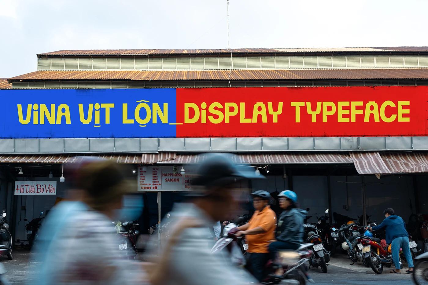
Vina Vit Lon: A Bold Display Typeface Rooted in Vietnamese Street Culture
Vina Vịt Lộn: A Street Culture-Inspired Typeface by Truong Di As modern design relies more and more on AI, local eatery signage has been losing some of that rustic, authentic charm. To bring back the soul of those familiar street corners, designer www.behance.net/truongdi191 created Vina Vịt Lộn, a display font packed with local personality. Inspired…
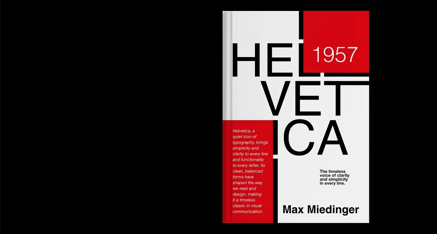
Helvetica Type Specimen Book Project by Nehir Köse
Helvetica Type Specimen Book Project by Nehir Köse Helvetica—the legendary typeface created back in 1957 by Max Miedinger and Eduard Hoffmann—just got a fresh, amazingly detailed showcase in an incredible type specimen book by designer Nehir Köse. This project breaks down glyph anatomy with serious precision. Set against a sleek black-and-white backdrop accented with bright…