
ux ui
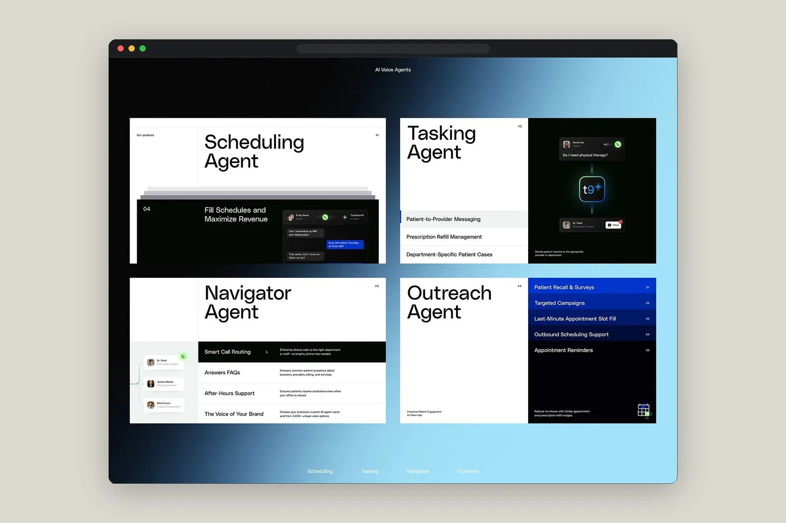
Transform9 Web Design by Tubik Studio: Humanizing Healthcare AI Communication
Transform9: Bringing a Warm, Human Touch to Healthcare Web Design by Tubik Studio Healthcare software often feels pretty rigid and clinical, which is a bit of a mismatch for an industry where trust between patients and doctors is everything. To fix this for Transform9—a clinical communication automation platform—Tubik Studio jumped in to rebuild both the…
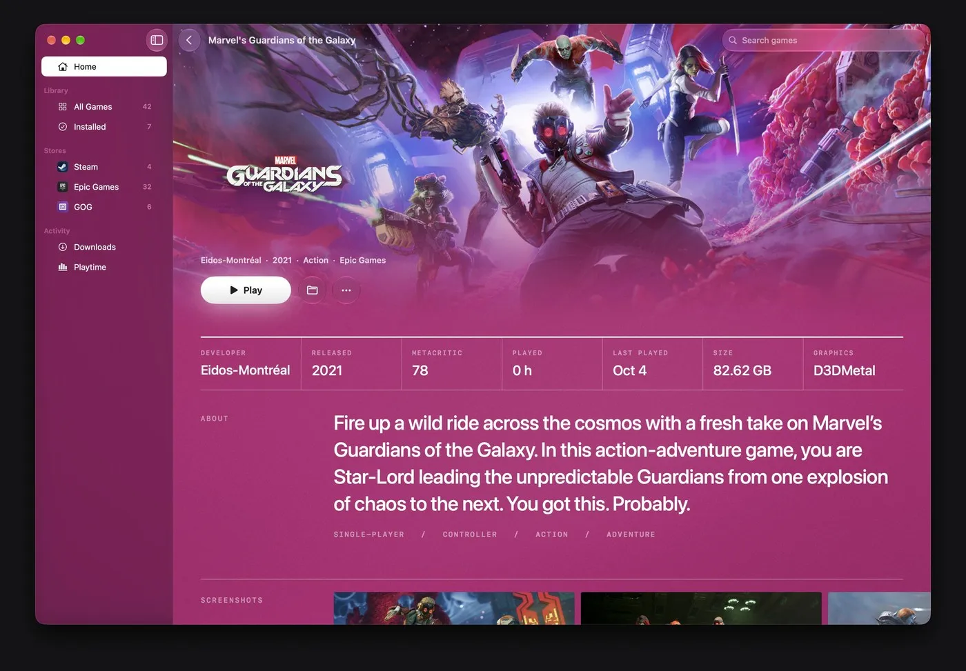
MaPC: Bringing PC Gaming to Apple Silicon with Native macOS Design
MaPC – PC Gaming on Mac with True Native Design PC gaming on Apple Silicon Macs has always required a bit of a compromise. Running Windows titles often meant wrestling with cryptic terminal commands, bulky emulators, or user interfaces that felt completely out of place on macOS. Created by the brilliant design team behind Calmaria…
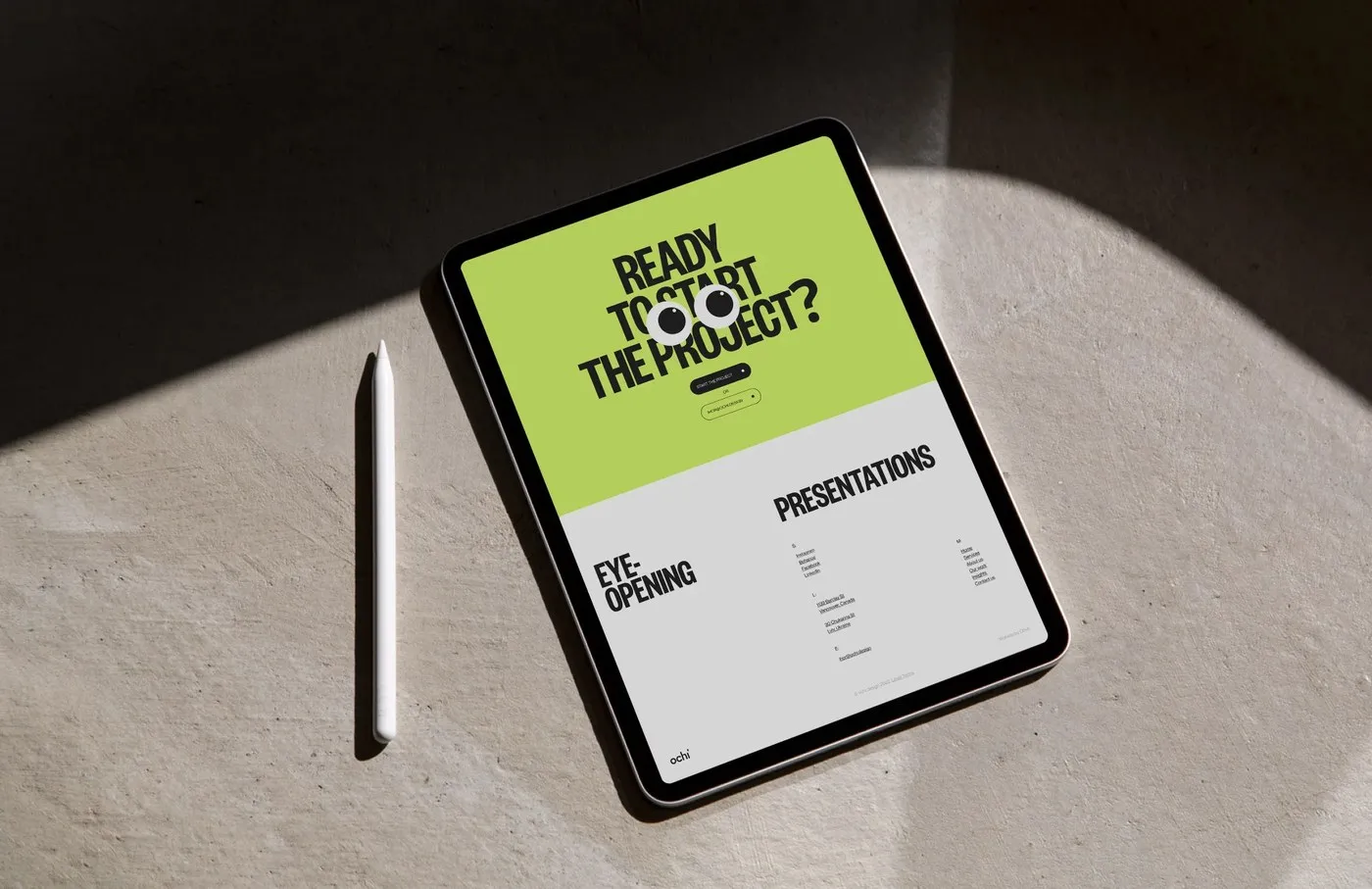
Ochi Design: How Obys Agency Crafted a Slide-Driven Web System
Ochi Design: A Slide-Driven Web System by Obys Agency Obys Agency just dropped a presentation-infused web design system for Ochi—a presentation strategy agency based in Lviv, Ukraine, and Vancouver, Canada. In Ukrainian, “ochi” means “eyes,” perfectly capturing the brand’s core belief: complex ideas are always easier to digest visually than through dense blocks of text.…
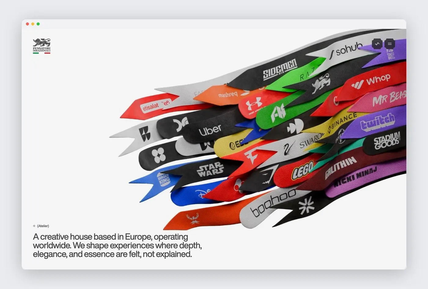
Pensatori Irrazionali: A Technical Atelier Combining Brutalist Typography and WebGL Physics
Pensatori Irrazionali: When Brutalist Typography Meets WebGL Physics Instead of going with a standard portfolio layout, European-born creative studio Pensatori Irrazionali—currently operating out of Dubai Digital Park—built its website as a fully interactive digital workshop. Right upon landing, the viewport opens onto a sleek, minimalist gray field featuring fluid 3D WebGL ribbons that react dynamically…
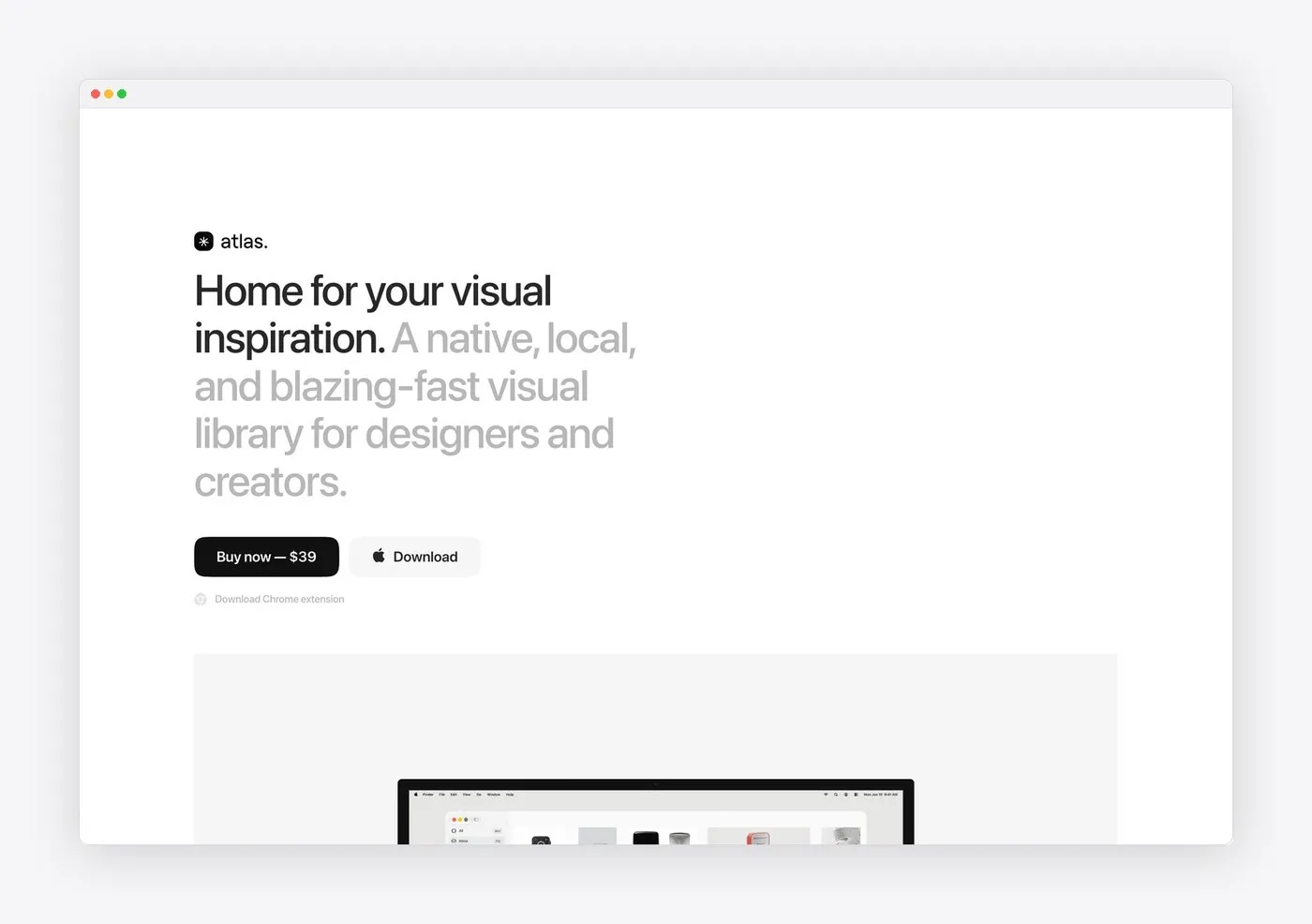
Atlas for Mac: Minimalist Editorial Web Design by Alexey Sekachov
Atlas for Mac: Minimalist Web Design Focused on Typography and Pure Experience While so many software sites these days end up visually overloaded with flashy gradients, heavy isometric 3D renders, and non-stop animations, designer and developer Alexey Sekachov took a completely fresh, refined direction for the Atlas for Mac landing page. The site comes together…
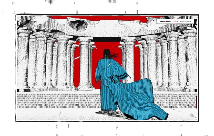
Active Theory Crafts a Comic Book-Inspired WebGL Experience for Santioni Spirits
Active Theory Brings Santioni Spirits into a Comic Book-Inspired WebGL Universe The “Notturno Experience” project by Active Theory officially launched the luxury brand Santioni Spirits with a stunning, comic book-inspired WebGL journey. Comic-Book Visuals Meet WebGL This experience follows a cloaked saint wandering through a barren landscape and stepping through a circular monolithic archway—designed after…
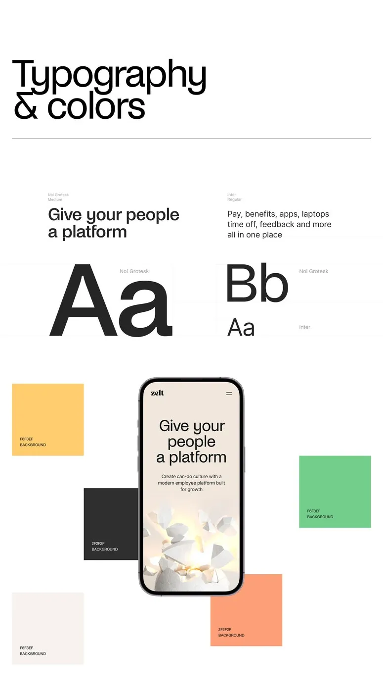
Zelt Web Design: How Cuberto Combined Tactile 3D and Modular Grid
Zelt Web Design: How Cuberto Turned a Dry Management Tool into an Engaging Experience Work management tools usually struggle with displaying dense data in a clear, digestible way. To solve this for Zelt—an all-in-one HR, IT, and payroll platform built for startups—design agency Cuberto built a remarkably fresh web design system. The core idea blends…
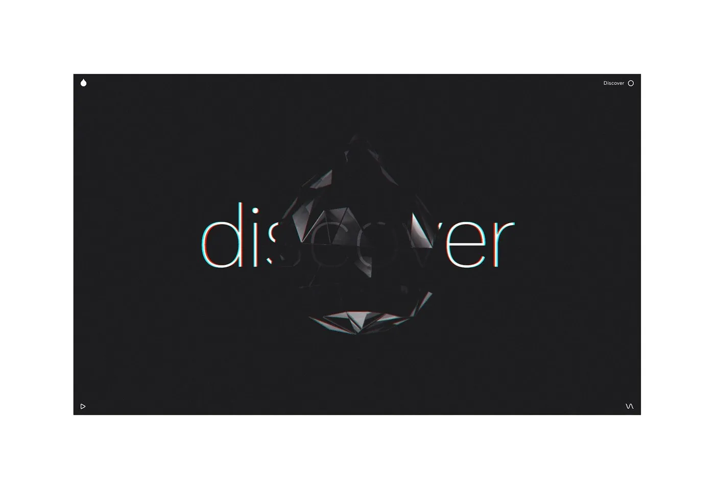
Interactive Web Design for Resn Portfolio by Marcus Brown
Interactive Web Design for Resn’s Portfolio by Marcus Brown Resn has long been a legend in the design community thanks to its delightfully quirky humor and insanely high level of technical craftsmanship. Under the art direction of Marcus Brown alongside Simon Jullien, Resn’s portfolio site brings the studio’s distinct brand personality to life while keeping…
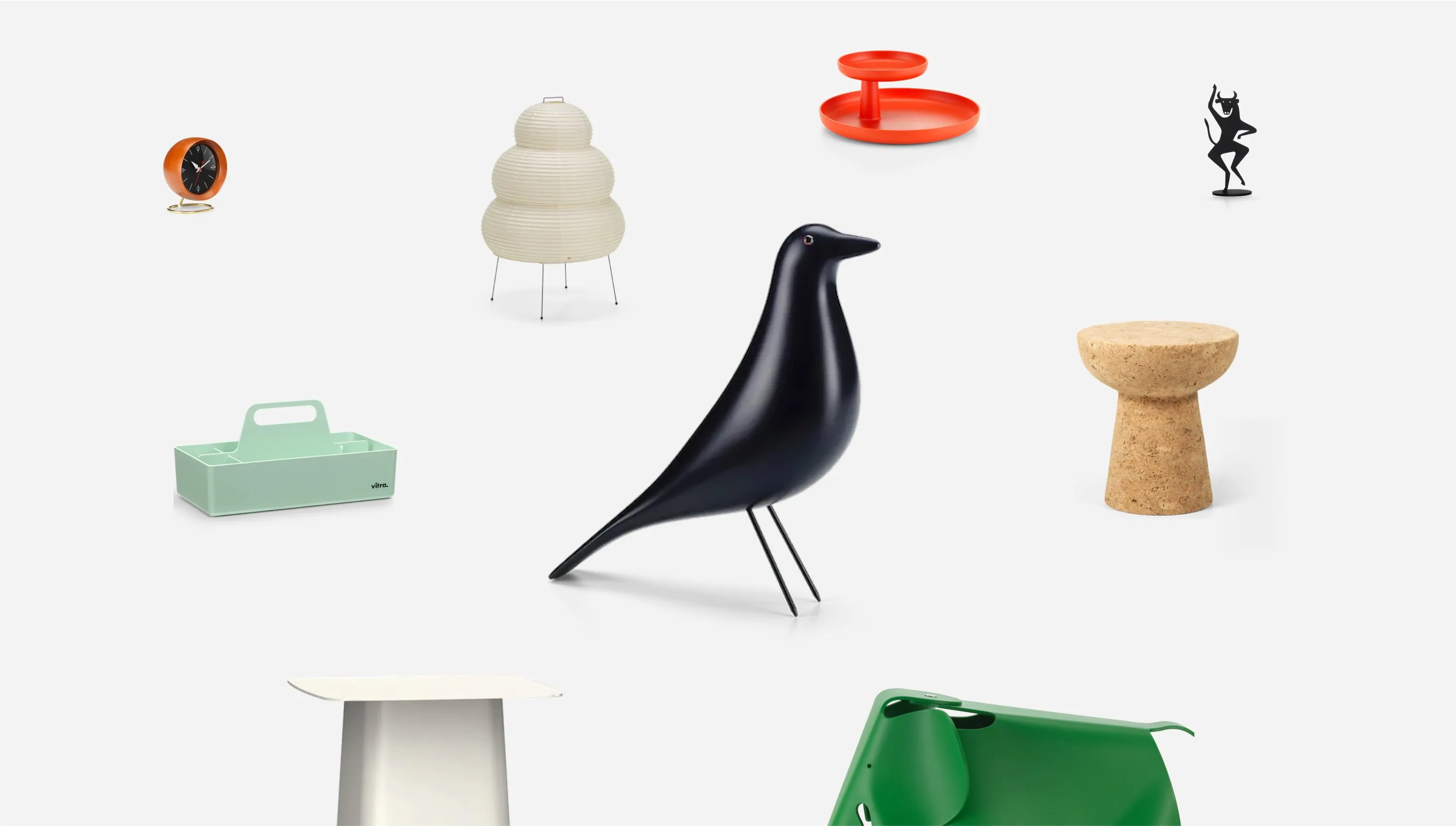
Vitra Gift Finder: Redefining Digital Product Exploration by Build in Amsterdam
Vitra Gift Finder: A Dynamic, Interactive Grid Experience Ditching traditional rows and standard product categories, the Vitra Gift Finder project by studio Build in Amsterdam turns gift-hunting into a completely interactive visual experience. The site opens up into a constellation-like display against a crisp white canvas, where iconic Vitra creations—like the Eames House Bird, cork…
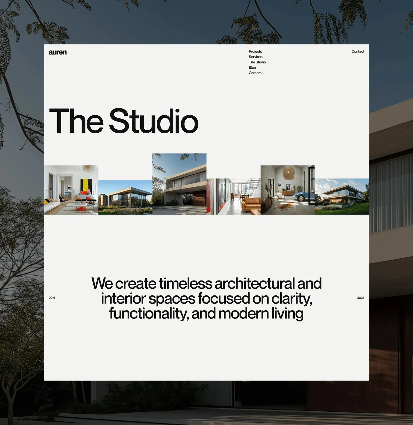
Auren — How Tubik Studio Built an Architectural UI/UX System
Auren: When Architectural Thinking Meets Web Design by Tubik Studio Auren specializes in minimalist residential and workspace design, putting natural materials and spatial balance front and center. To bring that calm, grounded vibe into the digital world, Artem Meshkov and the team at Tubik Studio created a beautifully serene web interface that prioritizes overall architectural…
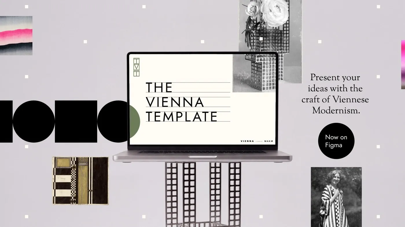
The Vienna Template: Bringing Viennese Modernism to Figma UI Design
The Vienna Template: Bringing Viennese Art and Architecture into Figma To kick off www.viennadesignweek.at/en/, the Vienna Tourist Board teamed up with creative agency Jung von Matt DONAU to drop something super cool: The Vienna Template! Instead of running a typical travel ad campaign, this project hands out a free UI design system and presentation template…
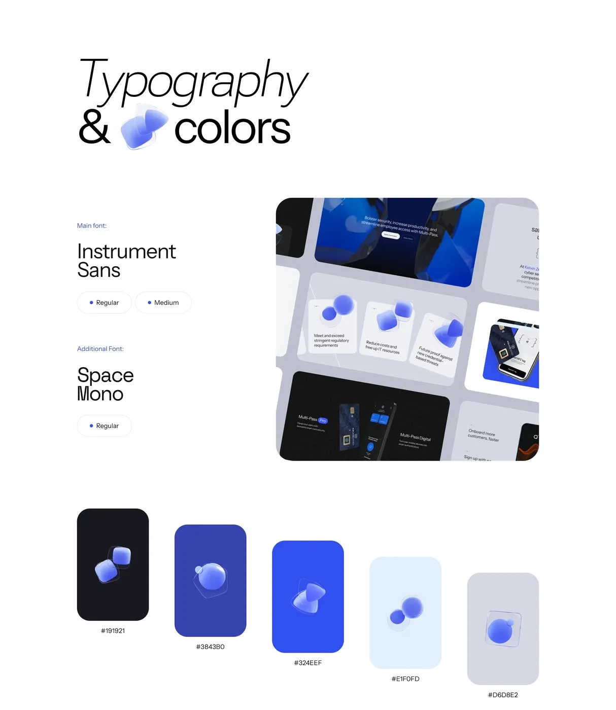
Inside Kelvin Zero: How Cuberto Redefined Dark-Mode Web Design for Cybersecurity
Design Perspective: How Cuberto Tells a Story Through Dark-Mode UI for Kelvin Zero Enterprise security and passwordless authentication usually sound pretty dry, but Cuberto brought a fresh, vibrant energy to Kelvin Zero’s website project. Rather than sticking to the same old enterprise software template, the design team took a visual approach inspired by an iceberg.…
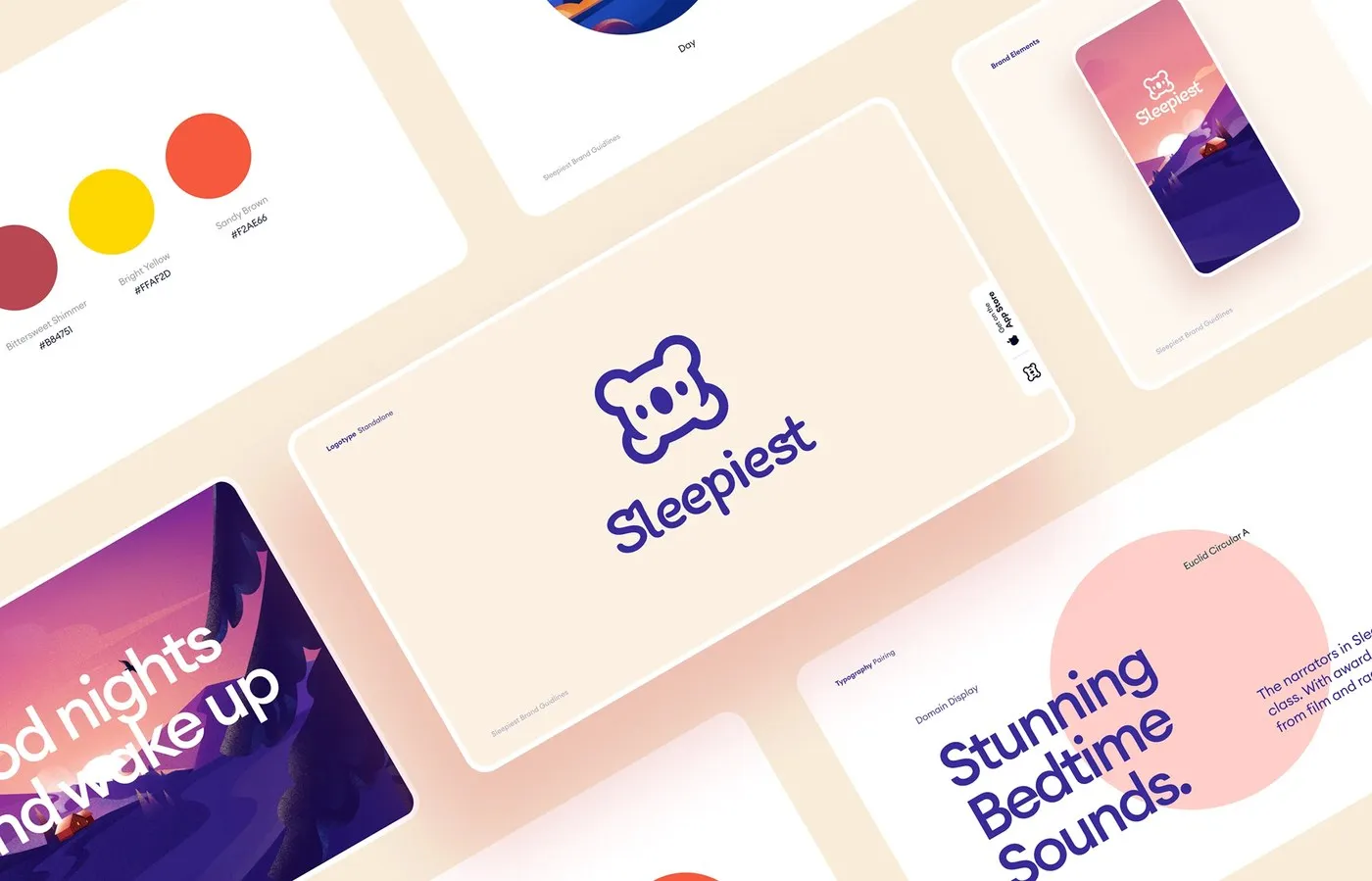
Inside Cuberto’s Sleepiest App: Designing a Peaceful Nocturnal Experience
Designing Cuberto’s Sleepiest App: A Soothing Nocturnal UI Experience Designed by Cuberto, the Sleepiest app sports an atmospheric dark color scheme paired with silky-smooth interactive sound controls that gently drift users off to sleep. Ditching harsh white backgrounds and rigid dividers, deep black and midnight blue take center stage, accented with sky blue, soft peach,…
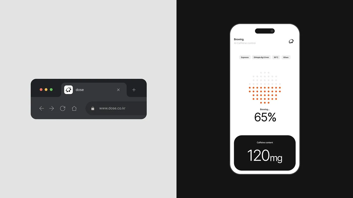
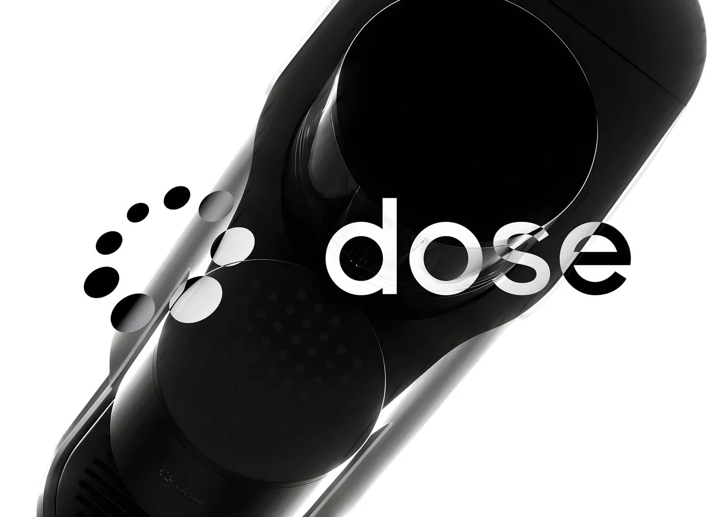
dose by Sungsik Kim: Engineering Caffeine Through Precision Branding and UI/UX Design
dose by Sungsik Kim: Calculating Daily Caffeine Intake Through Precision Design Most coffee drinkers keep things simple by choosing between regular or decaf. For designer Sungsik Kim, however, daily caffeine intake is a precise personal dosage that deserves careful measurement. The dose project seamlessly merges medical-grade precision with cozy, everyday comfort. A soothing palette of…
Tracking Caffeine Like a Science: UI/UX Design for dose by Sungsik Kim
dose: Sungsik Kim’s Milligram-Accurate Caffeine Tracker Grabbing a daily cup of coffee is effortless, but keeping precise tabs on exact caffeine intake is a whole different ballgame. Designer Sungsik Kim elevates this daily ritual into a precision science with the UI/UX design for “dose”. Instead of offering basic choices like standard coffee or decaf, the…
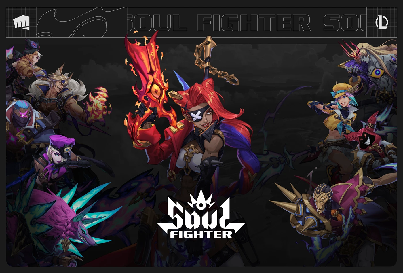
Game UI Design for League of Legends: Soul Fighter by Alena Eresko
Impressive Game UI Design for League of Legends: Soul Fighter by Alena Eresko Riot Games’ Soul Fighter summer event treated League of Legends players to a unique metagame called Tournament of Souls. To channel the hype of classic fighting games and tournament anime, the design team—featuring Alena Eresko, Evan Squire, and Ji Hwan Kim—crafted an…
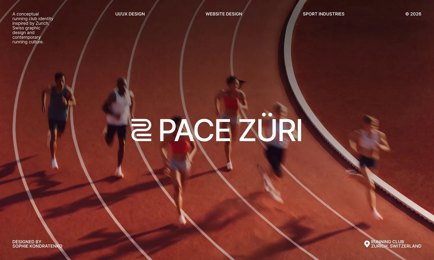
Pace Züri Web Design by Sophie Kondratenko: Swiss Grid Meets Running Telemetry
Pace Züri Web Design by Sophie Kondratenko: Where Swiss Grid Meets Running Telemetry Modern athletic communities need digital interfaces that deliver top-tier accuracy while keeping the energy high. For Pace Züri, a running club based in Zurich, designer Sophie Kondratenko created an electric web layout that brings the rhythm of street running straight into a…
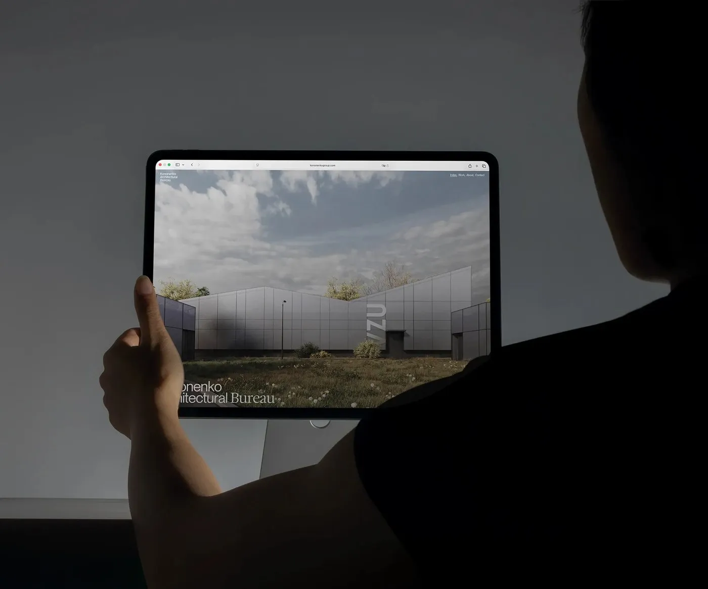
Kononenko Architectural Website by Artem Shcherban and Reksa Andhika
Kononenko Architectural Website by Artem Shcherban and Reksa Andhika The digital experience for Kononenko Architectural Bureau (KNKO) is an absolute showstopper, brought to life by designer Artem Shcherban and developer Reksa Andhika. Moving away from forgettable, cookie-cutter layouts, the creative team translated the true spirit of real-world architecture into every inch of digital space. Generous…
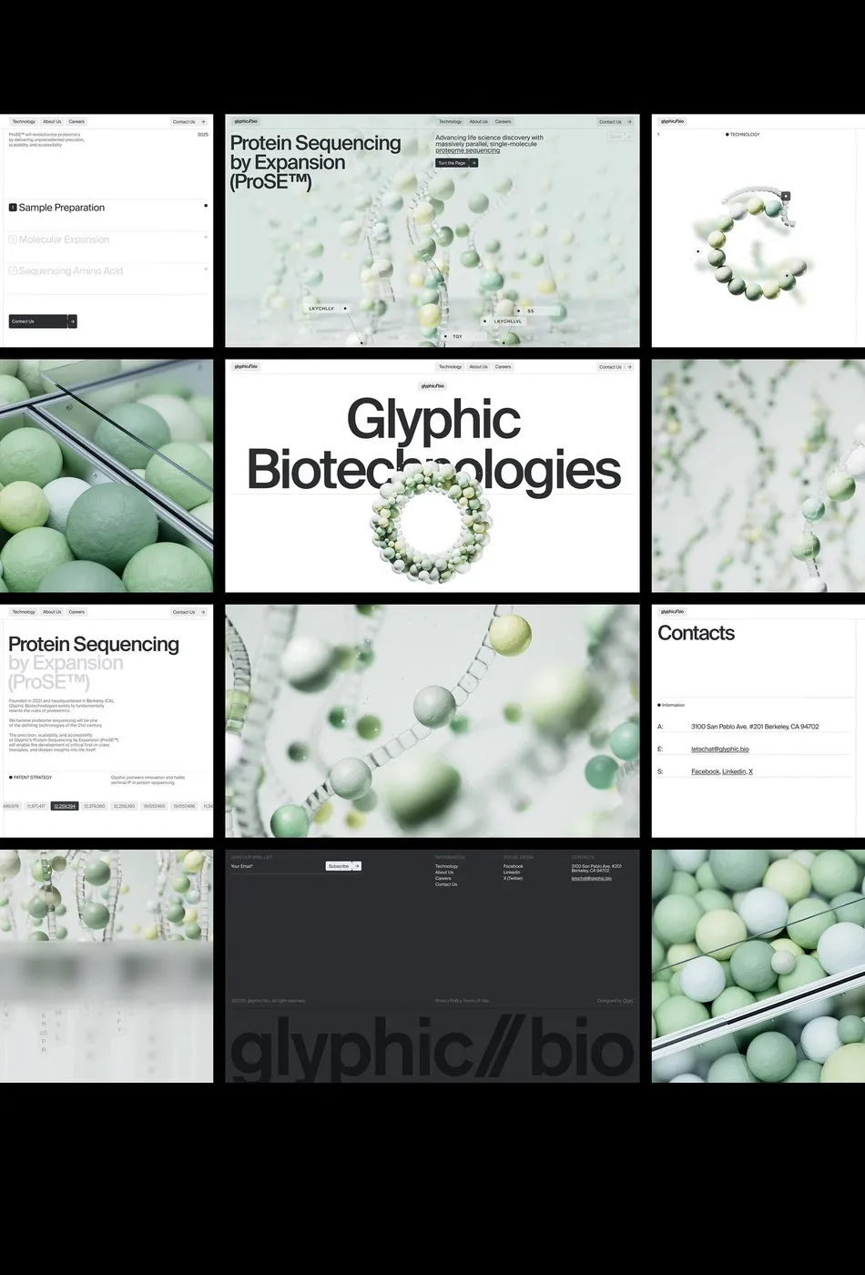
Glyphic Biotechnologies Web Design by Obys Agency: Translating Complex Science into Digital Motion
How Obys Agency Turned Complex Science into an Engaging Web Experience for Glyphic Biotechnologies Obys Agency, a design studio based out of Ukraine, recently launched a fresh website concept for Glyphic Biotechnologies—a biotech company focused on single-molecule protein sequencing. Instead of relying on dry scientific diagrams, the design adopts a vibrant visual approach set against…