
ux ui
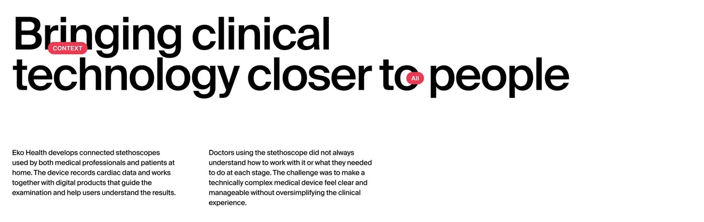
Eko Health Ecosystem: Crafting a Seamless Medical UI/UX Design by Humbleteam
Optimizing Healthcare Experiences: Designing Eko Health’s UI/UX Ecosystem with Humbleteam Digital stethoscopes are amazing at picking up faint heart and lung sounds, but raw audio graphs can be a total headache for medical teams to decipher on the fly. To solve this, Humbleteam revamped the entire product experience for Eko Health, making metric tracking simpler,…
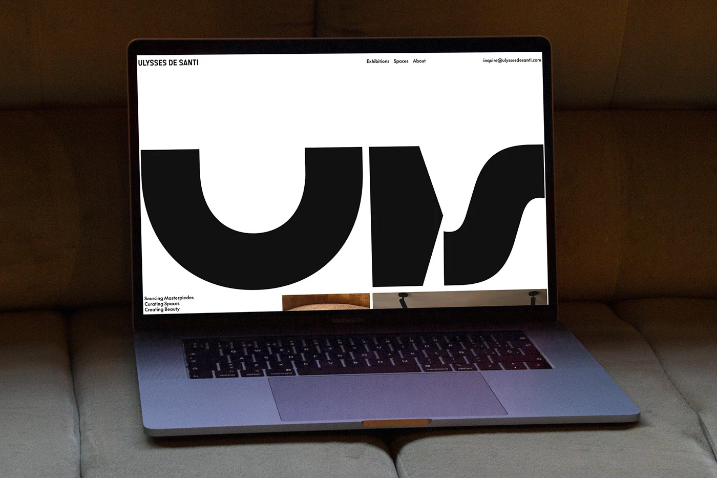
Minimalist Web Experience Designed by UDS Studio
A Minimalist and Modern Web Experience from UDS Studio The team over at UDS Studio just dropped a sleek, modular web system built around an ultra-clean, minimalist aesthetic. The color palette features a deep jet-black backdrop paired with high-contrast white text and fine gray borders, ensuring the interface stays razor-sharp and consistent on everything from…
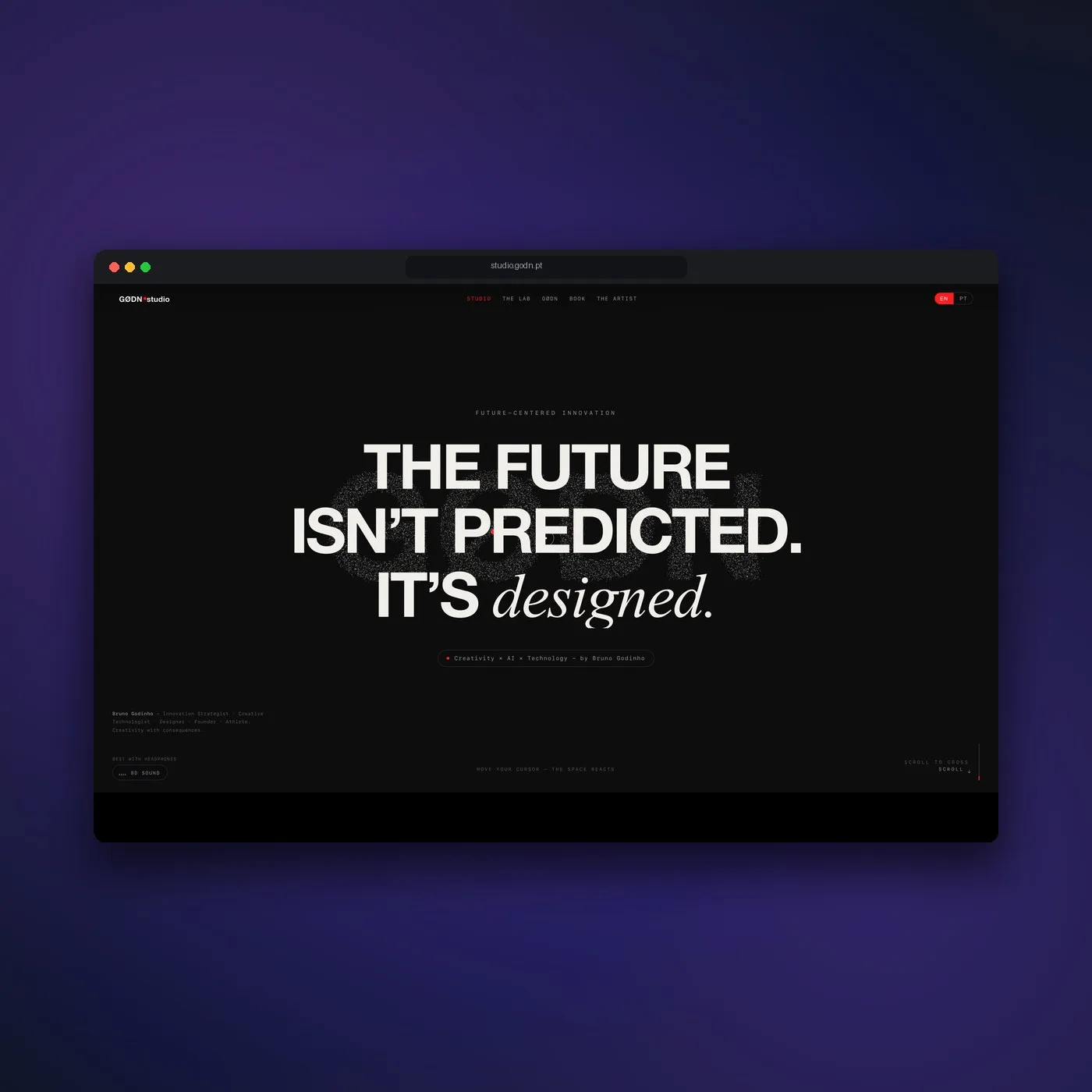
GØDN.studio: Interactive Web Design and Generative Code Playground
GØDN.studio & an Immersive Interactive Web Experience GØDN.studio is an incredibly exciting web portfolio project by Lisbon-based designer Bruno Godinho. Instead of showcasing work in a traditional static grid, this website turns the entire interface into a live, interactive playground. Right upon entering, the bold title text on the homepage shatters into a cloud of…
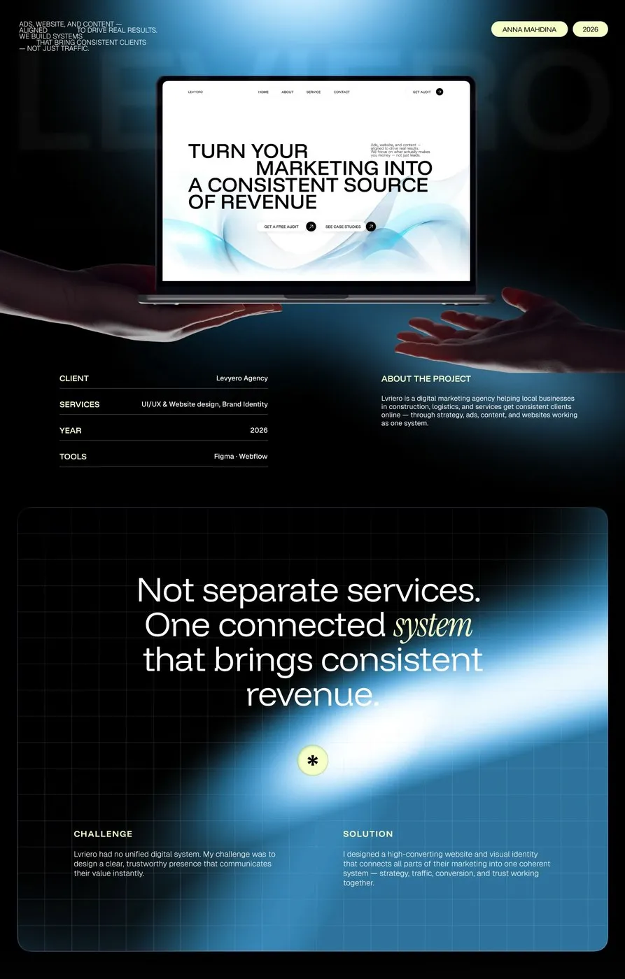
Levyero UI/UX Design System by Anna Mahdina: A Modular Approach for Marketing Agencies
UI/UX Design for Levyero by Anna Mahdina: A Modular Website System for Agencies Anna Mahdina recently completed a real-world UI/UX project for a marketing agency website named Levyero. The design features a deep charcoal gray background as its core foundation, giving the overall interface a solid, highly professional feel right out of the gate. A…
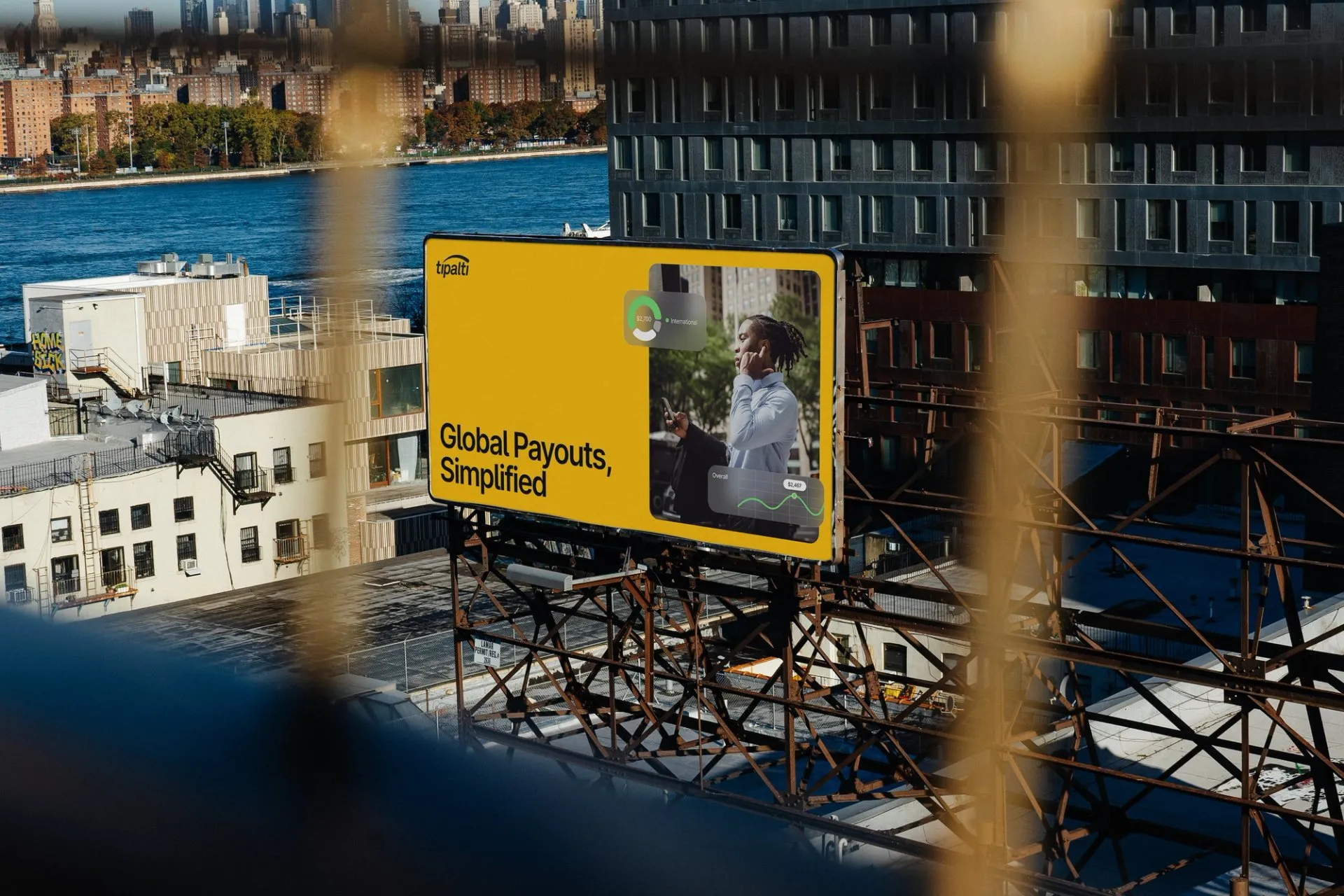
Tipalti Fintech Platform Web Design & Design System by Clay Global
Web Design & Design System for Tipalti Fintech Platform Turning complex payment processes into a super clean, easy-on-the-eyes web interface—that’s the magic behind the Tipalti fintech platform redesign by creative agency Clay Global. The star of the show here is the flexible modular card system paired with crisp, well-defined typography rules. Color-wise, the UI pops…
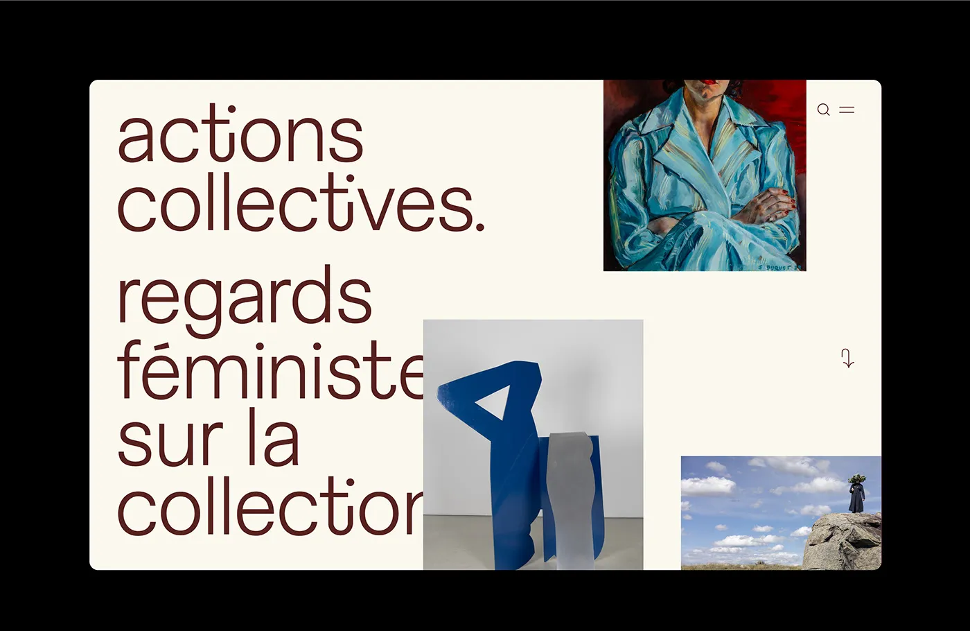
Collective Actions: Editorial Web Design for Digital Art Exhibition by Paprika Design
Collective Actions: An Editorial-Style Digital Art Exhibition Experience by Paprika Design The Collective Actions project by Paprika Design is a digital art exhibition platform that cleverly blends editorial layout thinking with modern web structure. Right off the bat, the soft and warm color palette makes a stunning first impression—rich dark burgundy typography set against an…
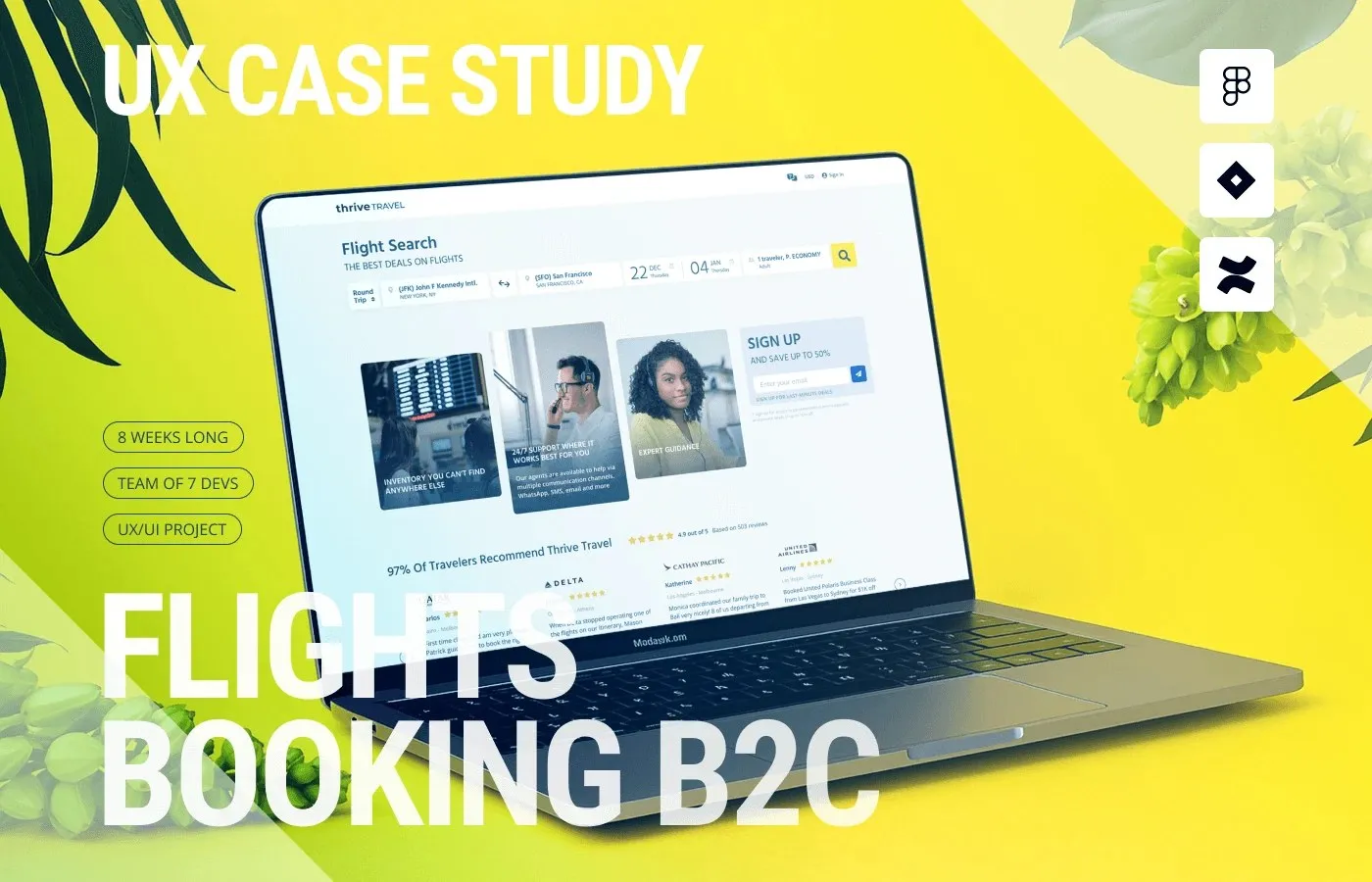
Thrive Travel UI UX Case Study by Roman Yashchenko
UI/UX Design Solution for the Thrive Travel Flight Booking Platform by Roman Yashchenko Booking flights usually comes with a head-spinning wave of information overload and hidden fees. Enter Thrive Travel, a flight booking platform concept by designer www.behance.net/gallery/224548535/B2C-Frlights-Booking-Platform-UX-case-study that brings a refreshingly sleek and intuitive interface to the table. Grounded in qualitative interviews with over…
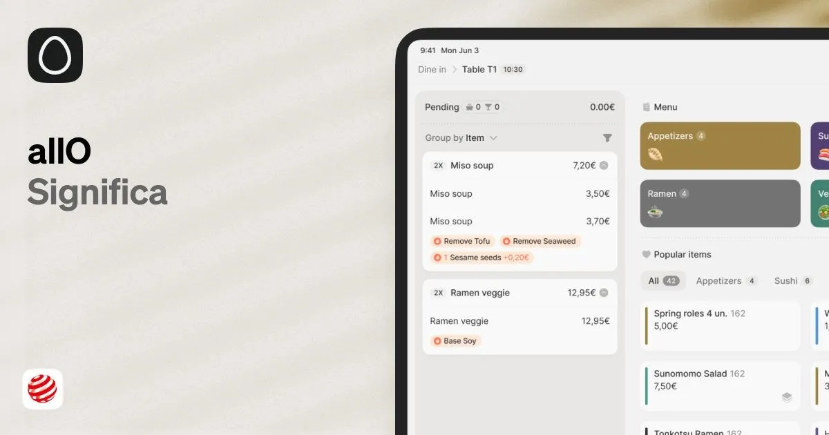
allO Restaurant Platform: A Masterclass in Utility-Focused UI/UX Design by Significa
A Modular UI/UX Design System Built for Seamless Restaurant Operations by allO and Significa Running a bustling restaurant is no joke, especially when the front-of-house gets hit with a massive rush. To tackle this challenge, Porto-based design studio Significa cooked up allO—a brilliant modular UI/UX design system that effortlessly bridges the gap between hardware and…
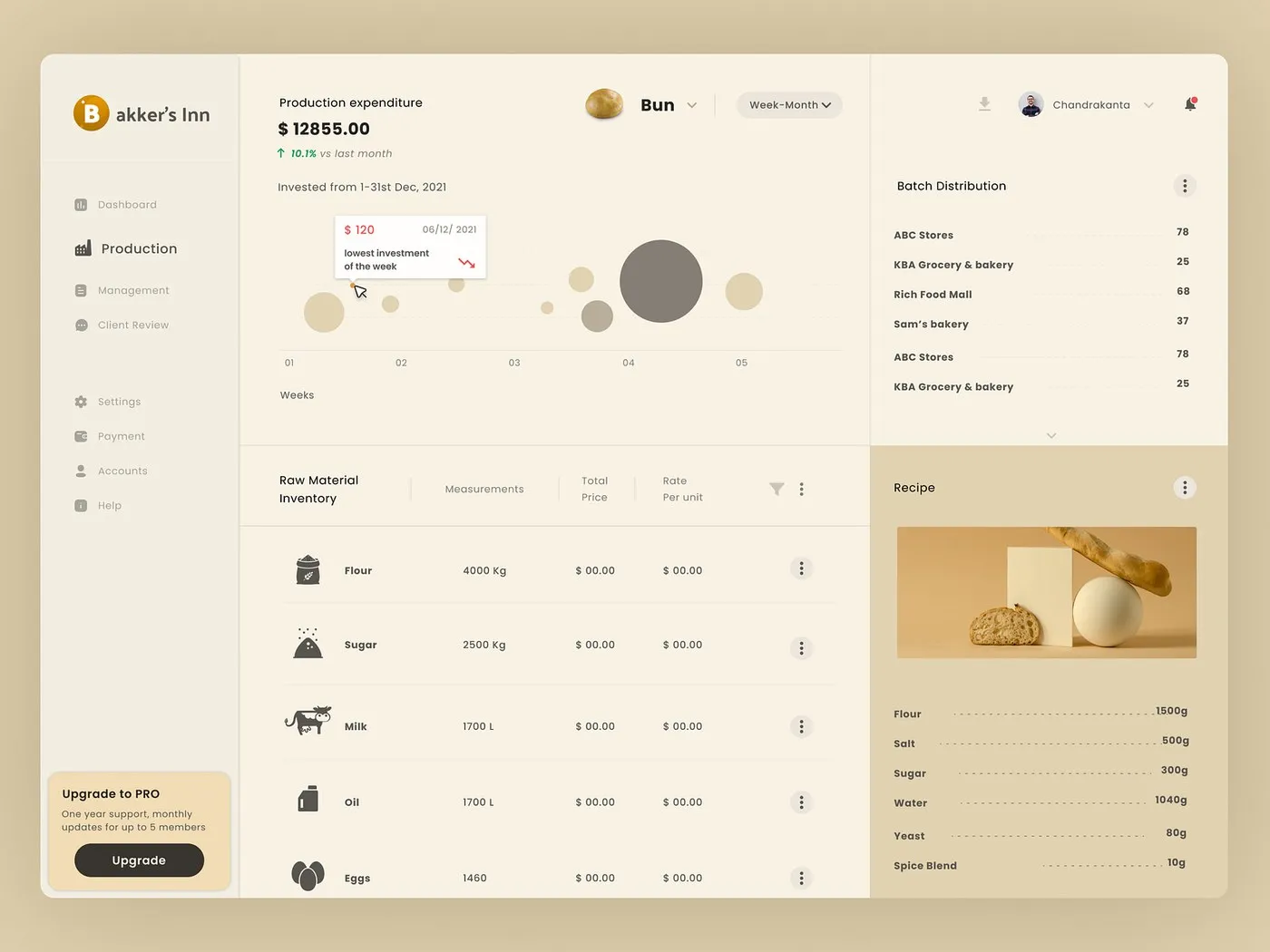
Bakker’s Inn Dashboard UI Design by Dnyanesh Maid
An incredibly optimized and data-driven dashboard UI for Bakker’s Inn by Dnyanesh Maid. Bakker’s Inn is an ultra-clean dashboard design featuring modular analytics widgets and intuitive data visualization, crafted by designer Dnyanesh Maid. Complex business metrics are smoothly transformed into a sleek, easy-to-digest SaaS interface. The real magic lies in the structured grid system, high-contrast…
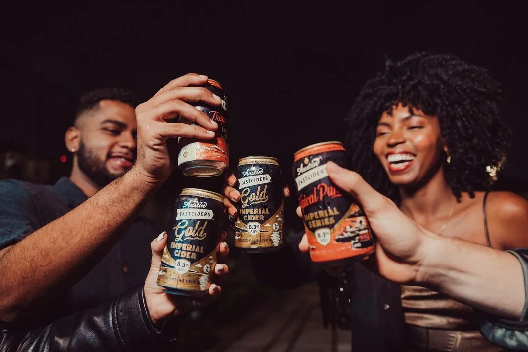
Austin Eastciders Shopify Website Redesign by Barrel
Austin Eastciders is a popular cider brand based in Austin, Texas. Using high-quality apples sourced from Europe, the brand’s goal is to ignite a digital love affair with their refreshing drinks. The creative agency Barrel stepped in for a major overhaul of the Austin Eastciders Shopify website, bringing the brand’s vibrant personality to life online.…
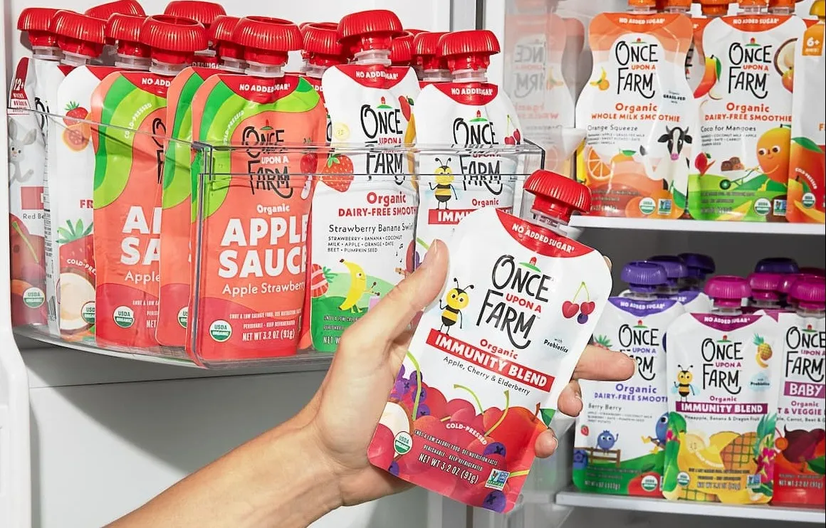
Once Upon A Farm Website Redesign by Barrel
Once Upon A Farm is a go-to brand for organic, cold-pressed pouches and plant-rich meals tailored for babies to big kids. To help them make an even bigger splash in the market, Barrel stepped in to give their website a fresh new look on Shopify Plus. The main goal? Bringing their story of real, farm-fresh…
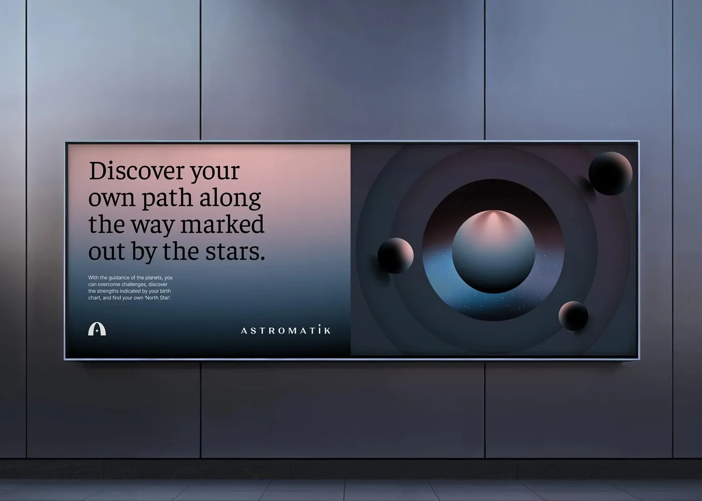
Astromatik App Branding and UX UI Redesign by Sencer B. Yilmaz
Sencer B. Yilmaz’s rebranding and UX/UI redesign for the Astromatik app serves up an incredibly organized design system featuring a flawless modular grid and excellent spatial balance. In this digital product, the approach to identity leans heavily into clean, minimalist geometry. The logo uses sharp vector lines to map out a celestial cycle, completely steering…

Interface and Branding Concept for Open Trading 2025
This awesome www.behance.net/gallery/237654601/Open-Trading-2025 project serves up a super fresh, modern take on online financial trading interfaces. The absolute best part? It completely nails the user experience, turning complicated charts and messy data into something totally intuitive and easy to digest. The entire design system is beautifully broken down into distinct sections, with every single detail—from…
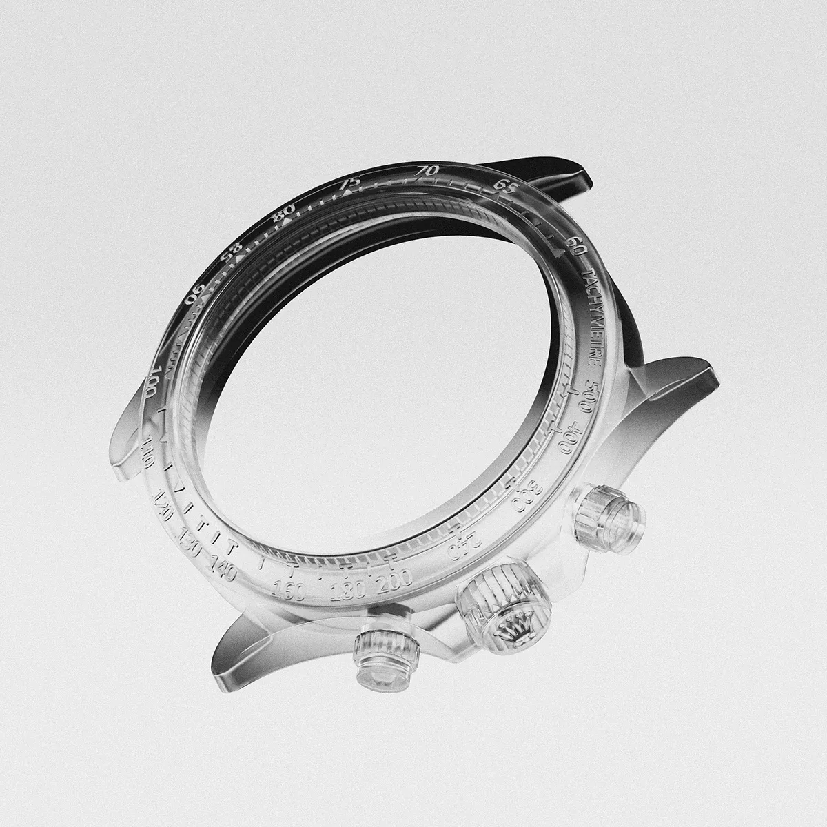
Hi Watch by C C: New Style Experiments and Upcoming Tutorials
This super inspiring project makes the absolute best use of free time to experiment with completely fresh and unique design styles. Up next, the creator is planning to carve out some time to put together a detailed tutorial series breaking down this entire set of artwork. Đây là một dự án đầy cảm hứng, tận…
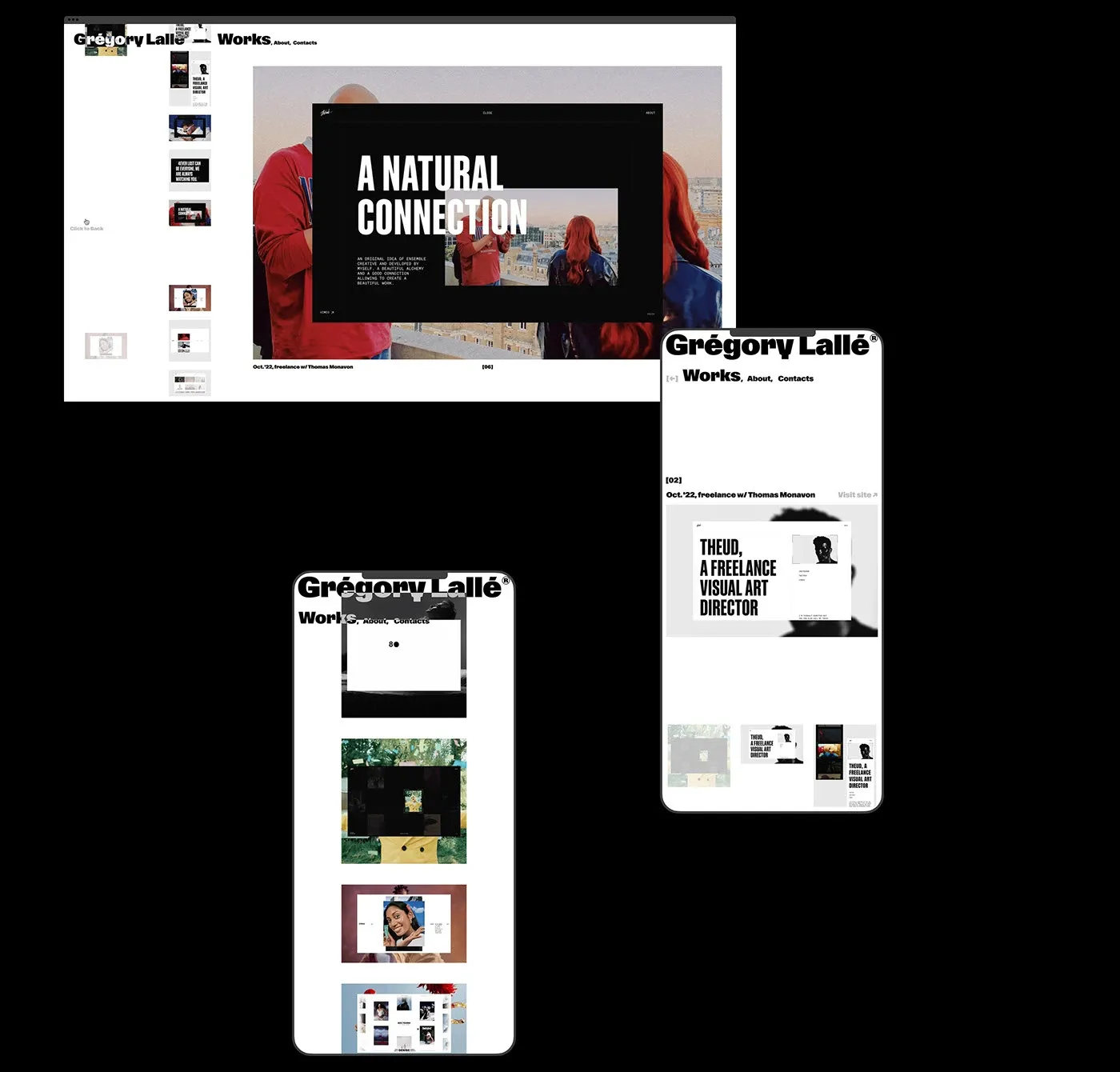
Gregory Lalle Portfolio Concept: A Clean UI UX System by Dmitri Semenov
Instead of sticking to the usual card grids or cookie-cutter templates, designer Dmitri Semenov created a super clean web experience for developer Gregory Lalle. This interface packs a major punch with a dark mode background paired with high-contrast sans-serif typography that instantly grabs attention. Gentle, subtle hover effects pop up to reveal project details as…

Design Spells: A Curated Library of Micro-Interactions and UI UX Details
If anyone is looking to add a little “magic” to their app or website interactions, Design Spells is an absolute goldmine. Instead of focusing on standard full-page layouts or massive banners, this platform curates those tiny micro-interactions and subtle UI/UX details that make modern software feel alive and deeply human. From buttery-smooth button hovers to…
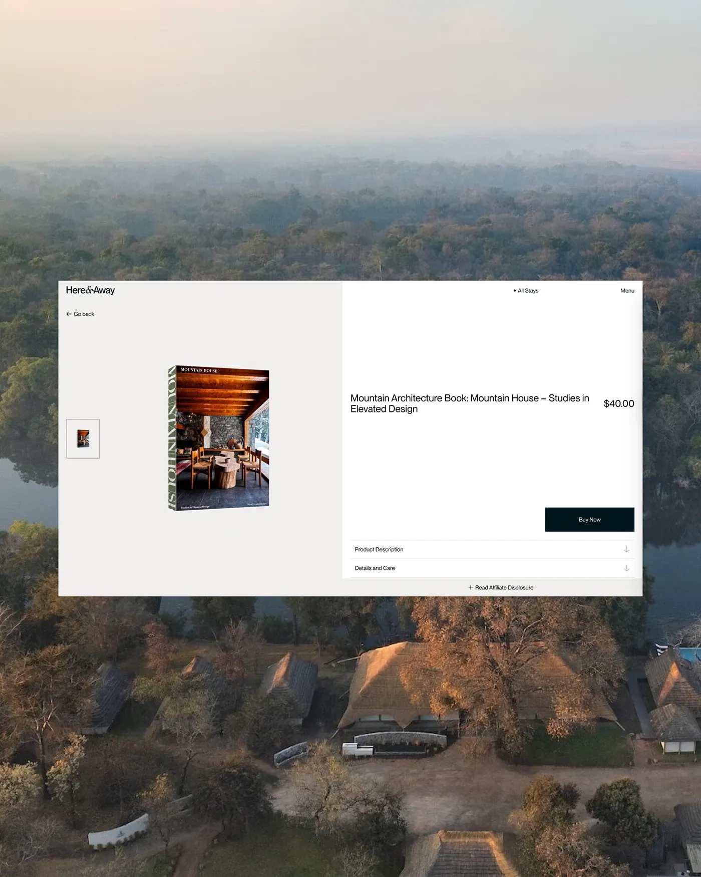
Here & Away Travel Platform UI UX Design by Andrea Jelić
I Andrea Jelić and Duo Studio brought a breath of fresh air to the Here & Away platform. The design focuses on a sophisticated UI/UX wrapped around the unique story of each stay, featuring warm-toned photography. A gentle cream background blends beautifully with elegant serif headlines and full-bleed imagery of the properties. The grid layout…
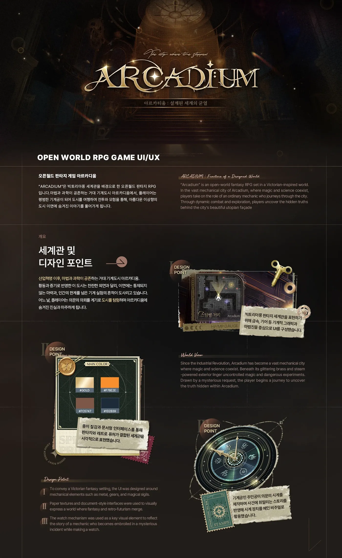
Mobile Game UX/UI Design for Open World Fantasy Game by JH K
Check out this incredibly creative UX/UI design concept for a mobile open-world fantasy game by designer JH K. This project focuses on optimizing visual interfaces and leveling up the interactive experience for mobile players. Cùng tham khảo một dự án thiết kế UX/UI đầy sáng tạo dành cho thể loại game di động thế giới…

Designing the Brakes: Why Digital Experiences Need a Generative Pause
For the longest time, the digital design world operated on a simple instinct: friction is the enemy. The shorter the user journey and the fewer the steps, the better. The goal was always to help users breeze through tasks as quickly and smoothly as possible. But times have completely changed. Now, everyone is interacting with…