
branding
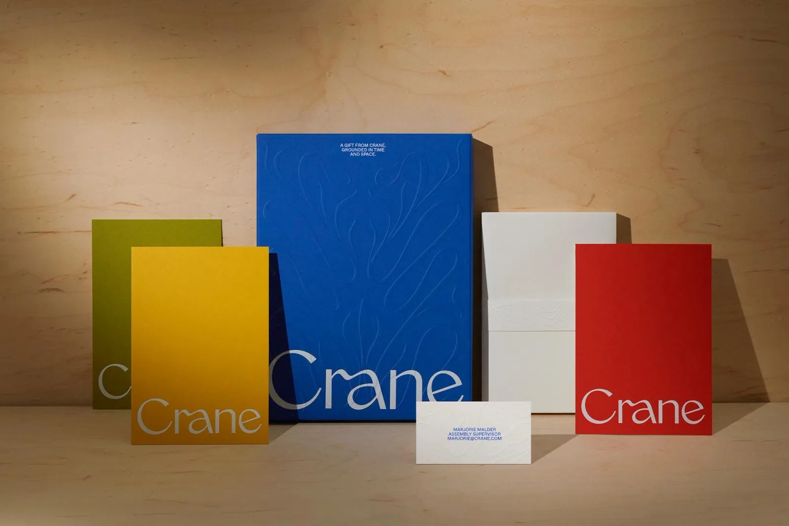
Redefining 250 Years of Craft: Inside COLLINS’s Branding for Crane Stationery
Breathing New Life into a 250-Year Legacy: COLLINS’s Crane Stationery Rebrand In today’s digital age, writing a letter by hand or reaching for artisanal paper might feel a bit nostalgic, but for Crane Stationery—a legendary American cotton paper maker dating back to 1770—the value of meticulous craftsmanship remains as relevant as ever. From supplying paper…
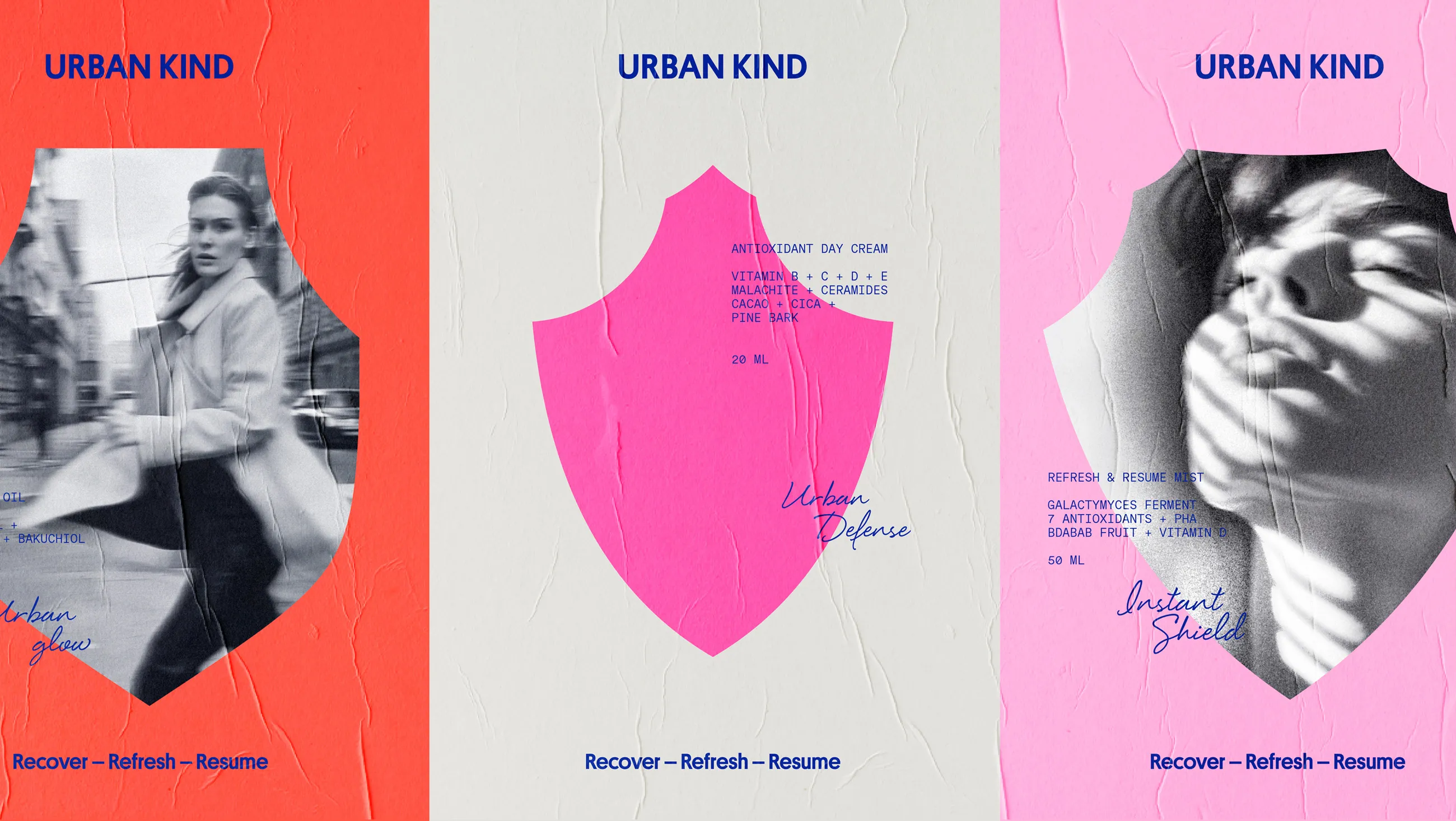
How EVERLAND Reimagined Skincare Identity for Urban Kind
How EVERLAND Built Urban Kind’s Brand Identity Around a Bold Shield Symbol Skincare shelves are super crowded, and most brands play it safe with soft, subtle designs. But design studio EVERLAND took a totally fresh, standout route when creating the brand identity for Urban Kind—a vegan skincare line founded by Peter Ternström—by designing a bold,…
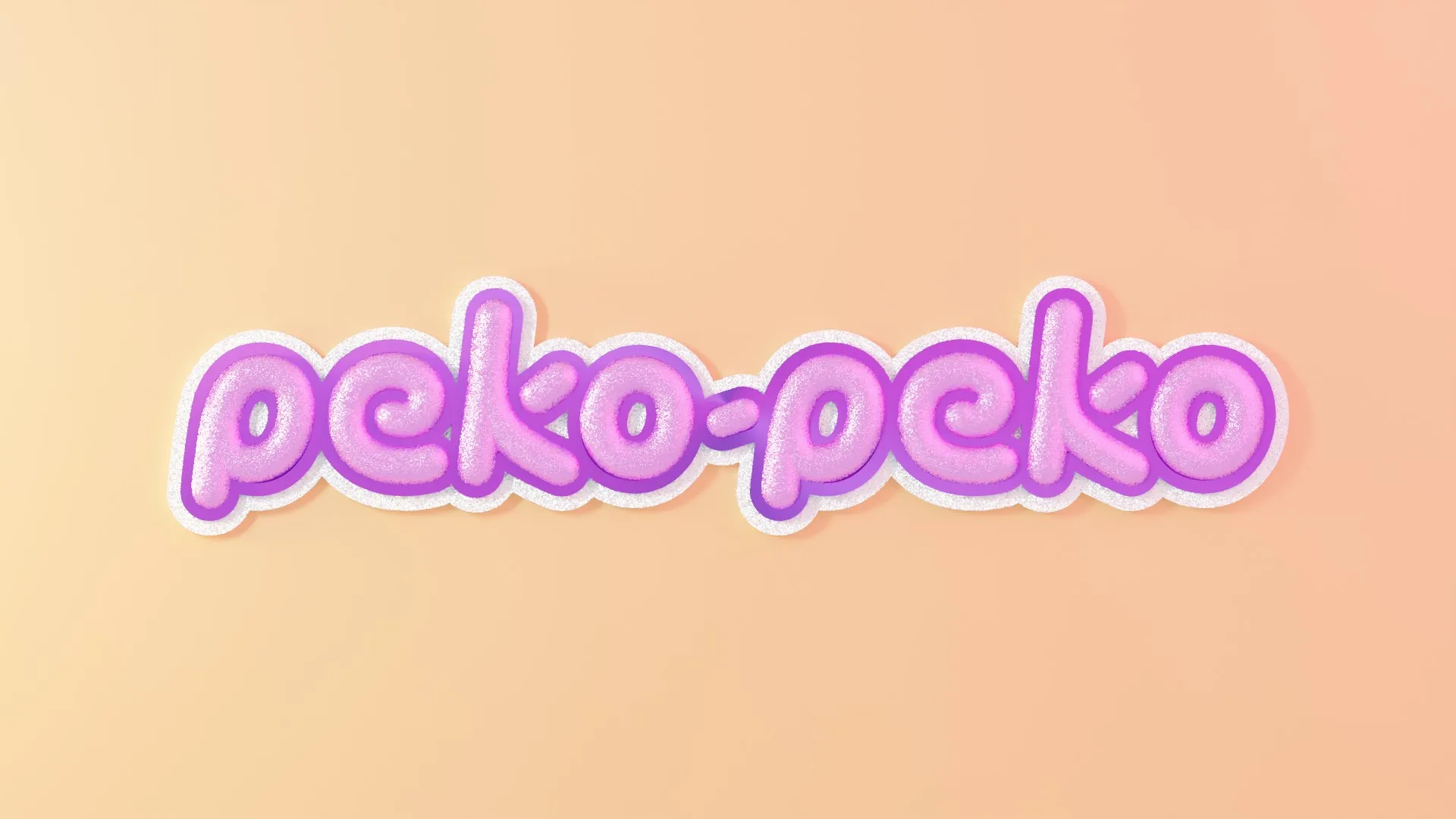
Inside the Craft of Peko-Peko Branding by Manifiesto
Peko-Peko: Manifiesto’s Brand Identity Fusion of Kawaii Style and Mexican Spirit Mexico City studio Manifiesto brought the Peko-Peko brand identity to life around the playful concept that “Mexicute is a mood”. The project builds a vibrant character universe that blends the adorable charm of Japanese kawaii culture with the rich, colorful expression of Mexico. Centered…
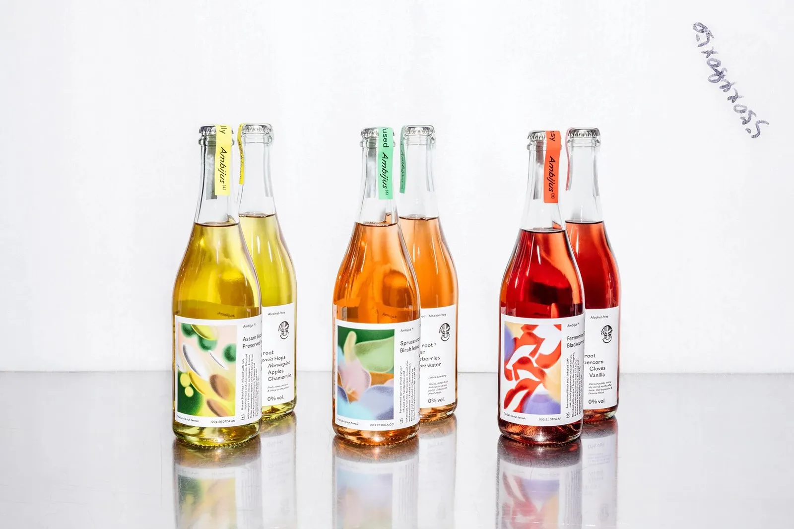
How OlssønBarbieri Crafted the Packaging for Ambijus
Ambijus Packaging Design by OlssønBarbieri: When Non-Alcoholic Drinks Break the Mold Most non-alcoholic drinks on the market today try way too hard to imitate traditional wine bottles, relying on embossed family crests or timid “0% vol” labels. But when Norwegian beverage producer Leske teamed up with Oslo-based studio OlssønBarbieri to develop a NOLO (No/Low Alcohol)…
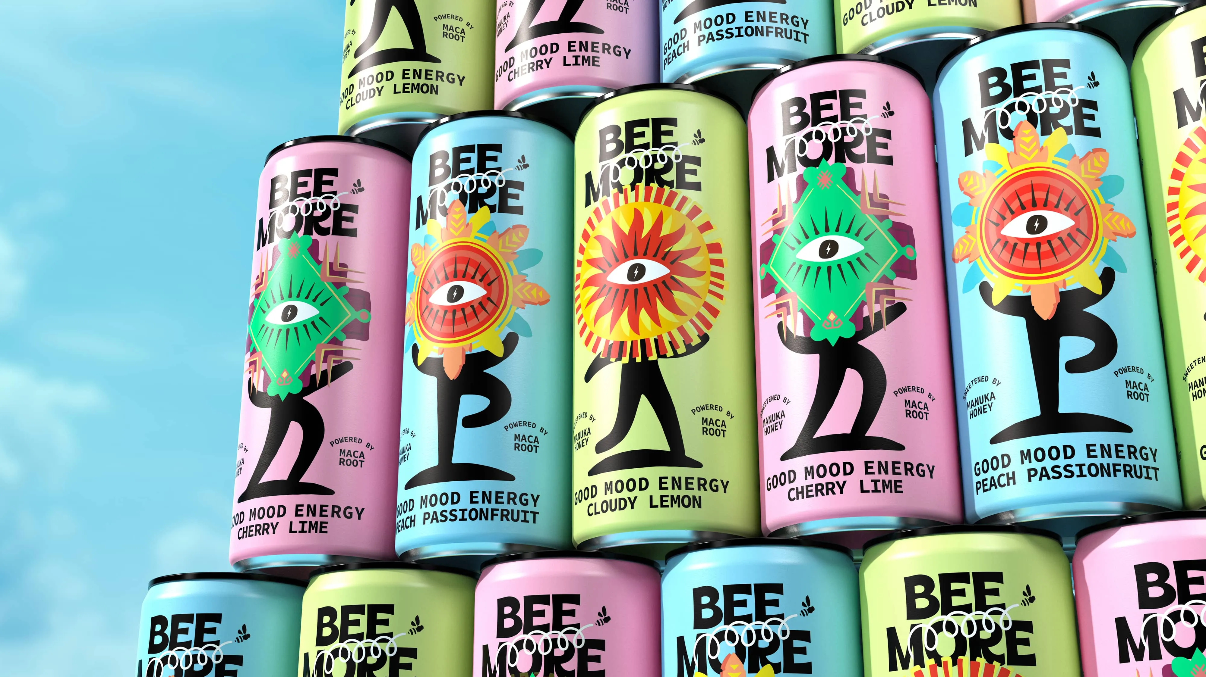
Beemore Rebrand by Boundless: Ancient Energy for Modern Civilisation
Beemore Rebrand by Boundless: Ancient Energy for Modern Civilisation London-based design studio Boundless recently delivered a striking rebrand for Beemore, a health-conscious wellness drink brand. This fresh visual identity grabs attention with mythical sun-and-eye iconography, ancient symbols, and a vibrant color palette. Instead of following the typical route of generic synthetic energy drinks, Beemore embraces…
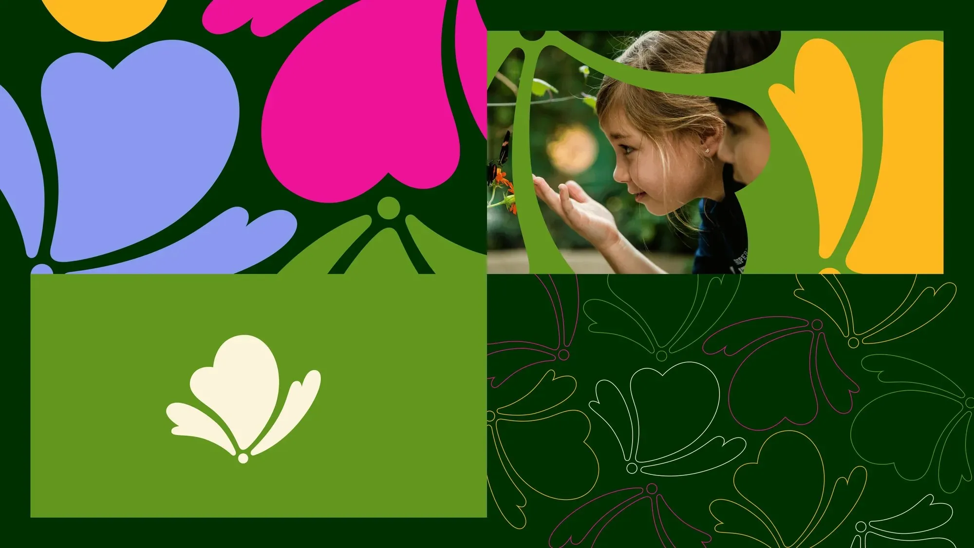
Span Redefines Chicago’s Nature Museum Identity with Prairie-Inspired Design
Span Breathes Fresh Prairie Energy Into Chicago’s Nature Museum Brand Identity Chicago’s Peggy Notebaert Nature Museum has been a beloved local staple since 1857. Driven by a fresh strategic plan, Nick Adam and the design team at Span stepped up to update a visual identity that had remained untouched for two decades. Taking inspiration directly…
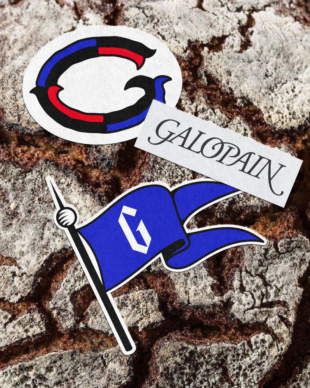
Medieval Manuscript Vibe in Charline GROEN’s Branding for Galopain
Medieval Manuscript Vibes in Charline GROEN’s Branding for Galopain Forget your typical French bakery with standard baguettes or buttery croissants. At Galopain—a bakery pitched as a “Taverne du pain chaud” (warm bread tavern)—slow-fermented traditional loaves made from ancient grains take center stage. To match that rustic baking spirit, designer Charline GROEN skipped the modern minimalist…
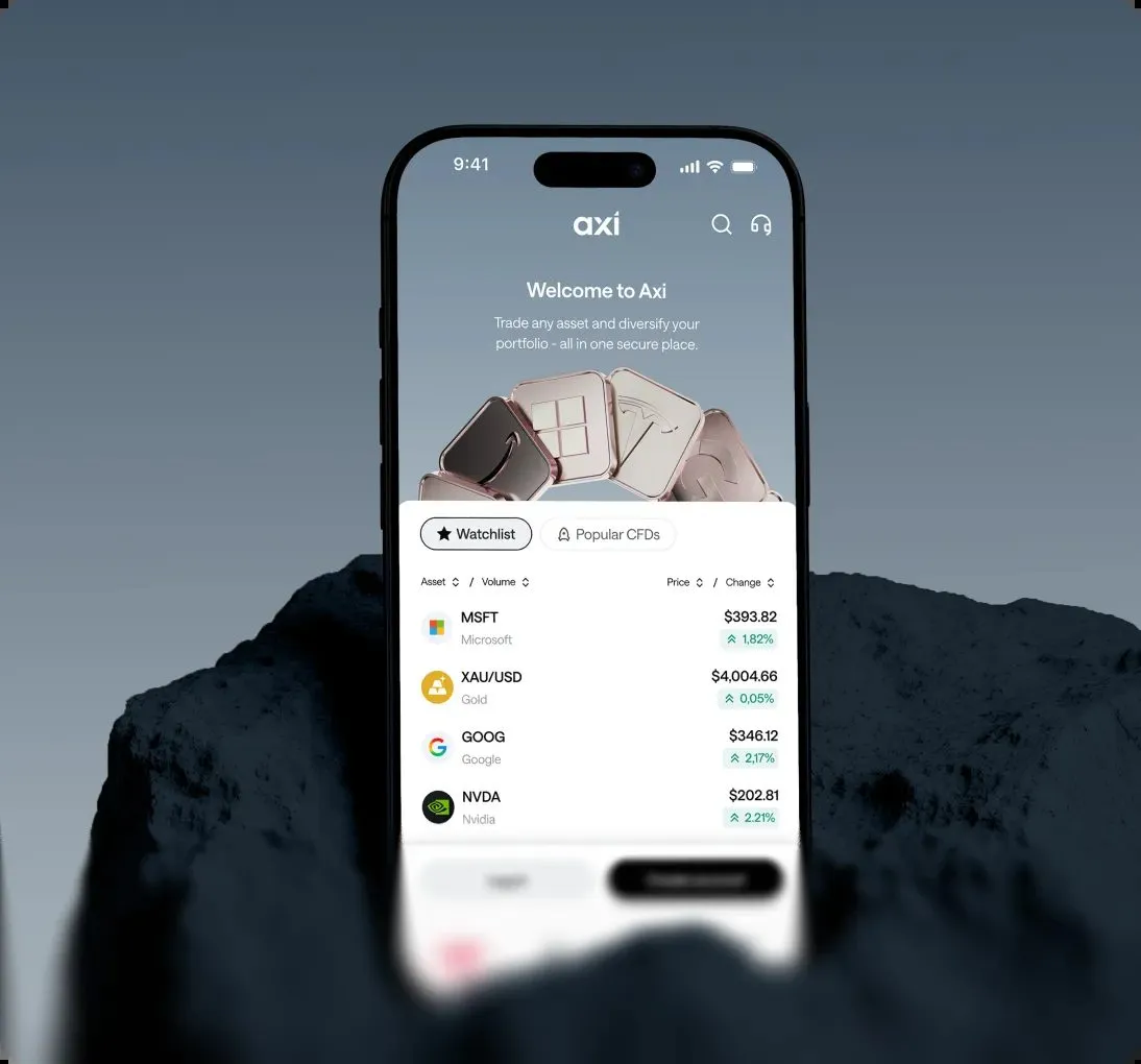
How Properly Studio Rebuilt Axi’s Brand, Website, and App in Four Months
Properly Studio’s 4-Month Rebrand for Axi Instead of spending an entire year on a massive rebranding overhaul, Properly Studio pulled off a complete refresh of the brand, a 150-page website, and a trading app UI for Axi—a global online broker—in just four short months. This project went way beyond swapping out a logo or building…
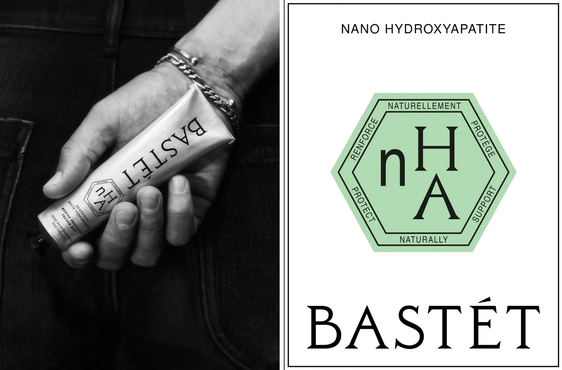
Bastét: How Wedge Brought Oral Care Branding to the Beauty Counter
Bastét: How Wedge Studio Brought Toothpaste to the Vanity Counter Take a look at Bastét’s packaging design—what stands out most is actually what’s missing! There is no sign of the usual red, blue, and white combo, nor any big smile graphics. Instead, it rocks a raw aluminum tube with a sleek industrial vibe, paired with…
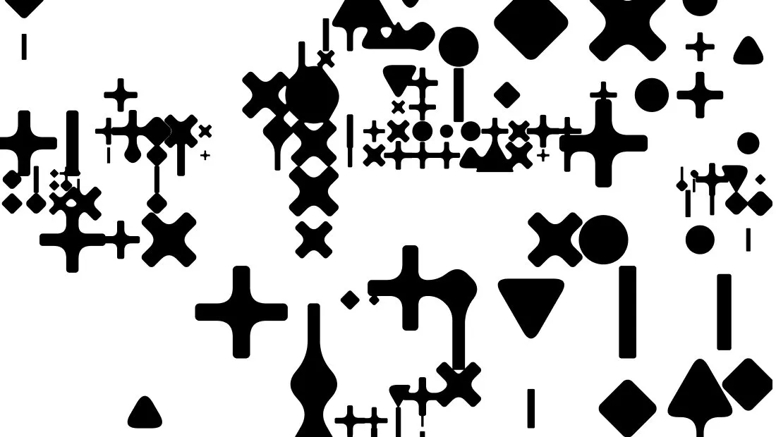
Inside CLEVER°FRANKE’s Living Brand Identity System for ADC
A Unique Living Brand Identity by CLEVER°FRANKE for ADC Design studio CLEVER°FRANKE just created a mind-blowing living brand identity for ADC, built from generative mathematical patterns, optimized by a custom AI model, and fine-tuned with human feedback. This standout project even took home Gold in the Brand Identity, Complete Systems category at the 2026 European…
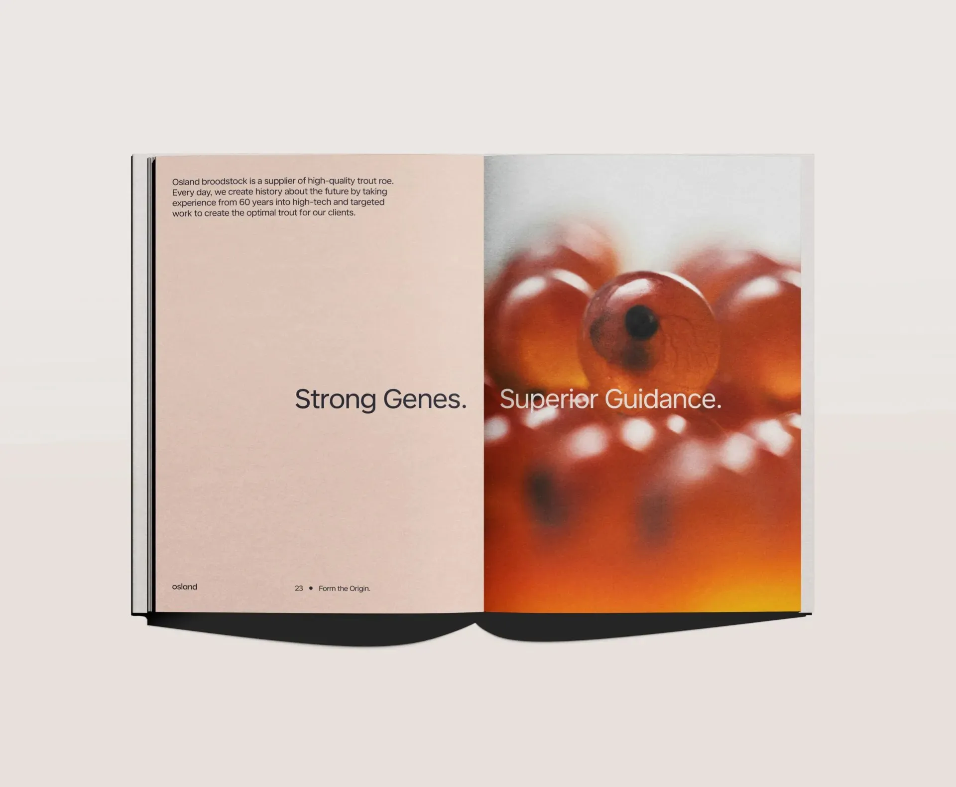
How KIND Reimagined the Brand Identity for Osland
Osland Rebrand: How Biology Became the Language of Brand Design Founded back in 1963, Osland holds the title of Norway’s oldest broodstock salmon producer. To capture both their massive industry heritage and their scientific rigor, design agency KIND crafted a standout brand identity that snagged a Gold award at the 2026 European Design Awards. The…
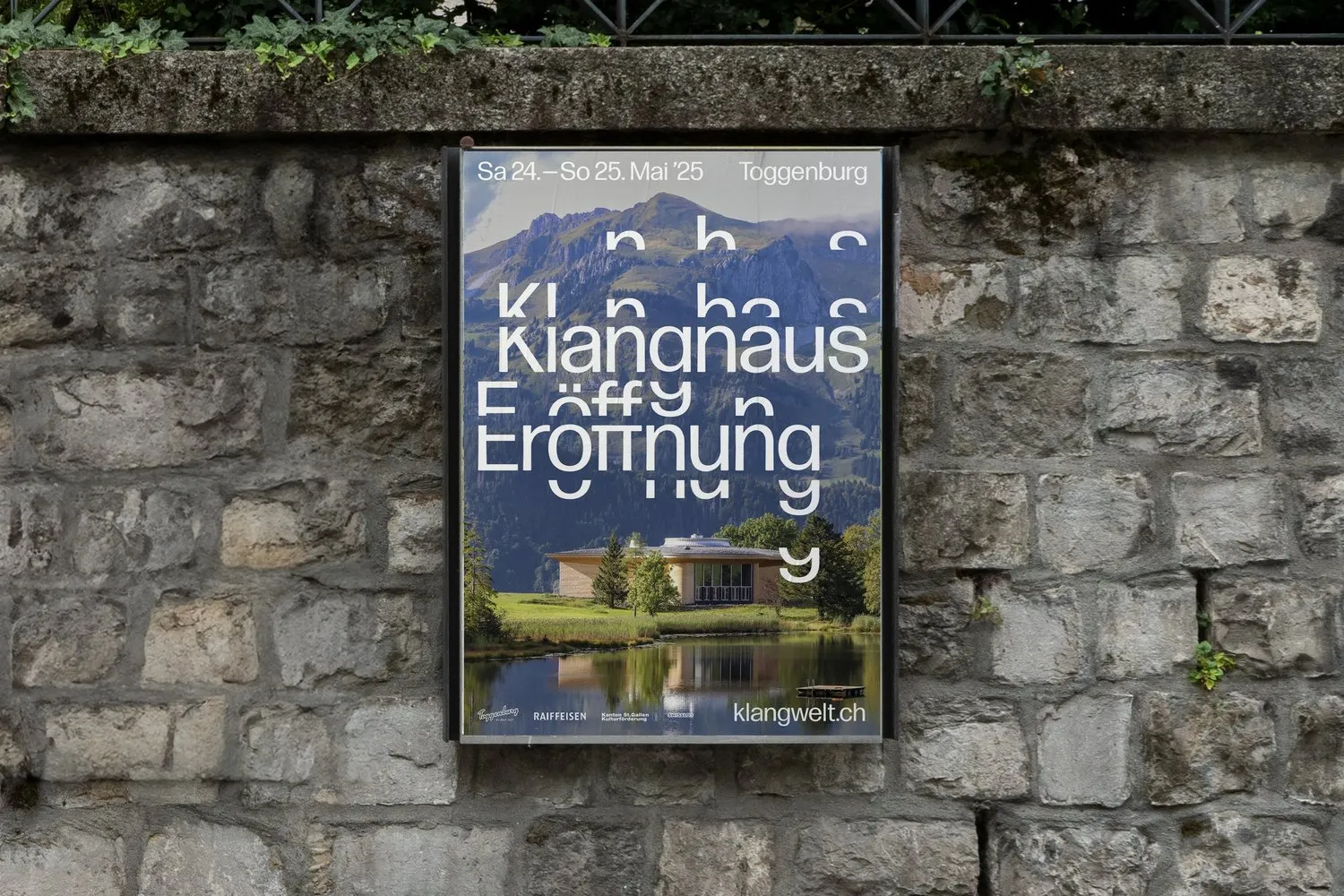
Klangwelt Toggenburg Rebrand by Studio Marcus Kraft
Studio Marcus Kraft’s Unique Visual Identity for Klangwelt Toggenburg When sound comes to mind, eardrums or audio waves usually spring up first, but Studio Marcus Kraft reimagined the concept of resonance into a remarkably intuitive brand identity system for Klangwelt Toggenburg. At the heart of the project sits a dynamic typeface where letters shift, drift,…
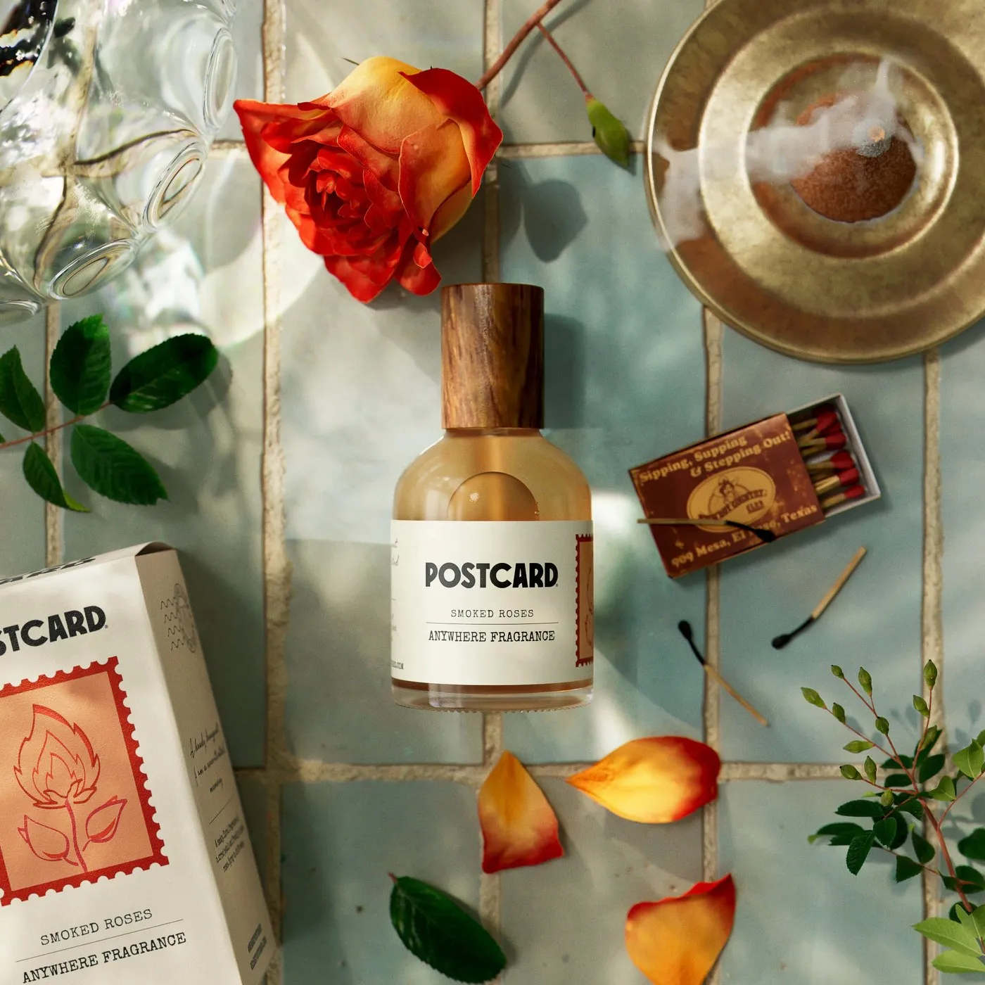
Inside Robot Food’s Packaging Design for Postcard
Robot Food rebranded Singapore’s sustainable beauty brand Oasis Beauty Kitchen into Postcard with stamp-inspired packaging design. When founder Hildra Grace approached Robot Food to expand Singapore’s sustainable beauty brand Oasis Beauty Kitchen globally, her brief was gloriously direct: “Less farmers’ market, more Sephora.” Overwhelming 10-step routines and endless plastic clutter had turned self-care into a…
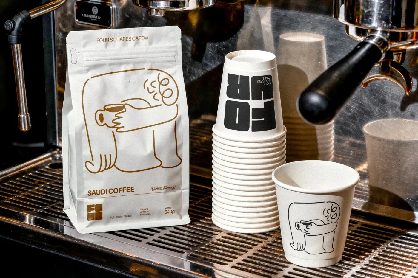
Four Squares Cafe: A Clever Brand Identity System by Studio Moara
Four Squares Cafe: A Cozy Brand Identity System by Studio Moara Most coffee shop brand identities usually lean toward either typography or a fun mascot. But for Four Squares Cafe in Saudi Arabia, Studio Moara cleverly combined both on a super harmonious grid system. The “FOUR” wordmark is arranged into a chunky 2×2 square layout,…
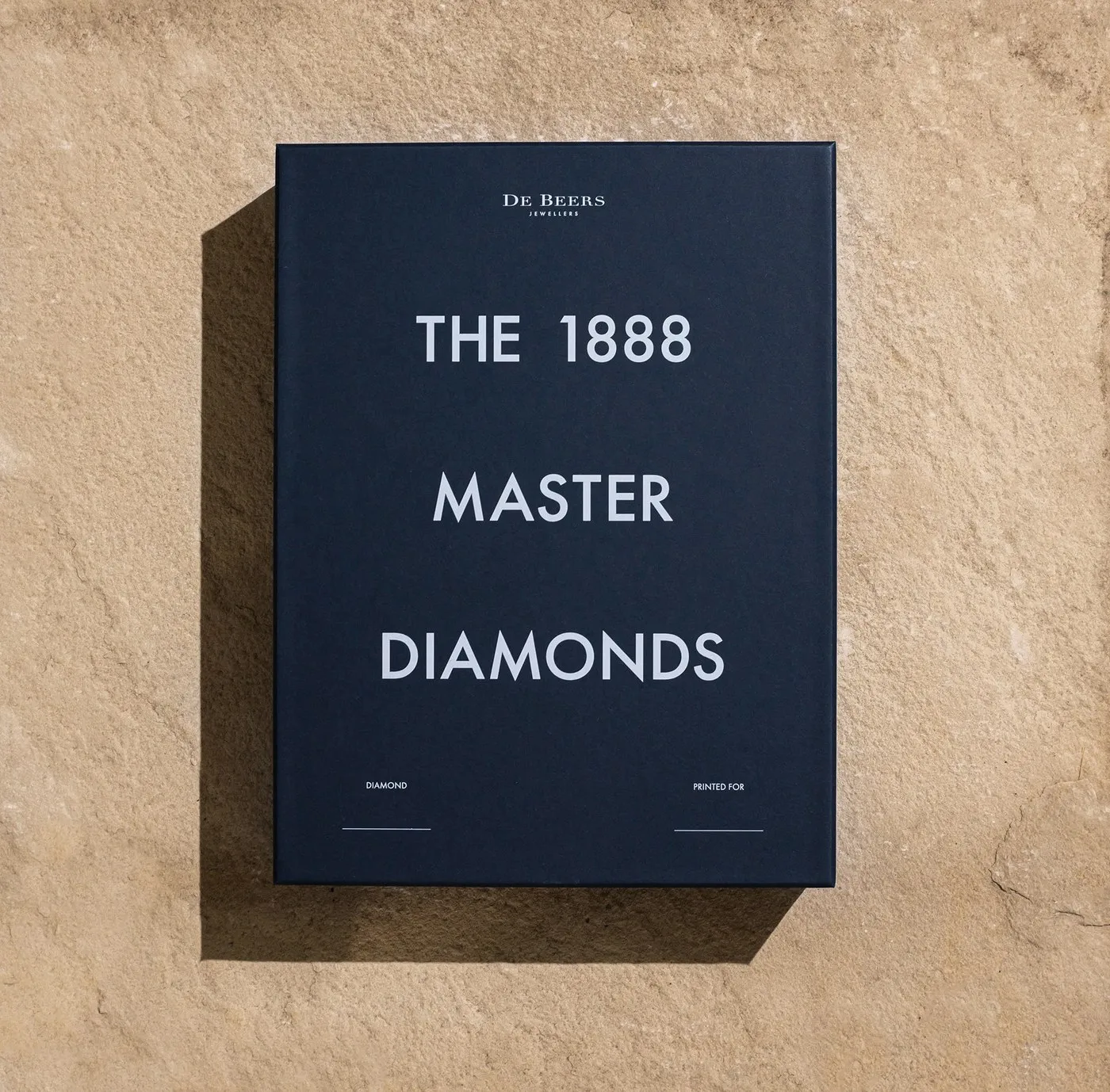
How Two Times Elliott Craft a Raw Geological Identity for De Beers
How Two Times Elliott Reimagined De Beers Through Raw Geological Storytelling Instead of leaning into the usual high-gloss clichés of luxury jewelry brands, London design studio Two Times Elliott took a refreshingly grounded route for De Beers’ high-end 1888 Master Diamond Collection. The team centered their concept on origin, time, and craftsmanship, drawing direct inspiration…
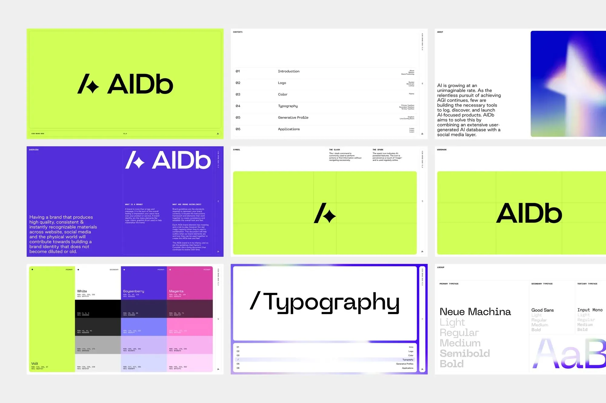
AIDb Identity: Inside Rafael Cespedes’ Branding System
Inside AIDb’s Brand Identity System by Rafael Cespedes AIDb serves as a go-to platform for archiving, discovering, and reviewing AI-powered products, layered with a social community aspect. To shape this brand’s visual presence, designer Rafael Cespedes crafted a vibrant, modern identity rooted in everyday web interaction habits. A Logo Combining Action and Tech AIDb’s logo…
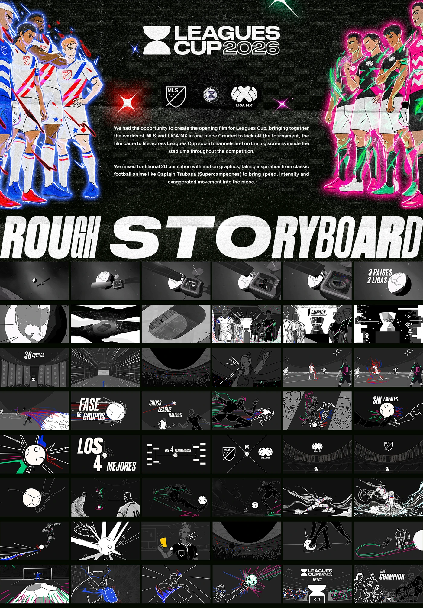
Visual Identity for LEAGUE CUP 2026
Visual Identity Design for LEAGUE CUP 2026 Check out this vibrant showcase of the LEAGUE CUP 2026 project featured on Behance! This post breaks down the graphic design modules and visual direction in full detail for the LEAGUE CUP 2026 tournament. Thiết kế nhận diện cho LEAGUE CUP 2026 Dự án LEAGUE CUP 2026 được…
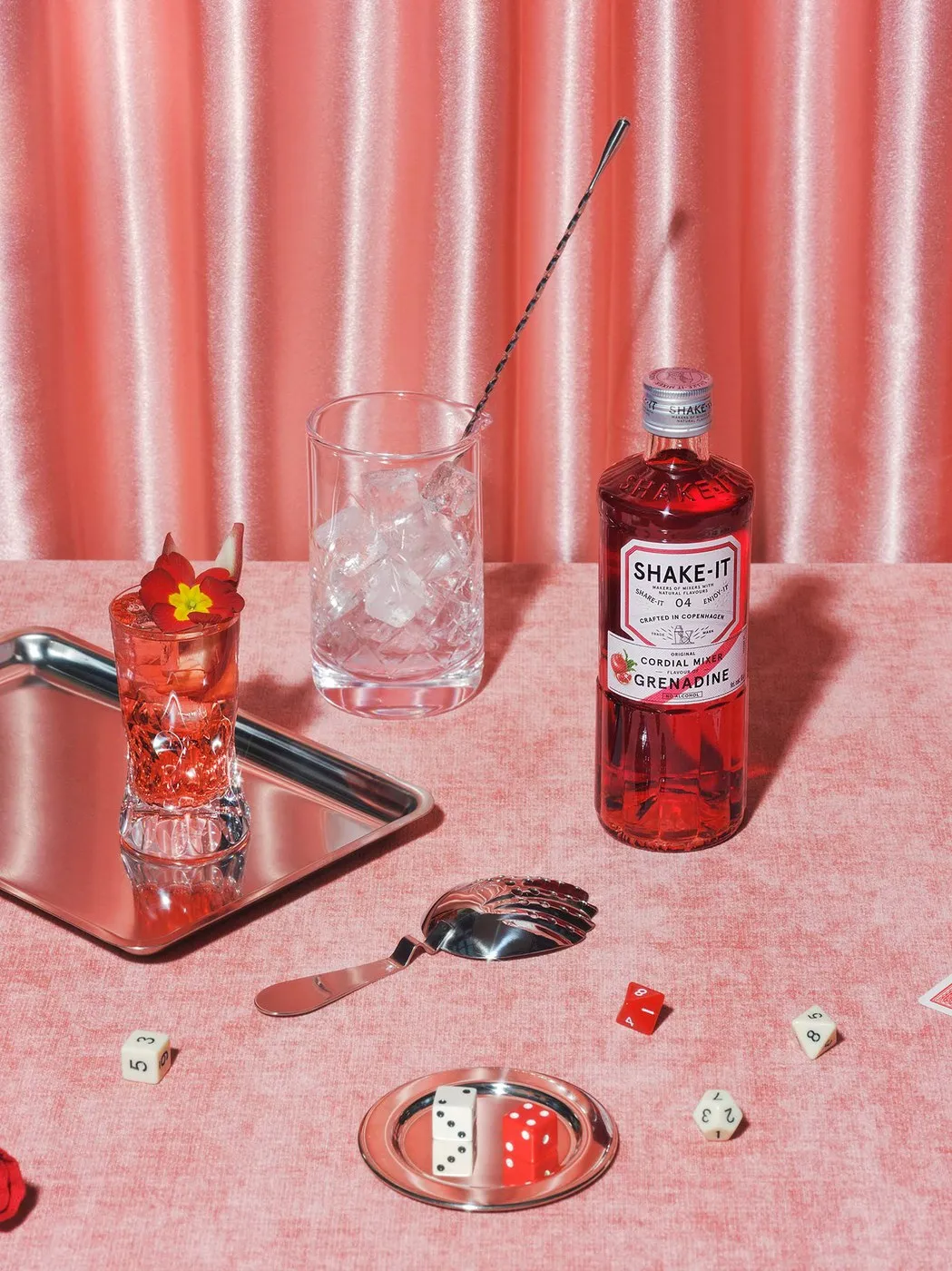
Shake-it Mixer: Inside OlssønBarbieri Packaging Design
Shake-it Mixer: How OlssønBarbieri Brought Classic Mixology Culture into Modern Packaging Design Home bartending used to rely heavily on artificial syrups and cordials tucked away in uninspiring plastic bottles. To turn the tide, Danish beverage group Hans Just Group teamed up with design studio OlssønBarbieri to revive the art of craft cordials for home bars.…
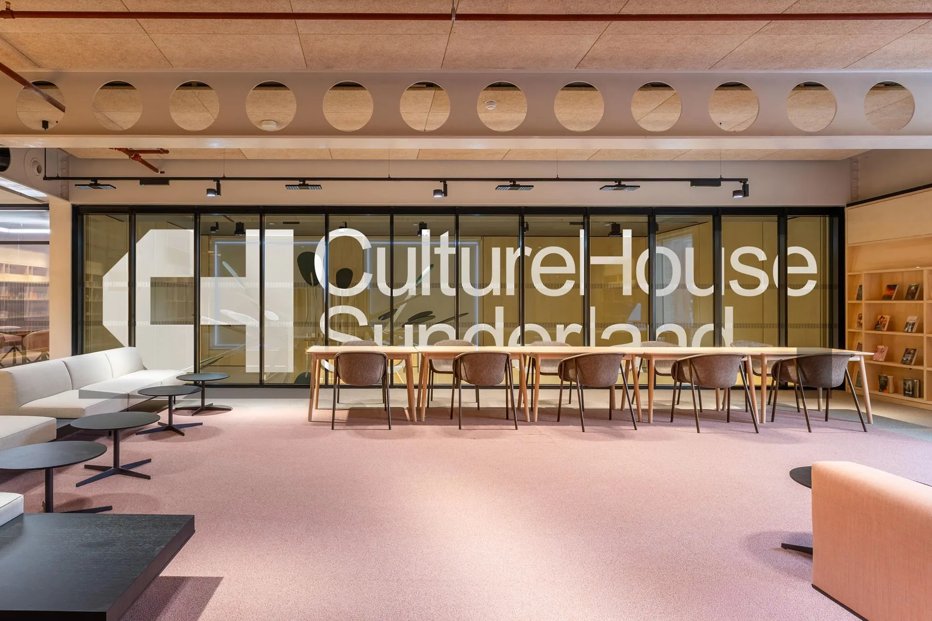
Culture House Sunderland Visual Identity by Studio Blackburn
Culture House Sunderland Brand Identity by Studio Blackburn Studio Blackburn recently rolled out a fresh visual identity for Culture House Sunderland, built around a playful C&H monogram that rotates and snaps neatly into a house silhouette. The real hero of this design system is the graphic container itself. A bold, solid black house shape sits…