
Porto Rocha Redefines Fursys’ Brand Identity with a Sharp Focus on ‘The Corner’ Fursys—South Korea’s premier office furniture brand established back in 1983—just dropped a fresh new brand identity crafted by design studio Porto Rocha. Rather than letting four decades of history turn into a rigid relic, the new identity system uses that rich legacy as a flexible, forward-thinking framework ready to adapt to the modern workspace.
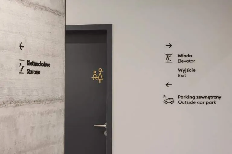
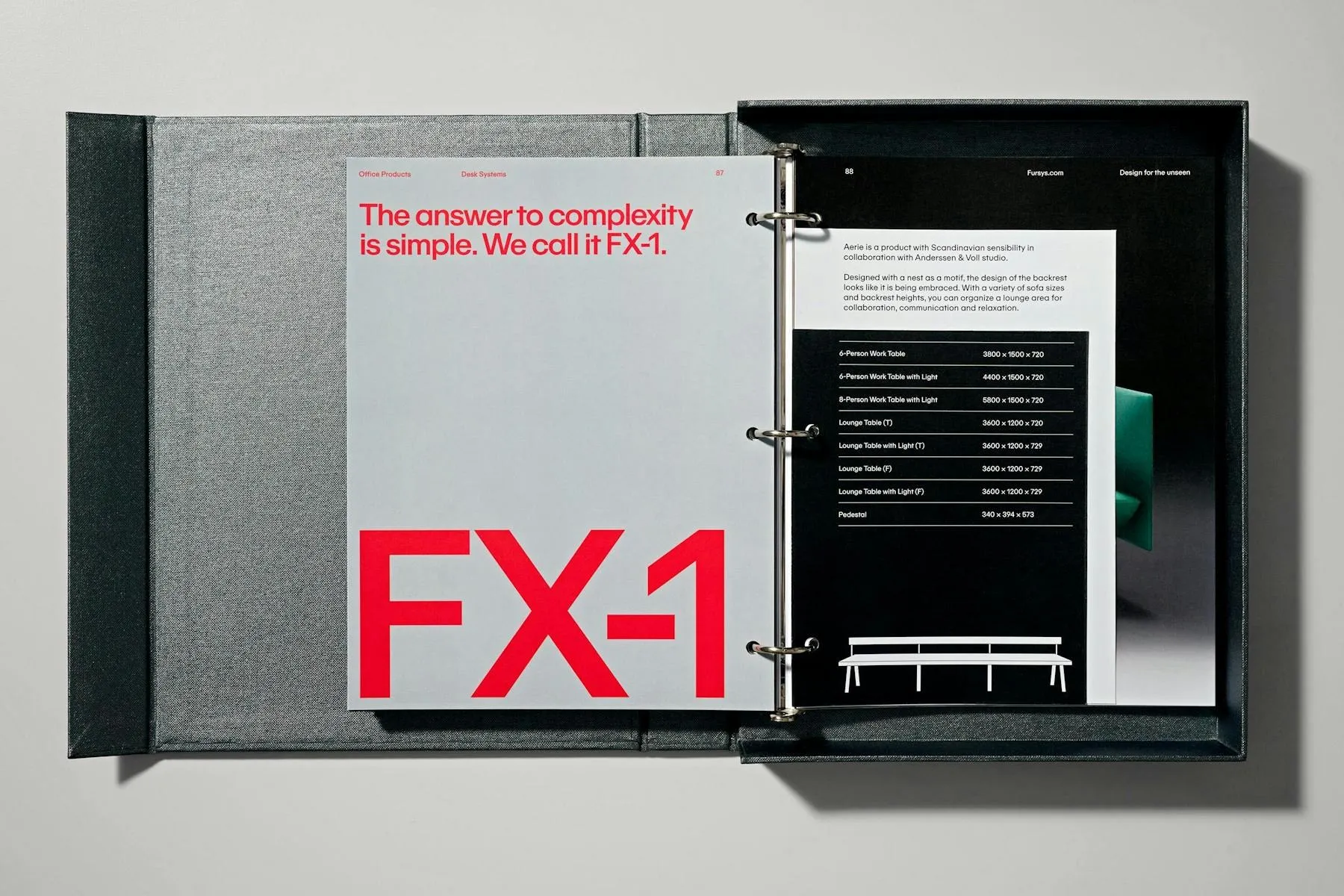
The core idea behind the rebrand stems from a surprisingly simple geometric detail: right angles, dubbed “The Corner”. From the clean wordmark down to the smallest touchpoints—like notched binder covers and wayfinding signage—everything follows a single, cohesive modular logic.
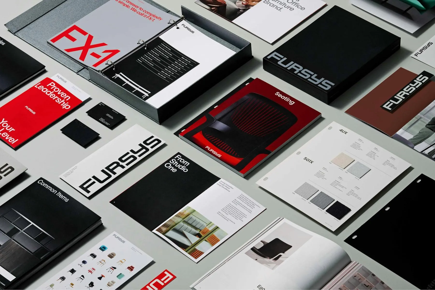
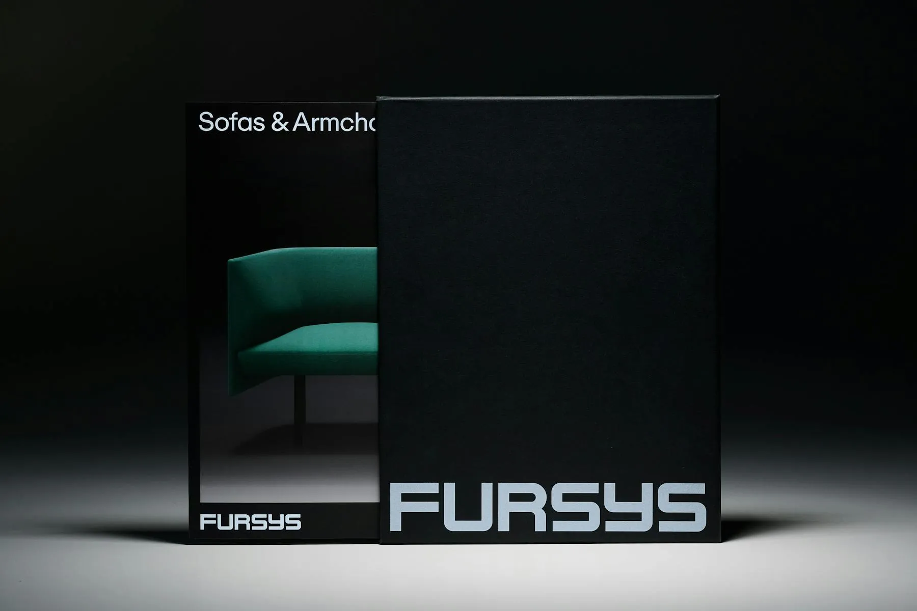
Visually, the system pairs crisp white typography against deep black, gives their signature red a vibrant refresh, and rounds things out with bold color blocking in navy and green. Porto Rocha also developed a custom geometric typeface, Fursys Sans, supporting both Korean and Latin scripts to keep the brand’s visual identity consistent from Seoul to the US.
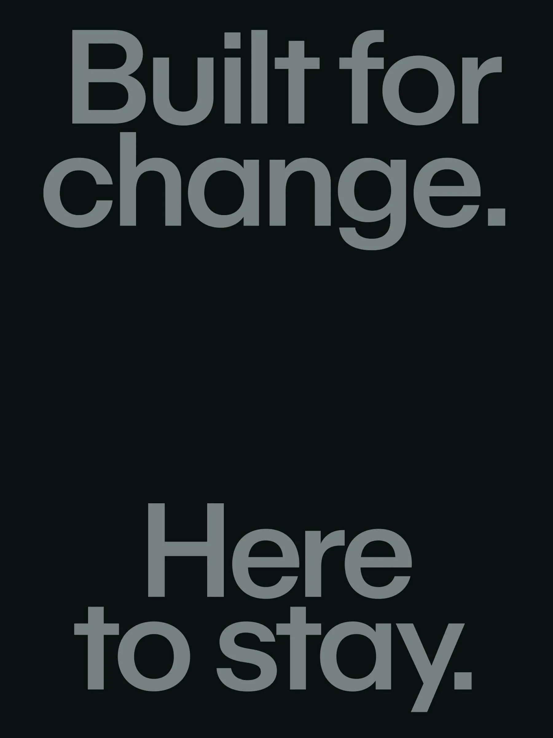
The brand voice adopts the persona of “The Proven Visionary,” paired with the tagline “Design for the unseen”. Copy stays short, punchy, and confident with lines like “Dynamic desks. Here’s a thought.” and “The answer to complexity is simple. We call it FX-1.”
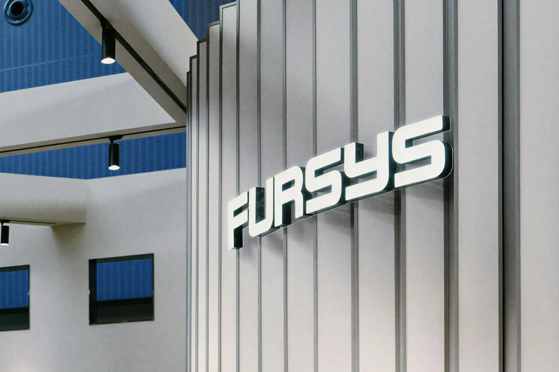
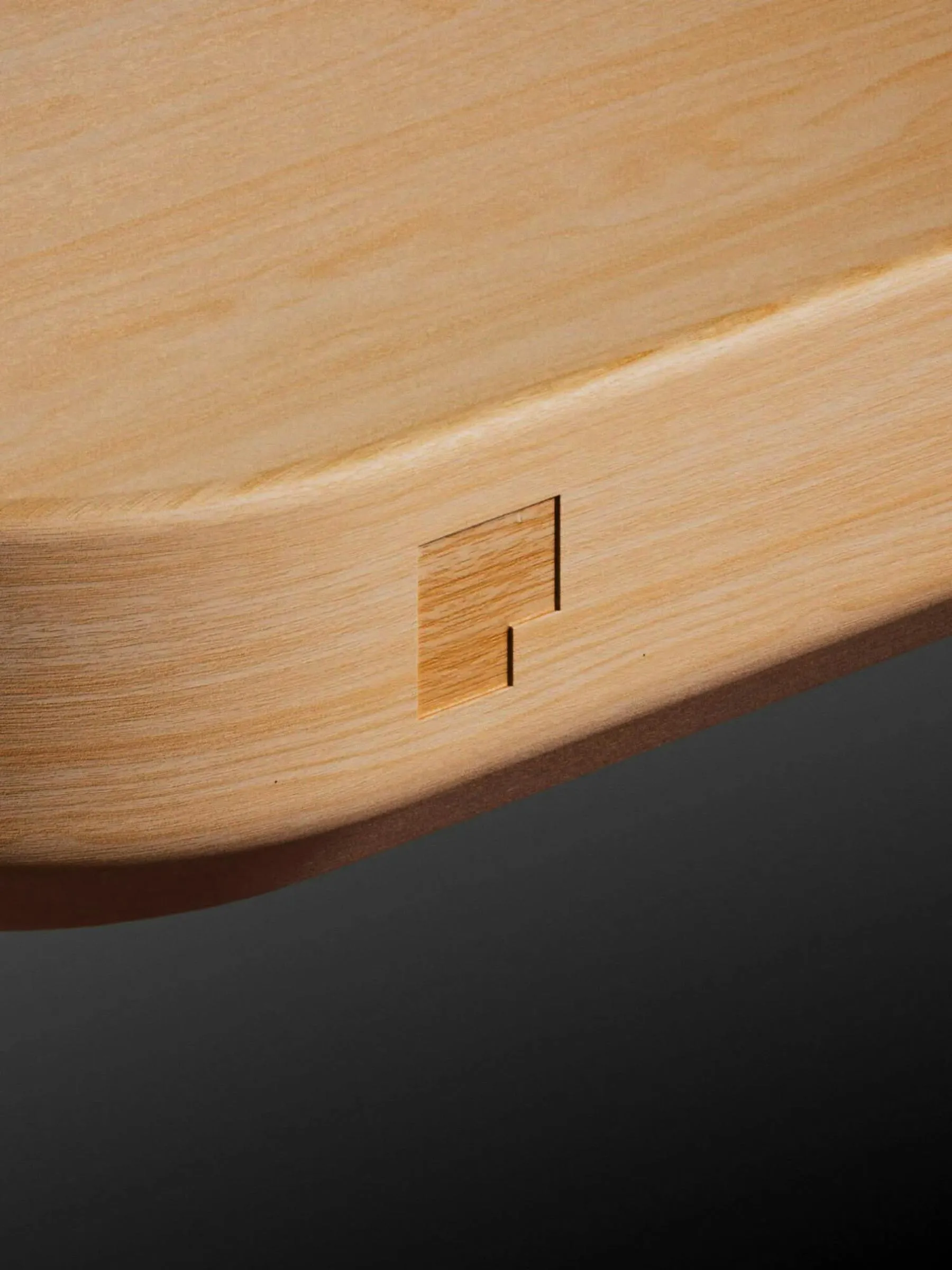
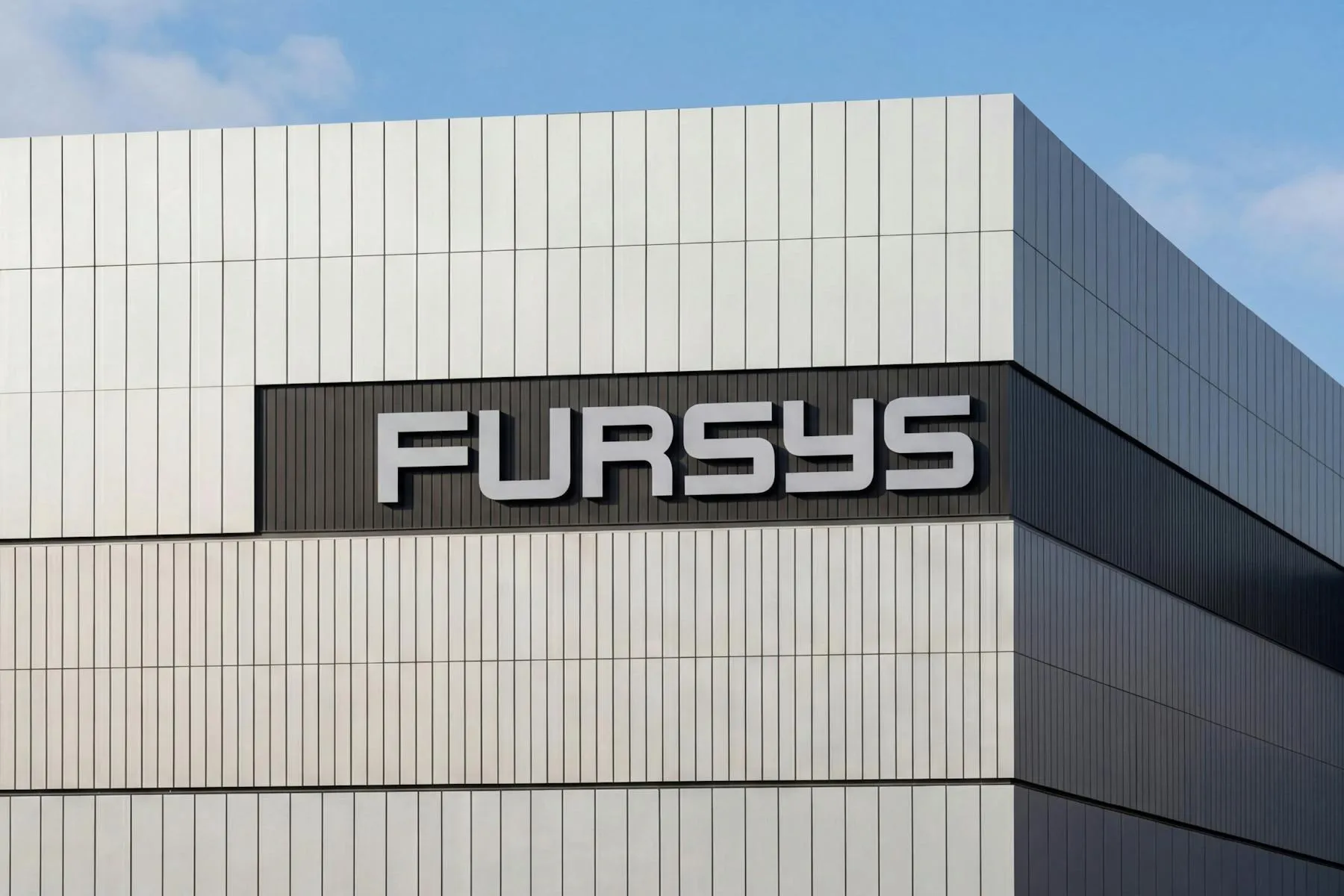
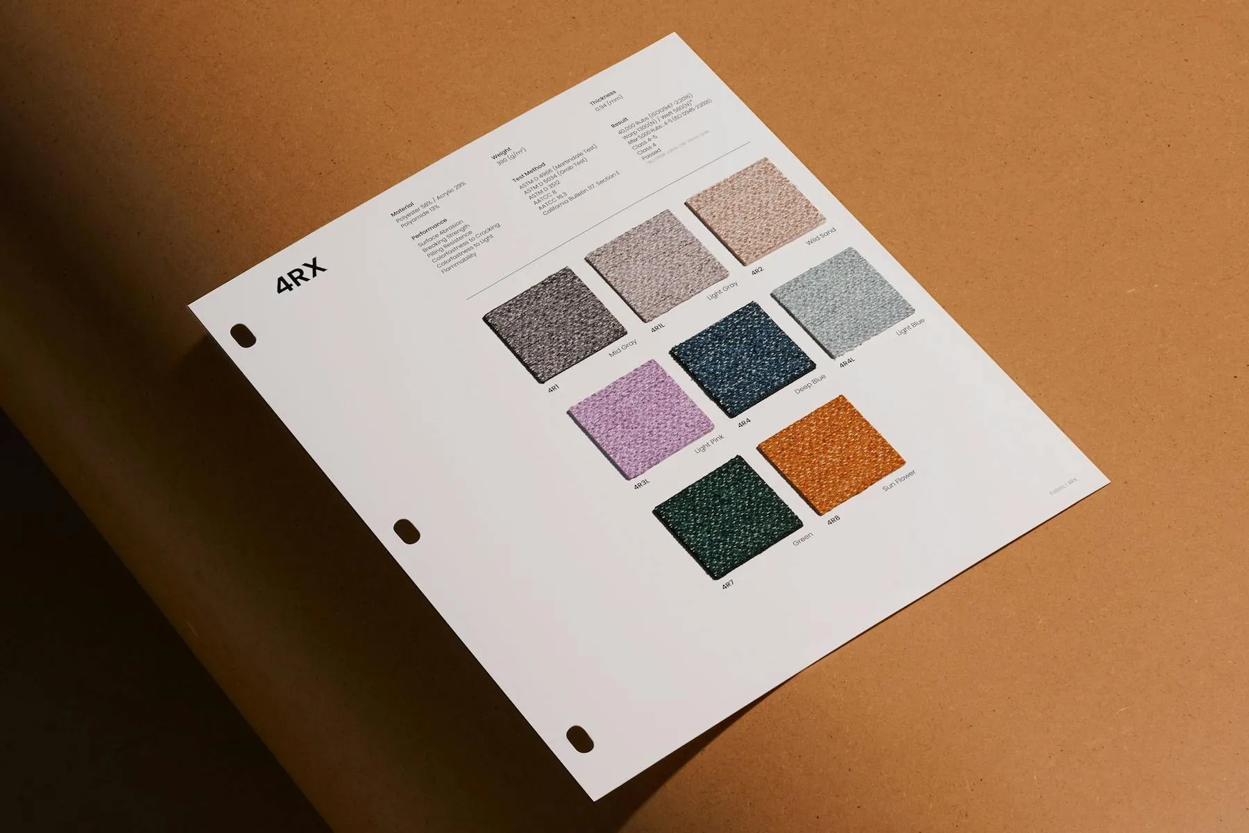
This identity shines across every material touchpoint and scale—from bent-wood joinery details on desk corners and leather-backed fabric swatches to embossed black stationery, bold building signage, and vibrant red delivery trucks. Everything comes together to create a seamless brand experience from digital platforms straight into physical showrooms.
Porto Rocha tái định hình thương hiệu nội thất Fursys từ chi tiết góc vuông
Fursys – thương hiệu nội thất văn phòng hàng đầu Hàn Quốc thành lập từ năm 1983 – vừa ra mắt bộ nhận diện thương hiệu mới do studio Porto Rocha thực hiện. Thay vì biến chặng đường 40 năm thành di sản đóng khung, hệ thống mới lấy chính lịch sử đó làm phương pháp làm việc linh hoạt, sẵn sàng thích ứng với những thay đổi của môi trường làm việc hiện đại.
Ý tưởng chủ đạo của dự án xuất phát từ một chi tiết hình học quen thuộc: những góc vuông (The Corner). Từ biểu tượng chữ (wordmark) cho đến các ứng dụng nhỏ nhất như vệt cắt ở góc bìa sổ binder hay hệ thống chỉ dẫn (wayfinding), tất cả đều tuân theo một logic mô-đun thống nhất.
Về mặt thị giác, thiết kế kết hợp chữ màu trắng trên nền đen, sắc đỏ đặc trưng được tinh chỉnh tươi mới cùng các mảng màu phẳng xanh lam đậm và xanh lá. Studio cũng xây dựng bộ phông chữ hình học custom Fursys Sans hỗ trợ cả tiếng Hàn lẫn chữ Latinh, giúp thương hiệu giao tiếp đồng bộ ở cả Seoul lẫn thị trường Mỹ.
Giọng nói thương hiệu được định danh là “The Proven Visionary” đi cùng khẩu hiệu “Design for the unseen”. Các câu thông điệp được thể hiện ngắn gọn và dứt khoát như “Dynamic desks. Here’s a thought.” hay “The answer to complexity is simple. We call it FX-1.”.
Hệ thống nhận diện thể hiện sự chỉn chu trên nhiều chất liệu và quy mô: từ chi tiết ghép gỗ uốn cong ở góc bàn, bảng mẫu vải trên nền da, bộ văn phòng phẩm đen dập nổi logo, cho đến chữ nổi trên mặt tiền tòa nhà và xe tải giao hàng sắc đỏ. Tất cả kết hợp lại tạo nên trải nghiệm thương hiệu xuyên suốt từ không gian số cho đến các showroom thực tế.