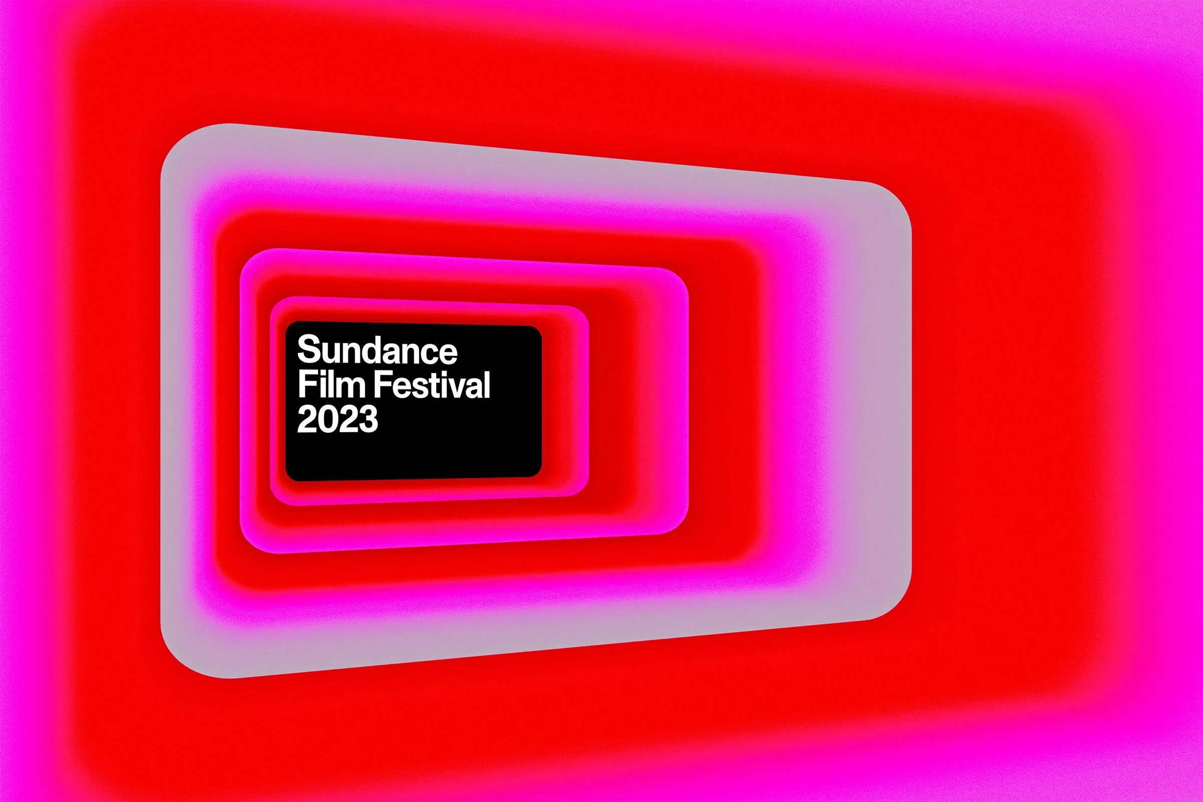
Porto Rocha’s visual identity for the Sundance Film Festival is a masterclass in subtle restraint. Instead of cluttering the design with unnecessary elements, Porto Rocha opted for a rounded black rectangular frame housing the festival name in large, three-line white typography. The design immediately calls to mind a classic movie screen. Porto Rocha leaned into that cinematic energy by overlaying the logo frame directly over video footage and still photos, drawing full focus to key moments, faces, and raw emotions.
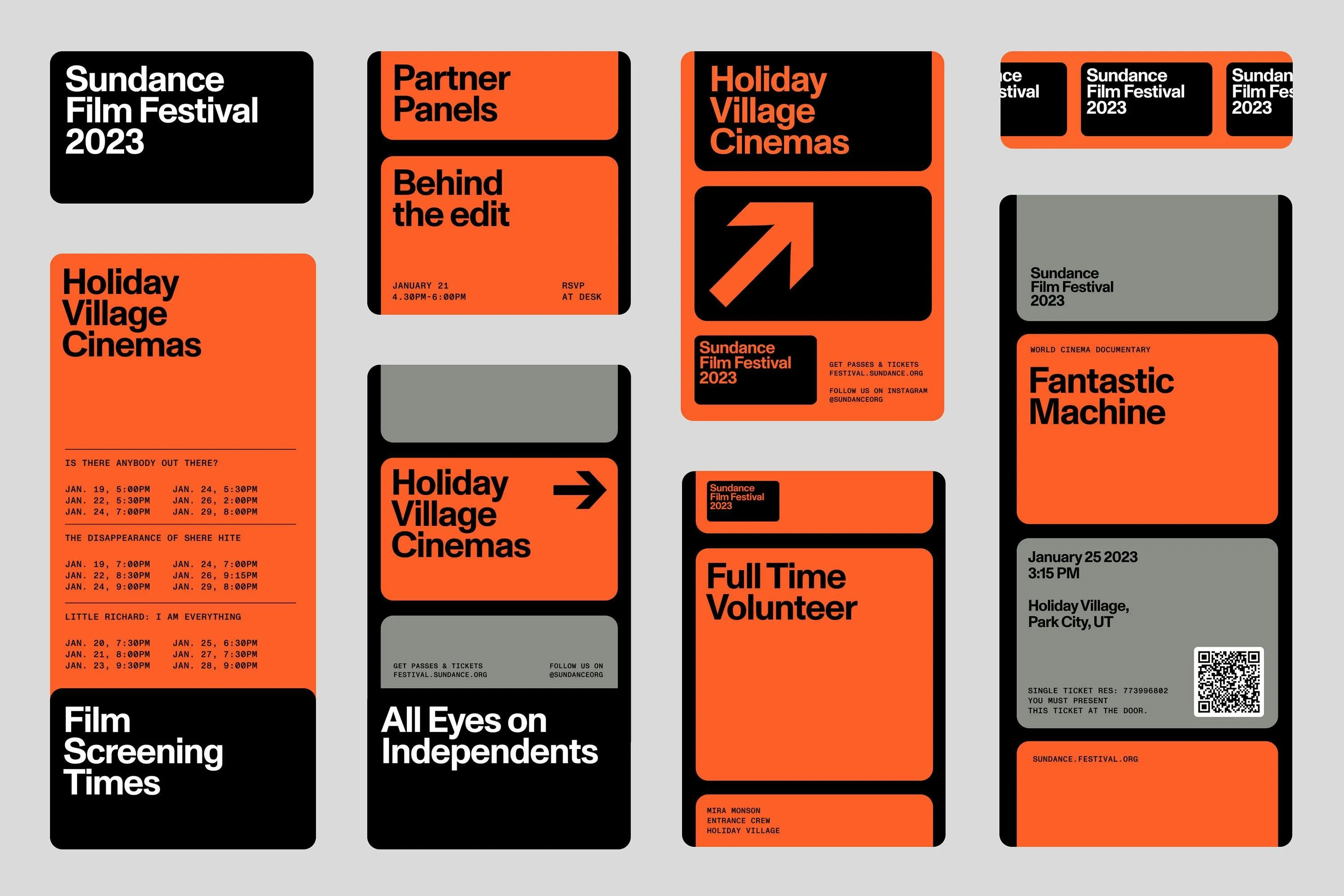
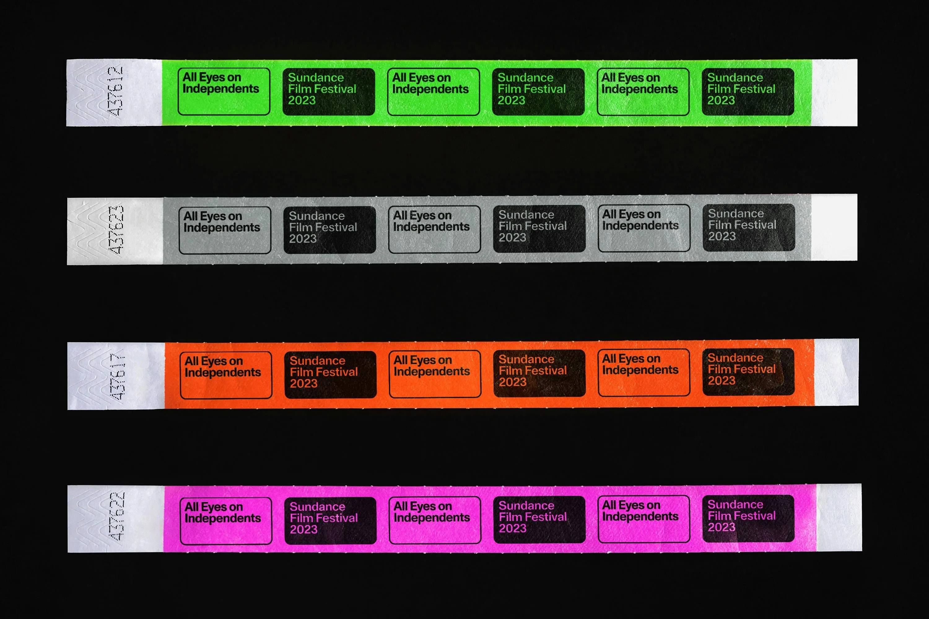
That minimalist geometry serves as the ultimate canvas for color to really shine. Across real-world applications, the flexible frame pops up in a variety of vibrant tones—like bright orange, fresh green, vivid pink, and muted gray—to organize different categories of information, from venue locations and screening times to volunteer passes. The container stays fixed while the content inside shifts, offering a brilliant framing solution for a festival presenting diverse film genres without ever stealing focus from the featured work.
On the typography front, Monument Grotesk was chosen to deliver a strong, recognizable punch without coming across as overly aggressive or competing with the movies. The festival title is set in massive, edge-to-edge type that completely fills out the frame. In contrast, secondary details like location, dates, and screening times are scaled down and neatly arranged at the bottom. This bold contrast creates a super intuitive visual hierarchy, whether viewed on a large-format poster or a compact mobile screen.
The grid system takes inspiration directly from cinematic frame sequencing. The layout mimics continuous film strips by repeating the rectangular frame across neat rows and columns. As a result, screening schedules, event tickets, and promotional posters feel unified like consecutive stills on a single roll of film. This repetition is tightly controlled—each block carries a specific purpose, while crisp black separating borders keep the entire layout effortless to read.
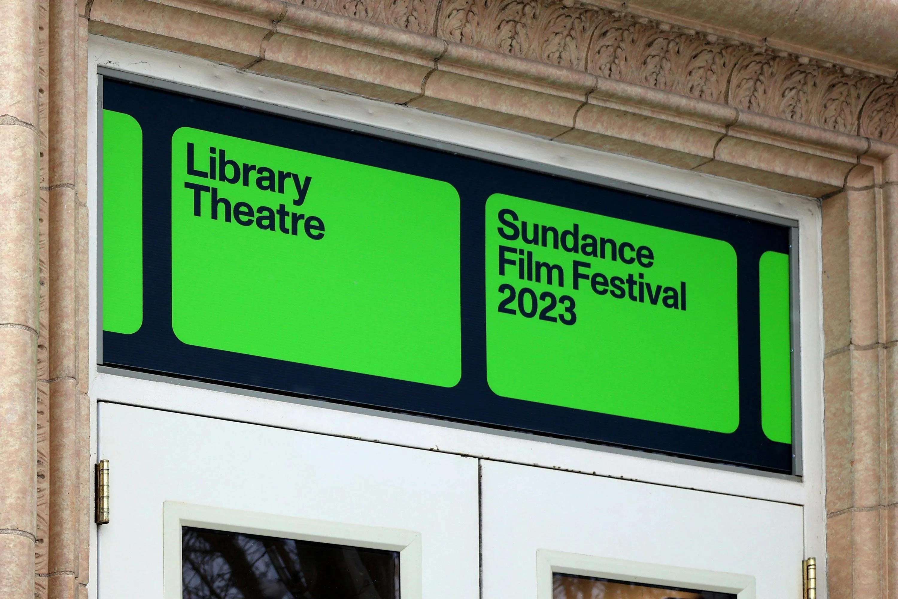
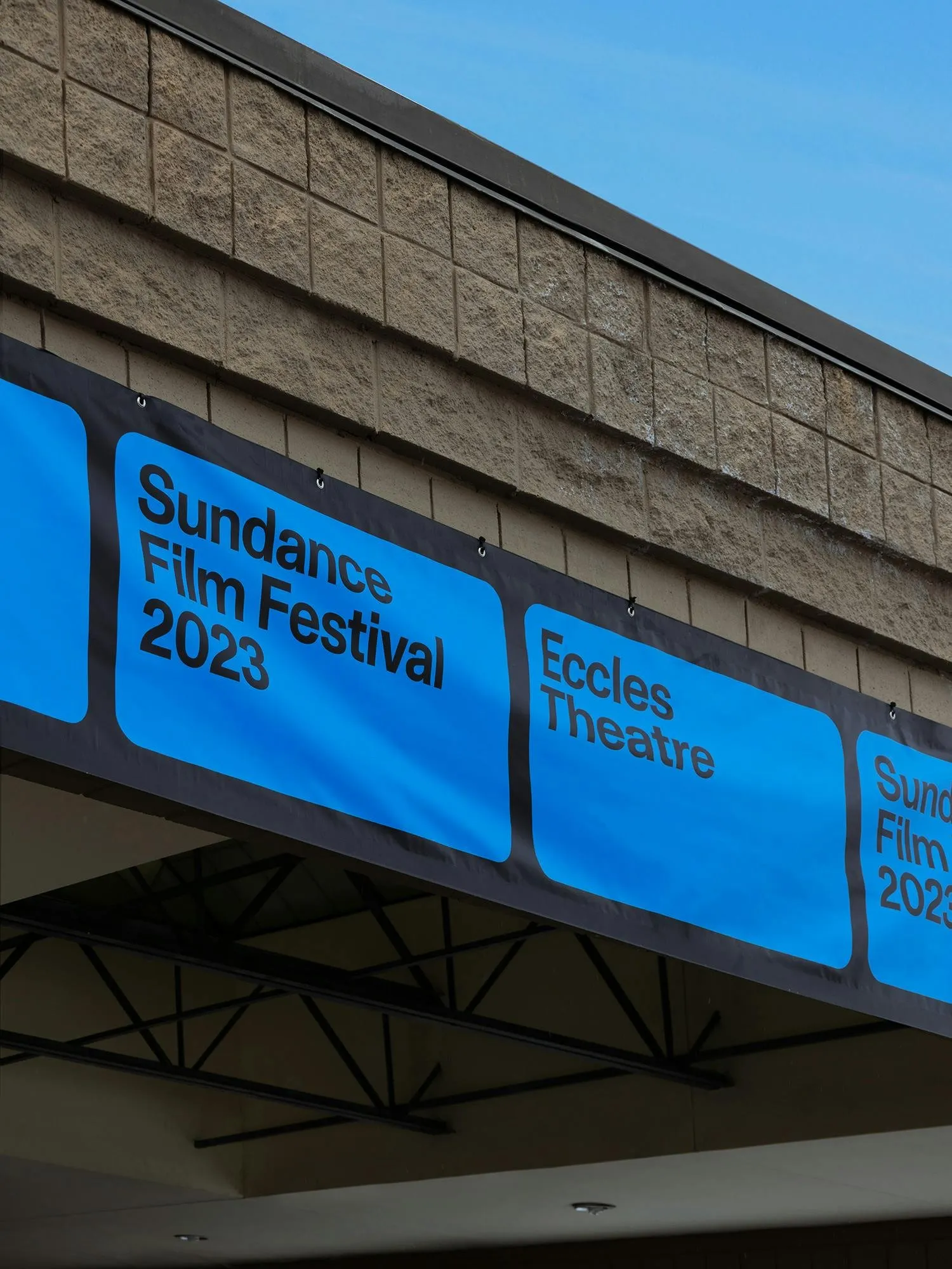
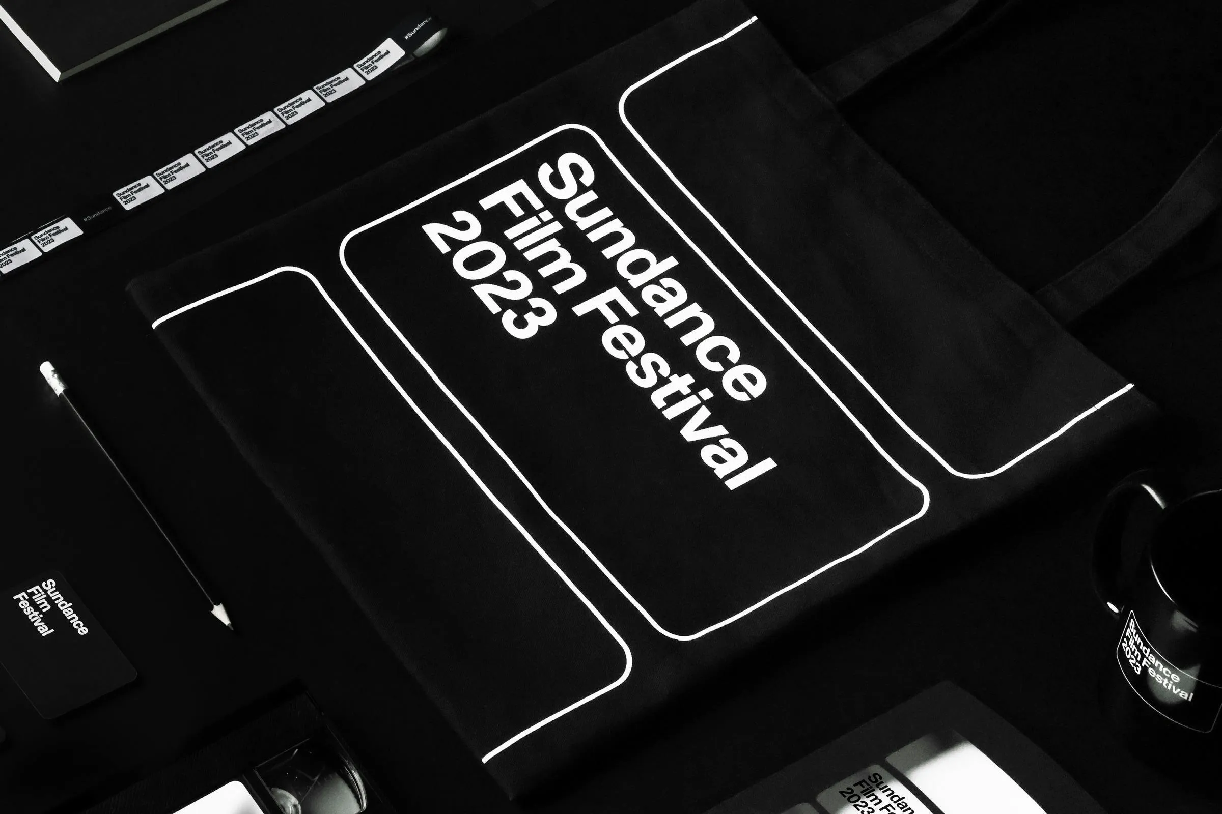
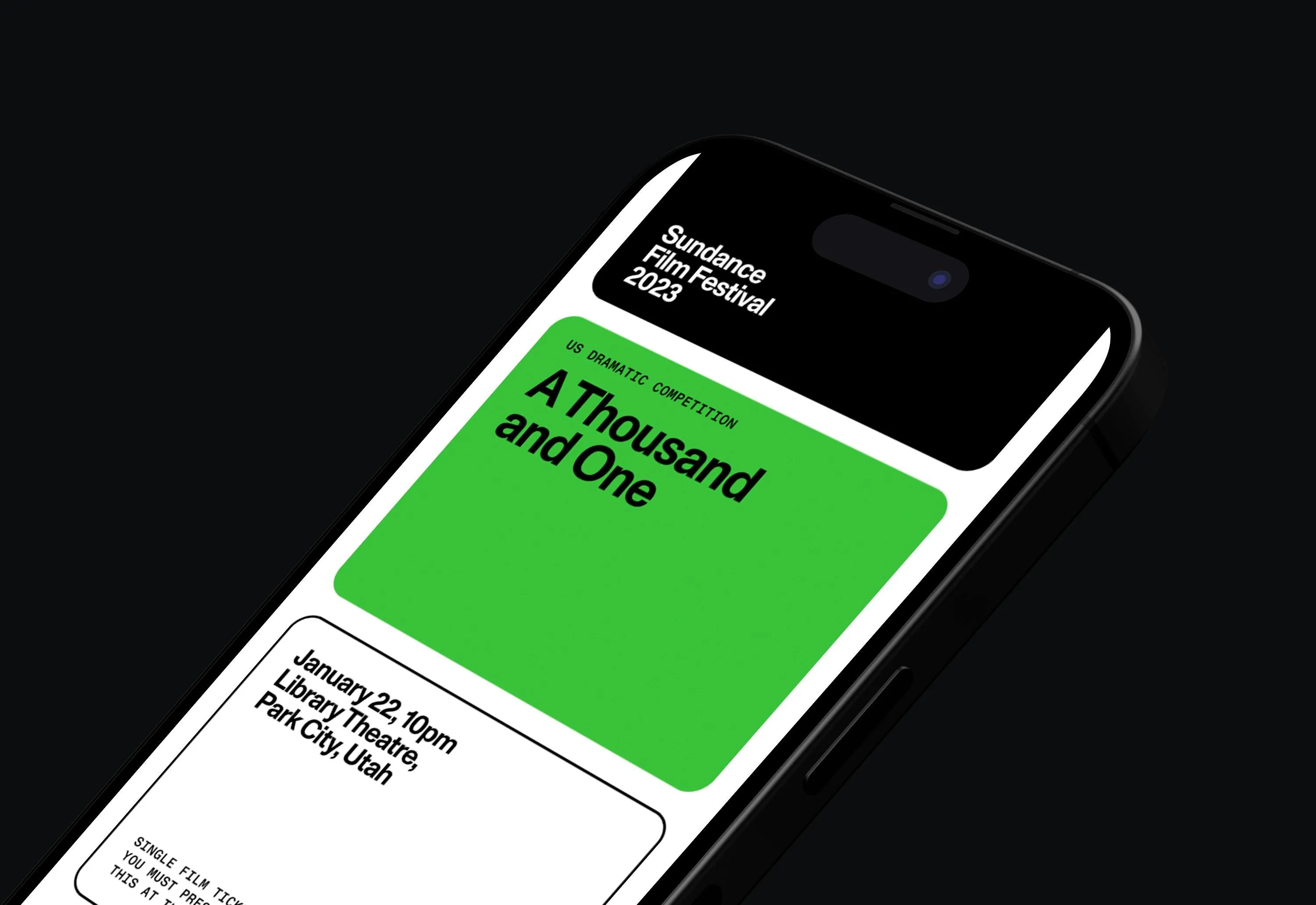
In practical execution, the visual system proves incredibly effective. Green directional signage marks the Library Theatre, bold blue banners stretch along Eccles Theatre, and color-coded wristbands come in blue, gray, orange, and pink. A black canvas tote bag highlights the clean white logo on the front, while smartphone screens showcase custom-scaled frames tailored for individual films alongside complete dates, venues, and screening times.
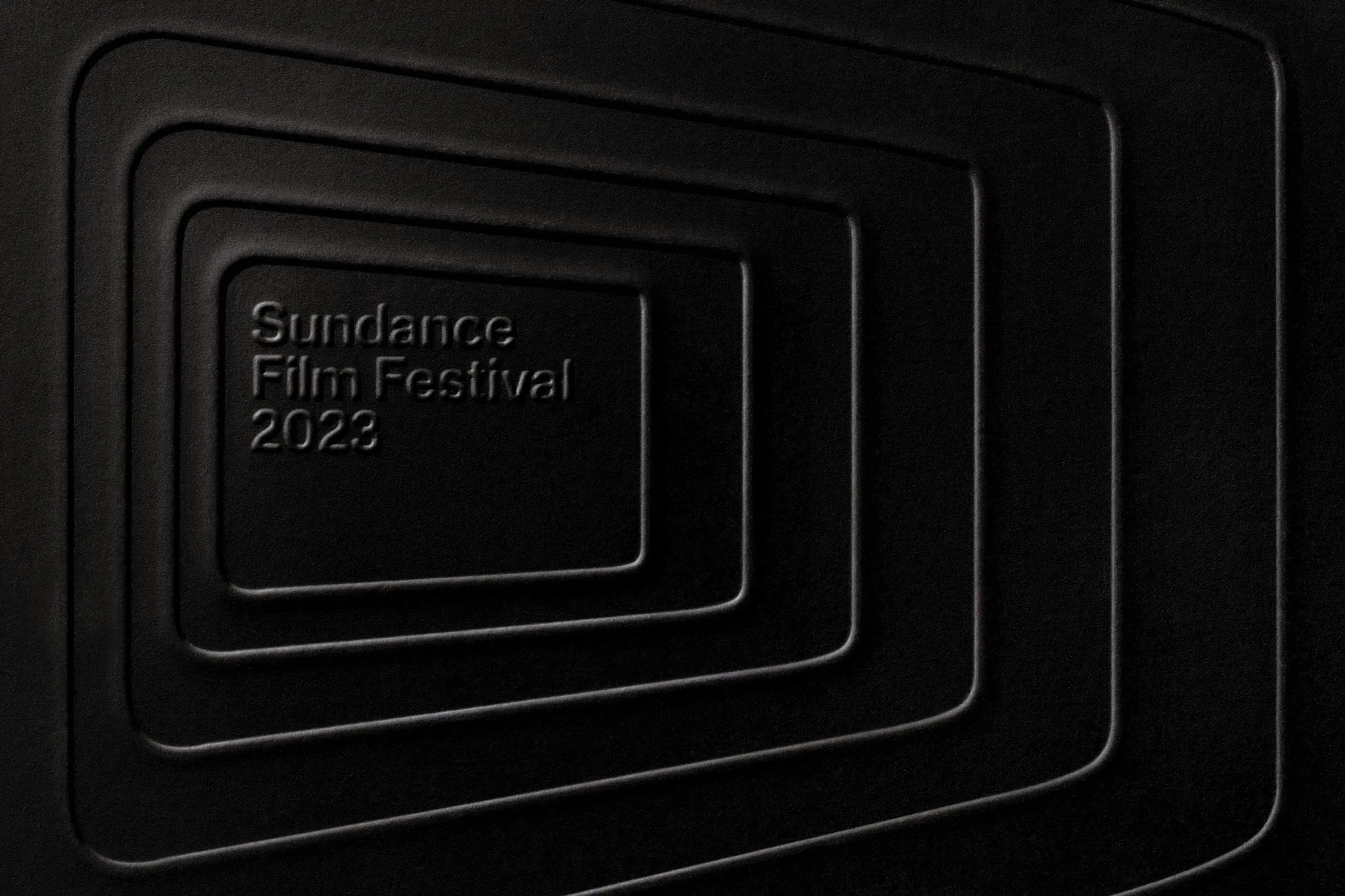
One of the coolest features is the embossed version, where interlocking frames are sharply debossed into a deep black surface. What makes this stand out is that even without color, the structural logo shape effortlessly maintains its iconic identity. Whether applied to posters, tickets, merchandise, or digital screens, the branding achieves seamless consistency through precise geometry, typography, and color harmony.
Explore the full project details on www.portorocha.com/sundance.
Bộ nhận diện thương hiệu của Sundance Film Festival do Porto Rocha thiết kế
Điểm gây ấn tượng đầu tiên ở bộ nhận diện này là sự tiết chế đầy tinh tế. Thay vì nhồi nhét quá nhiều chi tiết, Porto Rocha chọn một khung hình chữ nhật bo góc màu đen chứa tên liên hoan phim với chữ trắng khổ lớn dàn thành ba dòng. Thiết kế này gợi liên tưởng ngay đến một màn hình chiếu phim. Porto Rocha đã sử dụng đúng tinh thần đó khi đặt khung logo đè lên các đoạn footage hoặc ảnh tĩnh, giúp thu hút sự chú ý vào từng khoảnh khắc, gương mặt hay cảm xúc.
Sự tiết chế về hình khối chính là nền tảng để màu sắc phát huy tác dụng. Trên các ứng dụng thực tế, chiếc khung xuất hiện linh hoạt với nhiều tông màu như cam sáng, xanh lá tươi, hồng rực hay xám bệt để chứa các loại thông tin khác nhau: từ tên địa điểm, giờ chiếu cho đến thẻ tình nguyện viên. Chiếc khung giữ nguyên trong khi nội dung bên trong thay đổi – một ý tưởng rất thông minh dành cho một liên hoan phim trình chiếu nhiều thể loại tác phẩm mà không làm lấn lướt nội dung chính.
Về typography, phông chữ Monument Grotesk được lựa chọn nhằm tạo dấu ấn nhận diện rõ ràng mà không “khiêu khích” hay lấn lướt các bộ phim. Tên liên hoan phim được xếp kích thước lớn, sát lề và phủ kín khung hình. Ngược lại, các dòng thông tin phụ như địa điểm, ngày tháng hay khung giờ chiếu được thu nhỏ lại, sắp xếp gọn gàng ở phía dưới. Sự tương phản này giúp phân cấp thông tin (hierarchy) cực kỳ trực quan, dù nhìn trên poster khổ lớn hay màn hình điện thoại nhỏ.
Hệ thống lưới (grid) cũng tuân theo tư duy thiết kế khung hình điện ảnh. Bố cục mô phỏng sự nối tiếp của các cuộn phim, lặp lại hình dáng chiếc khung theo dạng hàng và cột. Nhờ đó, lịch chiếu, vé xem phim hay poster đều mang lại cảm giác nhất quán như các khung hình trên cùng một cuộn phim. Việc lặp lại được kiểm soát chặt chẽ: mỗi ô đảm nhận đúng một nhiệm vụ, kết hợp cùng các đường viền đen ngăn cách giúp tổng thể rất dễ đọc.
Khi đưa vào thực tế, bộ nhận diện tỏ ra cực kỳ hiệu quả. Hệ thống bảng biển màu xanh lá dành cho Library Theatre, banner màu xanh dương chạy dọc Eccles Theatre, cùng vòng đeo tay phân loại với các màu xanh, xám, cam và hồng. Chiếc túi tote vải đen nổi bật với logo trắng ở mặt trước, trong khi màn hình điện thoại hiển thị khung hình được tùy chỉnh kích thước cho từng bộ phim kèm đầy đủ ngày, địa điểm và giờ chiếu.
Chi tiết thú vị nhất chính là phiên bản dập nổi (embossed), nơi các khung hình lồng vào nhau được dập chìm sắc sảo trên nền đen. Điểm đặc biệt là dù không cần màu sắc, hình khối logo vẫn đủ sức tạo ra nét nhận diện riêng. Dù trên poster, vé, đồ lưu niệm hay màn hình số, bộ nhận diện vẫn giữ được tính thống nhất nhờ hình dáng, kiểu chữ và cách phối màu luôn duy trì sự chuẩn xác.
Xem chi tiết dự án tại trang web của www.portorocha.com/sundance.