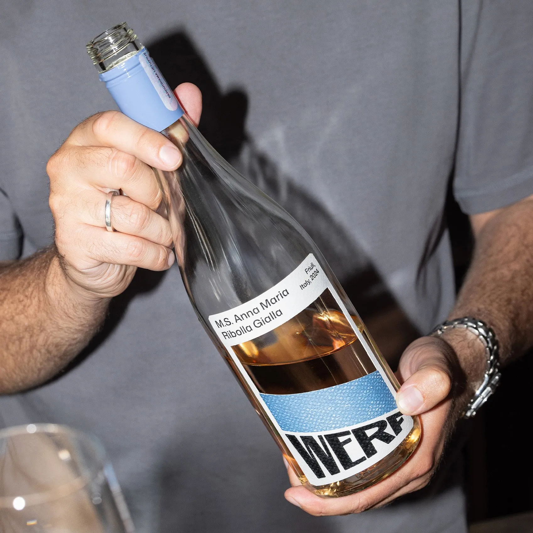
Werf Rotterdam Identity by andstudio: A Striking 20-Degree Tilt Werf is a bar and bistro nestled right inside a historic, fully functioning shipyard in Rotterdam. Instead of taking the predictable route with cliché maritime symbols, design firm andstudio crafted a brilliantly clever identity rooted in the shipyard’s real-world environment.
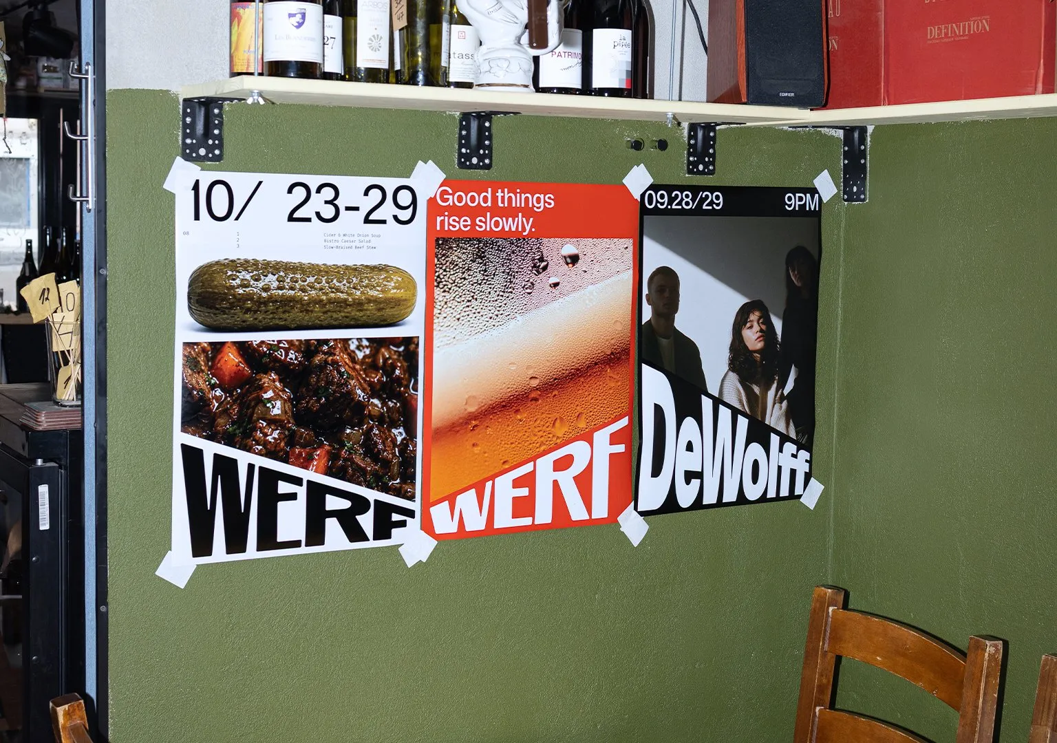
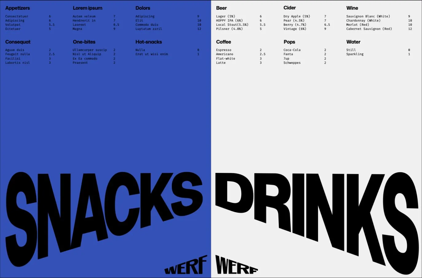
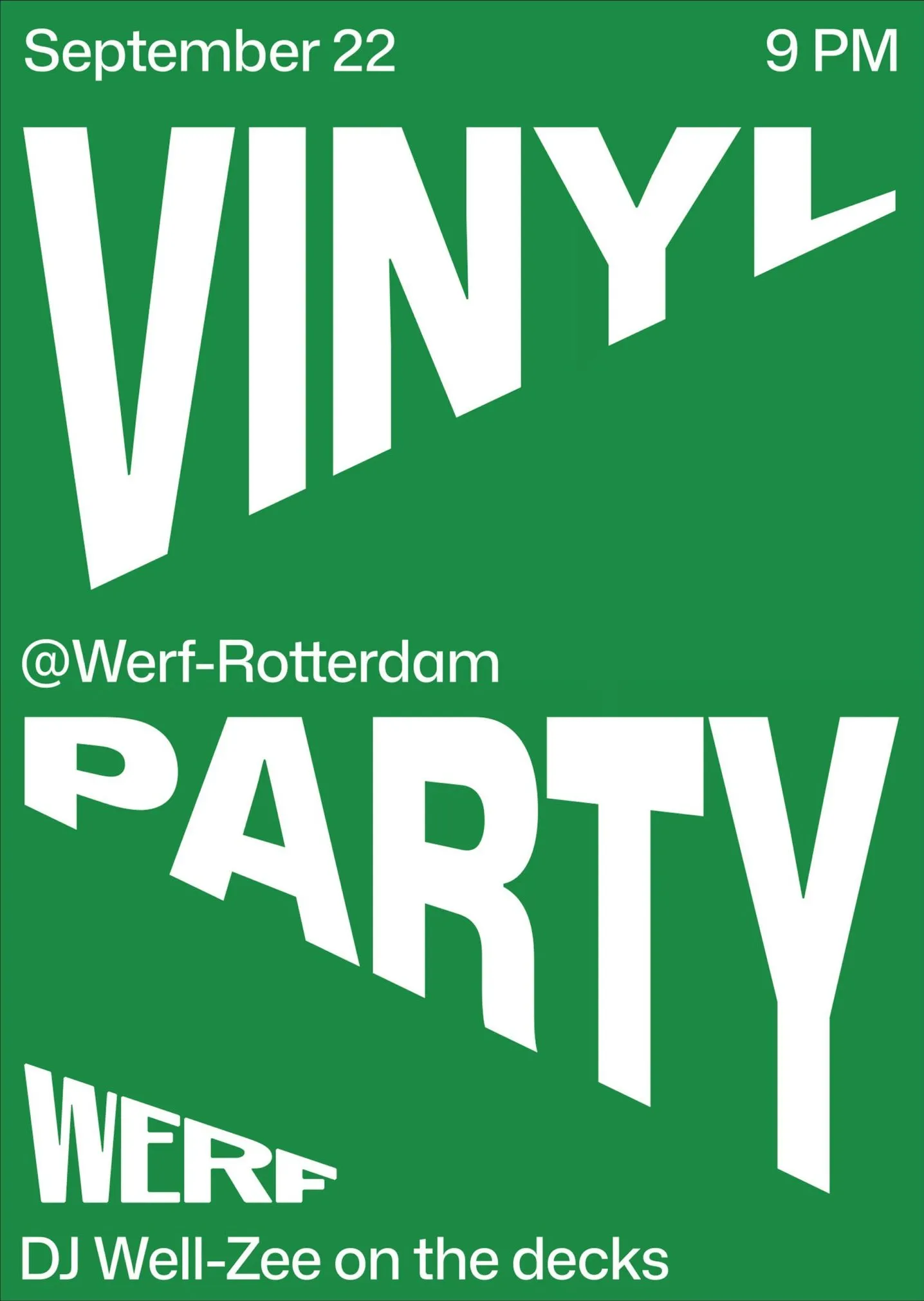
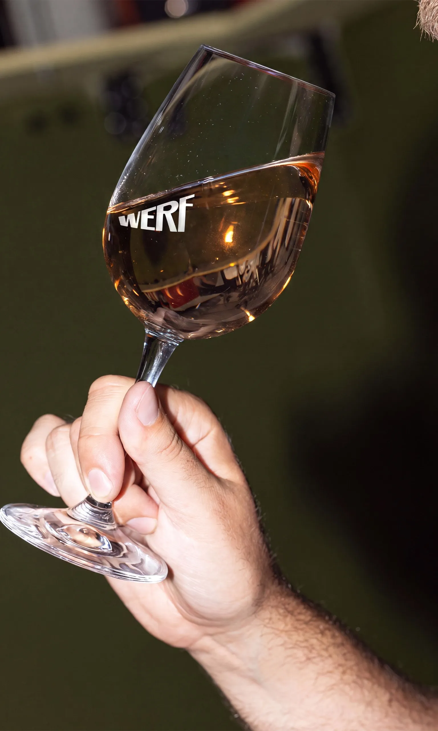
The cornerstone of the entire brand design is a sharp 20-degree angle. This tilt doesn’t just mirror the slipways that launch ships out to sea—it also cleverly mimics raising a glass or tipping a bottle during a meal. Far from being just decorative, this 20-degree lean defines every branded touchpoint, from steel menus to guest receipts.
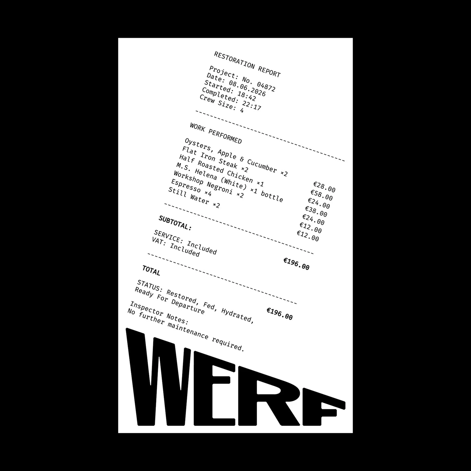
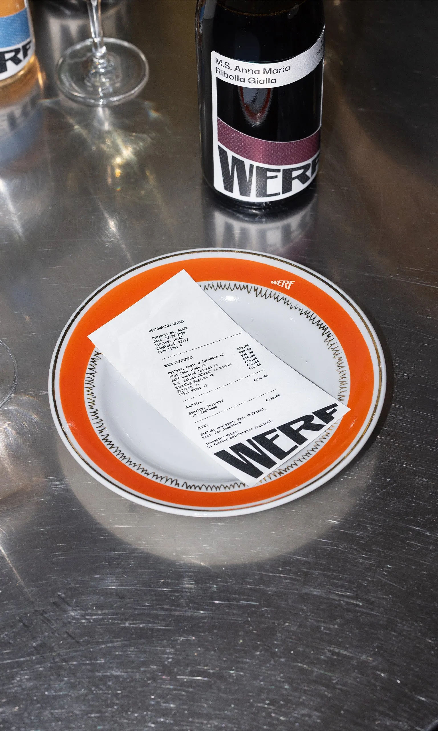
One of the coolest details is how the design transforms a guest’s dining experience into an actual ship maintenance session. The bill is formatted just like a technical restoration report, complete with a project number, start time, completion time, and crew size. At the bottom, a playful status check reads: “Restored, Fed, Hydrated, Ready For Departure,” followed by the note: “No further maintenance required”.
The typography system splits into two distinct vibes:
- Large condensed Display type set dynamically at that signature 20-degree slope.
- Small monospaced type handling all the fine details like prices, codes, and timestamps.
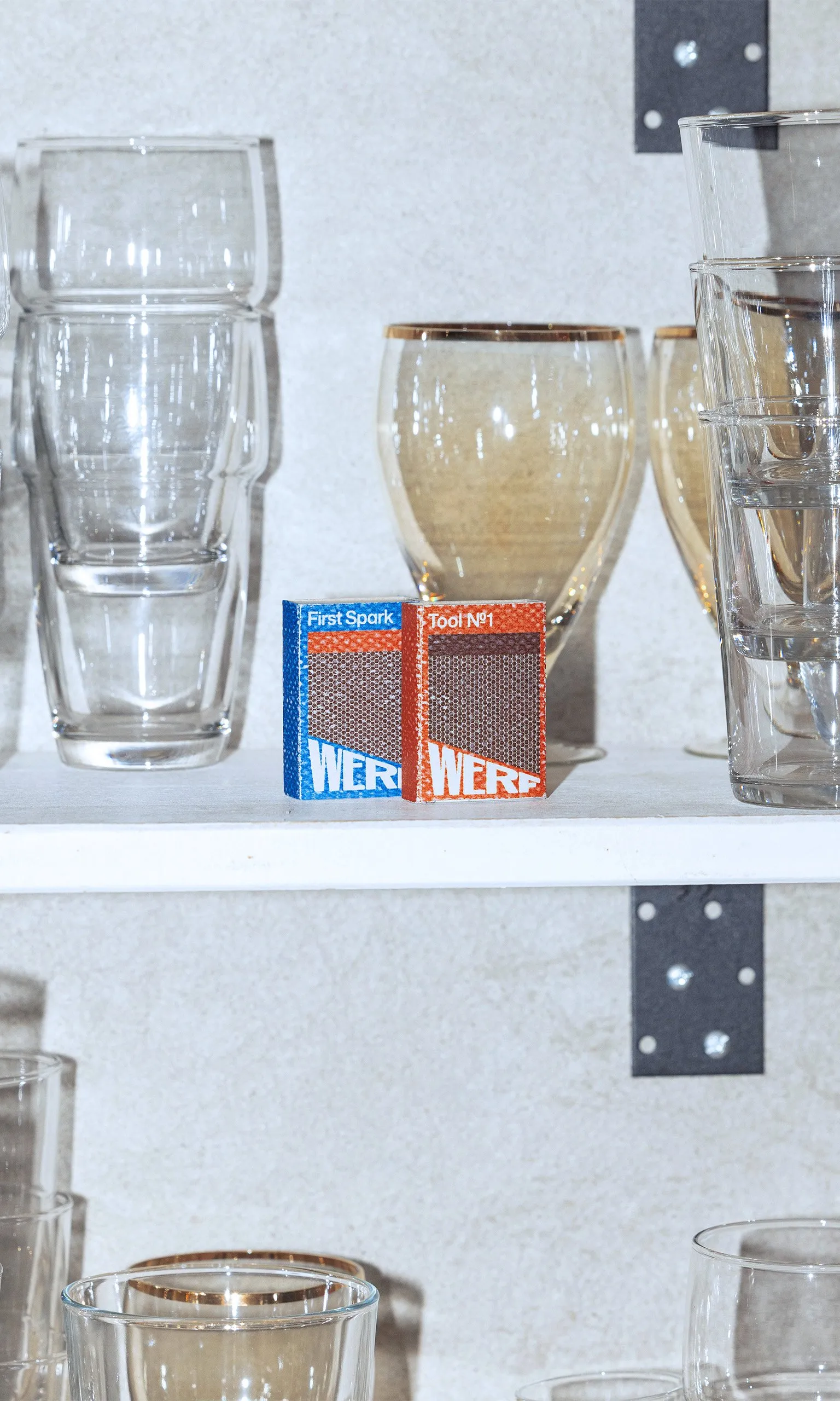
The brand’s color palette stays super responsive, too: the seasonal menu’s key colors actually shift to match whatever vessel is docked at the shipyard at that moment. Paired with rugged, industrial materials like brushed steel secured with hex bolts and industrial matchboxes, the result is a one-of-a-kind identity that captures the true pulse of the waterfront.
Bộ nhận diện Werf Rotterdam từ andstudio: Góc nghiêng 20 độ đầy ấn tượng
Werf là một quán bar và bistro nằm ngay bên trong một xưởng đóng tàu lịch sử vẫn đang hoạt động tại Rotterdam. Thay vì đi theo lối mòn với các biểu tượng hàng hải quen thuộc, studio thiết kế andstudio đã tạo ra một bộ nhận diện vô cùng thông minh dựa trên chính bối cảnh của xưởng tàu.
Yếu tố cốt lõi của toàn bộ thiết kế là một góc nghiêng 20 độ. Góc nghiêng này không chỉ tái hiện phần triền đà đưa tàu xuống biển, mà còn trùng khớp một cách khéo léo với cử chỉ nâng ly hay nghiêng chai rượu trong trải nghiệm thưởng thức ẩm thực. Độ nghiêng 20 độ này không chỉ dùng để trang trí mà xuất hiện xuyên suốt để định hình mọi vật dụng, từ bảng menu thép cho đến tờ hóa đơn thanh toán.
Điểm thú vị nằm ở cách thiết kế biến trải nghiệm dùng bữa của khách hàng thành một “ca bảo dưỡng” tàu thực thụ. Tờ hóa đơn được trình bày như một báo cáo phục hồi kỹ thuật, kê khai đầy đủ số dự án (project number), thời gian bắt đầu, thời gian hoàn thành và số lượng thành viên (crew size). Cuối hóa đơn là dòng trạng thái hóm hỉnh: “Restored, Fed, Hydrated, Ready For Departure” (Đã phục hồi, Đã ăn no, Đã đủ nước, Sẵn sàng khởi hành) kèm ghi chú “No further maintenance required” (Không cần bảo trì thêm).
Hệ thống typography được chia thành hai luồng rõ rệt:
- Phần chữ Display cỡ lớn, dáng cô đọng (condensed) và được đặt nghiêng theo góc dốc.
- Phần chữ monospaced kích thước nhỏ dùng cho các dữ liệu chi tiết như giá tiền, mã số, ngày giờ.
Bảng màu của thương hiệu cũng biến đổi linh hoạt khi màu chủ đạo của menu theo mùa sẽ thay đổi dựa theo màu sắc của chính con tàu đang neo đậu tại xưởng ở thời điểm đó. Sự kết hợp cùng các chất liệu đậm chất xưởng cơ khí như thép chải bắt bu-lông lục giác hay vỏ hộp diêm công nghiệp đã tạo nên một bộ nhận diện vừa độc đáo, vừa phản ánh trọn vẹn nhịp sống của vùng cảng biển.