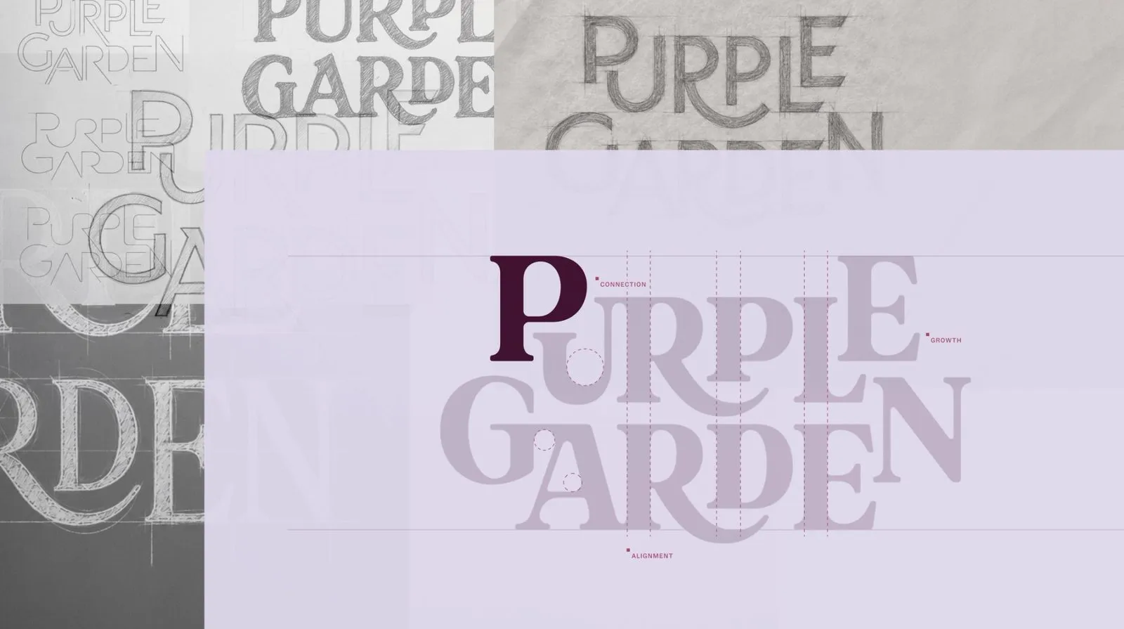



Purple Garden Brand Identity by Mother Design: Transforming Spirituality into a Living Design Language The rebrand for spiritual services app Purple Garden, crafted by Mother Design, kicked off in a super unique way: a full-on séance, chakra reading, and automatic drawing session. Taking inspiration from artist Hilma af Klint and her collective, The Five, the design team grabbed charcoal and paper to sketch organic shapes, freeing their minds from conventional design rules.
Core Concept: “A Living Practice” Instead of framing spiritual advice or psychic readings as a quick, one-off transaction, Mother Design reframed Purple Garden into “A Living Practice”—a daily ritual for personal growth and ongoing self-discovery.
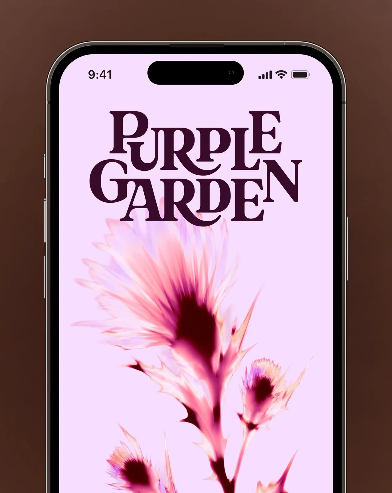
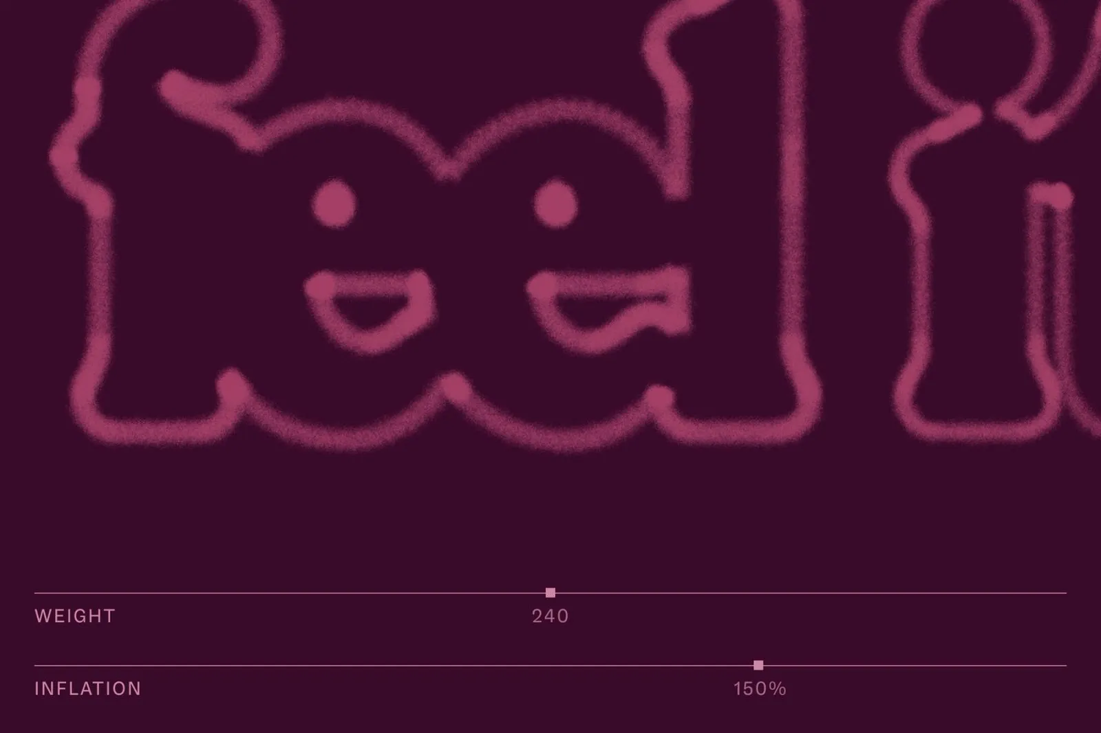
A Dynamic “Living Type” System The brand’s wordmark beautifully balances organic, flowing curves with crisp digital precision, complete with branch-like ligatures that reach outward. What really sets it apart is the “Living Type” system, which stretches and shifts weight based on cymatic sound wave patterns and atomic structures.
On the typography front, the identity pairs the romantically classic Literatura serif for major headlines with the clean, modern ABC Social font for effortless readability across the app UI.
Color Palette and Symbol System (Glyphs) Ditching the cool, blue-ish purples typical of the spiritual space, the identity adopts seven warm shades of purple anchored by a deep plum base, soft lilac accents, and vibrant neon accents. Secondary palette colors pull directly from magical natural transitions like dawn, dusk, and moonrise.
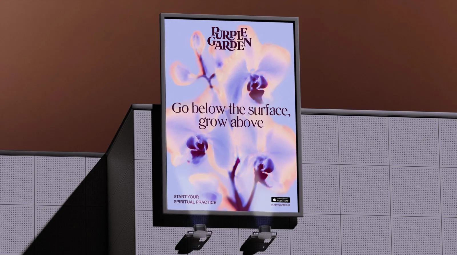
Meanwhile, compact glyph symbols channeling flora, crystals, and dragonflies allow the brand identity to scale seamlessly from tiny app icons to massive outdoor billboards.
Blending Analog Craftsmanship with AI Throughout the creative journey, the design team seamlessly blended traditional hands-on tools with AI, generating unexpected visual elements that stay surprisingly true to the overall brand spirit.
Explore more about this project on www.motherdesign.com/work/PurpleGarden.
Bộ nhận diện thương hiệu Purple Garden từ Mother Design: Khi tâm linh trở thành ngôn ngữ thiết kế sống động
Dự án rebrand cho ứng dụng dịch vụ tâm linh Purple Garden do studio Mother Design thực hiện bắt đầu theo một cách cực kỳ đặc biệt: một buổi gọi hồn (séance), đọc chakra và thực hành vẽ tự động (automatic drawing). Lấy cảm hứng từ nữ họa sĩ Hilma af Klint cùng nhóm The Five, team thiết kế đã dùng than và giấy để phác thảo những hình khối tự nhiên, giải phóng tâm trí khỏi các quy chuẩn thiết kế thông thường.
Khái niệm chủ đạo: “A Living Practice”
Thay vì xem bói hay tìm kiếm lời khuyên tâm linh là một dịch vụ ăn xổi, chớp nhoáng, Mother Design tái định hình Purple Garden thành “A Living Practice” – một thói quen đồng hành, rèn luyện và phát triển bản thân mỗi ngày.
Hệ thống chữ viết Living Type linh hoạt
Wordmark của thương hiệu kết hợp hài hòa giữa nét mềm mại của tự nhiên và độ sắc nét số hoá. Các chữ cái có nét nối ligature vươn dài như cành cây. Điểm độc đáo nằm ở hệ thống chữ “Living Type” có khả năng co giãn và thay đổi trọng lượng dựa trên họa tiết sóng âm (cymatic patterns) và cấu trúc nguyên tử.
Về mặt font chữ, dự án kết hợp font serif Literatura mang hơi hướng cổ điển lãng mạn cho các tiêu đề chính cùng font ABC Social hiện đại, dễ đọc trên giao diện ứng dụng.
Bảng màu và hệ biểu tượng (Glyph)
Hệ thống nhận diện loại bỏ các sắc tím xanh lạnh quen thuộc trong mảng tâm linh để chuyển sang 7 tông tím ấm áp. Màu nền chính là sắc tím mận sâu lắng (deep plum), kết hợp cùng tím nhạt (lilac) và các đường nét neon rực rỡ. Các màu phụ bổ trợ được lấy cảm hứng trực tiếp từ các khoảnh khắc chuyển mình của thiên nhiên như bình minh (dawn), hoàng hôn (dusk) và mặt trăng lên (moonrise).
Bên cạnh đó, biểu tượng glyph nhỏ gọn mô phỏng hình ảnh cỏ cây, tinh thể và chuồn chuồn giúp thương hiệu dễ dàng ứng dụng từ icon app đến biển quảng cáo tấm lớn ngoài trời.
Sự kết hợp giữa thủ công và trí tuệ nhân tạo
Trong suốt quá trình phát triển, đội ngũ thiết kế đã di chuyển linh hoạt giữa các công cụ thiết kế truyền thống và AI để tạo ra các yếu tố thị giác mới lạ, biến ảo ngẫu nhiên nhưng vẫn nhất quán với tinh thần chung.
Bạn có thể tìm hiểu thêm về dự án trên trang web của www.motherdesign.com/work/PurpleGarden.