Mother Design Transforms Serial Box into Realm with a Whimsical New Identity Podcast and audiobook platform Serial Box officially rebranded to Realm, complete with a fresh, otherworldly visual identity crafted by Mother Design.
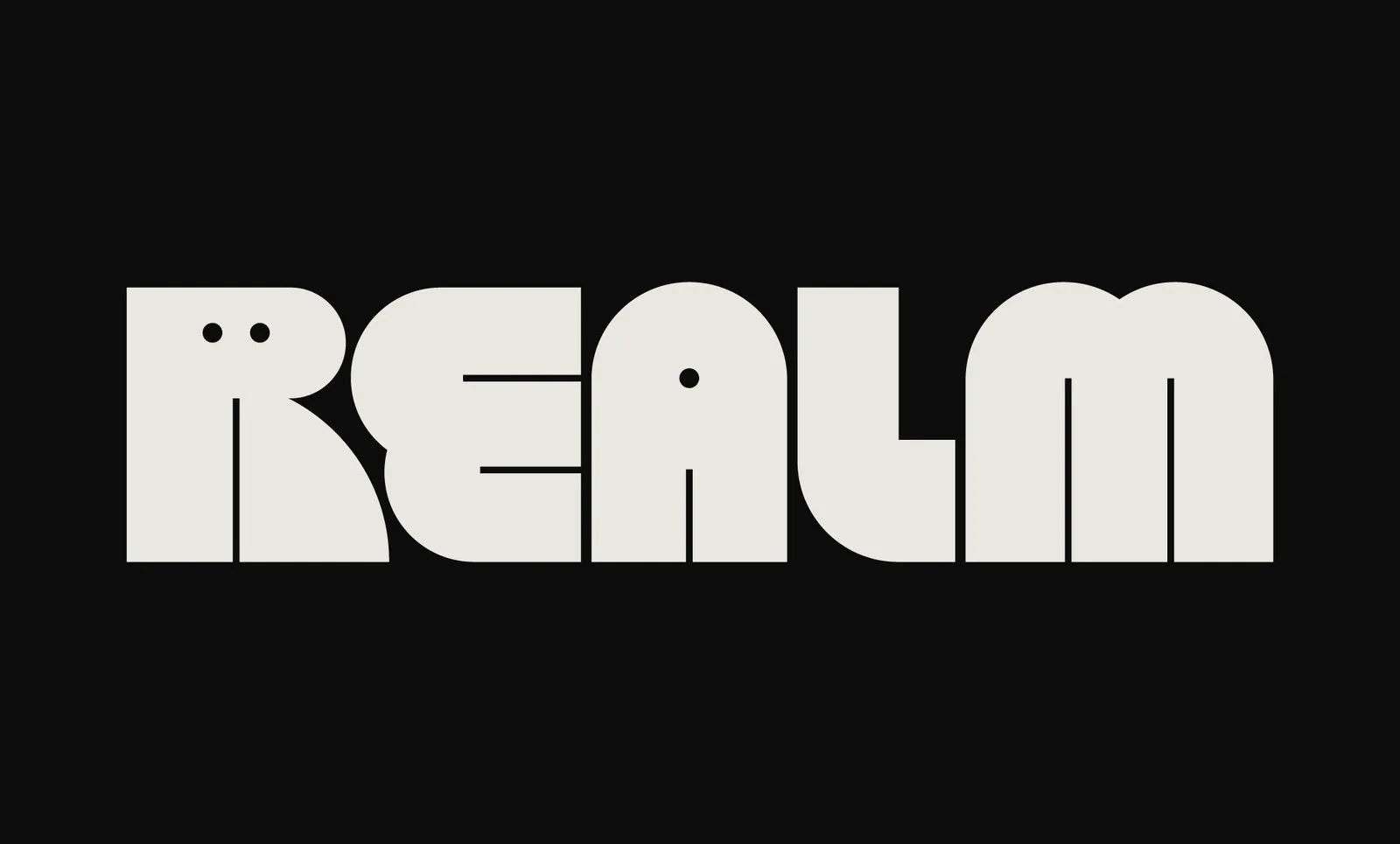
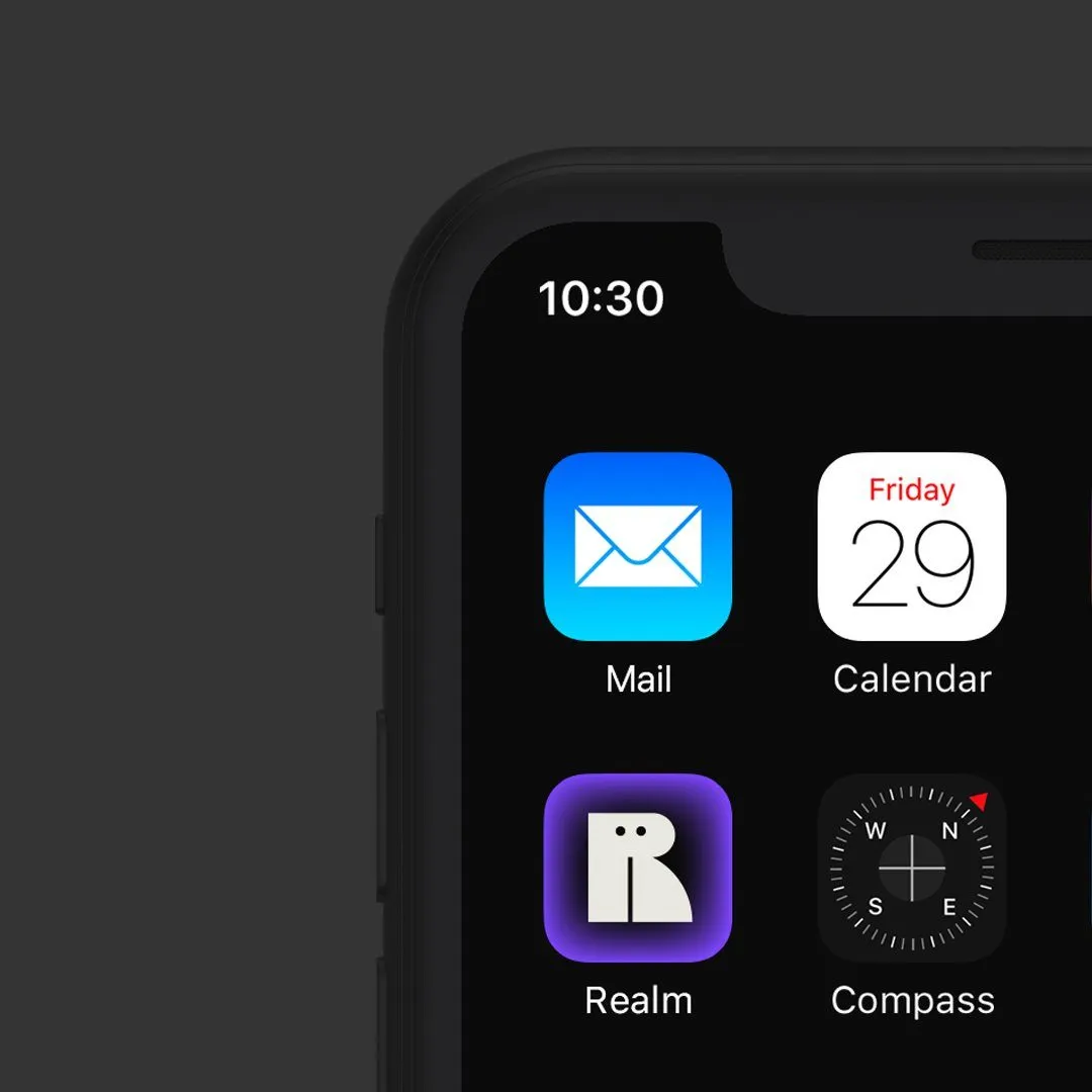
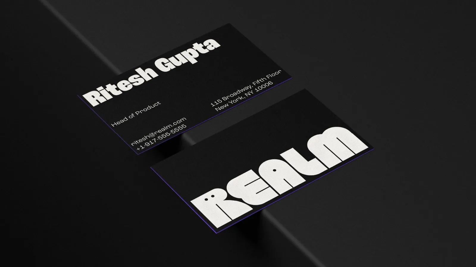
First impressions are everything, and this five-letter, off-white wordmark pops beautifully against dark backgrounds. The real magic happens with the letter “R,” which cleverly incorporates two tiny dots for eyes, transforming it into the brand’s mascot, Ruby. With lines that feel both soft and delightfully unexpected, the logo hits that sweet spot between friendly and unique.
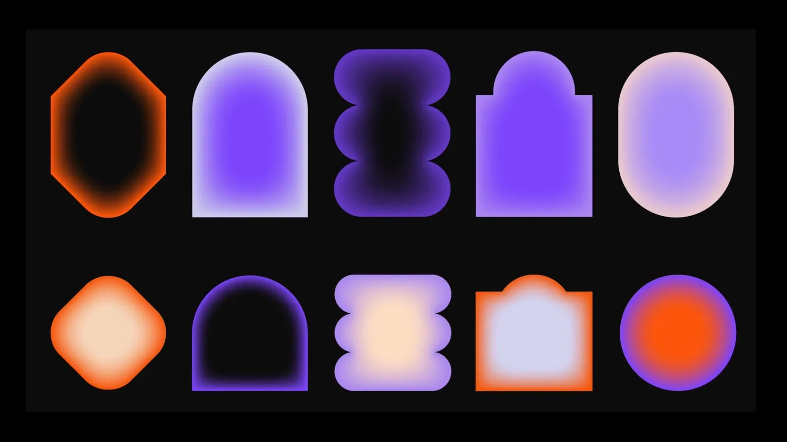
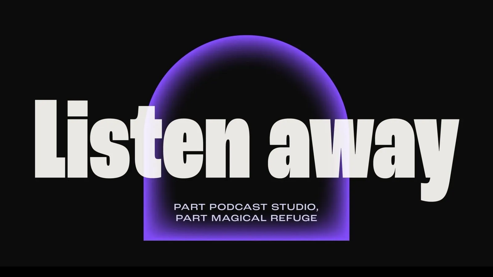
Mother Design built a visual world drenched in deep purples and mysterious blacks, complemented by vibrant pops of orange and off-white. The signature highlight is the glowing, gradient “portals”—arched and oval shapes that flex effortlessly across apps, posters, and headlines like magical doorways into soundscapes.
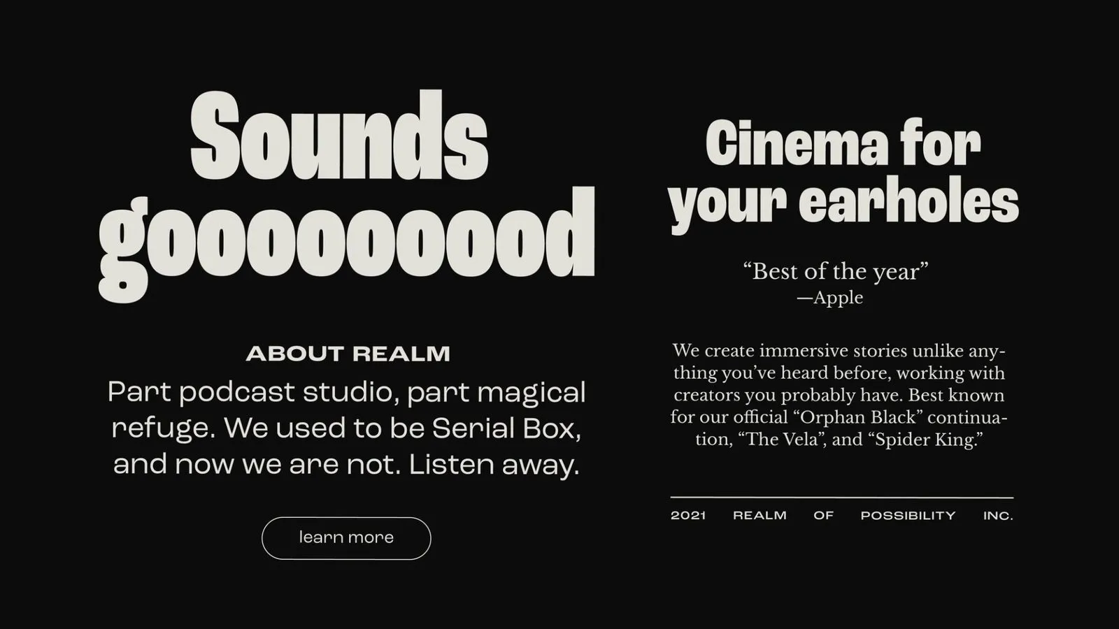
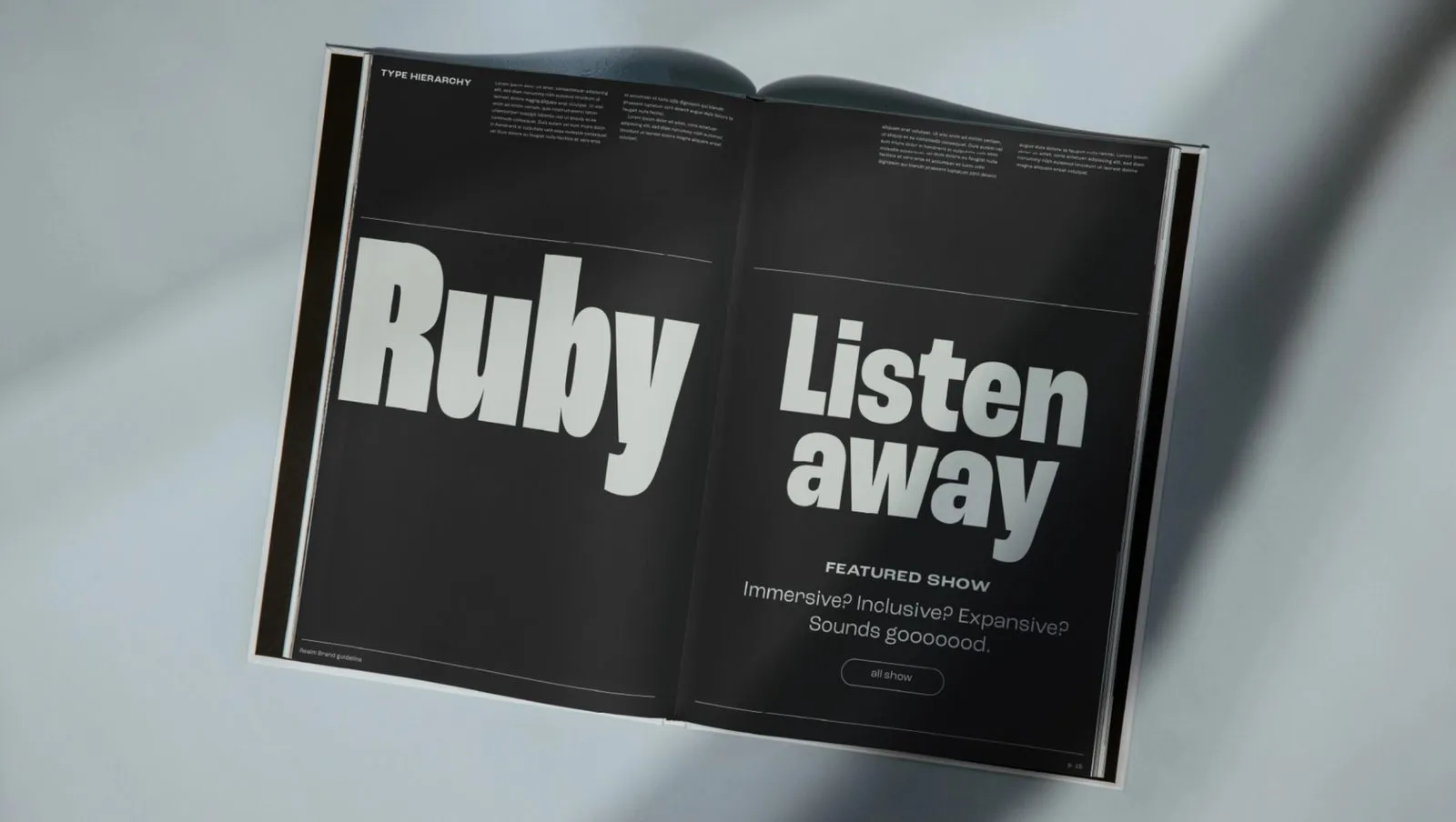
Typography plays a starring role here. Roc Grotesk brings bold, condensed personality to oversized headlines, allowing playful letter-stretching like “Sounds goooooood” and dynamic stacking. For smaller body text, switching over to Libre Baskerville keeps long-form screen reading smooth and comfortable.
It doesn’t stop at visual design either—Mother Design teamed up with Felt Not Heard to produce a cinematic sonic mark. The identity maintains total harmony across every application, from app icons featuring Ruby on a purple gradient and sleek dark business cards with subtle purple edges, to high-impact outdoor billboards. The result is a brand experience that is quirky, witty, and always ready to welcome new listeners.
Mother Design biến Serial Box thành Realm cùng bộ nhận diện thương hiệu đầy kỳ ảo
Thương hiệu podcast và audiobook Serial Box đã chính thức đổi tên thành Realm, đi kèm với một bộ nhận diện thương hiệu hoàn toàn mới do Mother Design thực hiện.
Ấn tượng đầu tiên đến từ thiết kế wordmark gồm 5 chữ cái bo tròn màu trắng ngà nổi bật trên nền tối. Điểm nhấn thú vị nằm ở chữ R khi được lồng ghép thêm hai chấm tròn làm mắt, biến chữ cái này thành mascot Ruby của thương hiệu. Các đường nét vừa mềm mại lại vừa có chút là lạ, tạo cảm giác thân thiện và độc đáo.
Mother Design đã xây dựng một không gian thị giác bao phủ bởi sắc tím đậm, đen huyền bí cùng những điểm xuyết sắc cam và trắng ngà. Điểm đặc trưng nhất chính là các “cổng không gian” (portals) dạng vòm hoặc ô-van chuyển màu phát sáng. Chúng xuất hiện linh hoạt từ ứng dụng, poster cho đến tiêu đề, giống như những cánh cửa mở ra các thế giới âm thanh khác nhau.
Hệ thống typography đóng vai trò then chốt trong thiết kế. Font chữ tiêu đề Roc Grotesk thuộc kiểu bold condensed đầy nét cá tính, được dùng ở kích thước rất lớn. Các đoạn chữ có thể kéo dãn vui mắt như “Sounds goooooood” hay xếp chồng linh hoạt. Đối với phần văn bản nhỏ, hệ thống chuyển sang Libre Baskerville giúp việc đọc nội dung dài trên màn hình trở nên mượt mà và dễ chịu.
Không chỉ dừng lại ở thị giác, Mother Design còn hợp tác với Felt Not Heard để tạo ra âm thanh nhận diện (sonic mark) mang chất điện ảnh. Bộ nhận diện thể hiện sự đồng bộ trên mọi sản phẩm: icon ứng dụng đưa chữ R lên nền tím gradient, danh thiếp tối màu viền tím tinh tế, hay billboard ngoài trời đầy thu hút. Tất cả tạo nên một hình ảnh thương hiệu độc lạ, hóm hỉnh và luôn rộng mở đón chào người nghe.