
branding
How cheeeeese Reimagined Brand Identity for TGLF
Cheeeeese Turns TGLF’s Monogram into a Bold New Brand Identity To mark a big 10-year milestone, The Geneva Learning Foundation (TGLF) decided to refresh the classic Trajan logo it relied on for a decade. Geneva-based design agency cheeeeese was brought in to craft the brand’s vibrant new look. This time around, cheeeeese cleverly fused the…
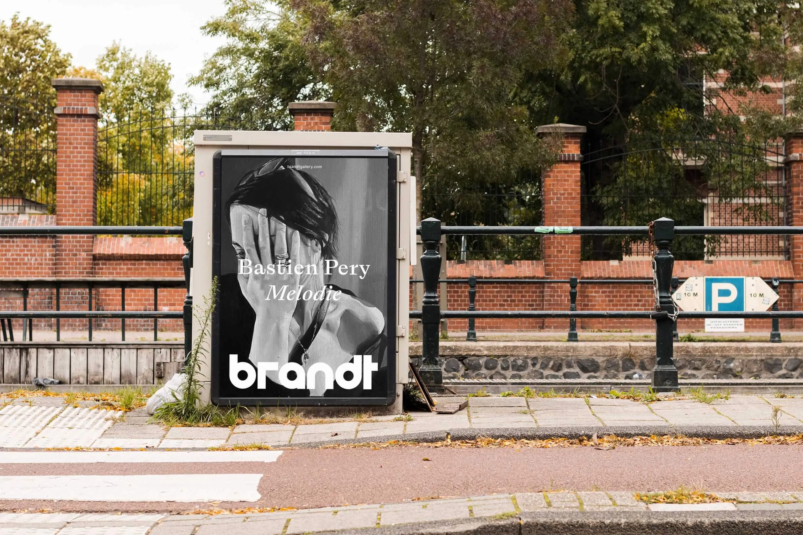
Brandt Gallery Celebrates 10 Years with a Bold Rebrand by Bureau Brandt
Brandt Gallery Marks 10 Years with a Fresh New Look by Bureau Brandt To celebrate a big 10-year milestone, Amsterdam’s Brandt Gallery teamed up with design studio Bureau Brandt for a fresh rebrand. Shortening the name from Rutger Brandt to simply “Brandt” signals a cool shift toward a more open, collective vibe. At the heart…

Exploring Vietnamese Culture in KẾT SẮC DỪA – COCONNECT Visual Identity
KẾT SẮC DỪA – COCONNECT: Breathing Life into Vietnamese Culture Through a Unique Visual Identity The “KẾT SẮC DỪA – COCONNECT” project stands out as a vibrant graphic design showcase created by Fairy Maniac (Bảo Huy), De Nguyen, Tracy Nguyen, and NowOn Creative Hub. Blending rich Vietnamese heritage with sleek, modern design trends, this project…
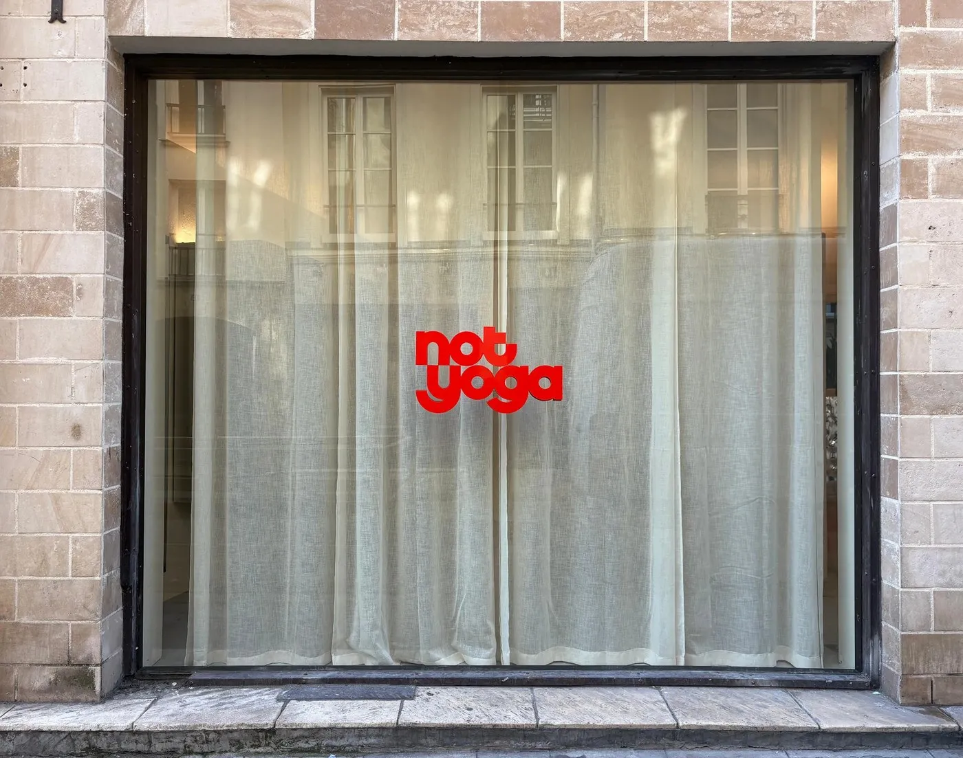
Not Yoga: How Brand Brothers Redefined Yoga Identity Through Kinetic Geometry
Not Yoga: A Bold, Punchy Brand Identity by Brand Brothers Located at 13 Rue des Tournelles in Paris, Not Yoga takes a completely fresh direction. Ditching traditional spiritual elements like mantras and chakras, this studio focuses entirely on full-body physical movement for all skill levels. The space features infrared heating maintained at 33°C to boost…
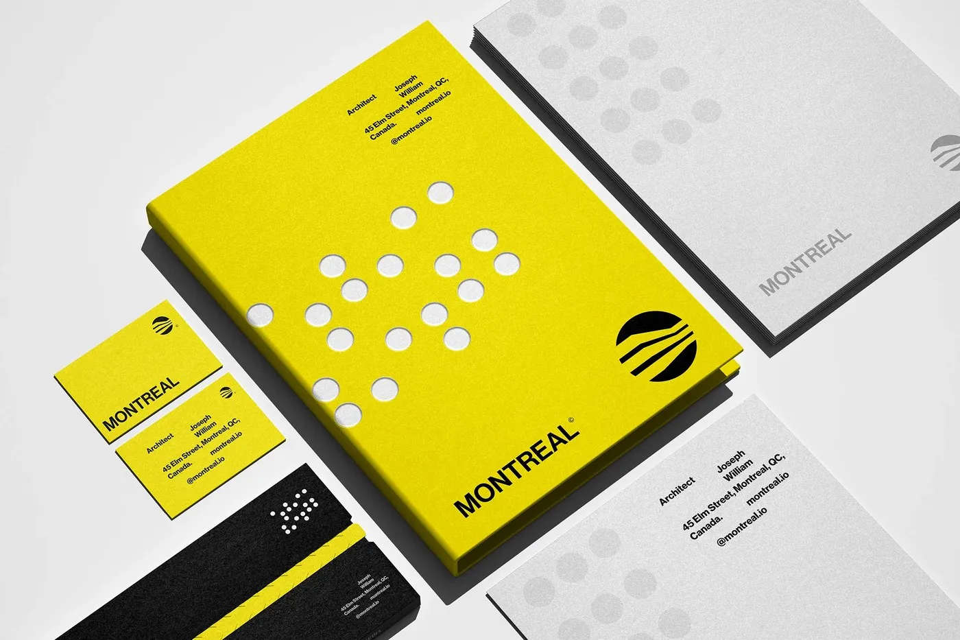
Translating Architectural Structure into Brand Identity for Montreal Architecture
Montreal Architecture Brand Identity by Mariane Farias Montreal Arquitetura is a design studio based in Montreal, Canada, known for its signature oversized circular windows. Drawing from this iconic structural element, designer Mariane Farias built a stunning, cohesive brand identity. The circular logo mark incorporates sleek 45-degree cuts that mimic rooflines and structural angles, while three…
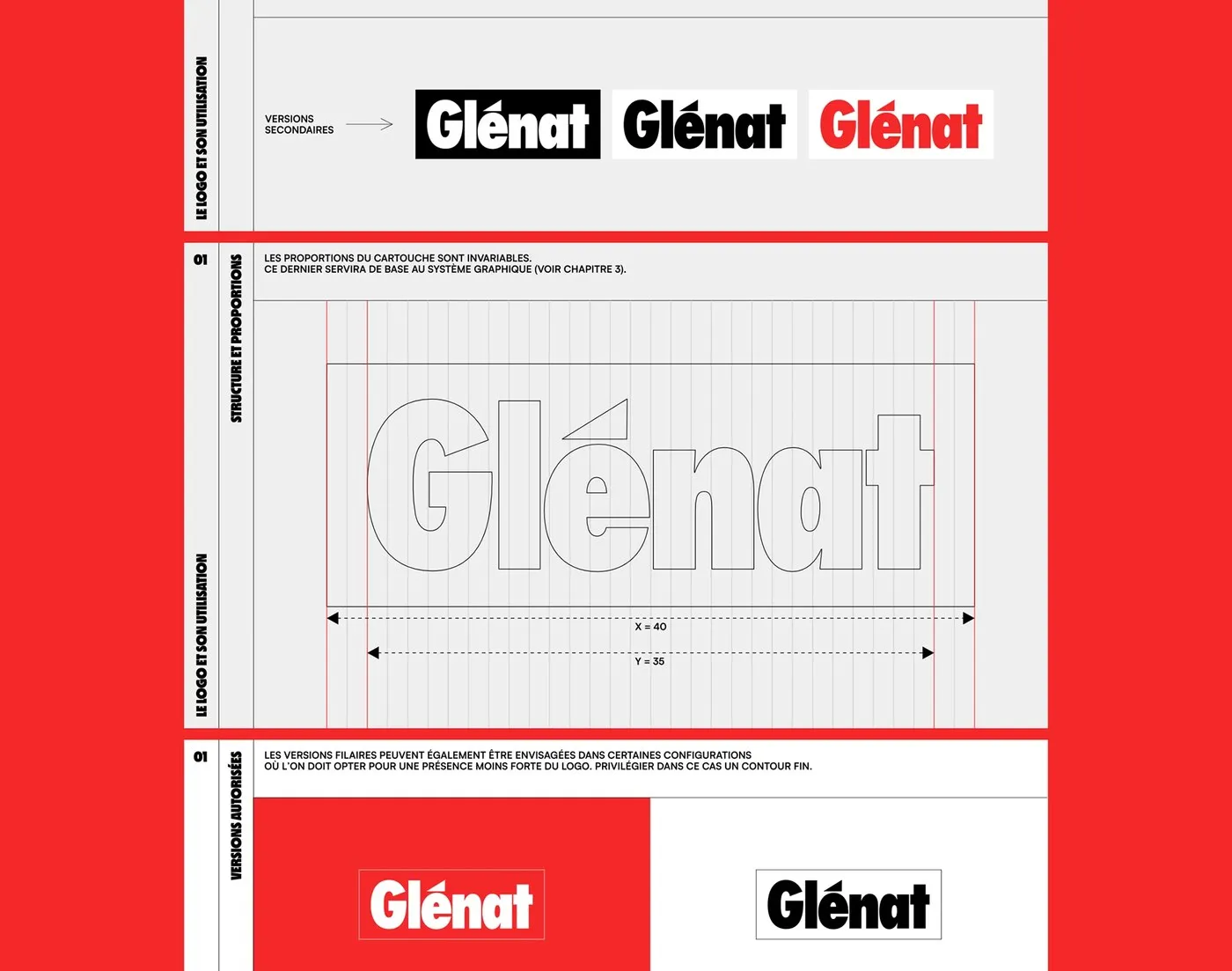
How Brand Brothers Built a Flexible Brand Identity System for Glénat
How Brand Brothers Tackled Glénat’s Brand Identity Refresh Glénat stands as one of France’s premier publishing powerhouses, founded back in 1969 in Grenoble by Jacques Glénat. With an incredible catalog of over 14,000 titles and a network of 2,000 authors, they are the creative home behind pop-culture giants like Dragon Ball, One Piece, Akira, and…
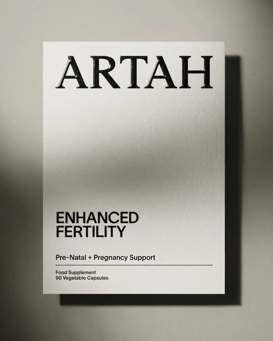
How Two Times Elliott Brought Clinical Precision and Style to Artah
Two Times Elliott Reimagines Artah’s Visual Identity Founded in 2021 by nutritionist Rhian Stephenson, Artah brings real medical depth to metabolic health. Rather than playing into traditional pharma tropes or making hype-filled promises, Artah charts a fresh path as a Certified B Corp running independent clinical trials. Prepping for a major jump from direct-to-consumer into…
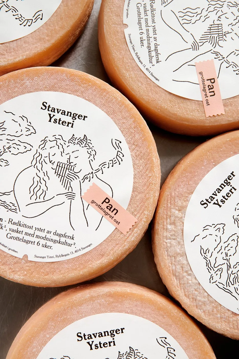
Tactile Packaging Design for Stavanger Ysteri by OlssønBarbieri
Stavanger Ysteri Cheese Packaging by OlssønBarbieri: Where Science Meets Mythology Stavanger Ysteri is an urban artisanal creamery producing raw milk cheese right in the heart of Stavanger’s historic fish-canning district. Founder Lise Brunborg took quite a unique path, holding a bachelor’s degree in physics alongside a master’s degree in chèvre cheesemaking. Every day, the creamery…
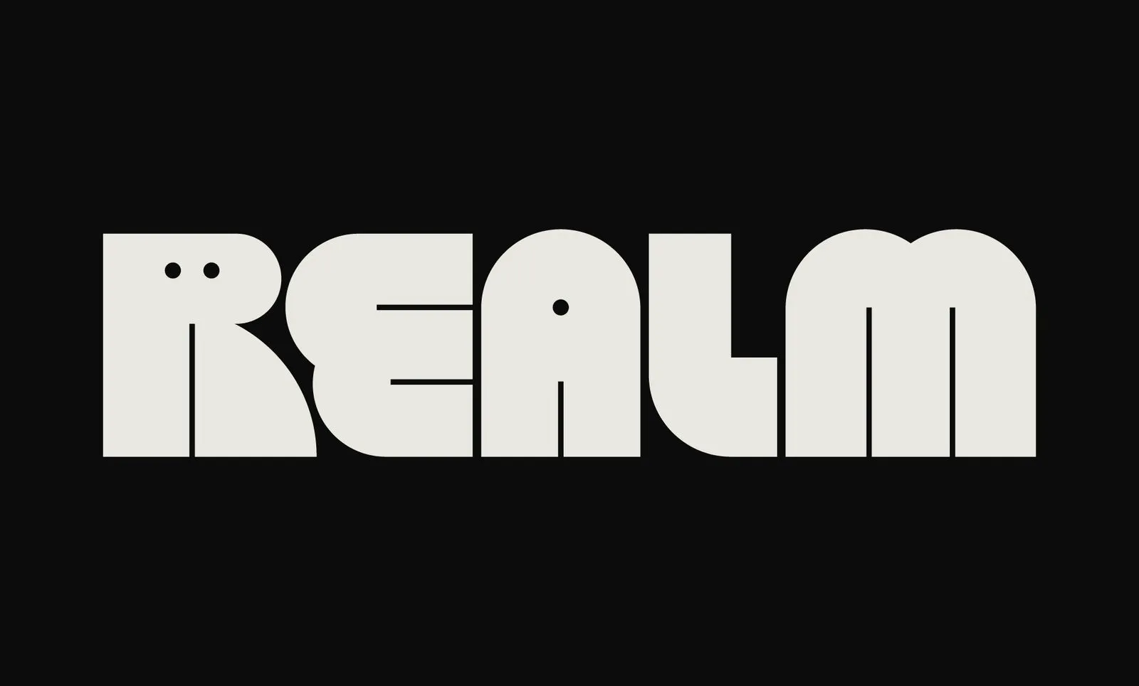
Mother Design Rebrands Serial Box into Realm with a Portal-Inspired Identity
Mother Design Transforms Serial Box into Realm with a Whimsical New Identity Podcast and audiobook platform Serial Box officially rebranded to Realm, complete with a fresh, otherworldly visual identity crafted by Mother Design. First impressions are everything, and this five-letter, off-white wordmark pops beautifully against dark backgrounds. The real magic happens with the letter “R,”…

Mix Interiors Branding and Type Design by Marçal Prats
Mix Interiors Brand Identity by Marçal Prats: From a Square Grid Logo to a Custom Typeface Designer Marçal Prats completely reimagined the brand identity system for Mix Interiors around a foundational square grid, seamlessly expanding the three-letter MIX logo into a full-fledged display typeface. Starting as flat 2D planes, the MIX logotype hints at three-dimensional…
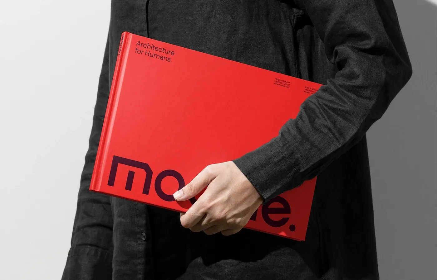
FAST Studio Crafts a Disciplined Brand Identity for Module Architecture
FAST Studio Crafts a Disciplined Brand Identity for Module Architecture Module is a Riyadh-based architecture studio focused on constructing enduring cultural infrastructure, beautifully balancing structural scale with human proportions. To highlight this philosophy, FAST Studio created a remarkably disciplined brand identity system. Instead of playing it safe with familiar neutrals, the brand embraces bold color…
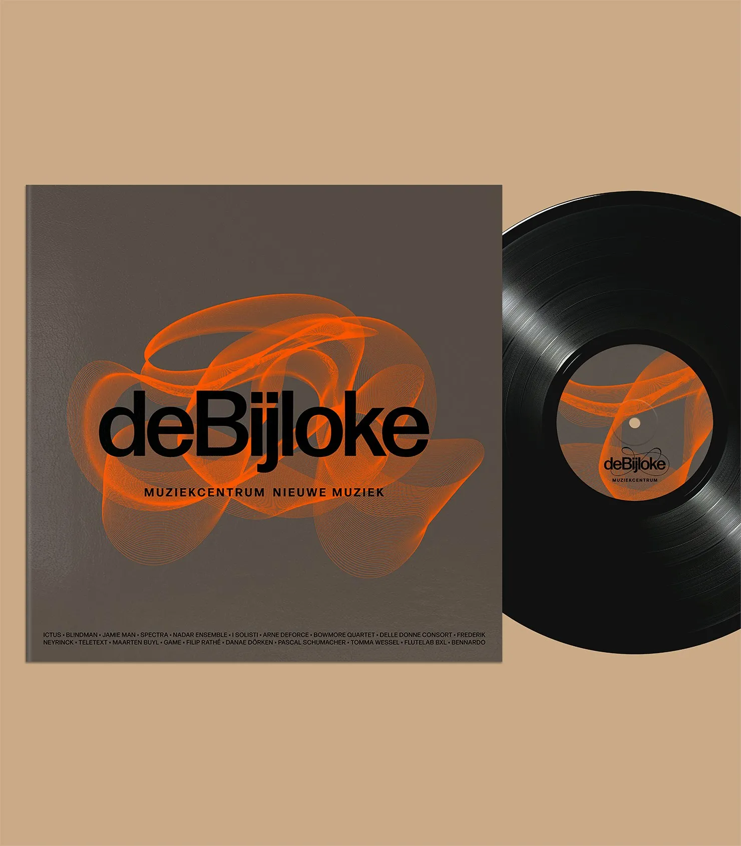
Pentagram Redefines Brand Identity for De Bijloke with Dynamic Sound Waves
Pentagram Breathes Life into De Bijloke’s Brand Identity with Dynamic Sound Waves The De Bijloke music center in Ghent just got a fresh, super dynamic, and adaptable brand identity designed by the team at Pentagram, tailored to fit everything from classical and jazz to modern beats. The centerpiece of this redesign is a ribbon-like swooshing…
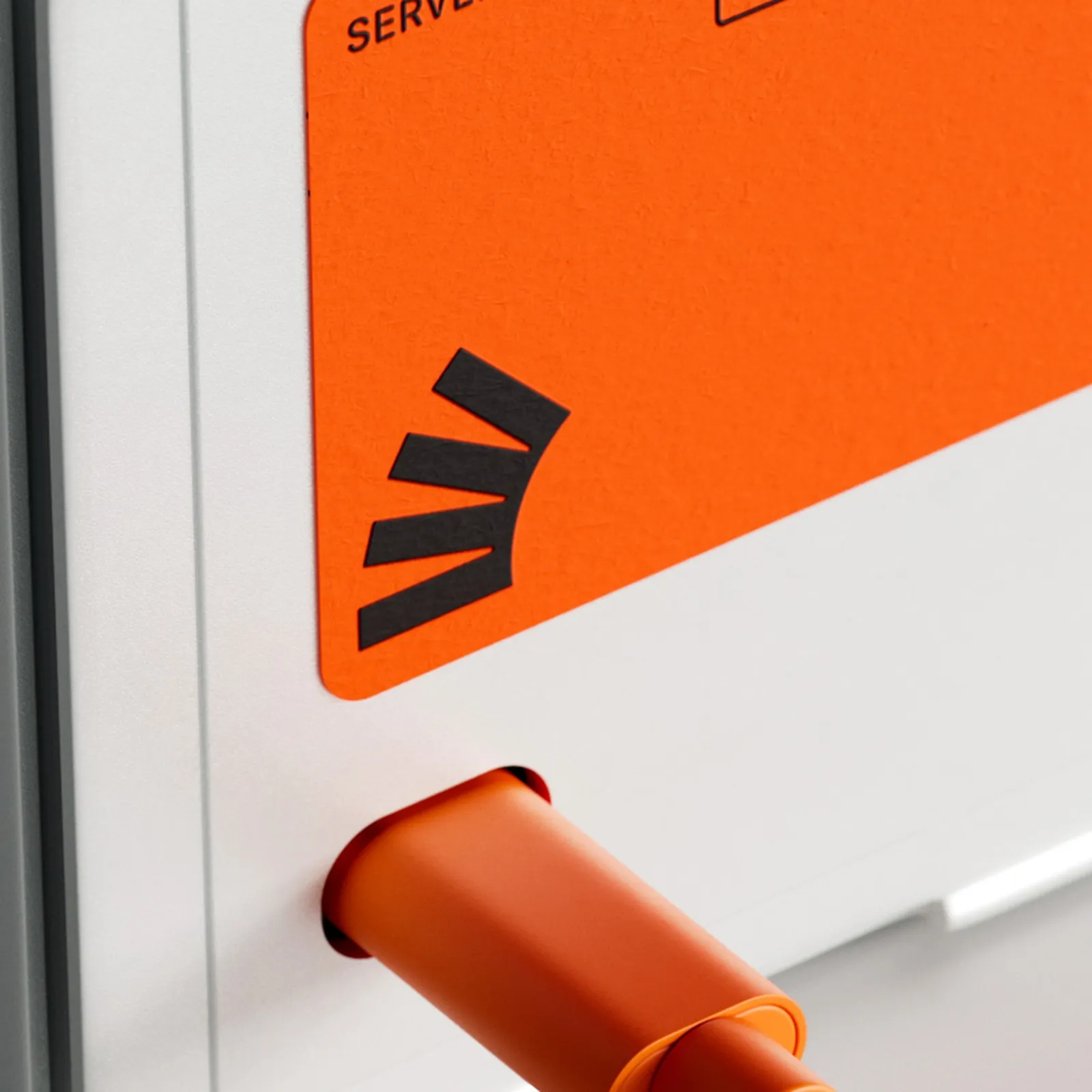
Koto Rebrands Stack Overflow: Anchor of Truth in the AI Era
Koto Rebranding Stack Overflow in the AI Era Does Stack Overflow still have a place in today’s booming AI landscape? Instead of treating this project as a simple visual tune-up, branding agency Koto tackled that existential question head-on by transforming Stack Overflow’s knowledge base into a human-verified anchor of truth. The product lineup got a…
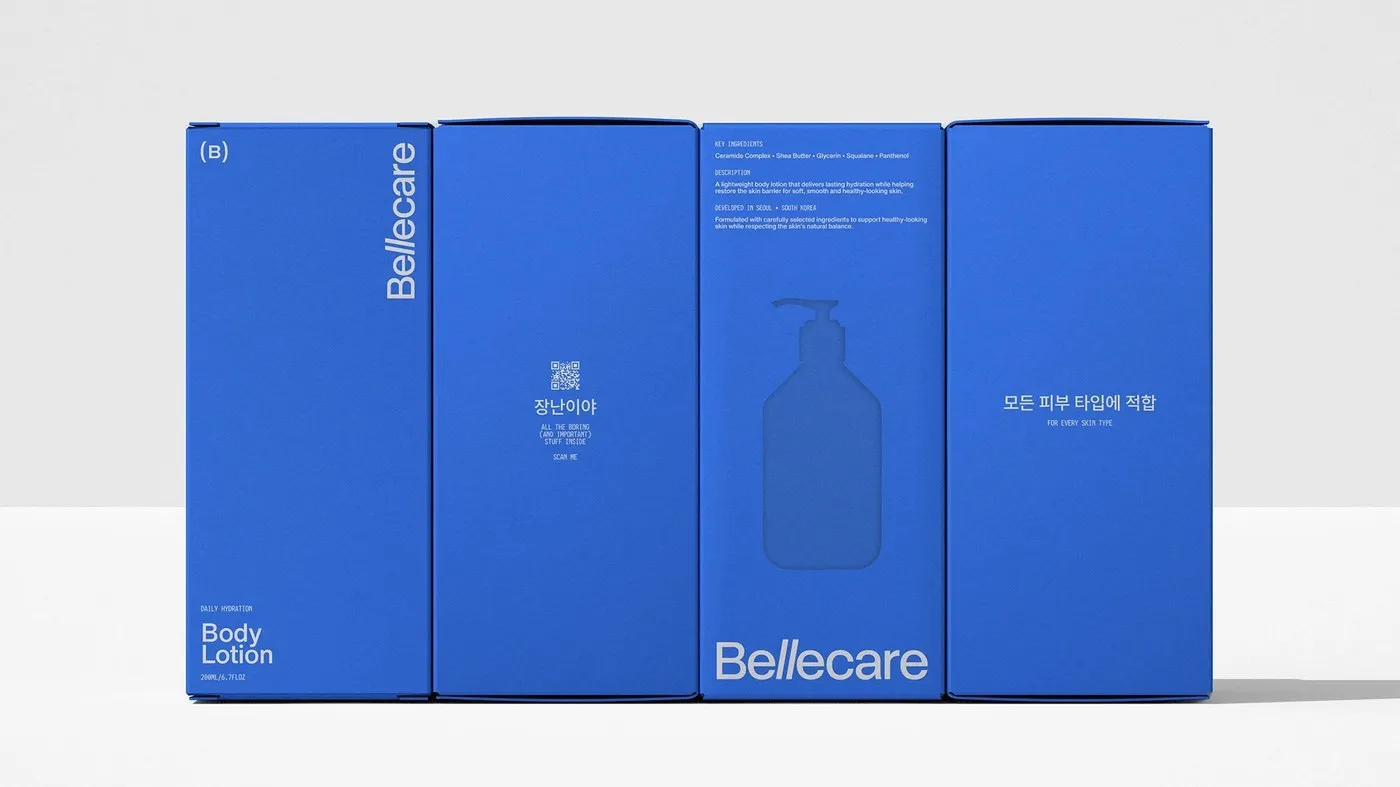
Kauan Lippi’s Minimalist Blue Brand Identity for Bellecare
Minimalist Cobalt Blue Brand Identity for Bellecare by Kauan Lippi Today’s beauty market is packed with leafy greens, warm earthy tones, and shiny foil accents. But for Korean skincare brand Bellecare, Brazilian designer Kauan Lippi and Estúdio Lippi took a totally different route: stripping back every visual element to pure minimalism. Brainstormed right in Seoul—where…
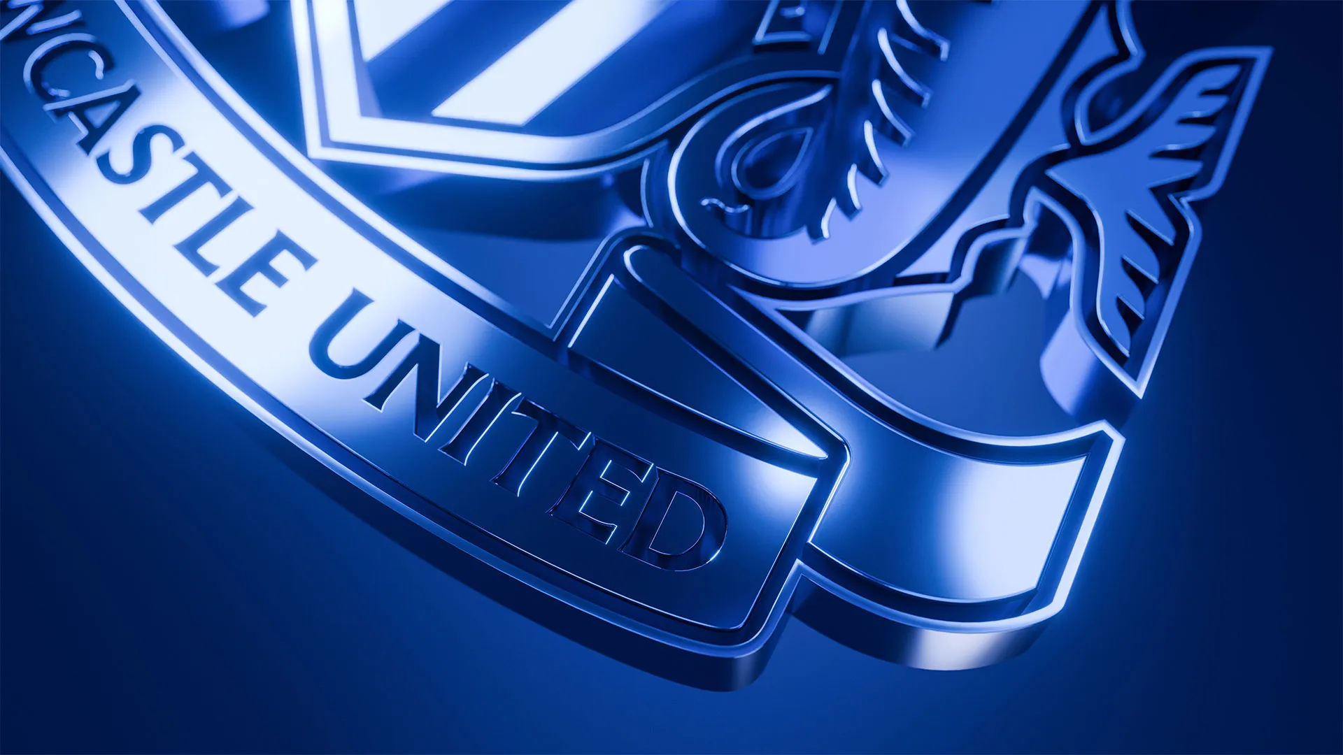
Newcastle United Crest: Refining 38 Years of Civic Heritage for the Modern Screen
Redesigning Newcastle United’s Crest: Polishing 38 Years of Heritage Through Fan Trust After 38 years with the exact same look, Newcastle United officially unveiled a fresh new take on its iconic crest. This isn’t some wild overhaul or over-the-top redesign—it’s the awesome result of two full years of dedicated listening to the fan community. Every…
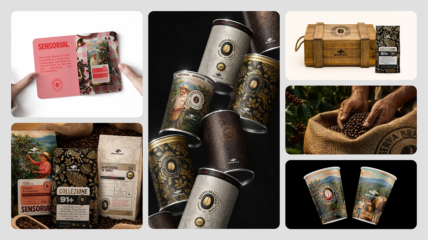
Riserva Brasitália: A Structured Packaging Design for Specialty Coffee
Riserva Brasitália: Packaging and Brand Identity Design for Specialty Coffee The Riserva Brasitália specialty coffee packaging project is a clever blend of detailed line art, luxurious gold foil accents, and a rich color system. Crafted by a design dream team—Pablo Eduardo Frandoloso, Chaminé Branding, Matthew Corseuil, and Lamaisson Marques dos Santos—the lineup spans three distinct…
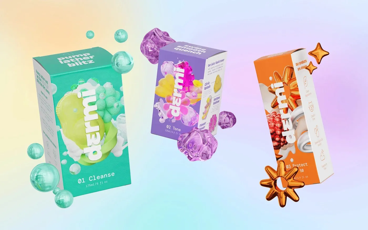
Inside Dermi: Robot Food’s Refillable Skincare Packaging Design for Tweens
Dermi – Refillable Skincare Packaging Design for Tweens by Robot Food Tweens today are diving into skincare earlier than ever. However, most products on the market either confuse them with complex chemical claims or look snooze-worthy under parental selection. Dermi approaches this audience with genuine honesty and a playful spirit. Delivering a simple daily 3-step…
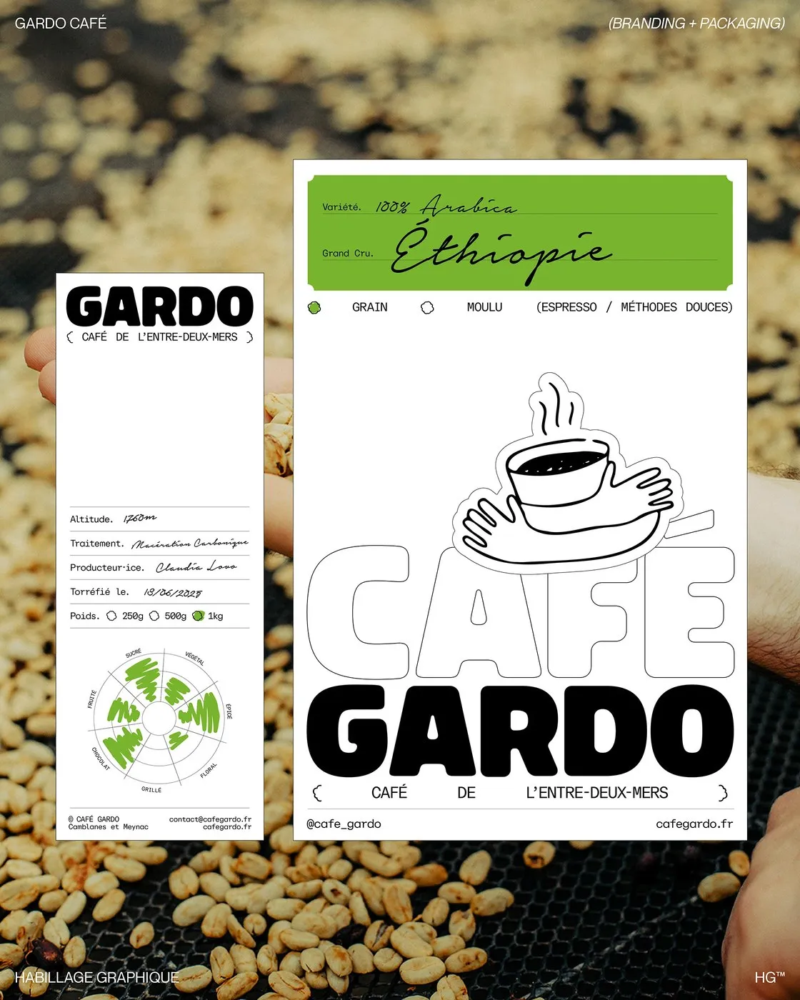
Florian Cornut Unveils Modular Packaging Design for Café Gardo
Modular Packaging Design for Café Gardo by Florian Cornut Café Gardo is a specialty coffee brand hailing from the Entre-Deux-Mers region in Southwestern France, founded by artisan roaster Frank Soccio in Camblanes-et-Meynac. The brand’s name takes inspiration from the vibrant meeting point of the Garonne and Dordogne rivers. Driven by a mission to source beans…
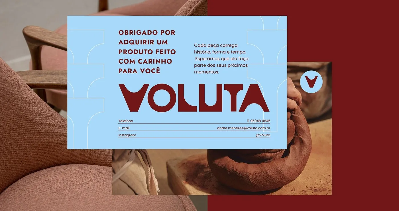
Voluta: Architectural Geometry Meets Brazilian Heritage in Tiago Araujo’s Visual Identity
Voluta: Where Architecture and Brazilian Heritage Meet in Tiago Araujo’s Brand Identity Voluta is a Brazilian studio dedicated to restoring mid-century modern furniture and curating artisanal ceramics. To capture that rich spirit, designer Tiago Araujo crafted a brand identity deeply rooted in architectural heritage, seamlessly weaving historical memory right into contemporary living spaces. What makes…