

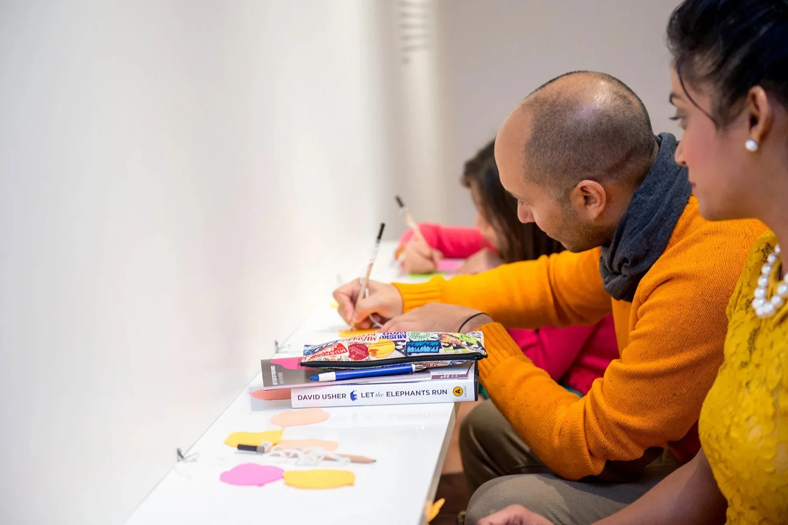
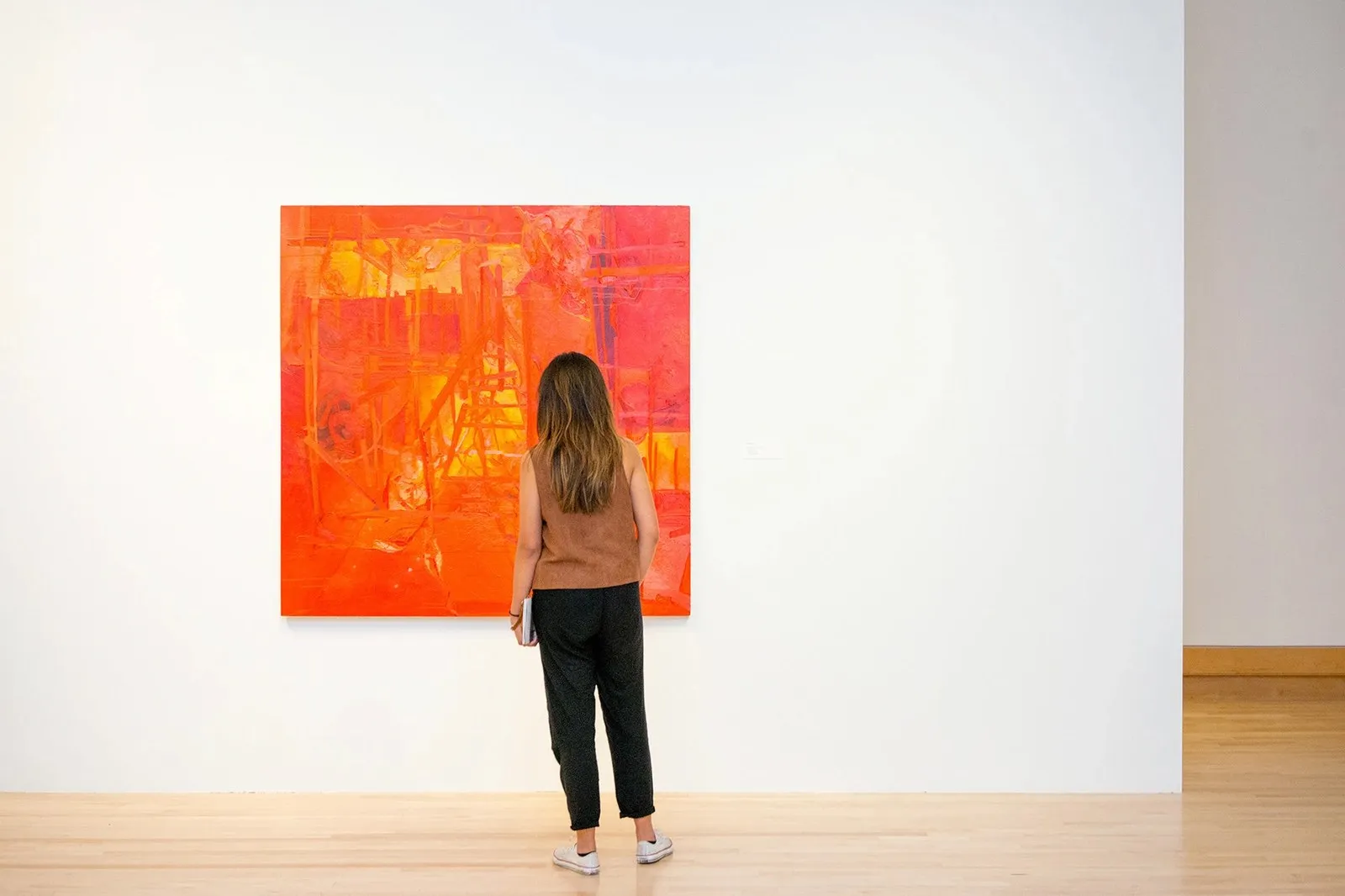
Varley Art Gallery Branding by Underline Studio: A Fresh Take for Art Museums Local art museums often fall into the trap of quiet, muted gray identities, but the Varley Art Gallery of Markham took a completely different path. Home to a celebrated collection of Canadian art at 216 Main Street Unionville—alongside a bustling lineup of art classes and community workshops—this institution needed a look that matched its lively spirit. Toronto-based Underline Studio stepped up with a bold, direct, and delightfully vibrant approach.
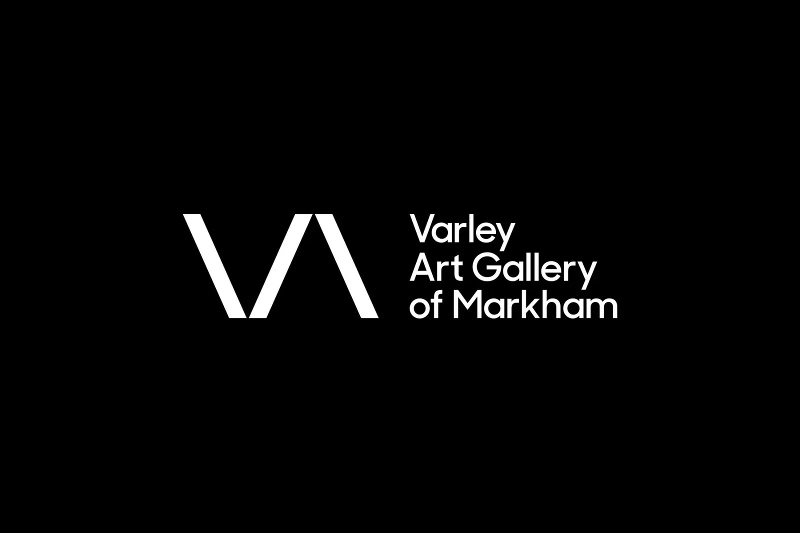
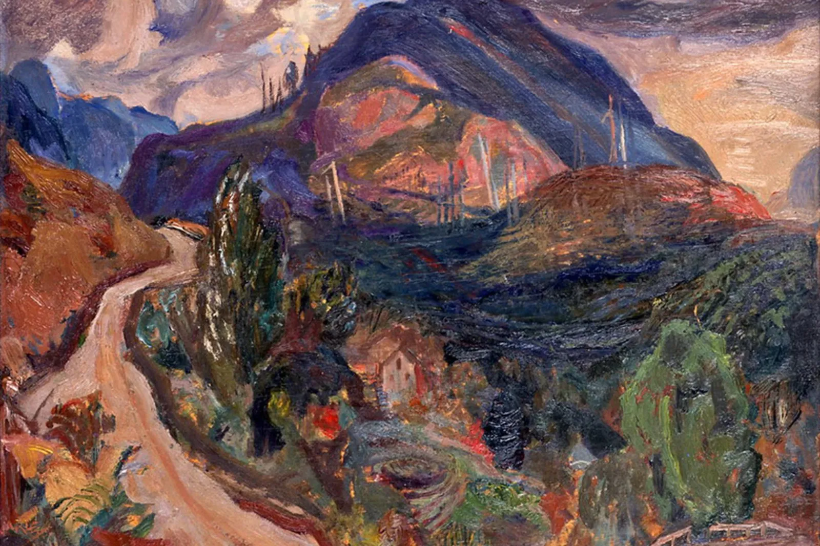
Ditching plays-it-safe neutrals, the design team pulled inspiration straight from the rich, vivid hues found in the gallery’s own painting collection: cobalt blue, cadmium red, ochre yellow, and forest green. This energetic palette pairs up with a sleek, three-stroke geometric monogram combining the letters V and A. Two diagonal lines meet at a sharp point at the bottom to form the V, while a third parallel stroke sits on the right to subtly hint at an open, crossbar-less A—all anchored by neat, three-line geometric sans-serif typography.
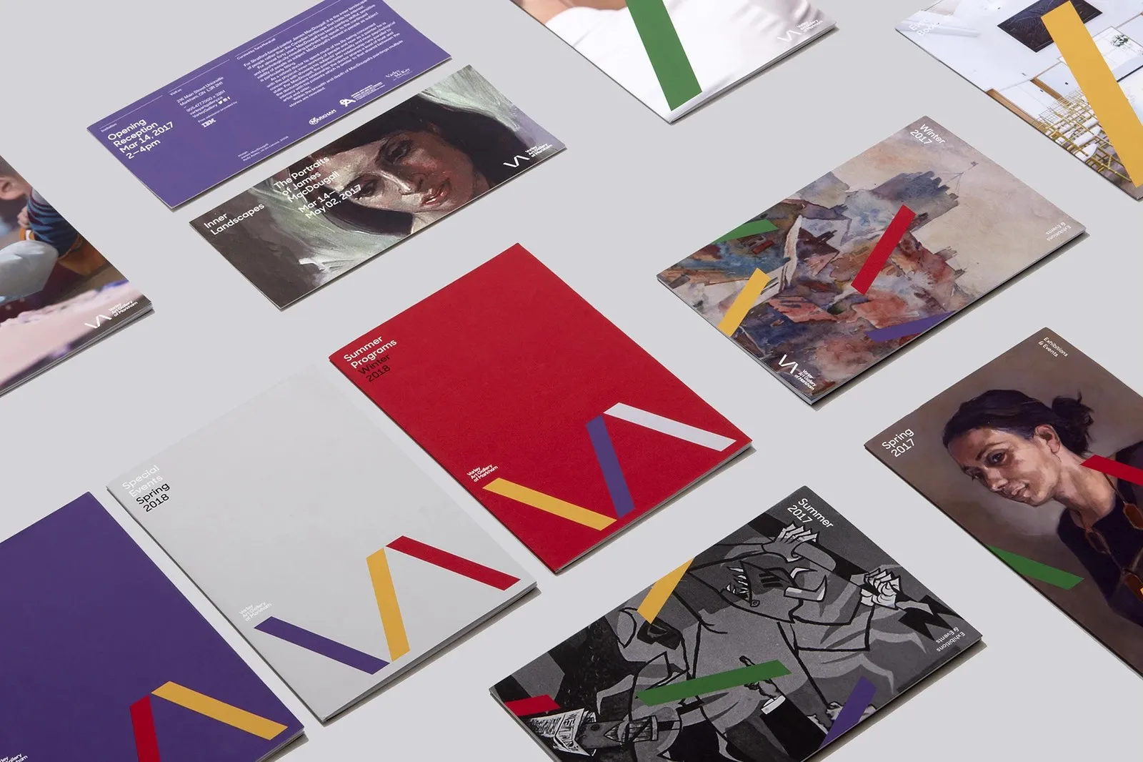
That three-stroke logo isn’t stuck sitting quietly in a corner, either! By breaking the mark into three independent vector paths in Illustrator, Underline Studio transformed them into dynamic framing accents across exhibition collateral. Flipping through seasonal guides like Winter 2017, Spring 2017, and Summer 2017—or the brochure for Inner Landscapes: The Portraits of James MacDougall, curated by Tom Smart—bold slashes of yellow, deep red, green, and purple cut across classic oil portraits and modern illustrations. Even the cover for the Spring 2017 kids’ program features a big diagonal purple stroke sweeping up from the bottom edge across a photo of a young artist at work, giving the design an extra burst of playful energy.
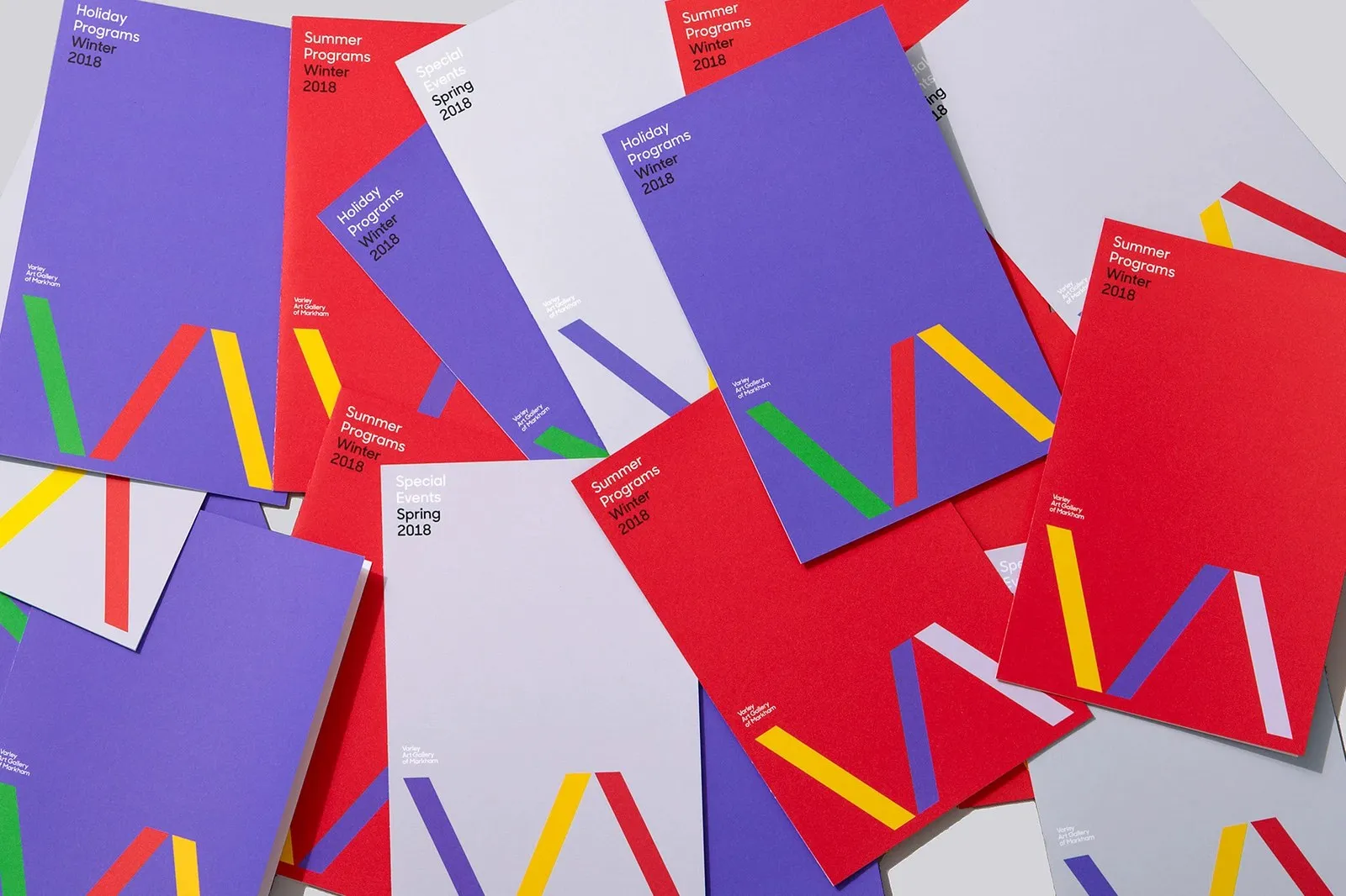
For recurring program guides, the layout system gets a bit more structured in InDesign while keeping all the fun. Printed on tactile uncoated paper across guides like Summer Programs Winter 2018, Special Events Spring 2018, and Holiday Programs Winter 2018, an oversized VA monogram anchors the bottom edge. Colors flex effortlessly—shifting from ochre, purple, and cool gray against a red background to green, deep red, and yellow over deep purple. Clean, left-aligned headlines at the top keep everything tidy and easy to read. A great public identity should feel open, welcoming, and community-minded, and this print system nails that vibe completely.
Check out the complete project by www.behance.net/gallery/73348031/Varley-Rebrand on Behance.
Bộ Nhận Diện Varley Art Gallery Từ Underline Studio: Làn Gió Mới Cho Bảo Tàng Nghệ Thuật
Các bảo tàng nghệ thuật địa phương thường hay rơi vào lối mòn với bộ nhận diện màu xám trung tính khá lặng lẽ. Nhưng với Varley Art Gallery of Markham – nơi lưu giữ bộ sưu tập tranh Canada nổi tiếng tại số 216 đường Main Street Unionville cùng hàng loạt lớp học vẽ và workshop cộng đồng – câu chuyện thiết kế lại đi theo một hướng hoàn toàn khác. Đội ngũ Underline Studio đến từ Toronto đã chọn cách tiếp cận trực diện và rõ ràng hơn rất nhiều.
Thay vì dùng tông màu an toàn, nhóm thiết kế lấy cảm hứng trực tiếp từ các gam màu rực rỡ trên chính những bức họa của bảo tàng: xanh chàm, đỏ cadmium, vàng đất ochre và xanh lá rừng. Bảng màu này được kết hợp cùng biểu tượng monogram hình học ba nét đơn giản từ hai chữ cái V và A. Hai thanh chéo gặp nhau ở góc nhọn phía dưới tạo thành chữ V, trong khi thanh chéo thứ ba nằm song song ngay cạnh bên phải để gợi hình ảnh chữ A dạng mở không có gạch ngang, đi kèm kiểu chữ sans-serif hình học ba dòng gọn gàng.
Biểu tượng ba nét này không chỉ nằm cố định một góc. Bằng cách tách ba đường vector độc lập trong Illustrator, Underline Studio đã biến chúng thành các chi tiết khung hình đồ họa rải rác trên các ấn phẩm in ấn triển lãm. Quan sát các cuốn hướng dẫn sự kiện theo mùa như Winter 2017, Spring 2017, Summer 2017 hay brochure triển lãm Inner Landscapes: The Portraits of James MacDougall do Tom Smart tuyển chọn, các vệt màu vàng, đỏ thẫm, xanh lá và tím cắt ngang qua các bức chân dung sơn dầu lẫn hình minh họa hiện đại. Ngay cả bìa chương trình thiếu nhi Spring 2017 cũng có một vệt chéo màu tím lớn cắt từ viền dưới qua bức ảnh em nhỏ đang tập vẽ, giúp thiết kế tràn đầy năng lượng.
Với các cuốn hướng dẫn định kỳ, hệ thống layout được quy chuẩn rõ ràng hơn khi dàn trang trong InDesign. Trên chất liệu giấy uncoated của các ấn phẩm Summer Programs Winter 2018, Special Events Spring 2018 và Holiday Programs Winter 2018, logo monogram VA bản lớn được đặt cố định ở mép dưới — thay đổi màu sắc linh hoạt từ vàng đất, tím, xám lạnh trên nền đỏ cho tới xanh lá, đỏ thẫm, vàng trên nền tím đậm. Tiêu đề nhỏ căn trái ở góc trên giữ cho tổng thể gọn gàng và dễ đọc. Một thiết kế nhận diện tốt cho tổ chức công cộng cần mang lại cảm giác mở cửa chào đón người dân địa phương, và hệ thống in ấn này đã đáp ứng đúng tinh thần đó.
Xem trọn bộ dự án của www.behance.net/gallery/73348031/Varley-Rebrand trên Behance.