
branding
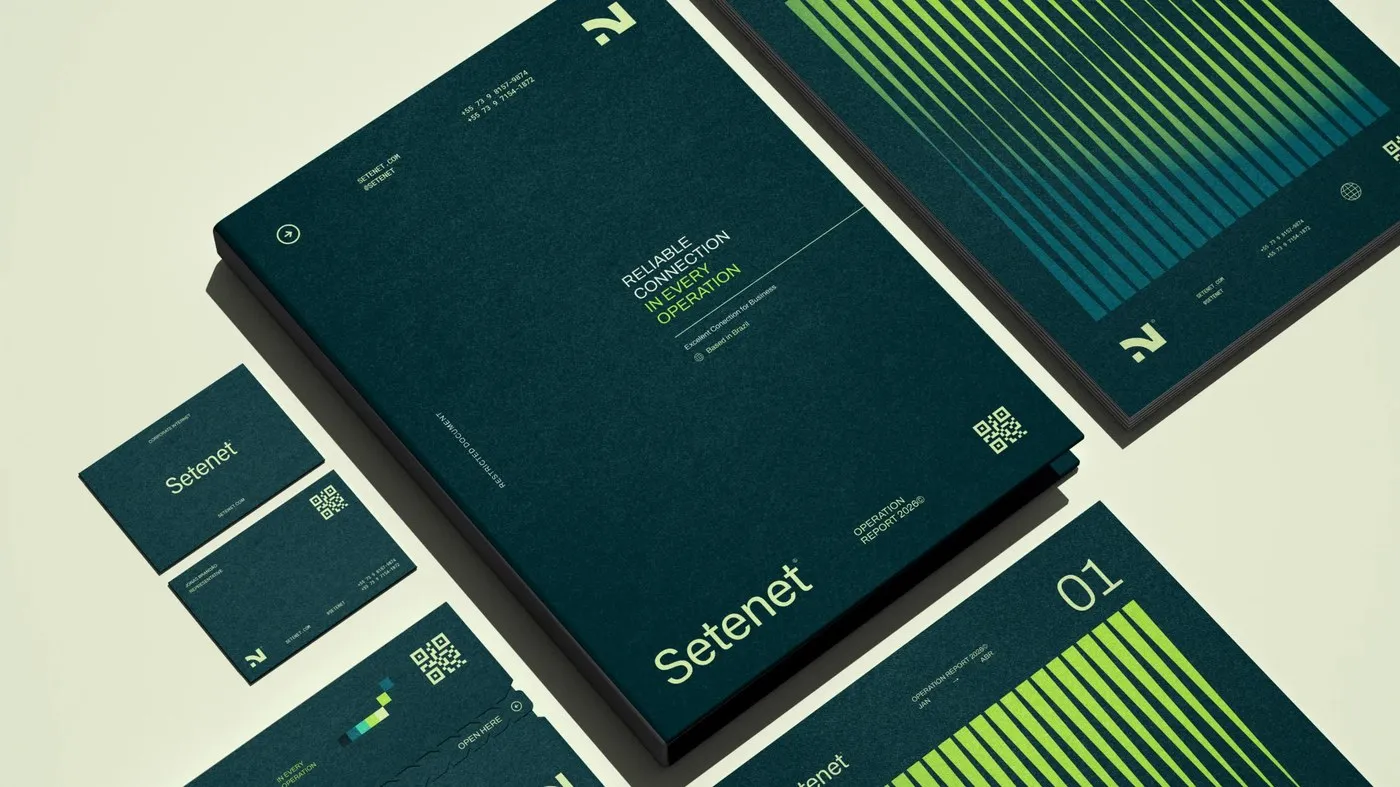
Setenet Brand Identity by Estúdio Reven: A Pragmatic Visual System for Data Infrastructure
Setenet Brand Identity by Estúdio Reven: A Pragmatic Visual System for Enterprise Network Infrastructure Most telecom branding hits the exact same clichés: glowing globes, swooshing blue fiber-optic cables, or overly enthusiastic call center reps. But when design studio Estúdio Reven built the brand identity system for Setenet, every single one of those tired tropes was…
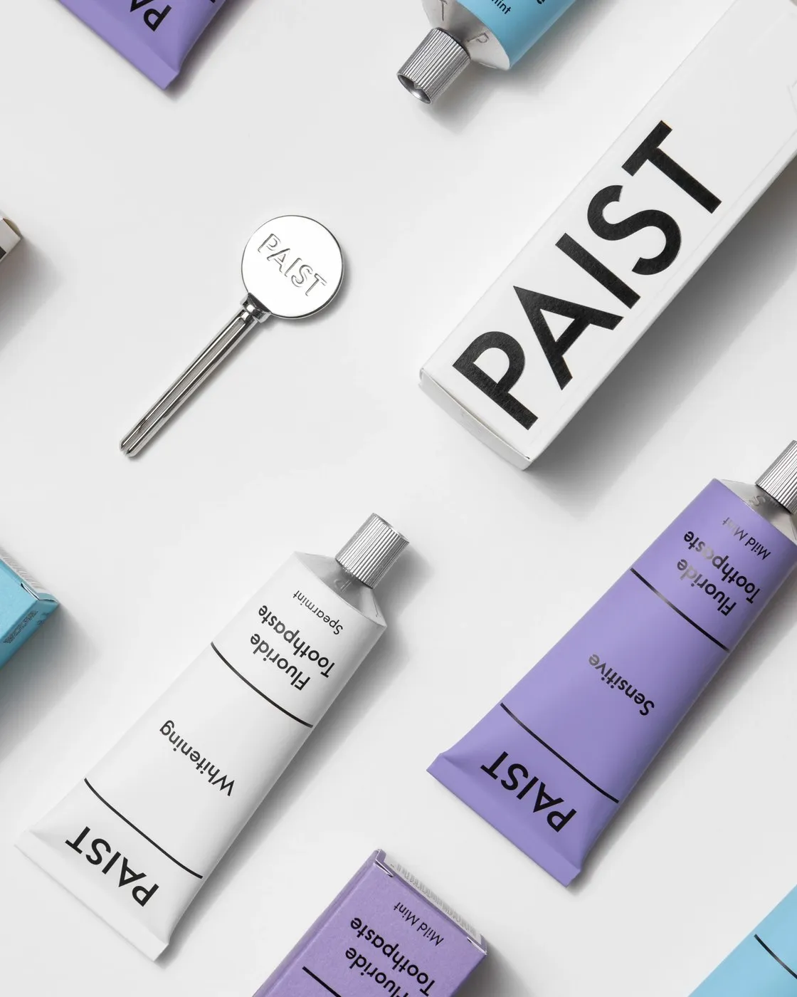
Paist: How Two Times Elliott Redefined Toothpaste Branding
Paist: Turning Daily Brushing into an Inspiring Ritual Oral care branding has felt super clinical and repetitive for ages, stuck in an endless loop of standard red, white, and blue. London-based design studio Two Times Elliott took a totally fresh angle with Paist, turning a mundane everyday chore into a calming, mindful moment amid a…
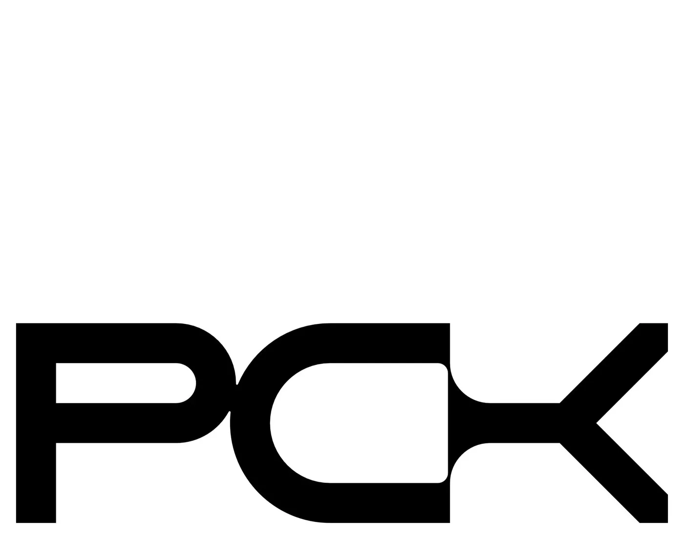
A Bold Black and White Identity for PCK by Brand Brothers
PCK’s Minimalist Black-and-White Brand Identity by Brand Brothers When you think of law firms, safe shades of blue and traditional logos usually come to mind. Studio Brand Brothers took a completely different path when designing the brand identity for PCK Intellectual Property—a firm specializing in patents, trademarks, and litigation across Toronto, Winnipeg, and Washington. Ditching…
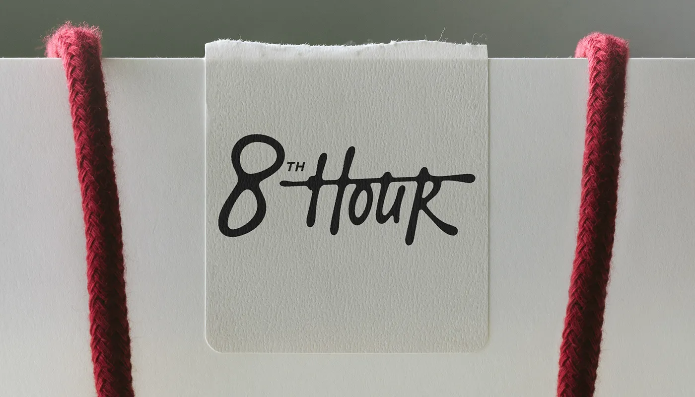
8th Hour: Merging Office Aesthetics with Modern Workwear Branding
8th Hour: Blending Office Aesthetics with Modern Workwear Branding 8th Hour is a standout branding project created by designer Anastasiia S., seamlessly bridging classic office wear with practical, rugged workwear. This visual identity strikes a fantastic balance between rugged workwear grit and sleek office sophistication. At the heart of the brand is a bold script…
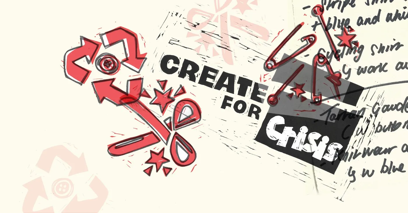
Dalziel & Pow Crafts Linocut Visual Identity for Crisis Campaign
Dalziel & Pow’s Handcrafted Identity for “Create for Crisis” London-based design studio Dalziel & Pow recently teamed up with UK homelessness charity Crisis to revamp their “Create for Crisis” campaign. Timed for Secondhand September, the “UNSOLD. RETOLD.” initiative brought 12 independent designers together at a Canning Town warehouse to upcycle unsold donated clothing. Using creative…
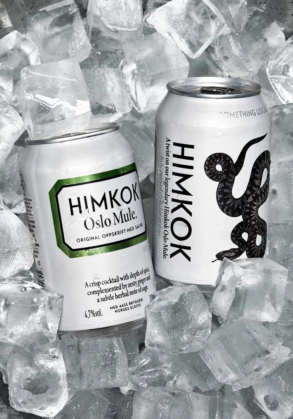
Himkok RTD: OlssønBarbieri’s Apothecary Packaging Design
Check Out Himkok RTD’s Fresh Canned Look Courtesy of OlssønBarbieri When Oslo’s local bars had to temporarily shut their doors, the crew behind the iconic cocktail spot Himkok came up with a brilliant idea: bringing their crafted drinks straight to grocery store shelves. To make it happen, design studio OlssønBarbieri packed that authentic craft cocktail…
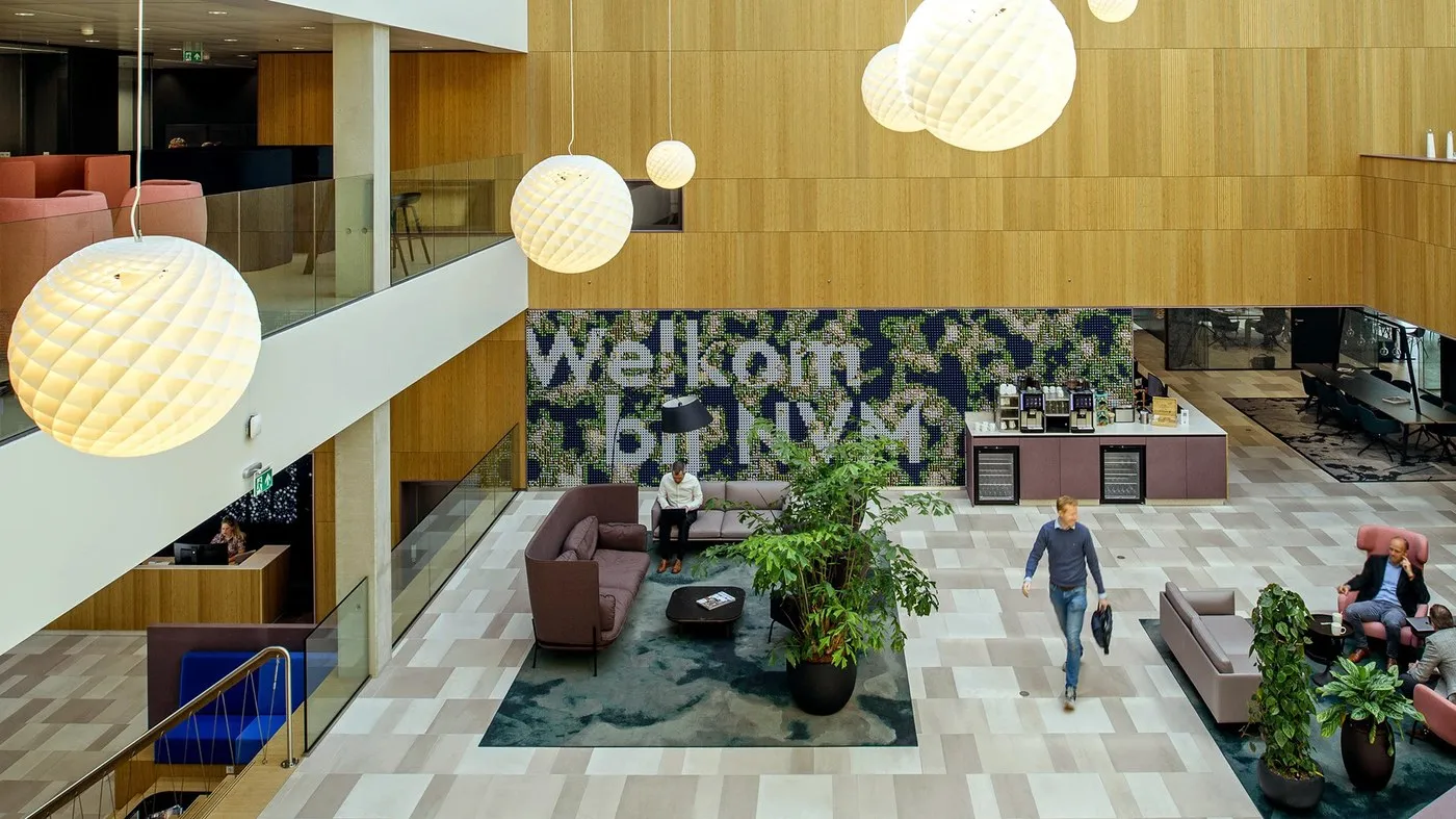
Spatial Design for NVM Association Clubhouse by Silo
Spatial Design for NVM Real Estate Association HQ by Silo NVM represents a huge network of real estate agents and brokers across the Netherlands. Their headquarters serves as both a hands-on training hub and a welcoming connection point for all its members. The team at Silo completely flipped the script on standard office floors, turning…
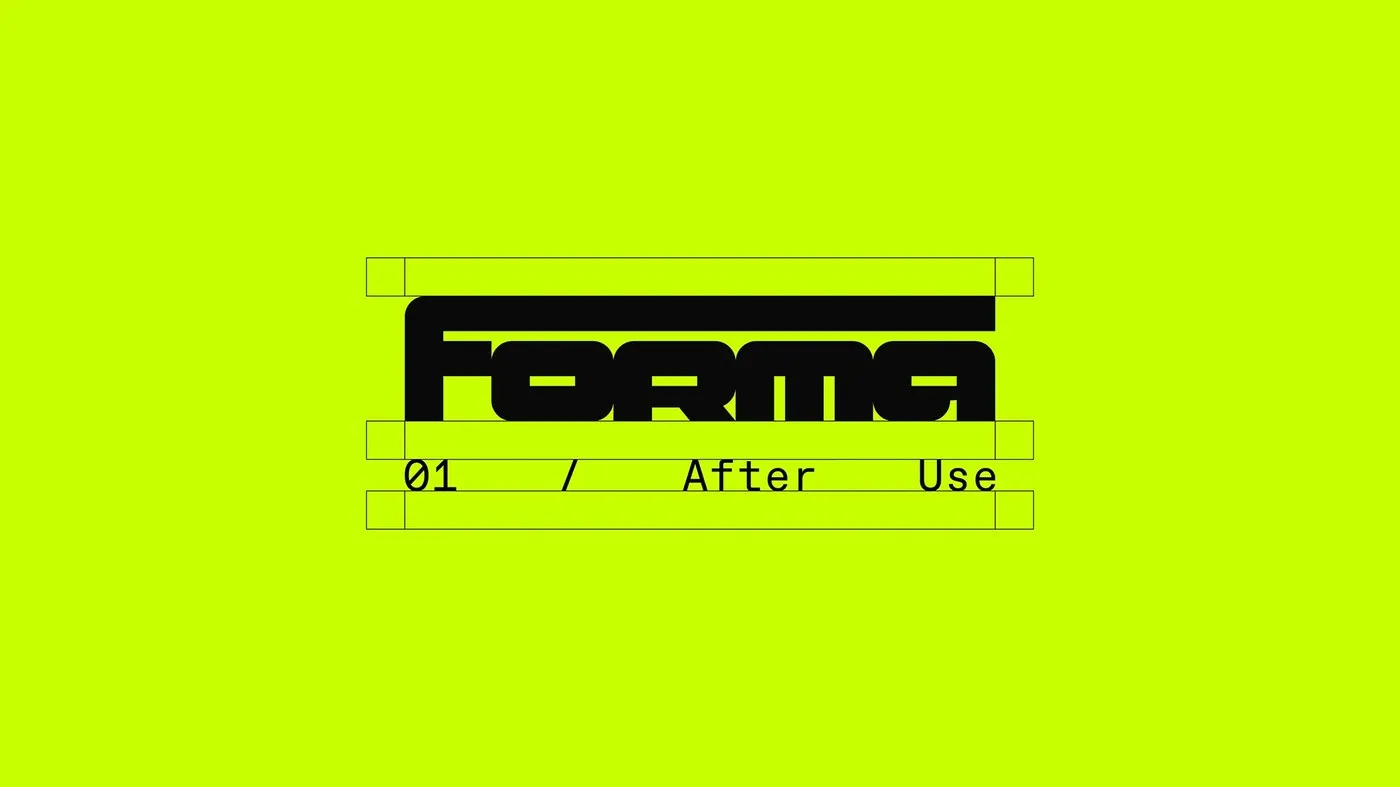
FORMA Festival Identity: Rethinking Material Culture with Luciano Quintana
Luciano Quintana’s FORMA Brand Identity: The Story of Object Lifecycles While most eco-focused design projects default to soothing greens or familiar kraft paper, the FORMA festival identity by Luciano Quintana takes a much bolder path. Centered around the concept of material culture, the project tackles a big question: what actually happens to event items once…
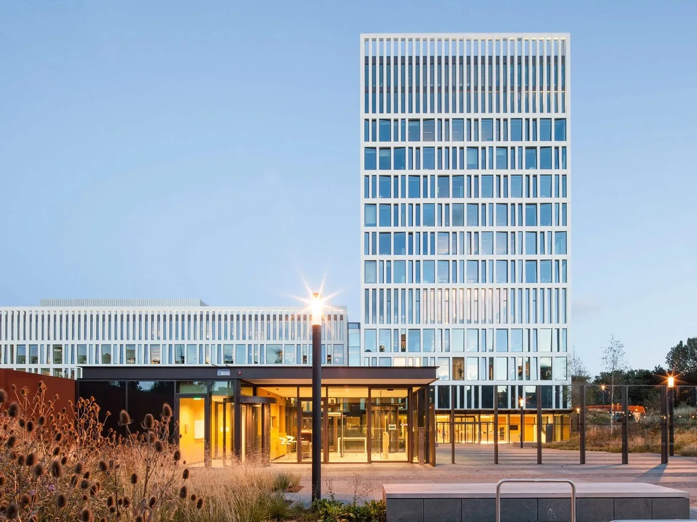
Eurojust Spatial Design: Balancing Privacy and Openness with Silo’s Graphic Glass Film
Spatial Design at Eurojust: Studio Silo’s Smart Privacy and Daylight Solution Eurojust serves as the European Union’s judicial cooperation agency fighting cross-border crime, with its headquarters located in The Hague. Nestled within a lush dune landscape, the sleek 12-story building designed by architecture firm Mecanoo brings together over 400 workspaces for legal delegates from across…
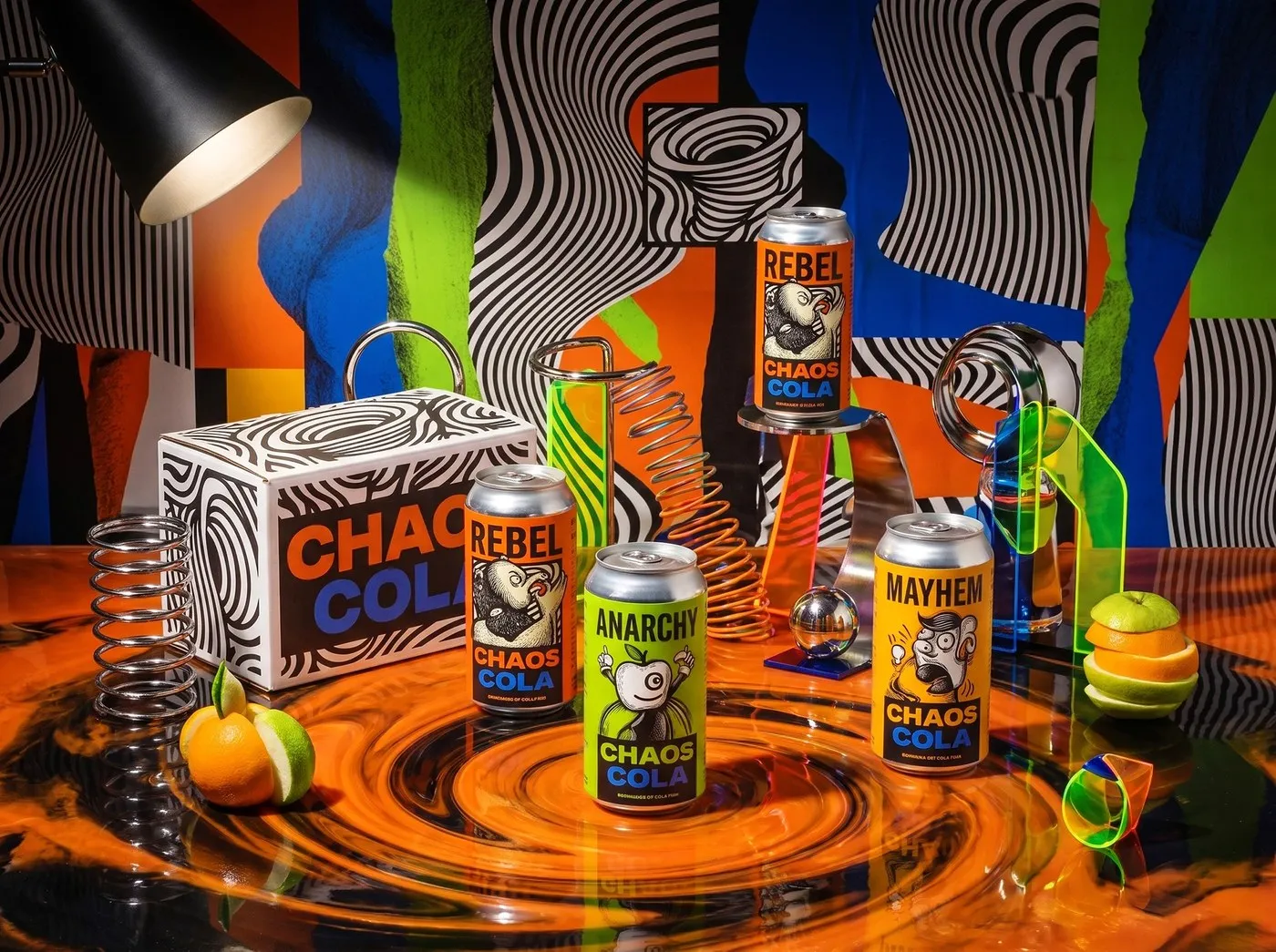
Chaos Cola Packaging Design by Up-Brands: Raw Pop-Anarchy in a Soda Can
Chaos Cola Packaging Design by Up-Brands: Pure Rebellion Fueled by Op-Art and Underground Comics The beverage market often falls into a rut with minimalist designs, soothing pastel tones, or play-it-safe corporate conformity. Flipping the script entirely, design studio Up-Brands brought Chaos Cola to life with an unapologetically bold look packed with raw pop-anarchy energy and…
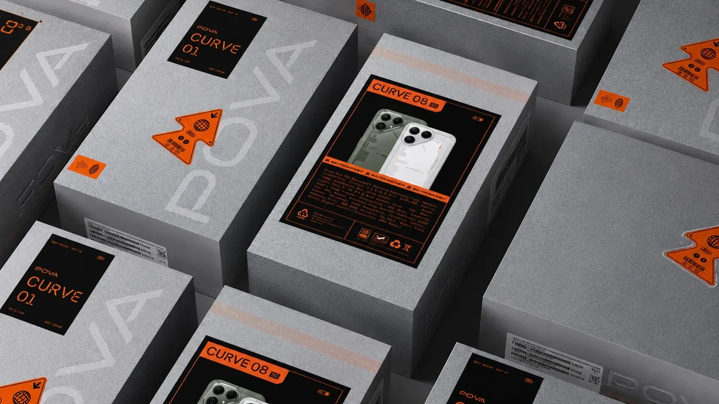
Brutalist Brand Identity Redesign for POVA by StudioDraft
POVA Redesign: A Bold Brutalist Identity by StudioDraft StudioDraft just wrapped up a fresh rebranding project for smartphone maker POVA—all while keeping the core logo completely untouched! Instead of playing it safe with the usual sleek, minimalist look dominating the tech scene, this design direction goes all-in on a raw, tech-heavy brutalist vibe, turning devices…
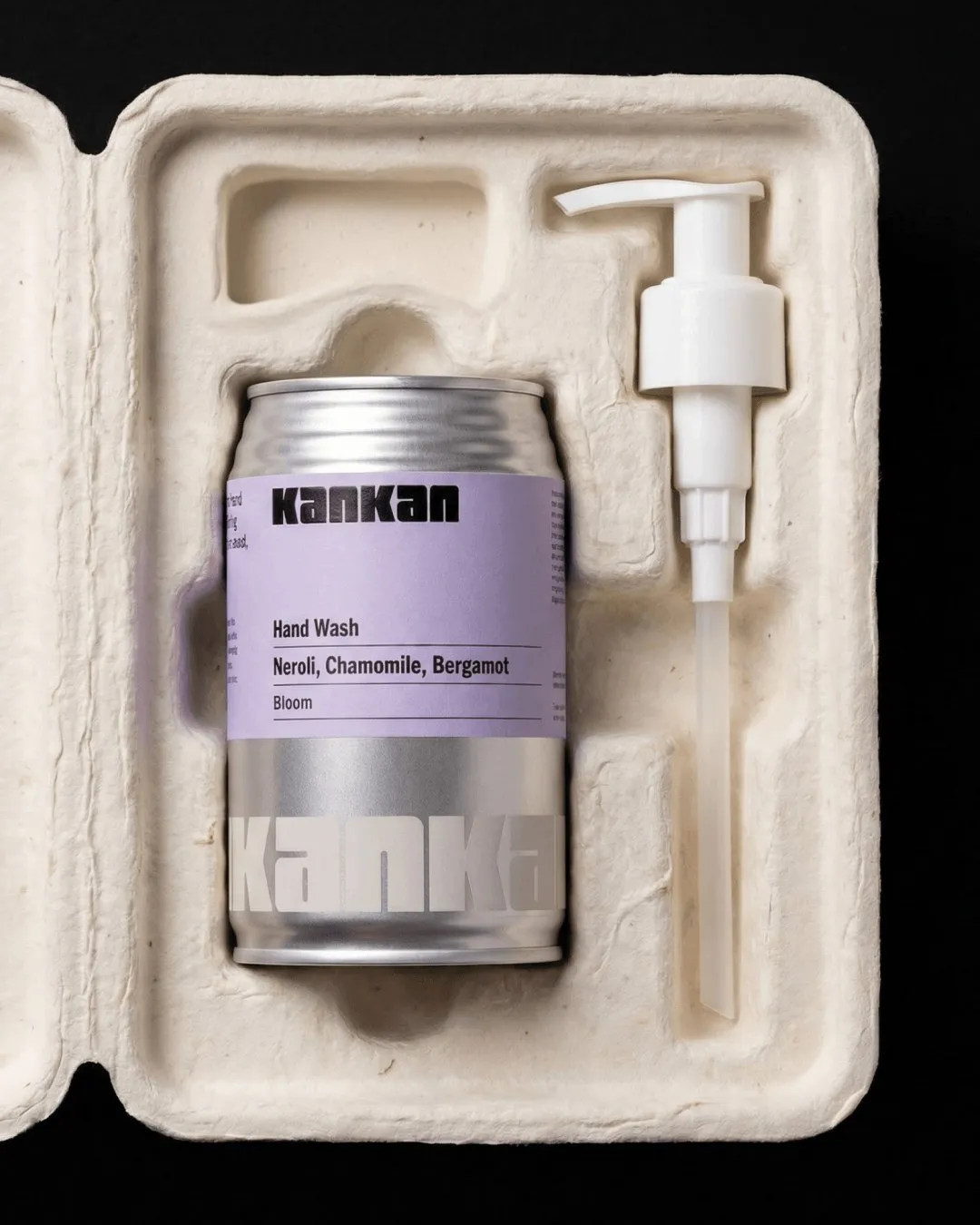
KanKan Circular Packaging Design by Two Times Elliott
Eco-Friendly Packaging Design for KanKan by Two Times Elliott Say goodbye to boring plastic shower bottles! Personal care brand KanKan teamed up with design studio Two Times Elliott to swap out plastic for sleek metal cans packed with liquid hand soap. This fresh redesign offers a circular packaging solution that makes eco-conscious living both super…
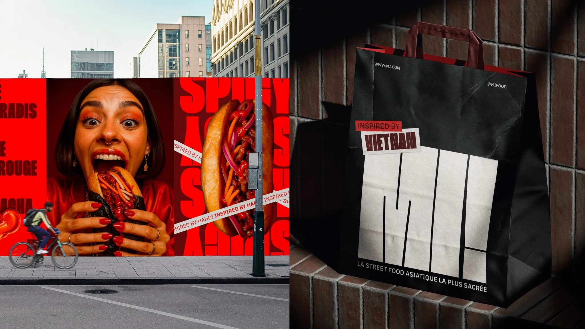
Packaging Design for MI! – A Tactile Take on Vietnamese Street Food
Packaging Design for Caroline Lafon’s Bánh Mì Brand, MI! Drawing inspiration from the rich culinary history shared between France and Vietnam, this brand identity project for MI! celebrates the iconic bánh mì sandwich. Designer Caroline Lafon crafted a striking brand image anchored by an energetic custom logotype complete with a high-powered exclamation mark. A warm…
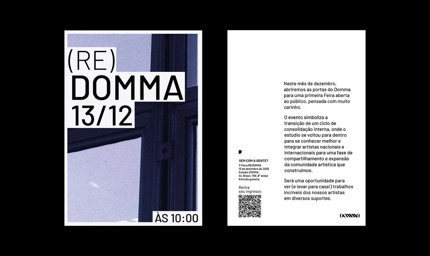
Translating Tattoo Art into Brand Identity: (RE)DOMMA by Gabriel Maciel
(RE)DOMMA by Gabriel Maciel: When Tattoo Art Breaks Free From the Skin Tattoo culture often gets stuck in the same old tropes when it ventures outside the parlor—think predictable blackletter typography, gritty distressed textures, or repetitive flash motifs. But Brazilian designer Gabriel Maciel took a totally fresh direction for (RE)DOMMA. He crafted a stunning visual…
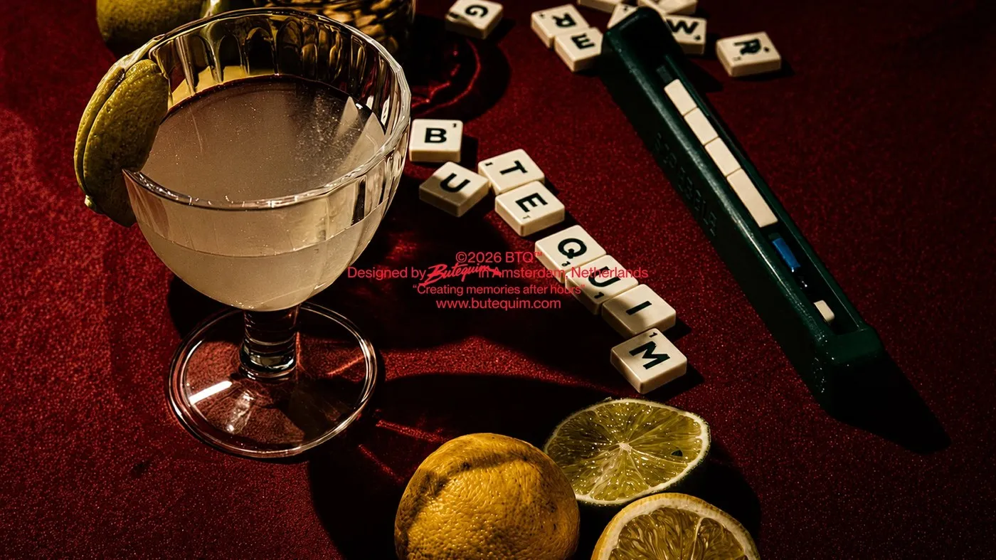
Butequim Cocktail Bar: A Brutalist Brand Identity by Estúdio Lippi
Butequim Cocktail Bar: A Rio Street-Style Brand Identity in Amsterdam Founders Rafael and Bruno spotted a cultural void in Amsterdam’s nightlife scene and decided to inject the laid-back, soulful vibe of Rio de Janeiro’s neighborhood botecos right onto Spuistraat. Even the deliberate spelling choice of “Butequim” with a “U” embraces imperfection and breaks rigid rules…
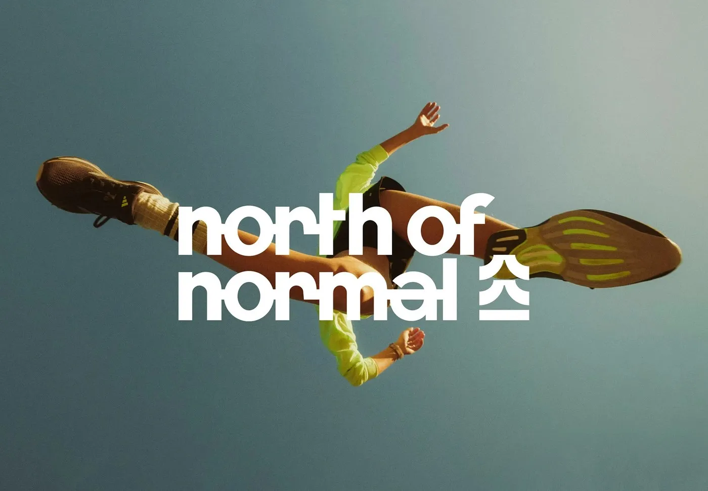
Kinetic Branding Design for North of Normal Studio by Molnár Péter
Dynamic Kinetic Branding for North of Normal Studio by Designer Molnár Péter North of Normal Studio specializes in sports video production, which demands a brand identity that truly captures momentum, speed, and crisp visual clarity on screen. Designer Molnár Péter delivered a striking identity system built around three primary tones: PANTONE 286 C cobalt blue,…
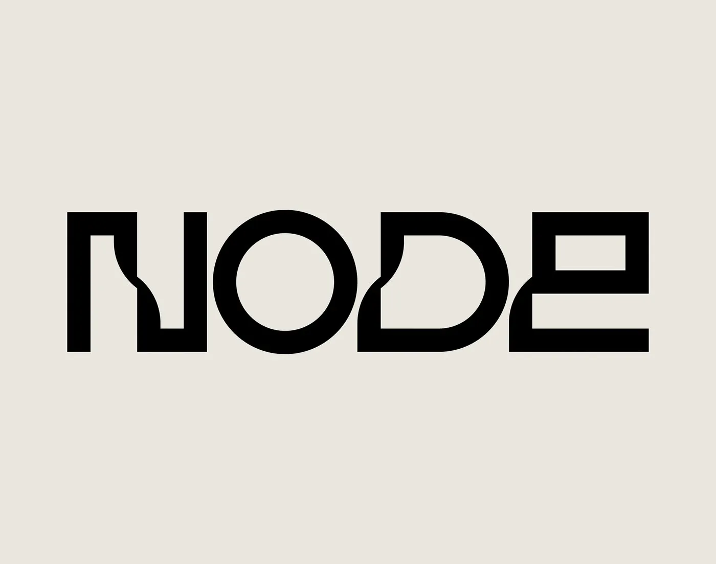
Node Brand Identity Visual System by Brand Brothers
Brand Brothers’ Brand Identity for the Node Personal Server Economy V1 just unveiled Node—a compact personal server designed to let users run custom AI agents and Bitcoin Lightning nodes, keeping full control over personal data, keys, and privacy tools. To craft the perfect look for this tech, Paris-based studio Brand Brothers built a sleek, grounded…
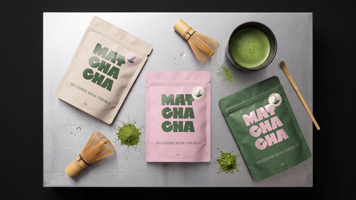
Matchacha Branding: Modern Japanese Tea Studio Identity by Yuliya Kuznetsova
Matchacha Branding: When Traditional Japanese Tea Culture Meets Modern Design Yuliya Kuznetsova’s Matchacha project brings a fresh, modern look to traditional Japanese tea culture. The standout feature of this design is the bold pairing of deep forest green color blocks with soft, powder-pink typography. The main color palette features forest green, matcha cream, powder pink,…
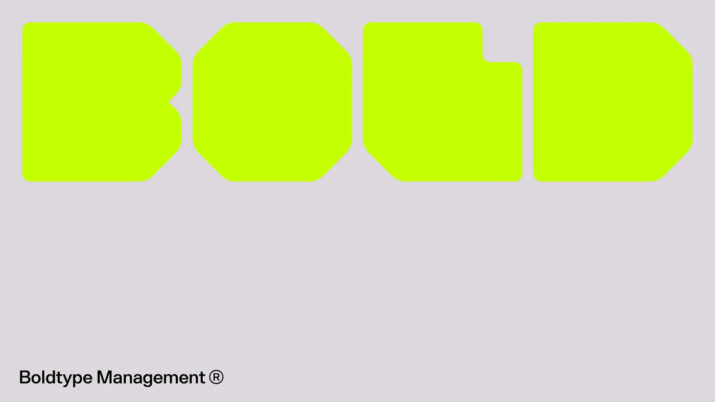
Boldtype Management: High-Contrast Branding with Ultra-Bold Typography
Boldtype Management: A Geometric Brand Identity by Aptum Studio Boldtype Management is a dynamic visual identity project brought to life by Aptum Studio alongside designers Luca Guerci, Matteo Polla, and Thomas Garaventa. Right at the heart of this visual system sits a custom, ultra-bold typeface crafted from striking octagonal block shapes to spell out “BOLD”.…