Peko-Peko: Manifiesto’s Brand Identity Fusion of Kawaii Style and Mexican Spirit Mexico City studio Manifiesto brought the Peko-Peko brand identity to life around the playful concept that “Mexicute is a mood”. The project builds a vibrant character universe that blends the adorable charm of Japanese kawaii culture with the rich, colorful expression of Mexico.
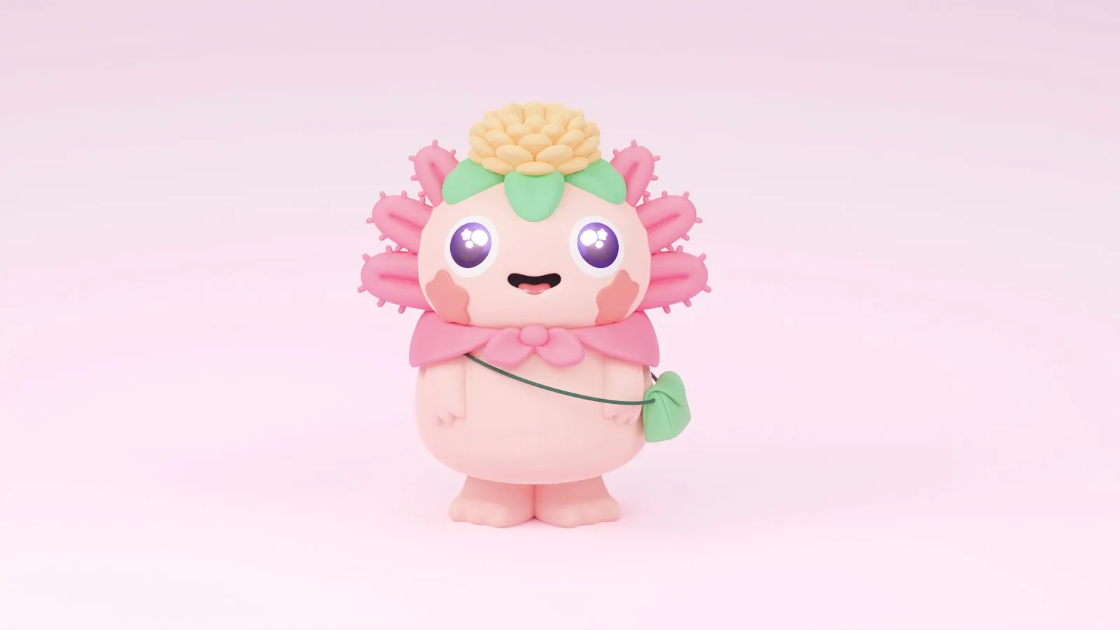
Centered around Mexico’s iconic axolotl salamander, Manifiesto designed a pink 3D character rocking a crossbody bag and a floral crown. Supporting characters like a cat and a frog round out the crew, ready to spring onto hats, packaging, and print media. The color palette features bubblegum pink, grape purple, mint green, peach, and lime green, combined with soft 3D lighting for a tender, touchable feel.
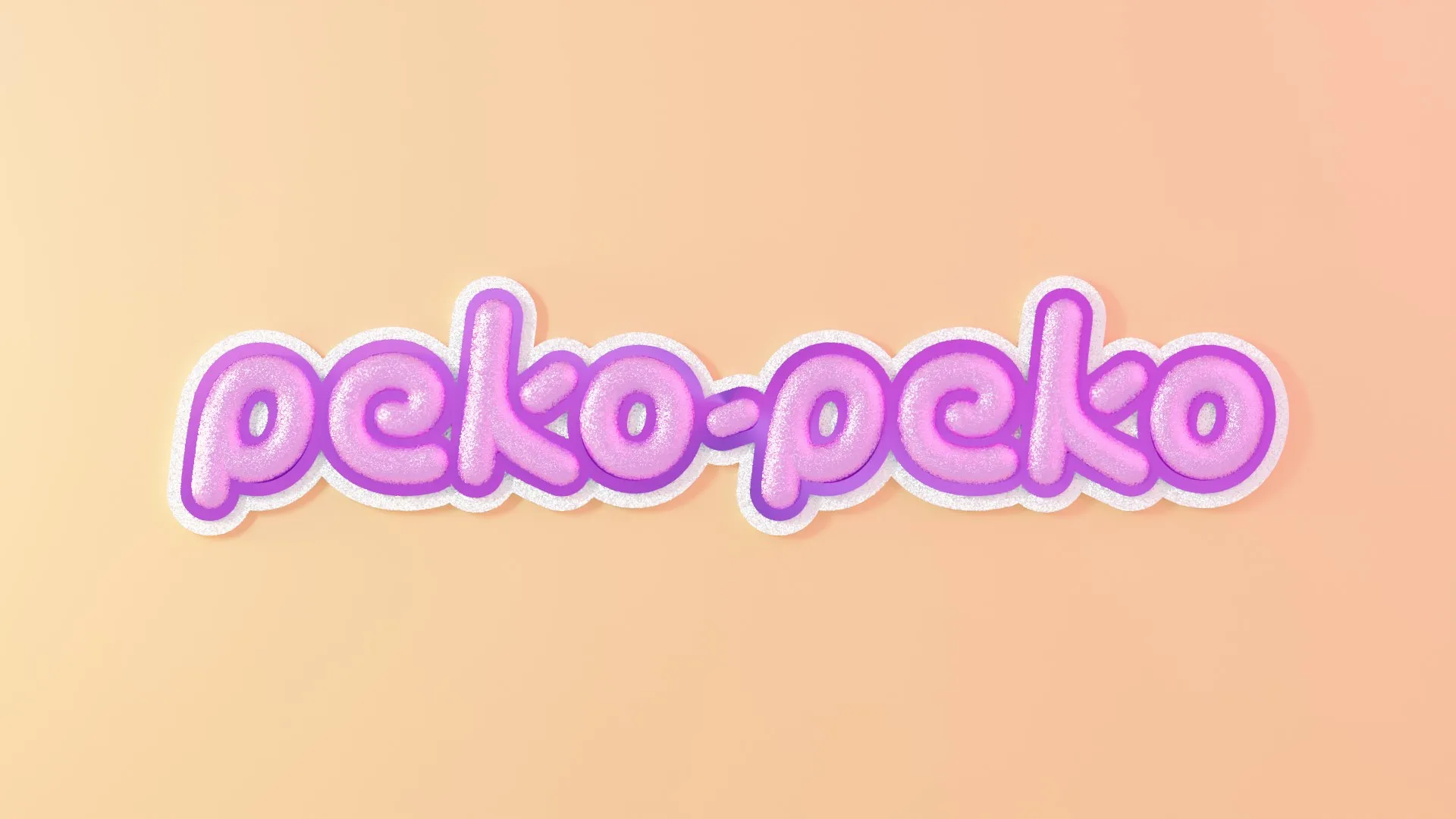
The lowercase “peko-peko” wordmark uses rounded, bubbly balloon letters built in two 3D versions. One version sets a bright white logo against a purple gradient, while the other features pink glitter with purple outlining and fluffy white clouds on a peach backdrop. Clean, minimalist grotesque typography handles contact info across stationery, ensuring the main logo stays center stage.
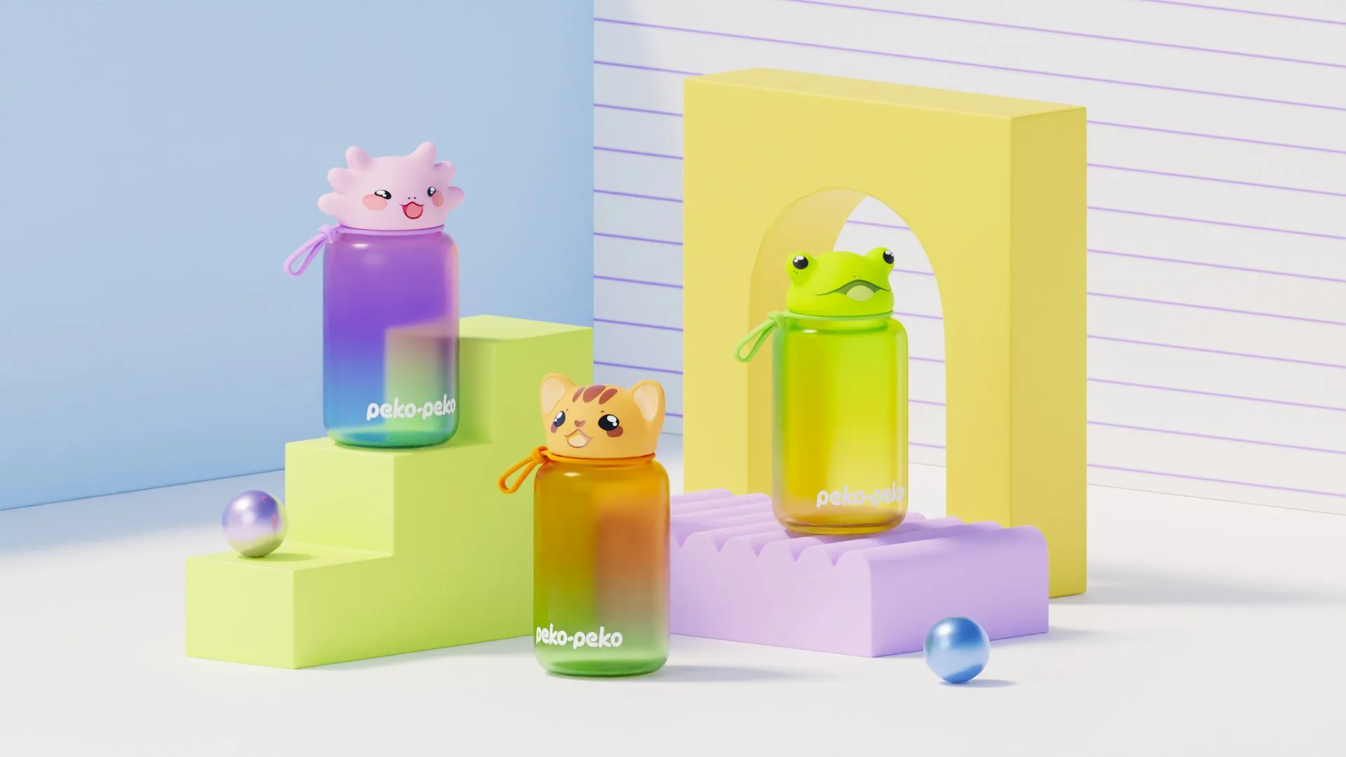
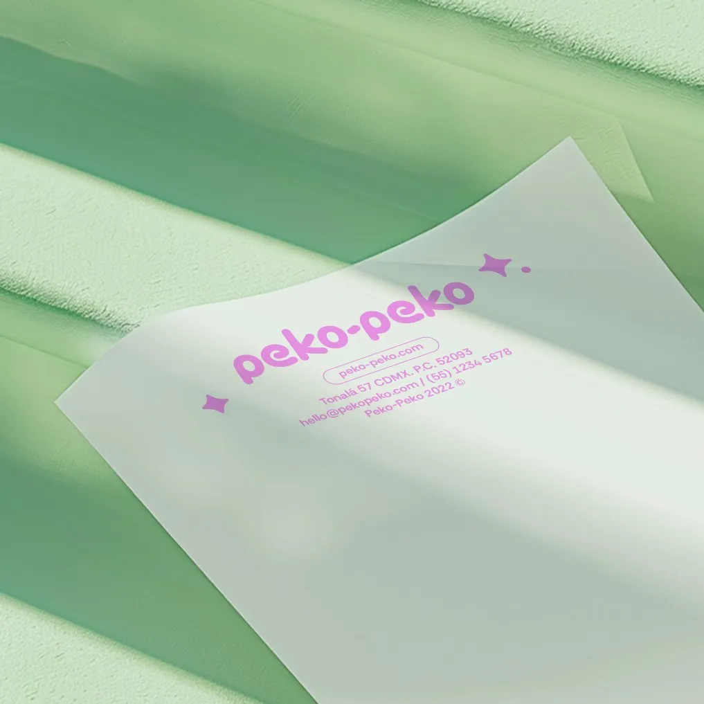
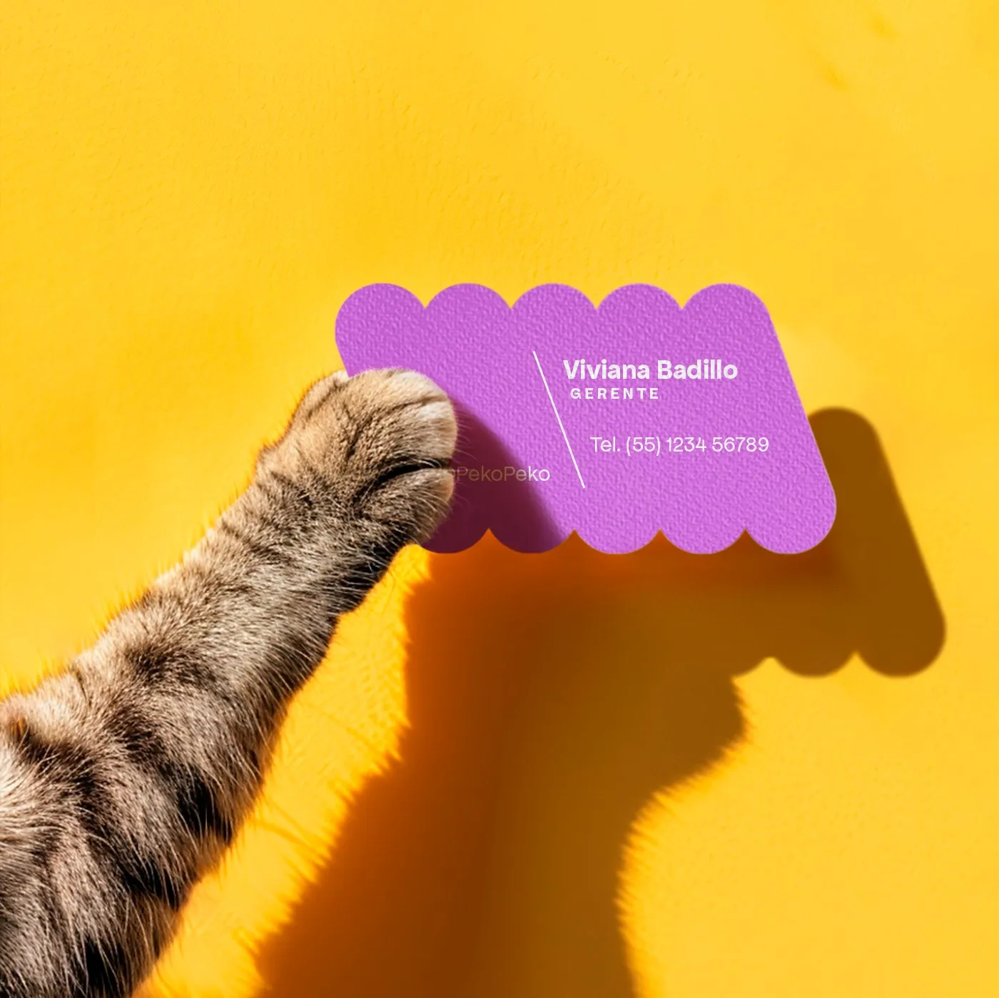
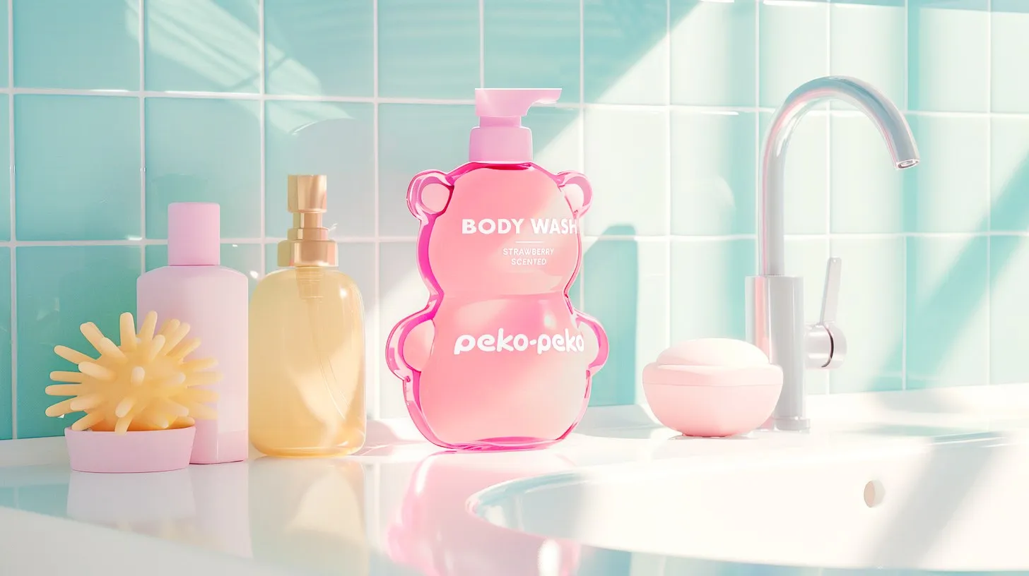
The design system stretches seamlessly across multiple applications. Characters turn into clever bottle caps: a cat cap for amber bottles, a frog cap for yellow bottles, and the axolotl for purple bottles. A strawberry body wash takes the shape of a pink bear bottle with the logo stamped across its belly. Business cards showcase wavy die-cut borders mimicking the balloon typography, while letterheads keep it clean with a compact pink logo centered and accented by a simple star.
More details about the project can be explored on bymanifiesto.mx/work/peko-peko.
Peko-Peko: Dự án nhận diện thương hiệu kết hợp phong cách Kawaii và tinh thần Mexico từ Manifiesto
Studio Manifiesto tại Mexico City triển khai dự án nhận diện thương hiệu Peko-Peko dựa trên ý tưởng “Mexicute is a mood”. Dự án xây dựng một thế giới nhân vật sinh động, hòa trộn nét dễ thương của văn hóa kawaii Nhật Bản với sự rực rỡ trong phong cách thể hiện của Mexico.
Lấy hình ảnh loài kỳ nhông axolotl đặc trưng của Mexico làm nhân vật trung tâm, Manifiesto thiết kế nhân vật 3D màu hồng đeo túi xéo và đội vương miện hoa. Đi cùng là các nhân vật phụ như mèo và ếch, sẵn sàng ứng dụng trên nón, packaging cùng các ấn phẩm in ấn. Bảng màu sử dụng gồm hồng kẹo cao su, tím nho, xanh mint, màu đào và xanh chanh, kết hợp hiệu ứng ánh sáng trong không gian 3D tạo cảm giác mềm mại.
Phần wordmark “peko-peko” sử dụng kiểu chữ bóng (balloon letters) béo tròn dạng chữ thường, được dựng dưới hai phiên bản 3D. Một phiên bản màu trắng nổi bật trên nền gradient tím, phiên bản còn lại mang hiệu ứng kim tuyến hồng với viền tím và quầng mây trắng trên nền màu đào. Phần typography phụ trợ sử dụng kiểu chữ grotesque tối giản cho thông tin liên hệ trên bộ văn phòng, giữ trọn sự chú ý cho phần logo chính.
Hệ thống thiết kế được triển khai đồng bộ trên nhiều ứng dụng. Các nhân vật biến thành nắp chai: nắp hình mèo cho chai màu hổ泊 (amber), nắp hình ếch cho chai vàng và axolotl cho chai tím. Mẫu sữa tắm hương dâu được thiết kế dạng chai chú gấu màu hồng với logo in trên bụng. Danh thiếp được cut die-cut dập viền lượn sóng mô phỏng đường nét chữ bóng, trong khi giấy tiêu đề giữ logo màu hồng nhỏ gọn ở trung tâm, điểm xuyết bằng một ngôi sao đơn giản.
Chi tiết về dự án có thể xem thêm tại trang web của bymanifiesto.mx/work/peko-peko.