Breathing New Life into a 250-Year Legacy: COLLINS’s Crane Stationery Rebrand
In today’s digital age, writing a letter by hand or reaching for artisanal paper might feel a bit nostalgic, but for Crane Stationery—a legendary American cotton paper maker dating back to 1770—the value of meticulous craftsmanship remains as relevant as ever. From supplying paper for Paul Revere’s very first banknotes to becoming the official banknote paper provider for the U.S. Department of the Treasury in 1801, Crane carries a proud two-and-a-half-century heritage. Even so, facing stiff competition from European luxury mainstays like Smythson and Montblanc, Crane partnered with design studio COLLINS to reposition the brand for modern living.
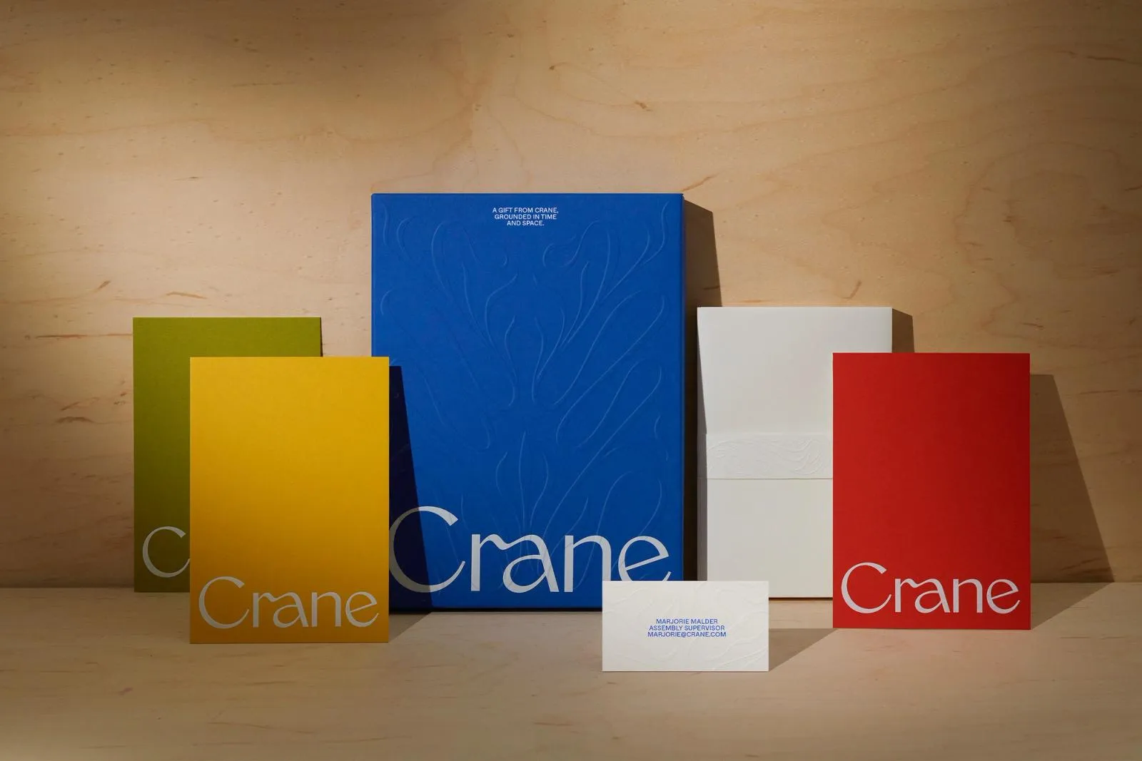
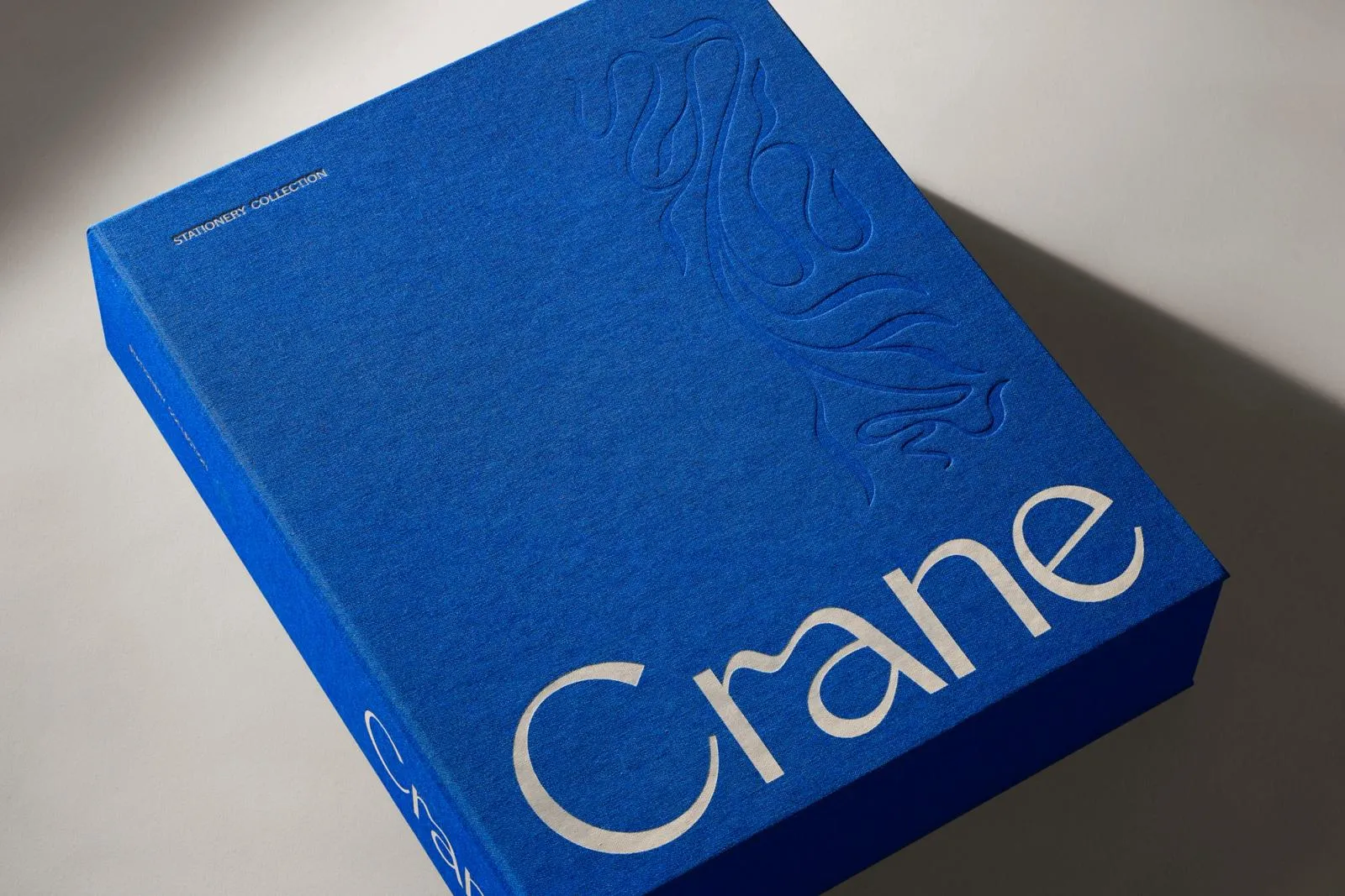
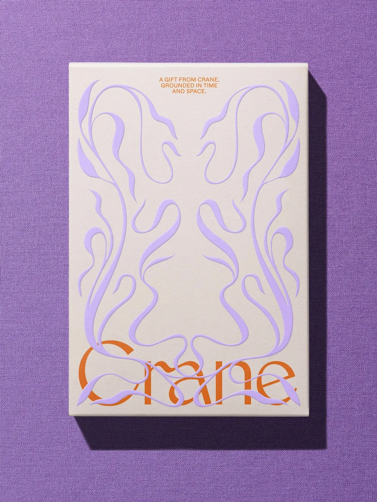
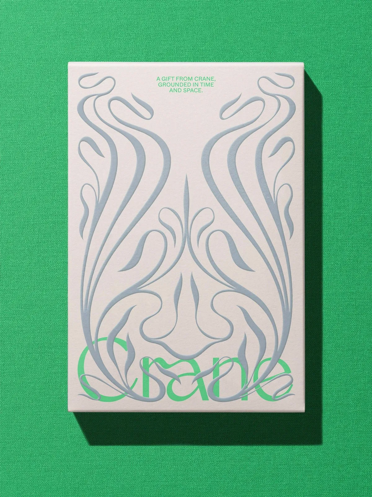
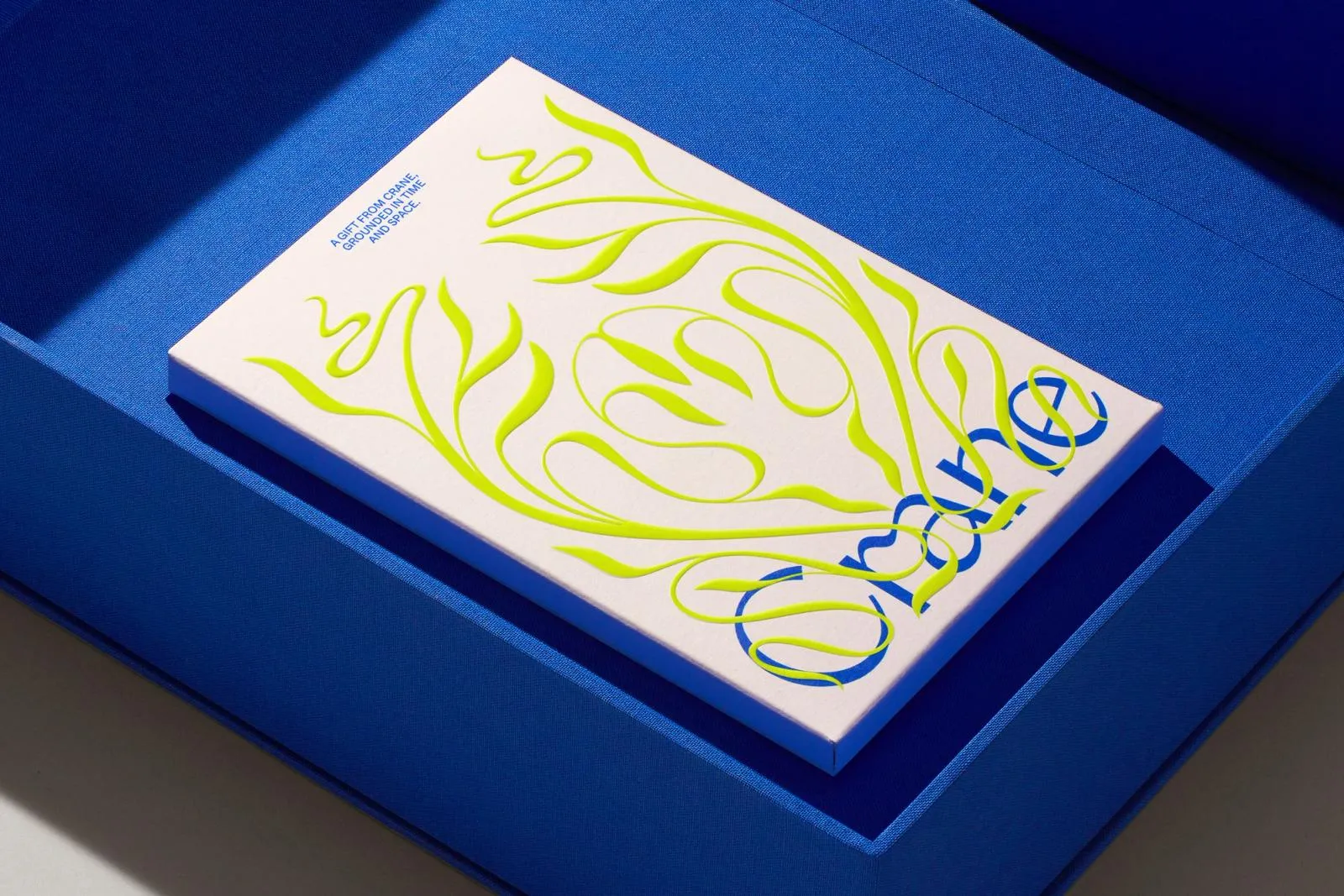
The big creative concept from COLLINS was all about pulling stationery boxes out of hidden desk drawers and transforming them into stunning display pieces for the coffee table. COLLINS started by redrawing a sleek, high-contrast serif wordmark featuring a smooth ligature that flows seamlessly from the arch of the “r” to the stem of the “a,” striking a perfect vintage vibe without feeling dusty. Positioned right along the bottom edge of the box, the brand name leaves the top two-thirds open, giving the design plenty of clean breathing room.
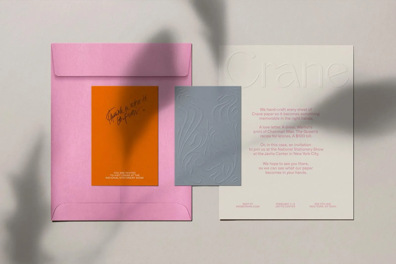
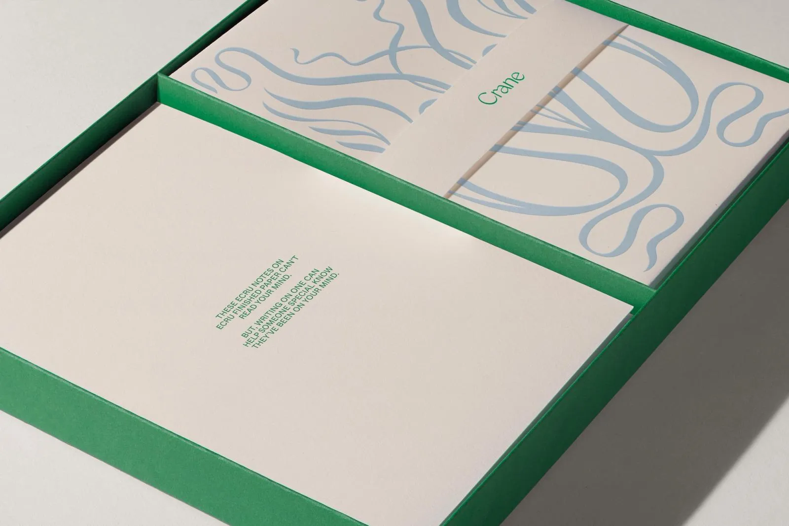
That thoughtful touch extends to the intricate botanical scrollwork featured on the box inner linings and invitations for the National Stationery Show. These organic, leafy accents pop in sculptural relief, weaving directly through the letterforms in vibrant palette pairings like chartreuse, soft lilac, and slate blue.
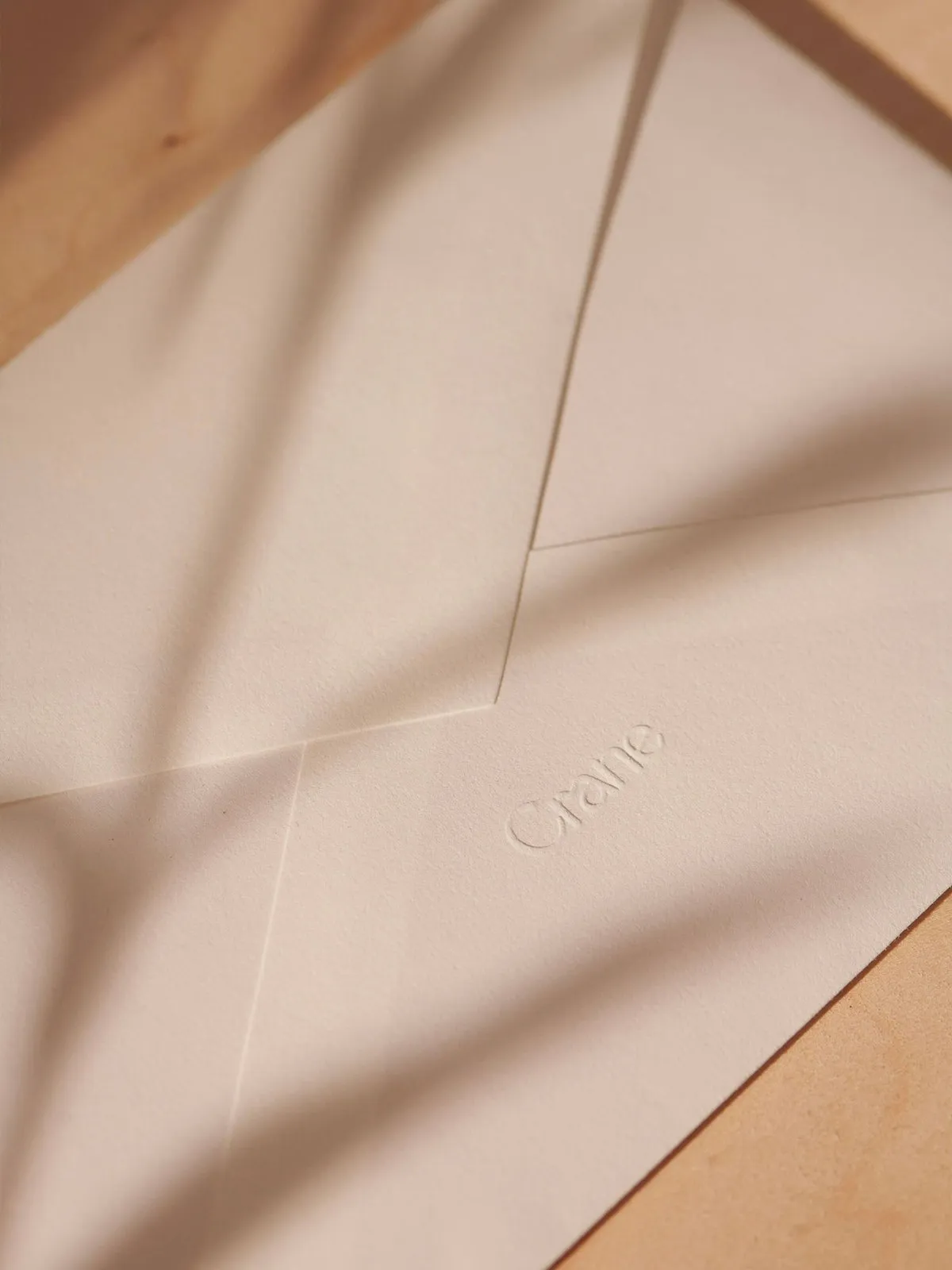
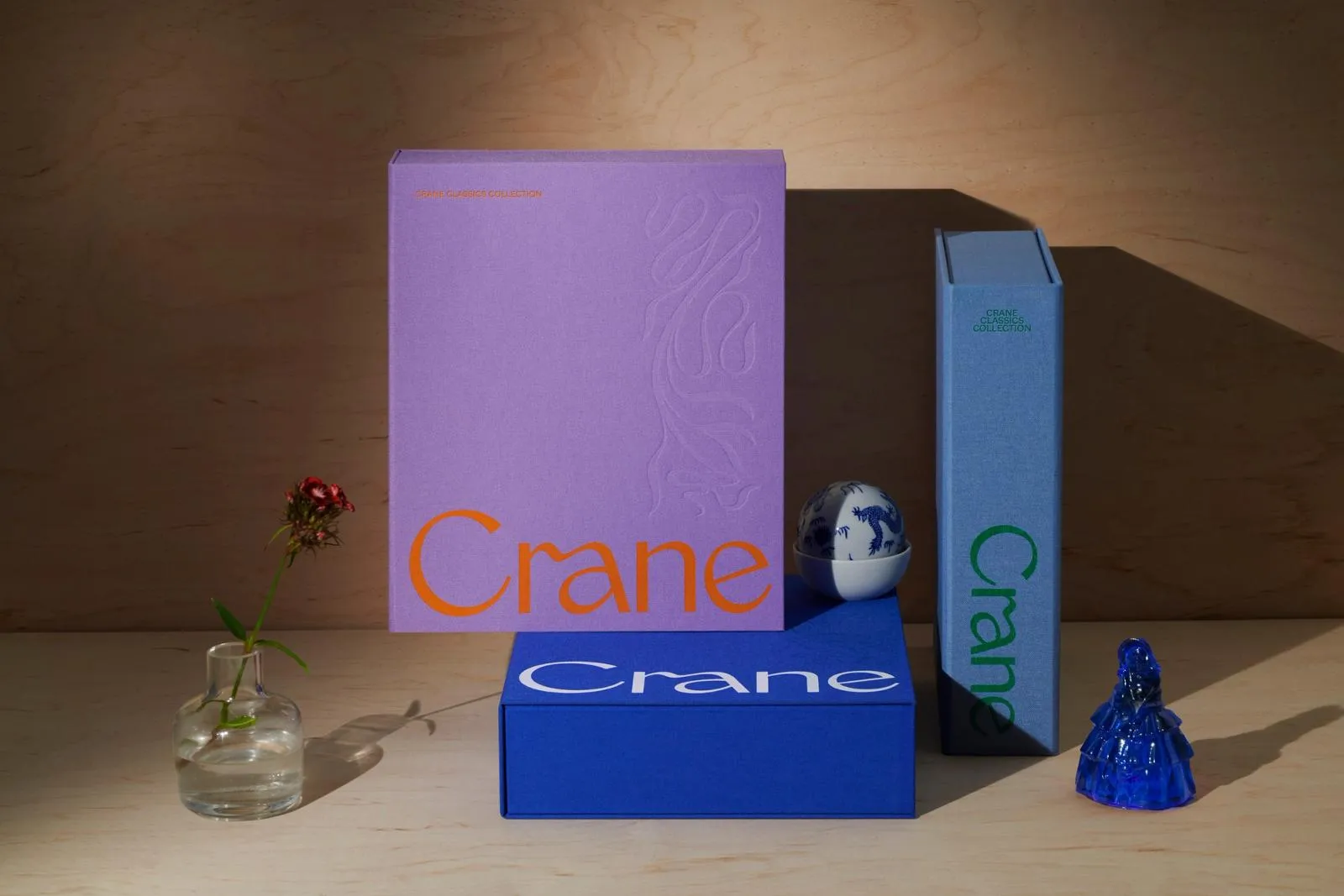
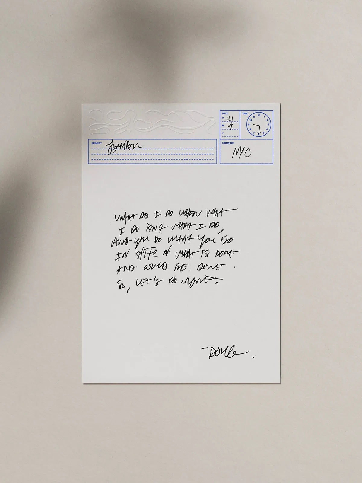
When it comes to color, Crane’s iconic blue gets a vivid cobalt boost on rich bookcloth texture. COLLINS dialed up the excitement with playful, high-contrast color pairings like purple with burnt orange, slate with forest green, and mustard yellow with deep crimson. Inside the box tray, ecru cotton note cards come complete with a handy clock-face stamp, allowing writers to log the exact date, time, and location of every note. To top it off, blind-debossed envelopes open up to reveal a gorgeous metallic silver and lavender interior lining.
The entire project can be explored on the wearecollins.com/case-studies/crane.
Thổi sức sống mới vào di sản 250 năm: Dự án branding Crane Stationery của COLLINS
Trong kỷ nguyên số, viết thư tay hay dùng giấy thủ công nghe có vẻ hoài niệm, nhưng với Crane Stationery — xưởng sản xuất giấy cotton lâu đời tại Mỹ từ năm 1770 — giá trị của sự tỉ mỉ vẫn luôn tồn tại. Từng cung cấp giấy in tiền đầu tiên cho Paul Revere và trở thành nhà cung cấp chính thức cho Bộ Ngân khố Hoa Kỳ năm 1801, Crane mang trên mình di sản hai thế kỷ rưỡi đầy tự hào. Dù vậy, trước sự cạnh tranh gay gắt từ các thương hiệu xa xỉ Châu Âu như Smythson hay Montblanc, Crane đã kết hợp cùng studio thiết kế COLLINS để tái định vị lại hình ảnh thương hiệu trong không gian sống hiện đại.
Ý tưởng lớn của COLLINS là đưa những hộp đựng giấy viết vốn hay bị giấu trong hộc tủ ra ngoài, biến chúng thành vật trang trí sang trọng ngay trên bàn phòng khách. COLLINS bắt đầu bằng việc vẽ lại wordmark dạng serif có độ tương phản cao. Điểm nhấn nằm ở phần ligature mượt mà nối phần vòm của chữ r sang thân chữ a, tạo cảm giác cổ điển nhưng không hề bị “dày bụi thời gian”. Tên thương hiệu được căn sát mép dưới của vỏ hộp, dành hẳn hai phần ba không gian phía trên để bề mặt thiết kế có khoảng thở.
Sự chỉn chu còn nằm ở các chi tiết botanical scrollwork (họa tiết hoa lá uốn lượn) trên lớp áo lót bên trong và thiệp mời cho Triển lãm National Stationery Show. Những đường nét thảo mộc này nổi lên dạng phù điêu chạm khắc (sculptural relief), đan xen trực tiếp qua các chữ cái với các phối màu độc đáo như xanh chartreuse, tím nhạt lilac hay xanh phiến đá (slate blue).
Về màu sắc, sắc xanh đặc trưng của Crane được tăng độ bão hòa cobalt trên chất liệu vải bọc sách (bookcloth). COLLINS khéo léo kết hợp thêm các cặp màu đối lập bất ngờ như tím – cam cháy, xanh slate – xanh rừng, hay vàng nghệ – đỏ thẫm. Bên trong khay hộp, các tờ giấy ghi chú bằng vải cotton màu kem (ecru cotton) đi kèm con dấu tiện ích hình mặt đồng hồ để người dùng ghi lại chính xác ngày, giờ và địa điểm viết thư. Phong bì sử dụng kỹ thuật dập chìm (blind-debossed) khi mở ra sẽ hé lộ phần lót bên trong ánh bạc metallic và tím lavender đầy tinh tế.
Toàn bộ dự án có thể tham khảo tại trang web của wearecollins.com/case-studies/crane.