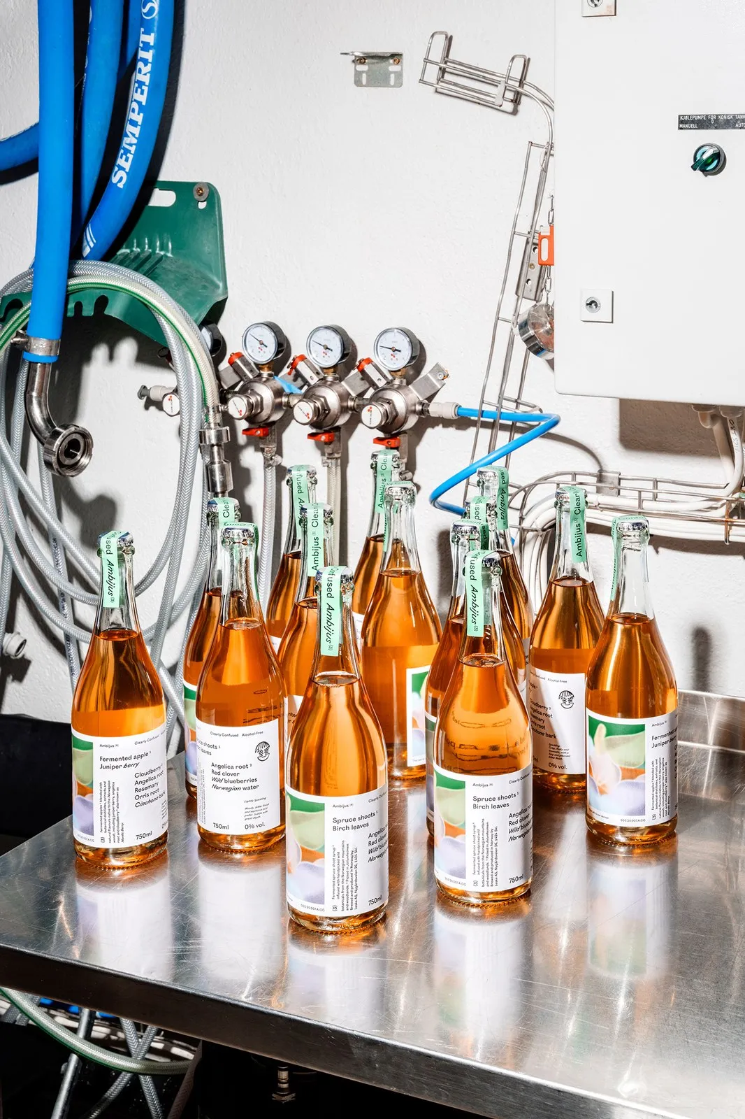
Ambijus Packaging Design by OlssønBarbieri: When Non-Alcoholic Drinks Break the Mold Most non-alcoholic drinks on the market today try way too hard to imitate traditional wine bottles, relying on embossed family crests or timid “0% vol” labels. But when Norwegian beverage producer Leske teamed up with Oslo-based studio OlssønBarbieri to develop a NOLO (No/Low Alcohol) fermented drink lineup, they took a completely different path.
The name “Ambijus” blends “ambiguous” (open to multiple interpretations) with “jus” (a classic natural wine term for fresh juice). It is a brand name designed for a drink that refuses to be constrained by conventional rules. Even the inaugural trio of releases rocks a set of wonderfully paradoxical names: (1) Act Naturally, (2) Real Fantasy, and (3) Clearly Confused.
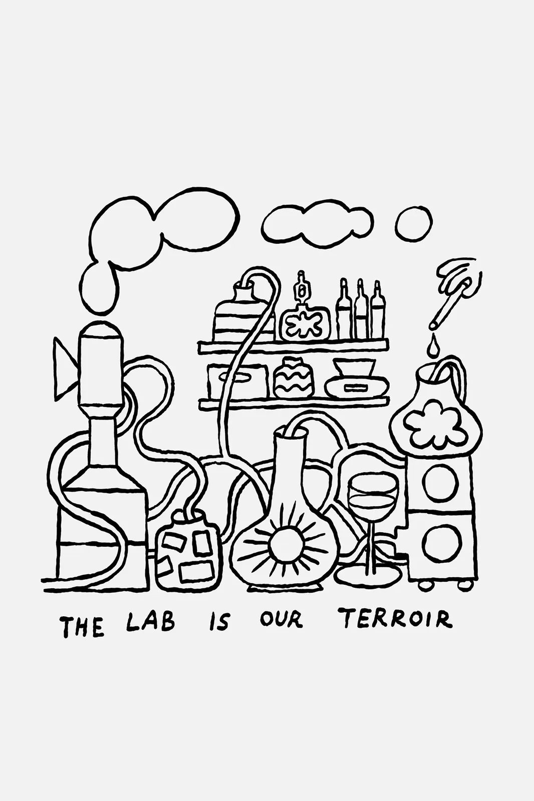
The label structure treats flavor profiling like a full-on chemistry experiment. Instead of playing it safe behind typical images of countryside châteaux or picturesque vineyards, the brand identity centers on an unapologetic mindset: “The lab is our terroir”. Illustrator Espen Friberg brought this playful spirit to life using charming monoline art featuring bubbling science flasks, coiled tubing, and a dropper depositing drops straight into a wine glass—capped off with a cheeky “See-No-Evil” hands-over-eyes icon perched right above the 0% vol mark.
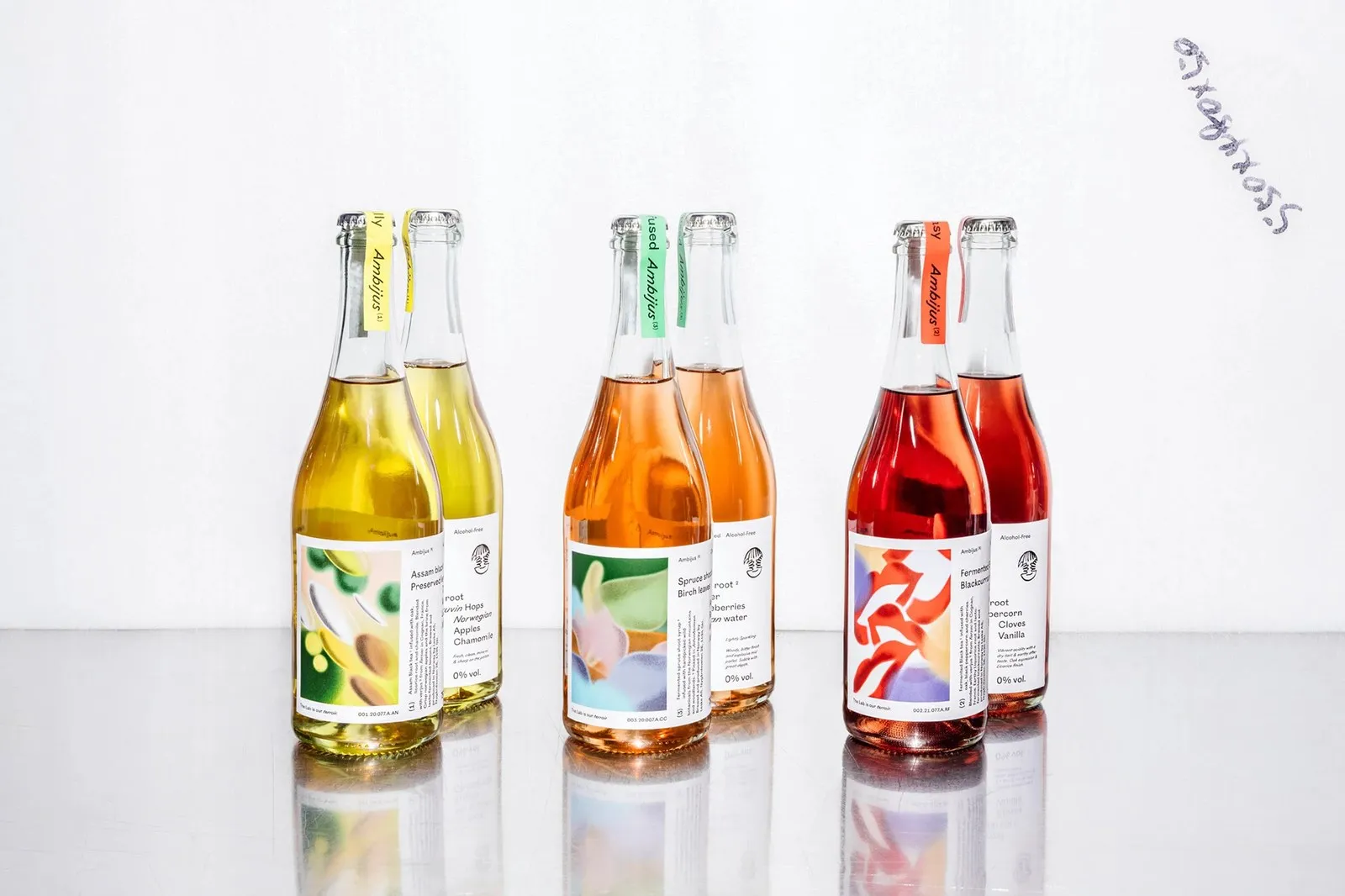
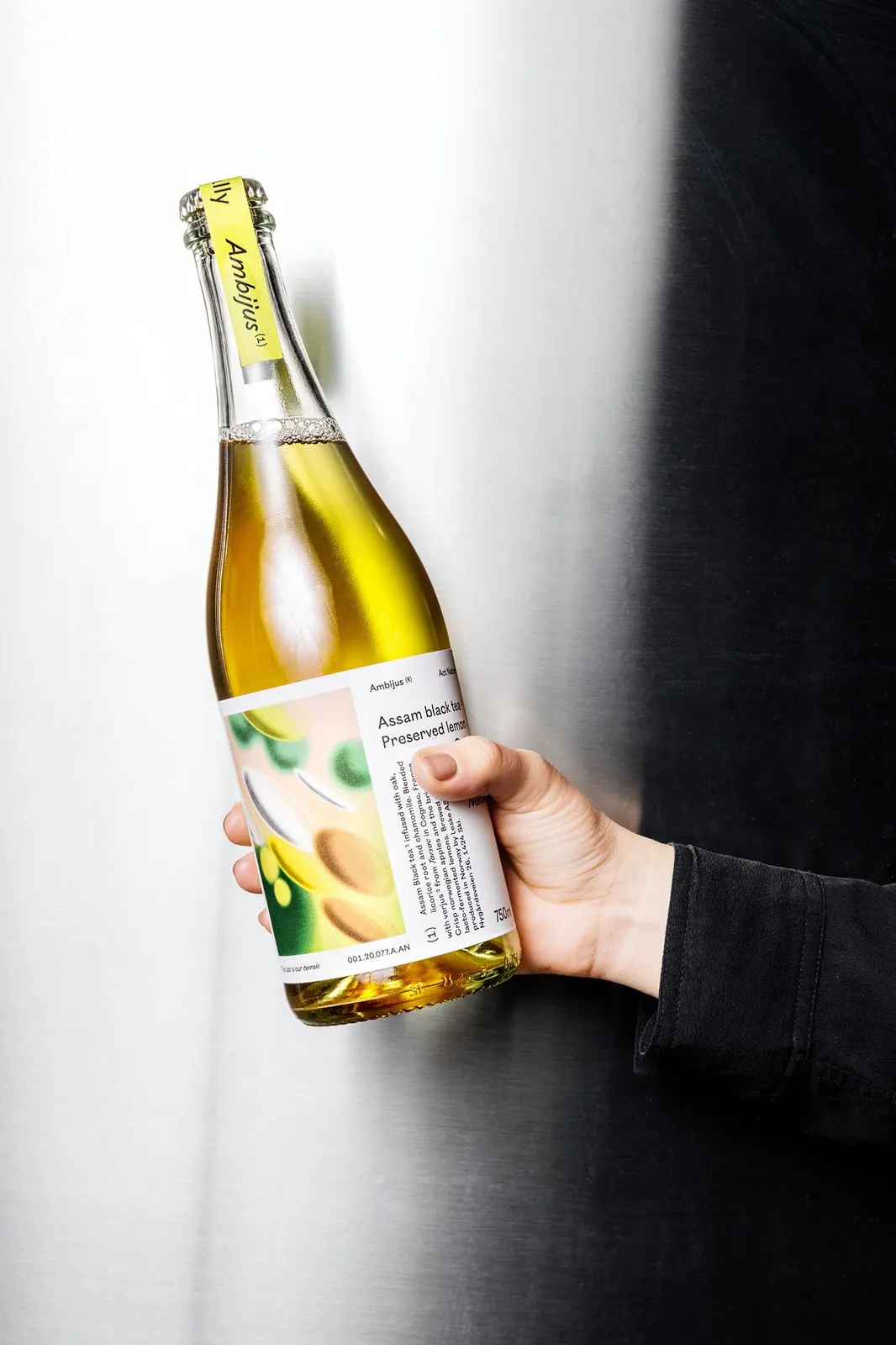
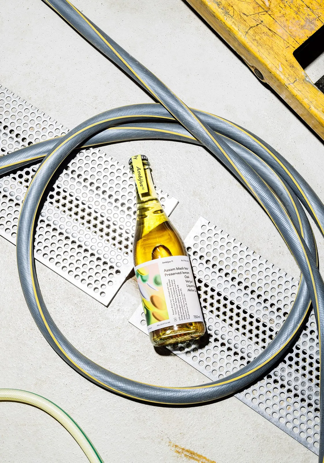
Wrapped around the 750ml glass bottle is a textured uncoated paper label featuring grainy artwork that blends digital and handcrafted techniques by French artist Alexis Jamet. Jamet’s soft airbrush gradients capture microorganisms for (1) Act Naturally, sensory waves for (2) Real Fantasy, and a dreamy stroll through a misty forest for (3) Clearly Confused.
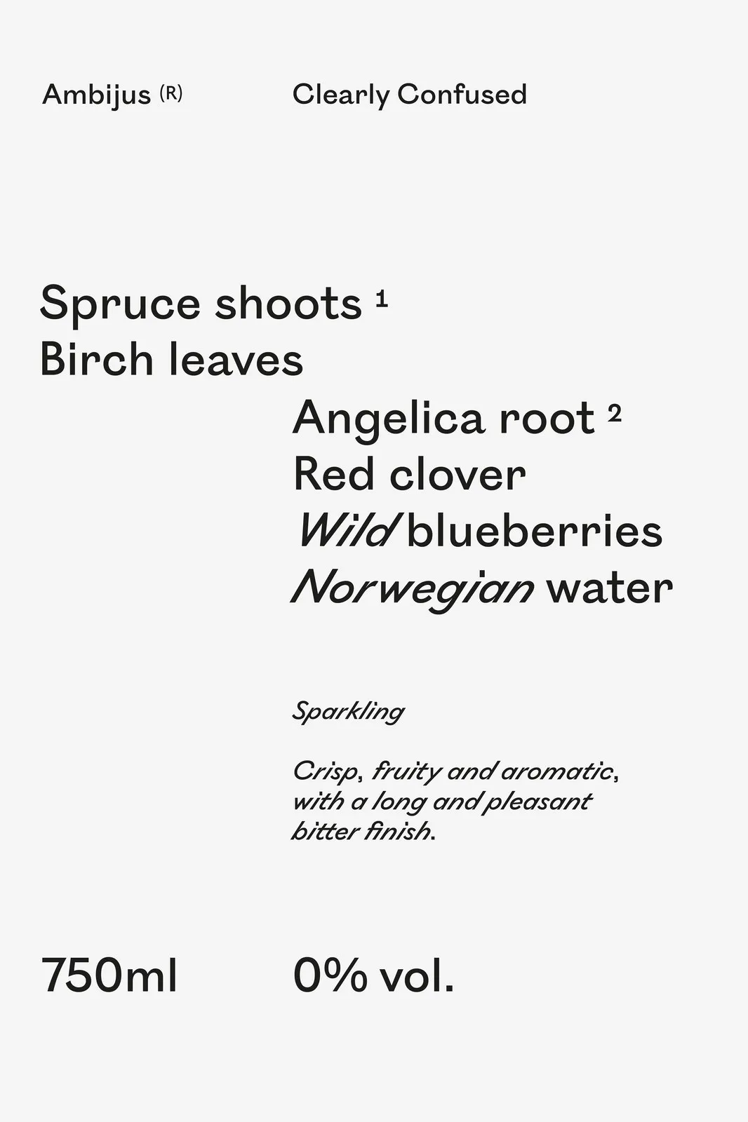
Crisp typography and intentional color choices handle the information hierarchy seamlessly. On the label wrap for Clearly Confused, clean sans-serif lines listing key ingredients like Spruce shoots 1, Birch leaves, Angelica root 2, and Red clover cascade directly down into slanted italics for Wild blueberries and Norwegian water. A vertical footer column houses details like Cognac verjus, lacto-fermented lemon, and batch codes like 003.20.007.a.cc.
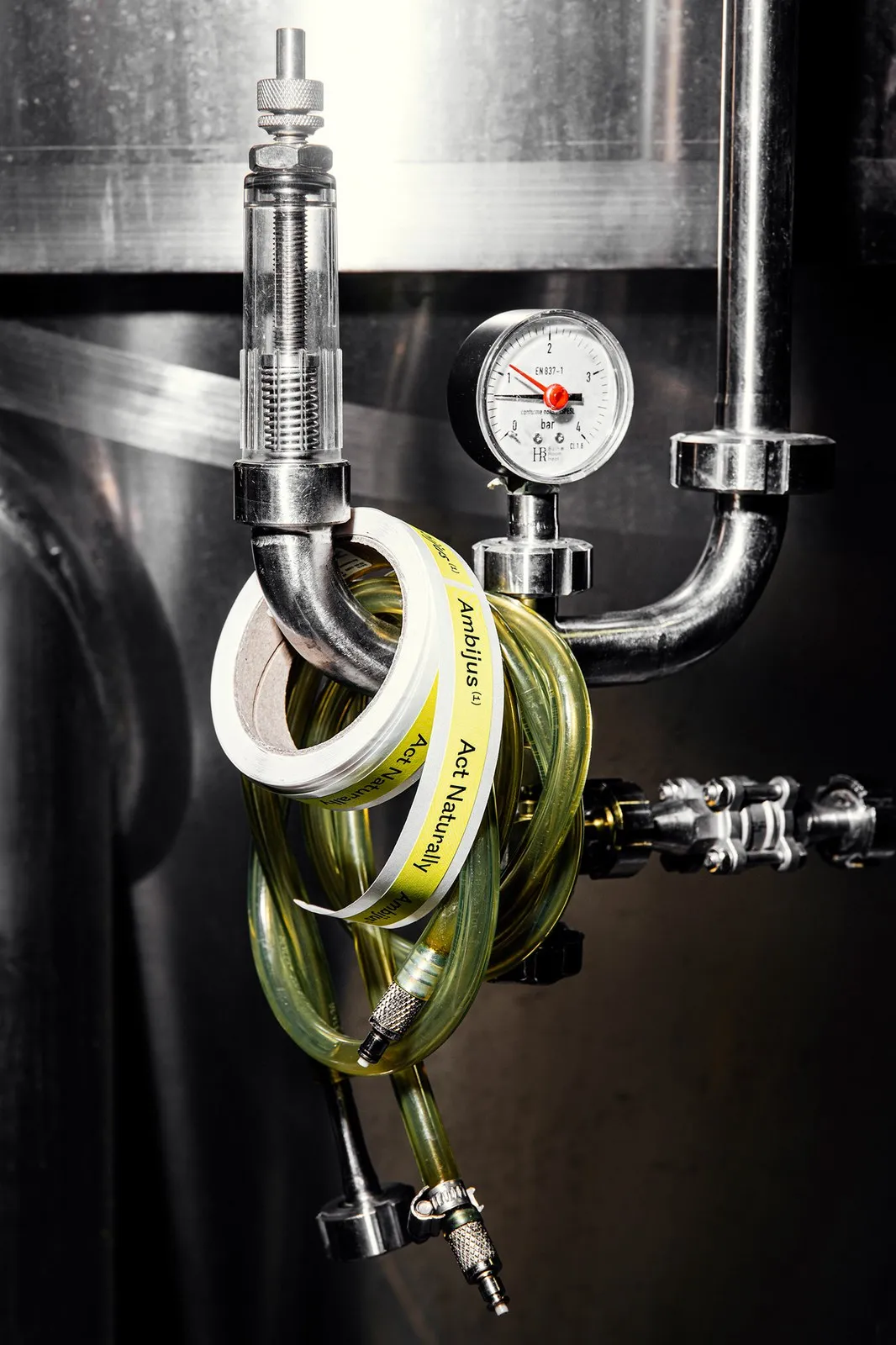
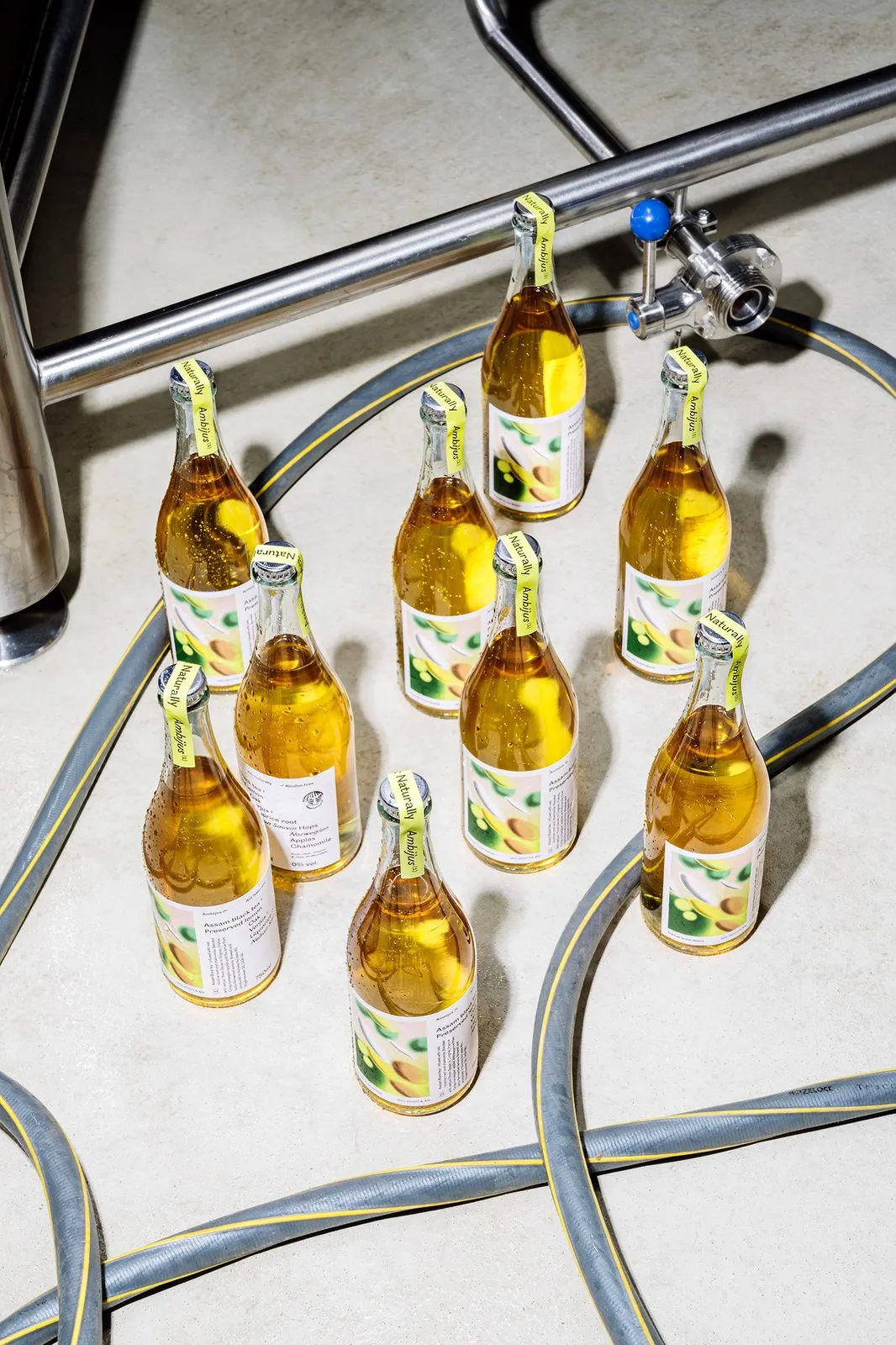
The ultimate visual highlight comes from the color-coded paper neck seal—available in bright yellow, coral red, and mint green—folded directly over the silver metal crown cap. Whether resting on a brewery floor alongside pressure gauges and stainless steel piping or sitting at a dinner table, Ambijus bottles deliver a bold, remarkably polished look.
Explore the full design project on www.behance.net/gallery/118967623/Ambijus.
Thiết kế bao bì Ambijus từ OlssønBarbieri: Khi thức uống không cồn rời xa lối mòn
Hầu hết các dòng đồ uống không cồn trên thị trường hiện nay thường cố gắng mô phỏng hình ảnh của những chai rượu vang truyền thống bằng biểu tượng gia tộc dập nổi hay nhãn mác “0% vol” mang chút phân sưa. Nhưng khi nhà sản xuất Leske tại Na Uy bắt tay cùng studio OlssønBarbieri ở Oslo để phát triển dòng thức uống lên men NOLO (No/Low Alcohol), họ đã chọn một hướng đi hoàn toàn khác.
Tên gọi “Ambijus” là sự kết hợp giữa “ambiguous” (mơ hồ, đa nghĩa) và “jus” (thuật ngữ chỉ nước ép tươi trong rượu vang tự nhiên). Đây là cái tên dành cho một loại thức uống không chấp nhận bị gò bó vào bất kỳ quy chuẩn quen thuộc nào. Ngay cả bộ ba sản phẩm đầu tiên ra mắt cũng sở hữu những tên gọi đầy tính nghịch lý: (1) Act Naturally, (2) Real Fantasy, và (3) Clearly Confused.
Cấu trúc nhãn chai xử lý hương vị như một thí nghiệm hóa học thực thụ. Thay vì ẩn mình sau những hình ảnh trang trại hay điền trang quen thuộc, nhận diện thương hiệu xoay quanh một tinh thần dứt khoát: The lab is our terroir (Phòng thí nghiệm chính là thổ nhưỡng của chúng tôi). Họa sĩ Espen Friberg đã cụ thể hóa tinh thần đó qua nét vẽ monoline hóm hỉnh với hình ảnh bình thí nghiệm đang sủi bọt, ống cuộn và chiếc ống nhỏ giọt thả từng giọt xuống ly vang, đi kèm biểu tượng đôi tay che mắt kiểu “See-No-Evil” đặt ngay trên con dấu 0% vol..
Bọc quanh thân chai thủy tinh 750ml là lớp giấy nhám (uncoated paper) mang các tác phẩm hạt mịn kết hợp giữa kỹ thuật thủ công và kỹ thuật số của nghệ sĩ Pháp Alexis Jamet. Những mảng màu airbrush mềm mại của Jamet mô phỏng các vi sinh vật trong (1) Act Naturally, các dải giác quan trong (2) Real Fantasy, và khung cảnh dạo bước trong rừng sương mờ của (3) Clearly Confused.
Kỹ thuật dàn trang typography và màu sắc đảm nhận việc phân loại thông tin. Trên phần nhãn bọc của Clearly Confused, các dòng chữ sans-serif đứng thẳng ghi tên thành phần như Spruce shoots 1, Birch leaves, Angelica root 2, Red clover được xếp giật cấp xuống các dòng in nghiêng dành cho Wild blueberries và Norwegian water. Cột chân trang đặt dọc hiển thị thông tin về Cognac verjus, chanh lên men lacto cùng mã lô sản xuất như 003.20.007.A.CC.
Điểm hoàn thiện visual nằm ở dải giấy dán cổ chai có màu sắc phân loại riêng—vàng, đỏ san hô và xanh bạc hà—gập trực tiếp qua phần nắp crown metal màu bạc. Khi đặt trên nền sàn nhà máy bia bên cạnh đồng hồ đo áp suất và ống dẫn bằng thép không gỉ, những chai Ambijus tạo nên một sự xuất hiện đầy cá tính và chỉn chu trên bàn ăn.
Xem toàn bộ dự án thiết kế trên www.behance.net/gallery/118967623/Ambijus.