Inside AIDb’s Brand Identity System by Rafael Cespedes AIDb serves as a go-to platform for archiving, discovering, and reviewing AI-powered products, layered with a social community aspect. To shape this brand’s visual presence, designer Rafael Cespedes crafted a vibrant, modern identity rooted in everyday web interaction habits.
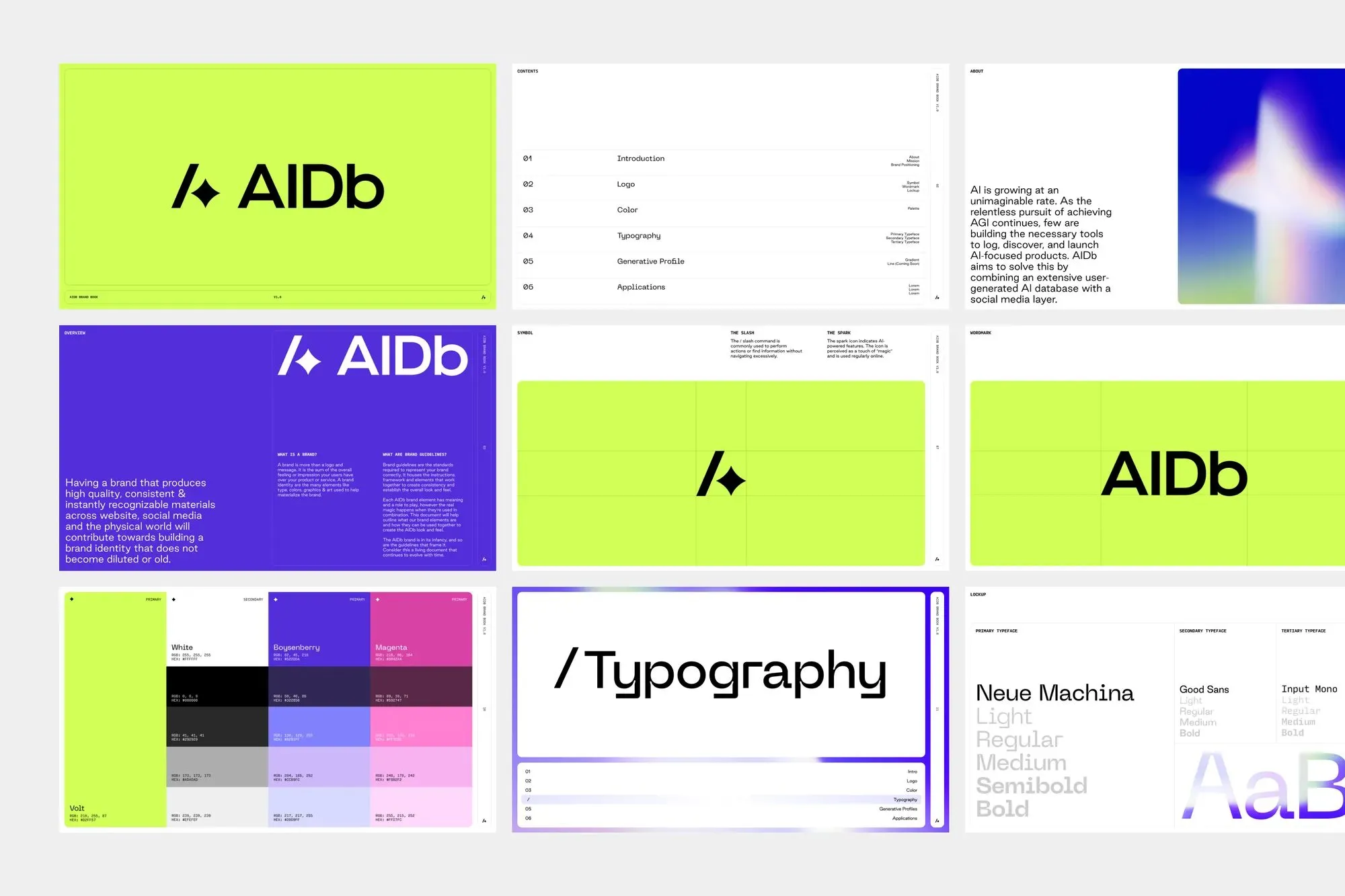
A Logo Combining Action and Tech AIDb’s logo keeps things ultra-clean, built from just two minimalist symbols: a forward slash (/) and a spark. The slash represents interface command actions, while the spark is the universally recognized icon for AI. Bringing these two symbols together allows the logo to tell the full product story effortlessly without needing any extra text.
Vibrant Palette and Generative Color Gradients The energetic spirit of the brand shines right through its dynamic color choices. A bright chartreuse tone—dubbed Volt in the style guide—creates an eye-popping background for the bold black wordmark. Meanwhile, Boysenberry purple and Magenta push the identity into a fun, playful register that breaks away from the usual serious tone of the tech sector.
Sitting right underneath the graphic elements are soft color gradients generated using Midjourney. These abstract color sweeps are intentionally given a gentle blur, creating a dreamy, ambient feel rather than feeling stiff or technical.
Clear Typographic Hierarchy The typography system for AIDb comes with perfectly defined roles for every font:
- Neue Machina leads as the main headline font, utilized across weights from Light to Bold for both the wordmark and big titles.
- Good Sans plays a reliable supporting role as the secondary font for body copy.
- Input Mono handles all the smaller administrative details, like content lists, color specifications, and system labels, keeping the brand guide feeling neat and precise.
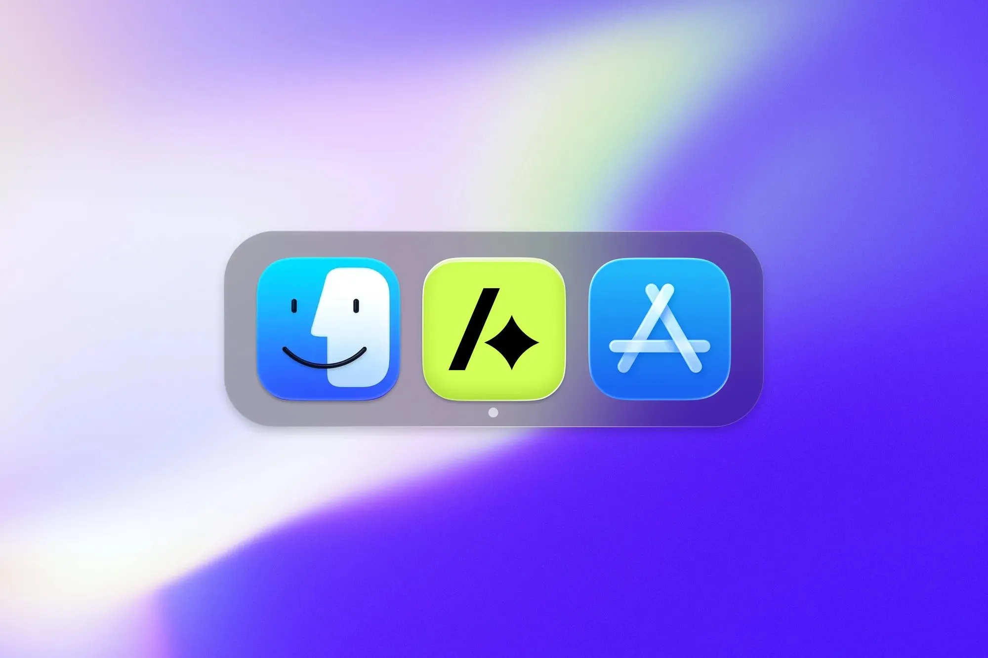
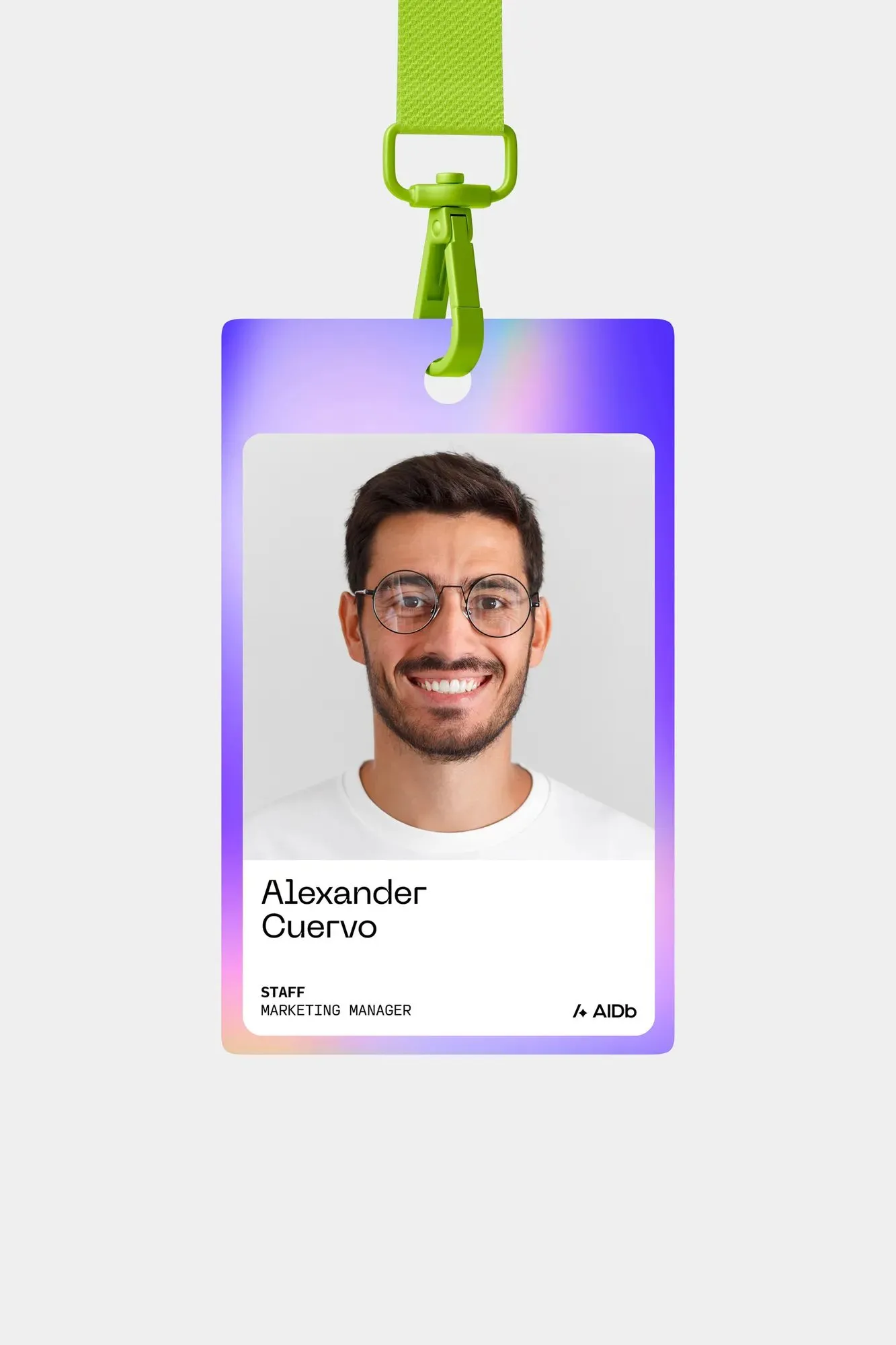
Real-World Applications This brand system proves its strength when brought into real-life collateral. ID badges feature randomized gradient patterns paired with bright Volt lanyards; the app icon stands out clearly alongside other icons on home screens; and business cards keep it minimalist with a Volt background, sleek typography, and the core logo.
By establishing a cohesive AI imagery system built on consistent gradients and soft blurs, Rafael Cespedes helped AIDb solve a major startup challenge: continuously generating fresh marketing assets while maintaining flawless brand consistency. Explore more exciting design work at rafaelcespedes.com/.
Bộ nhận diện thương hiệu AIDb: Góc nhìn bên trong thiết kế của Rafael Cespedes
AIDb là nền tảng chuyên lưu trữ, đánh giá các sản phẩm tích hợp AI kết hợp cùng yếu tố mạng xã hội. Để định hình thương hiệu này, designer Rafael Cespedes đã xây dựng một bộ nhận diện rực rỡ, hiện đại và dựa trên những thói quen tương tác quen thuộc của người dùng web.
Biểu tượng kết hợp giữa thao tác và công nghệ
Logo của AIDb được tạo nên từ hai ký tự tối giản: dấu xuyệt (/) và ngôi sao lấp lánh (spark). Dấu xuyệt đại diện cho các hành động lệnh trong giao diện, còn ngôi sao là hình ảnh quen thuộc gắn liền với AI. Sự kết hợp của hai ký tự này giúp logo truyền tải trọn vẹn bản chất sản phẩm mà không cần phần chữ thích rõ thêm.
Bảng màu nổi bật và dải màu generative sinh động
Sự tươi mới của thương hiệu thể hiện rõ qua màu sắc. Tông màu xanh chartreuse sáng (được gọi là Volt) làm nền nổi bật cho wordmark màu đen. Bên cạnh đó, màu tím Boysenberry và hồng Magenta giúp bộ nhận diện trở nên vui tươi, bứt phá khỏi nét trầm tính thường thấy ở nhóm ngành công nghệ.
Nằm bên dưới các yếu tố đồ họa là dải màu chuyển (gradient) được tạo ra bởi Midjourney. Các mảng màu trừu tượng này được cố tình làm mờ nhẹ để mang lại cảm giác nhẹ nhàng, ambient thay vì khô khan tính kỹ thuật.
Phân cấp kiểu chữ rõ ràng
Hệ thống typography của AIDb được phân chia vai trò cụ thể:
- Neue Machina là phông chữ chính, sử dụng từ định dạng Light đến Bold cho wordmark và các tiêu đề lớn.
- Good Sans giữ vai trò phông chữ phụ hỗ trợ nội dung.
- Input Mono dành cho các chi tiết nhỏ như danh sách, thông số màu và nhãn hệ thống, tạo cảm giác chỉn chu cho tài liệu hướng dẫn thương hiệu.
Khả năng ứng dụng thực tế
Bộ nhận diện chứng minh tính hiệu quả khi đưa vào thực tế. Thẻ nhân viên kết hợp dải màu ngẫu nhiên với dây đeo màu Volt; biểu tượng ứng dụng đứng vững giữa các icon khác trên màn hình; còn danh thiếp được tinh giản tối đa với nền Volt, kiểu chữ và logo.
Bằng cách tạo ra hệ thống hình ảnh AI có sự thống nhất về dải màu và độ mờ, Rafael Cespedes đã giúp AIDb giải quyết bài toán tự sản xuất hình ảnh truyền thông liên tục mà vẫn duy trì tính đồng bộ của thương hiệu. Bạn có thể xem thêm các dự án khác tại rafaelcespedes.com/.