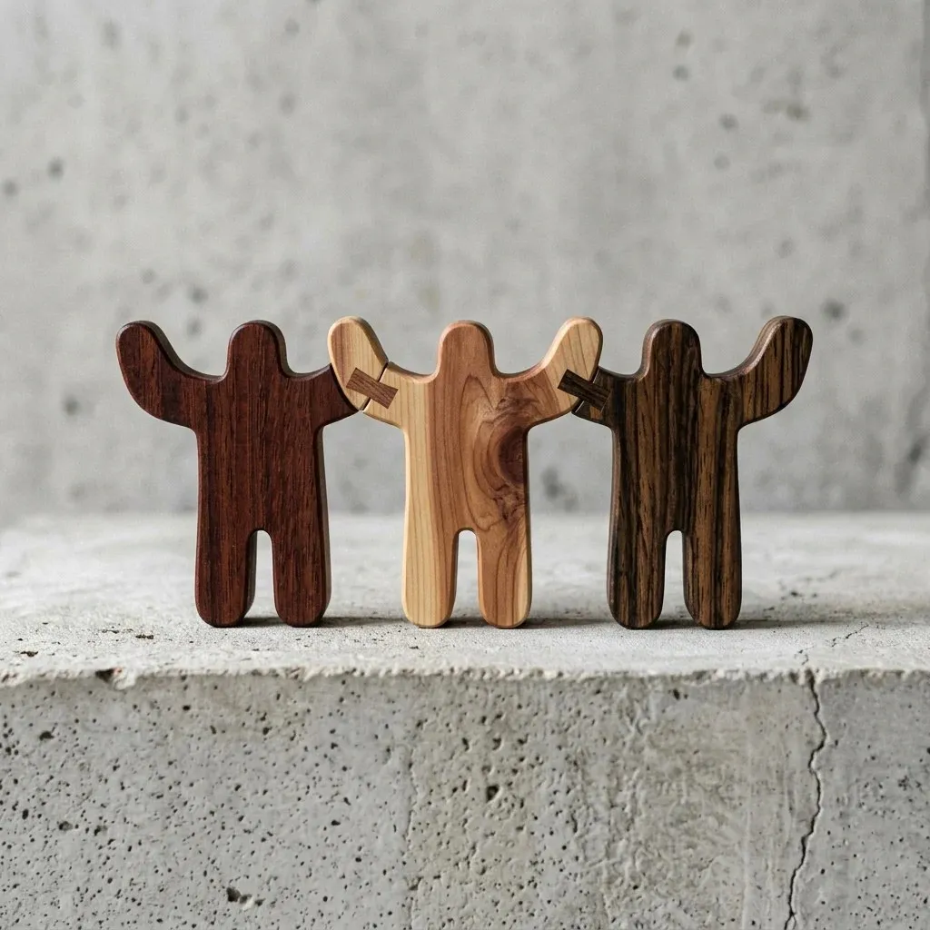
Be More Human by Defy: A Minimalist and Connection-Driven Brand Identity Turning a local community effort into a lasting cultural platform is exactly the challenge Philadelphia-based strategic agency Defy solved for fashion brand Be More Human. Instead of chasing flashy streetwear trends, this project focuses on authentic human connection, drawing architectural inspiration from the iconic Benjamin Franklin Bridge.
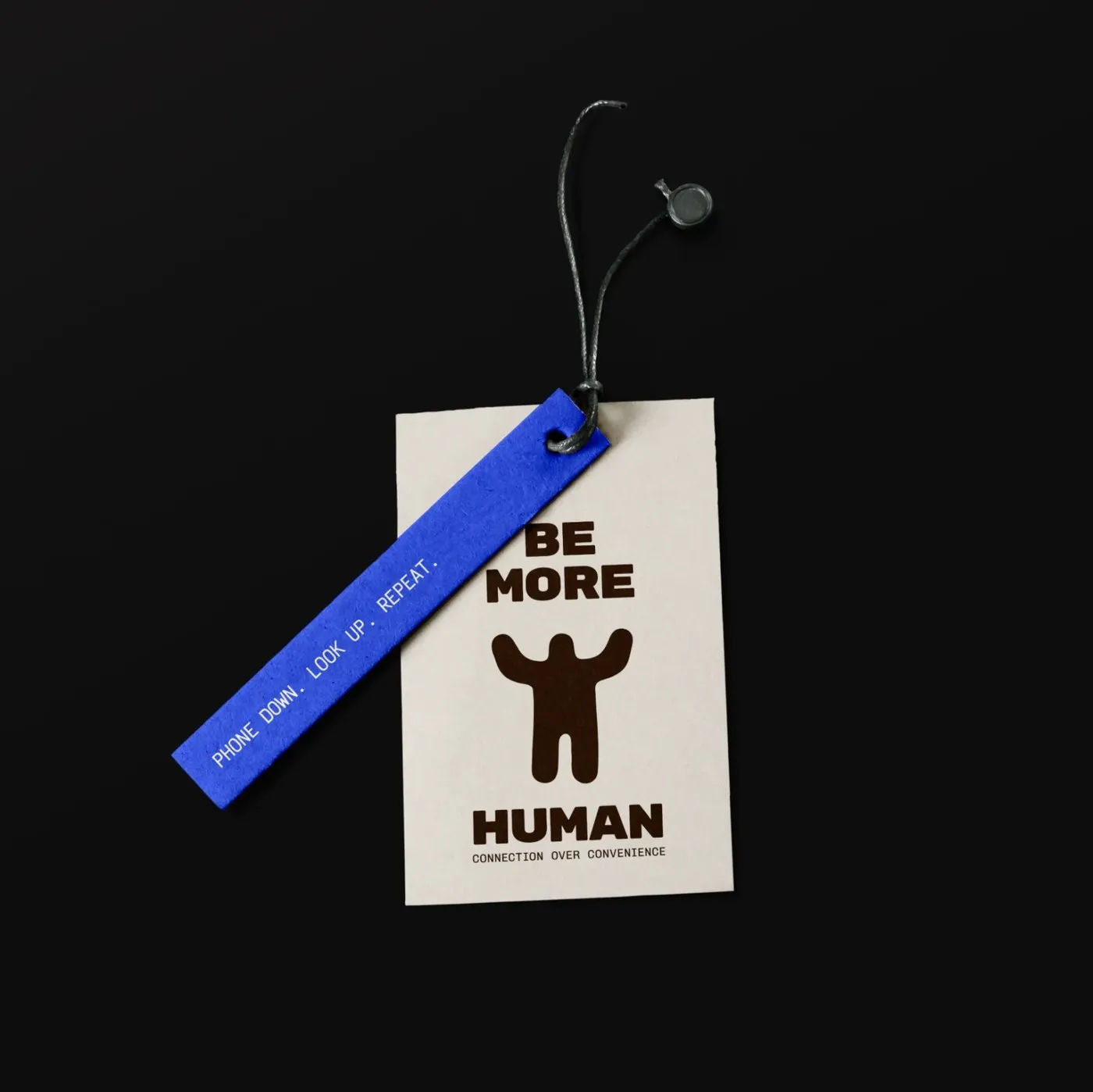
The centerpiece of the design is the iconic ‘H’ emblem, styled like a bridge deck linking two vertical towers to represent mutual support and movement between people. Pairing clean sans-serif typography with intentional whitespace gives the logo a grounded yet warm, welcoming feel.
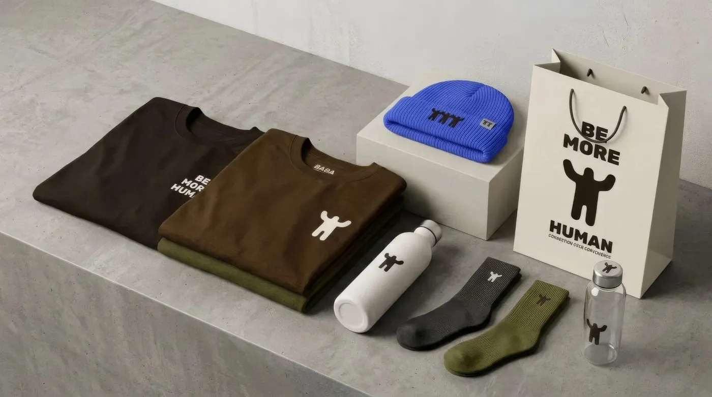
Minimalist Touches Across Apparel The visual identity prioritizes balance on fabric over flashy graphic prints. Subdued branding appears tucked away on wrist cuffs, hems, or chest placements across hoodies, crewnecks, and t-shirts. A primary color palette of neutral tones, unbleached cotton, and off-white puts fabric quality front and center.
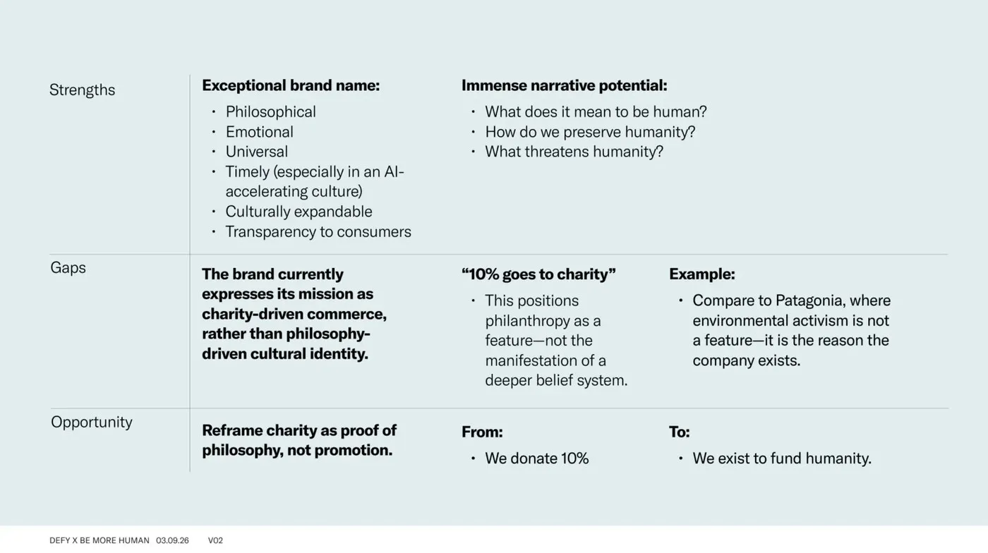
Bold statements like “Make humanity visible again” and “We exist to fund humanity” are thoughtfully set on woven labels. Meanwhile, a structured typographic grid organizes product details and care instructions into neat, functional columns.
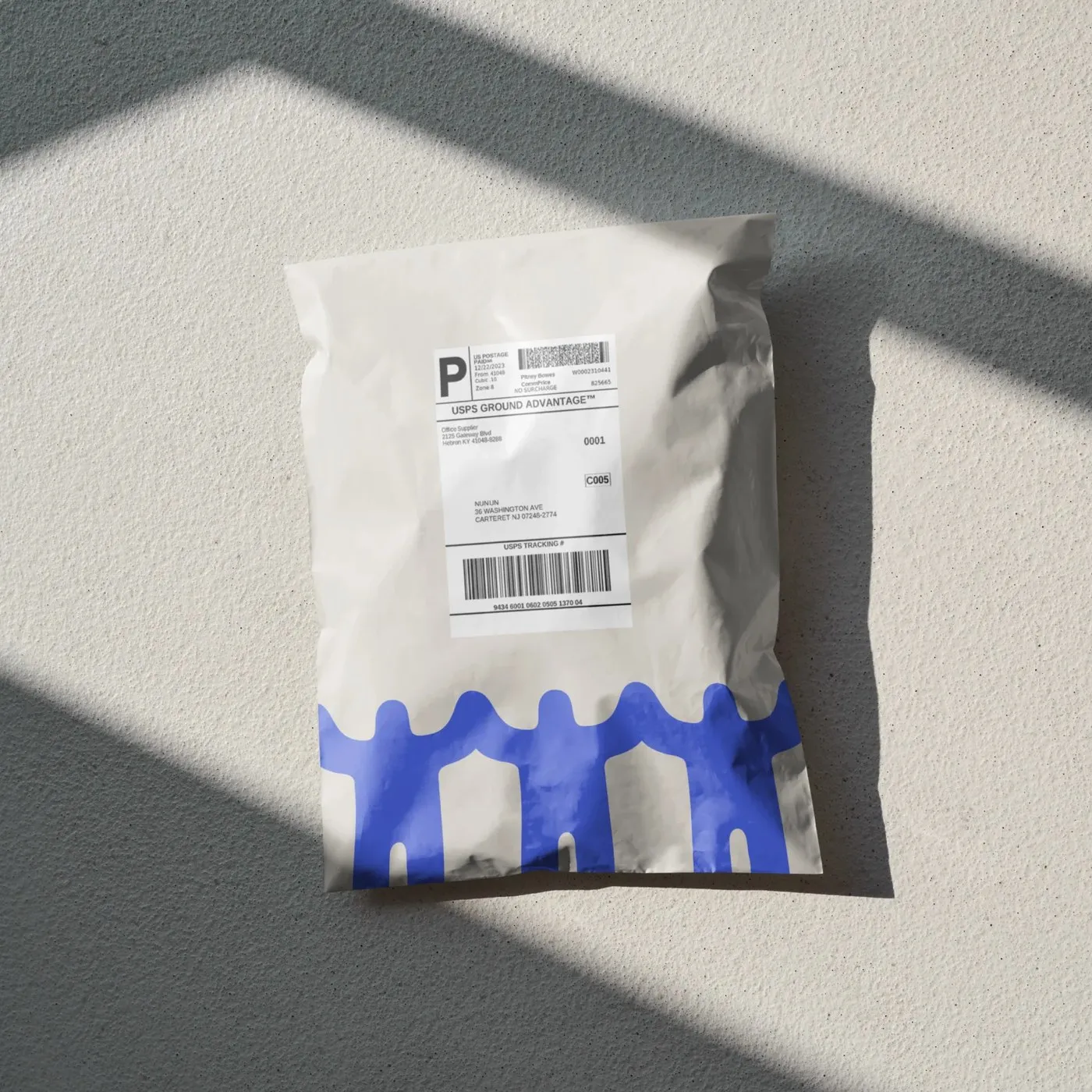
Seamless Continuity from Packaging to Physical Space The visual language extends seamlessly into packaging and retail design. Custom kraft tape, recycled cardboard boxes, and natural wood display racks keep the aesthetic honest and grounded.
Built in Adobe Illustrator and InDesign, this design demonstrates how graphic restraint can build lasting community appeal while helping a fashion brand convey a social message with understated sophistication.
Check out the full project at wedefy.com/projects/be-more-human/.
Be More Human bởi Defy: Bộ nhận diện thương hiệu thời trang tối giản và kết nối
Biến một dự án cộng đồng địa phương thành một nền tảng văn hóa lâu dài là bài toán mà agency chiến lược Defy tại Philadelphia đã giải quyết cho thương hiệu thời trang Be More Human. Thay vì chạy theo xu hướng streetwear hào nhoáng, dự án chọn hướng đi tập trung vào sự kết nối giữa người với người và lấy cảm hứng từ kiến trúc cầu Benjamin Franklin.
Điểm nhấn thiết kế nằm ở chữ H biểu tượng, được cách điệu như một nhịp cầu nối hai trụ đứng, thể hiện sự hỗ trợ lẫn nhau và sự di chuyển giữa con người. Sự kết hợp giữa bộ chữ sans-serif tinh gọn và khoảng trắng hợp lý giúp logo vừa có sự vững chãi, vừa mang lại cảm giác ấm áp và gần gũi.
Ứng dụng tối giản trên sản phẩm thời trang
Hệ thống nhận diện ưu tiên tính cân bằng trên từng chất liệu vải thay vì dùng các hình in đồ họa phô trương. Tên thương hiệu xuất hiện khiêm tốn ở các vị trí như cổ tay, lai áo hoặc ngực áo của hoodies, crewnecks và áo t-shirt. Bảng màu chủ đạo sử dụng các tông màu trung tính, màu bông vải chưa qua tẩy và nền trắng ngà, giúp chất lượng chất liệu được tôn lên hàng đầu.
Các thông điệp tuyên ngôn như “Make humanity visible again” hay “We exist to fund humanity” được sắp xếp chỉn chu trên nhãn dệt (woven label). Lưới typographic (typographic grid) tổ chức các thông số sản phẩm và hướng dẫn bảo quản thành các cột chức năng gọn gàng, rõ ràng.
Đồng bộ từ bao bì đến không gian
Ngôn ngữ thị giác của thương hiệu còn mở rộng sang packaging và không gian bán lẻ. Băng dính kraft thiết kế riêng, hộp giấy carton tái chế và kệ trưng bày bằng gỗ tự nhiên giúp thương hiệu giữ được tính chất chân thật.
Được thực hiện trên Adobe Illustrator và InDesign, dự án chứng minh rằng sự tiết chế trong thiết kế đồ họa vẫn có thể tạo ra sức hút cộng đồng bền vững, giúp một thương hiệu thời trang truyền tải thông điệp xã hội một cách tinh tế.
Xem toàn bộ dự án tại wedefy.com/projects/be-more-human/.