Union Branding by Two Times Elliott: Sleek, Minimal, and Architecturally Inspired Office branding can so easily slide into tired clichés—think stiff, dry corporate collateral on one end, or hyper-flashy co-working spaces packed with bright neon on the other. Spotting an opportunity for something far more refined, London studio Two Times Elliott joined forces with Union—a pioneer in Managed Office Services—to create a clean, clutter-free visual language.
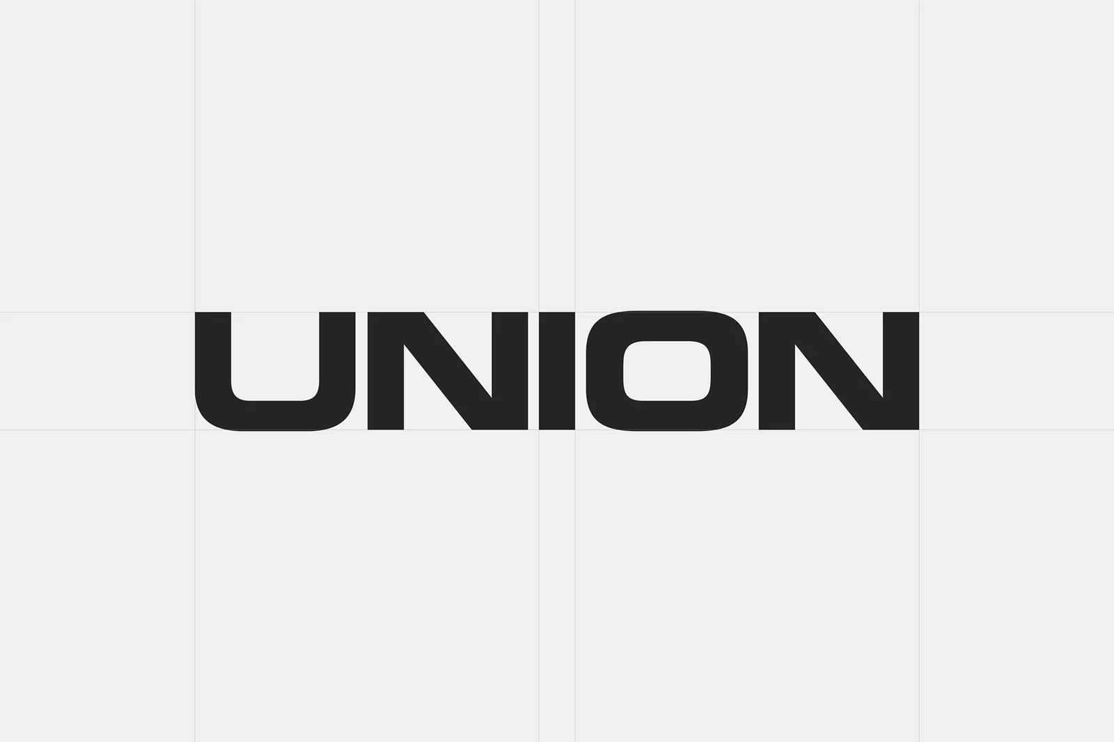
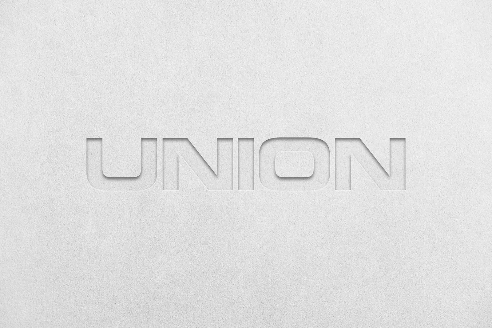
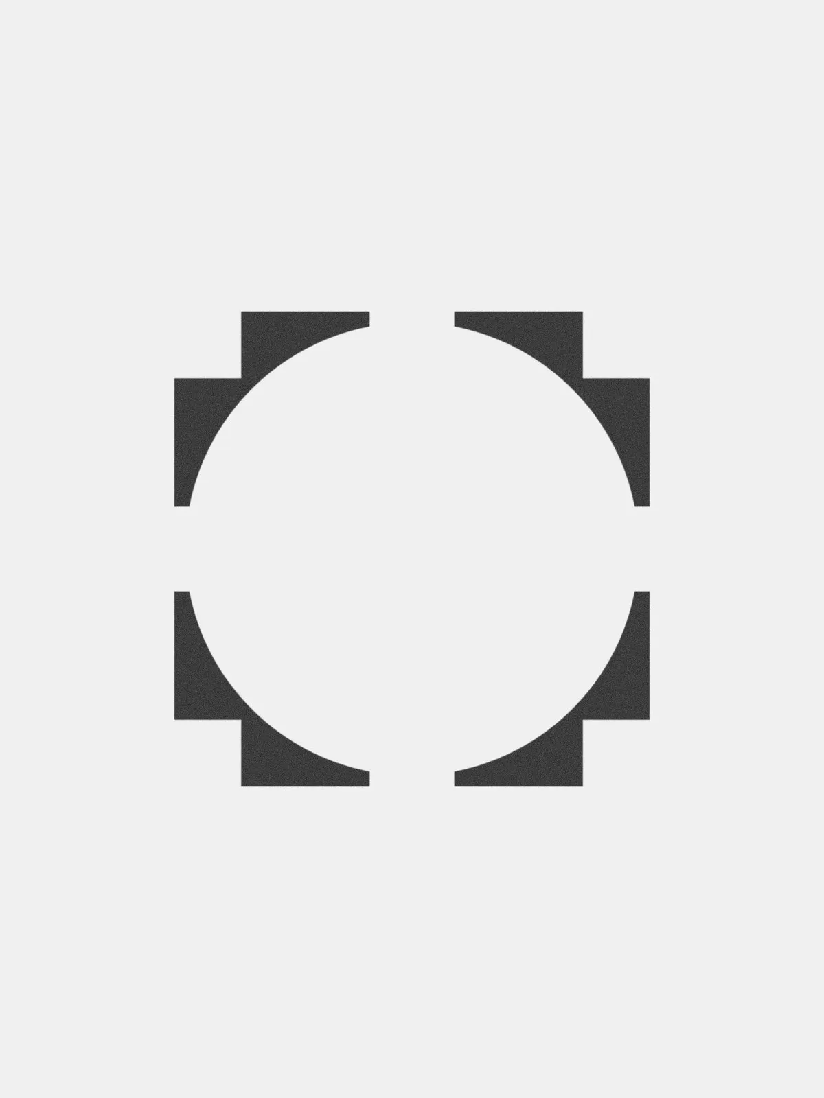
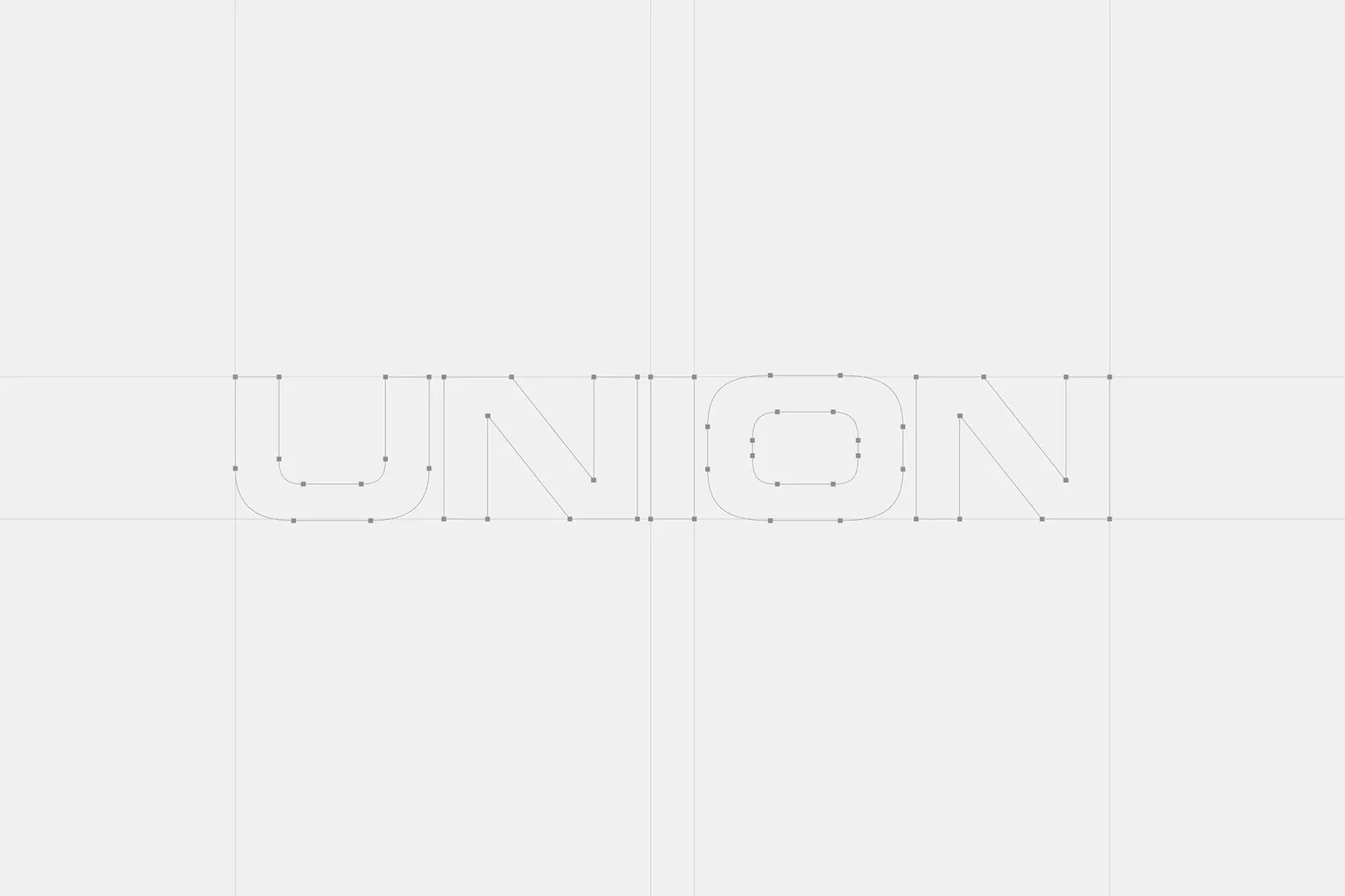
Typography takes center stage in this visual system. Built on a clean horizontal baseline grid in Illustrator, the extended “UNION” wordmark balances squared-off curves on the U and O with razor-sharp diagonal cuts on the N. Accompanying the wordmark is a geometric emblem featuring four layered corners framing a central circular space. Whether debossed on lush cotton paper or paired with the slogan “A Smarter HQ,” the overall design communicates polished clarity.
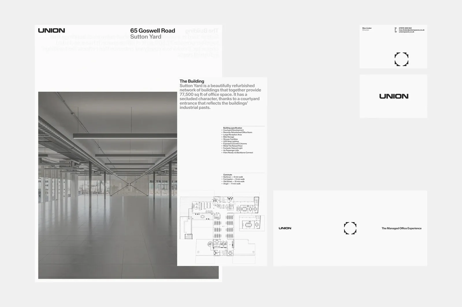
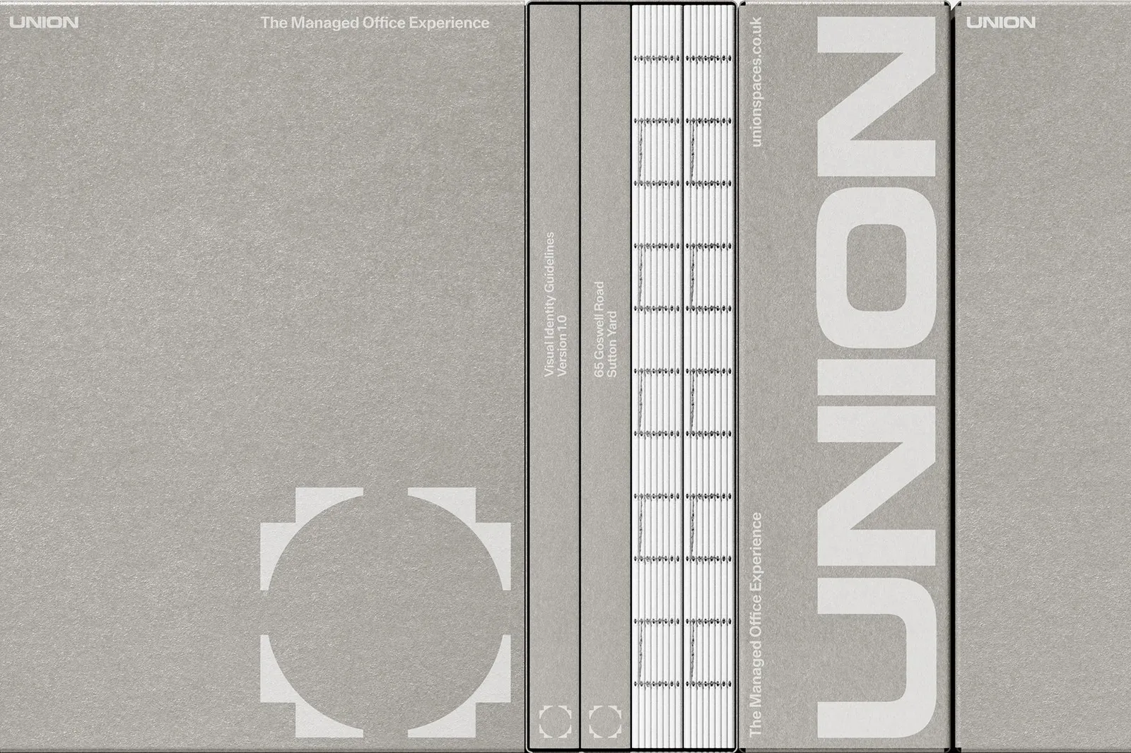
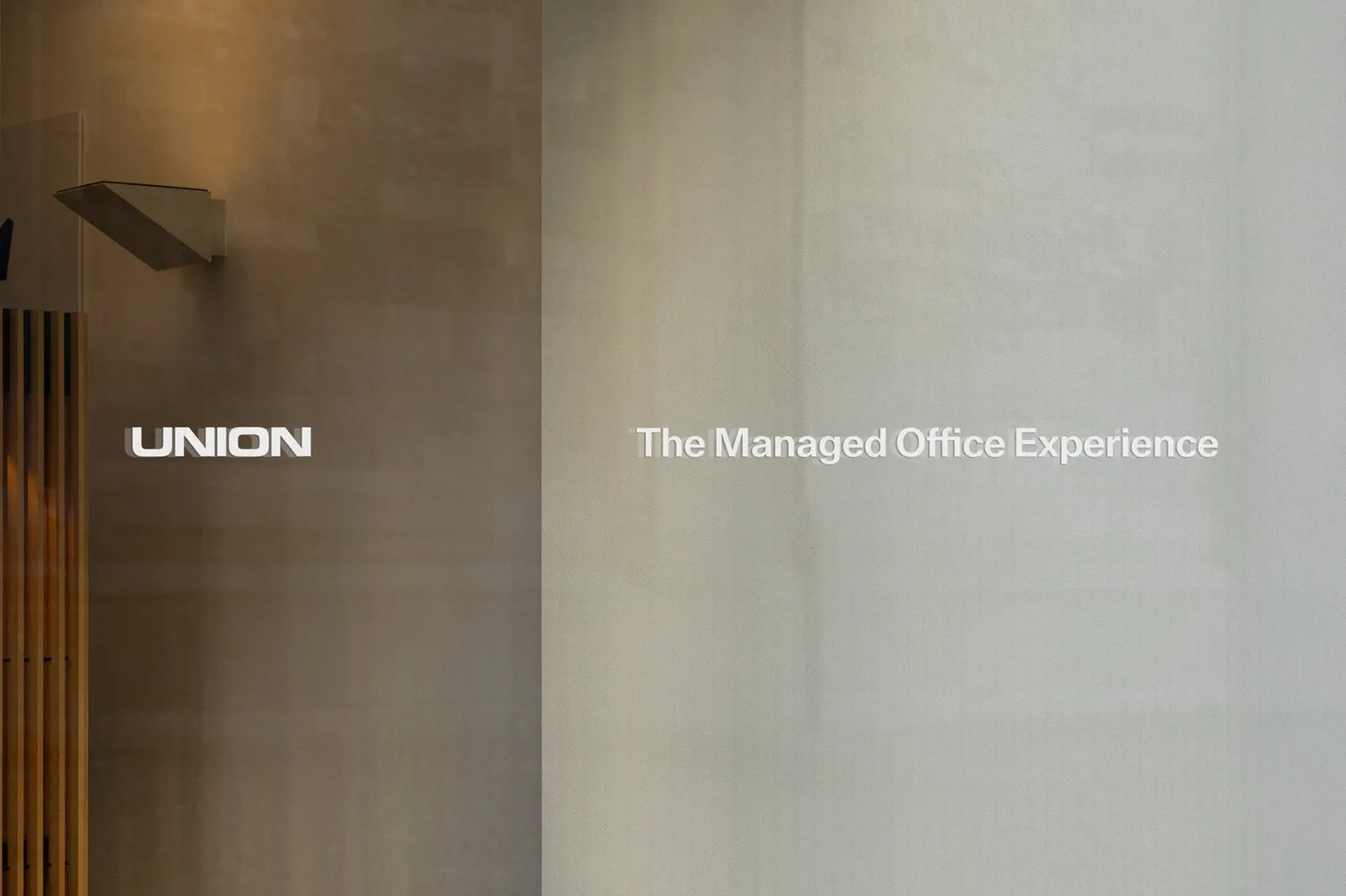
The print collateral brings that very same minimalist energy. Brand guidelines and print assets for the 65 Goswell Road building at Sutton Yard feature raw greyboard covers with exposed white spine stitching. Inside, the InDesign-crafted layouts use translucent overlays sitting atop monochrome architectural photography of the 77,500 sq ft space, technical CAD drawings, and walking times to Barbican, Farringdon, Old Street, and Angel. From Director Max Linder’s business cards to the glass signage in the main lobby, every piece keeps the design language seamless and consistent.
Explore the complete project in detail on www.behance.net/gallery/236085667/Union.
Bộ nhận diện thương hiệu Union từ Two Times Elliott: Tối giản và đậm chất kiến trúc
Mảng nhận diện cho không gian văn phòng thường dễ đi vào lối mòn: hoặc là những cuốn brochure doanh nghiệp cứng nhắc, hoặc là phong cách co-working quá sặc sỡ với đèn neon. Nhận ra điều đó, studio Two Times Elliott tại London đã hợp tác cùng Union — đơn vị tiên phong trong mô hình Managed Office Services — để tạo nên một thiết kế gọn gàng, loại bỏ các chi tiết thừa.
Yếu tố chủ đạo của dự án nằm ở phần typography. Chữ UNION dạng extended được dựng trên lưới baseline nằm ngang trong Illustrator, kết hợp các đường bo vuông vức ở chữ U, O với nét cắt chéo sắc sảo của chữ N. Đi cùng với logo là biểu tượng hình học với bốn góc xếp tầng ôm trọn khoảng không hình tròn ở giữa. Dù dập chìm trên chất liệu giấy cotton hay xuất hiện cùng slogan “A Smarter HQ”, tổng thể nhận diện vẫn thể hiện sự rõ ràng và chỉn chu.
Ấn phẩm in ấn cũng mang tinh thần tối giản tương tự. Bộ cẩm nang thương hiệu và ấn phẩm cho tòa nhà 65 Goswell Road, Sutton Yard sử dụng bìa cứng greyboard để lộ chỉ may gáy màu trắng. Bên trong, các trang thông tin dàn trang bằng InDesign áp dụng lớp giấy trong suốt phủ lên hình ảnh nhiếp ảnh đơn sắc của tòa nhà rộng 77,500 sq ft, các bản vẽ kỹ thuật CAD cùng thông tin thời gian đi bộ đến Barbican, Farringdon, Old Street và Angel. Ngay cả danh thiếp của Giám đốc Max Linder hay phần biển hiệu kính ở sảnh cũng giữ nguyên ngôn ngữ thiết kế nhất quán này.
Có thể xem đầy đủ chi tiết dự án tại www.behance.net/gallery/236085667/Union.