Pearlfisher and the Brand-New Design System for CVS When a brand can instantly pop out from a wall packed with 3,000 products, that’s the true power of systems design. Design agency Pearlfisher gave CVS’s entire private-label line a massive overhaul, building a hyper-disciplined identity system that seamlessly spans over 3,000 products across 9,000 retail locations.
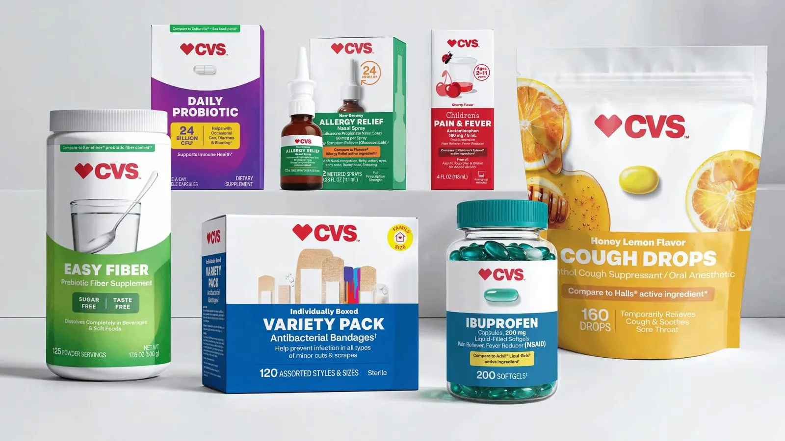
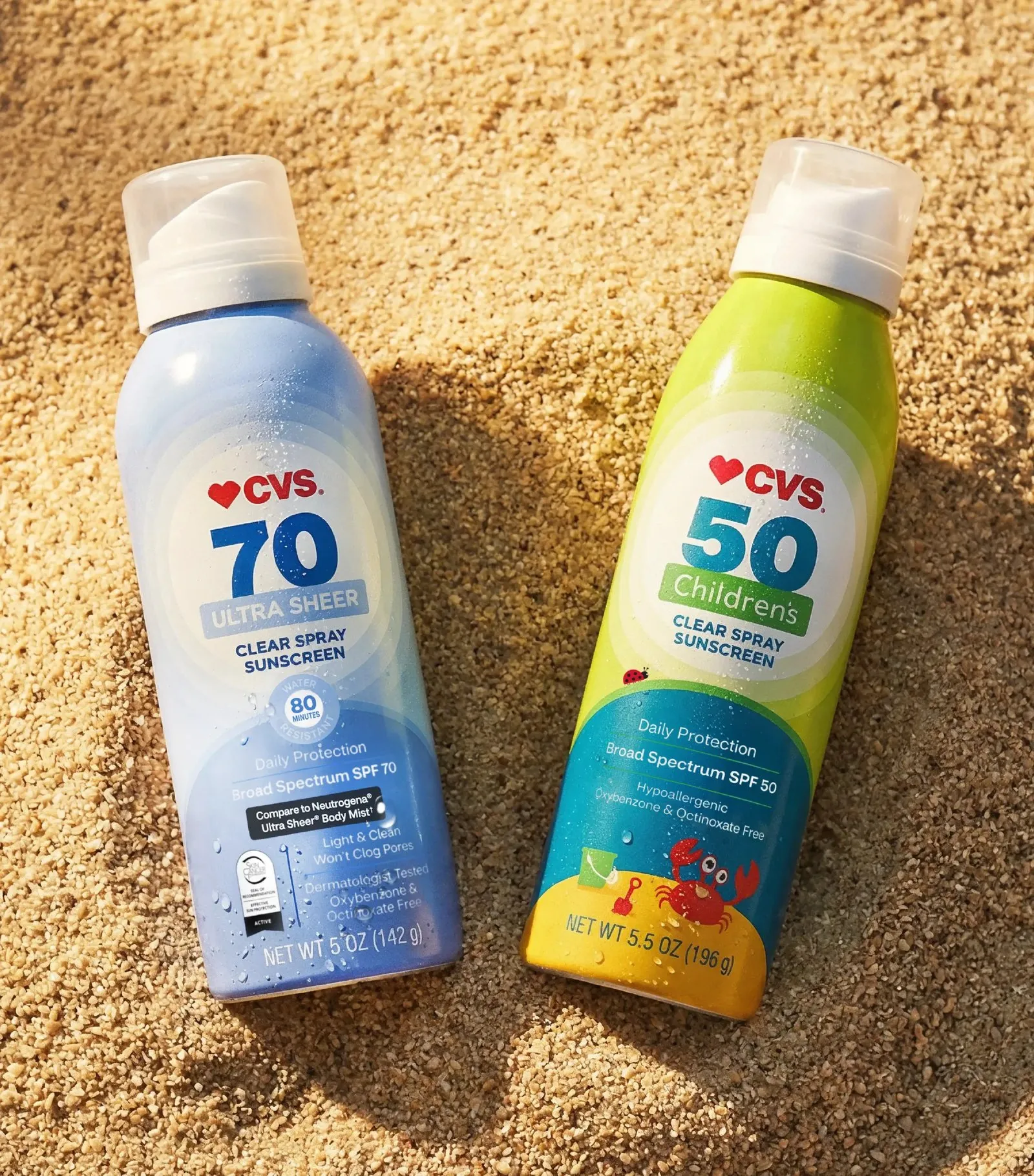
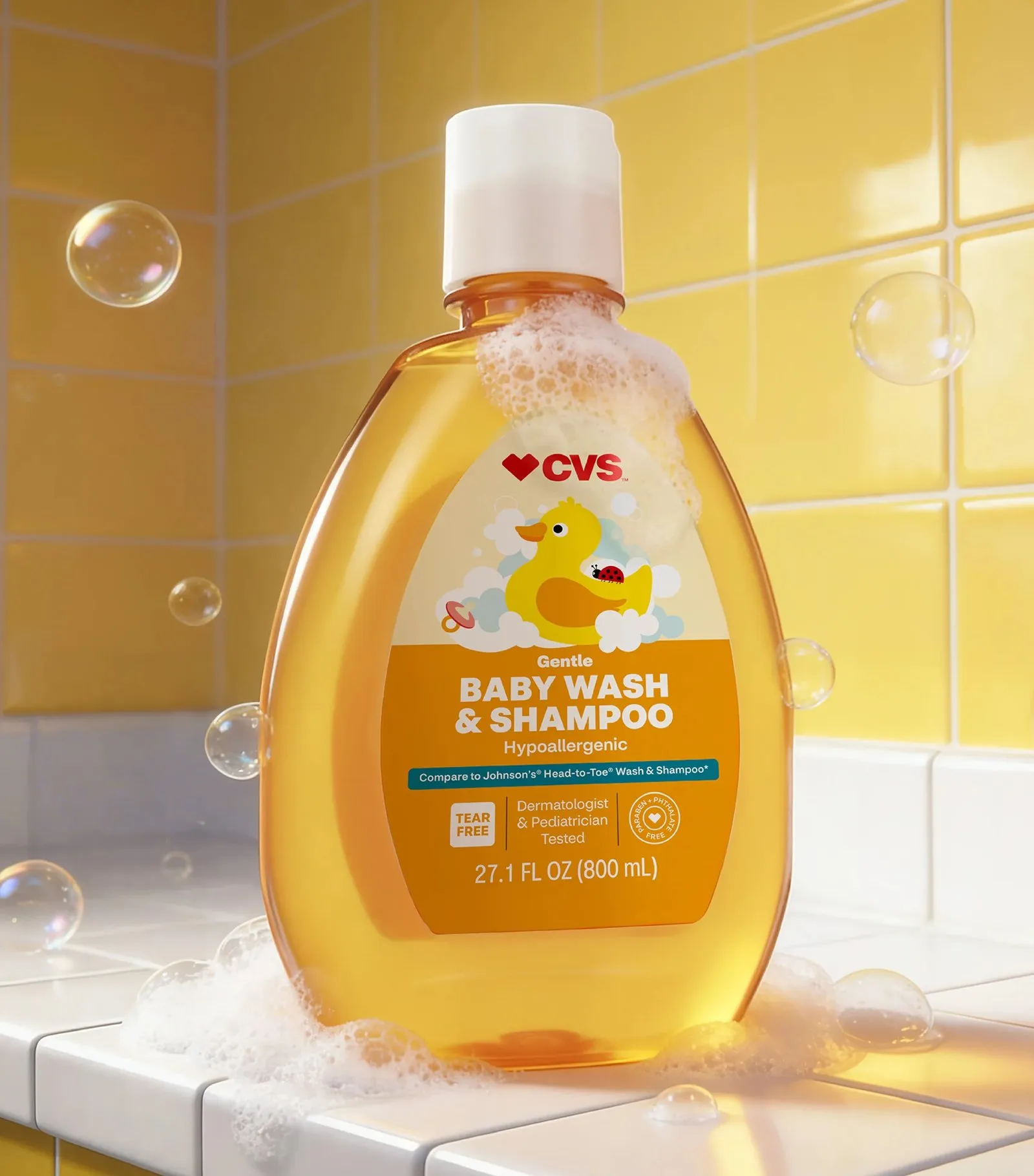
Every box and bottle features the iconic red heart emblem alongside the CVS logo anchored right at the top of a clean white front panel. Directly beneath sits a crisp flat color block for effortless category navigation: cheerful pink for allergy relief, calm blue for pain management, and fresh green for nasal sprays, with the product name rendered in bold all-caps text right above the quantity count. Gone are the days of cluttered, noisy elements. The previous packaging crammed tiny text across cold clinical gradients, while the heart icon appeared in so many random iterations it lost its impact. Pearlfisher stripped away the clutter, establishing a core set of fixed brand assets paired with a flexible color-coding framework so shoppers instantly know which aisle they are in. Here, the system itself is the design.
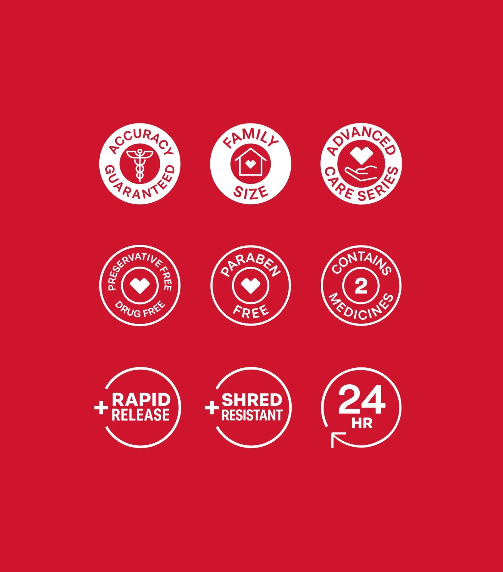
The wordmark also received a smart cleanup. Dropping the serif “Health” text leaves a clean, punchy “CVS” logo, giving the heart emblem plenty of room to breathe. On-pack layout grids stay rock-solid: logo up top, category color block in the middle, bold uppercase product name, quantity near the bottom, and a neat “Compare to” tab calling out national brand equivalents. To top it off, a red block showcasing nine circular white icons neatly highlights secondary callouts—like accuracy guarantees, family size, paraben-free status, or 24-hour relief—sparing shoppers from wading through dense walls of fine print.
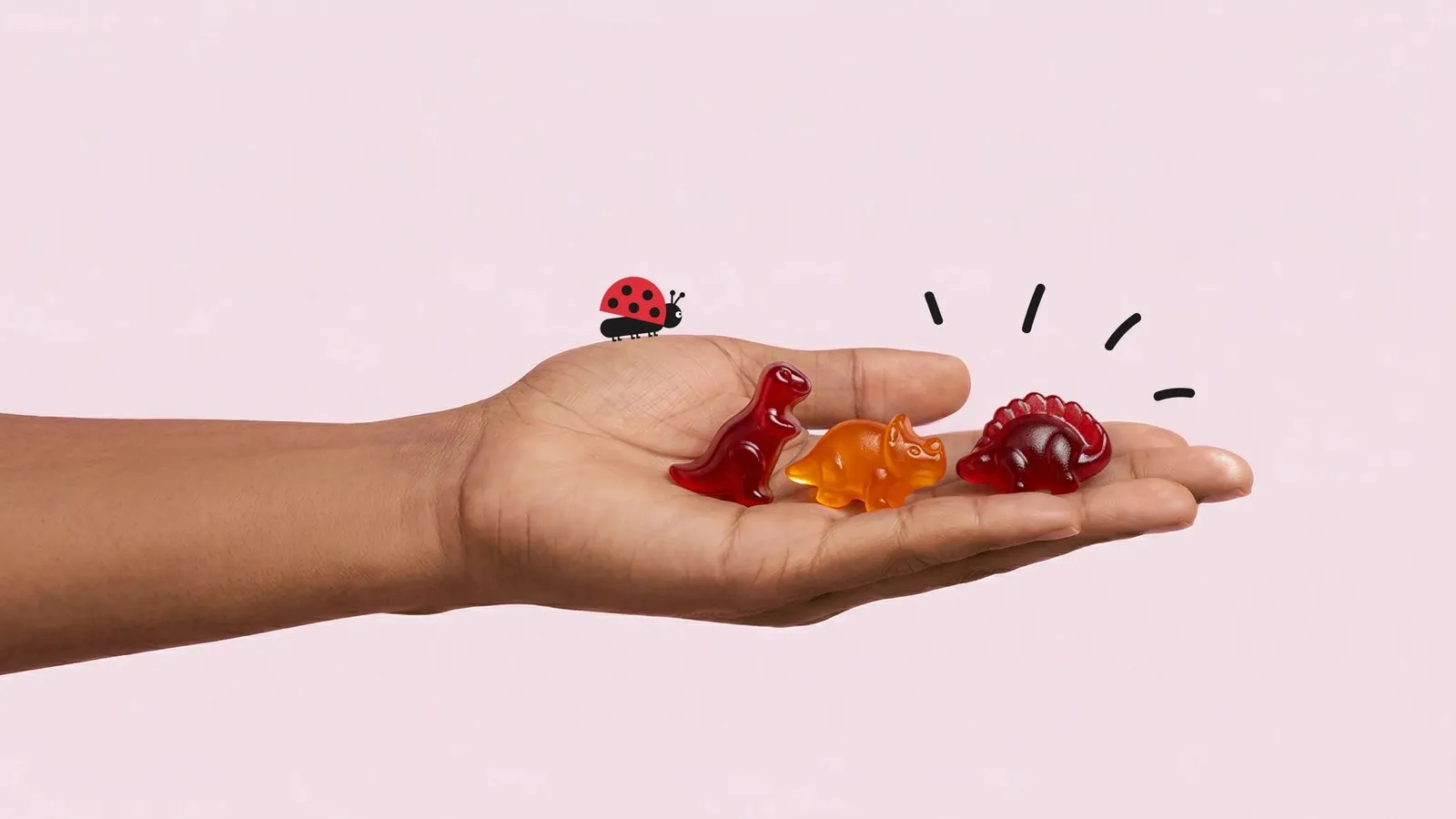
Pearlfisher grouped more than 20 product categories into distinct core pillars based on consumer values. Even as each category shifts to its own color story, every package follows the exact same playbook. For example, kids’ products get a charming little ladybug illustration, helping weary parents spot pediatric formulas at a glance.
This massive redesign marks CVS’s first full brand refresh in nearly a decade. Over the course of a year, Pearlfisher and CVS put concepts to the test using eye-tracking technology and extensive feedback from thousands of shoppers. The nationwide rollout kicked off in June 2025 across 68 pain reliever SKUs, with the full suite of roughly 3,000 products scheduled to hit shelves by the end of 2026.
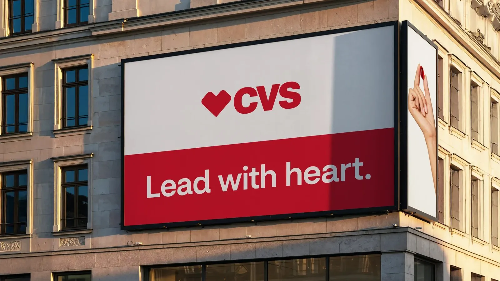
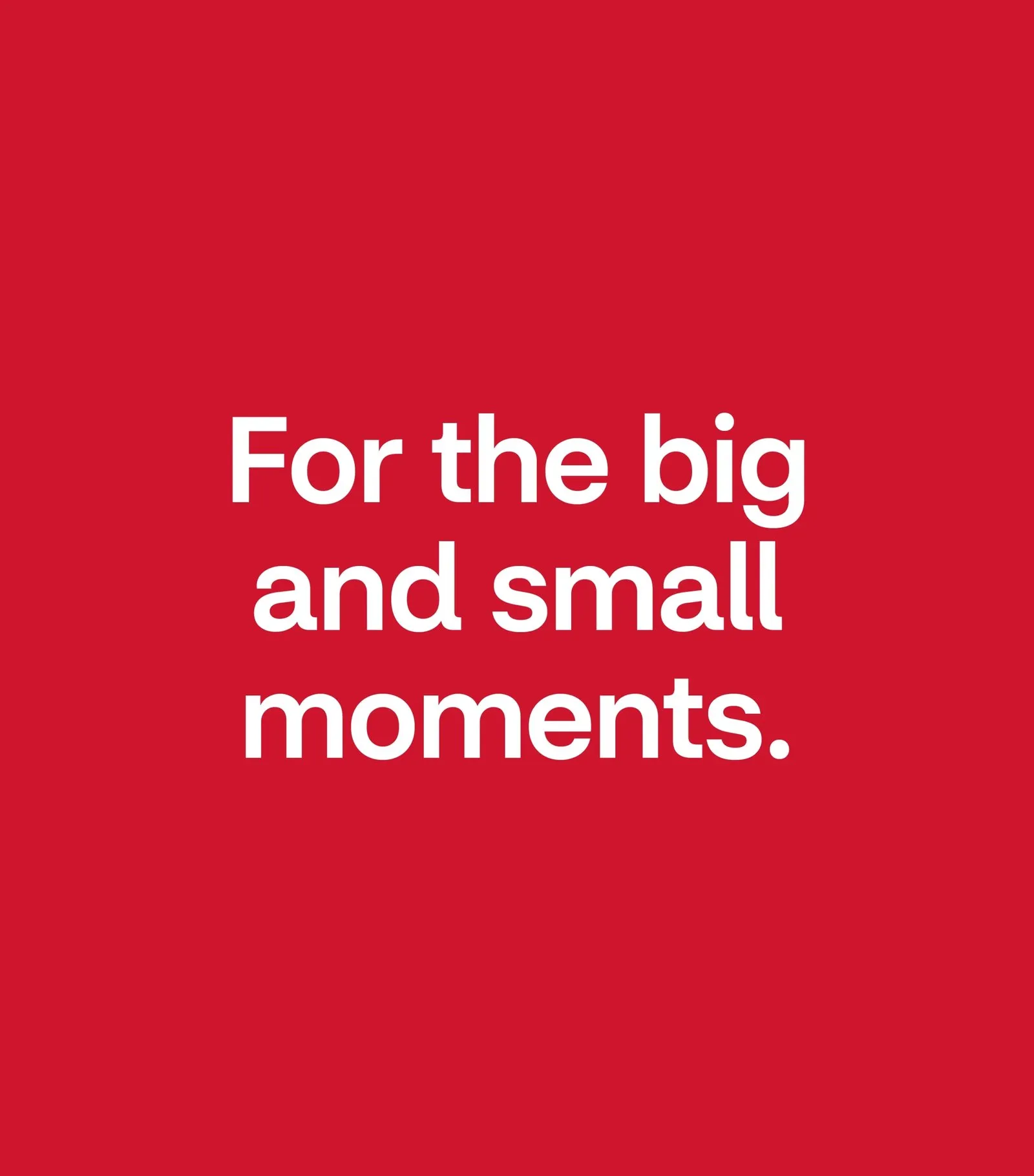
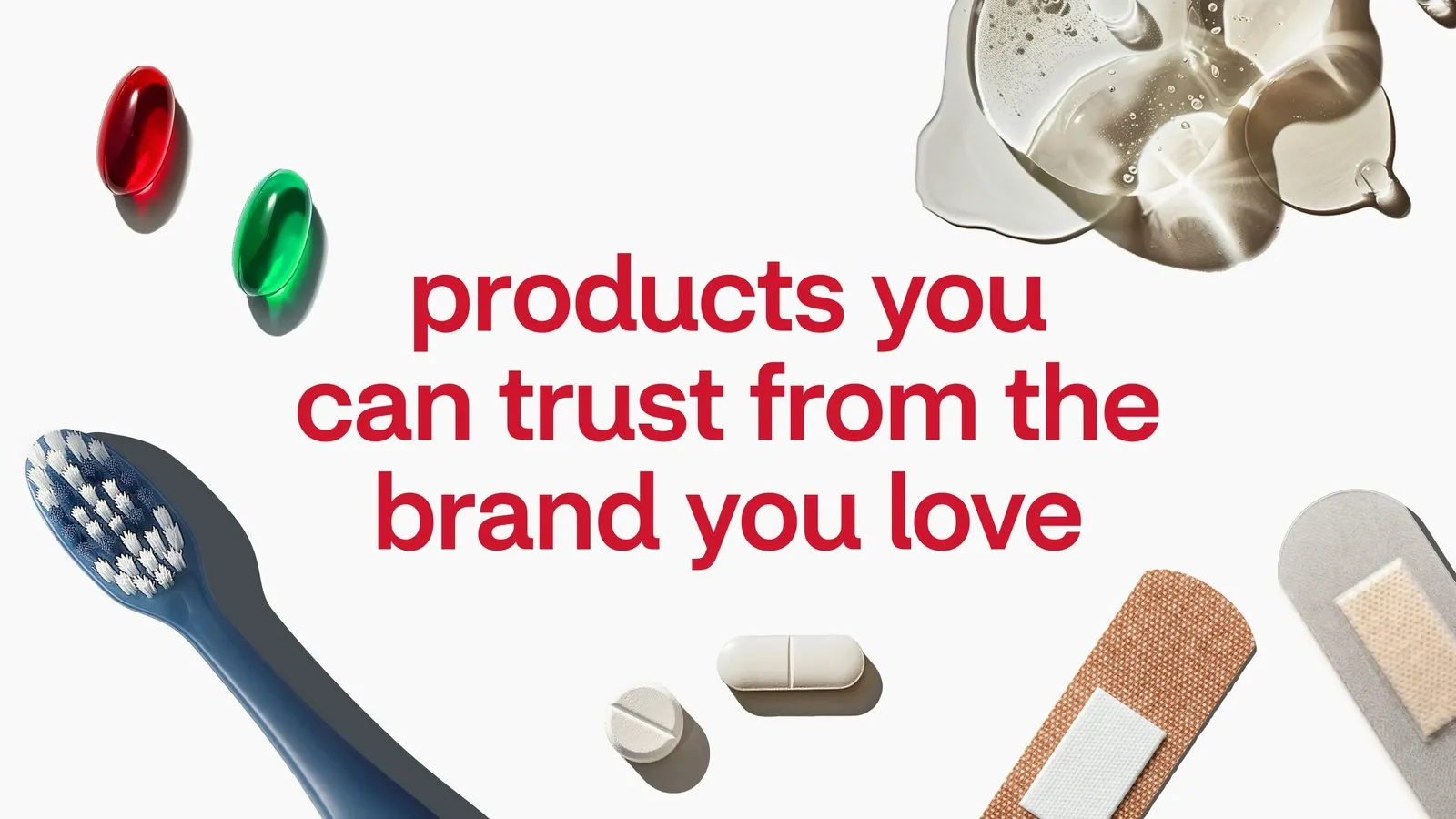
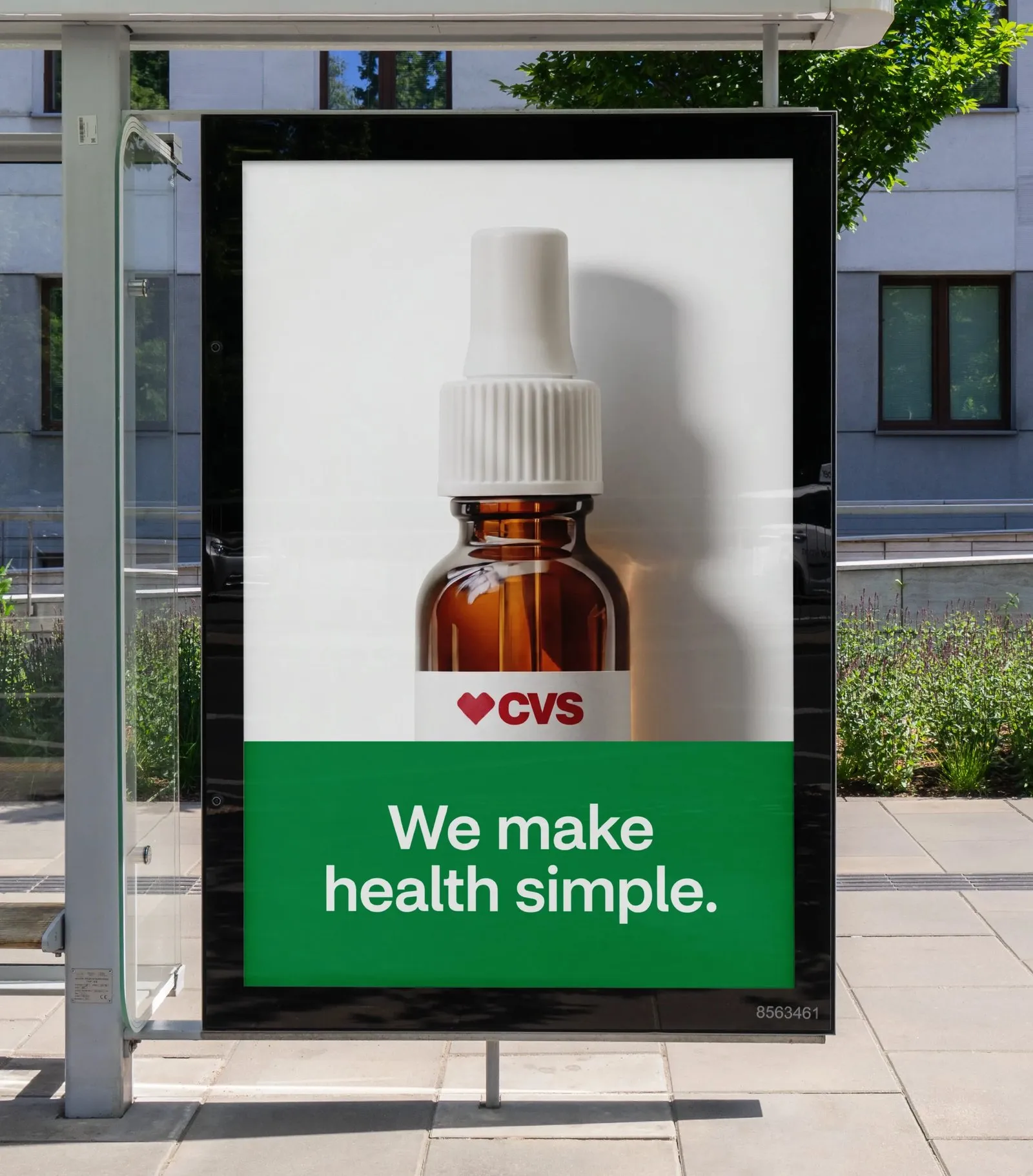
This sleek consistency carries over to out-of-home campaigns as well: the bold “Lead with heart” message set against a rich red background, “We make health simple” resting beneath a minimalist medicine dropper icon, and “For the big and small moments” popping in crisp white typography over red.
Check out more details about this project on the pearlfisher.com/work/cvs/.
Pearlfisher Và Hệ Thống Thiết Kế Mới Cho Nhãn Hàng CVS
Nhìn vào một bức tường xếp chồng 3.000 sản phẩm mà nhận ra ngay thương hiệu chỉ trong một ánh nhìn thì quả là thành công của thiết kế hệ thống. Pearlfisher đã tái cấu trúc lại toàn bộ nhãn hàng riêng của chuỗi nhà thuốc CVS thành một hệ thống nhận diện cực kỳ kỷ luật, phủ sóng hơn 3.000 sản phẩm tại 9.000 cửa hàng.
Mỗi bao bì đều mang biểu tượng trái tim màu đỏ cùng logo CVS nằm ở vị trí trên cùng của mặt trước màu trắng. Ngay phía dưới là mảng màu phẳng (flat colour block) giúp phân loại sản phẩm rõ ràng: màu hồng cho thuốc dị ứng, màu xanh dương cho thuốc giảm đau, màu xanh lá cho xịt mũi, và tên sản phẩm được viết in hoa đậm nằm ngay trên phần ghi số lượng. Không hề có chi tiết nào rườm rà hay cố tình gào thét. Các mẫu bao bì cũ trước đây từng nhét quá nhiều chữ nhỏ vào những dải màu chuyển (clinical gradients), còn biểu tượng trái tim thì xuất hiện dưới quá nhiều biến thể đến mức mất đi ý nghĩa. Pearlfisher đã tối giản tất cả thành một bộ asset cố định kết hợp với hệ thống mã màu linh hoạt giúp khách hàng biết ngay mình đang đứng ở gian hàng nào. Bản thân hệ thống này chính là thiết kế.
Về phần wordmark, mọi thứ cũng được làm gọn lại. Phần chữ “Health” mang font serif đã bị loại bỏ để chỉ còn giữ lại “CVS”, tạo khoảng thở cho biểu tượng trái tim. Trên bao bì, phần layout grid luôn cố định: logo ở trên cùng, mảng màu ở giữa, tên sản phẩm in hoa đậm, số lượng nằm gần đáy và một tab “Compare to” nhỏ để đặt tên sản phẩm tương đương. Ngoài ra, một mảng màu đỏ chứa 9 icon hình tròn màu trắng được dùng để thể hiện các thông tin bổ trợ như đảm bảo độ chính xác, dung tích gia đình, không chứa paraben hay tác dụng 24 giờ, giúp người mua dễ đọc thay vì phải nhìn một đoạn văn bản chật chội.
Pearlfisher cũng nhóm hơn 20 ngành hàng thành các nhóm trụ cột dựa trên giá trị của người tiêu dùng. Dù mỗi ngành hàng chuyển đổi màu sắc riêng nhưng vẫn tuân thủ chung một bộ quy tắc. Chẳng hạn như dòng sản phẩm dành cho trẻ em sẽ có thêm hình con bọ rùa nhỏ nhắn để các phụ huynh đang mệt mỏi có thể nhận ra nhanh chóng.
Dự án này là đợt làm mới toàn bộ thương hiệu đầu tiên của CVS trong gần một thập kỷ qua. Pearlfisher và CVS đã mất hơn một năm để thử nghiệm các concept, so sánh với bao bì cũ thông qua công nghệ eye-tracking và khảo sát hàng nghìn người tiêu dùng. Quá trình áp dụng bắt đầu từ tháng 6 năm 2025 với 68 sản phẩm giảm đau và dự kiến hoàn thành cho khoảng 3.000 sản phẩm vào cuối năm 2026.
Sự đồng bộ này còn lan tỏa ra cả các bảng quảng cáo ngoài trời: thông điệp “Lead with heart” trên nền đỏ, “We make health simple” bên dưới hình chai thuốc nhỏ giọt, và “For the big and small moments” với chữ trắng nổi bật trên nền đỏ.
Xem thêm chi tiết về dự án này tại www.pearlfisher.com/work/cvs/.