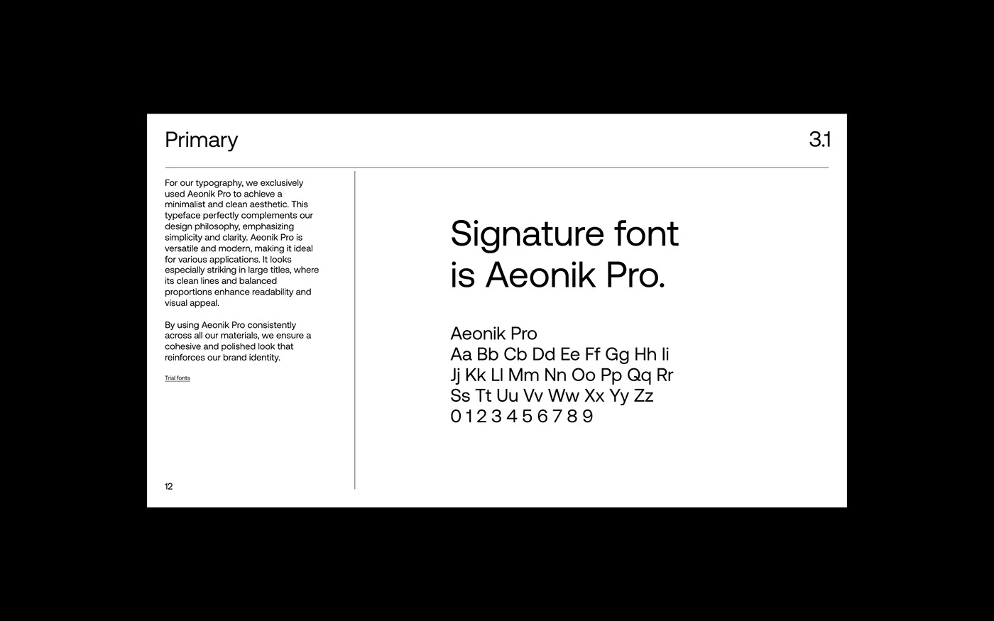
Peers: A Sleek Modern Brand Identity Built on Custom Type and Grid Systems Designed by Anvar K., Peers is a corporate visual identity built around a custom typography setup and a super crisp grid system.
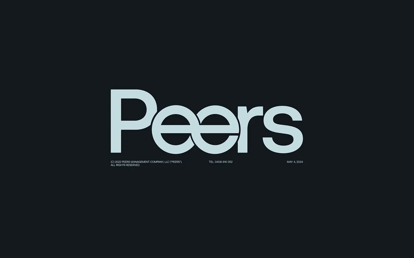
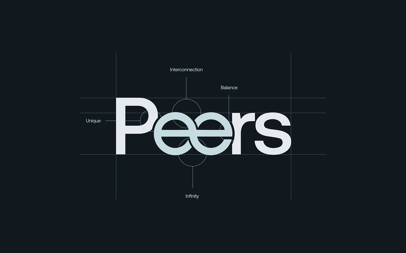
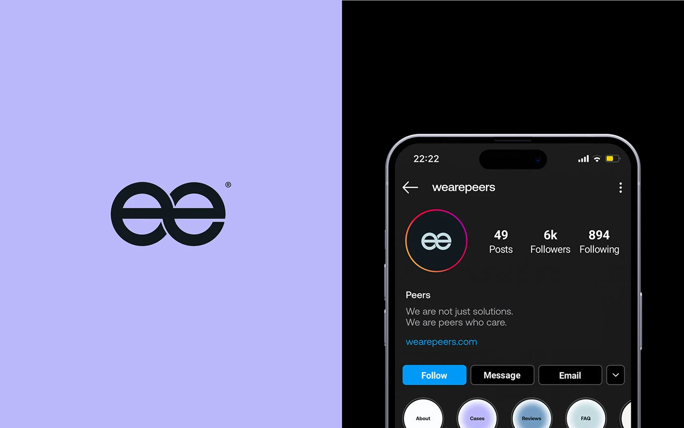
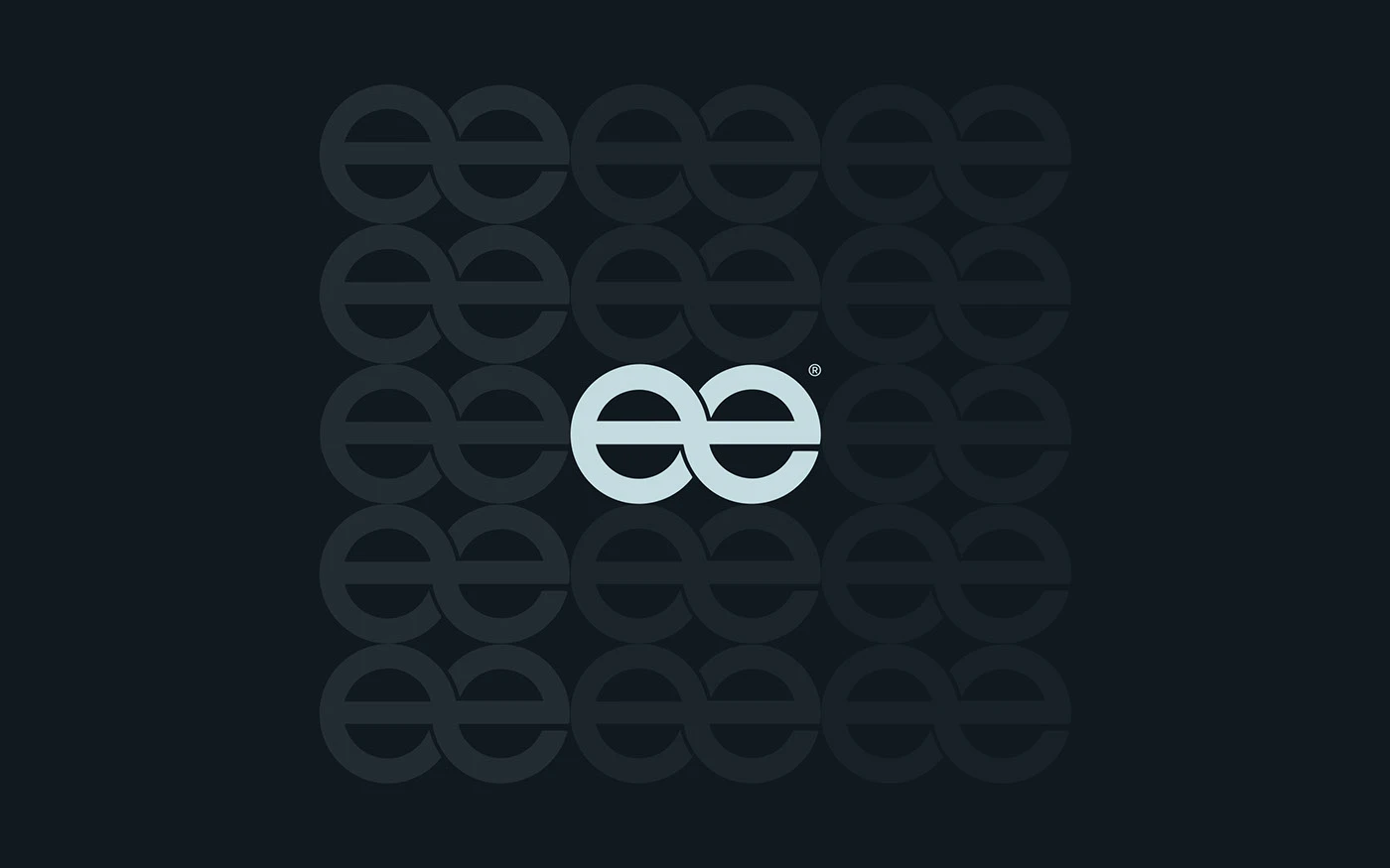
At the heart of this visual system is a custom wordmark logo featuring tailored letterforms. The two interlocking “e”s right in the middle symbolize teamwork and togetherness. A soft light blue stands out against a deep navy background, while subtle catalog-style text along the bottom edge adds a clever tech-spec vibe.
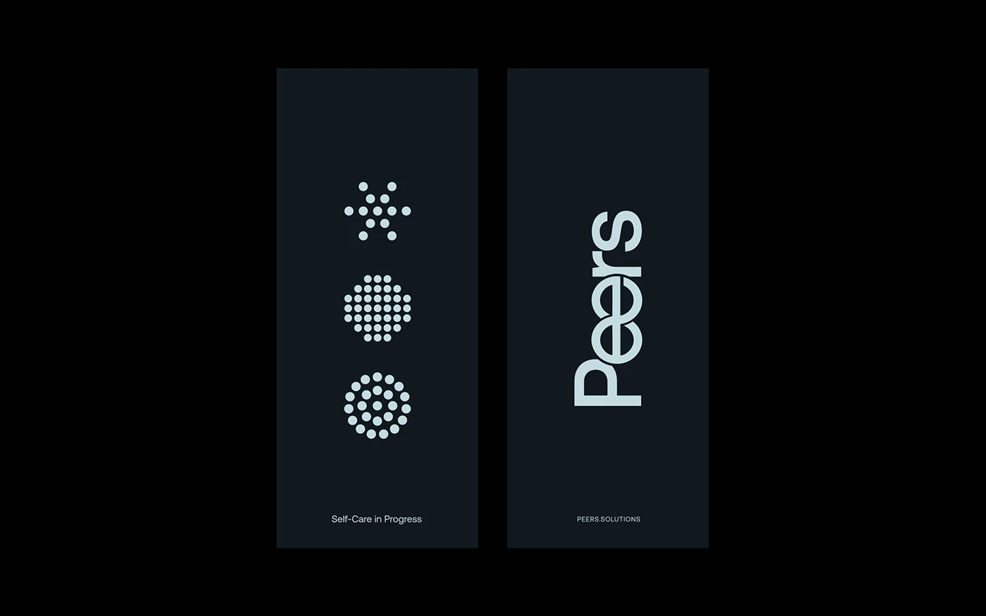
Beyond the logo, the brand identity introduces a dot-matrix icon set representing self-care and team growth. These geometric dot patterns pop as circular badges set against dark paper stock.
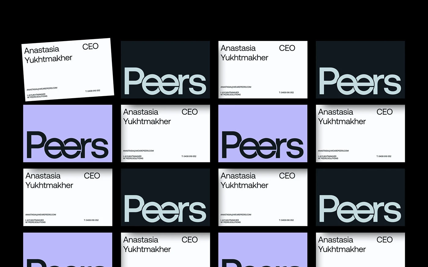
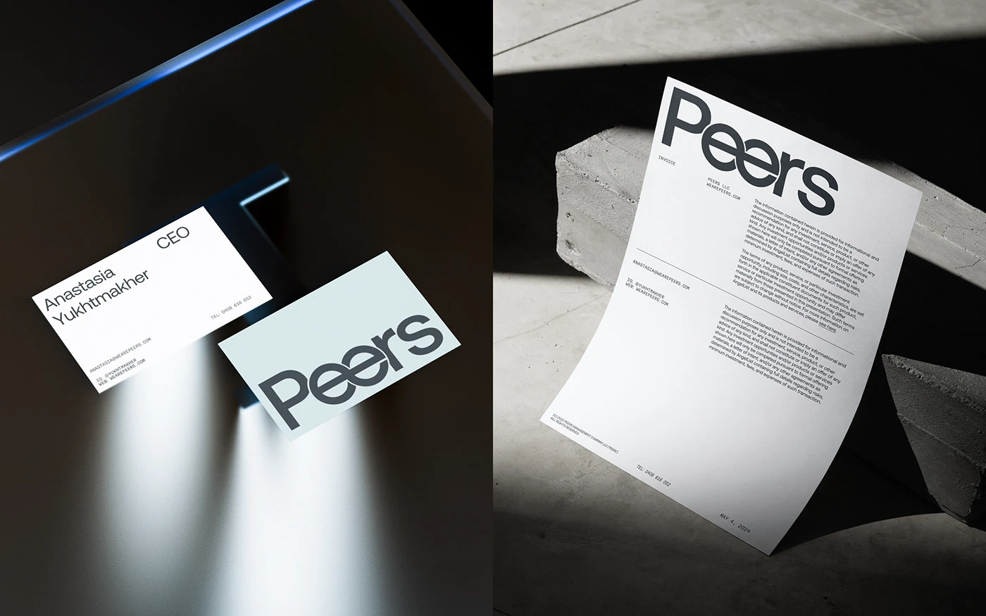
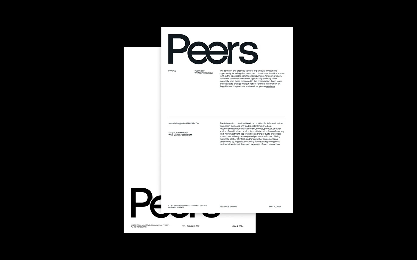
Versatile Print Collateral The print suite brings this design language straight into the real world. Business cards follow a tidy grid using a color palette of crisp white, periwinkle blue, and deep navy. Invoices mix elegant tall-serif headlines with clean, readable sans-serif text for line items. High-contrast lighting with harsh shadows against raw concrete showcases the rich paper textures.
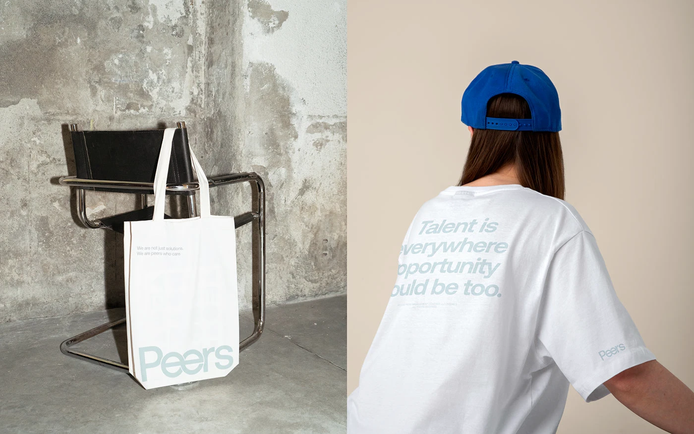
Branded swag like tote bags and staff tees sport subtle gray prints on soft white cotton, proving how adaptable the mark is across different mediums.
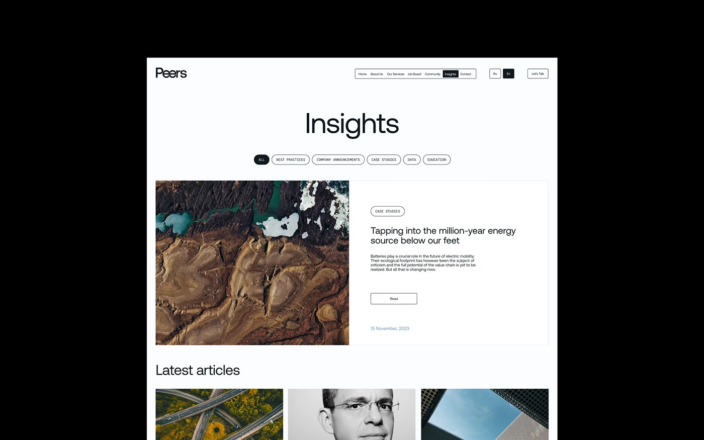
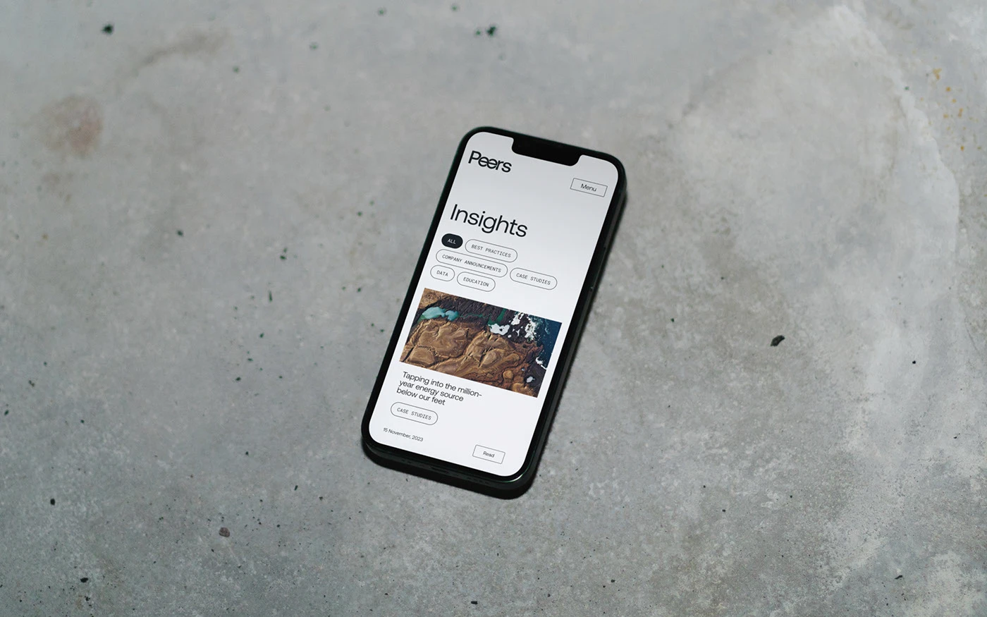
Seamless Digital Experience The visual identity translates smoothly onto web and mobile interfaces. The digital design leans heavily on generous white space and structured content blocks to effortlessly guide the viewer’s eye. Soft gray tone blocks subtly separate posts and projects instead of harsh divider lines.
Minimalist buttons and clean icon grids keep the focus right where it belongs: on the content. The result is a cohesive brand experience that feels totally unified across both print and digital touchpoints.
Check out the full brand identity project over on www.behance.net/gallery/221915567/Peers-Visual-Identity.
Peers: Bộ nhận diện thương hiệu hiện đại dựa trên typography và hệ thống lưới chỉn chu
Peers là dự án nhận diện thương hiệu doanh nghiệp do nhà thiết kế Anvar K. thực hiện, xây dựng xung quanh phông chữ tự thiết kế (custom typography) và hệ thống lưới (grid system) cực kỳ gọn gàng.
Trọng tâm của hệ thống thị giác này nằm ở logo dạng wordmark với các nét chữ được tùy chỉnh riêng. Hai chữ “e” lồng vào nhau ở trung tâm tên thương hiệu thể hiện tinh thần hợp tác và sự gắn kết của tập thể. Bảng màu sử dụng tông xanh lam nhạt trên nền xanh navy trầm. Để tạo thêm nét chính xác như một bản thông số kỹ thuật, tác giả đặt thêm các dòng chữ nhỏ dạng catalog chạy dọc theo mép dưới.
Bên cạnh logo, bộ nhận diện còn phát triển hệ thống icon dạng dot matrix (ma trận điểm) đại diện cho sự chăm sóc bản thân và sự phát triển của nhóm. Các mô-típ hình học dạng điểm này tạo thành các biểu tượng huy hình tròn nổi bật trên nền giấy tối màu.
Ứng dụng ấn phẩm in ấn linh hoạt
Các ấn phẩm văn phòng thực tế đã đưa ngôn ngữ thiết kế này vào đời sống. Danh thiếp được sắp xếp theo khung lưới sạch sẽ với ba tông màu trắng, xanh periwinkle và xanh navy. Tờ hóa đơn sử dụng phông chữ serif dáng cao cho các phần tiêu đề chính và chữ sans-serif dễ đọc cho danh mục chi tiết. Ánh sáng gắt tạo hiệu ứng bóng đổ trên các khối bê tông thô làm nổi bật chất liệu bề mặt của giấy.
Ngoài ra, các sản phẩm như túi tote hay áo phông nhân viên đều được in họa tiết xám nhẹ trên vải cotton trắng, cho thấy logo có thể biến hóa linh hoạt trên nhiều chất liệu khác nhau.
Mở rộng trên nền tảng số
Ngôn ngữ thiết kế của Peers còn được mở rộng sang giao diện trang web và ứng dụng di động. Thiết kế số tận dụng nhiều khoảng trắng (white space) cùng các khối nội dung rõ ràng để điều hướng mắt người đọc. Thay vì dùng các đường kẻ phân cách cứng nhắc, các mảng màu xám nhẹ được dùng để chia tách giữa các bài viết và dự án.
Các nút bấm tối giản và lưới icon đơn giản giúp người dùng giữ sự tập trung vào nội dung. Cách làm này tạo ra một diện mạo đồng nhất cho thương hiệu từ kênh in ấn đến kênh kỹ thuật số.
Có thể xem đầy đủ dự án nhận diện thương hiệu này trên Behance của www.behance.net/gallery/221915567/Peers-Visual-Identity.