Redesigning the Digital Experience for The i Paper: Bringing Print Thinking to Mobile Screens Most news apps these days end up looking pretty identical—drab grey interfaces, standard blue links, and flashy red breaking-news banners. But when design studio ustwo set out to revamp the digital experience for The i Paper, they took a completely different route. They built a visual system grounded directly in the paper’s core editorial promise of “impartial news and intelligent debate,” anchored by a striking, vibrant red grotesque typeface.
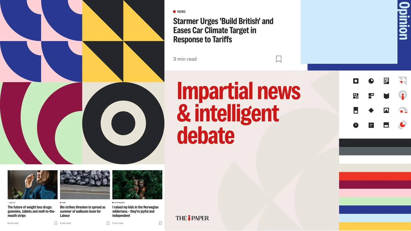
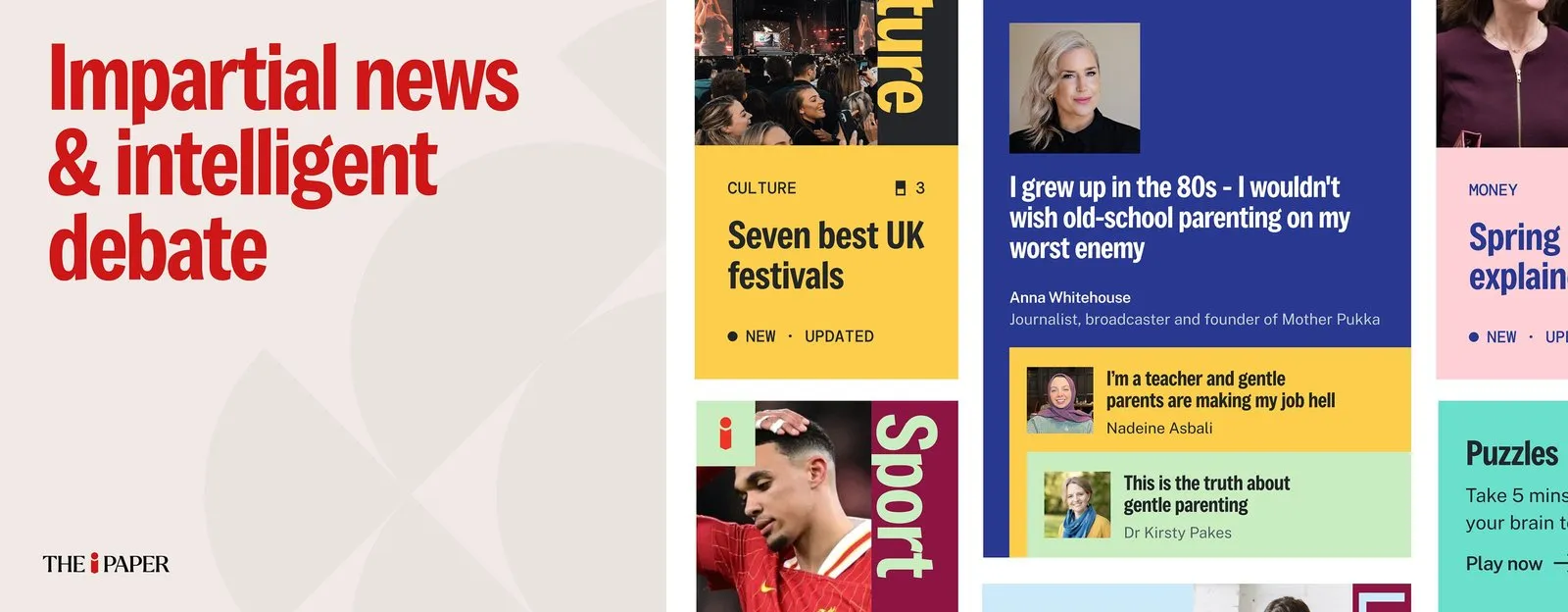
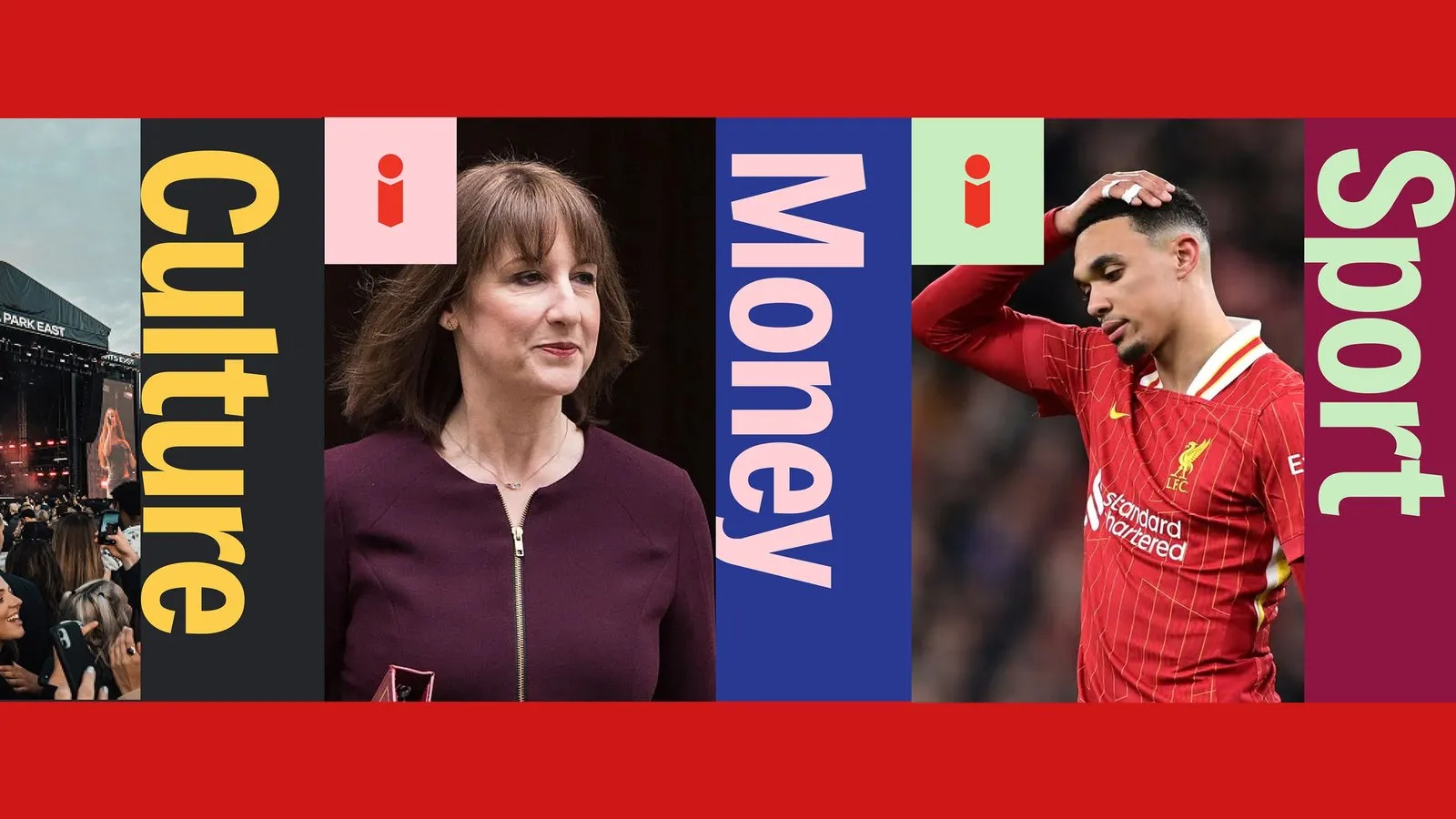
Color serves as an amazingly intuitive tool for section navigation here: Culture pops in yellow against ink black, Money rocks pink over cobalt blue, and Sport pairs mint green with a deep burgundy red. Each category introduces itself with massive, vertically rotated typography that feels like a miniature poster. That signature red “i” acts as a steady visual anchor, tying everything together from the main masthead all the way to the app icon. Alongside these energetic bursts of color, the core reading interface stays delightfully calm and relaxed, balanced by clean geometric patterns, functional iconography, and article cards complete with estimated read times.
The typography in this project does some serious heavy lifting. Headlines feature a robust grotesque font that conveys the authority and weight of a classic print front page. Right alongside, the vintage serif masthead “THE i PAPER”—complete with its iconic red “i”—adds a subtle nod to traditional newsprint heritage. Massive vertical category labels drive the main navigation, while smaller functional bits like NEW and UPDATED tags, along with read times, stay subtle and understated in soft, muted greys.
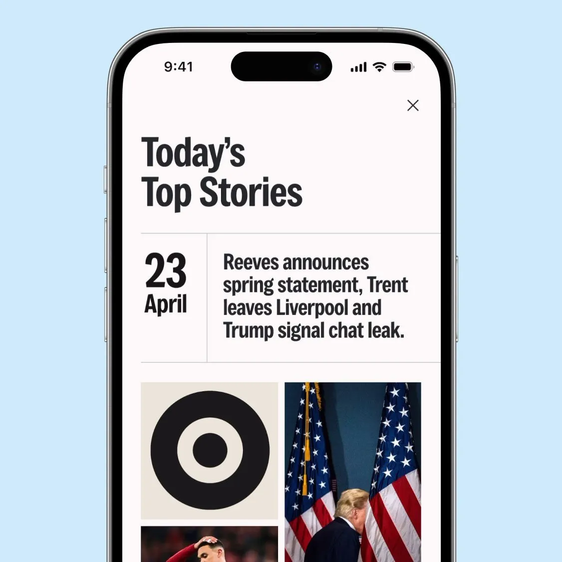
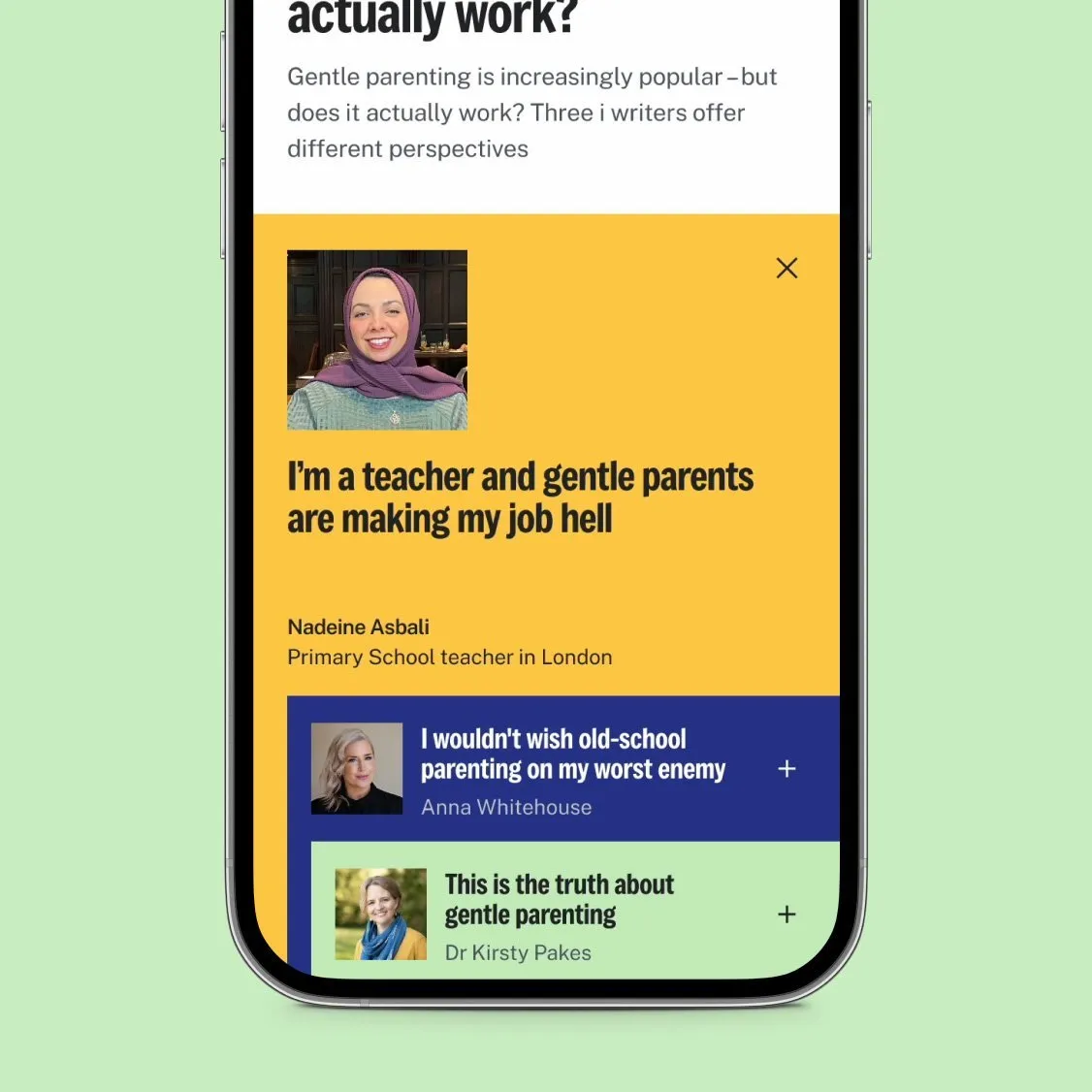
The mobile grid system is super neat, organizing article feeds into a clean single column. The “Today’s Top Stories” screen pairs oversized date numbers with sleek article titles, while the Opinion section features a distinctive vertical spine running alongside the story columns. It is editorial design thinking translated flawlessly onto a smartphone screen.
Rather than just delivering high-level concepts, ustwo handed over a comprehensive toolkit in just 15 weeks of close collaboration with the paper’s production team. The delivery package included brand positioning, a tone of voice framework, a full Figma UI kit, interactive prototypes, plus custom email and social media templates. Today, the fresh design is already live on the homepage, the Shorts feature has rolled out, and the Perspectives section is currently in live testing. To top it off, this project earned The i Paper seven nominations at the Press Awards! The full case study is available at ustwo.com/work/the-i-paper/.
Tái thiết kế trải nghiệm số cho The i Paper: Đưa tư duy báo in lên màn hình điện thoại
Hầu hết ứng dụng tin tức hiện nay đều trông khá giống nhau với giao diện xám xịt, đường link xanh và banner tin nóng màu đỏ. Nhưng khi bắt tay tái thiết kế trải nghiệm số cho The i Paper, studio ustwo đã chọn một hướng đi hoàn toàn khác. Họ xây dựng hệ thống thị giác dựa trên đúng lời hứa biên tập của tờ báo: “tin tức khách quan và tranh luận thông minh” với phong cách chủ đạo lấy từ font grotesque sắc đỏ rực rỡ.
Màu sắc được dùng làm công cụ phân loại chuyên mục vô cùng trực quan: Culture mang sắc vàng trên nền mực, Money khoác áo hồng trên xanh cobalt, Sport nổi bật với xanh mint trên đỏ burgundy, và mỗi chuyên mục đều tự giới thiệu bằng dòng chữ xoay dọc cỡ lớn như một bức poster. Chữ “i” màu đỏ đóng vai trò điểm neo xuyên suốt từ masthead cho đến biểu tượng ứng dụng. Bên cạnh các mảng màu rực rỡ là bề mặt đọc tin thư thái, kết hợp cùng họa tiết hình học, bộ icon thực dụng và các thẻ bài viết có đính kèm thời gian đọc.
Phần typography ở đây làm việc vô cùng hiệu quả. Tiêu đề sử dụng font grotesque cứng cáp, tạo cảm giác trịch thượng và trang trọng như trang nhất của một tờ báo in. Ngay bên cạnh là masthead dạng serif cổ điển “THE i PAPER” với chữ “i” đỏ đặc trưng, đóng vai trò như một nét chấm phá cổ điển giữ lại chất báo giấy truyền thống. Nhãn chuyên mục được xoay dọc với kích thước khổng lồ để làm nhiệm vụ điều hướng. Trong khi đó, các yếu tố chức năng nhỏ hơn như nhãn NEW, UPDATED hay thời gian đọc đều giữ sự tiết chế với sắc xám nhẹ nhàng.
Hệ thống lưới được tối ưu cho di động với danh sách bài viết xếp thành một cột đơn gọn gàng. Màn hình “Today’s Top Stories” kết hợp số ngày kích thước lớn cùng tiêu đề bài viết, còn trang Opinion lại sở hữu một đường cột sống chạy dọc bên cạnh các cột bài viết. Đây chính là tư duy thiết kế xuất bản được ứng dụng khéo léo trên màn hình điện thoại.
ustwo không chỉ đưa ra ý tưởng suông mà bàn giao hẳn một toolkit hoàn chỉnh chỉ trong 15 tuần làm việc cùng đội ngũ sản xuất của tờ báo. Bộ tài liệu bao gồm định hướng thương hiệu, khung giọng văn, bộ UI kit trên Figma, các bản prototype cùng mẫu email và template mạng xã hội. Hiện tại, diện mạo mới đã lên sóng ở trang chủ, tính năng Shorts đã ra mắt và mục Perspectives đang được thử nghiệm thực tế. Dự án này còn mang về cho The i Paper 7 đề cử tại giải thưởng Press Awards. Chi tiết case study đầy đủ có tại ustwo.com/work/the-i-paper/.