Masthead Zine: A Typography Masterclass in 1960s–70s Chicano Newspaper Logos The very first thing that jumps out about this zine is its incredible restraint. Printed in a single striking shade of vermilion red on warm cream paper, the design lets pure typography take center stage. Right on the cover, the letters M-A-S-T-H-E-A-D stack together in an eclectic mix of historical styles: a bold Victorian M, a circus-inspired slanted A, a blackletter-flavored S, and a playful hand-lettered h with a swirly tail.
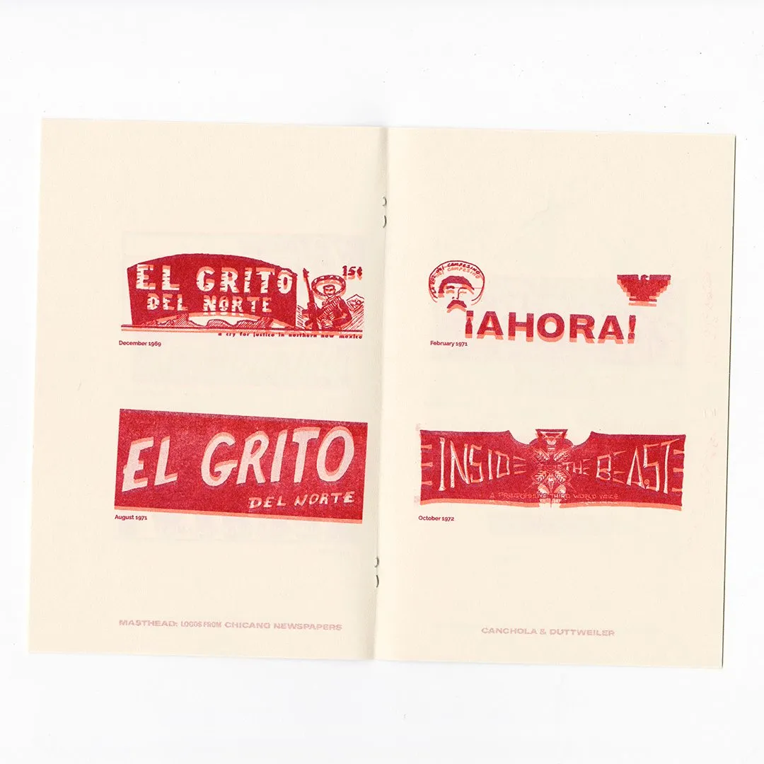
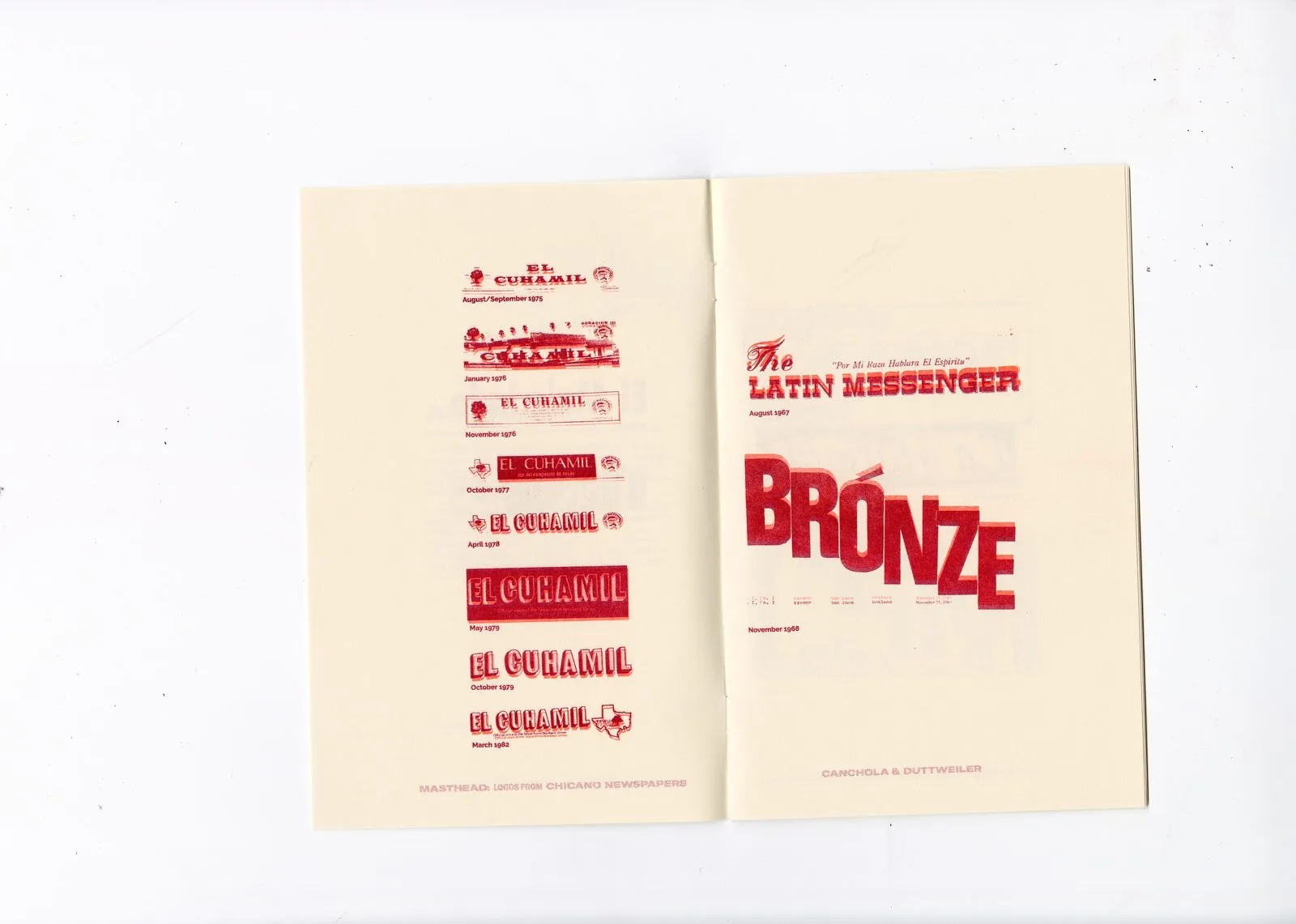
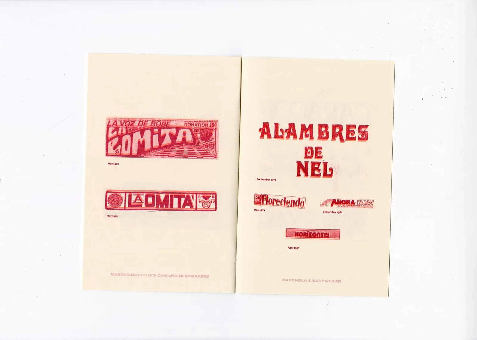
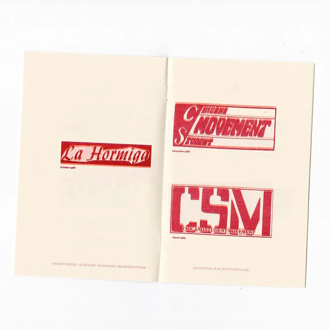
Co-designed by Alexandria Canchola and Joshua Duttweiler, this publication functions as a gorgeous archive of mastheads from Chicano newspapers of the 1960s and 1970s. Inside, each two-page spread treats these newspaper headers like prized design specimens, categorizing them publication by publication with tiny dates below so viewers can trace how each logo evolved over time.
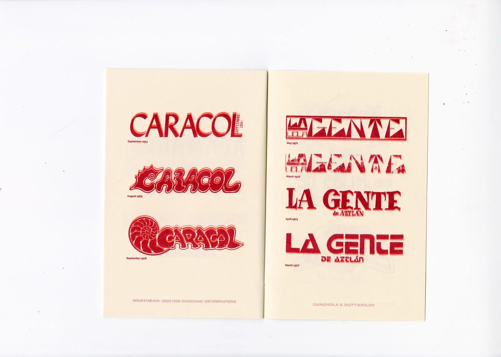
Take the logo sequence for EL CUHAMIL from 1971 to 1983, which transformed from a compact framed thumbnail into a bold, full-bleed white-on-red slab treatment. Meanwhile, CARACOL lived three distinct visual lives: starting with a refined serif, shifting into a groovy psychedelic bubble letterform, and ultimately settling into a nautilus shell artwork with the title nested inside. Even though the red ink stays constant throughout, every single design overflows with its own distinct personality.
Designing a newspaper masthead requires serious visual weight—it needs to pop off a busy page and stay instantly recognizable even when partially covered. The Chicano press mastered this art form by seamlessly blending lettering with illustration, drawing inspiration from post-Mexican Revolution art, Indigenous motifs, colonial Rococo, Victorian display type, Aztec-inspired Art Deco, Mexican street sign painting, calligraphy, and woodcut techniques. These vibrant influences shine through in the dynamic zigzags of LA GENTE, the medieval woodcut vibe of AHORA, and the majestic eagle perched over a ribbon banner in INSIDE THE BEAST.
The layout of Masthead Zine remains wonderfully minimal, utilizing generous white space and compact captions so the letterforms can be easily compared side by side. Printed at Current Press at Texas A&M University–Corpus Christi (where Joshua Duttweiler serves as an assistant professor of graphic design), it was released in a limited run of 100 copies in October 2022. The zine was distributed at the AIGA National Conference in Seattle, with the creators also featured at the PRINT 2026 event during Mexico Design Week. From every ink impression to the tactile cream paper, this project stands as a rich typographic legacy that truly deserves the spotlight.
Masthead Zine: Lớp học typography từ các logo báo chí Chicano thập niên 60 – 70
Ấn tượng đầu tiên mà cuốn zine này mang lại chính là sự tiết chế đầy tinh tế. Chỉ sử dụng duy nhất một tông màu đỏ vermilion trên nền giấy kem ấm áp, toàn bộ điểm nhấn thị giác đều nhường chỗ cho vẻ đẹp của chữ viết. Ngay ở phần bìa, các chữ cái M-A-S-T-H-E-A-D được xếp chồng lên nhau với hàng loạt phong cách từ nhiều thời kỳ: chữ M kiểu Victorian dày dặn, chữ A nghiêng nhẹ kiểu rạp xiếc, chữ S mang hơi hướng blackletter và chữ h viết tay tự do với phần đuôi uốn cong.
Ấn phẩm do Alexandria Canchola và Joshua Duttweiler hợp tác thiết kế, đóng vai trò như một kho lưu trữ lưu giữ lại các logo (masthead) từ những tờ báo Chicano trong thập niên 1960 và 1970. Bên trong cuốn zine, mỗi trang đôi phân loại các masthead theo từng tờ báo như những mẫu vật thiết kế, đi kèm ngày tháng nhỏ bên dưới để người xem theo dõi sự biến đổi của từng logo theo thời gian.
Ví dụ như chuỗi logo của tờ EL CUHAMIL từ năm 1971 đến 1983 đã dần biến đổi từ khung hình nhỏ gọn thành dạng slab white-on-red phủ tràn viền (full-bleed). Trong khi đó, tờ CARACOL trải qua ba diện mạo riêng biệt: bắt đầu bằng kiểu chữ serif chỉn chu, chuyển sang phong cách bubble-letter uốn lượn rực rỡ, rồi dừng lại ở hình ảnh vỏ ốc xà cừ chứa tên báo bên trong. Dù sắc đỏ xuyên suốt không thay đổi, mỗi thiết kế lại mang một cá tính riêng.
Thiết kế logo báo chí vốn đòi hỏi sức nặng thị giác đủ lớn để nổi bật trên một trang giấy nhiều chi tiết, đồng thời phải giữ được độ nhận diện ngay cả khi bị che khuất một phần. Báo chí Chicano thời kỳ đó đã kết hợp chữ viết và hình ảnh một cách khéo léo, lấy cảm hứng từ nghệ thuật hậu Cách mạng Mexico, họa tiết bản địa, phong cách Rococo thời thuộc địa, chữ trưng bày Victorian, art deco cảm hứng Aztec, chữ cọ phố phường Mexico, calligraphy và kỹ thuật khắc gỗ. Những nét đặc trưng này xuất hiện rõ nét qua các mảng zigzag của LA GENTE, phong cách trung cổ pha nét khắc gỗ của AHORA, hay biểu tượng chim ưng trải dài trên dải ruy-băng của INSIDE THE BEAST.
Bố cục của Masthead Zine được giữ tối giản với khoảng trống rộng rãi và chú thích nhỏ gọn để làm nổi bật sự so sánh giữa các đường nét chữ. Ấn phẩm được in ấn tại Current Press thuộc Đại học Texas A&M-Corpus Christi (nơi Joshua Duttweiler đang là trợ lý giáo sư ngành thiết kế đồ họa) với số lượng giới hạn 100 bản vào tháng 10 năm 2022. Cuốn zine từng được phân phối tại Hội nghị Quốc gia AIGA ở Seattle và tác giả cũng góp mặt tại sự kiện PRINT 2026 trong khuôn khổ Tuần lễ Thiết kế Mexico. Từng vết mực in và bề mặt giấy kem đều cho thấy đây là những di sản typography giá trị xứng đáng được ghi nhận.