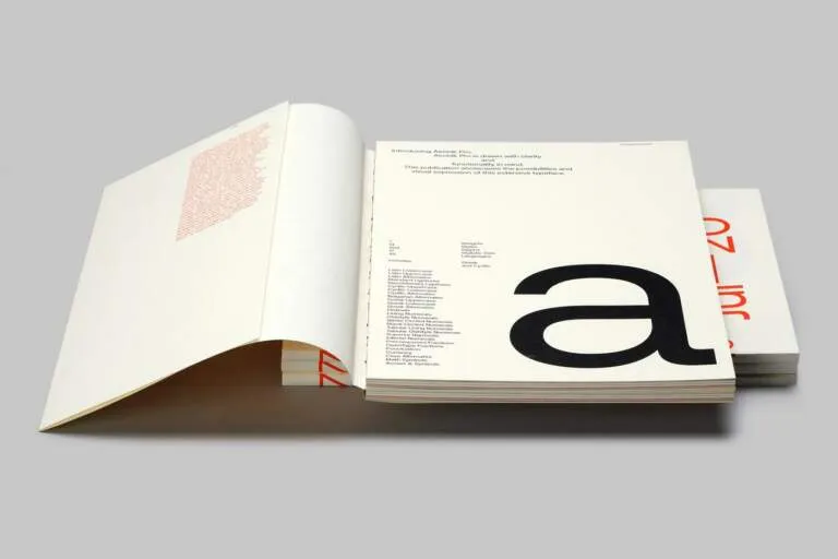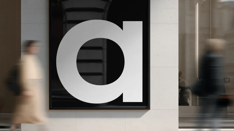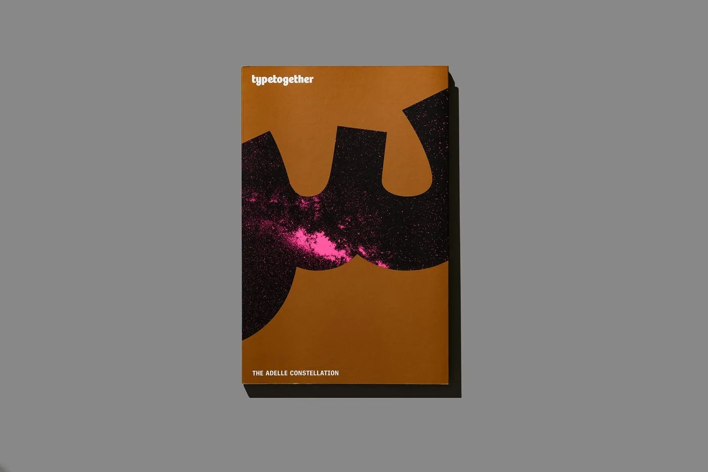
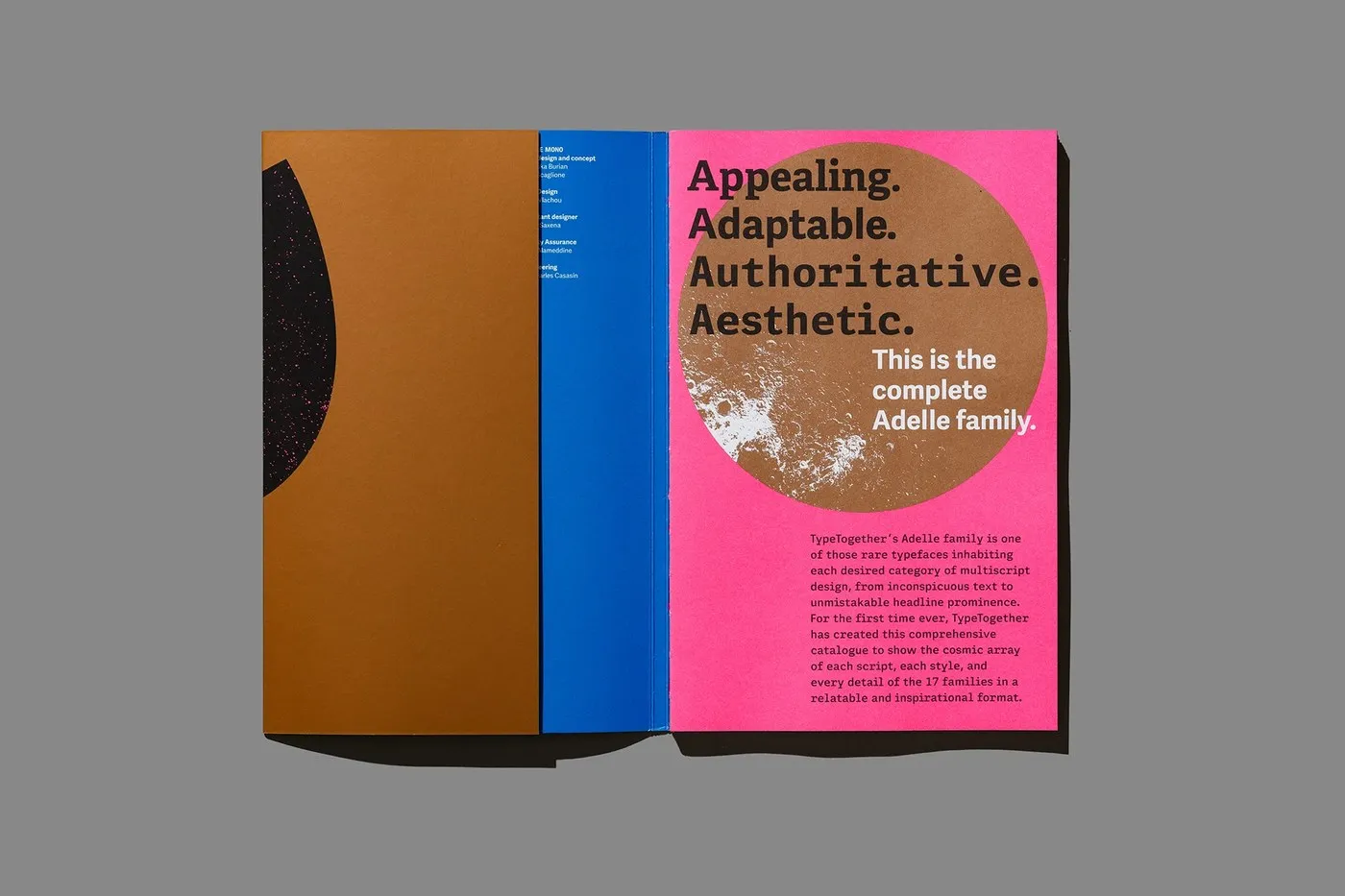
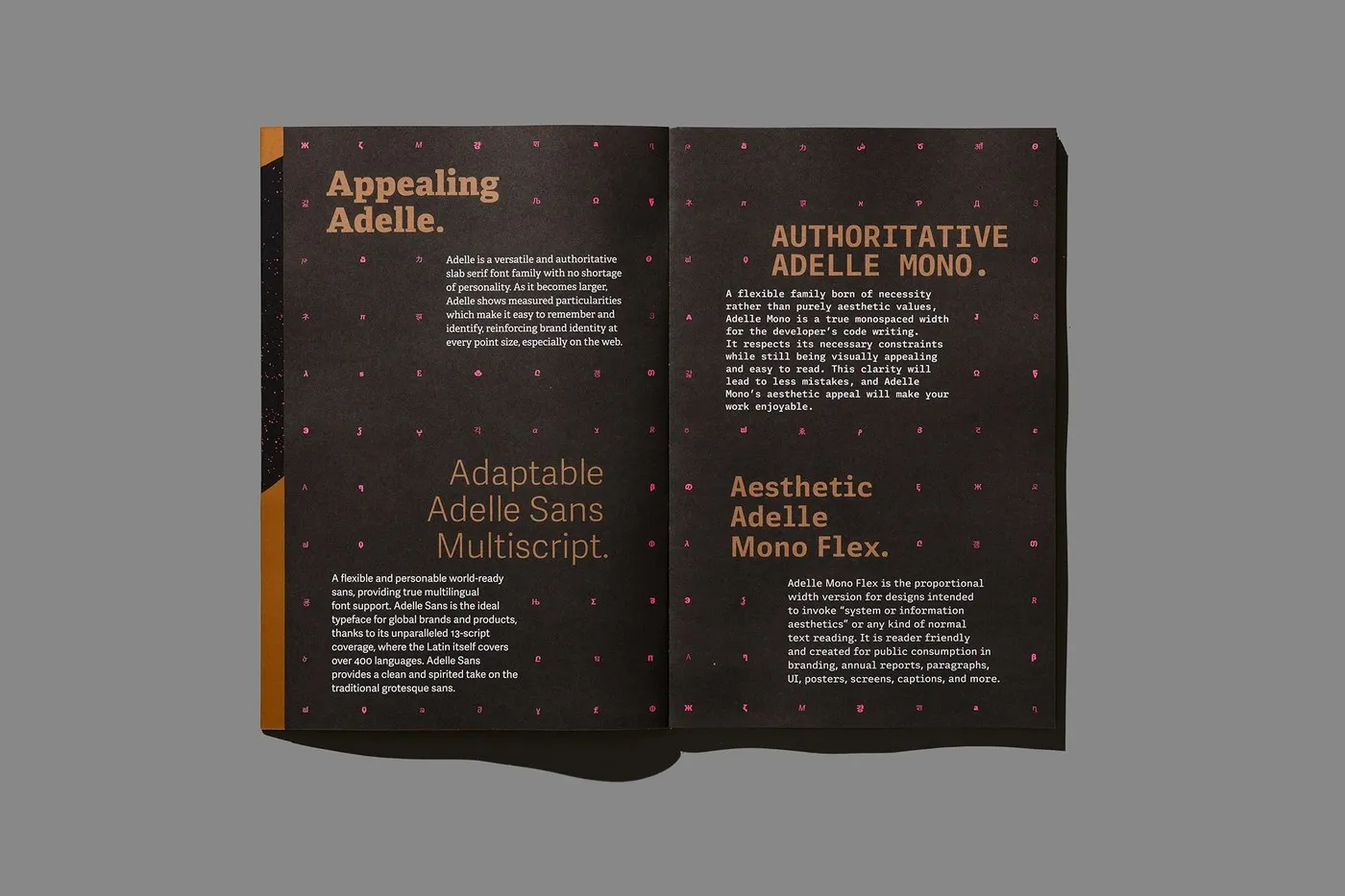
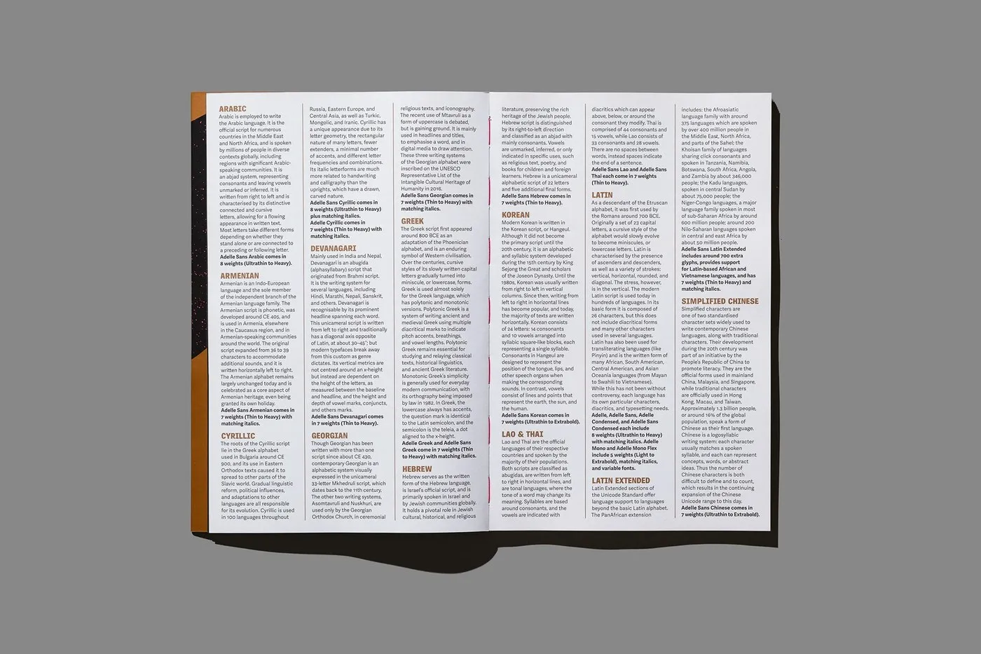
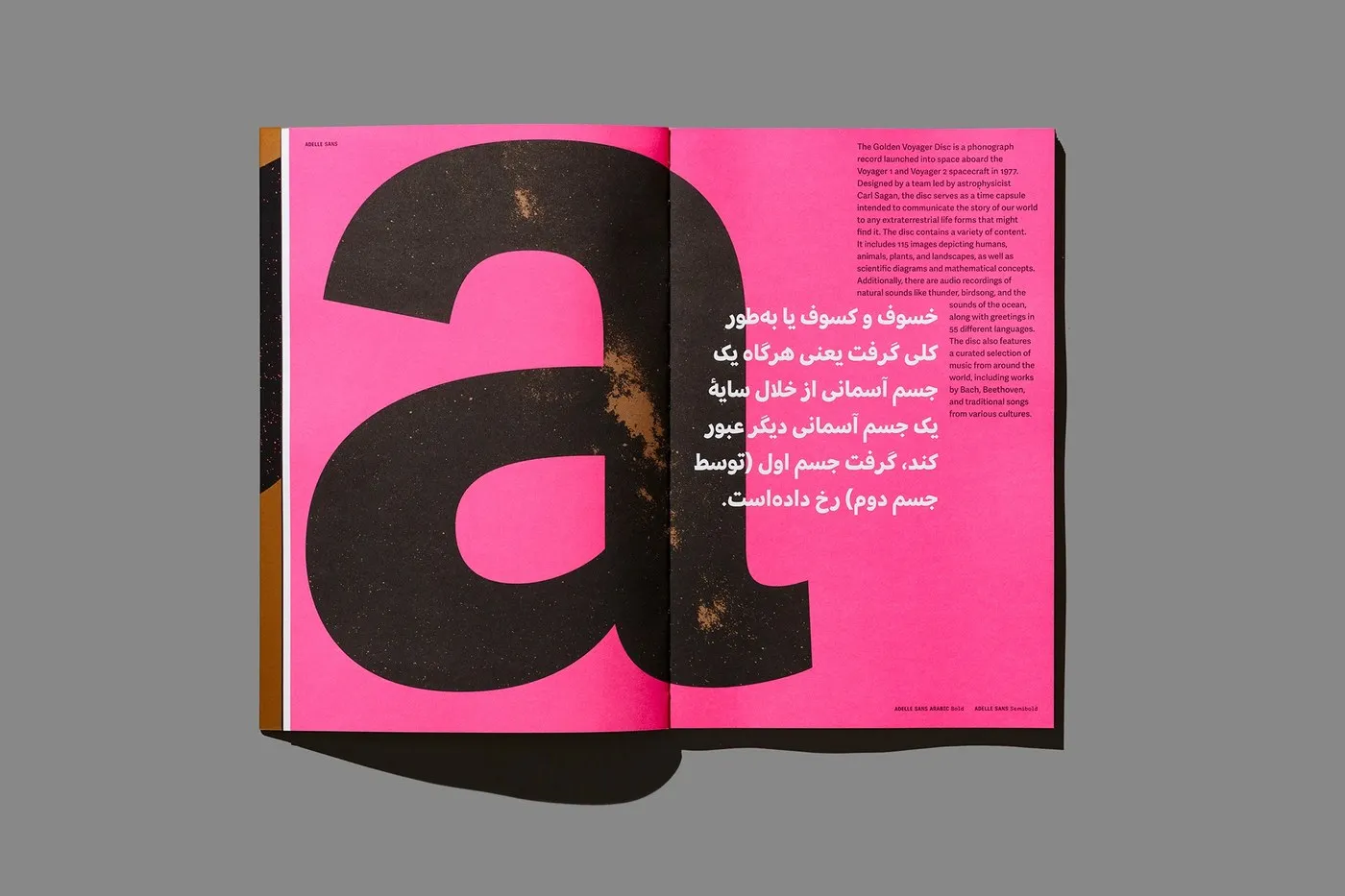
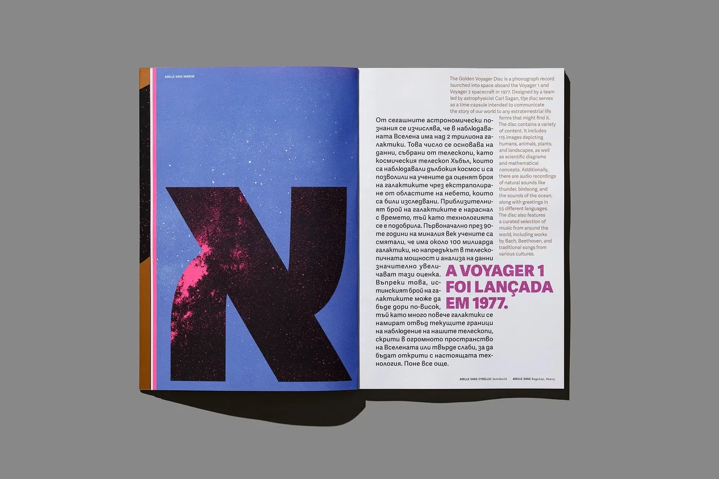
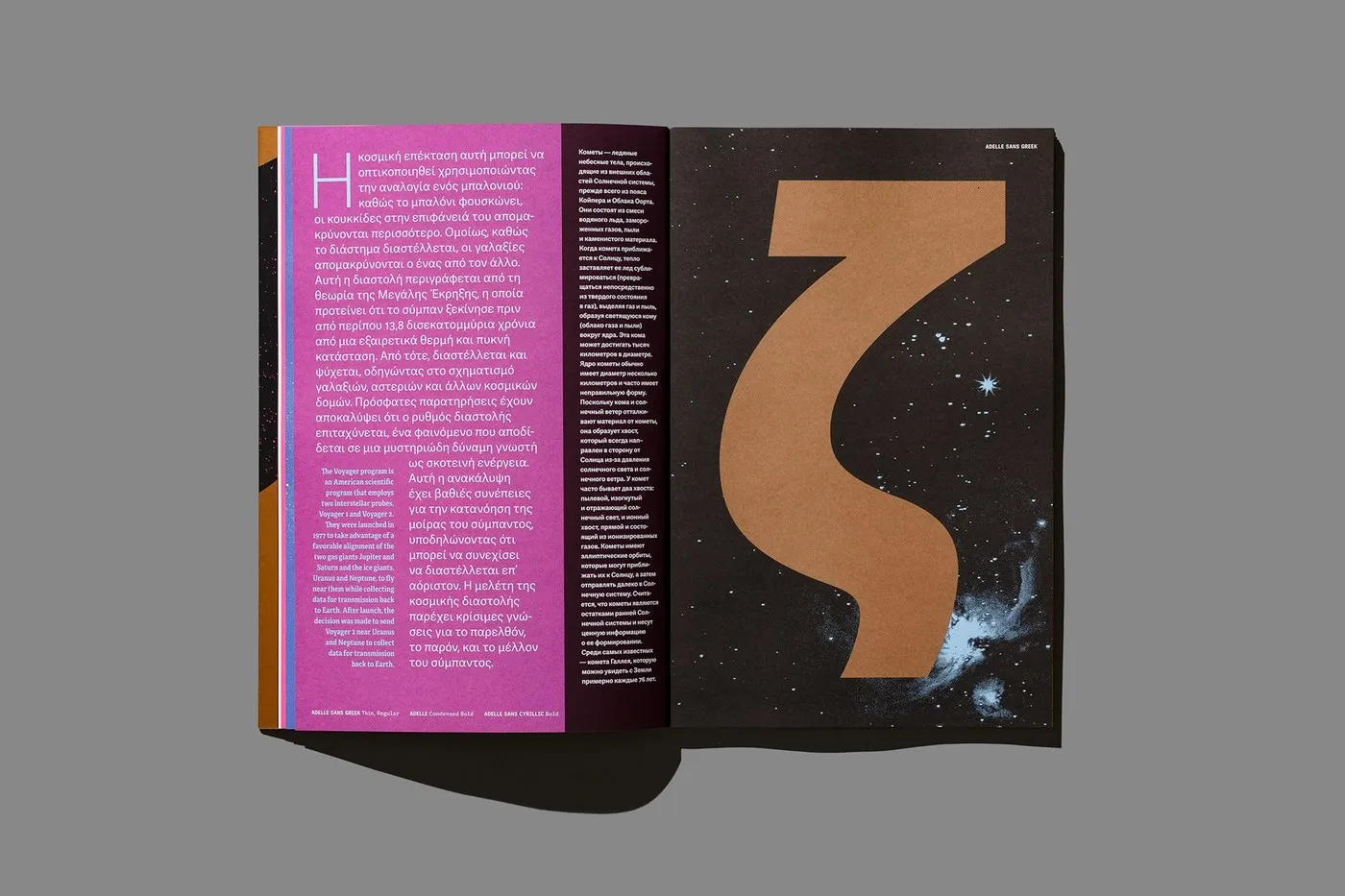
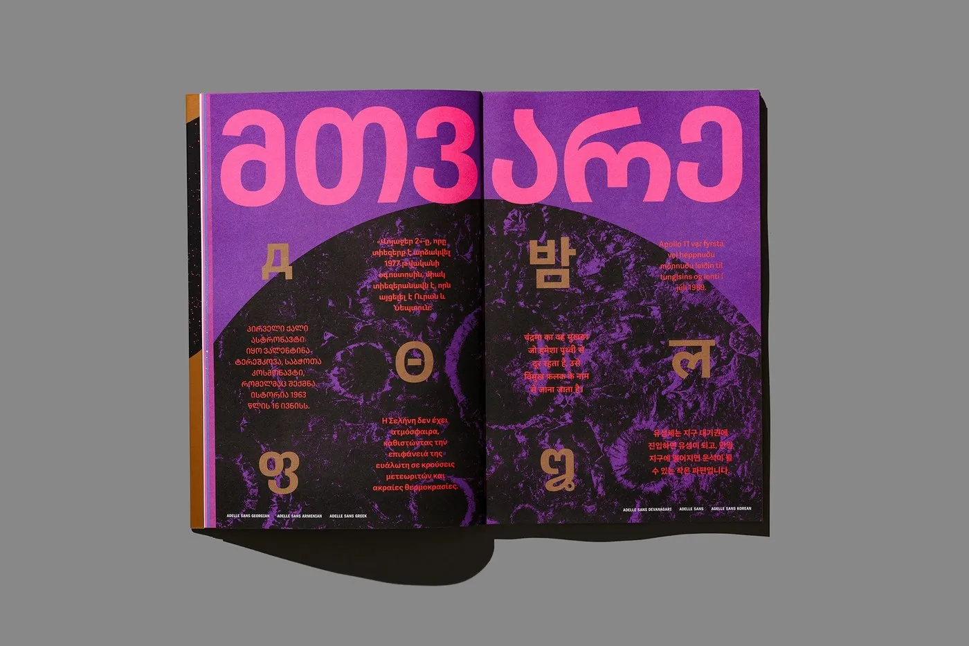
Exploring “The Adelle Constellation” Typographic Universe by Tereza Bettinardi Tereza Bettinardi’s project, “The Adelle Constellation,” is a stunning 64-page specimen book created for TypeTogether. For the very first time, the entire Adelle superfamily comes together in one gorgeous keepsake, showcasing all 17 font families and their multilingual systems—from Adelle Serif and Adelle Condensed to Adelle Sans, Adelle Mono, and Adelle Mono Flex. Spanning 13 different language scripts, the visual system maps out variable weights from ultrathin to heavy into a cosmic orbital grid. It’s a brilliant demonstration of how systematic typography runs smoothly across multiple languages and complex editorial hierarchies.
At the heart of this typographic masterpiece is a rock-solid layout grid that creates a unique orbital alignment for every script, character, and tiny glyph detail. By locking down strict margins and a super clean baseline grid, the letterforms, grid contrast, and letter-spacing completely drive the visual rhythm of the book. The scale contrast between the massive display headers, the body copy, and the fine metadata is perfectly calculated to keep structural harmony without feeling cluttered. Even with a ton of text packed into each page, everything stays beautifully crisp and readable.
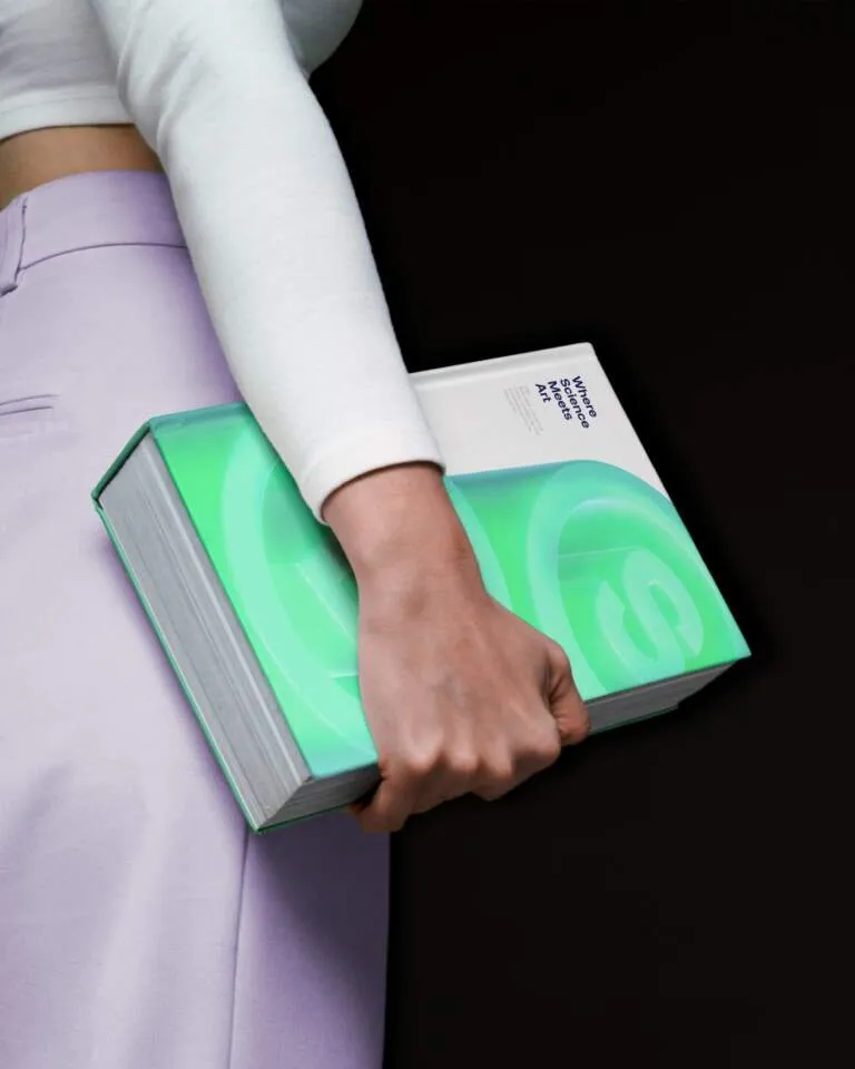
Beyond the layout, the binding details and paper selections use material contrast to turn highly technical typography into a pure work of visual art. Printed with four fluorescent neon spot colors combined with shimmering metallic Pantone inks, every single page pops with intense contrast between vibrant highlights, iridescent gradients, and deep, rich blacks. Choosing a thick, textured fine art paper adds an amazing tactile feel, making sure the ink density, paper grain, and printing techniques hit the absolute highest quality. This meticulous attention to production materials sets a whole new benchmark for modern catalogue design and book production.
Explore the full project on www.behance.net/gallery/252670921/The-Adelle-Constellation-2025.
Vũ trụ chữ Adelle Constellation qua bàn tay thiết kế của Tereza Bettinardi
Dự án mang tên “The Adelle Constellation” của nhà thiết kế Tereza Bettinardi là một ấn phẩm dày 64 trang được thực hiện cho TypeTogether. Đây là lần đầu tiên toàn bộ siêu họ phông chữ (superfamily) Adelle được quy tụ lại trong một tập tài liệu lưu niệm, giới thiệu trọn vẹn 17 font families cùng các hệ chữ đa ngôn ngữ từ Adelle Serif, Adelle Condensed cho đến Adelle Sans, Adelle Mono và Adelle Mono Flex. Trên nền 13 hệ ngôn ngữ, hệ thống thị giác sắp xếp các độ dày phông chữ (variable weights) từ siêu mảnh (ultrathin) đến siêu dày (heavy) thành một lưới quỹ đạo không gian, thể hiện cách typography hệ thống vận hành mượt mà trên nhiều ngôn ngữ và cấu trúc phân cấp biên tập phức tạp.
Nền tảng của thiết kế chữ này là một hệ thống lưới (layout grid) chặt chẽ, tạo ra sự căn chỉnh quỹ đạo riêng biệt cho từng hệ chữ, ký tự và chi tiết glyph. Bằng cách thiết lập các khoảng lề nghiêm ngặt và hệ thống baseline grid rõ ràng, Tereza Bettinardi đã để hình khối của chữ, độ tương phản lưới và khoảng cách ký tự (letter-spacing) dẫn dắt nhịp điệu thị giác cho toàn bộ ấn phẩm. Sự tương phản về tỷ lệ giữa tiêu đề lớn (display headers), nội dung chính (body copy) và các phần thông tin phụ (metadata) được tính toán kỹ để duy trì sự hài hòa cấu trúc mà không bị rối mắt. Nhờ vậy, các trang sách dù chứa mật độ thông tin chữ dày đặc vẫn hiển thị rất rõ ràng.
Bên cạnh bố cục trên trang, các chi tiết đóng gáy và mẫu thử giấy cũng tận dụng sự tương phản chất liệu để biến typography kỹ thuật thành một tác phẩm nghệ thuật thị giác. Được in bằng 4 màu mực neon phản quang (fluorescent spot colors) kết hợp cùng mực kim loại Pantone lấp lánh, mỗi trang sách đều mang lại sự tương phản mạnh mẽ giữa các điểm nhấn rực rỡ, hiệu ứng chuyển màu ánh kim và các khối chữ đen sâu thẳm. Việc lựa chọn chất liệu giấy mỹ thuật dày, có vân bề mặt giúp tăng cảm giác chân thực khi cầm nắm, đảm bảo mật độ mực in, thớ giấy và kỹ thuật in ấn đều đạt hiệu quả cao nhất. Cách xử lý chất liệu kỹ lưỡng này đặt ra một tiêu chuẩn chất lượng cao cho việc thiết kế catalogue biên tập và sản xuất sách hiện đại.
Người xem có thể tham khảo toàn bộ dự án này của www.behance.net/gallery/252670921/The-Adelle-Constellation-2025 trên Behance.
Nguồn: abduzeedo.com