Plau Design and Greco Drop Grecotipo, a Super Versatile 32-Font Superfamily When Brazilian design studio Greco needed a unified voice that could rock both physical spaces and digital screens, they teamed up with Rio-based type foundry Plau Design to craft Grecotipo. Led by typographers Rodrigo Saiani and Carlos Mignot, this project sets out to hit that sweet spot right where tactile print meets digital experience. Instead of taking the usual route with cold, rigid corporate grotesques, Grecotipo brings a welcoming warmth thanks to its soft, inviting inner curves.
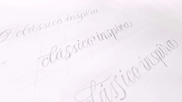
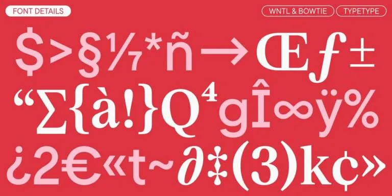
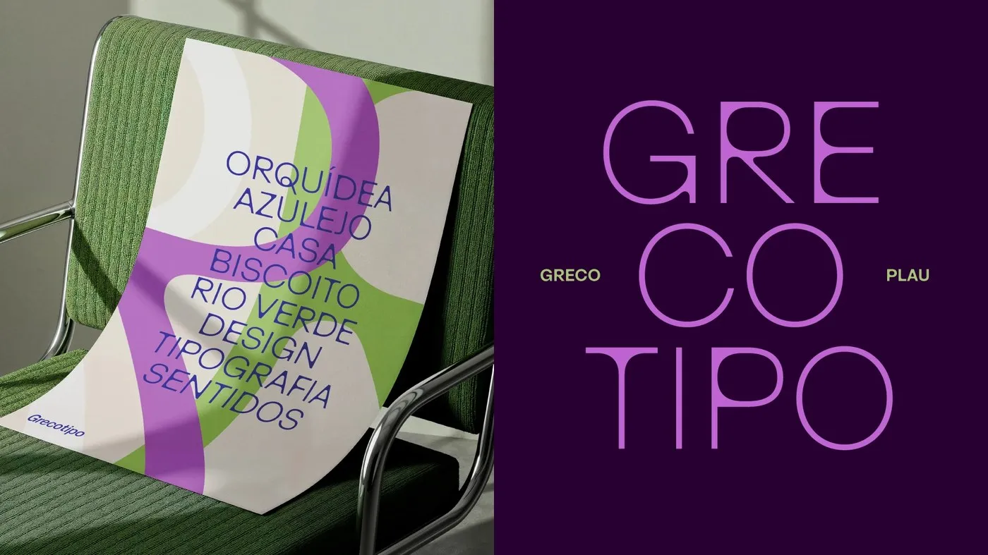
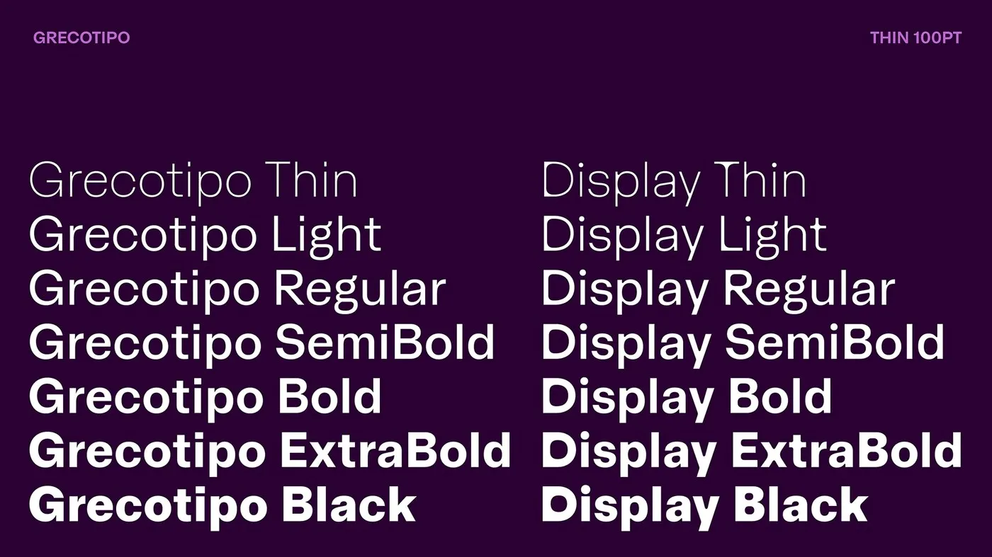
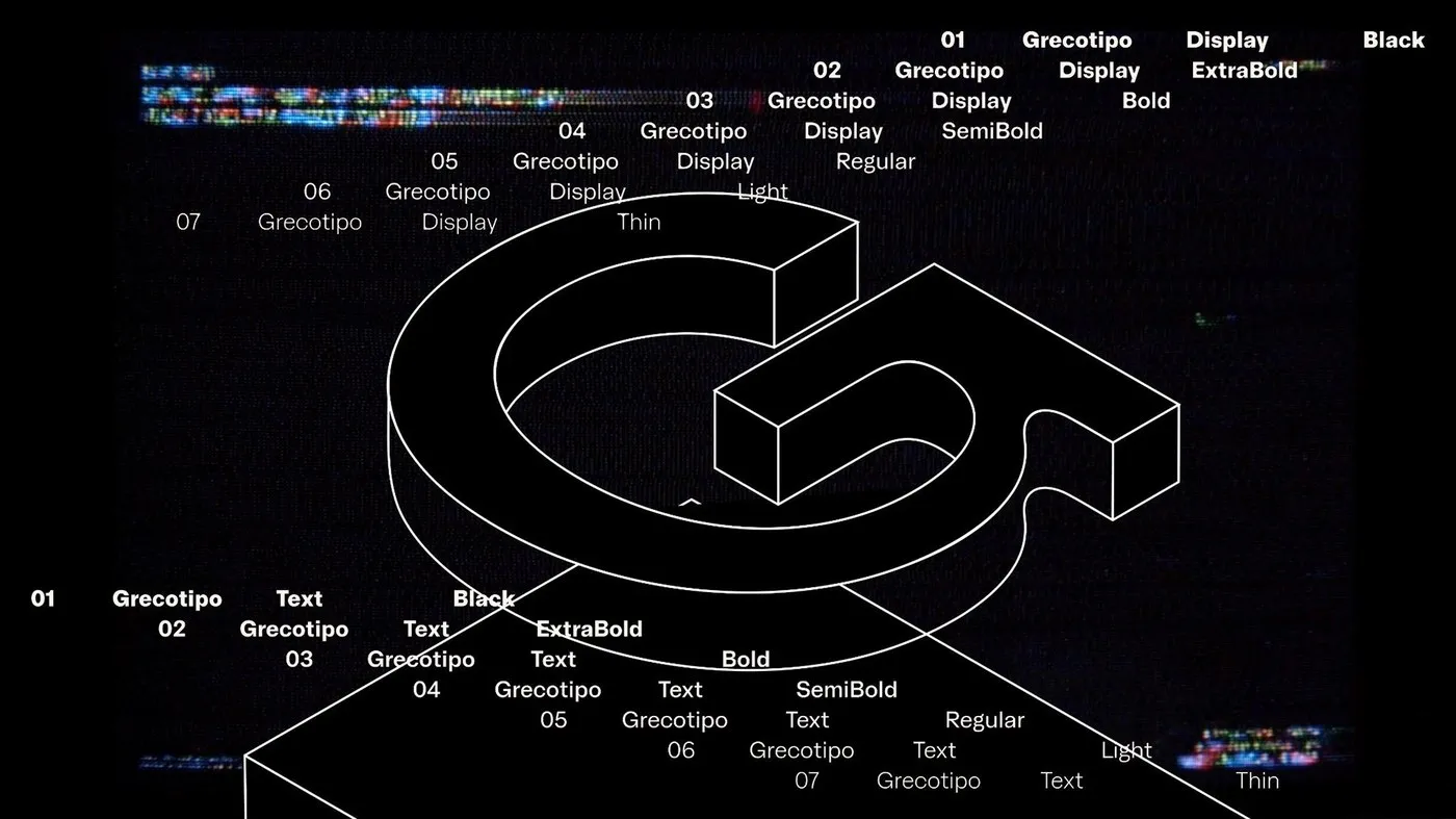
The family packs eight distinct weights, spanning all the way from Thin to Black, each paired with matching italics to round out a massive 32-font lineup. That versatile setup makes tackling complex layouts a breeze for any designer. The system is built around two core vibes: Normal and Display. The Display cut turns heads with rounded inner counters that pop against flat outer stems, while the Normal cut sticks to a classic grotesque skeleton for crystal-clear readability across long body text. Both styles share quirky, cohesive details—like a lowercase “g” featuring a sculpted bridge and a stylized lower loop.
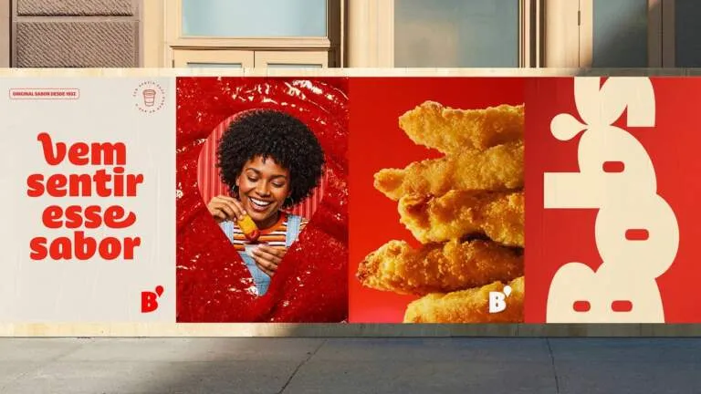
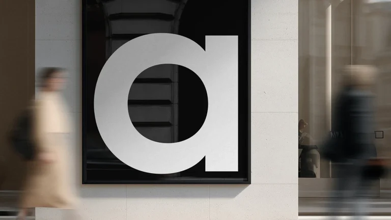
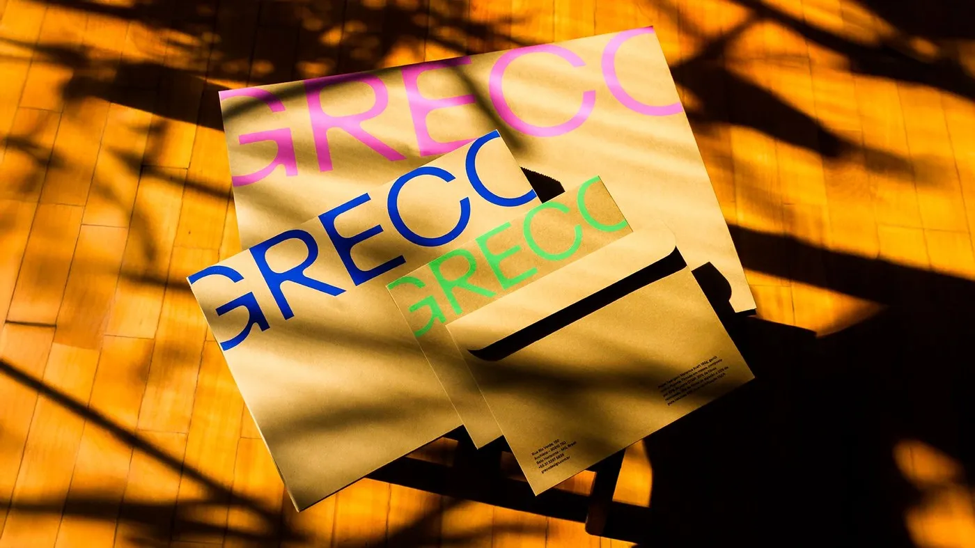
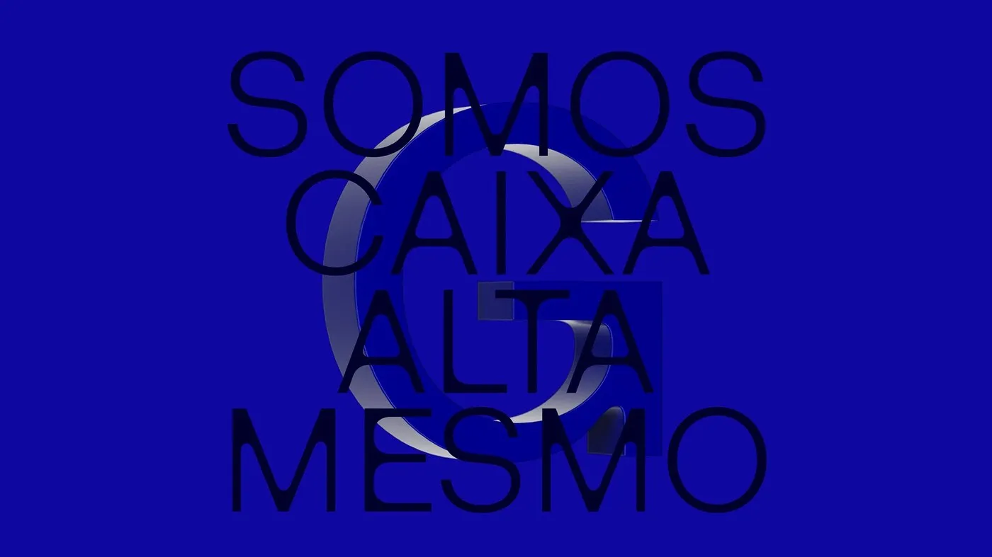
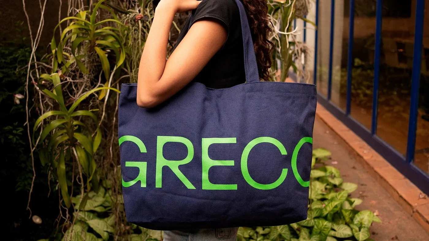
Plau and Greco put this variable font system through its paces across both tangible products and digital media. Physical stationery comes alive on Fedrigoni Materica Kraft paper, splashed with vibrant neon pink, deep blue, and lime green inks. Bold Black cuts make a heavy statement on canvas tote bags, whereas the delicate Thin styles shine on large-format prints and exhibition posters. Over on the screen side, smooth variable sliders and motion videos demonstrate just how effortlessly these glyphs morph in real time.
Check out the full project on www.behance.net/gallery/245613111/Grecotipo.
Plau Design và Greco trình làng bộ font Grecotipo với 32 kiểu chữ đa năng
Khi xưởng thiết kế Greco tại Brazil cần một tiếng nói rõ ràng cho cả không gian thực tế lẫn màn hình kỹ thuật số, họ đã bắt tay cùng type foundry Plau Design ở Rio để tạo nên bộ font Grecotipo. Dự án do hai typographer Rodrigo Saiani và Carlos Mignot dẫn dắt, cùng tìm kiếm điểm giao thoa giữa chất liệu in ấn và trải nghiệm số. Thay vì đi theo lối mòn của các bộ chữ corporate grotesque vốn dễ mang lại cảm giác lạnh lẽo, Grecotipo tạo nét ấm áp nhờ những đường cong mềm mại ở phần nét trong.
Hệ thống chữ này gồm 8 trọng lượng (weight) từ Thin cho đến Black cùng các bản nghiêng (italics) tương ứng, tạo nên tổng cộng 32 font chữ riêng biệt. Cấu trúc này giúp người làm thiết kế dễ dàng làm chủ các bố cục phức tạp. Hệ thống được chia thành hai phong cách chính: Normal và Display. Phiên bản Display gây ấn tượng với phần inner counter được bo tròn, tạo độ tương phản mạnh với các nét đứng phẳng bên ngoài. Trong khi đó, bản Normal giữ khung nét grotesque cổ điển để mang lại độ sắc nét cho các đoạn văn bản dài. Cả hai phong cách đều chia sẻ những nét đặc trưng đồng bộ, tiêu biểu như chữ “g” thường có phần cầu nối dạng điêu khắc và vòng lặp bên dưới uốn cong cá tính.
Plau và Greco đã thử nghiệm hệ thống variable font này trên cả sản phẩm thực tế lẫn định dạng số. Bộ ấn phẩm văn phòng sử dụng giấy Fedrigoni Materica Kraft kết hợp với các gam mực hồng neon, xanh đậm và xanh chuối. Những nét chữ bản Black dày dặn xuất hiện nổi bật trên túi tote vải canvas, còn kiểu Thin mảnh mai lại dành riêng cho poster triển lãm và ảnh in khổ lớn. Song song đó, các thanh trượt biến đổi font cùng video chuyển động giúp người xem thấy rõ cách các glyph biến hình linh hoạt.
Có thể xem chi tiết dự án này của www.behance.net/gallery/245613111/Grecotipo trên Behance.