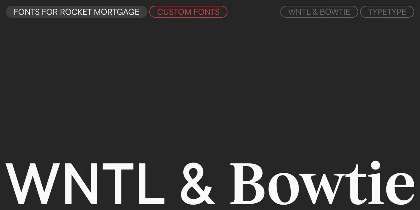
TypeType Foundry’s Rocket Dual-Type System: Digital Precision Meets Deep Meaning TypeType Foundry recently rolled out a custom dual-font system for Rocket, bringing together two distinct type families—the geometric sans WNTL and the transitional serif Bowtie. It’s a super seamless blend of two completely different design styles that come together into one beautifully cohesive brand identity.
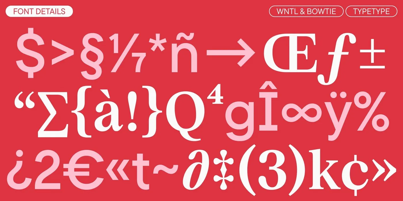
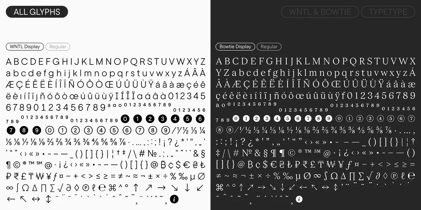

Looking closely at the duo, WNTL transforms TT CommonsTM Pro into a clean geometric sans with breezy open counters and flat terminals, giving off a super approachable and ultra-readable feel. On the flip side, Bowtie draws inspiration from TT Livret to deliver a classy, traditional serif look, complete with crisp serifs, high stroke contrast, and a strong vertical axis. Across the specimen designs, both families pop against a rich deep red backdrop accented with soft pink and clean white lettering. Every little detail—from currency symbols to circled numbers and directional arrows—was crafted to match seamlessly across both font lines.
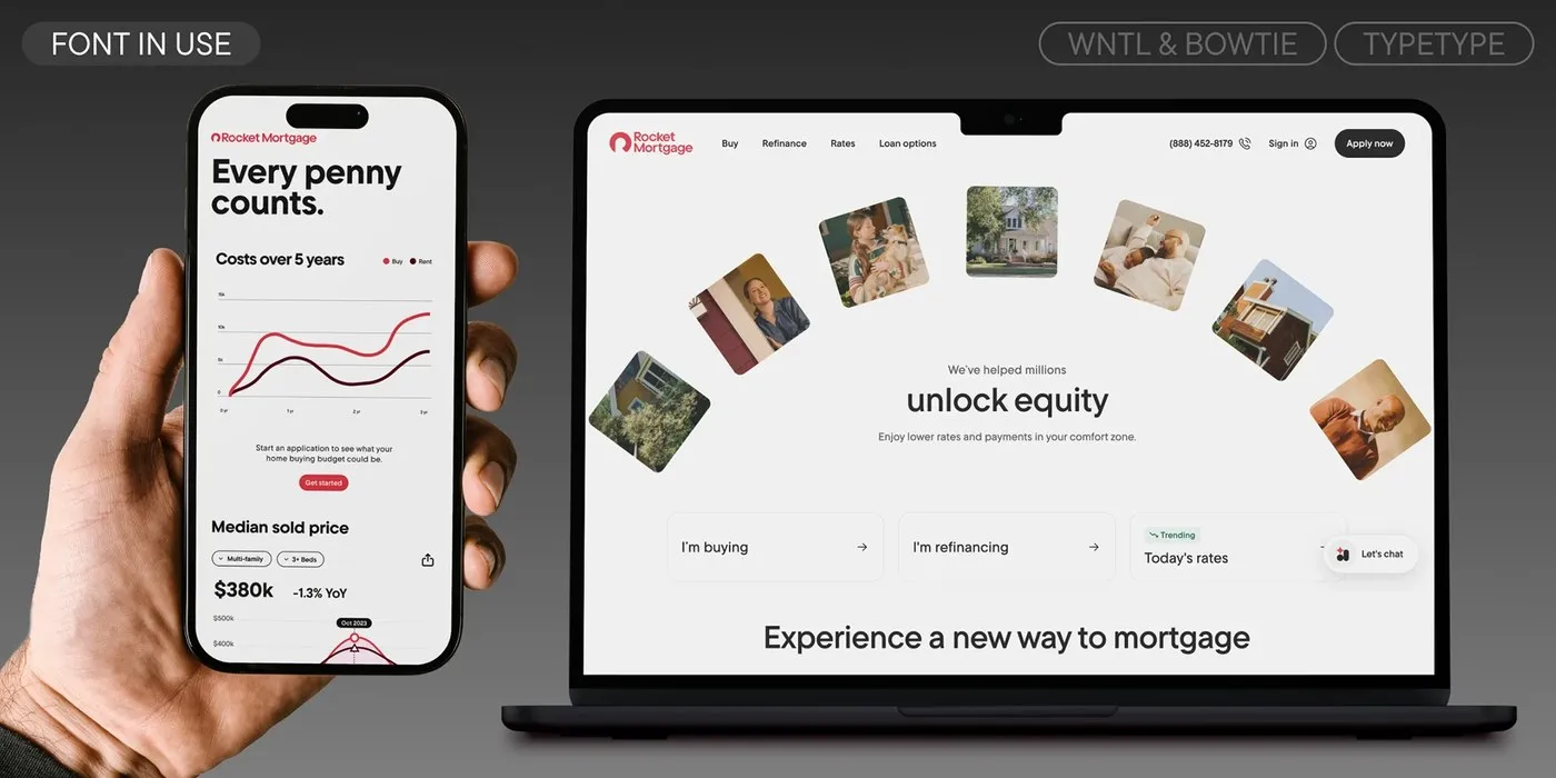
On the technical side, this system is finely tuned for digital screens. Technical Director Yuri Nakonechny and developer Victor Rubenko fine-tuned custom delta hints to keep every character crisp down to the pixel on digital interfaces. Inside the consumer lending app, WNTL Text handles the heavy lifting for payment charts, interest rate calculators, and data cards. Meanwhile, Bowtie Display shines at top-level layouts, taking charge of web editorial headlines. The system also features flexible optical cuts designed for everything from massive 175pt titles all the way down to 22pt text.
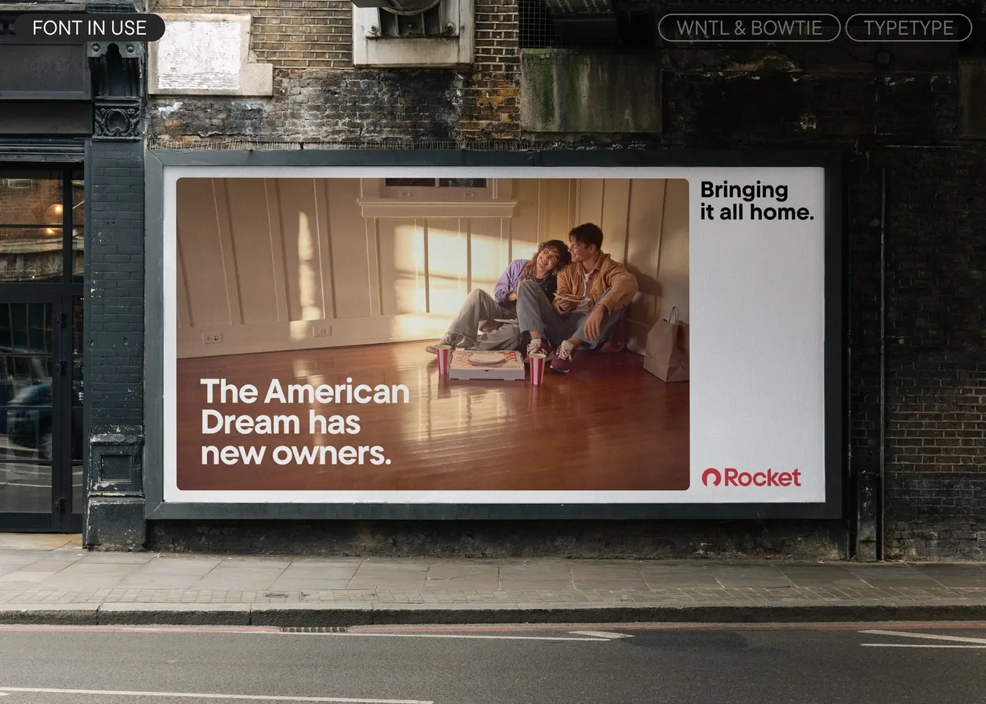
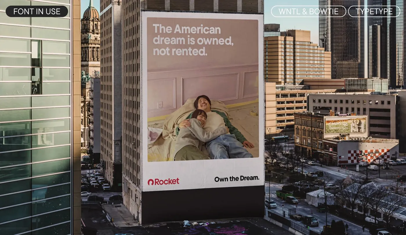
Beyond all the technical precision, there’s a deeply touching personal story woven right into the design. The names of both font families pay tribute to Nick Gilbert, the late son of the company’s founder. WNTL stands for Nick’s personal motto, “What’s Not To Like,” while Bowtie nods to his signature bow tie accessory. This heartfelt tribute travels right alongside the typography, lighting up street billboards and skyscrapers across Detroit.
Check out the full design breakdown over on www.behance.net/gallery/244893427/The-Hearth-and-The-Home-A-Type-System-for-Rocket.
Bộ Font Kép Rocket Của TypeType Foundry: Tối Ưu Kỹ Thuật Số Và Câu Chuyện Ý Nghĩa
TypeType Foundry vừa thiết kế một hệ thống font chữ kép dành riêng cho thương hiệu Rocket, kết hợp giữa phông geometric sans WNTL và phông transitional serif Bowtie. Hệ thống này kết hợp hai phong cách thiết kế riêng biệt thành một tổng thể hài hòa và đồng nhất.
Trong bộ đôi này, WNTL được tùy biến từ TT CommonsTM Pro thành một phông sans-serif hình học gọn gàng với khung chữ mở (open counters) và chân chữ phẳng, tạo cảm giác vô cùng gần gũi và dễ đọc. Ngược lại, Bowtie được phát triển từ TT Livret mang dáng vẻ serif cổ điển, sở hữu chân serif sắc nét, độ tương phản nét cao và trục đứng rõ rệt. Trên các bản thiết kế specimen, hai họ font xuất hiện nổi bật trên nền đỏ thẫm kết hợp điểm nhấn hồng nhạt và chữ trắng. Các chi tiết như ký hiệu tiền tệ, số khoanh tròn hay mũi tên chỉ hướng đều được thiết kế đồng bộ cho cả hai dòng font.
Về mặt kỹ thuật, thiết kế này được tối ưu kỹ lưỡng cho khả năng hiển thị trên màn hình. Giám đốc kỹ thuật Yuri Nakonechny cùng lập trình viên Victor Rubenko đã căn chỉnh custom delta hints để đảm bảo độ sắc nét tới từng pixel trên các giao diện kỹ thuật số. Trong ứng dụng vay tiêu dùng, WNTL Text chịu trách nhiệm hiển thị các biểu đồ thanh toán, công cụ tính lãi suất và thẻ dữ liệu. Còn Bowtie Display lại đảm nhận các tiêu đề báo chí trên nền tảng web. Hệ thống cũng phân chia các cấp độ kích thước quang học (optical cuts) linh hoạt từ tiêu đề lớn 175pt xuống tới cỡ chữ 22pt.
Bên cạnh yếu tố kỹ thuật, hệ thống typography này còn mang một câu chuyện cá nhân vô cùng xúc động. Tên gọi của hai họ font được đặt để tưởng nhớ Nick Gilbert, người con trai đã mất của nhà sáng lập công ty. WNTL được viết tắt từ câu châm ngôn sống của Nick – “What’s Not To Like”, trong khi Bowtie lấy cảm hứng từ chiếc nơ đeo cổ đặc trưng của anh. Thông điệp ý nghĩa này đồng hành cùng bộ font xuất hiện trên các biển quảng cáo đường phố và các tòa nhà chọc trời tại Detroit.
Chi tiết về dự án thiết kế chữ này có thể tham khảo tại www.behance.net/gallery/244893427/The-Hearth-and-The-Home-A-Type-System-for-Rocket trên Behance.