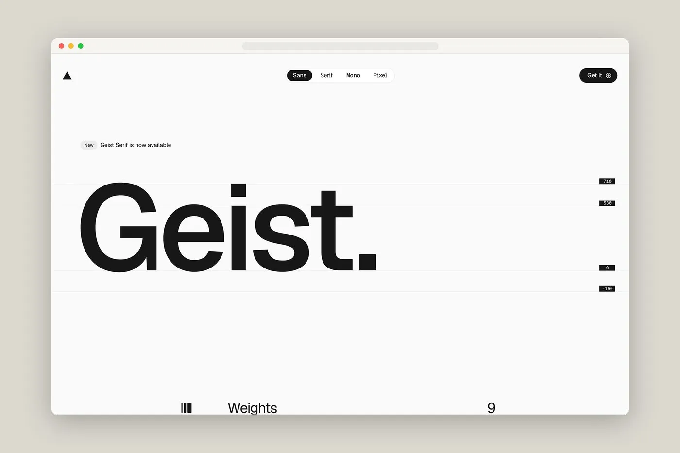
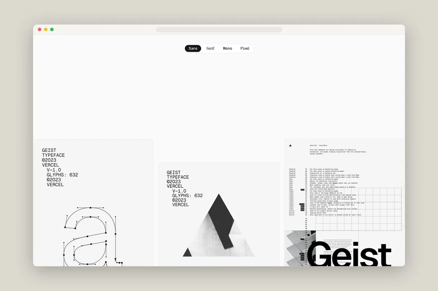
Vercel’s Geist Font Specimen: Where Swiss Style Meets Developer Typography Most type specimen sites out there tend to swing between two total extremes: either super plain—looking like a quick PDF-to-HTML export—or way too flashy, with crazy animations completely covering up the actual letterforms. Vercel totally flipped the script, though! For the Geist font specimen project, they created a sleek, ultra-responsive interactive lab that feels like having an actual design desk right in the browser. Developers and designers can dive right in to tweak font weights, zoom into glyph anchor points, and test out visual balance live on screen without any clutter getting in the way.
This typeface oozes classic mid-20th-century Swiss style, but tuned up perfectly for modern software interfaces. Vercel teamed up with Basement Studio to build Geist, starting out with a rock-solid monospace foundation before branching into crisp sans and serif variants. That methodical start is why every single character feels super snapped-in and locked to a precise technical grid.
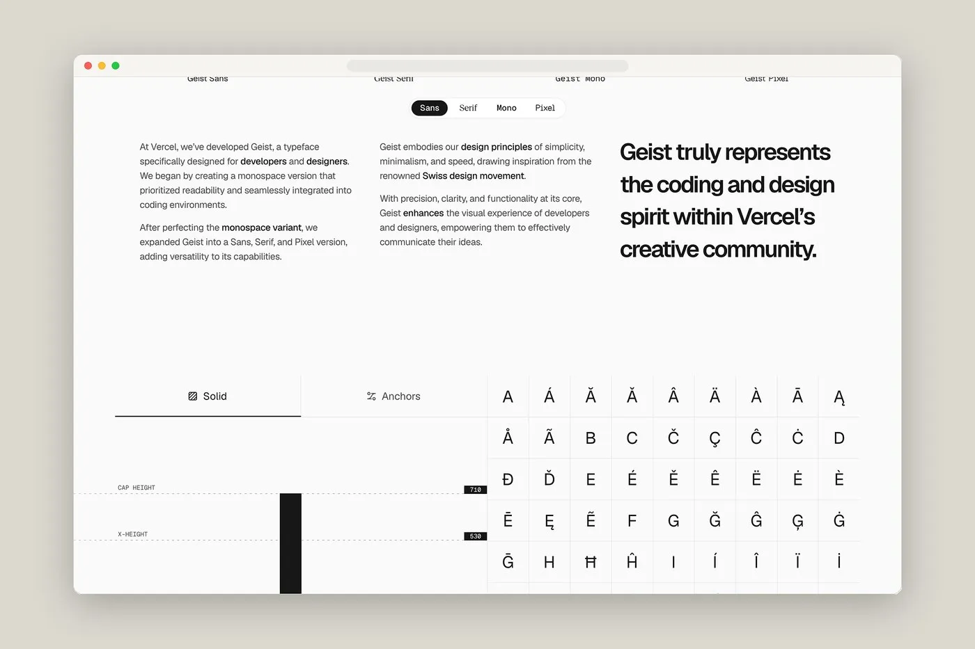
The Geist font family packs four main flavors: Sans, Serif, Mono, and Pixel. Every single variant is meticulously crafted across nine weights, running all the way from Thin to Ultra Black. It’s built to stay razor-sharp and legible in tiny code editors while packing plenty of punch for big headline text on news pages or articles. Over in the Mono build, punctuation and math symbols snap into strict geometric grids to keep code looking ultra-tidy. Meanwhile, the Serif flavor brings high-contrast strokes and sharp triangular serifs to add a touch of elegance to long-form text.
What makes this specimen site a real standout is how effortlessly it puts typographic anatomy on full display. Real-time metrics like cap height, baseline offset, and stylistic alternates sit right beside interactive controls. Anyone can slide through font weights, toggle Cyrillic glyphs, or inspect anchor points with smooth precision. Plus, the sleek dark theme keeps the spotlight focused entirely on the geometric shapes and rhythm of the letterforms.
Geist Font Specimen Từ Vercel: Khi Phong Cách Thụy Sĩ Gặp Phông Chữ Cho Developer
Hầu hết các trang web giới thiệu phông chữ (type specimen) hiện nay thường rơi vào hai trường cực đoan: một là nhìn đơn điệu chẳng khác gì file PDF chuyển sang HTML, hai là nhồi nhét quá nhiều hiệu ứng chuyển động làm che mất hình dáng của chữ. Nhưng Vercel thì hoàn toàn khác. Với dự án giới thiệu bộ phông Geist, họ đã biến trang web thành một phòng thí nghiệm tương tác cực kỳ gọn gàng và nhạy bén, hoạt động như một bàn thiết kế thực thụ ngay trên trình duyệt. Nhờ đó, các lập trình viên lẫn designer đều có thể thoải mái thử nghiệm độ dày nét chữ (weight), soi kỹ từng điểm anchor của glyph hay kiểm tra sự cân bằng thị giác trực tiếp trên màn hình mà không bị xao nhãng bởi chi tiết thừa.
Bộ font này mang đậm tinh thần của phong cách Thụy Sĩ giữa thế kỷ 20, nhưng được tinh chỉnh riêng cho các giao diện phần mềm hiện đại. Vercel đã hợp tác cùng Basement Studio để phát triển Geist, bắt đầu từ nền tảng monospace chuẩn chỉnh rồi mới mở rộng sang các biến thể sans và serif. Đó là lý do vì sao từng ký tự đều tạo cảm giác như được gắn chặt vào một hệ lưới kỹ thuật tỉ mỉ.
Hệ thống font Geist gồm 4 biến thể chính: Sans, Serif, Mono và Pixel. Mỗi biến thể lại được thiết kế tỉ mỉ với 9 cấp độ weight từ Thin cho đến Ultra Black. Thiết kế này vừa đảm bảo độ sắc nét, dễ đọc ở các kích thước chữ nhỏ trong trình biên dịch code, vừa giữ được thần thái mạnh mẽ khi làm tiêu đề cho các trang tin hay bài viết. Ở bản monospace, các dấu câu và ký tự toán học được xếp vào các lưới hình học nghiêm ngặt giúp cấu trúc code luôn ngăn nắp. Trong khi đó, biến thể serif sở hữu nét chữ tương phản cao cùng các phần chân chữ hình tam giác sắc sảo, mang lại nét tinh tế cho các đoạn văn bản dài.
Điểm làm nên sự ấn tượng của trang web này chính là cách giao diện phô diễn trực diện “giải phẫu” của chữ (typographic anatomy). Các chỉ số thời gian thực như cap height, baseline offset hay các biến thể kiểu dáng (stylistic alternates) đều hiển thị rõ ràng ngay bên cạnh các thẻ tương tác. Người dùng có thể kéo thanh chỉnh weight, bật tắt glyph tiếng Cyrillic hay soi từng điểm anchor một cách mượt mà. Tông màu tối chủ đạo giúp mọi sự chú ý được tập trung hoàn toàn vào hình khối hình học và nhịp điệu của đường nét.