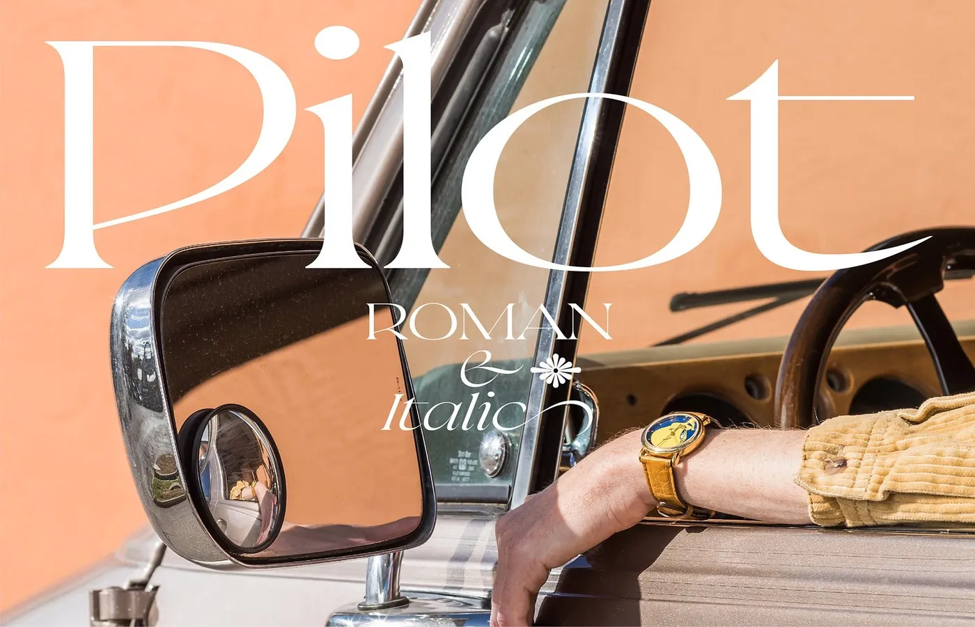
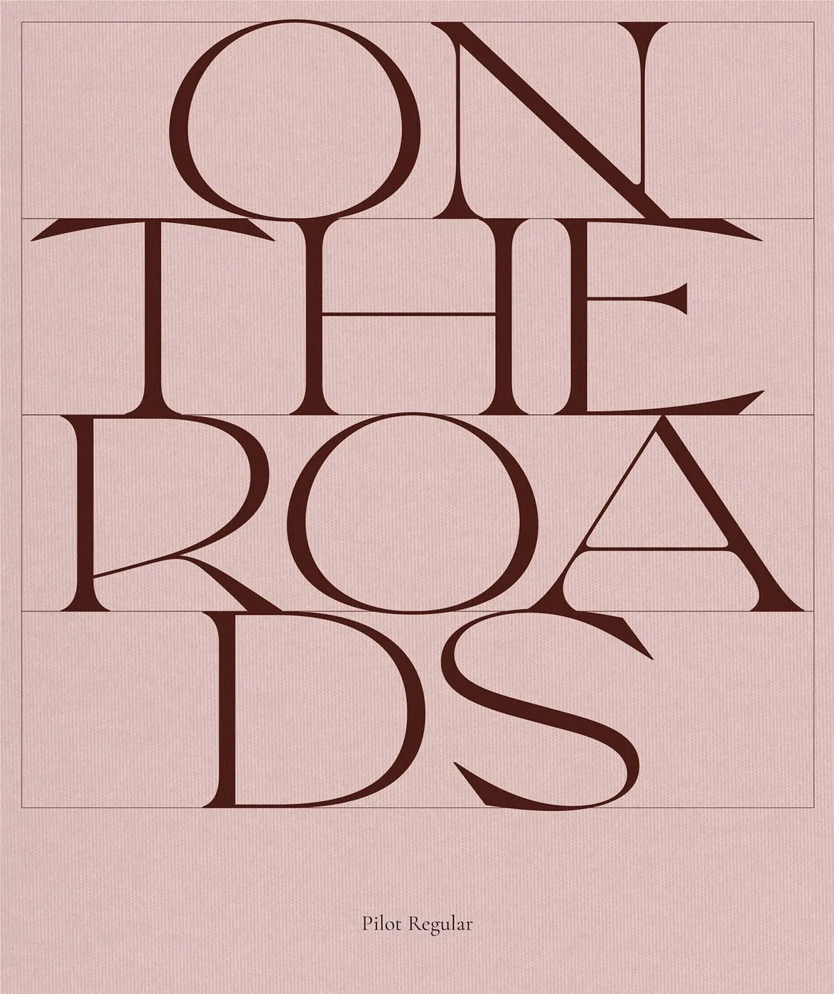
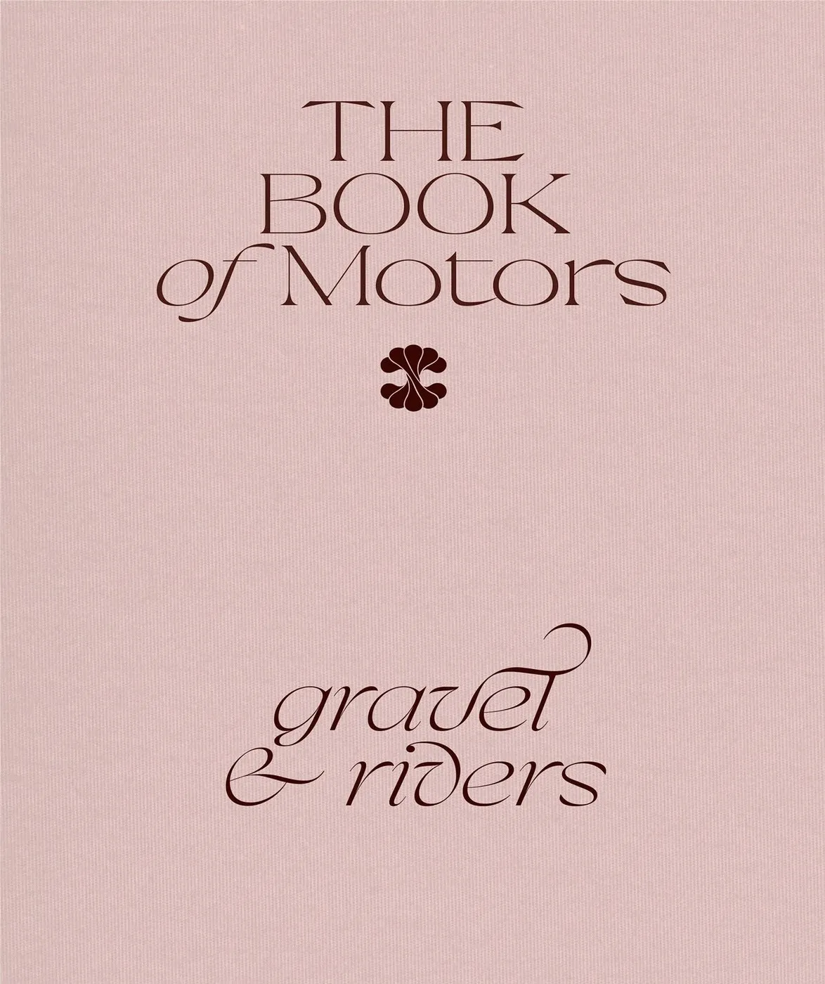
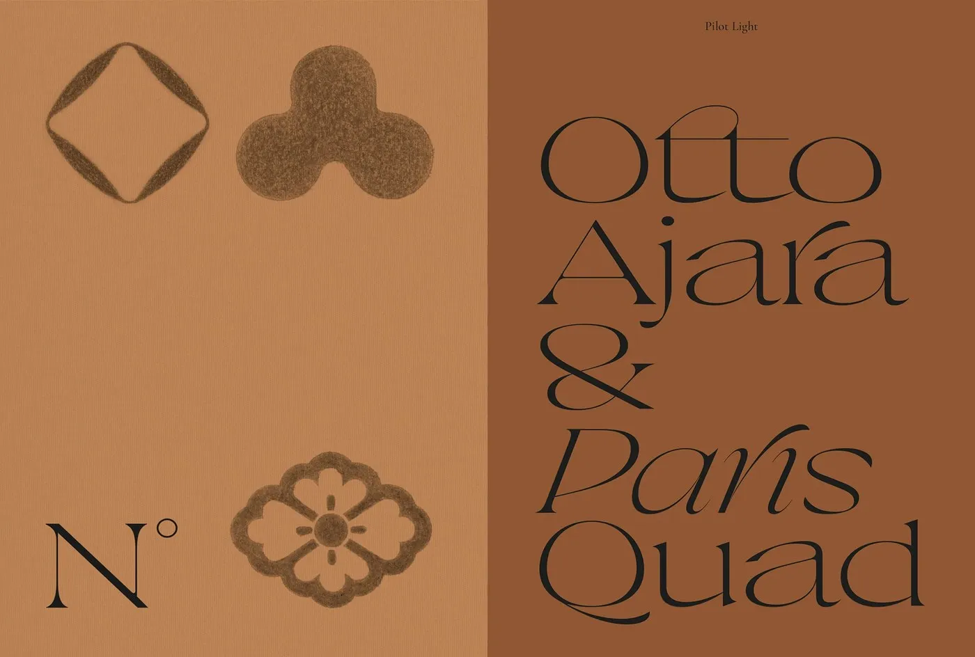
Pilot Typeface by Violaine & Jérémy: A Sharp Serif Inspired by Aviation Gear Parisian design studio VJ-Type just rolled out Pilot—a stunning display serif packed with personality, bringing together razor-sharp angles and speedy calligraphic strokes. Designed by the creative duo Violaine & Jérémy alongside talented designers Antoine Brun, Liana Korios, and Julie Senné, this project is a masterclass in typographic balance.
The initial spark for Pilot came directly from 20th-century aviation instruments and nautical navigation charts. It strikes a seamless harmony between technical accuracy and high-end modern style, making it ideal for editorial spreads and luxury fashion branding.
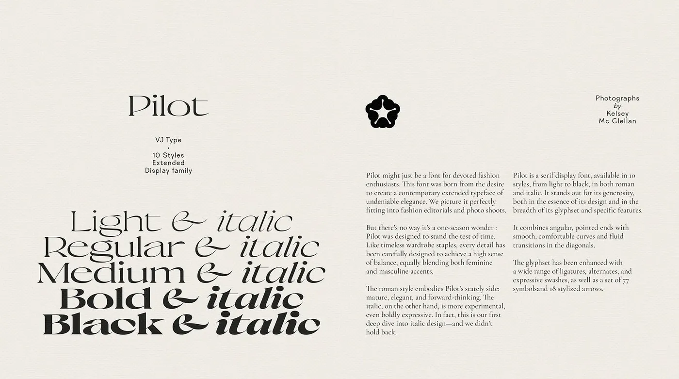
Letterform Structure and Sharp Contrast The real magic of Pilot lies in the bold contrast between its crisp, needle-sharp serifs and sturdy vertical stems. Diagonal strokes end in sharp geometric points, giving a subtle nod to the sleek aerodynamics of aircraft wings.
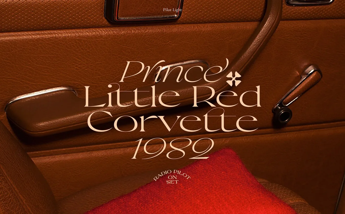
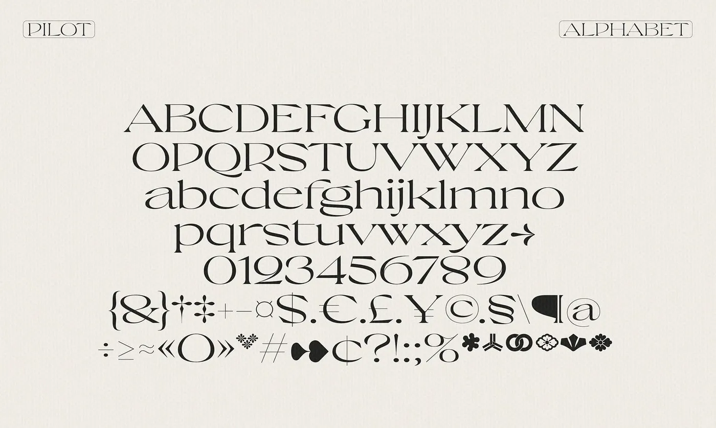
Across the lowercase set, compact counters team up with wide apertures to create a smooth, rhythmic cadence perfect for headers and pull quotes. Thanks to a rich collection of alternate glyphs and custom ligatures, building visually rich typography layouts is effortlessly versatile. It feels right at home on high-fashion magazine headers, exhibition visuals, or premium book designs.
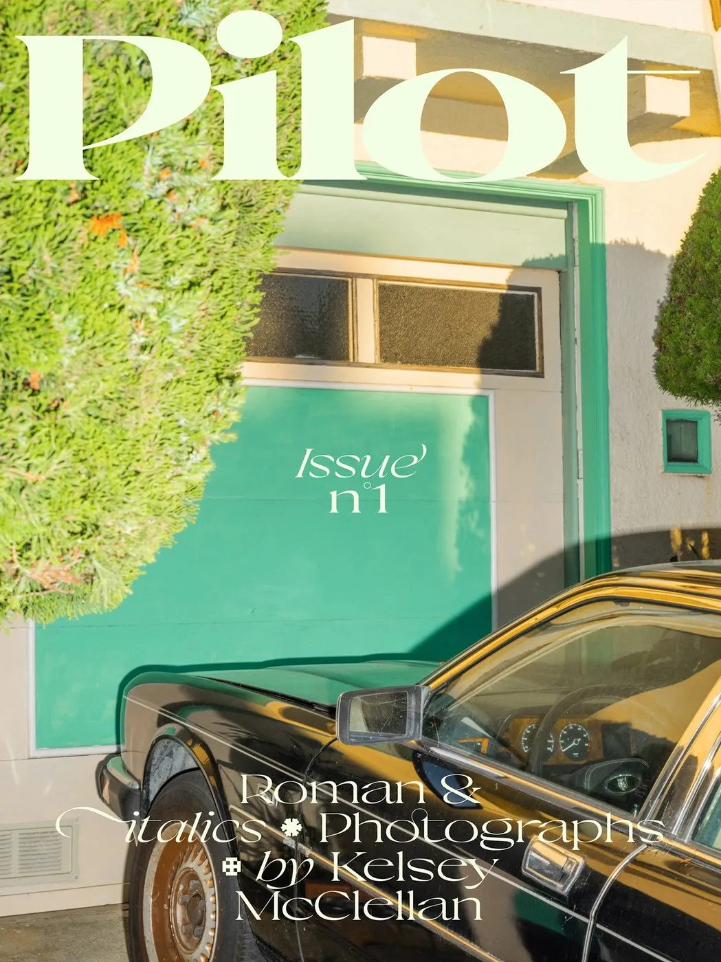
A Surreal Still-Life Specimen Shoot To mark Pilot’s official debut, Violaine & Jérémy teamed up with photographer Kelsey McClellan to produce a vibrant type specimen series. High-contrast black-and-white lettering interacts with tactile studio backdrops and surreal food arrangements, capturing both sides of Pilot: ultra-precise like a vintage gauge, yet endlessly inspiring for creative design.
Check out the complete project on www.behance.net/gallery/217061767/Pilot-Typeface.
Pilot Typeface từ Violaine & Jeremy: Bộ Font Serif Góc Cạnh Lấy Cảm Hứng Từ Thiết Bị Hàng Không
Studio Vj-Type tại Paris vừa trình làng Pilot – bộ font display serif đầy cá tính, kết hợp giữa những góc cạnh sắc nét và đường nét thư pháp tốc độ. Dự án được phát triển bởi bộ đôi Violaine & Jeremy cùng sự hợp tác của các designer Antoine Brun, Liana Korios và Julie Senné.
Ý tưởng thiết kế của Pilot xuất phát từ các thiết bị đo đạc trên máy bay và bản đồ định vị hàng không thế kỷ 20. Bộ font vừa giữ được sự chính xác về mặt kỹ thuật, vừa sở hữu kiểu dáng hiện đại, đáp ứng tốt các yêu cầu khắt khe của thiết kế editorial và thời trang cao cấp.
Cấu trúc nét chữ và độ tương phản góc cạnh
Sự thu hút của Pilot đến từ độ tương phản mạnh mẽ giữa phần chân chữ (serif) sắc nét và phần thân dọc (stem) dày dặn, vững chãi. Những nét gạch chéo kết thúc bằng các khối hình học nhọn, gợi liên tưởng đến khí động học của cánh máy bay.
Ở ký tự chữ thường (lowercase), phần counter được thu gọn kết hợp cùng aperture mở rộng, tạo nên nhịp điệu mượt mà cho các dòng tiêu đề hoặc đoạn trích dẫn (pull quote). Nhờ hệ thống ký tự thay thế (alternate glyphs) và ligature phong phú, việc đan xen chữ để tạo nên những kết cấu typography ấn tượng trên trang in trở nên vô cùng linh hoạt. Bộ font này đặc biệt phù hợp cho tiêu đề tạp chí thời trang, nhận diện triển lãm hay bìa ấn phẩm cao cấp.
Bộ ảnh specimen kết hợp nhiếp ảnh tĩnh vật
Đánh dấu sự ra mắt của Pilot, Violaine & Jeremy đã kết hợp cùng nhiếp ảnh gia Kelsey McClellan để thực hiện bộ ảnh giới thiệu font (specimen). Sự kết hợp giữa chữ đen trắng tương phản cao với các chất liệu bề mặt, phông nền studio và những khung hình tĩnh vật ẩm thực mang yếu tố siêu thực đã thể hiện trọn vẹn hai khía cạnh của Pilot: vừa nghiêm túc, chuẩn mực như một thiết bị kỹ thuật, vừa là chất liệu sáng tạo đầy cảm hứng.
Xem đầy đủ dự án của www.behance.net/gallery/217061767/Pilot-Typeface trên Behance.