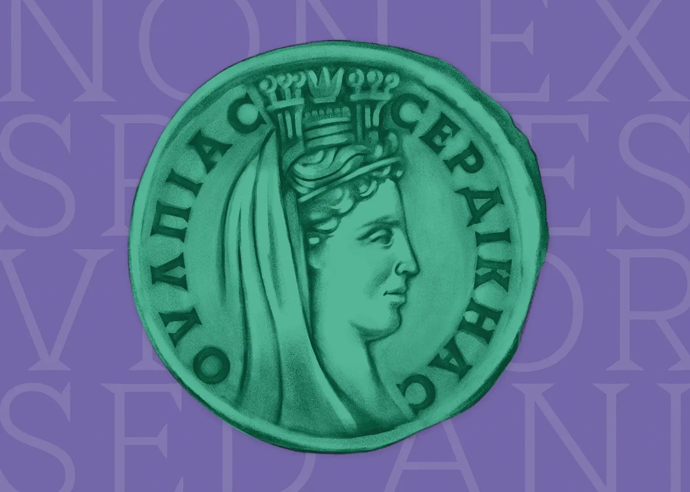
Thorn Serif: Type Forward’s Roman Coin-Inspired Typeface Inspired by ancient Roman coinage, designers Stan Partalev and Mirela Belova from studio Type Forward have released Thorn Serif—a high-impact variable font built for bold, memorable designs.
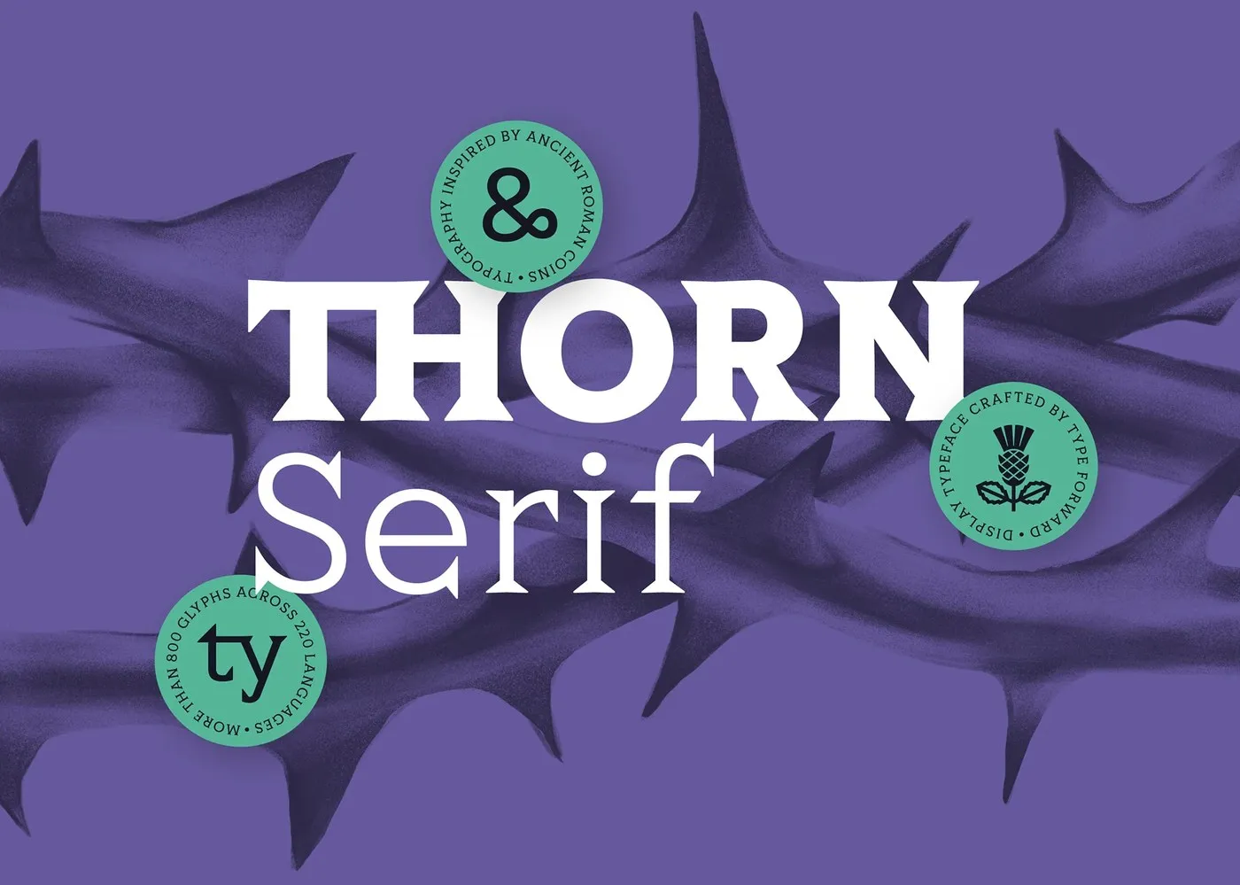
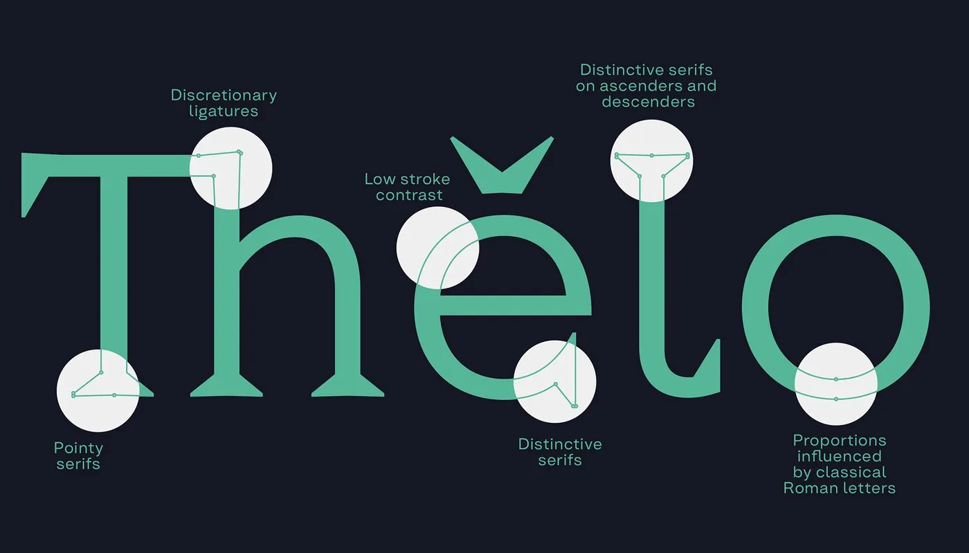

Rather than relying on soft curves, Thorn Serif takes a raw, tactile approach with sharp, thorn-like serifs and solid proportions. A high x-height combined with short ascenders creates compact, seamlessly flowing lines of text. Pairing rich deep purple and fresh mint green with thistle motifs in presentation visuals highlights the font’s distinctive character.
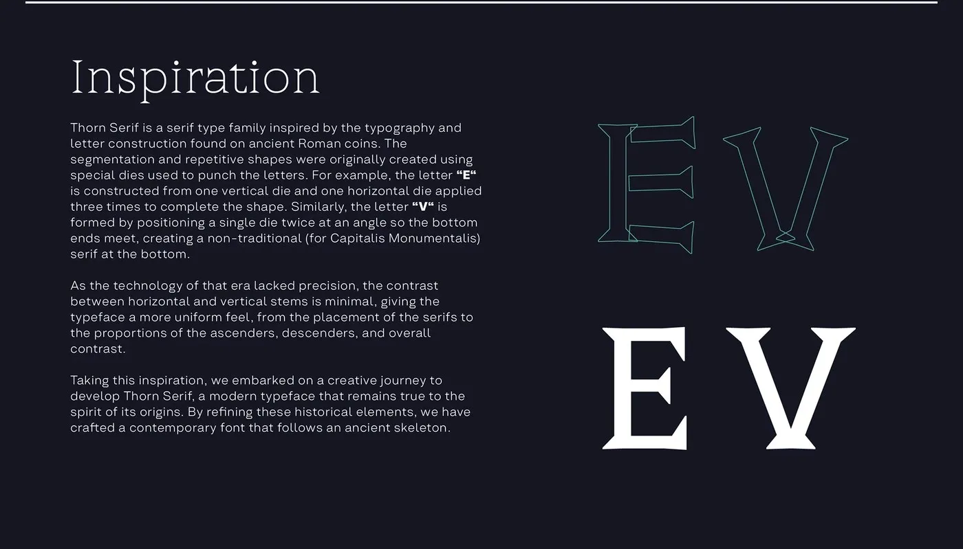
Ancient Minting Energy in Every Stroke The character shaping of Thorn Serif echoes the historic art of coin minting, where craftspeople struck hand-carved matrix dies directly into metal. This gives the typeface minimal stroke contrast and a sturdy, grounded rhythm that feels carved right into stone.
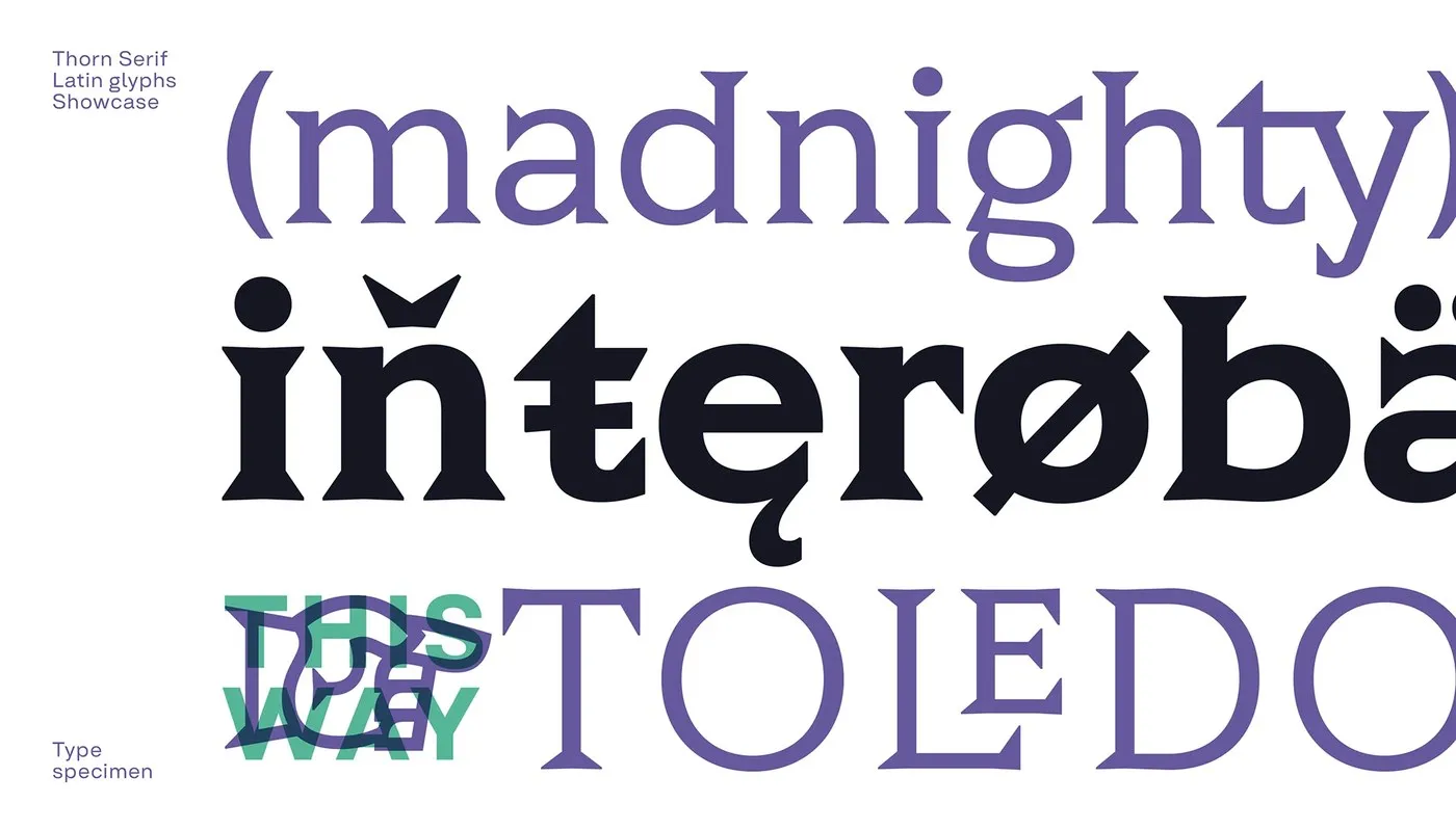
Built for Everything from Print to Packaging More than just a nod to history, Thorn Serif is designed as a complete, modern typographic workhorse. All eight weights—stretching from delicate Hairline to monolithic Black—are conveniently bundled into a single variable font file. Supporting over 220 languages, the family comes packed with rich OpenType features like ligatures and unique alternate characters.
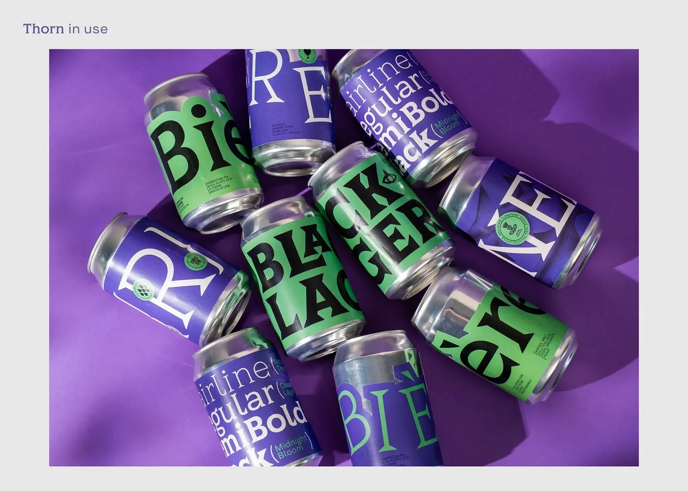
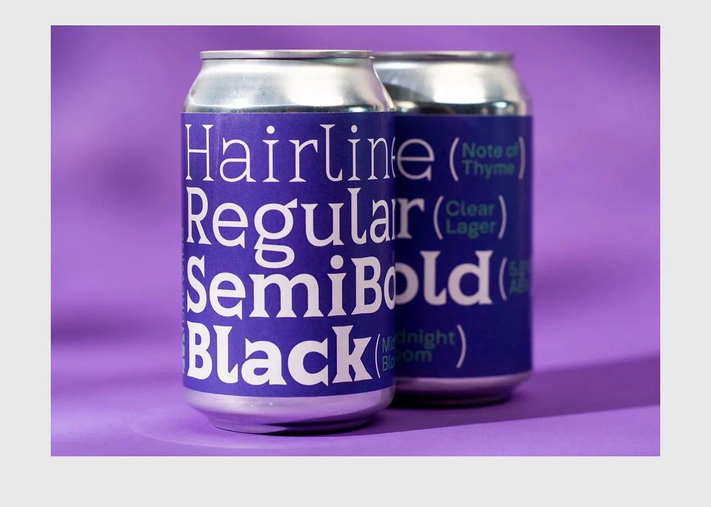
In practical application, the typeface excels on beverage packaging: heavy weights command total attention in main product titles, while lighter weights stay remarkably crisp and readable on small labels.
Thorn Serif: Bộ font lấy cảm hứng từ đồng xu La Mã của Type Forward
Lấy cảm hứng từ những đồng tiền xu La Mã cổ đại, hai nhà thiết kế Stan Partalev và Mirela Belova đến từ studio Type Forward vừa ra mắt Thorn Serif — một bộ font variable gồm 8 weight dành cho các thiết kế ấn tượng.
Thay vì sử dụng những đường cong mềm mại, Thorn Serif chọn hướng đi thô mộc với các nét serif sắc nhọn như gai và phom dáng chắc chắn. Cấu trúc chữ sở hữu x-height cao cùng phần ascender ngắn, giúp các dòng chữ khi đứng cạnh nhau trở nên cô đọng và liền mạch. Việc kết hợp bảng màu tím đậm, xanh mint tươi cùng biểu tượng hoa kế trên bản trình diễn càng làm nổi bật nét độc đáo của bộ chữ.
Tinh thần đúc tiền cổ trong từng nét chữ
Cách tạo hình của Thorn Serif mô phỏng quá trình đúc tiền thời xa xưa, khi người thợ thủ công dùng khuôn sắt đóng từng nét lên mảnh kim loại. Nhờ vậy, font chữ có độ tương phản nét thấp, tạo nên nhịp điệu vững chãi như được khắc thẳng vào đá.
Linh hoạt cho cả in ấn lẫn bao bì
Không chỉ dừng lại ở tính thẩm mỹ lịch sử, Thorn Serif còn là một hệ thống typography hiện đại. Cả 8 weight từ Hairline siêu mảnh đến Black siêu dày đều được tích hợp gọn gàng trong một file variable font duy nhất. Hỗ trợ hơn 220 ngôn ngữ, bộ font này đi kèm nhiều tính năng OpenType như ligature hay các ký tự thay thế độc đáo.
Đặc biệt, tính ứng dụng của font chữ đã được thử nghiệm thực tế trên bao bì lon đồ uống: các nét chữ dày dặn giúp phần tiêu đề sản phẩm trở nên nổi bật, trong khi các weight mảnh hơn vẫn giữ được độ rõ ràng khi in ở kích thước nhỏ trên nhãn mác.