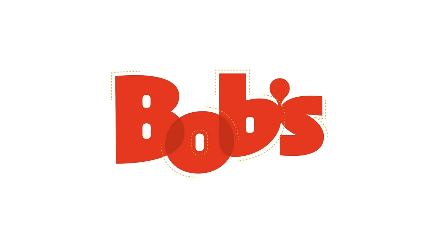
Bob’s Display: A Fast-Food-Inspired Typeface by Plau Design Bob’s is Brazil’s very first fast-food chain, founded back in 1952 and now boasting over 1,000 locations nationwide. Its iconic script logo and signature milkshakes are legendary staples of local food culture. To give the brand’s identity a fresh spin, agency Artplan teamed up with Rio-based studio Plau Design to craft a custom display typeface.
Brought to life by the talented design trio Carlos Mignot, Lu Leitenperger, and Rodrigo Saiani, the project infuses the cozy, upbeat vibe of classic diners into every single stroke, striking a sweet balance between retro nostalgia and sleek modern design.
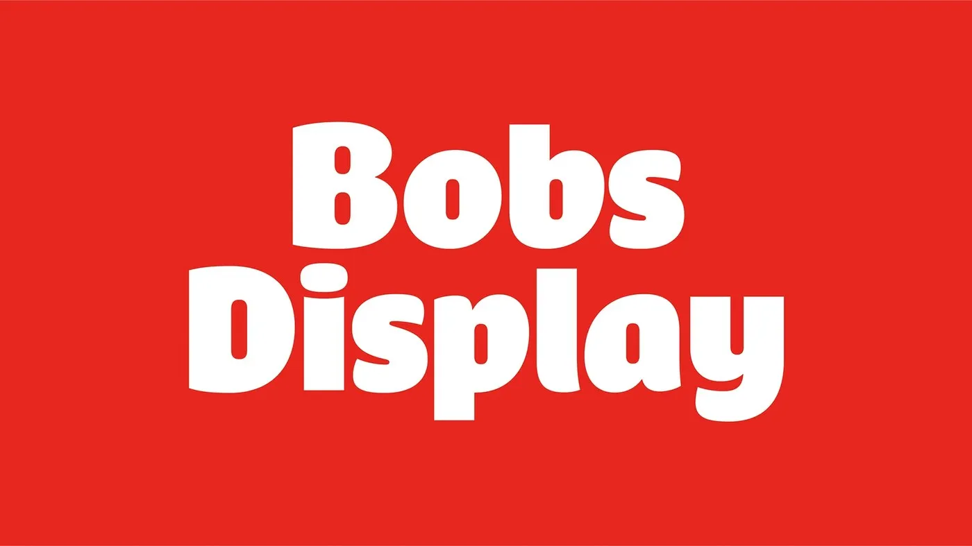
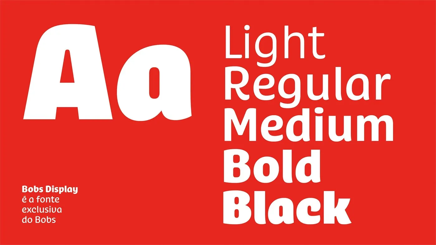
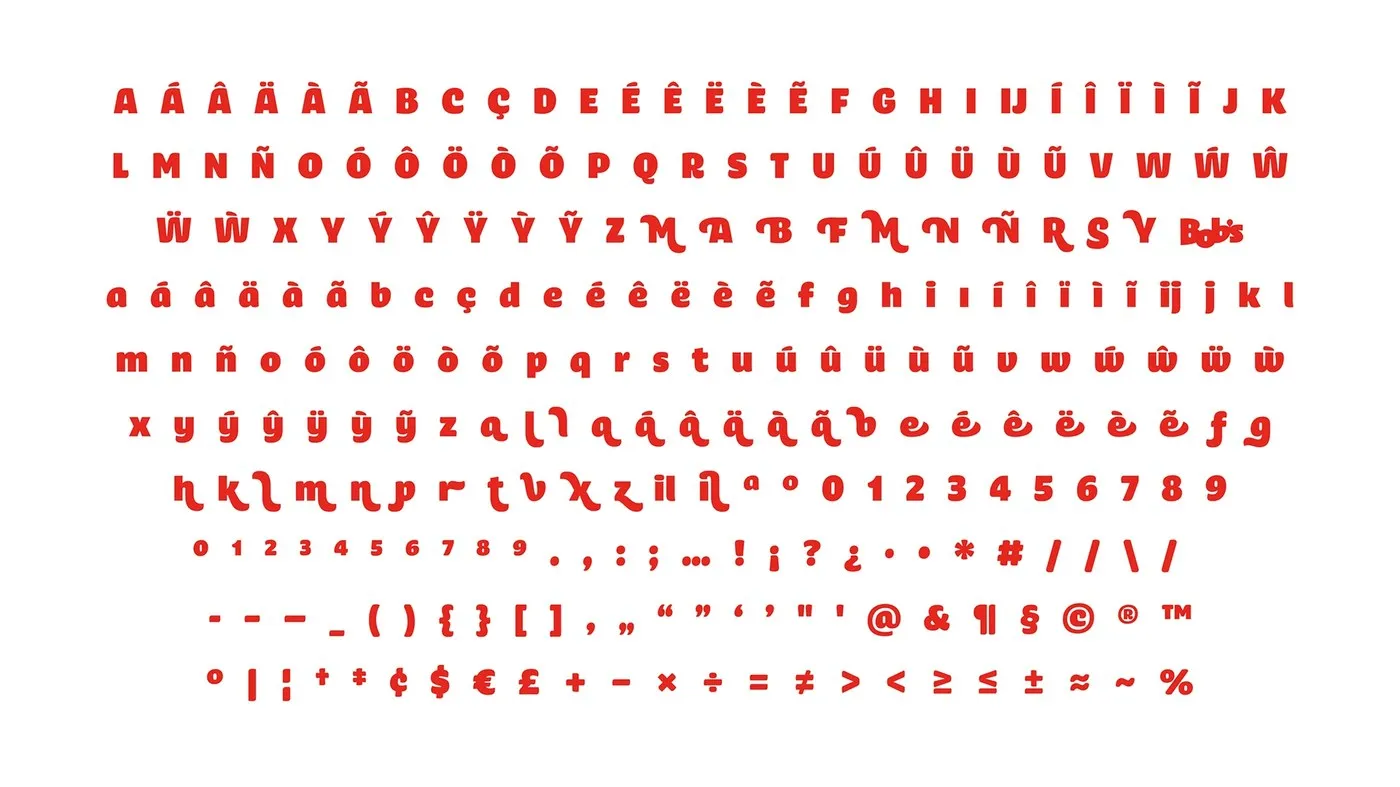

Inside the Bob’s Display Type Family The font family spans 5 weights, ranging from Light all the way to Black. In the heavier weights, thick stems, tight counters, and smoothly rounded corners evoke the luscious richness of thick milkshakes and savory sauces.
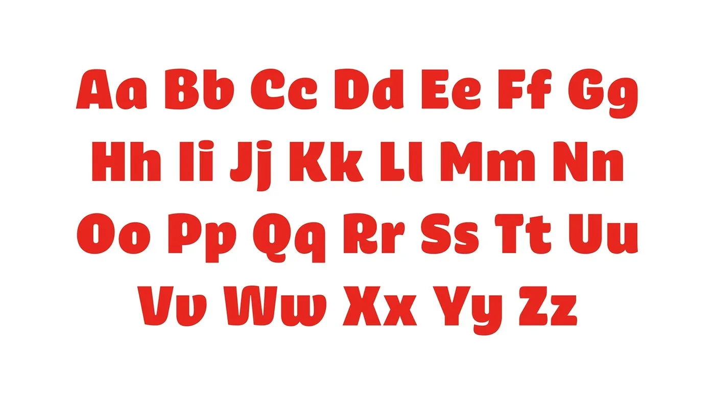
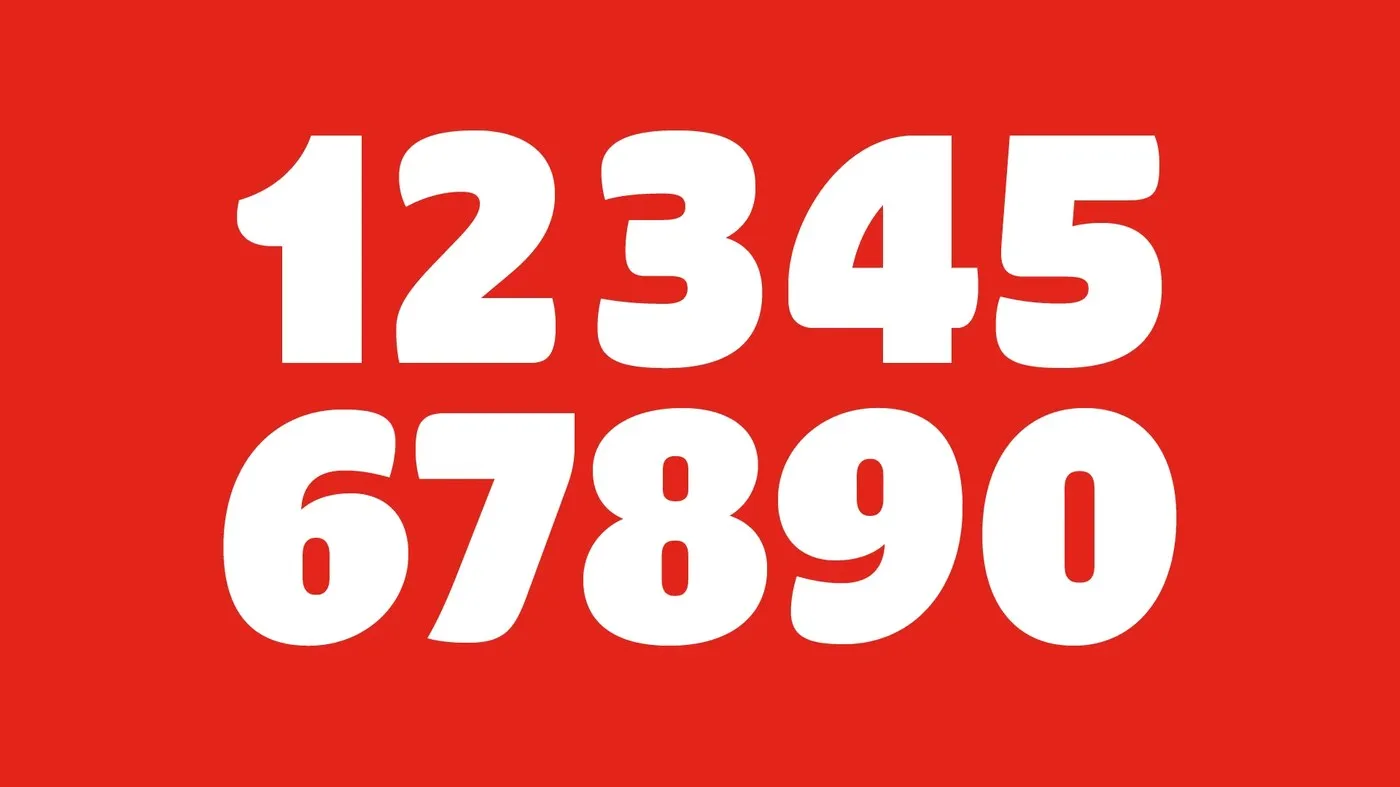
Plau Design also created versatile swashes and alternate characters for big, bold headlines, bringing a lively visual rhythm to layouts. Smart glyph features handle price tags and decimals effortlessly, making menu design and digital signage a total breeze. A sturdy baseline paired with a generous x-height keeps everything neatly aligned and super readable from afar. Plus, it includes full support for Portuguese accents and diacritics.
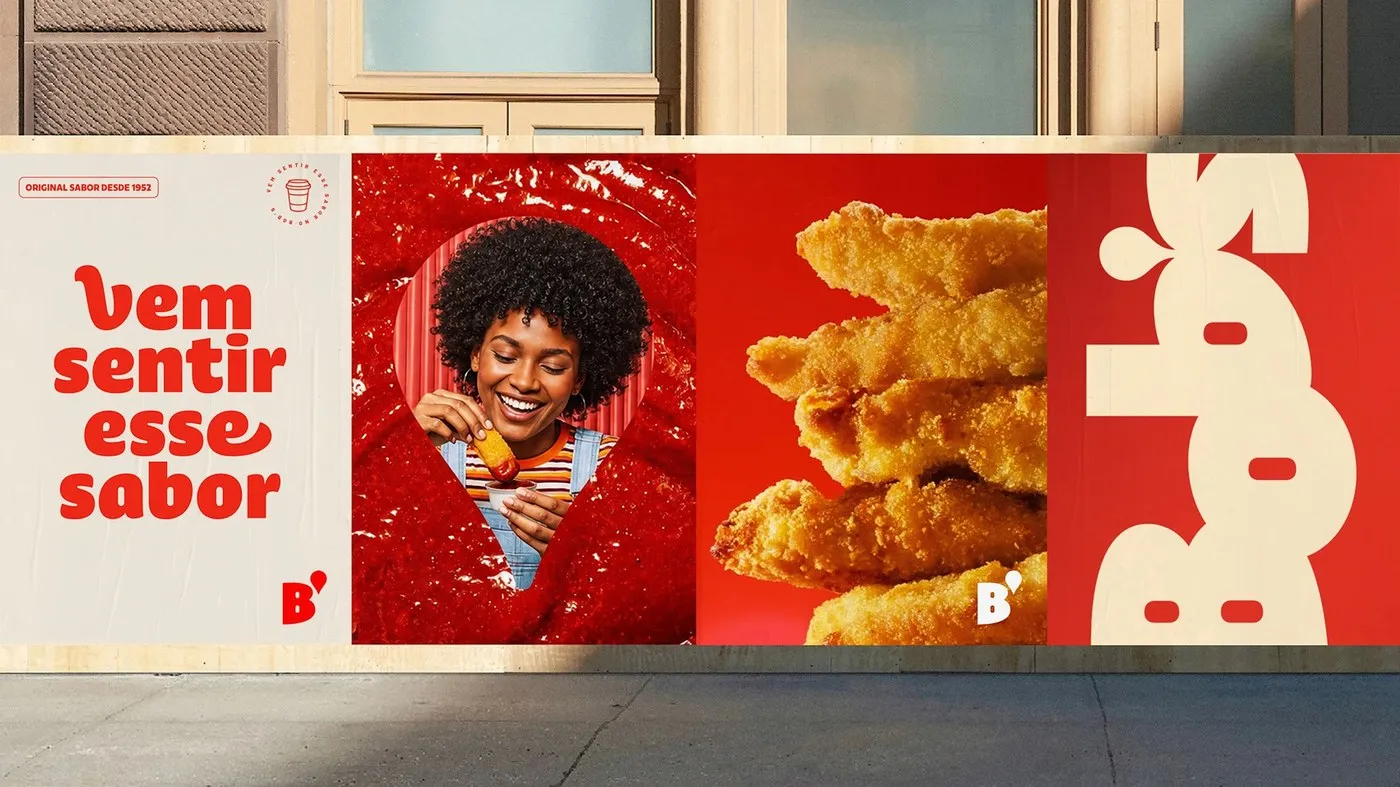
Real-World Application On outdoor posters, the bold letterforms pop off the page against warm red and soft cream backgrounds alongside mouthwatering food imagery, making counter menus easy to read at a glance. Whether painted on store walls, printed on paper cups, or displayed on mobile screens, the typography stays crisp, legible, and instantly recognizable.
Check out the full project on Behance by www.behance.net/gallery/253036825/Bobs-Display.
Bob’s Display: Bộ font chữ mang tinh thần fast-food từ Plau Design
Bob’s là chuỗi cửa hàng thức ăn nhanh đầu tiên của Brazil, ra đời từ năm 1952 và hiện sở hữu hơn 1.000 chi nhánh trên toàn quốc. Logo nét uốn cùng những ly milkshake đặc trưng của hãng đã trở thành một phần quen thuộc trong văn hóa ẩm thực bản địa. Nhằm làm mới diện mạo thương hiệu, agency Artplan đã bắt tay cùng studio Plau Design tại Rio để thiết kế một bộ font display riêng biệt.
Dự án được đảm nhận bởi bộ ba designer Carlos Mignot, Lu Leitenperger và Rodrigo Saiani. Họ đã đưa tinh thần ấm cúng, vui vẻ của những quán diner truyền thống vào từng đường nét chữ, mang lại sự kết hợp hài hòa giữa nét hoài cổ và phong cách thiết kế hiện đại.
Chi tiết về bộ font Bob’s Display
Họ font này bao gồm 5 weight trải dài từ Light đến Black. Ở các bản weight nặng, phần stem được làm dày dặn, counter thu hẹp lại cùng các góc bo tròn mịn màng, gợi liên tưởng đến độ sánh của milkshake và các loại sốt.
Plau Design cũng tạo thêm các ký tự swash và alternate linh hoạt cho các tiêu đề lớn, giúp bố cục có nhịp điệu thị giác tự nhiên hơn. Đội ngũ thiết kế còn tích hợp các tính năng glyph thông minh để xử lý việc hiển thị giá tiền và số lẻ, hỗ trợ tối đa cho việc trình bày menu hay bảng hiệu kỹ thuật số. Baseline chắc chắn cùng chiều cao chữ lớn giúp phần text luôn thẳng hàng và dễ đọc ngay cả khi nhìn từ xa. Ngoài ra, bộ font cũng hỗ trợ trọn vẹn hệ thống dấu tiếng Bồ Đào Nha.
Khả năng ứng dụng thực tế
Trên các poster quảng cáo ngoài trời, những dòng chữ nét dầy kết hợp nổi bật cùng hình ảnh món ăn trên nền đỏ ấm áp hoặc nền màu kem nhẹ nhàng, giúp người xem dễ dàng quan sát menu tại quầy. Dù xuất hiện trên tường cửa hàng, ly giấy hay màn hình điện thoại, các nét chữ vẫn giữ được sự rõ ràng và nét nhận diện đặc trưng.
Xem chi tiết dự án do www.behance.net/gallery/253036825/Bobs-Display thực hiện trên Behance.