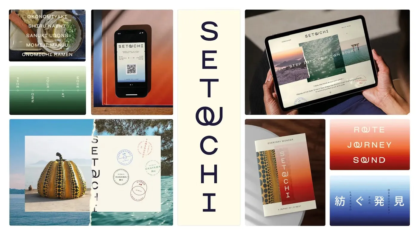
Setouchi Sans: Bringing Pure Serenity to Japan’s Brand Identity Through Custom Typography Tucked right between bustling Tokyo and historic Kyoto, the Setouchi region set out to position itself as Japan’s peaceful, meditative “third destination”. When crafting the region’s brand identity, design agency Saffron Brand Consultants took a refreshingly subtle route—skipping flashy tourism clichés to focus entirely on building a soothing visual space. To bring this tranquil vibe to life, Saffron teamed up with French type foundry Blaze Type to create the custom typeface Setouchi Sans.
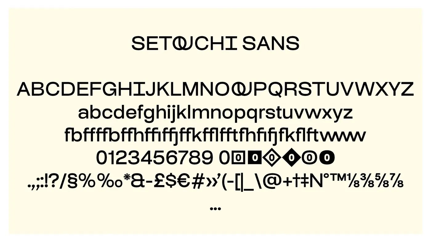
Rather than building a new font entirely from scratch, Blaze Type cleverly customized Osmose, a sans-serif from their existing catalog. This smart move solved two big challenges at once: streamlining complex licensing across multiple regional stakeholders while tweaking the letterforms to fit airy, slow-paced layouts.
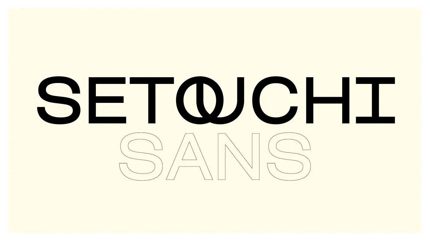
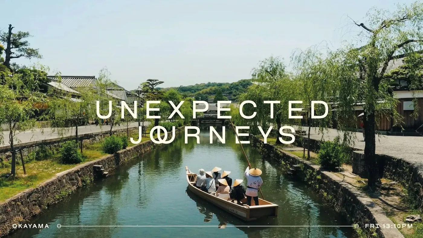
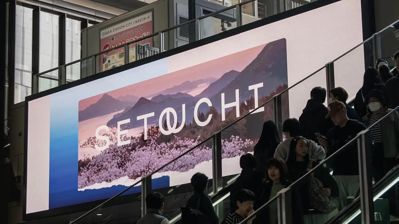
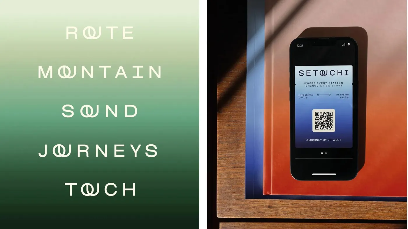
The real magic comes down to beautiful restraint. The original Osmose font already featured clean proportions, open counters, and a relaxed horizontal rhythm. The design team fine-tuned the kerning and poured their focus into one stand-out detail: an interlocking “OU” ligature. Connecting the closed curve of the “O” with the open curve of the “U” created a signature focal point for the main logotype.
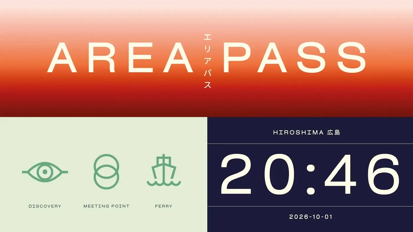
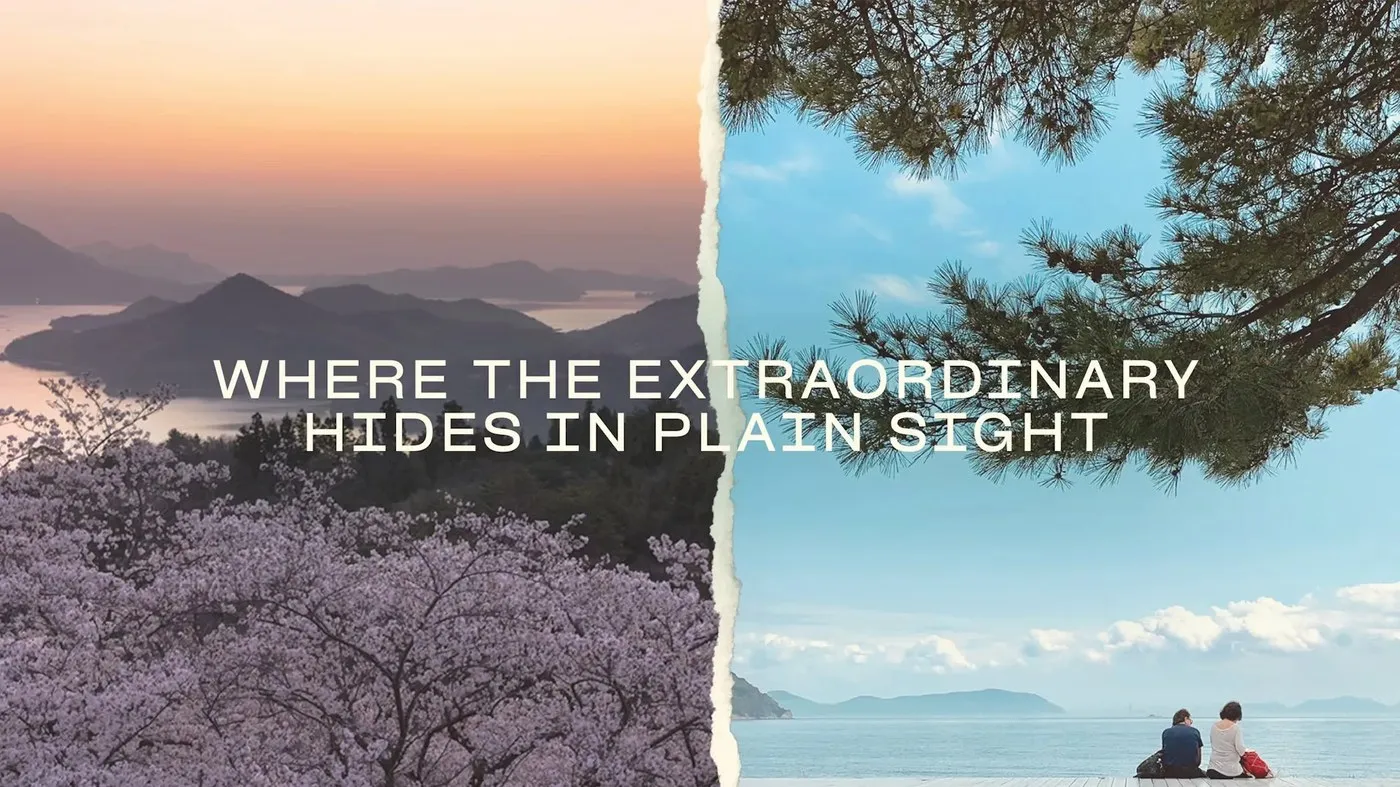
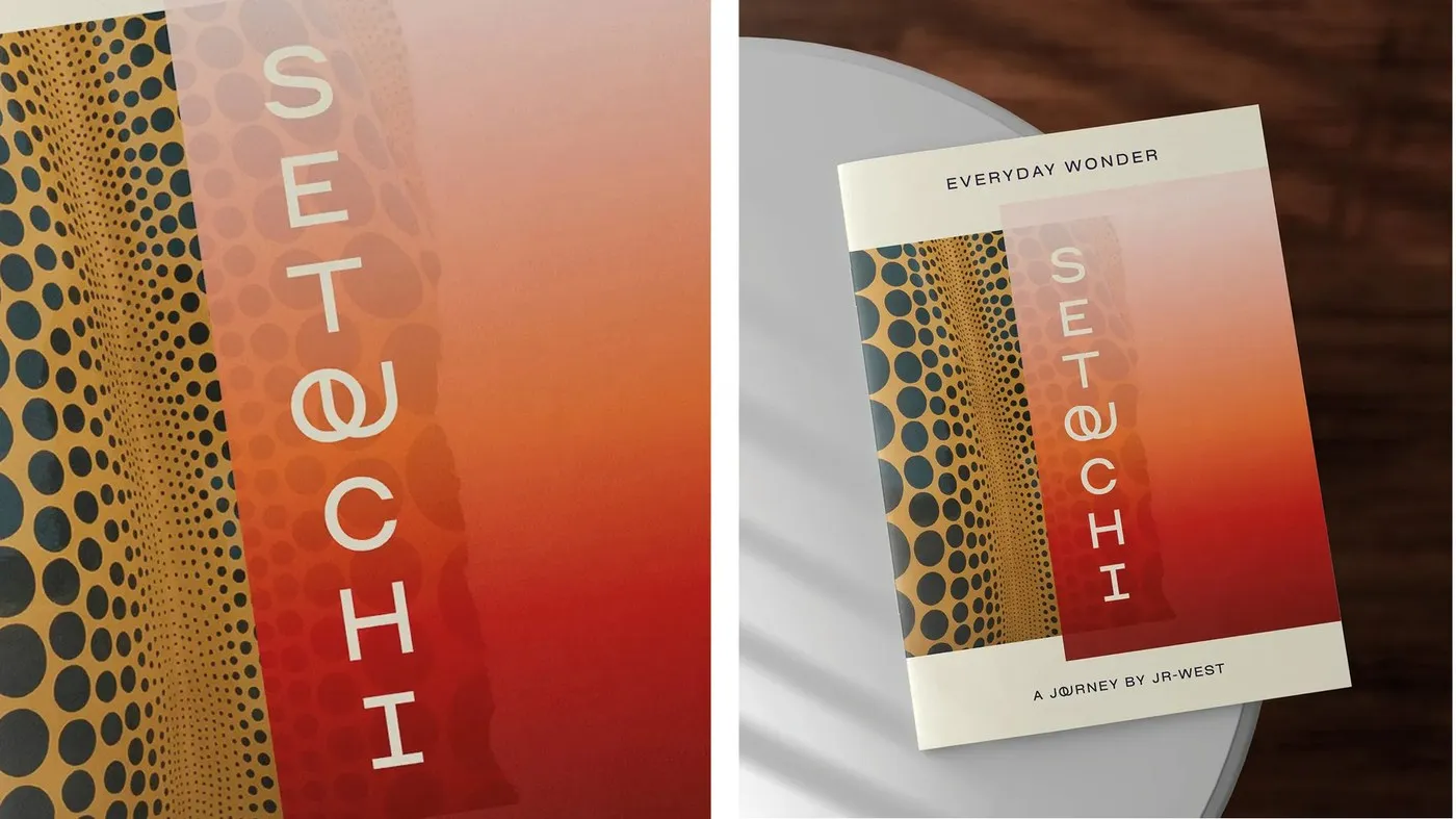
What makes this typographic design so clever is how naturally that “OU” ligature pops up in everyday text. Whenever those two letters meet in headlines or body copy, the ligature automatically appears as a subtle, elegant nod to the brand. Building this feature straight into the font file ensures every piece of regional collateral stays completely cohesive without needing rigid graphic templates. Paired with generous white space and soft color palettes, the typography itself brings a serene atmosphere to the entire brand experience.
Check out the full project details at blazetype.eu/case-studies/setouchi-sans.
Setouchi Sans: Thổi hồn thư thái vào bộ nhận diện vùng đất Nhật Bản qua nét chữ custom tinh tế
Nằm giữa một Tokyo sôi động và một Kyoto cổ kính, vùng đất Setouchi muốn định vị bản thân là điểm đến thứ ba đầy lắng đọng và bình yên của Nhật Bản. Khi xây dựng bộ nhận diện cho khu vực này, agency Saffron Brand Consultants đã chọn một hướng đi tinh tế: bỏ qua những biểu tượng du lịch ồn ào để tập trung tạo nên một không gian thị giác mang cảm giác thư thái. Để hiện thực hóa điều đó, họ đã hợp tác cùng foundry Blaze Type đến từ Pháp để sáng tạo nên bộ phông chữ Setouchi Sans.
Thay vì thiết kế một bộ font hoàn toàn mới từ đầu, Blaze Type quyết định tùy biến từ phông chữ sans-serif Osmose có sẵn trong catalogue của mình. Giải pháp này xử lý mượt mà hai vấn đề lớn: vừa giải quyết quy trình cấp phép bản quyền phức tạp giữa nhiều bên liên quan trong vùng, vừa tinh chỉnh các đường nét chữ để phù hợp với những bố cục thoáng đãng và chầm chậm.
Điểm sáng tạo đắt giá nhất nằm ở sự tiết chế đầy tinh tế. Bản thân phông chữ Osmose vốn đã sở hữu tỷ lệ gọn gàng, phần counterform mở cùng nhịp điệu ngang thong thả. Đội ngũ thiết kế chỉ tinh chỉnh lại kerning và dồn trọng tâm vào một chi tiết duy nhất: ligature “OU” lồng vào nhau. Sự kết hợp này nối liền nét cong khép kín của chữ O với đường cong mở của chữ U, tạo nên một điểm nhấn đặc trưng cho wordmark chính.
Điểm hay của bộ type này là cách ligature “OU” xuất hiện tự nhiên ngay trong các đoạn văn bản thông thường. Mỗi khi cụm ký tự này xuất hiện ở tiêu đề hay phần body text, nét nối ligature lại tự động hiển thị như một điểm chạm nhẹ nhàng nhắc nhớ về thương hiệu. Việc tích hợp trực tiếp chi tiết thiết kế này vào file font giúp tất cả các ấn phẩm thiết kế của vùng luôn giữ được sự nhất quán mà không cần dựa vào các graphic template phức tạp. Khi kết hợp cùng khoảng trống lề rộng và các mảng màu mềm mại, bản thân chữ viết đã tự mang lại bầu không khí yên bình cho toàn bộ thiết kế.
Xem chi tiết dự án tại blazetype.eu/case-studies/setouchi-sans.