PP Altera: Pangram Pangram’s Ultra-Versatile “Shapeshifting” Variable Font System
Choosing the right font for a design project often demands serious thought right from the start. Picture starting a layout with a clean neo-grotesk, only to realize halfway through that it needs a sharp accent or a warm editorial touch—the usual fix is hunting for a second font and hoping both x-heights play nicely together. To solve this headache, Pangram Pangram Foundry released PP Altera, a flexible variable font system capable of morphing across diverse styles while maintaining the exact same foundational skeleton.
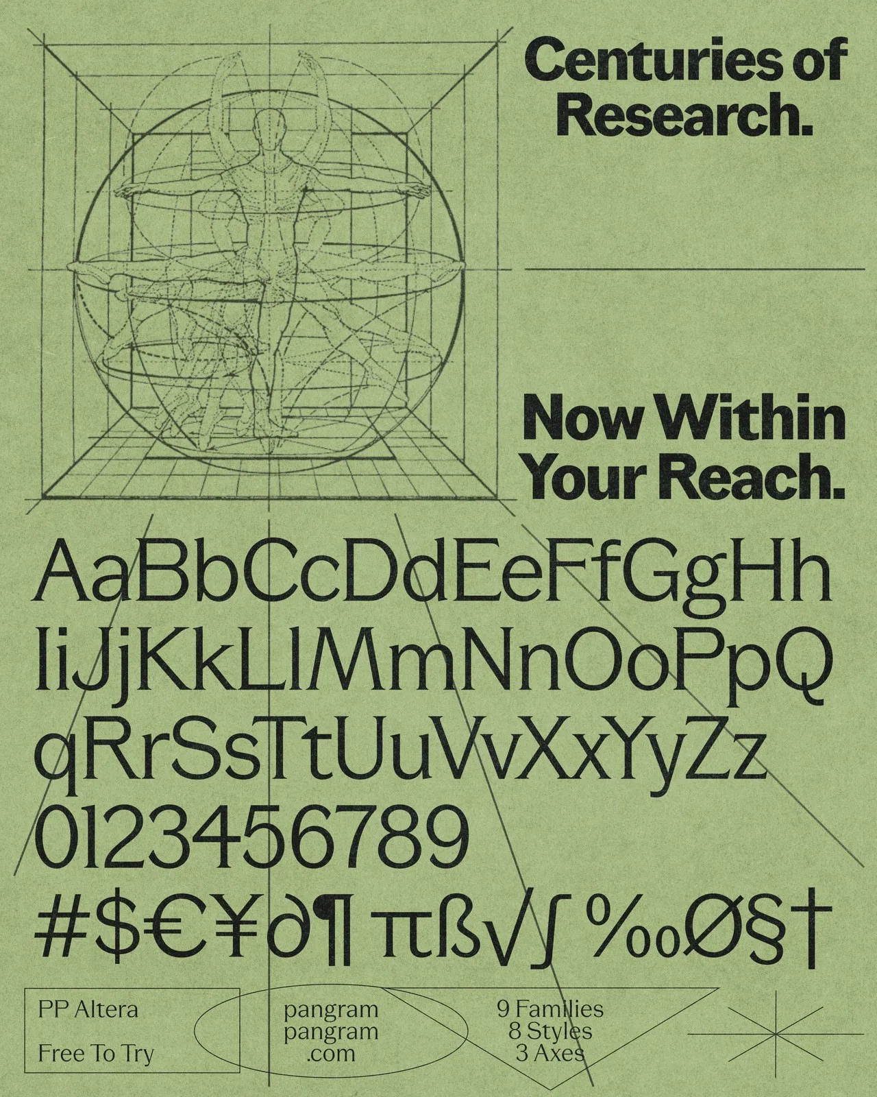
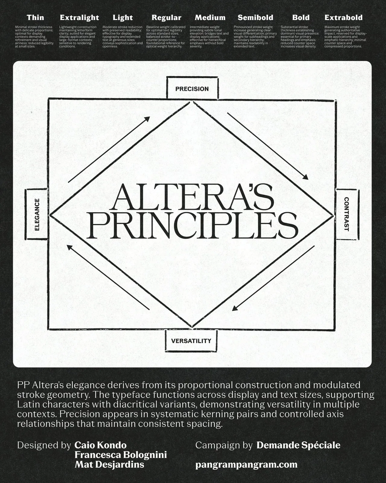
The concept behind PP Altera springs from metamorphosis in Greek mythology and the Latin word alter (meaning “other” or “another”). Designed by Caio Kondo, Francesca Bolognini, and Mat Desjardins, the typeface packs 3 variable axes, 9 sub-families, and 72 distinct styles, with 510 glyphs per cut. Built on identical metrics and synchronized kerning, moving from practical body text to an expressive display headline won’t shift the design grid at all.
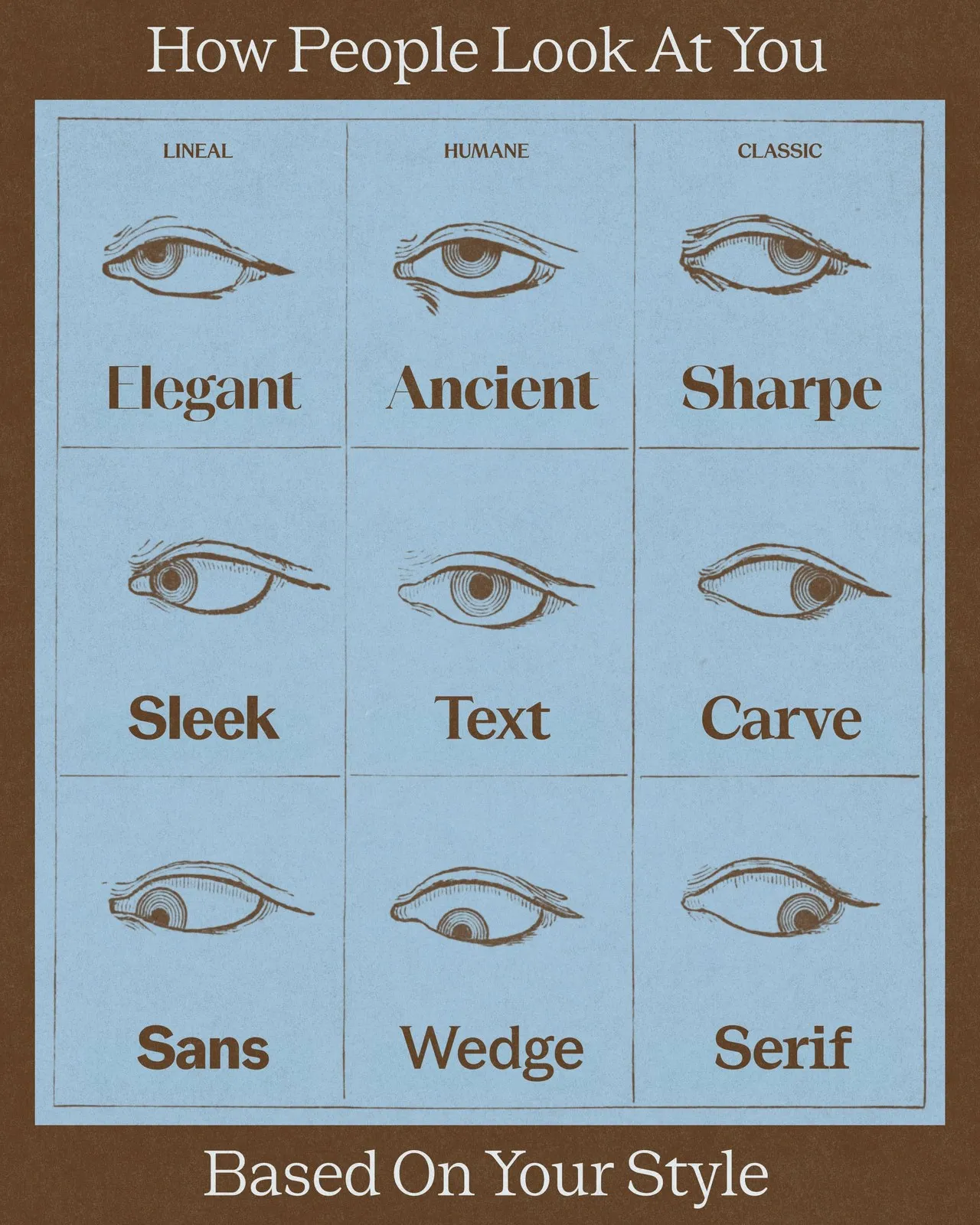
The 9 sub-families in the PP Altera system are organized into 3 clear categories:
- Lineal group: Elegant, Sleek, and Sans.
- Humane group: Ancient, Text, and Wedge.
- Classic group: Sharpe, Carve, and Serif.
Each sub-family includes 8 weights ranging from Thin to Extrabold. Adjustments along the variable axes allow instant tweaking of stroke thickness, terminal sharpness, and serif prominence.
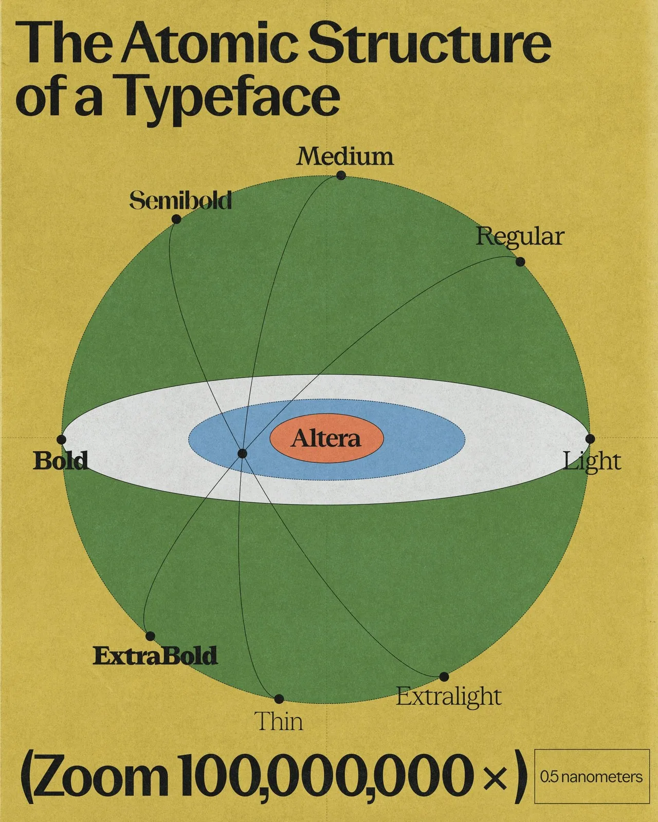
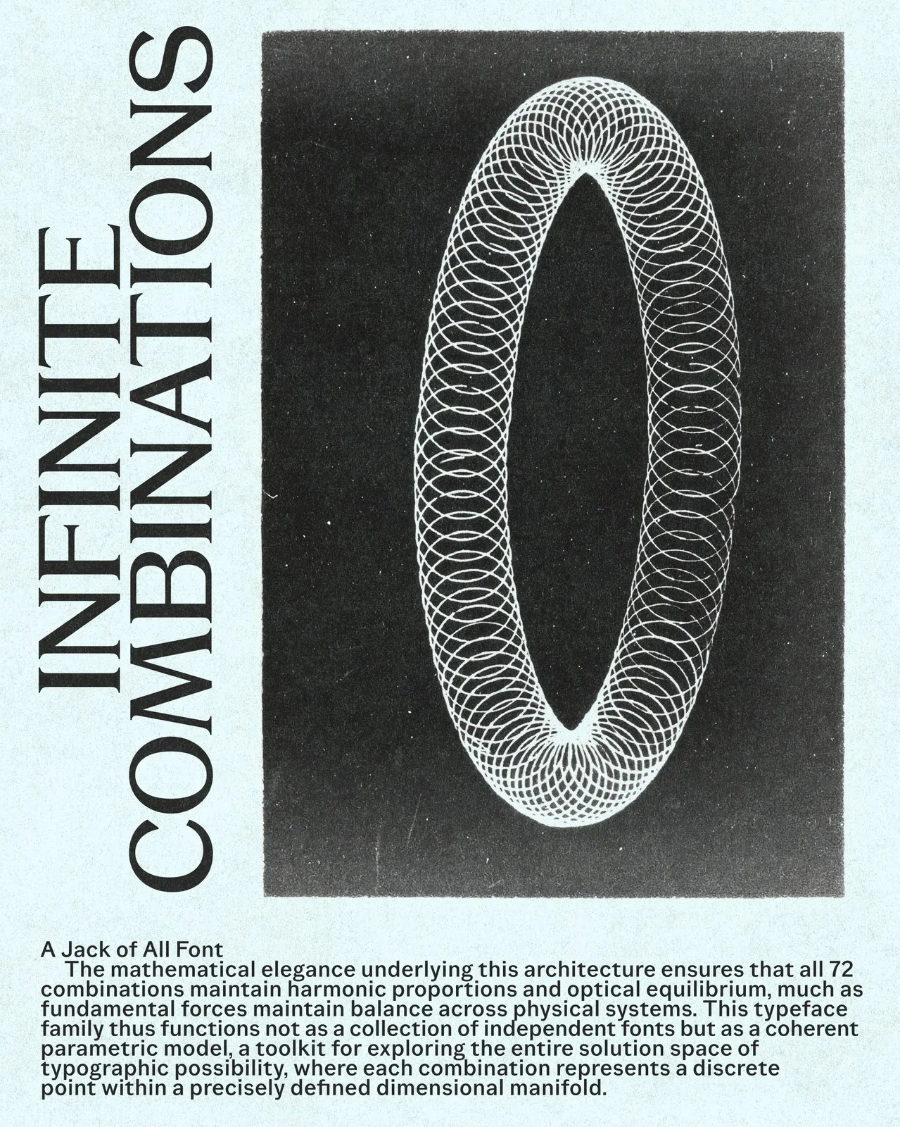
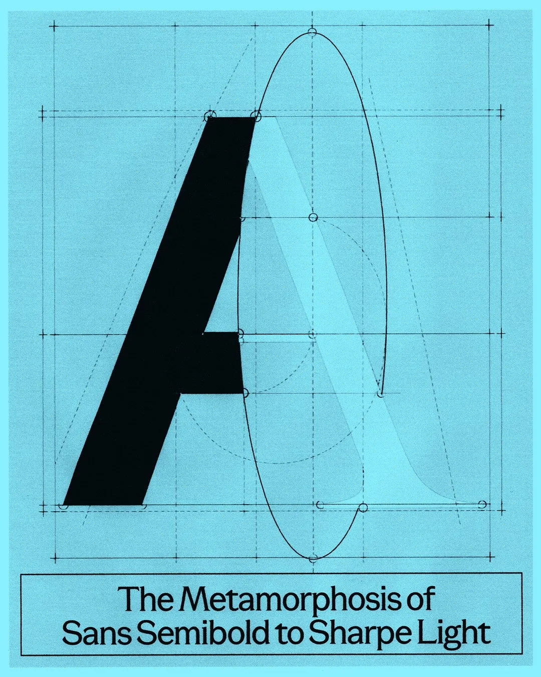
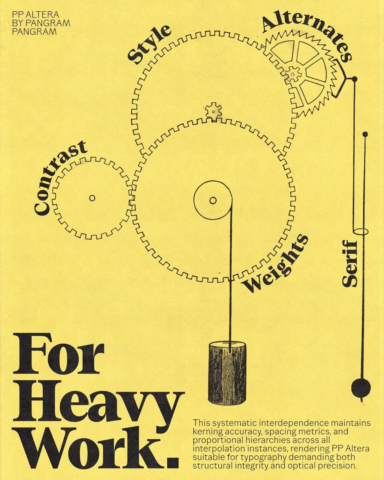
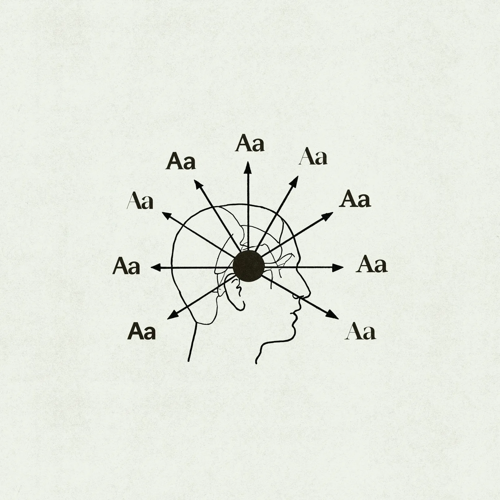
To showcase the fun possibilities of this system, creative studio Demande Spéciale developed a campaign inspired by classic scientific documents. The specimen poster series features striking imagery like brass gears, enlarged atomic models, and Vitruvian scale grids, vividly showing how Sans Semibold seamlessly transforms into Sharpe Light. PP Altera offers a truly versatile type system, ready to adapt to any design requirement instead of forcing layouts to fit a rigid font box.
PP Altera: Hệ Thống Variable Font “Biến Hình” Đa Năng Từ Pangram Pangram
Việc chọn font chữ cho một dự án thiết kế thường khiến người làm sáng tạo phải cân nhắc rất kỹ ngay từ đầu. Nếu lỡ bắt đầu layout với một kiểu chữ neo-grotesk tối giản mà giữa chừng lại cần thêm một điểm nhấn sắc sảo hay một đoạn text mang tinh thần editorial ấm áp, giải pháp thường thấy là phải đi tìm một bộ font thứ hai và hồi hộp cầu mong x-height của cả hai hợp rơ với nhau. Để giải quyết bài toán này, Pangram Pangram Foundry đã ra mắt PP Altera – một hệ thống variable font linh hoạt có thể thay đổi diện mạo qua nhiều phong cách khác nhau mà vẫn giữ nguyên bộ khung xương nền tảng.
Ý tưởng của PP Altera xuất phát từ sự biến hình trong thần thoại Hy Lạp và từ “alter” trong tiếng Latin (nghĩa là “khác” hoặc “mặt khác”). Được sáng tạo bởi ba designer Caio Kondo, Francesca Bolognini và Mat Desjardins, bộ font gói gọn 3 trục biến thể (variable axes), 9 họ chữ phụ và tổng cộng 72 style khác nhau (mỗi bản cut chứa 510 glyph). Nhờ xây dựng trên cùng một thông số kích thước và hệ thống kerning đồng bộ, việc chuyển từ một đoạn body text tiện dụng sang tiêu đề display phá cách hoàn toàn không làm xê dịch lưới thiết kế.
Hệ thống 9 phong cách của PP Altera được chia thành 3 nhóm rõ ràng:
- Nhóm Lineal gồm Elegant, Sleek và Sans.
- Nhóm Humane gồm Ancient, Text và Wedge.
- Nhóm Classic gồm Sharpe, Carve và Serif.
Mỗi họ chữ đều có đủ 8 cấp độ weight từ Thin đến Extrabold. Việc điều chỉnh trên trục variable cho phép thay đổi độ dày nét, độ nhọn của đầu nét chữ (terminal) cũng như mức độ xuất hiện của chân chữ (serif) cực kỳ nhanh chóng.
Nhằm thể hiện sự thú vị của hệ thống này, creative studio Demande Spéciale đã thực hiện chiến dịch quảng bá lấy cảm hứng từ các tài liệu khoa học cổ điển. Bộ poster specimen gây ấn tượng với hình ảnh bánh răng đồng, mô hình nguyên tử phóng đại hay lưới tỷ lệ Vitruvian, minh họa sinh động cho cách một font Sans Semibold có thể biến chuyển mượt mà thành Sharpe Light. PP Altera chính là một hệ thống chữ linh hoạt, sẵn sàng thích ứng với từng yêu cầu thiết kế thay vì bắt bố cục phải khuôn mẫu theo font chữ.