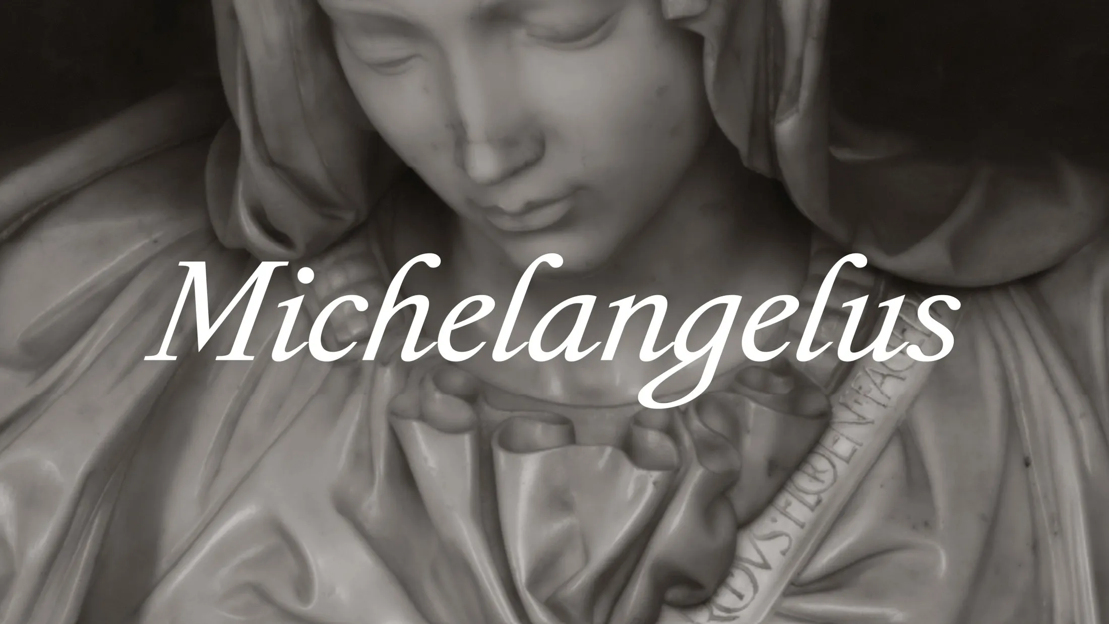
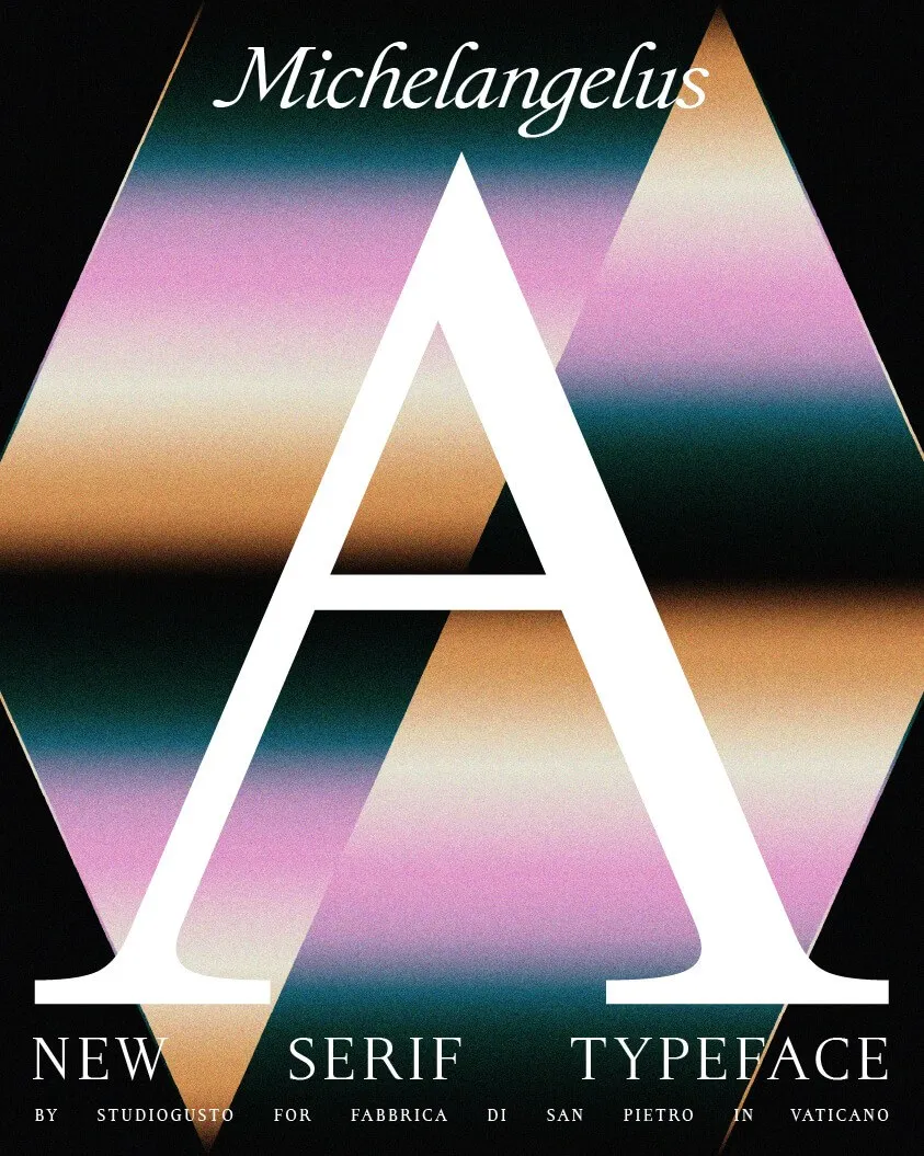
Studiogusto & Michelangelus: Turning Michelangelo’s Handwriting into Modern Typography Fresh off the press! Italian design agency Studiogusto has unveiled Michelangelus, a stunning new typeface commissioned by the Vatican. The exciting news? This humanist serif is dropping right into Microsoft 365 later this year, bringing Renaissance elegance to everyday documents and slides.
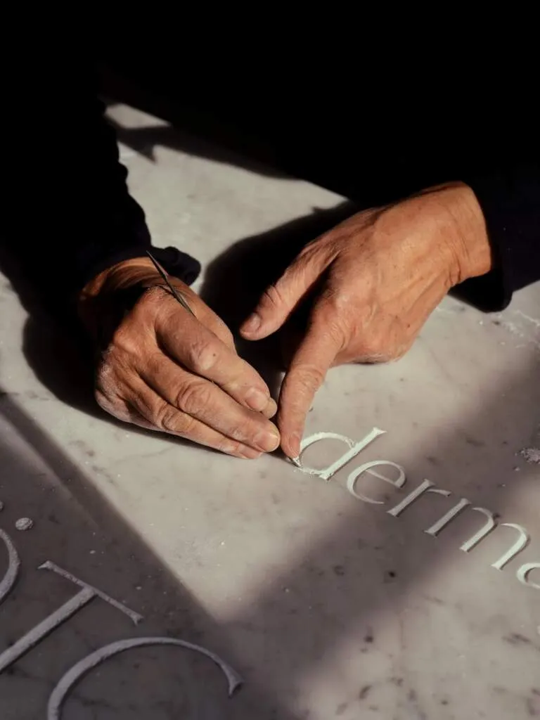
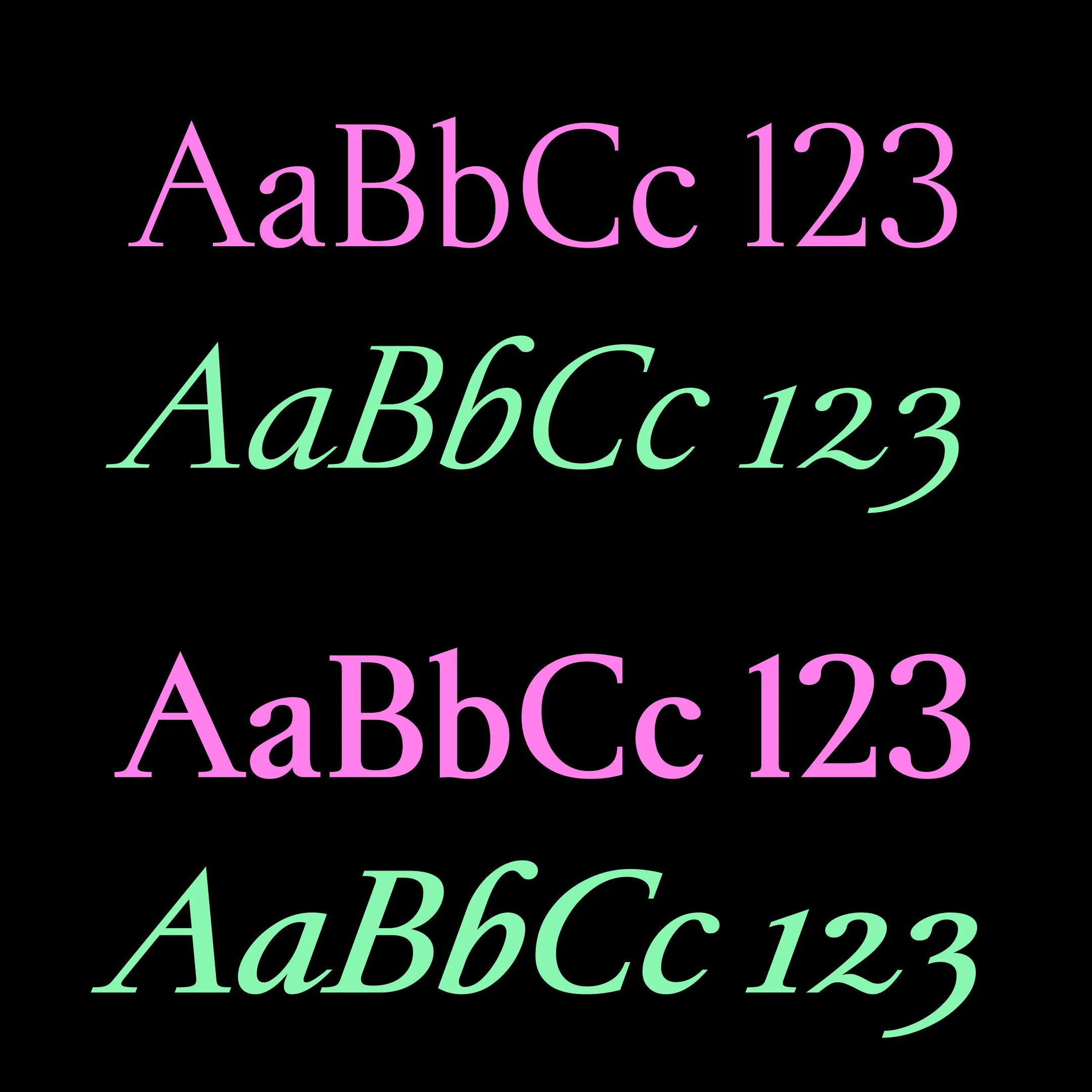
Looking at the typography, the design radiates pure Renaissance spirit. The lowercase glyphs capture the organic rhythm of a broad-nib quill: the ‘o’ features generous open counters, the bowl of the ‘b’ holds ink-like pools, and the terminals finish with smooth, delicate curves. Meanwhile, the capitals embody a bold, chiseled stone-carving aesthetic inspired by classic Roman inscriptions Michelangelo carved onto masterpieces like the Pietà, St. Peter’s Basilica, and the Sistine Chapel. Set slightly narrower than Garamond without feeling cramped, the font balances scribe-like delicacy down below with lapidary strength up top.
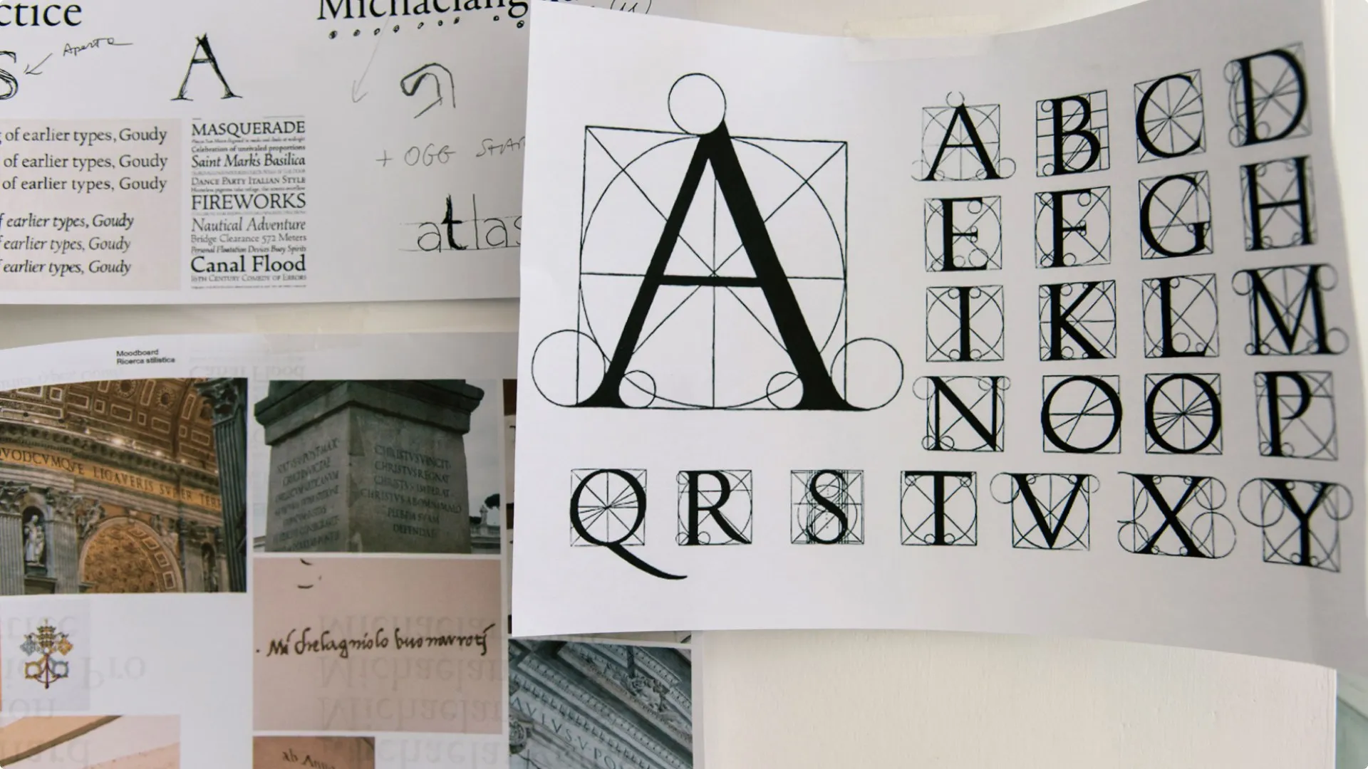
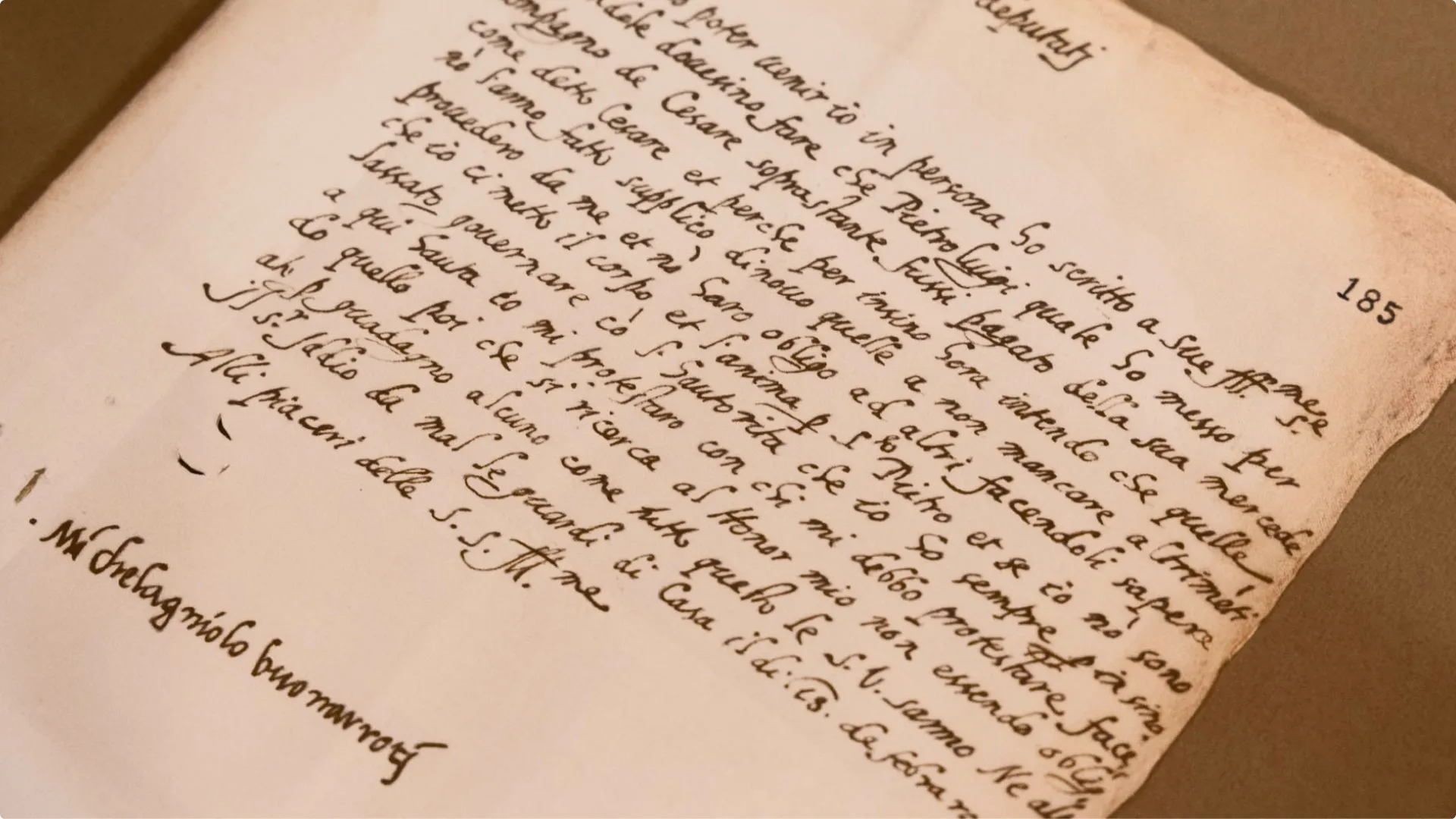
Rather than creating a literal trace of Michelangelo’s penmanship, Studiogusto built a modern modular grid system. As founder and creative director Stefano Caliandro shared, the breakthrough came from unlocking the hidden geometric logic behind Michelangelo’s handwriting. By identifying the underlying structural framework used by the Renaissance master, the design team translated those fluid strokes into precise, structured characters.
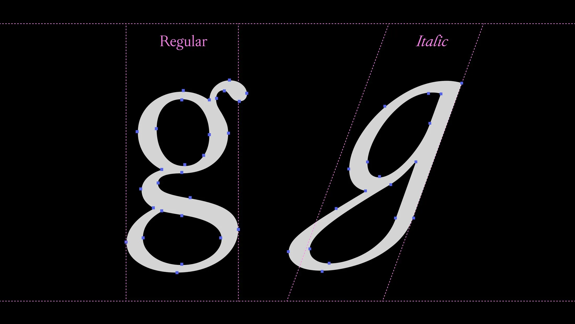
Since no complete historical alphabet survived, font development actually started with the italic style. Crafting the lowercase ‘g’ alone took an entire week, blending a double-storey shape in the regular weight with slanting curves sampled directly from the artist’s own signature. In the specimen sheets—highlighted with blue letterforms inside pink circles along slanted grid lines—letters like B, D, and E showcase dynamic internal spatial tension, the crossbar of the T spreads wide like wings, and the apex of the N punches straight through the baseline.
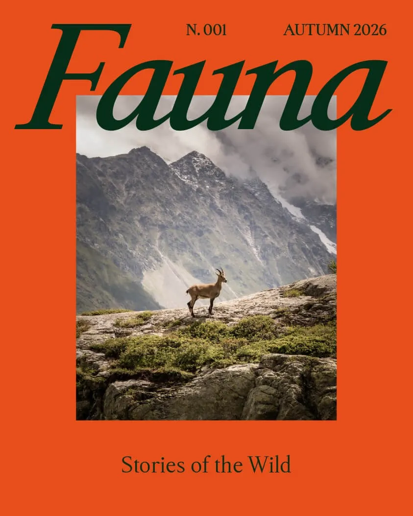
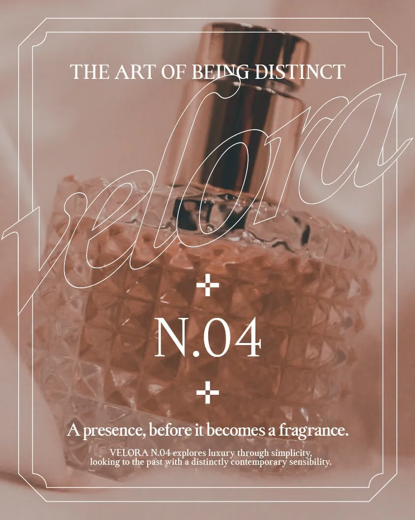
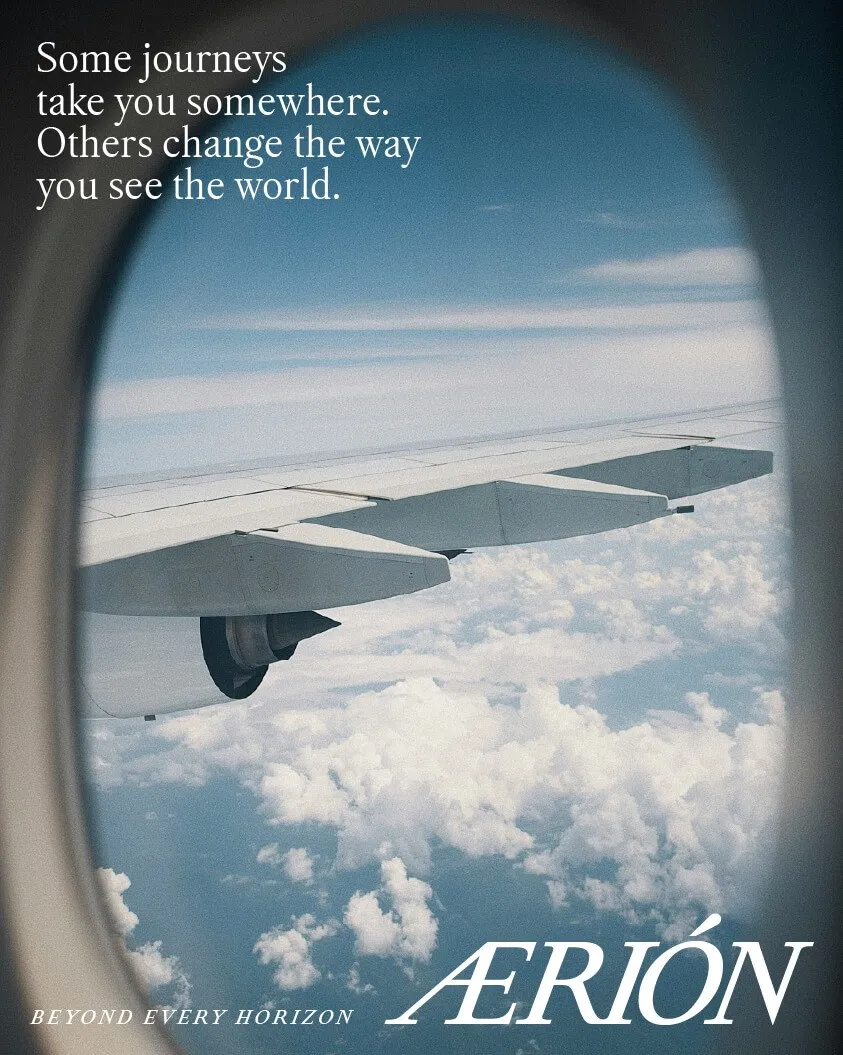
Versatility is where this typeface truly excels. Beyond being available for free download right now, its upcoming arrival in Microsoft 365 will bring high-quality typography to millions of Word files and presentation decks. Studiogusto’s promotional posters highlight just how flexible it is: appearing across vibrant orange-and-green magazine covers, outlined script layouts for luxury perfume ads, and sweeping airline graphics spanning airplane windows.
Check out more details and full specimen visuals on the michelangelus.studiogusto.com/.
Studiogusto và bộ font Michelangelus: Khi nét chữ tay của Michelangelo biến thành hệ thống Typography hiện đại
Một bộ font chữ mới mang tên Michelangelus vừa được Studiogusto trình làng theo đơn đặt hàng từ Tòa thánh Vatican. Điểm thú vị là bộ humanist serif này sẽ được tích hợp trực tiếp vào bộ ứng dụng Microsoft 365 vào cuối năm nay.
Nhìn vào thiết kế, bộ font thể hiện rõ tinh thần Phục hưng. Phần chữ viết thường (lowercase) tuân theo tư duy của ngòi bút lông vát (quill): chữ ‘o’ mang phần ruột chữ (counter) rộng rãi, phần bụng chữ ‘b’ đọng lại nét như giọt mực, và các nét kết thúc (terminal) đều lượn nhẹ nhàng chứ không dứt gắt. Trong khi đó, phần chữ in hoa (capitals) lại mang tinh thần của nét đục khắc trên đá, lấy cảm hứng từ các dòng chữ La Mã mà Michelangelo từng chạm khắc trên tượng Pietà, Tòa thánh St. Peter hay Nhà nguyện Sistine. Nét chữ chạy hẹp hơn Garamond nhưng không tạo cảm giác bị nén (condensed), giữ cho hai phần của bộ font một sự cân bằng khéo léo: nét mềm mại của người chép sách ở bên dưới và sự vững chãi của thợ khắc đá ở bên trên.
Thay vì mô phỏng lại nguyên xì nét chữ tay của Michelangelo, Studiogusto đã chọn cách tiếp cận dựa trên hệ thống khung lưới (grid). Theo chia sẻ từ Stefano Caliandro, nhà sáng lập kiêm chỉ đạo nghệ thuật của studio, quyết định quan trọng nhất là giải mã trật tự ẩn sâu bên dưới chữ viết của Michelangelo. Họ tìm ra cấu trúc mà vị kiến trúc sư lỗi lạc này đã áp dụng, rồi tái tạo lại các ký tự thành những module có ranh giới rõ ràng.
Do không có một bảng chữ cái hoàn chỉnh nào từ thời đó còn lưu lại, quá trình dựng font được bắt đầu với bản italic trước. Chỉ riêng chữ ‘g’ thường đã mất tới một tuần làm việc, kết hợp giữa dạng double-stacked ở bản regular và nét nghiêng lấy trực tiếp từ chữ ký của chính nghệ sĩ. Trong các bản specimen, các chữ cái màu xanh nằm trong khung tròn màu hồng cùng đường gióng nghiêng: chữ B, D, E mang áp lực không gian nội bộ, nét ngang chữ T vươn rộng như đôi cánh, còn đỉnh chữ N cắt qua đường baseline.
Bộ font này mang tính ứng dụng rất cao. Bên cạnh việc cho tải về miễn phí ngay từ bây giờ, việc xuất hiện trên Microsoft 365 sắp tới sẽ đưa một bộ serif chất lượng đến với hàng triệu tài liệu Word và slide thuyết trình. Các bản poster do studio thực hiện cũng thể hiện tính linh hoạt của bộ font: từ bìa tạp chí phối màu cam – xanh lá, chiến dịch nước hoa với dạng script nét viền, cho đến quảng cáo hàng không trải dài trên cửa sổ máy bay.
Có thể xem thêm thông tin và hình ảnh chi tiết trên michelangelus.studiogusto.com/.