
motion
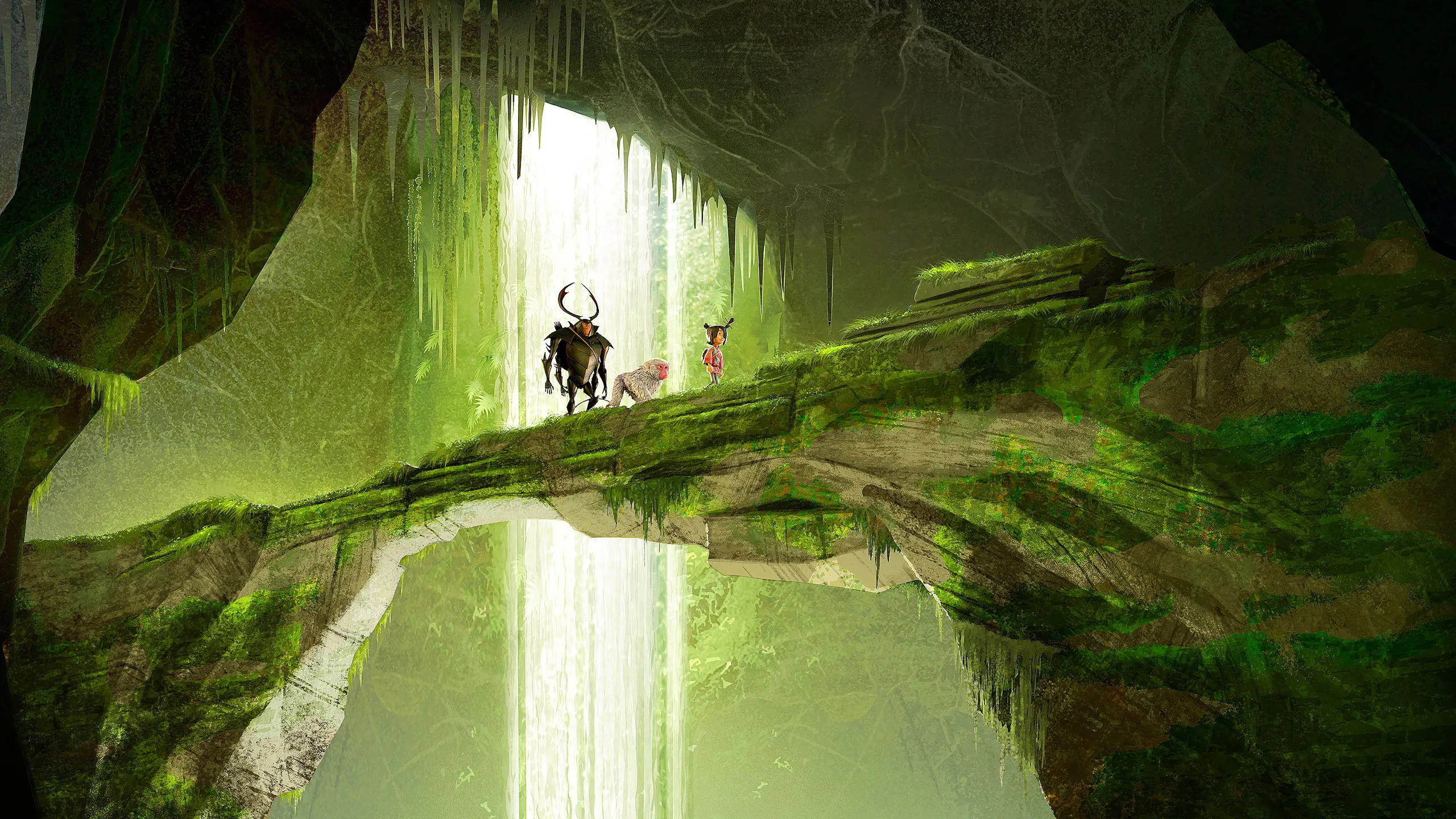
Kubo and the Two Strings: A Masterpiece of Stop-Motion and Japanese Aesthetics
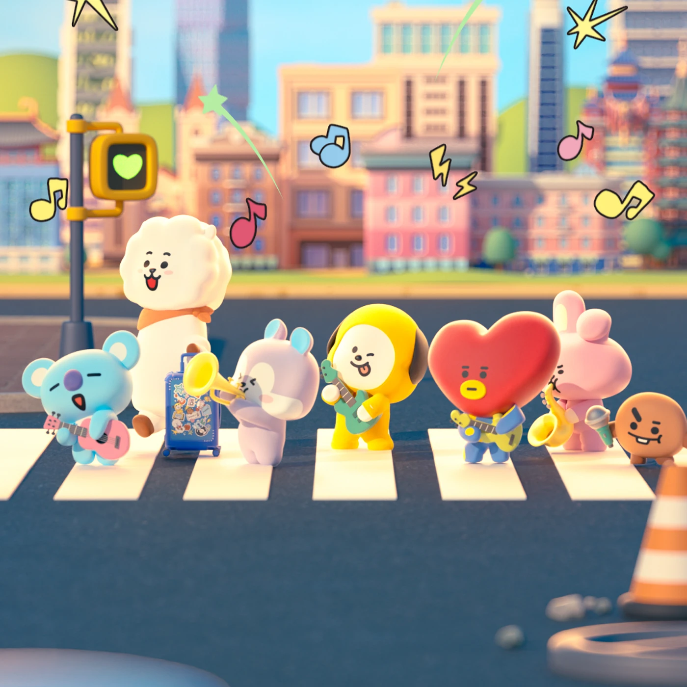
BT21 X CASETiFY: A Colorful Musical World Voyage Tech Collection
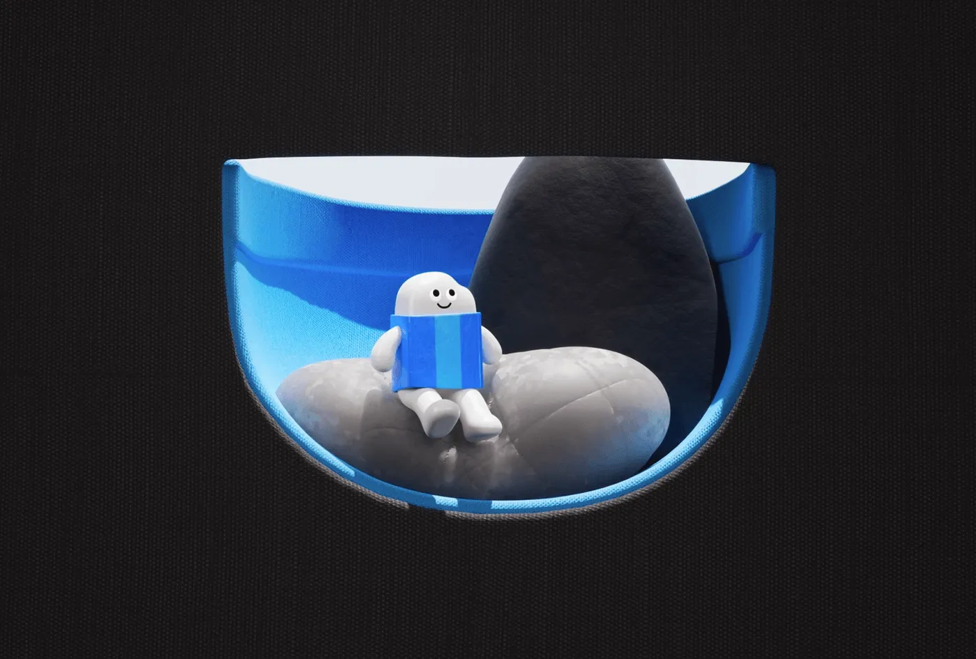
Inside the Creative Pocket Universe: PTS XS Channel Branding Film by Bito
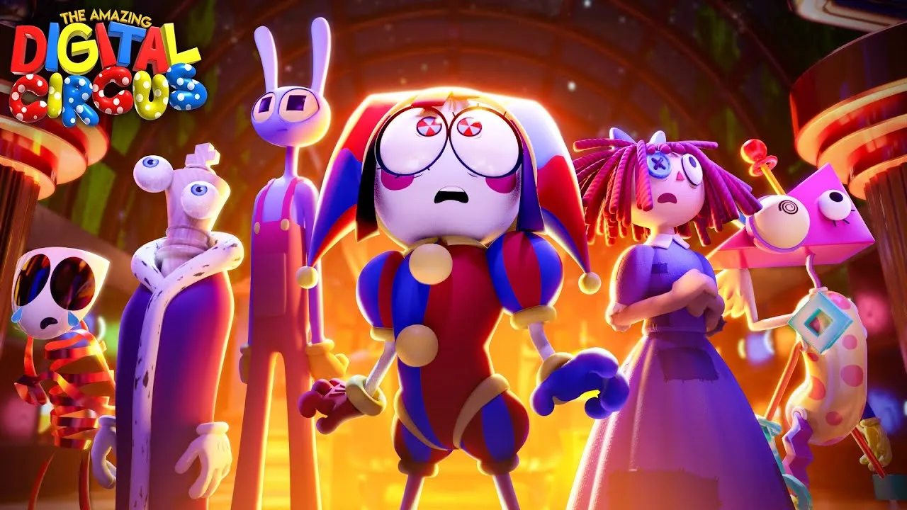
YouTube’s New Monetization Thresholds Policy Sparks Worry for Independent Animators
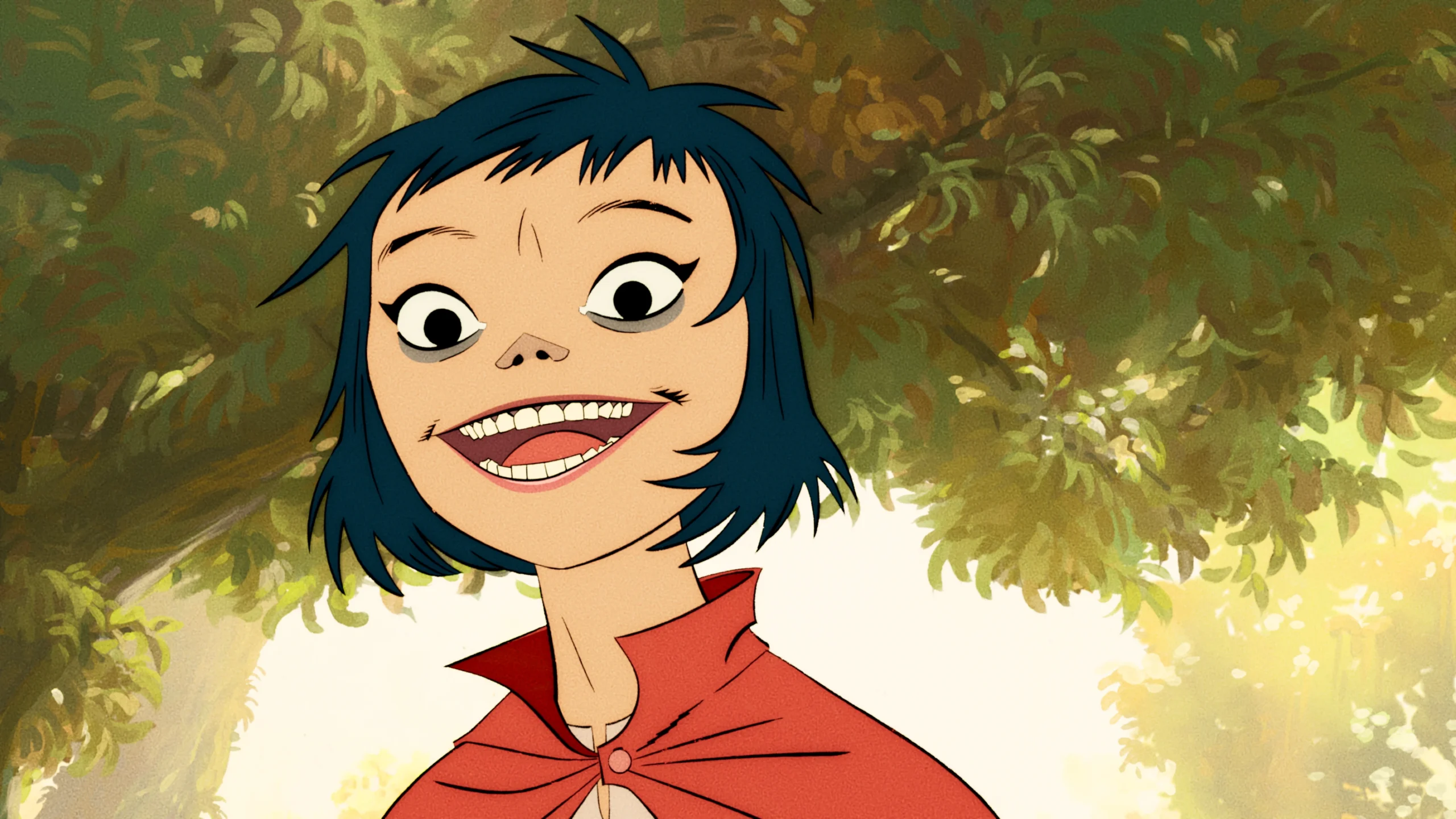
The Mountain: A Hand-Drawn Cinematic Journey for Gorillaz by The Line and Box of Toys Audio
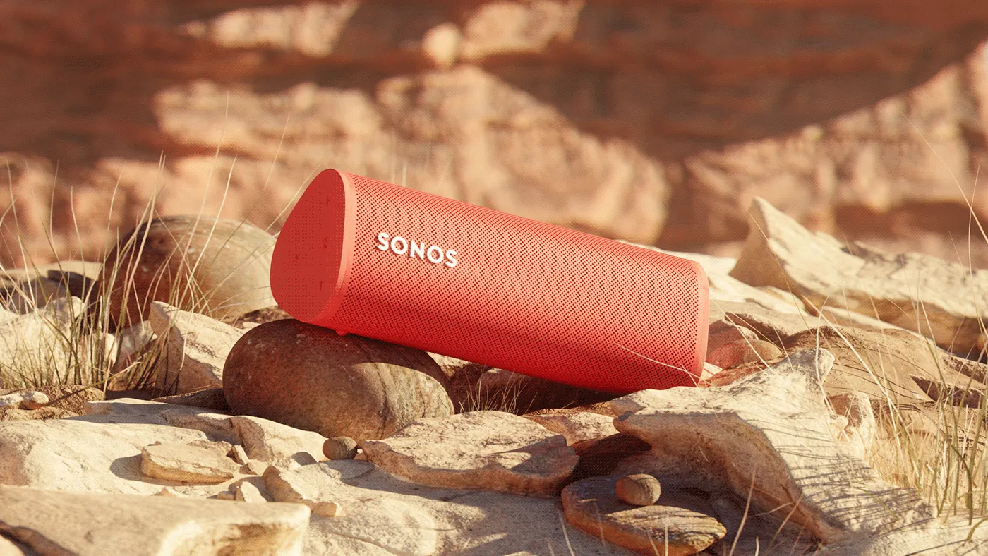
Sonos Roam: A Sonic Reimagining by evolsound
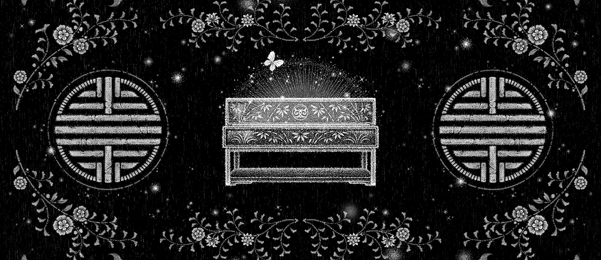
Traditional Korean Motifs Meet K-Pop in Dodree – HAWWAH Promotional Video ‘Black’ by soman
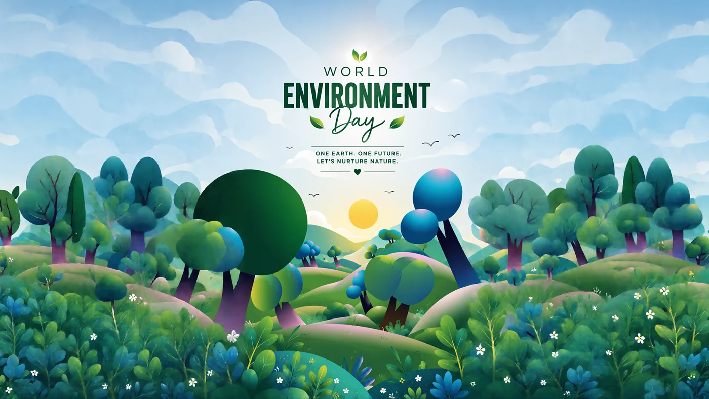
Bringing Environmental Awareness to Life Through Motion Design by Picto Design Studio
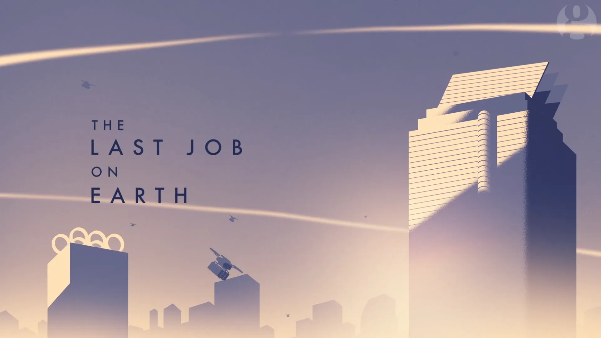
The Last Job On Earth: Behind the Animation by Moth Collective and The Guardian
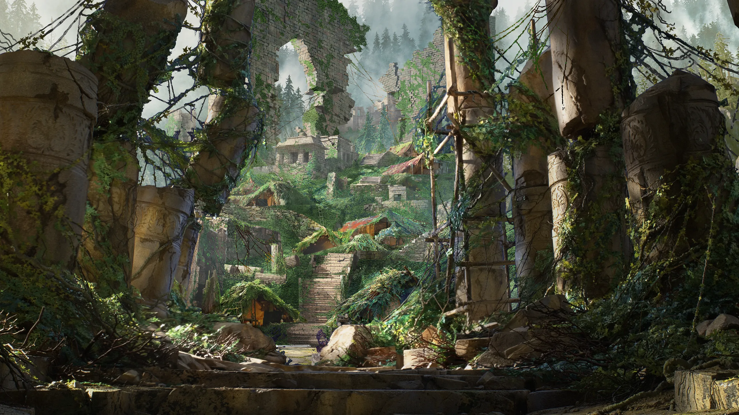
Wildwood – The Ambitious Stop-Motion Animation Project from LAIKA Studios
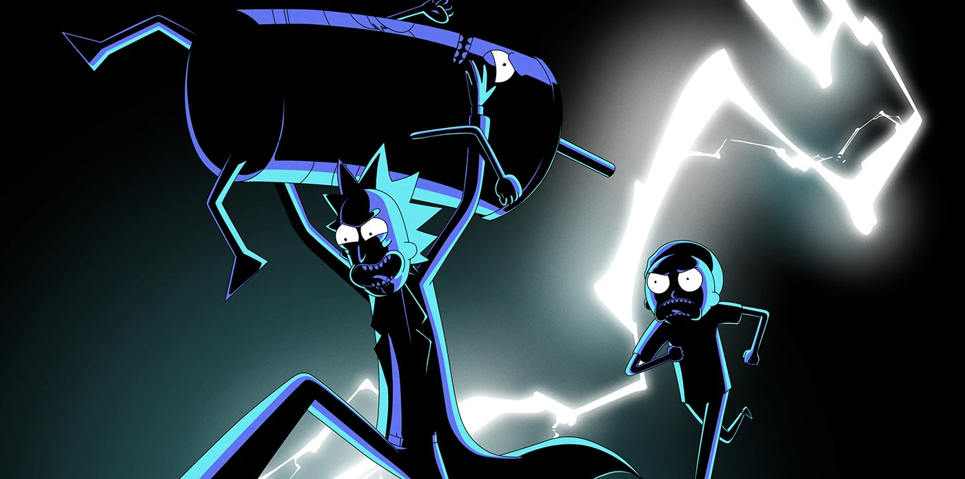
Rick & Morty x Wendy’s Drive Through Flash Frames by Johnny Cardoso
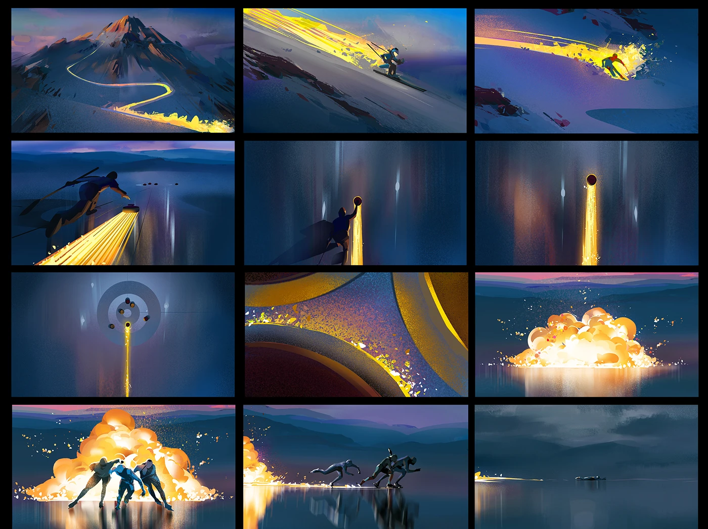
Inside the Striking Color Concepts of BBC’s ‘Trails Will Blaze’ by Michał Sawtyruk
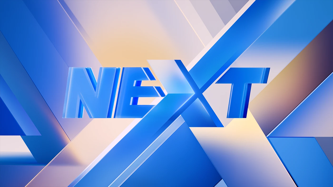
New Visual Identity for SBS NEX 4K UHD Channel
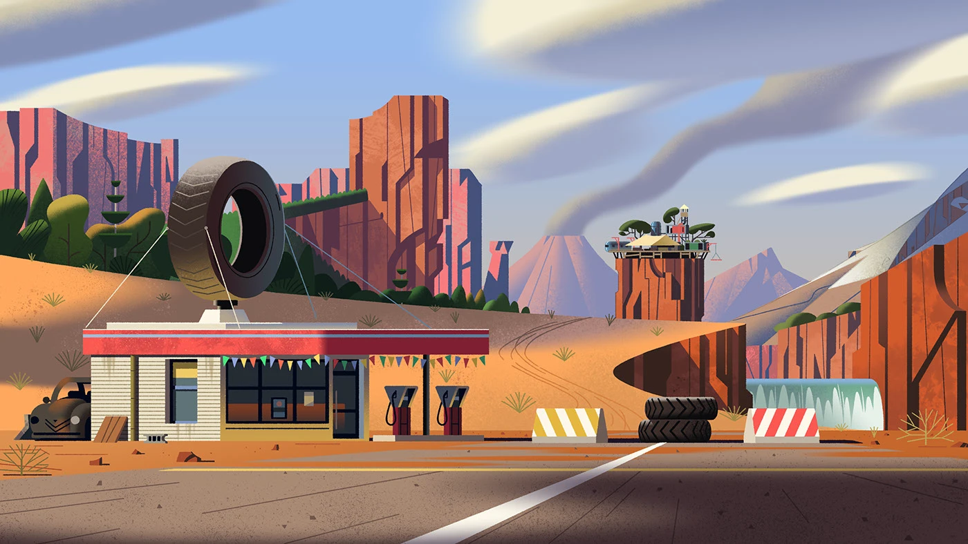
Background Design Bible for Monster 500 Series by Théo Guignard
game

My Raccoon Story: The Debut Cozy Game by HappieSprout Studio
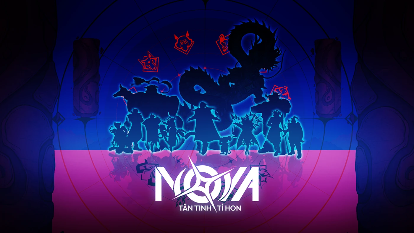
NOVA – The Tiny Guardian: A Creative Sci-Fi Fantasy Game Design Concept by Brianz Mau
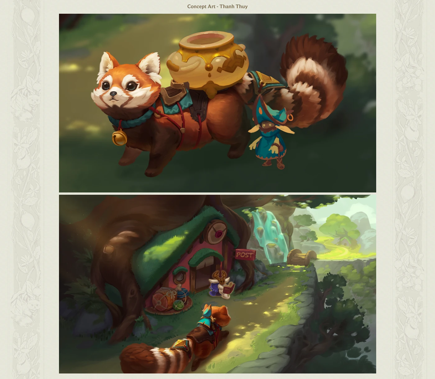
Pathlinker: A Captivating Fantasy PC Game UI/UX Concept
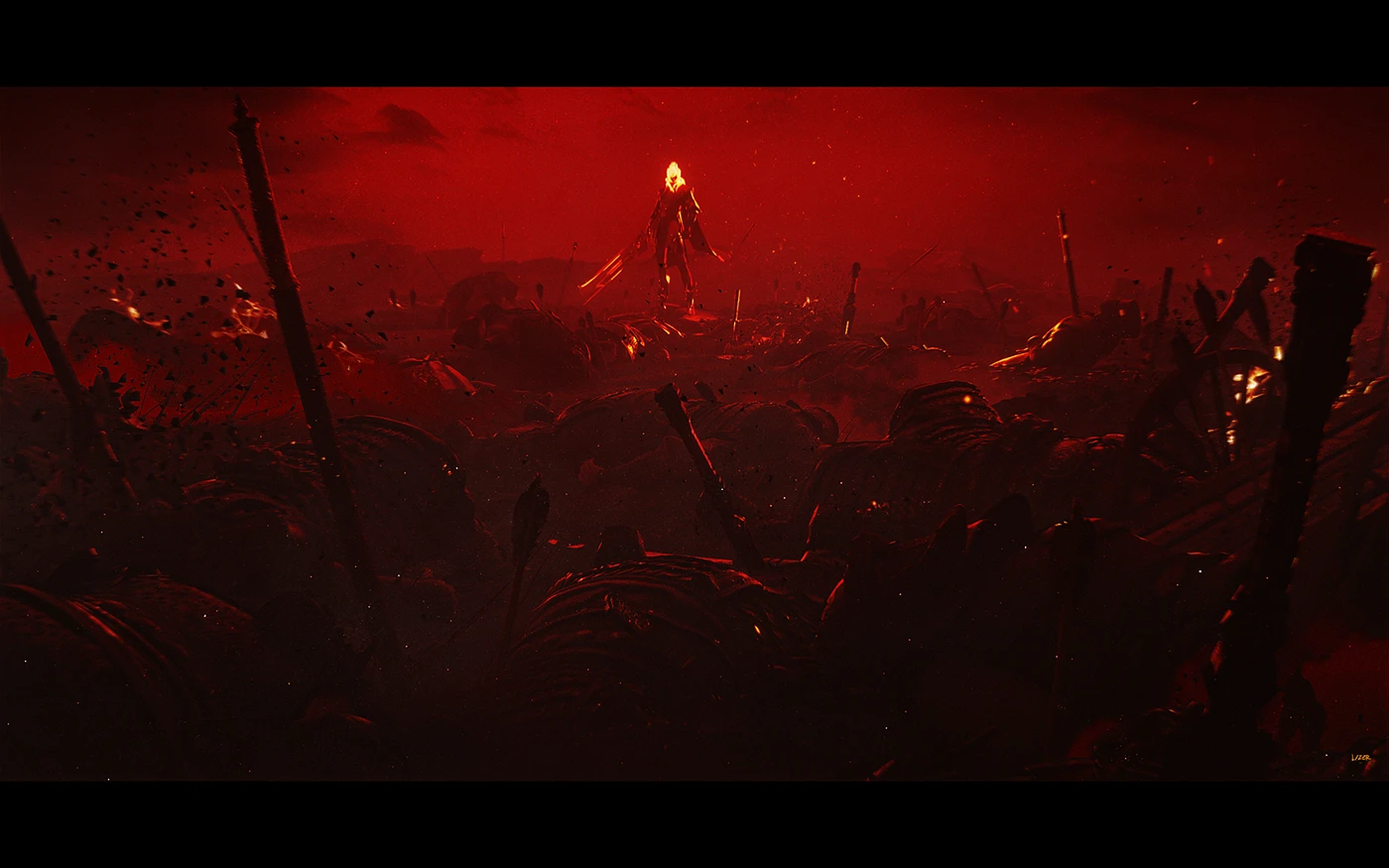
The Striking Concept Art of GoldSpear & RedMist by Lizer
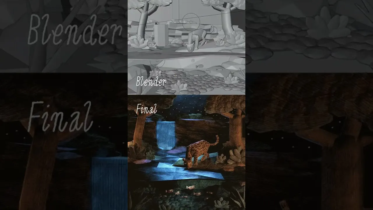
James Shedden creates a cozy 3D game with woodcut aesthetics using Godot Engine
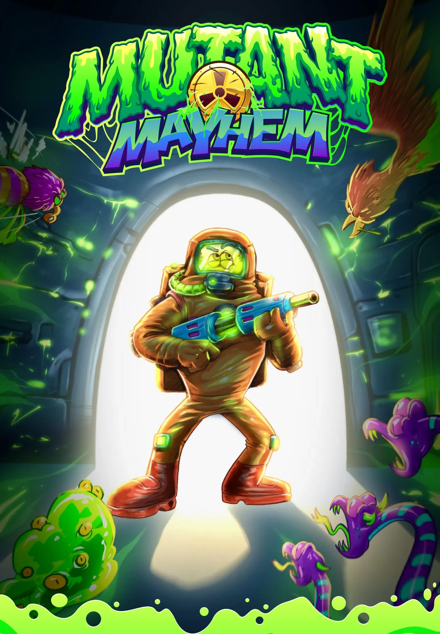
Mutant Mayhem: A Playful Twist on Post-Apocalyptic Game Design
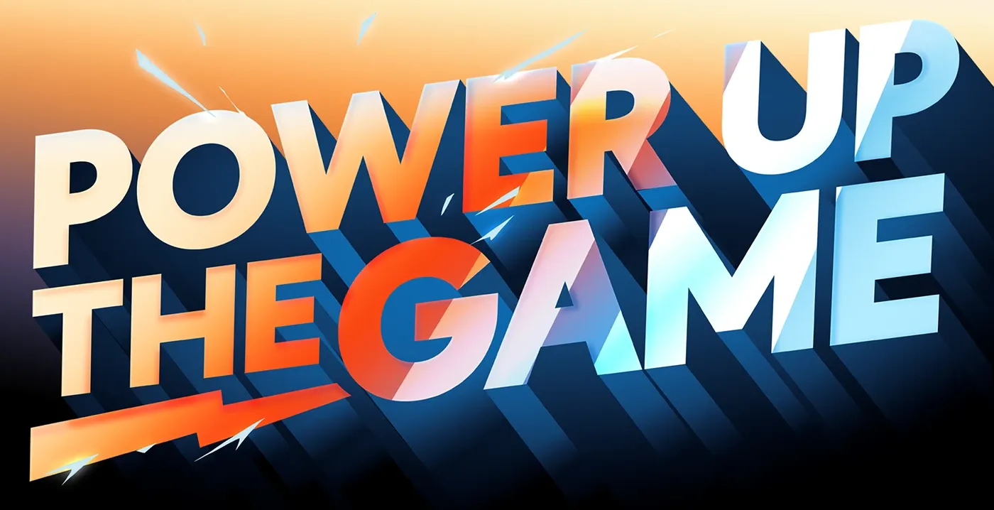
DEI: Power Up The Game Creative Concepts
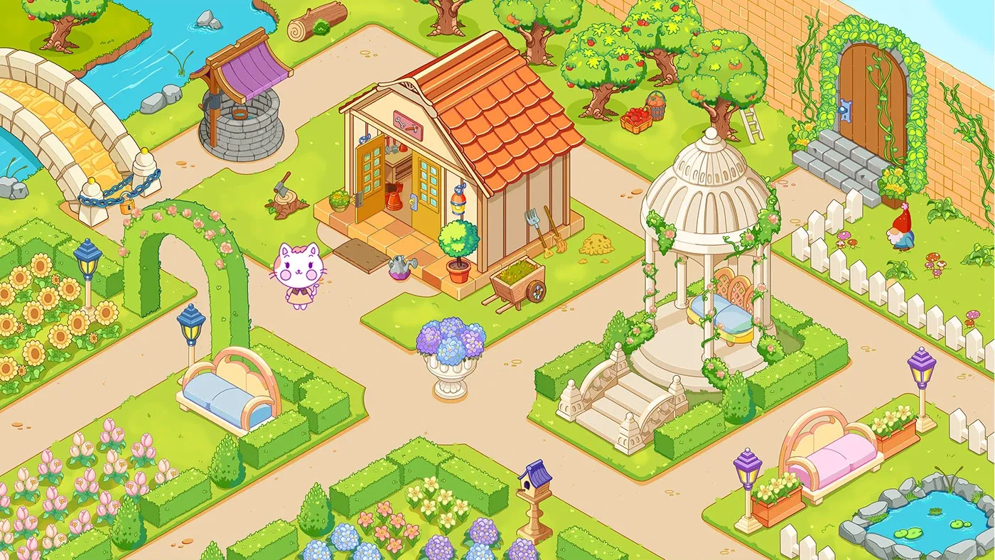
The Secret Garden: Cozy Game Asset Design by Rose Guedes
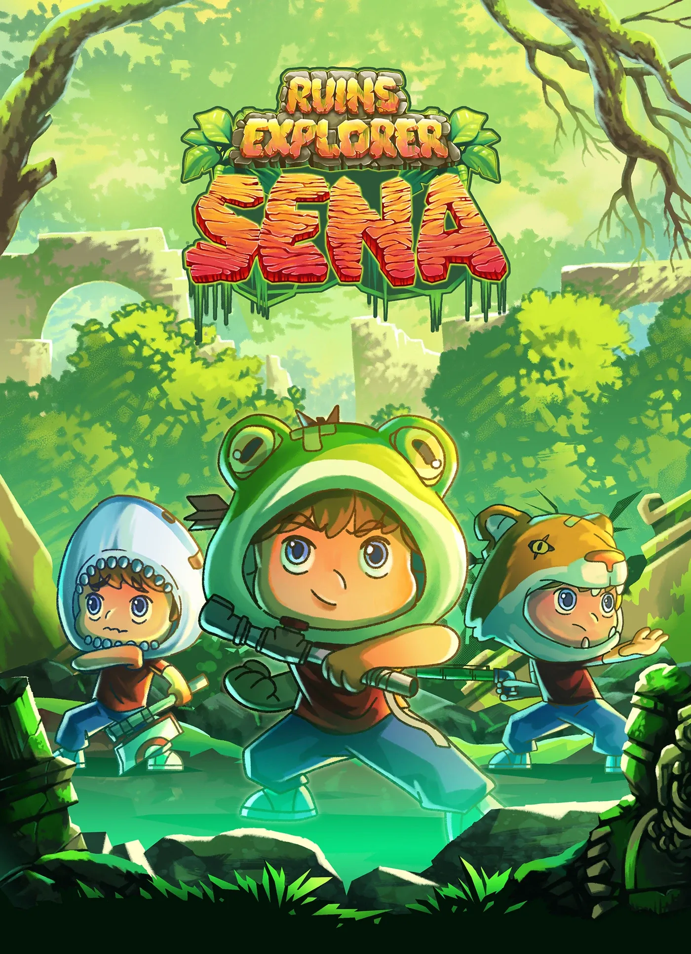
Character Concept Art: Ruins Explorer Sena Illustration
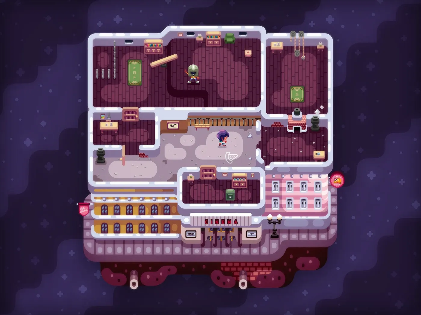
Timo: A Point-and-Click Adventure Game Born From an Indie Comic
branding
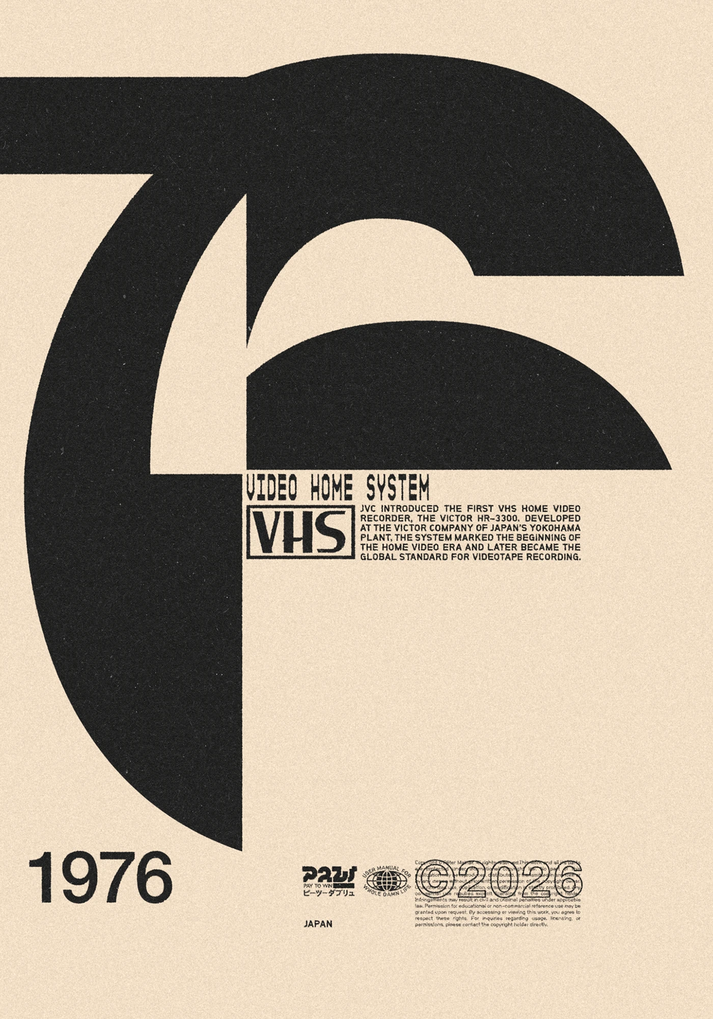
Molnár Péter Reimagines 1976 Cultural Icons in Bold Poster Concept
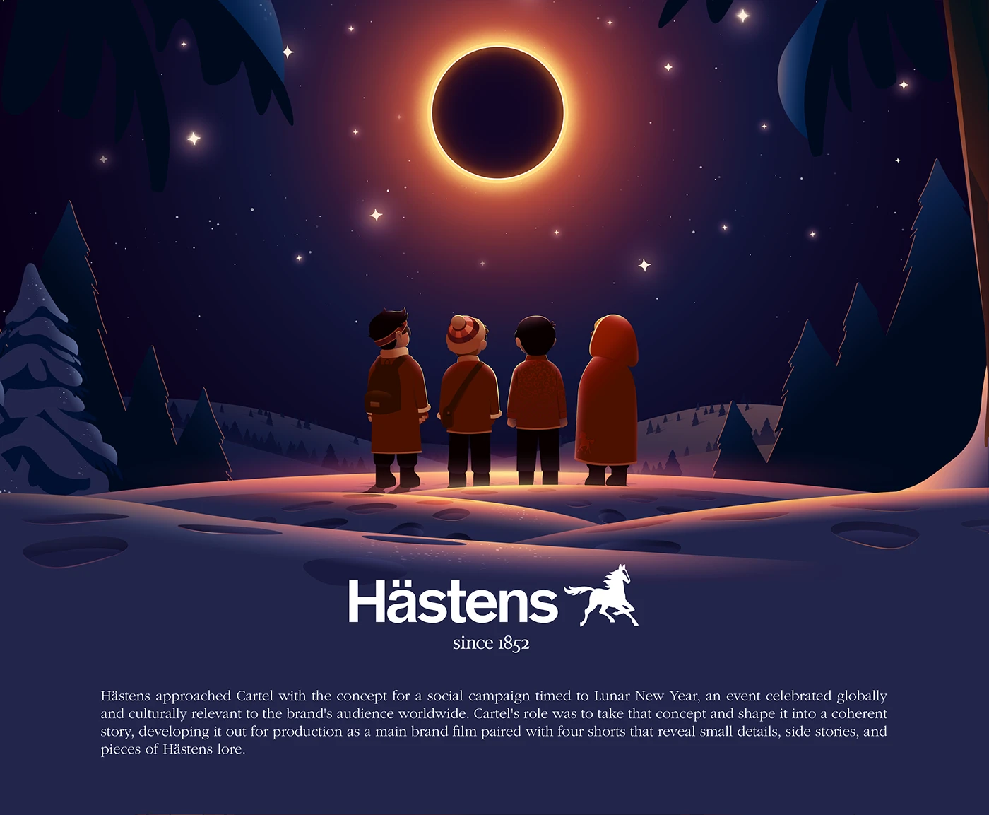
CARTEL x Hästens: A Festive Visual Story for Lunar New Year
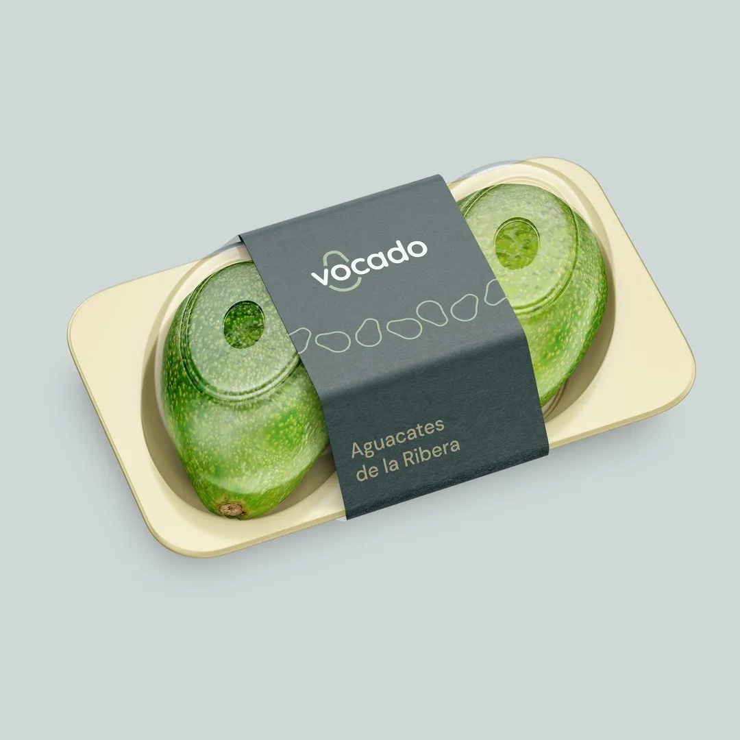
Vocado Branding and Packaging Identity by Estudio E
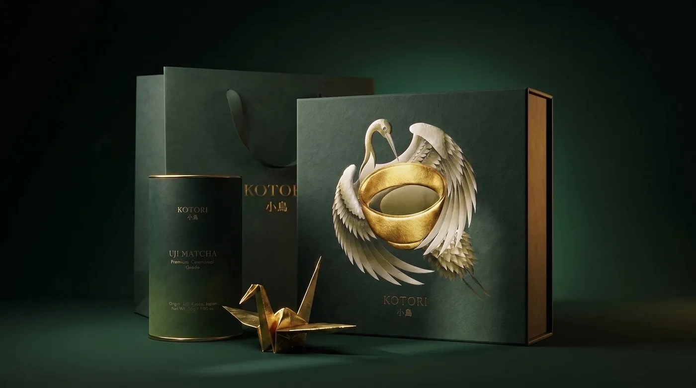
KOTORI Uji Matcha: Japanese Tea Tradition Rendered in Packaging Design by Valeriia Löffler
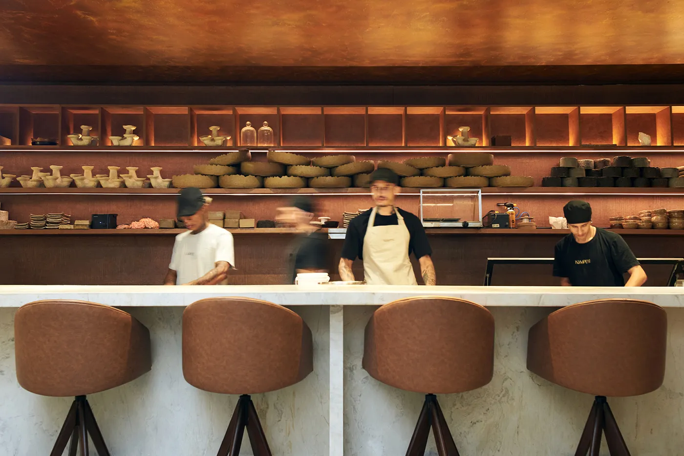
Minimalist Visual Identity for Kampeki Sushi by Blank Design Studio
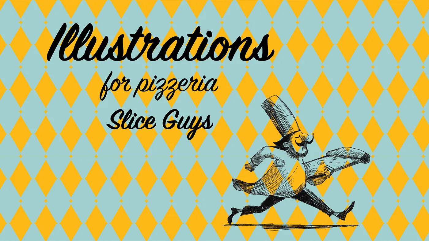
Slice Guys: Jeanne Nazinian Builds a Bold Retro Visual Identity
good stuffs
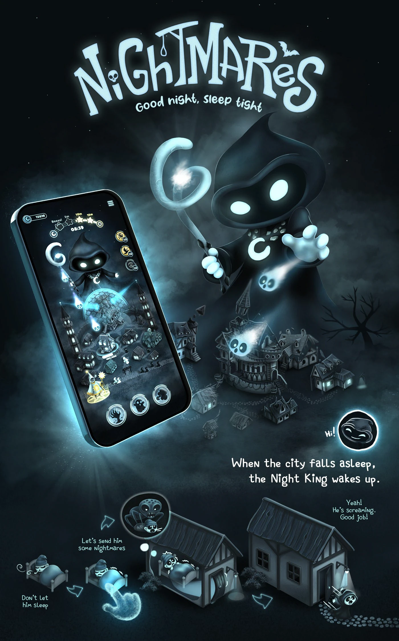
Nightmares: Creepy Insomnia Visual Project
Nightmares: Creepy Insomnia – Turning Sleepless Fears Into Art Those restless, tossing-and-turning nights can actually spark some seriously impressive artwork! The “Nightmares: Creepy Insomnia” project serves up a chilling, moody look at the world of nightmares and that sheer feeling…
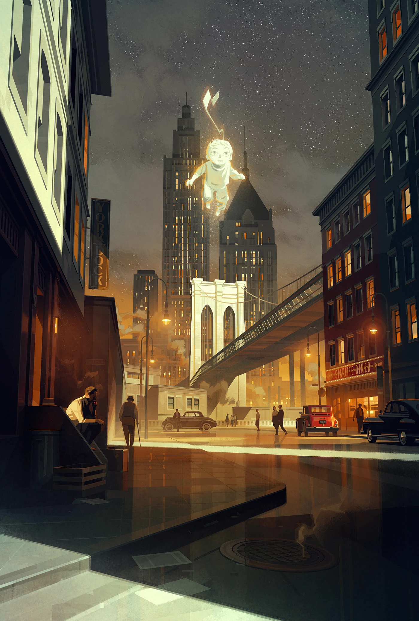
Saint-Exupéry Movie Pitch Doc Visuals by Sergey Kolesov
Concept illustrations for Sergey Kolesov’s Saint-Exupéry movie project! Back in 2020, artist Sergey Kolesov crafted a series of incredible visuals to support the pitch deck phase for a feature film about author Antoine de Saint-Exupéry. The project featured art direction…
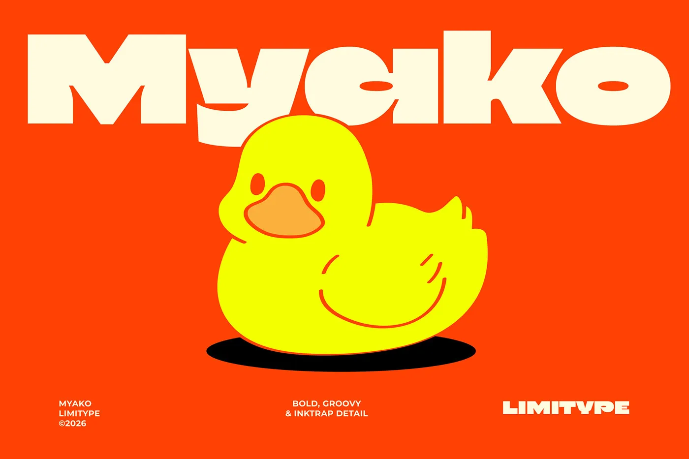
Myako Display Font: Heavy Stems and Inktrap Details for Modern Packaging
Myako Display Font: Bold Stems and Sharp Inktrap Details for Packaging Design Limitype’s Myako display font brings together plush, rounded curves and deep, sharp inktrap cuts. This playful style adds a fun, standout vibe to modern layouts, from eye-catching posters…
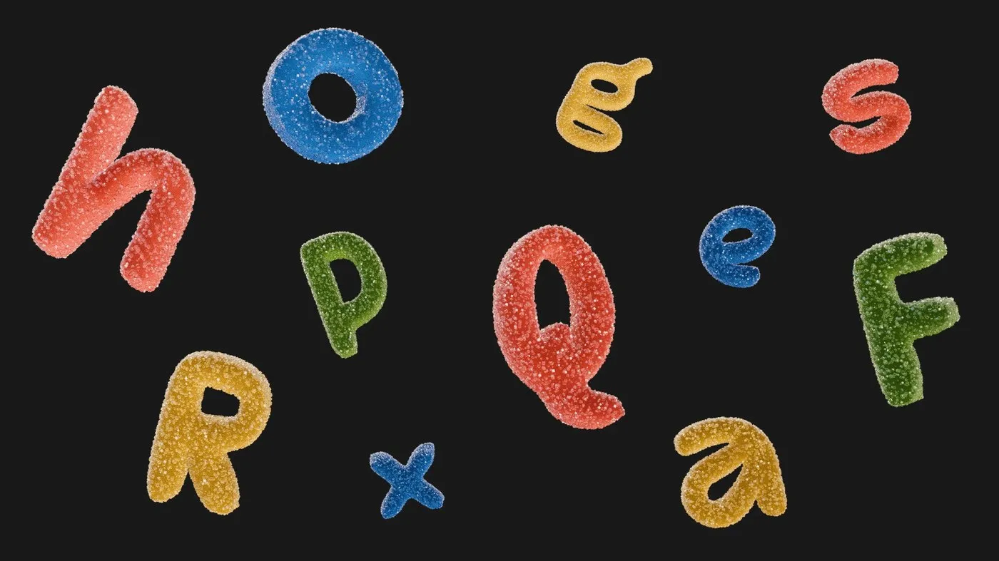
ESH Typeface: A Bold Custom Font System Created by ESH Gruppa
ESH Typeface: A Geometric, Retro-Inspired Font by ESH Gruppa ESH Gruppa crafted a custom font named ESH Typeface to anchor its brand identity. The letterforms seamlessly blend crisp geometric structures with playful, expressive curves. Featuring extra-heavy stroke weights, the font…
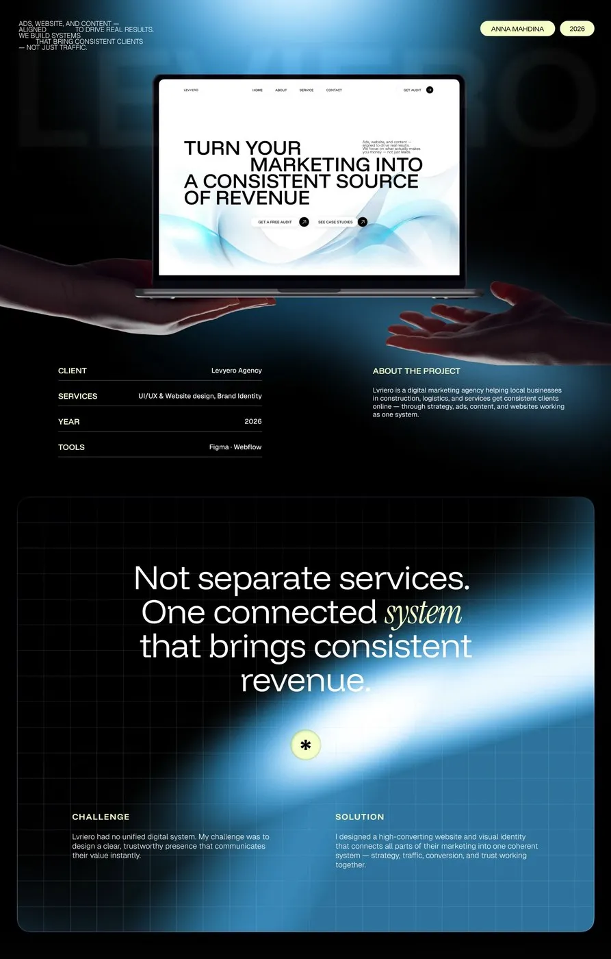
Levyero UI/UX Design System by Anna Mahdina: A Modular Approach for Marketing Agencies
UI/UX Design for Levyero by Anna Mahdina: A Modular Website System for Agencies Anna Mahdina recently completed a real-world UI/UX project for a marketing agency website named Levyero. The design features a deep charcoal gray background as its core foundation,…
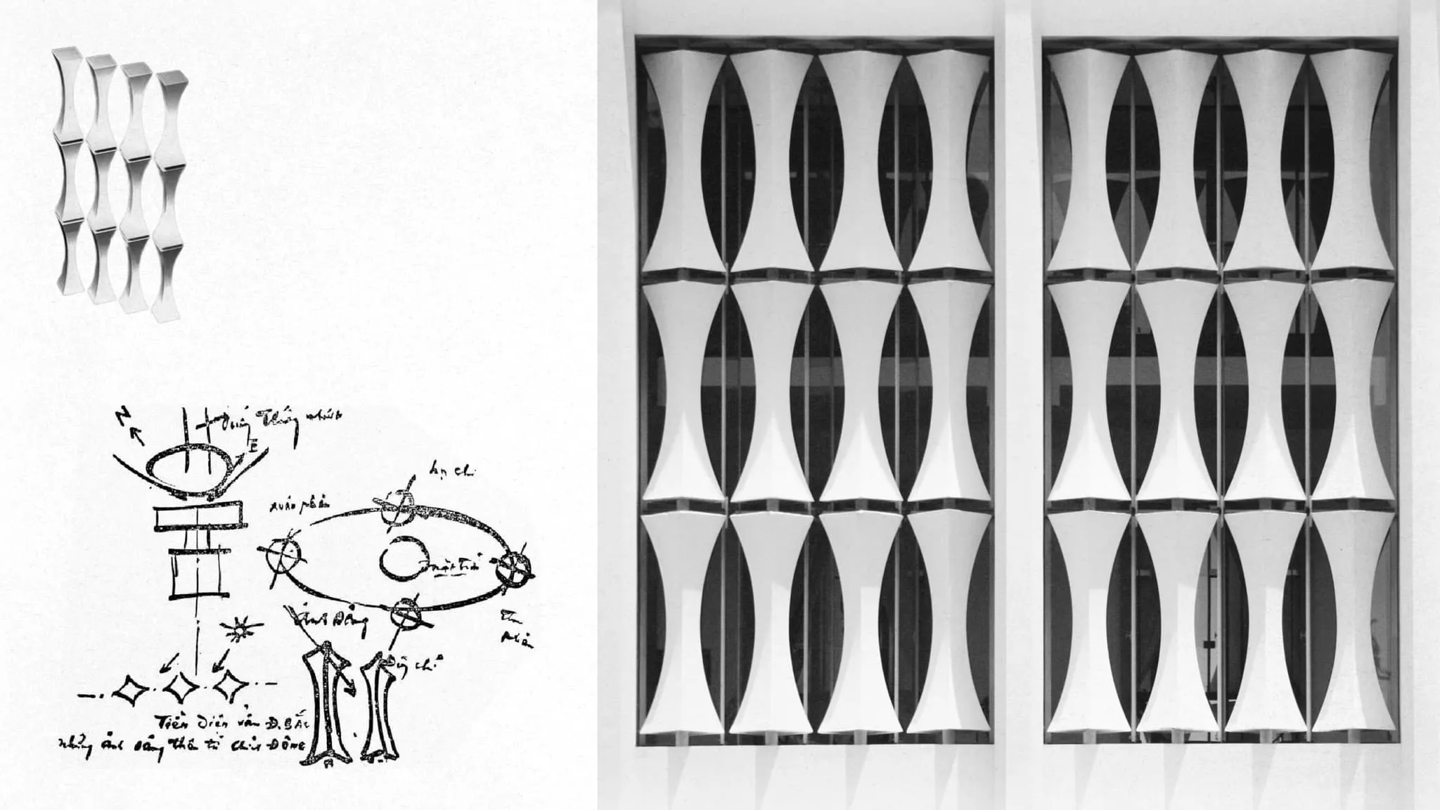
CDA Independence: A Custom Variable Typeface Inspired by the Independence Palace
CDA Independence: A Variable Typeface Inspired by the Independence Palace’s Stone Lattice CDA Independence is a versatile variable typeface created by Cōllective Design Agency (CDA) in collaboration with the Independence Palace. The project transforms iconic concrete stone lattice motifs into…
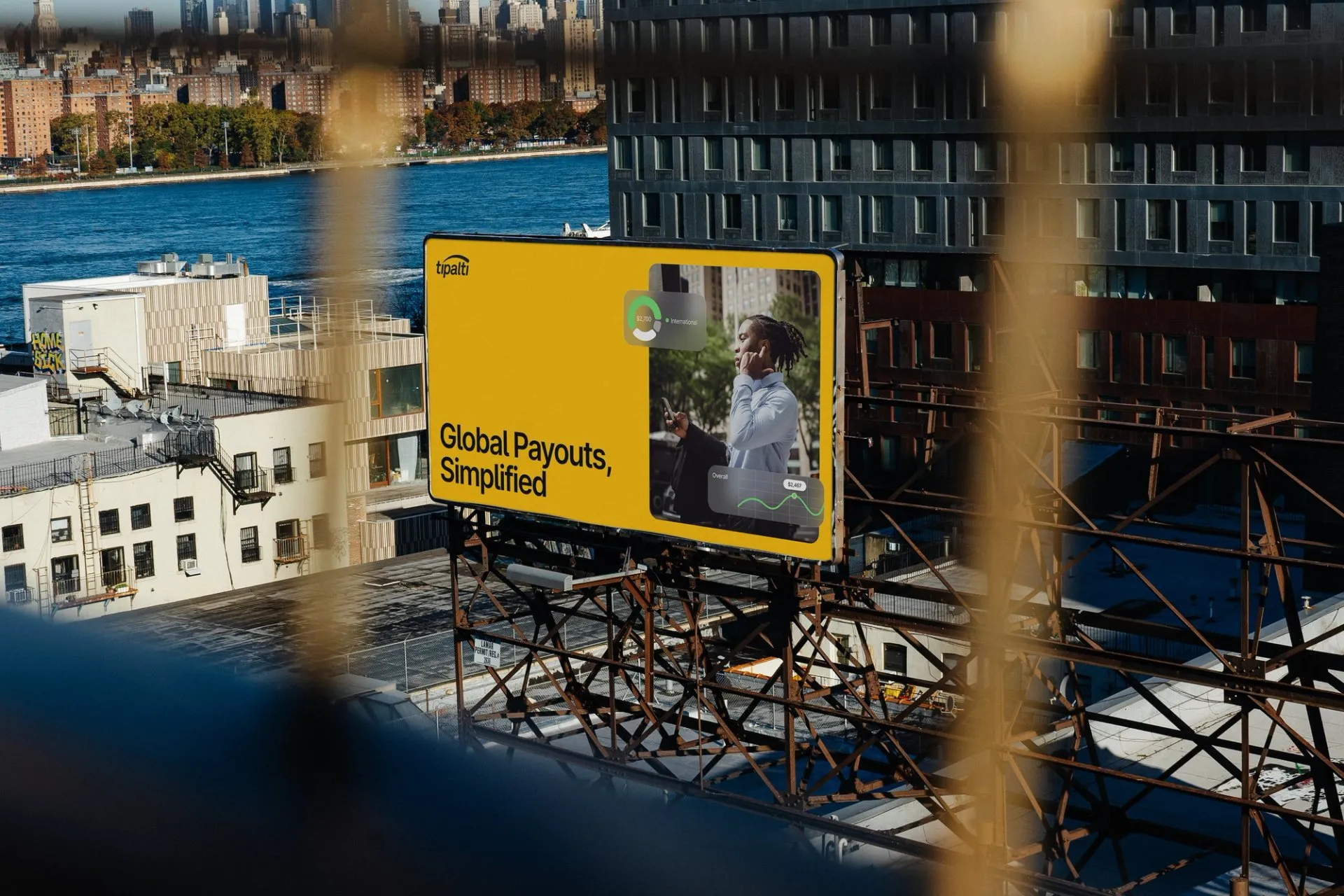
Tipalti Fintech Platform Web Design & Design System by Clay Global
Web Design & Design System for Tipalti Fintech Platform Turning complex payment processes into a super clean, easy-on-the-eyes web interface—that’s the magic behind the Tipalti fintech platform redesign by creative agency Clay Global. The star of the show here is…
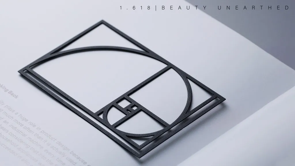
1.618 Golden Ratio Paperclip by Yuan Design Studio: Bringing Geometry to Desk Tools
1.618 Golden Ratio Paperclip by Yuan Design Studio: When Math Meets Everyday Desk Tools The Golden Ratio (phi = 1.618) is a classic design staple in fine arts and graphic design. Instead of leaving this famous mathematical concept trapped in…
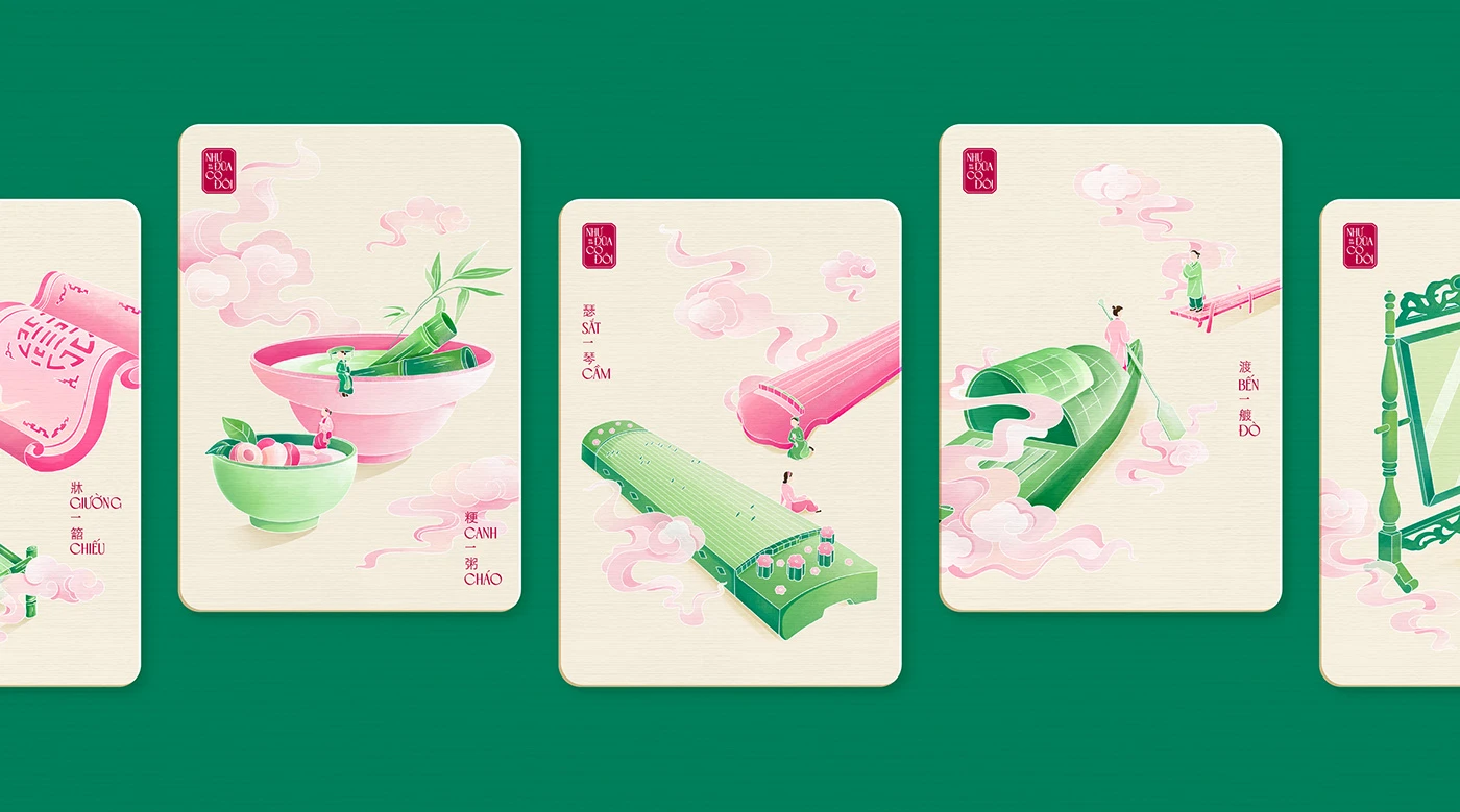
NHƯ ĐŨA CÓ ĐÔI – A Vietnamese Cultural Card Design Project by Miên Ơi
The “NHƯ ĐŨA CÓ ĐÔI” card deck by designer Miên Ơi is packed with rich Vietnamese culture. If you’re a fan of beautiful illustration and traditional heritage, this awesome card design project, www.behance.net/gallery/248676567/NHU-DUA-CO-DOI-Card-Design by Ho Chi Minh City-based creator www.behance.net/mcmin1,…
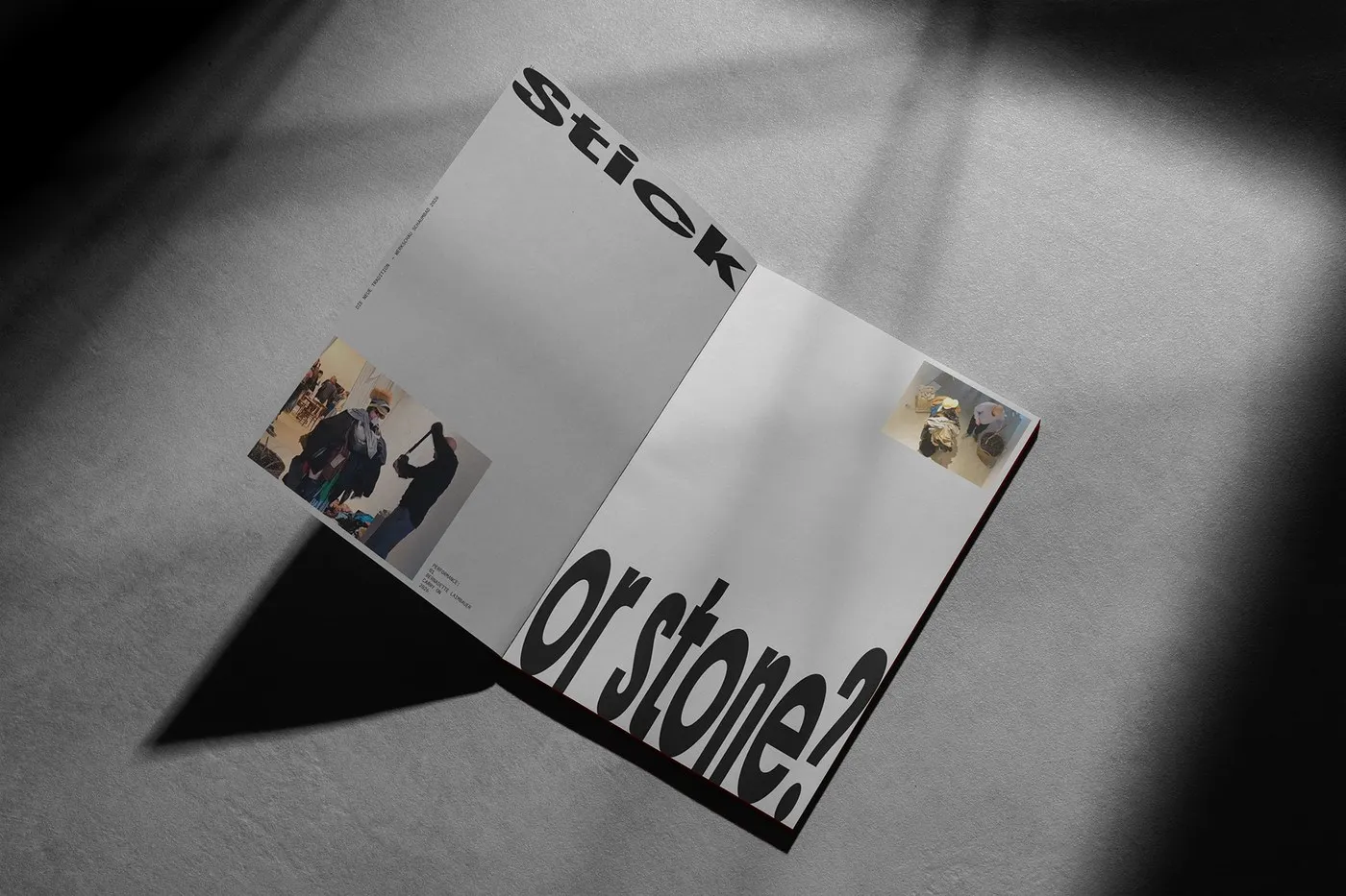
Bold Grid and Raw Contrast in Die neue Tradition by Schickeria Studio
Fresh, raw editorial layout for Schickeria Studio’s “Die neue Tradition” exhibition For the exhibition at Schaumbad Graz, Schickeria Studio built a striking visual language rooted in sharp, decisive editorial design. The layout intentionally takes a backseat as a sleek, refined…
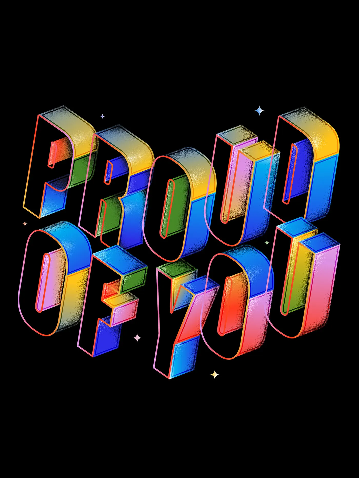
Type 1.1 by Hust Wilson: Isometric Forms and Granular Shading in Custom Typography
Type 1.1: Isometric 3D Lettering and Granular Shading by Hust Wilson The Type 1.1 project by designer Hust Wilson dives deep into expressive lettering using bold isometric 3D shapes and detailed granular stipple shading. Each character in the collection is…
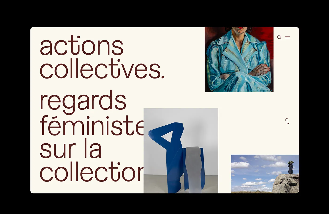
Collective Actions: Editorial Web Design for Digital Art Exhibition by Paprika Design
Collective Actions: An Editorial-Style Digital Art Exhibition Experience by Paprika Design The Collective Actions project by Paprika Design is a digital art exhibition platform that cleverly blends editorial layout thinking with modern web structure. Right off the bat, the soft…