Central European Collage: Matúš Hnát’s Book Cover Design for “Pohľad grófky Hahn-Hahn” Péter Esterházy’s 1990 novel, “The Glance of Countess Hahn-Hahn,” tells the story of a traveler journeying along the Danube River from the upper reaches all the way to the Black Sea. The title takes inspiration from Heinrich Heine’s playful jab at female writers—except for Countess Hahn-Hahn, who famously had just one eye! When independent Slovak publisher BRAK published this edition, Bratislava-based designer Matúš Hnát chose a fresh, modern approach: building a vibrant collage of river keepsakes instead of a traditional book cover.
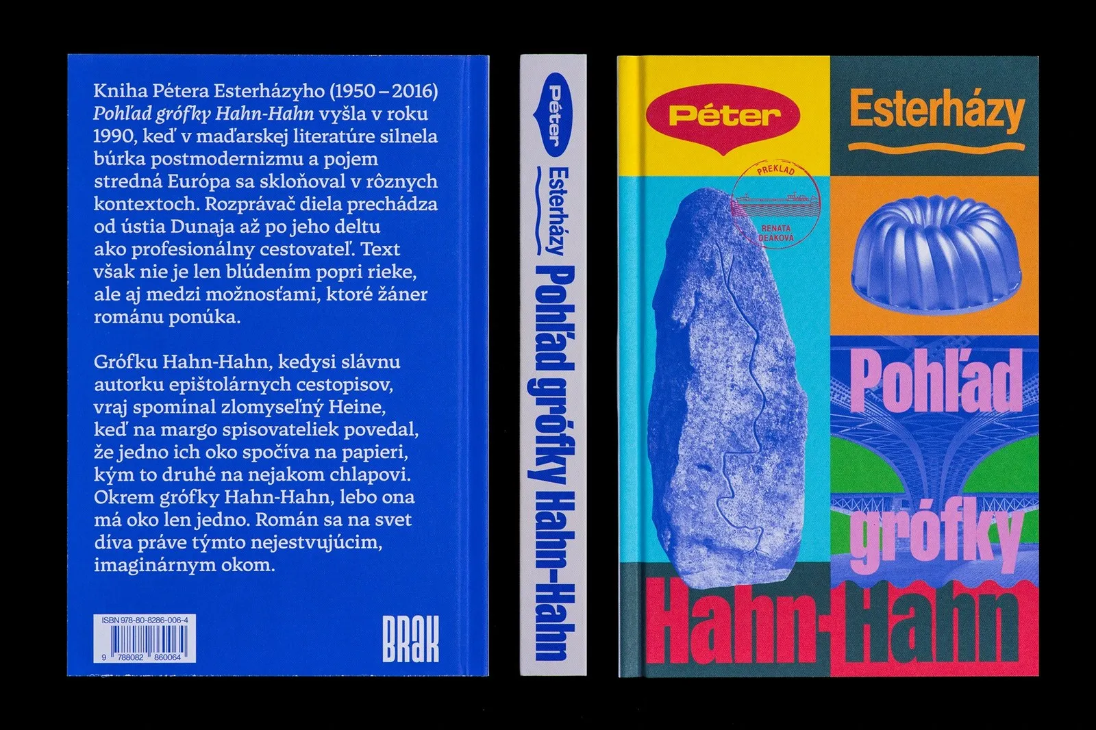
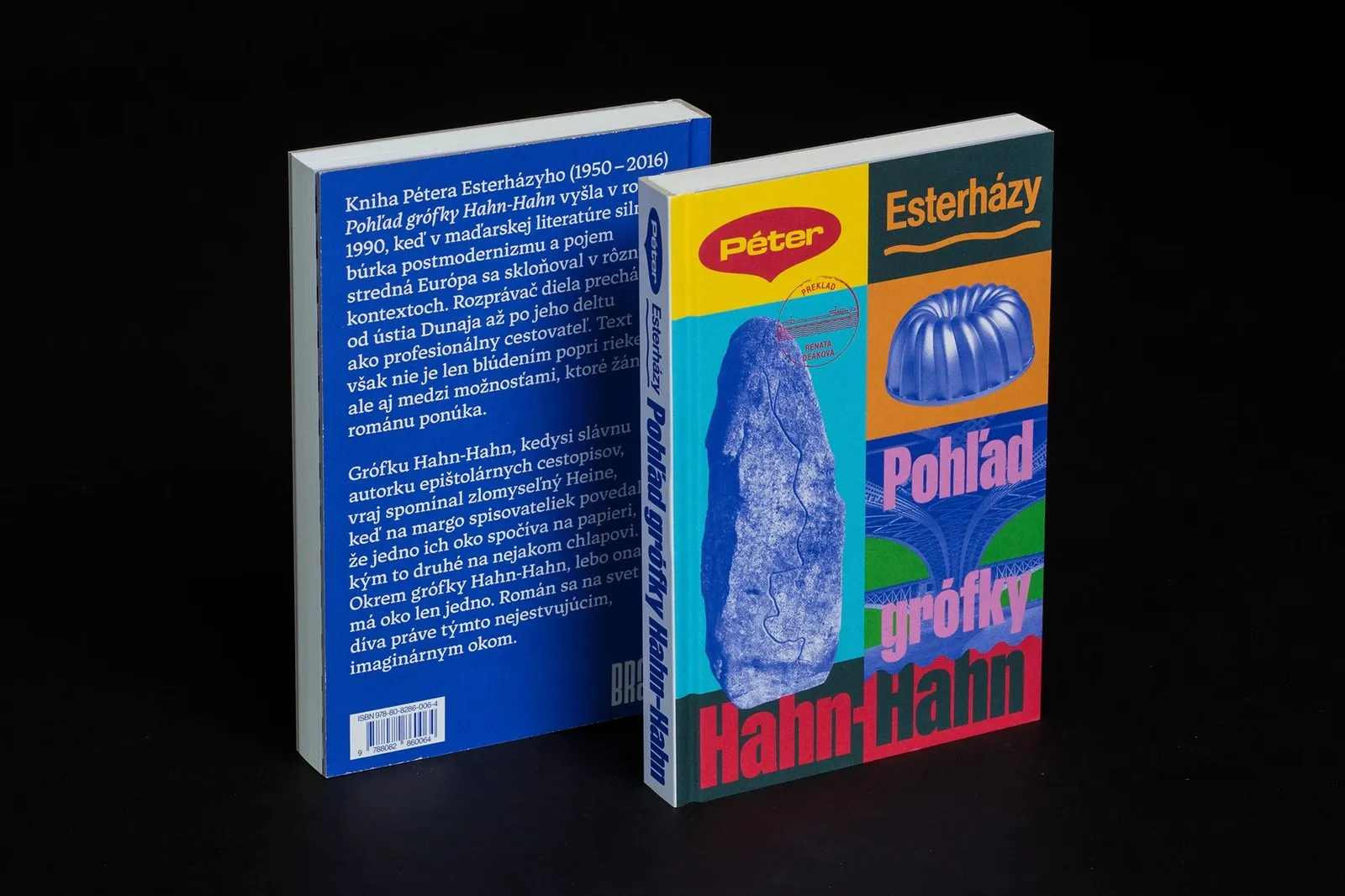
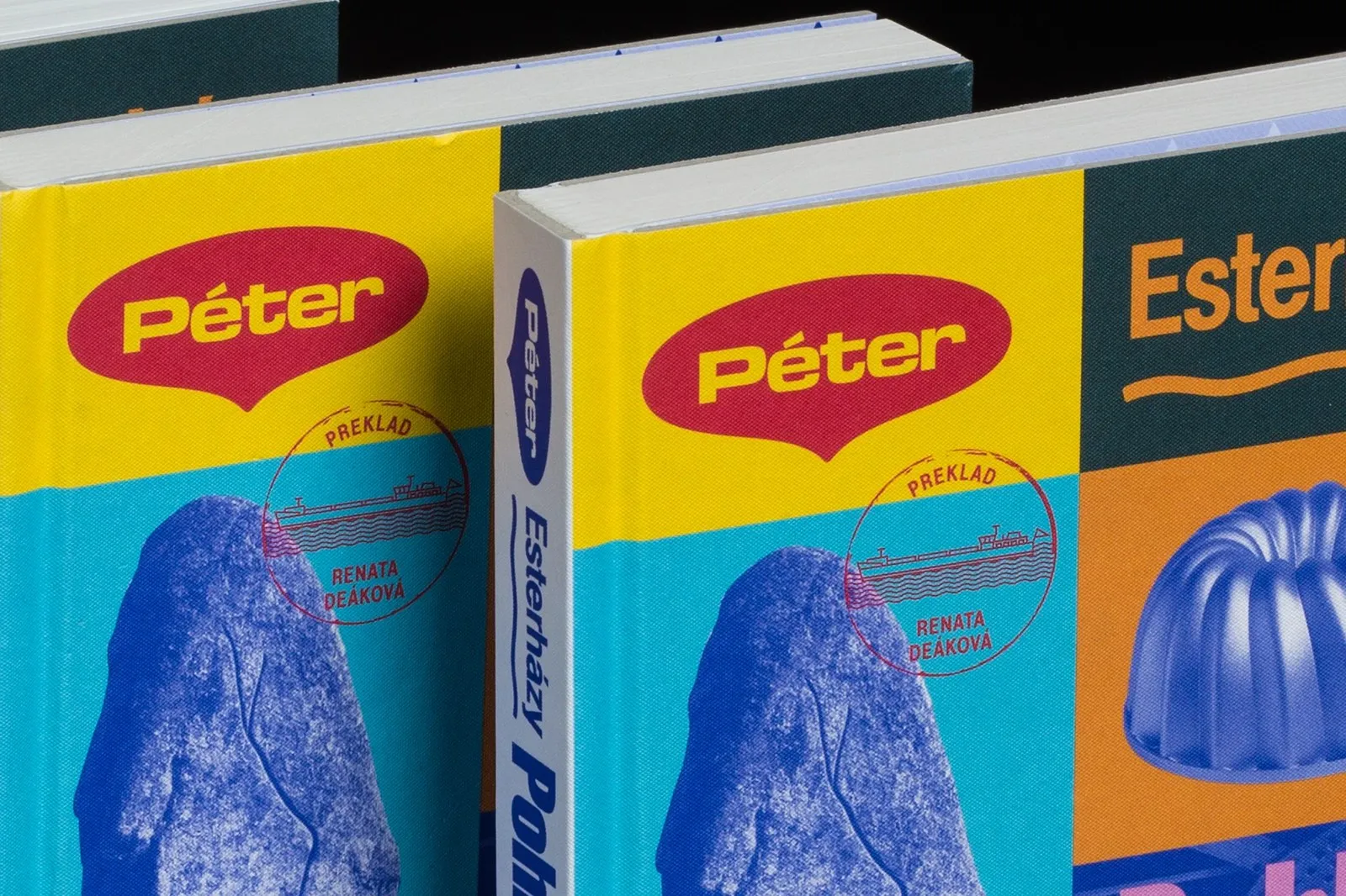
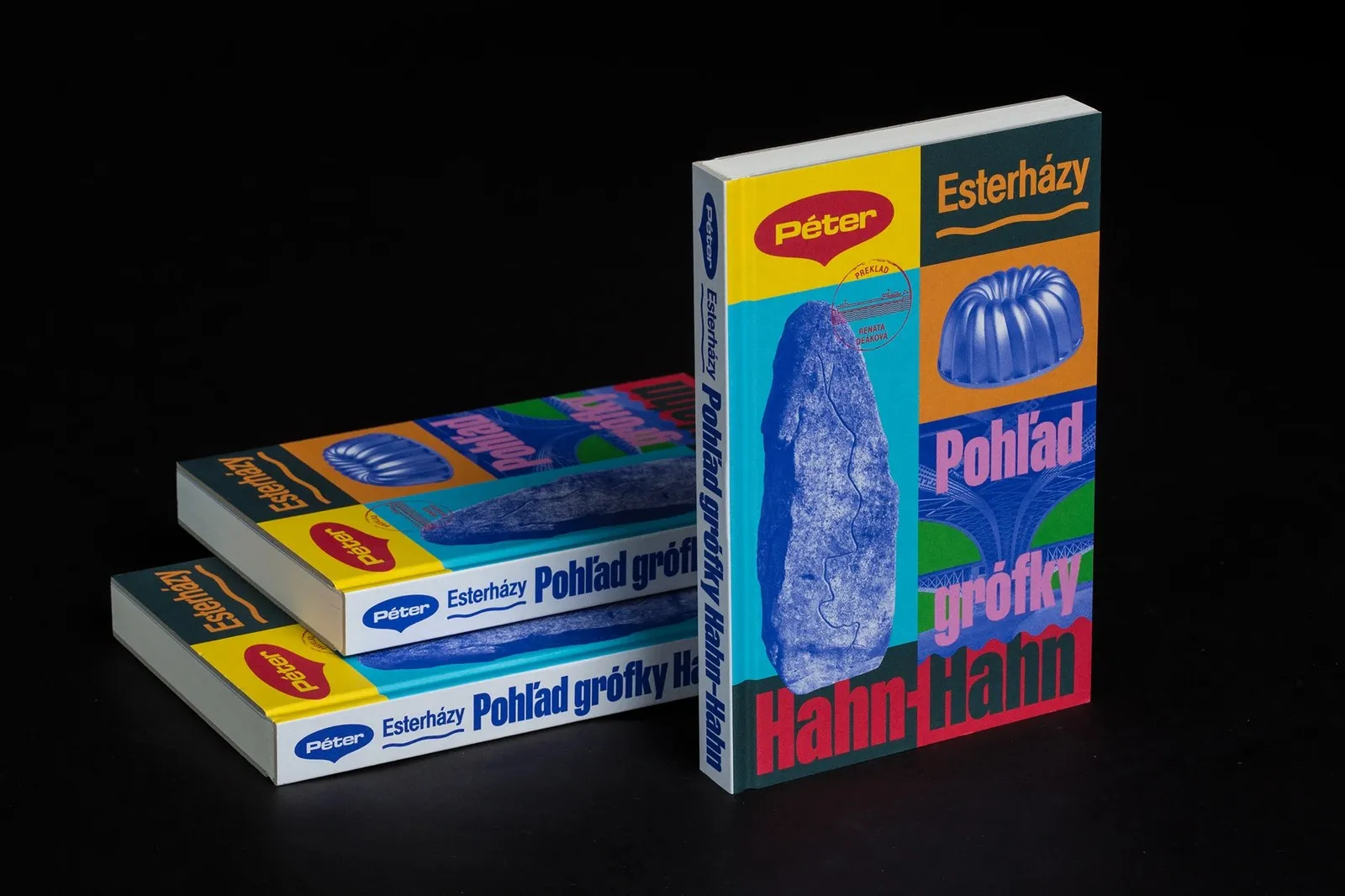
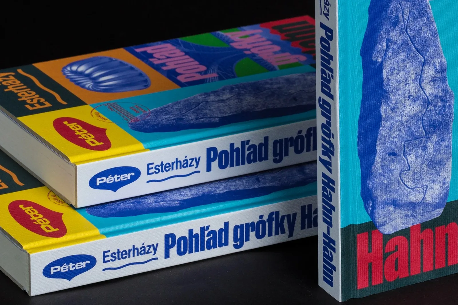
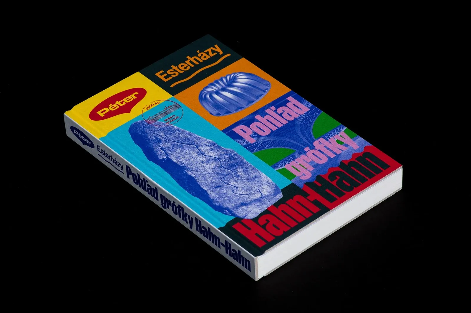
Created in InDesign and Illustrator, the design breaks the linen fabric cover into energetic blocks of yellow, cyan, slate blue, orange, and deep cobalt blue. In the yellow block, author name “Péter” sits neatly inside a red speech bubble, bringing to mind the familiar Maggi seasoning labels found in Danube-region kitchens. Right beside, “Esterházy” stands out in condensed orange typography across river waves, paired with a red rubber stamp featuring translator Renata Deáková’s name wrapped around a barge drawing. The left column blends a blue halftone block showing a Danube River map, a Gugelhupf cake mold, and steel bridge structures.
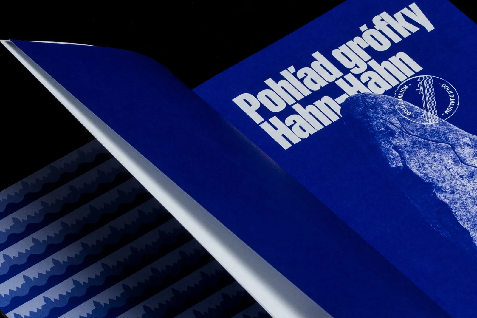
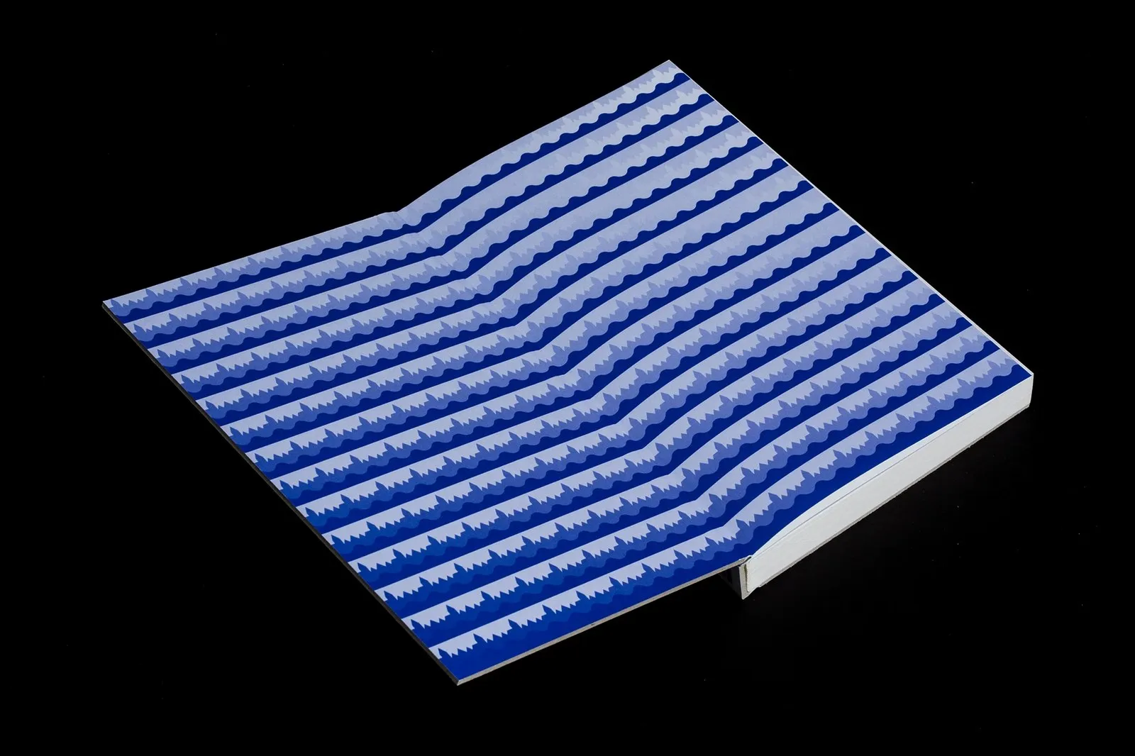
The Slovak title, “Pohľad grófky Hahn-Hahn,” uses stacked, condensed grotesk lettering in lilac pink and dark red in the lower panels, flowing smoothly into an icy blue spine. The back cover features a deep cobalt blue backdrop with the book summary in clean white serif type alongside BRAK’s geometric logo. Unfolding the gatefold cover brings a fun surprise: the inner side highlights a “Dolu Dunajom” ship stamp alongside three-toned horizontal waves in blue, periwinkle, and white that mimic the steady flow of the river.
The entire project is available to view on the www.behance.net/gallery/250038393/Pter-Esterhazy-The-Glance-of-Countess-Hahn-Hahn.
Thiết kế bìa sách Pohľad grófky Hahn-Hahn của Matúš Hnát qua ngôn ngữ Collage Trung Âu
Tiểu thuyết “The Glance of Countess Hahn-Hahn” của nhà văn Péter Esterházy ra đời năm 1990, kể về chuyến hành trình của một lữ khách dọc theo dòng sông Danube từ thượng nguồn đến tận Biển Đen. Tựa đề tác phẩm lấy cảm hứng từ lời châm biếm của Heinrich Heine về các nữ văn sĩ, ngoại trừ nữ bá tước Hahn-Hahn vốn chỉ có một con mắt. Khi nhà xuất bản độc lập BRAK tại Slovakia ấn hành phiên bản này, designer Matúš Hnát từ Bratislava đã chọn cách tiếp cận giàu tính hiện đại: dựng nên một bức tranh collage từ những món đồ kỷ niệm sông nước thay vì lối thiết kế bìa truyền thống.
Thực hiện trên InDesign và Illustrator, Matúš Hnát chia mặt bìa chất liệu vải linen thành các mảng màu rực rỡ như vàng, xanh cyan, xanh xám, cam và xanh cobalt. Ở góc màu vàng, tên tác giả “Péter” nằm gọn trong nhãn thoại màu đỏ gợi liên tưởng đến nhãn hiệu gia vị Maggi quen thuộc trong các căn bếp vùng Danube. Đặt kế bên là chữ “Esterházy” dạng font condensed màu cam nổi bật trên đường sóng nước, cùng con dấu cao su đỏ in tên dịch giả Renata Deáková ôm quanh hình vẽ chiếc xà lan. Cột bên trái kết hợp khối đá halftone xanh in bản đồ sông Danube, khuôn bánh Gugelhupf và hệ kết cấu cầu sắt.
Tên sách tiếng Slovakia “Pohľad grófky Hahn-Hahn” sử dụng kiểu chữ grotesk cô đọng mang sắc hồng lilas và đỏ sẫm xếp chồng ở các ô phía dưới, kéo dài sự đồng bộ sang phần gáy sách màu xanh băng. Mặt sau cuốn sách phủ tông xanh cobalt sâu với đoạn tóm tắt màu trắng dạng chữ serif kết hợp cùng logo BRAK hình học. Bìa gấp (gatefold) mang lại sự thú vị khi mở ra: mặt trong là con dấu con tàu “Dolu Dunajom” cùng các đường sóng ngang ba màu xanh, periwinkle và trắng mô phỏng dòng chảy chuyển động của con sông.
Toàn bộ dự án có thể xem trực tiếp tại trang Behance của www.behance.net/gallery/250038393/Pter-Esterhazy-The-Glance-of-Countess-Hahn-Hahn.