
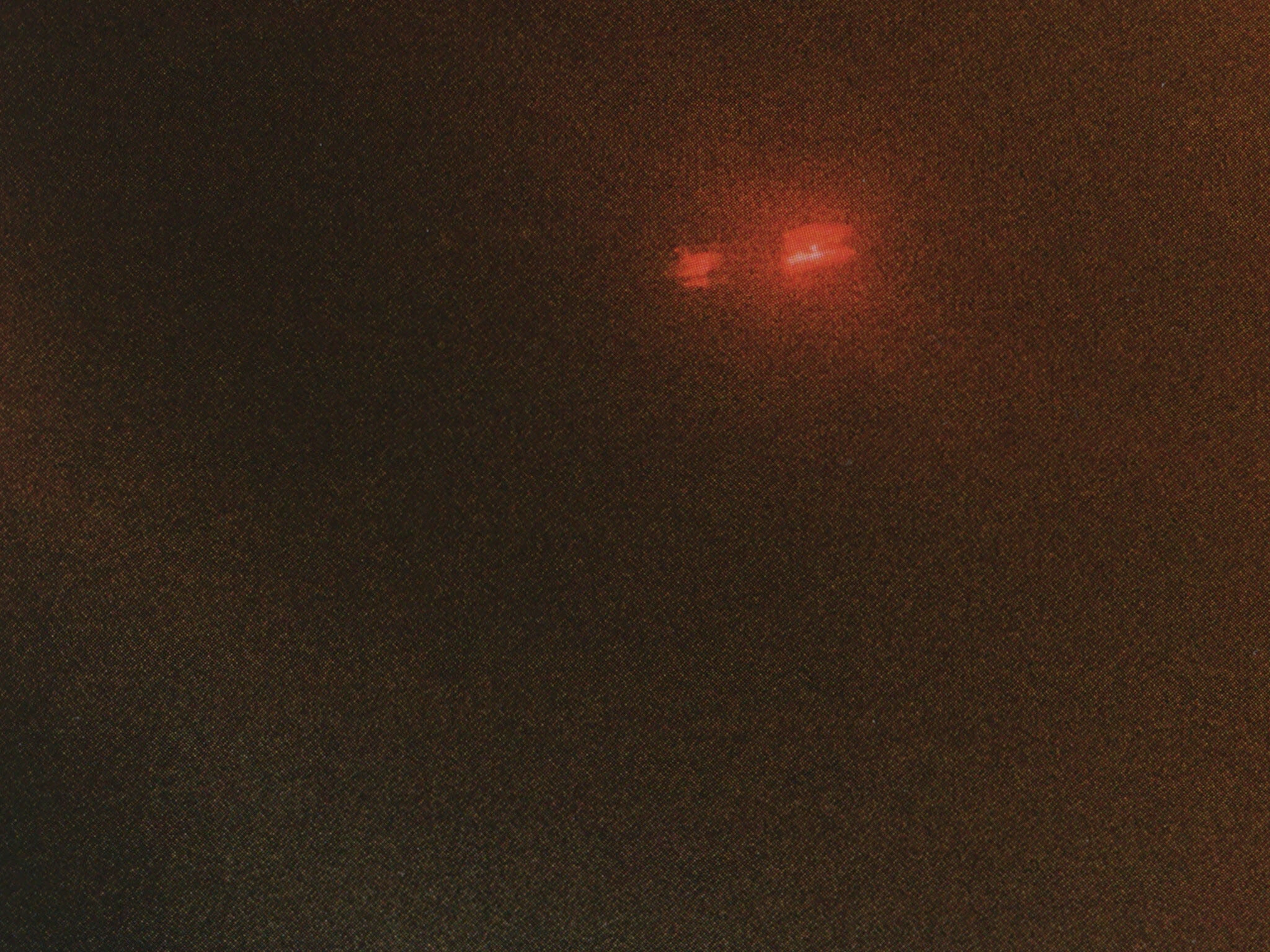
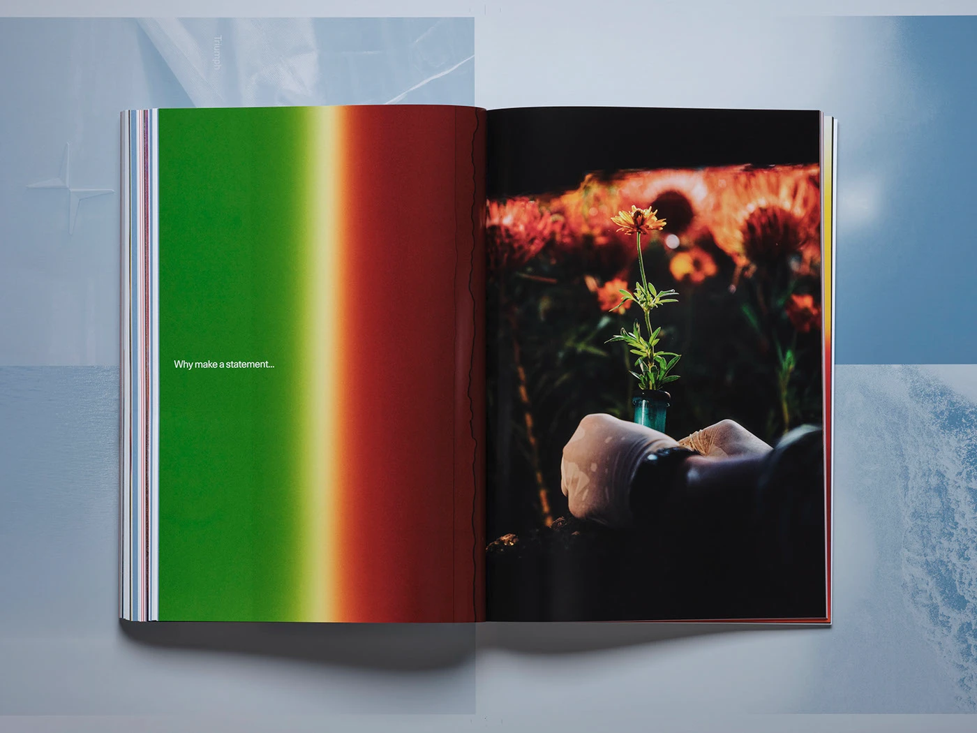


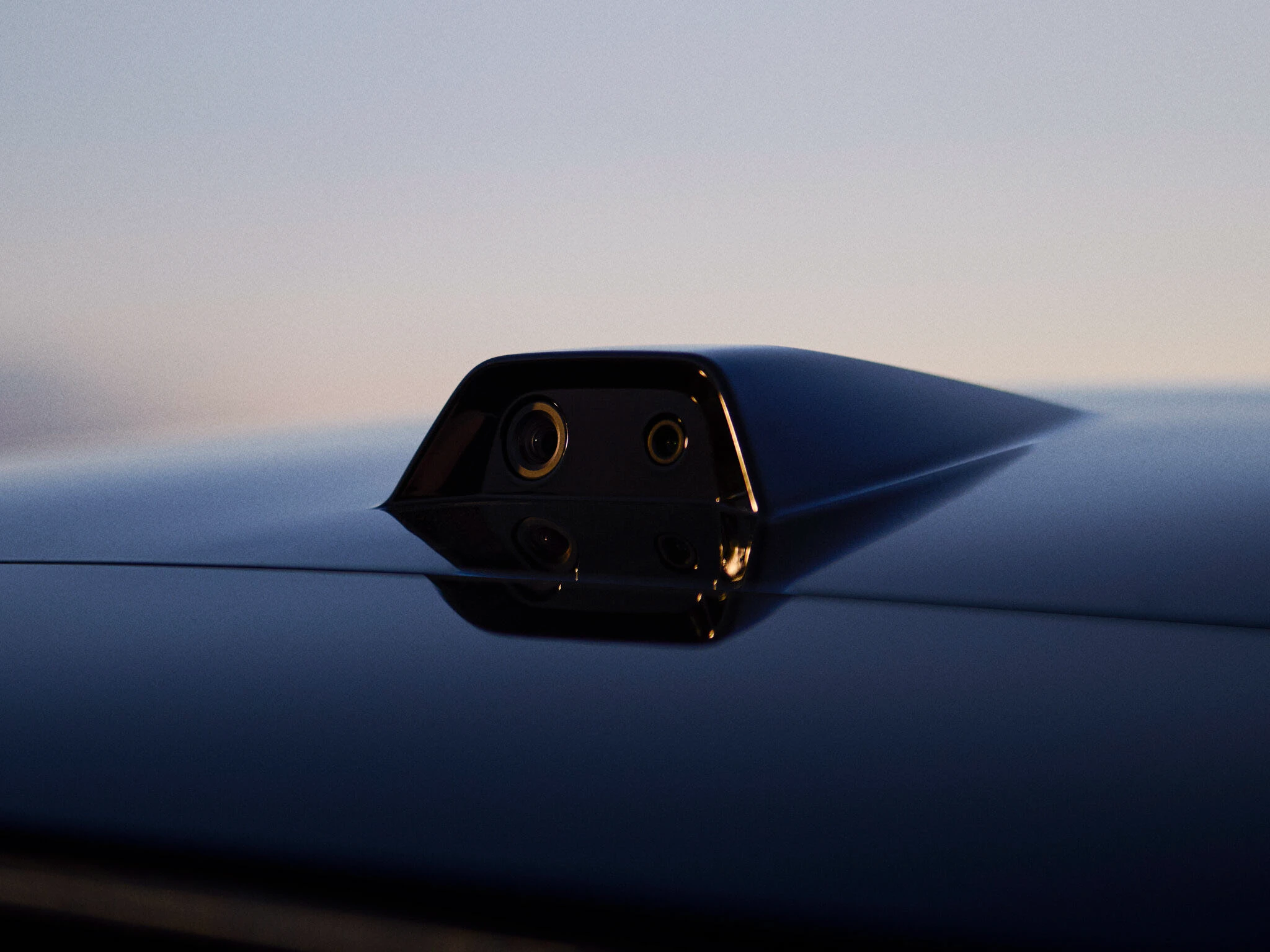


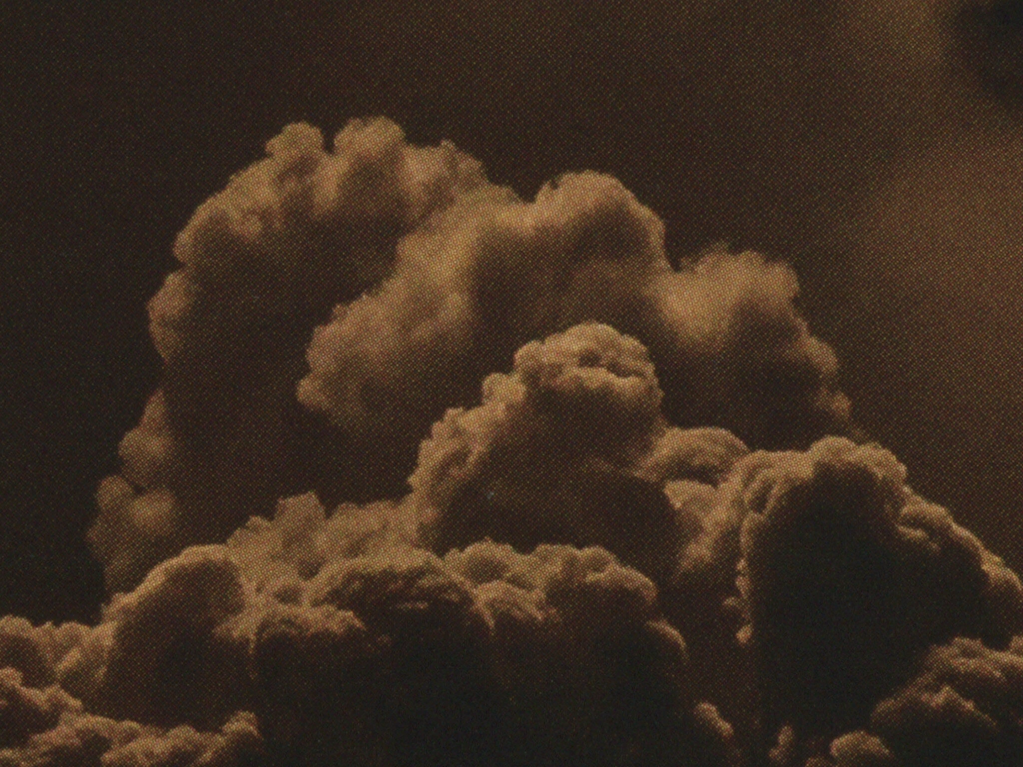

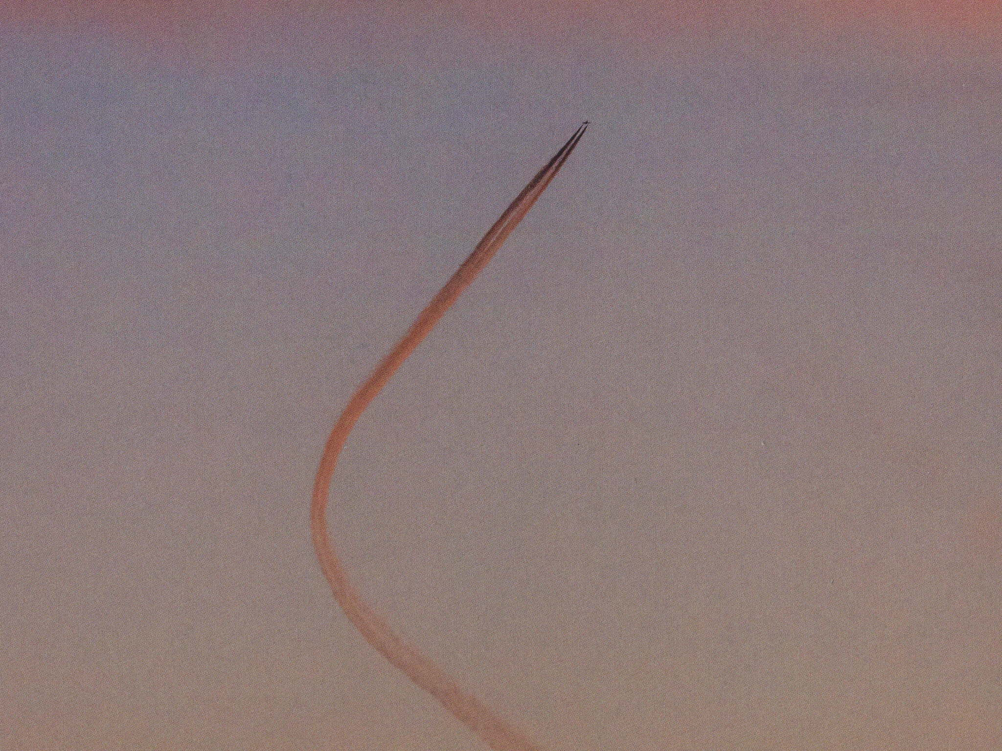
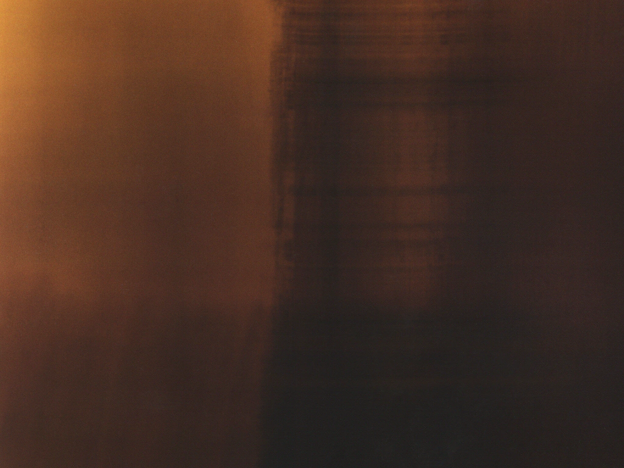
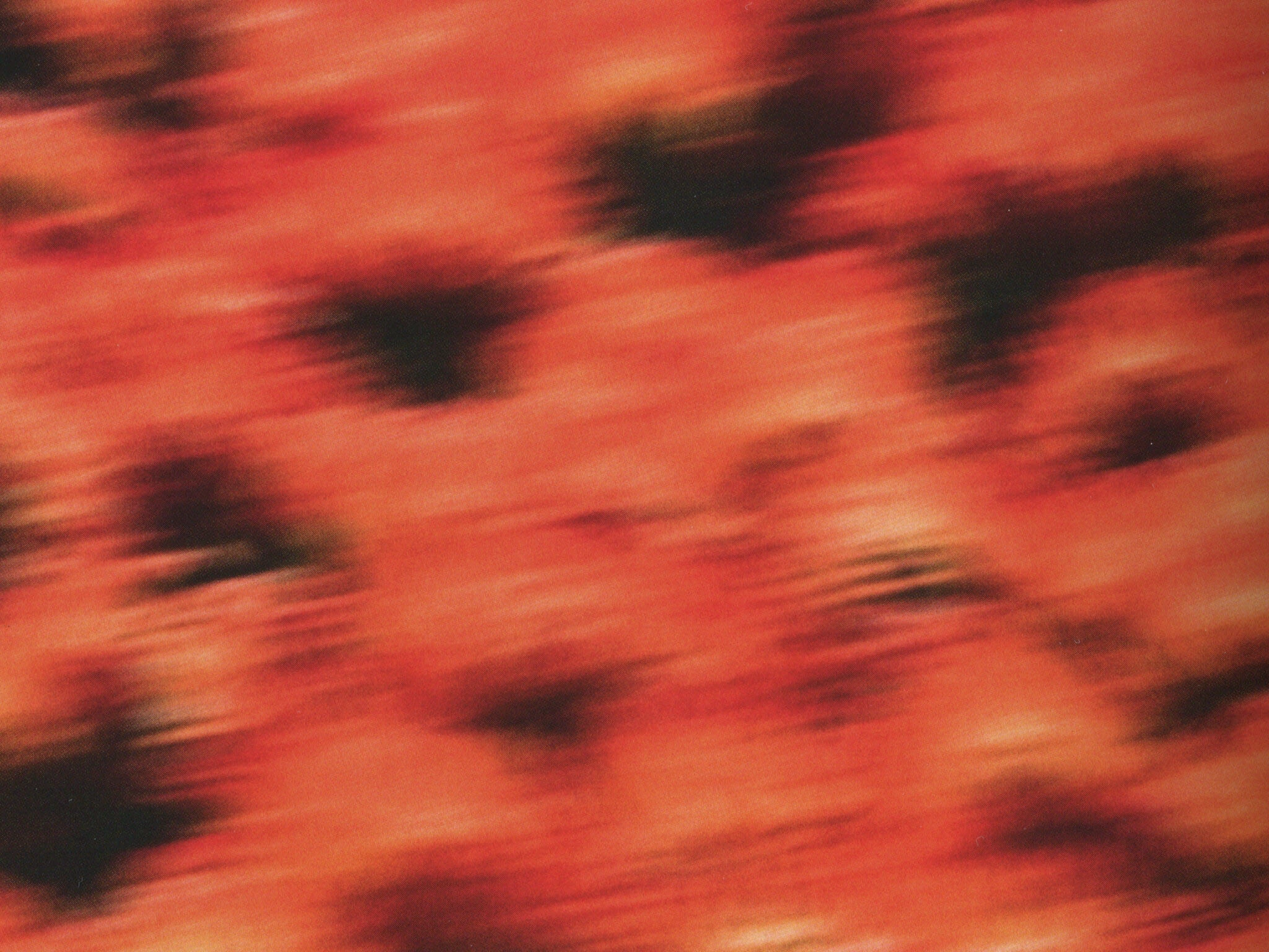
Hậu trường chiến dịch Airflow của Polestar được ghi hình tại Thung lũng Chết (Death Valley).
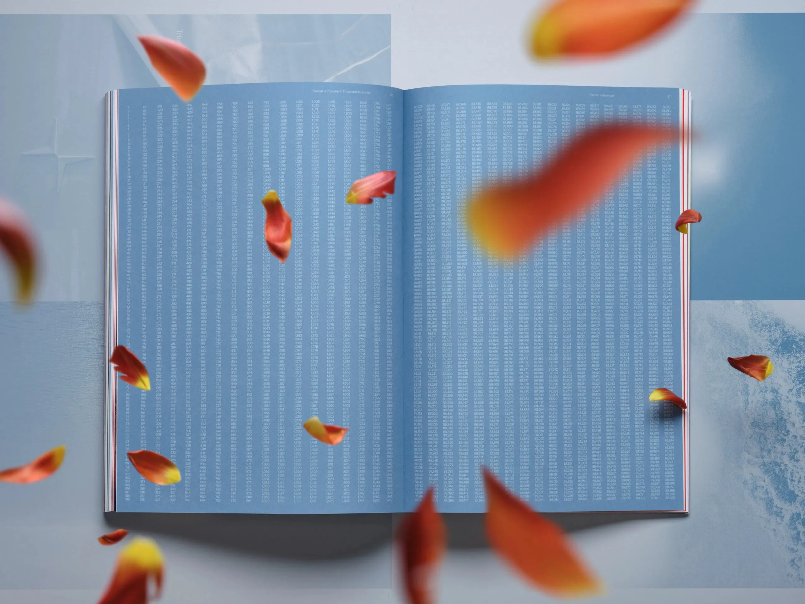
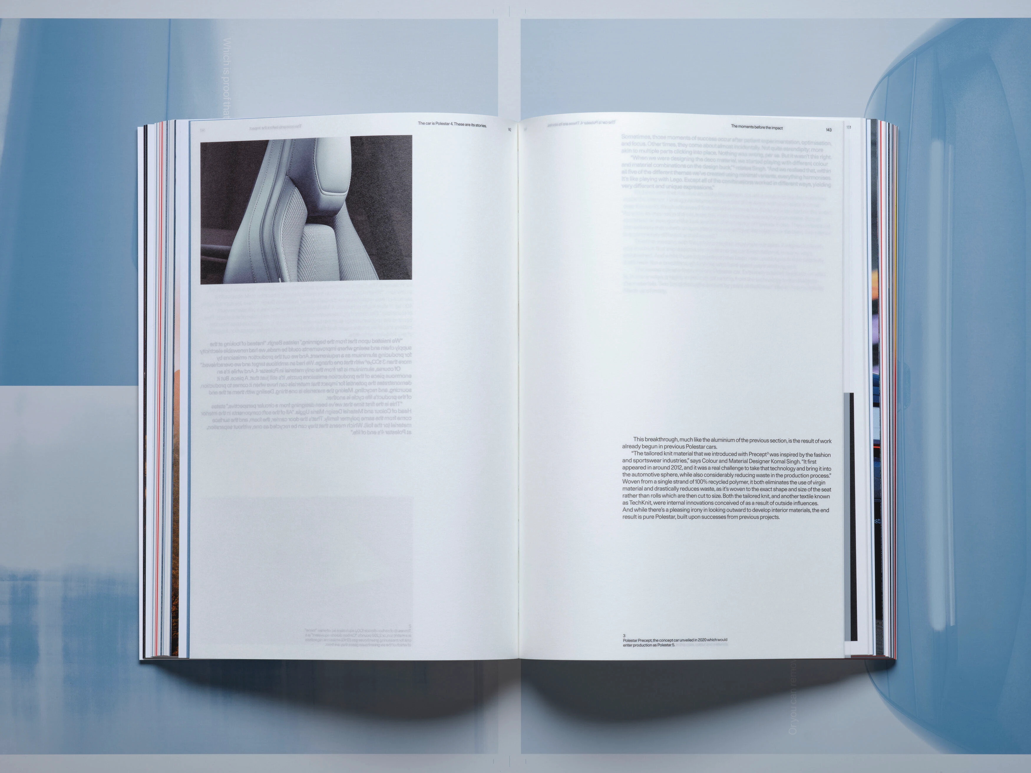
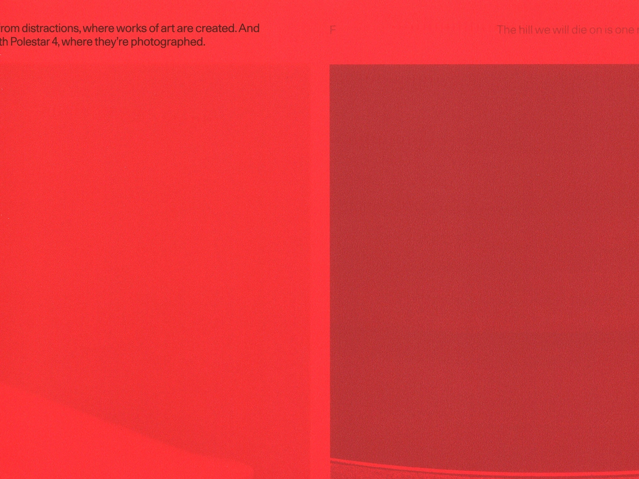
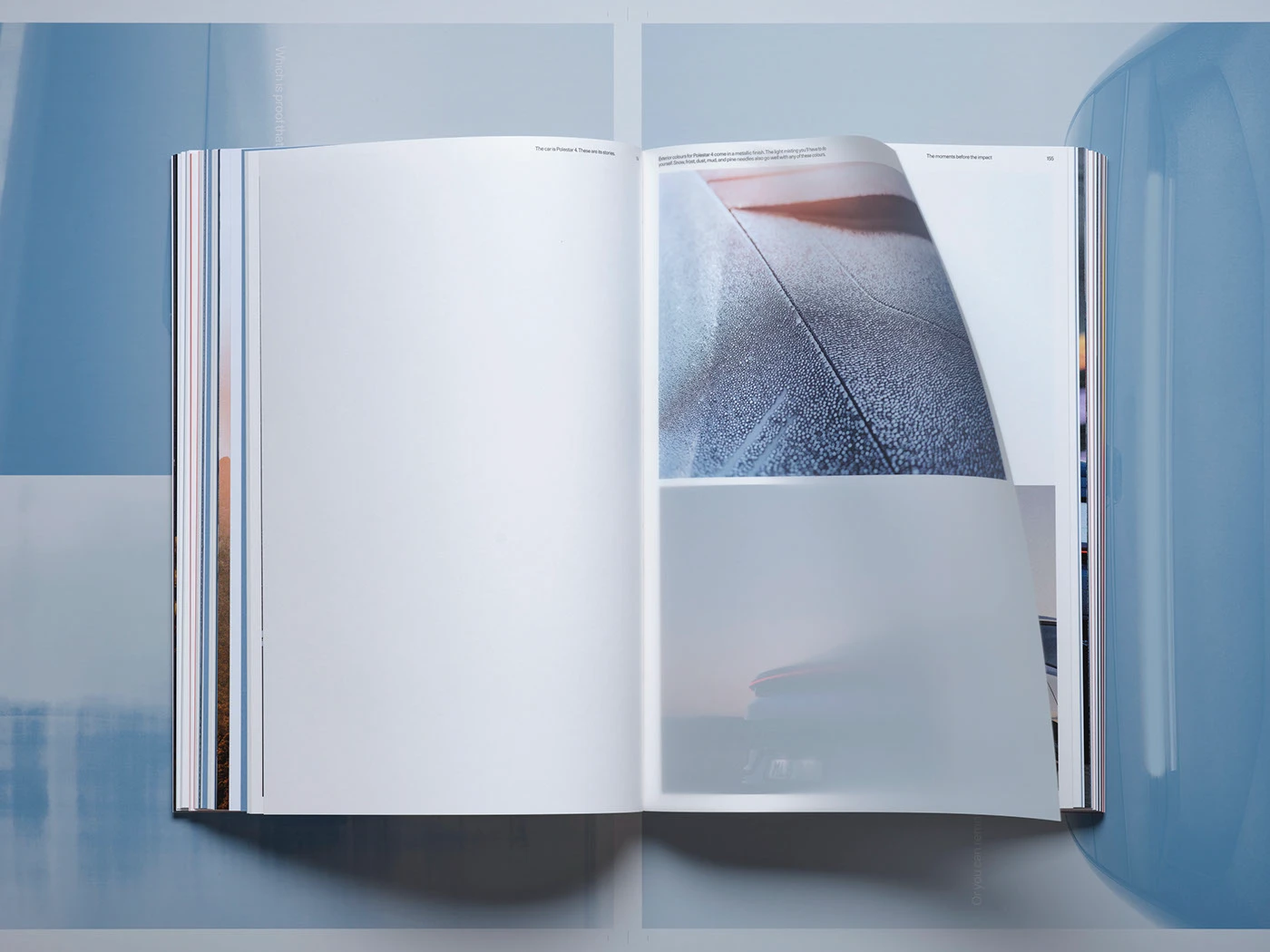
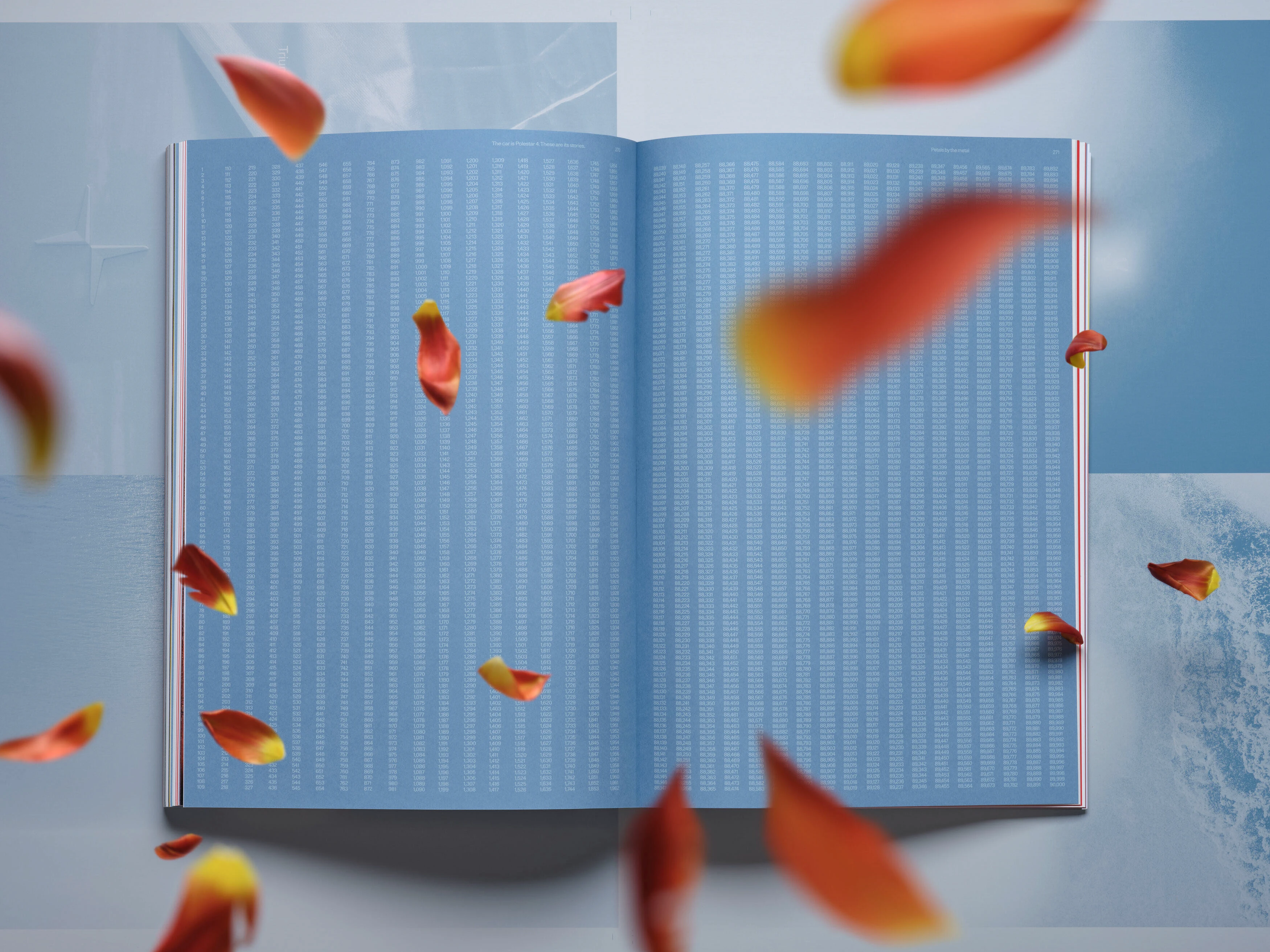
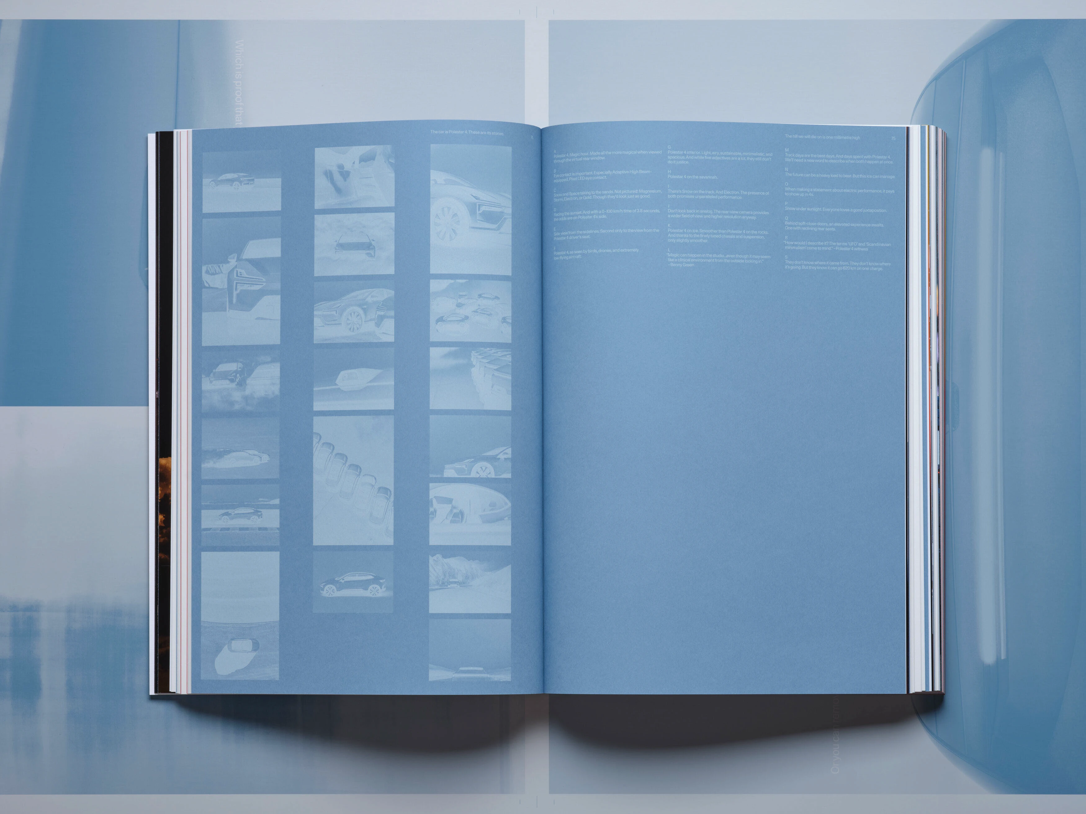
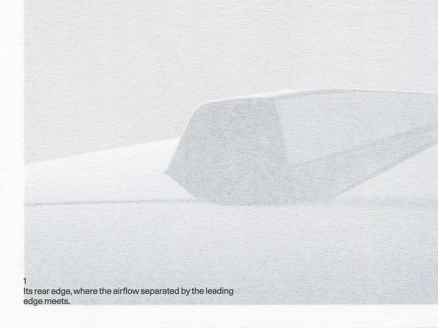
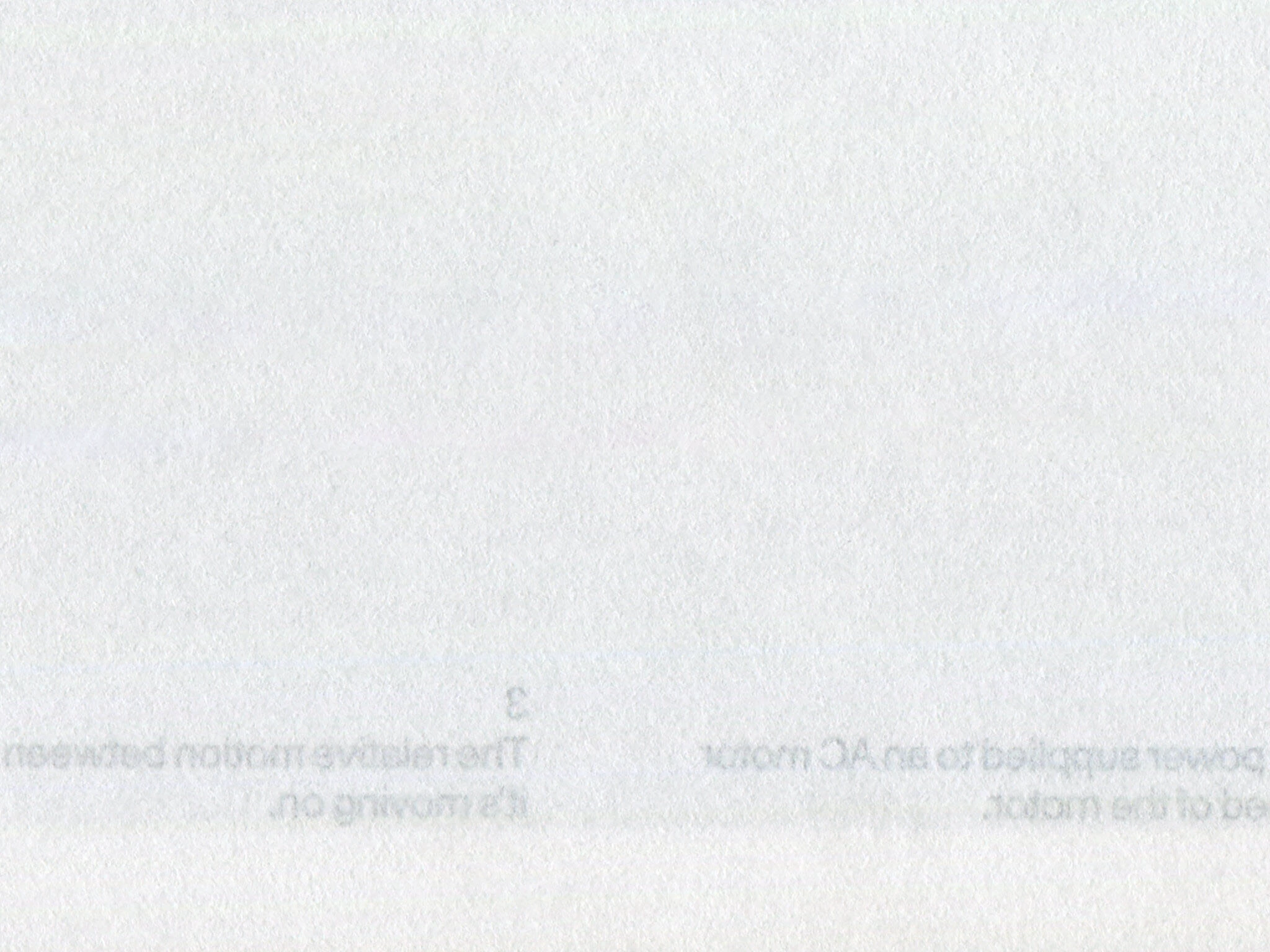
Độ mờ của loại giấy IBO One 60 g/m² dùng cho các trang văn bản tạo nên những bố cục cực kỳ linh hoạt khi các chữ cái xếp chồng lên nhau.
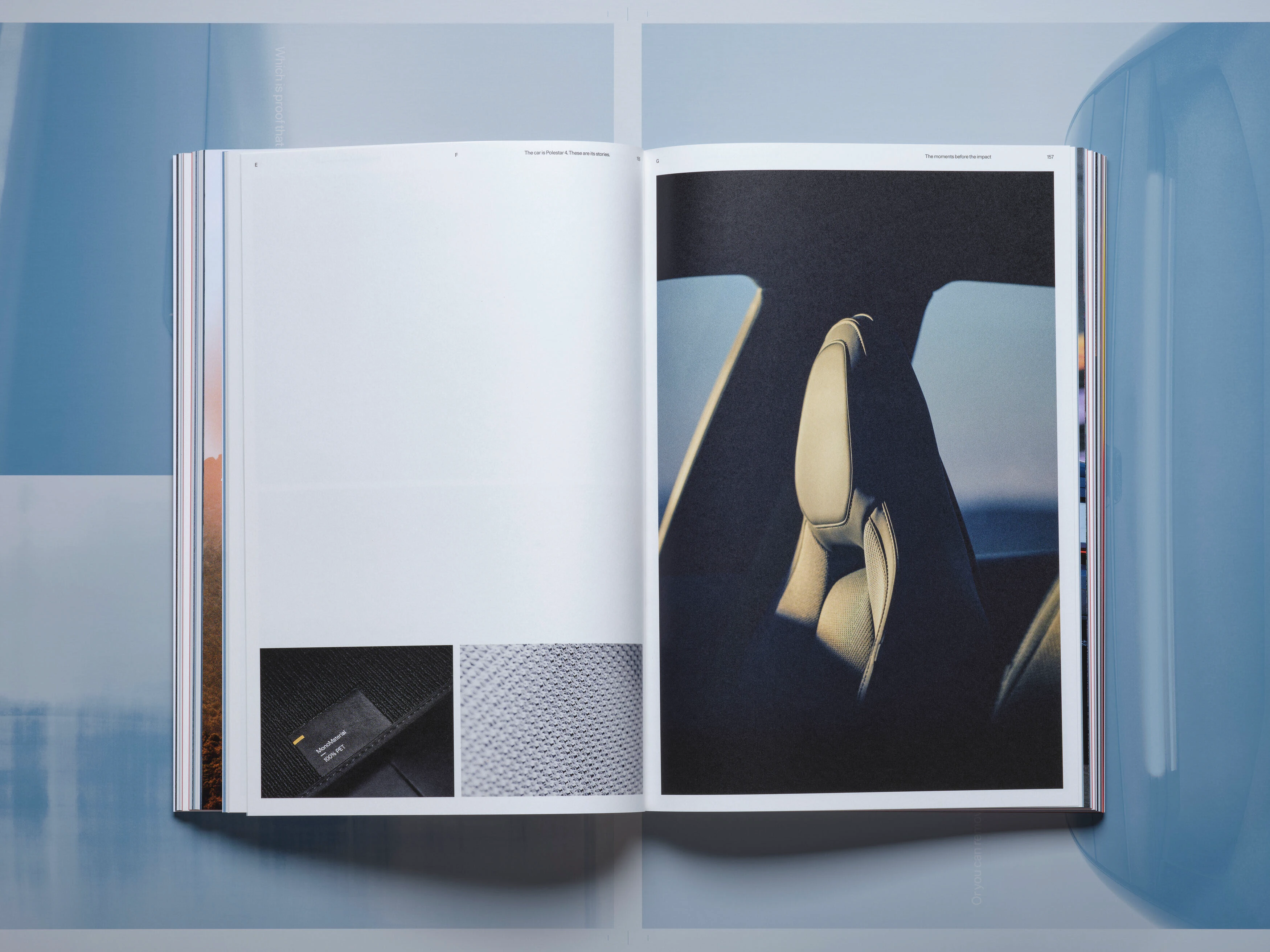
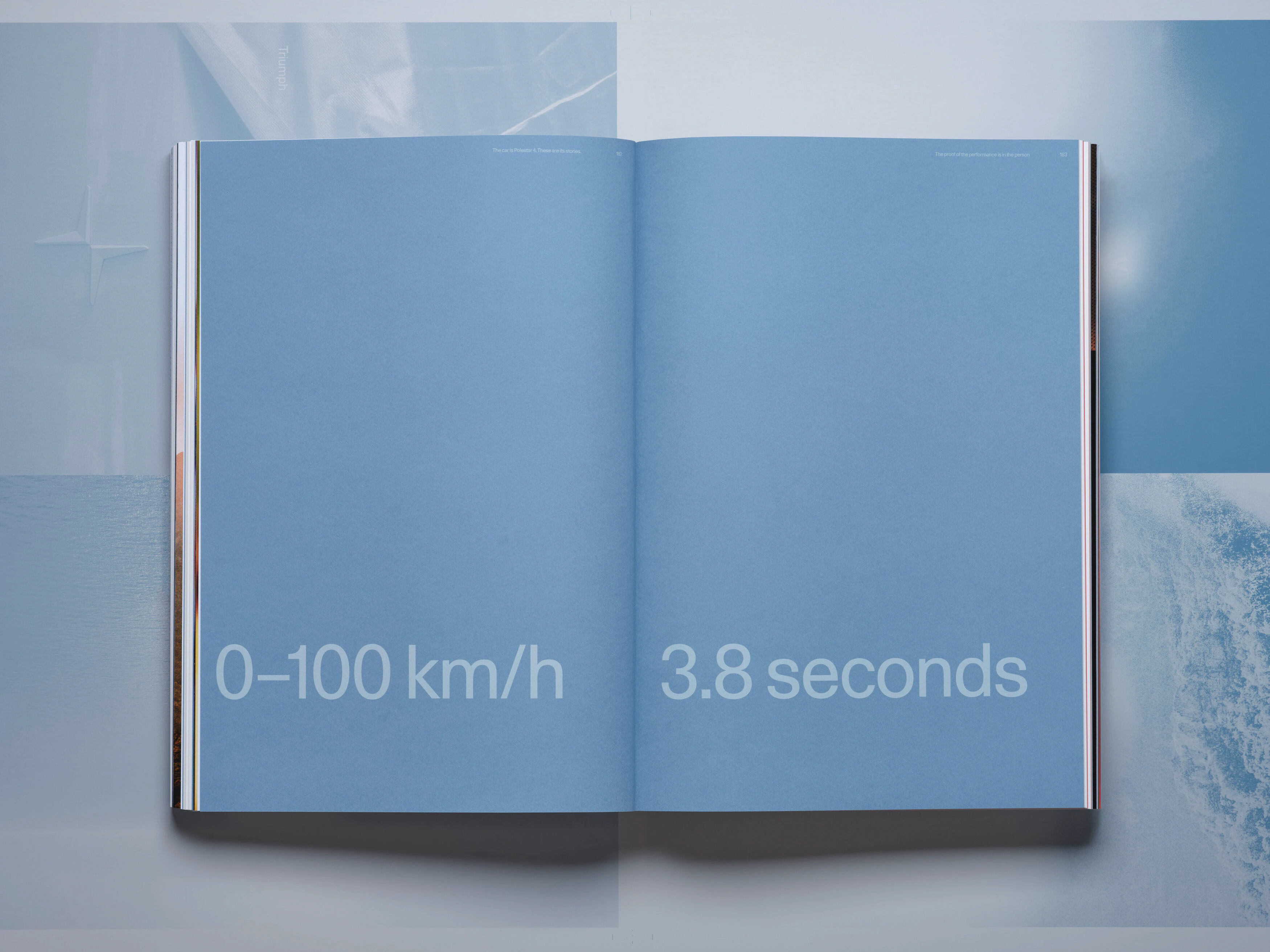
Năm loại giấy được lựa chọn kỹ lưỡng để định hình cho từng phần riêng biệt của cuốn sách.
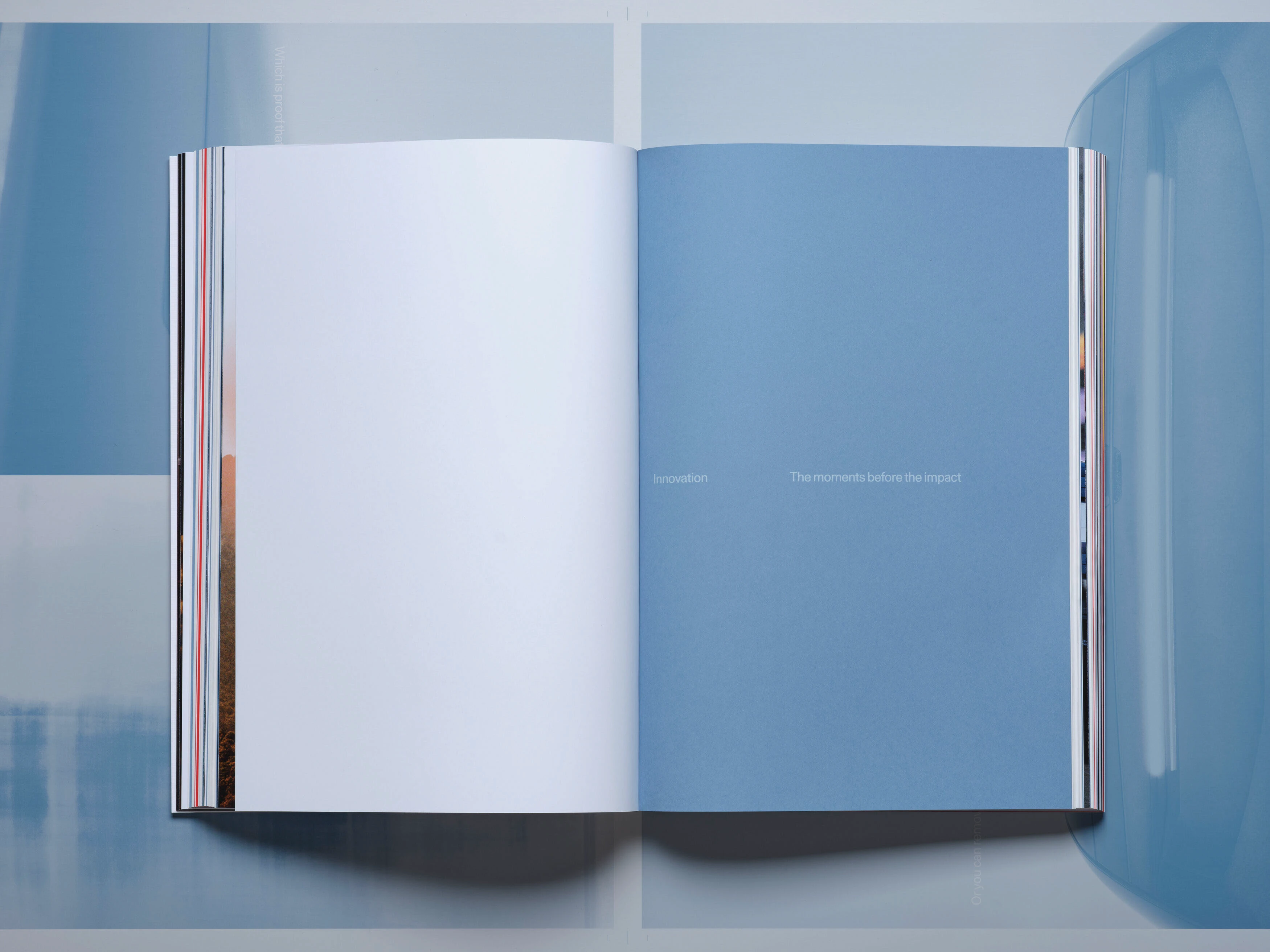
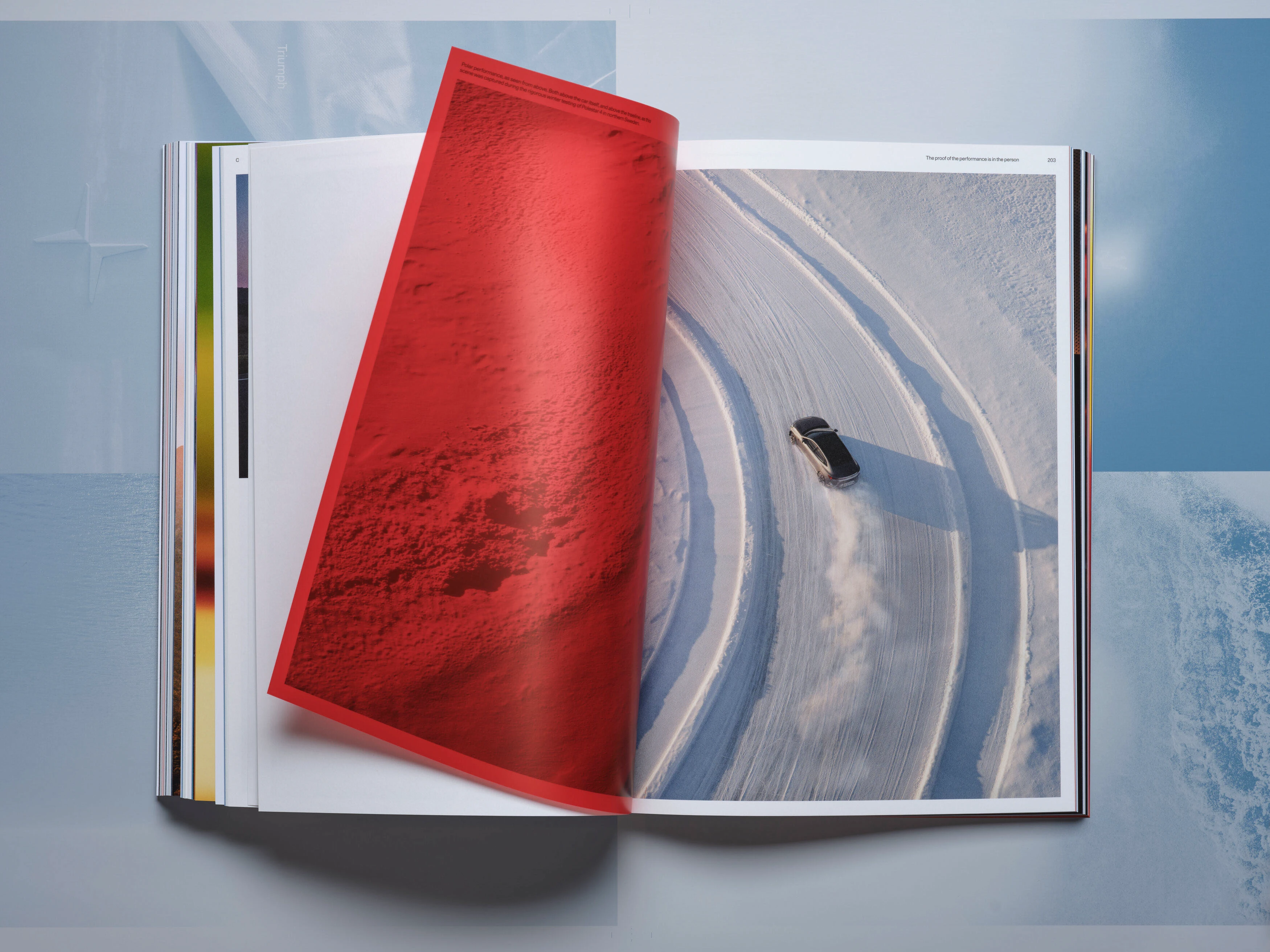
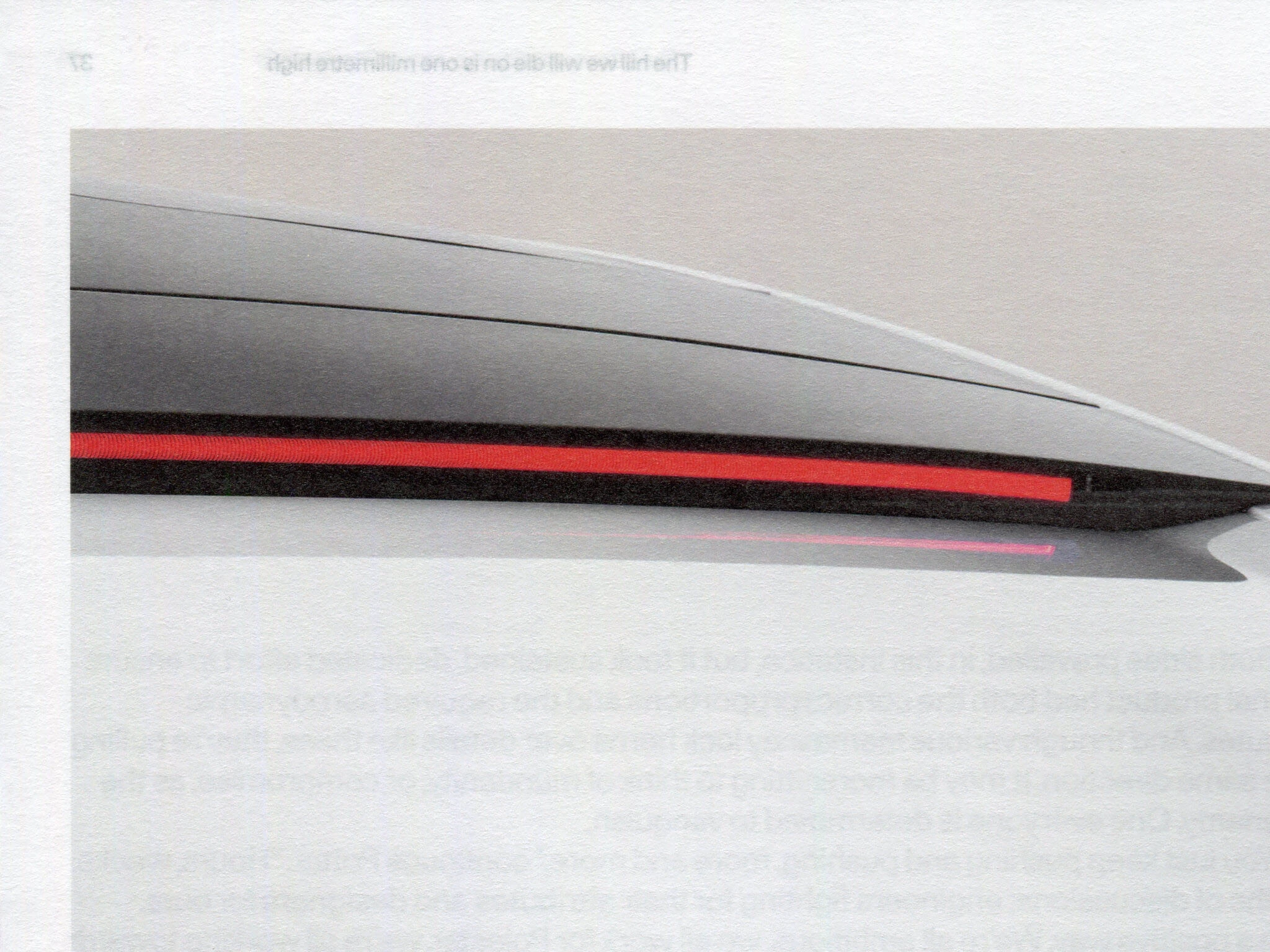
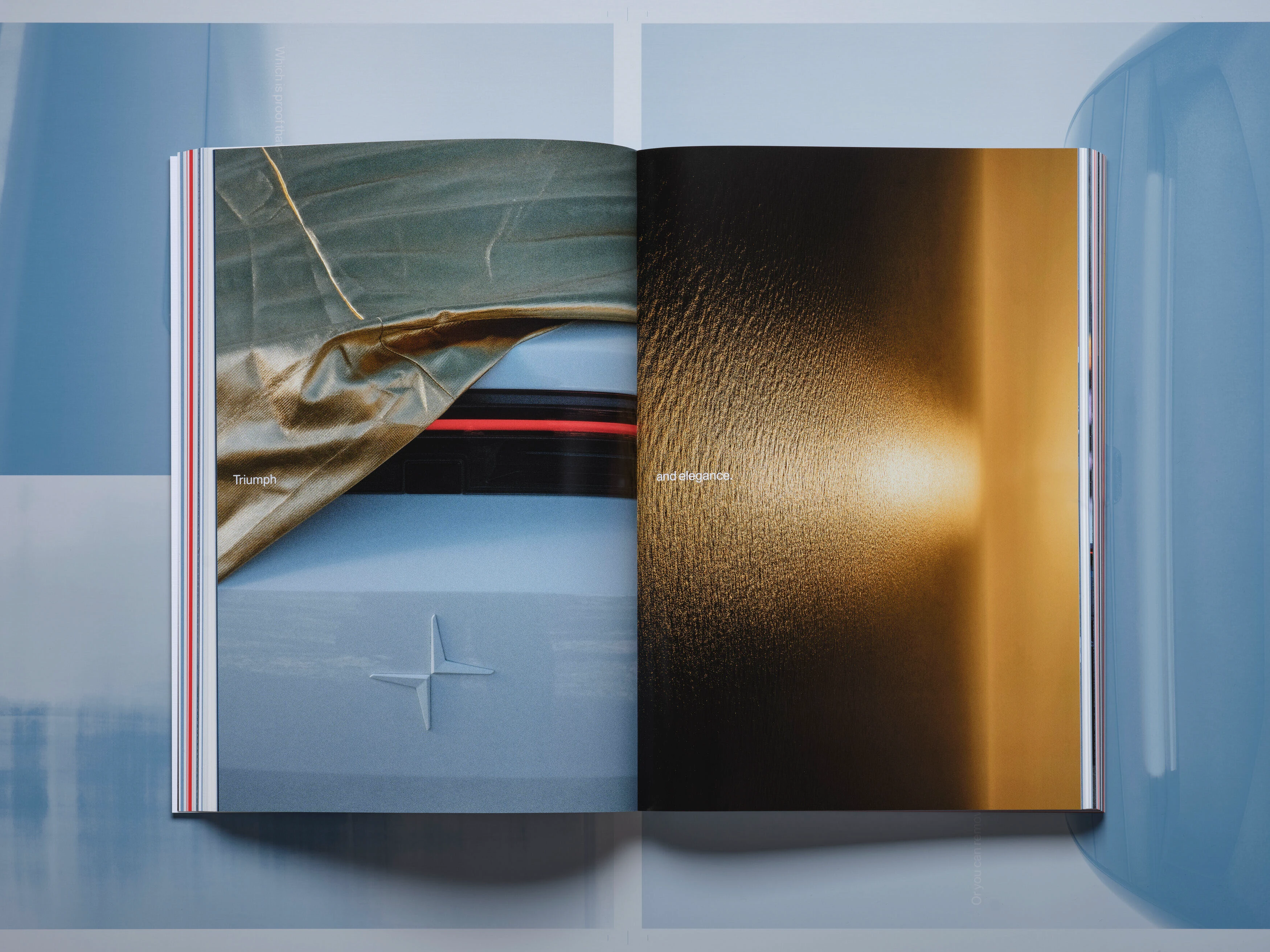
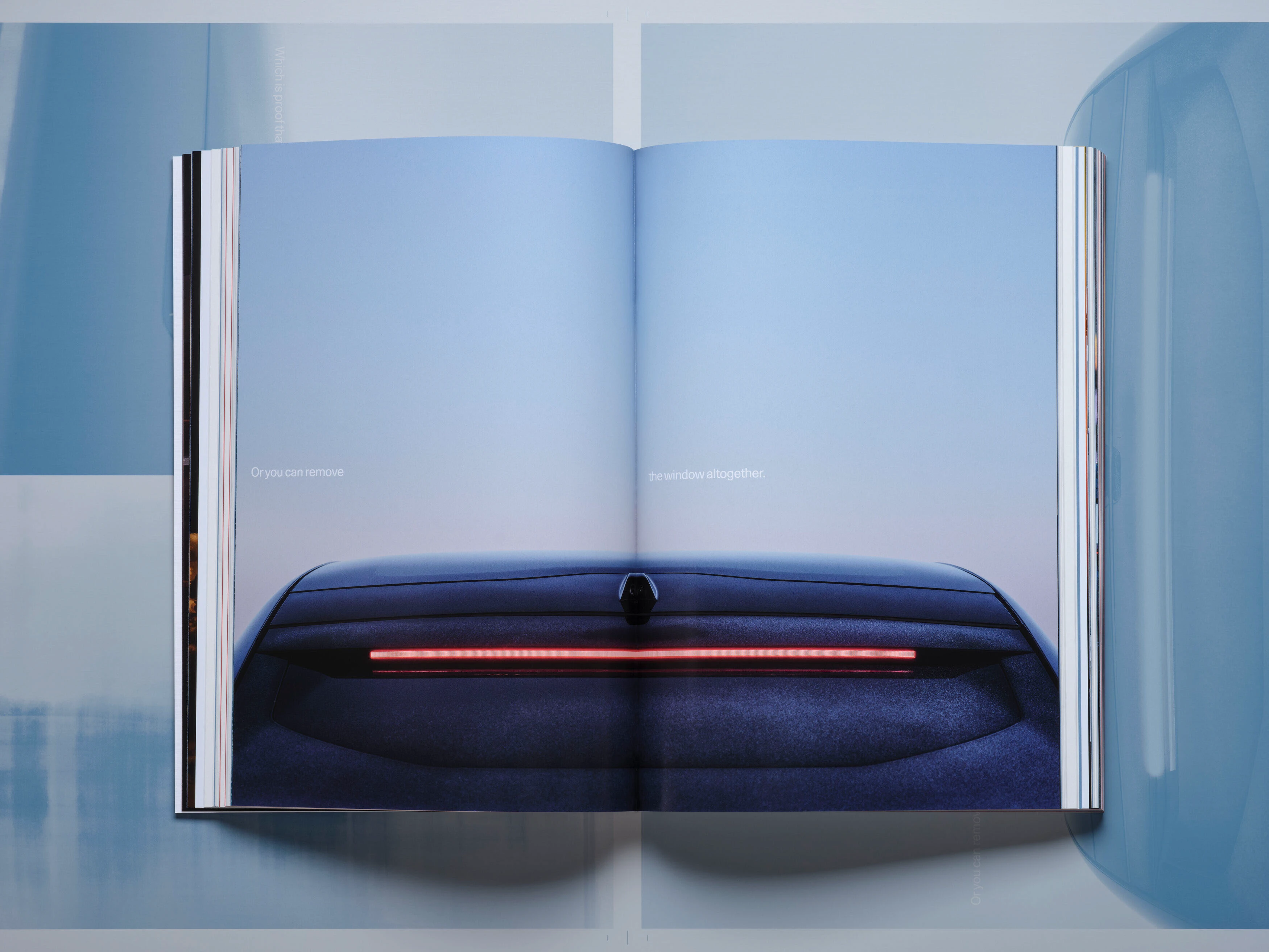
Sự xuyên thấu của giấy tạo ra các hiệu ứng hình ảnh thú vị ở trang sau, mang lại trải nghiệm đọc đầy chiều sâu và bất ngờ.
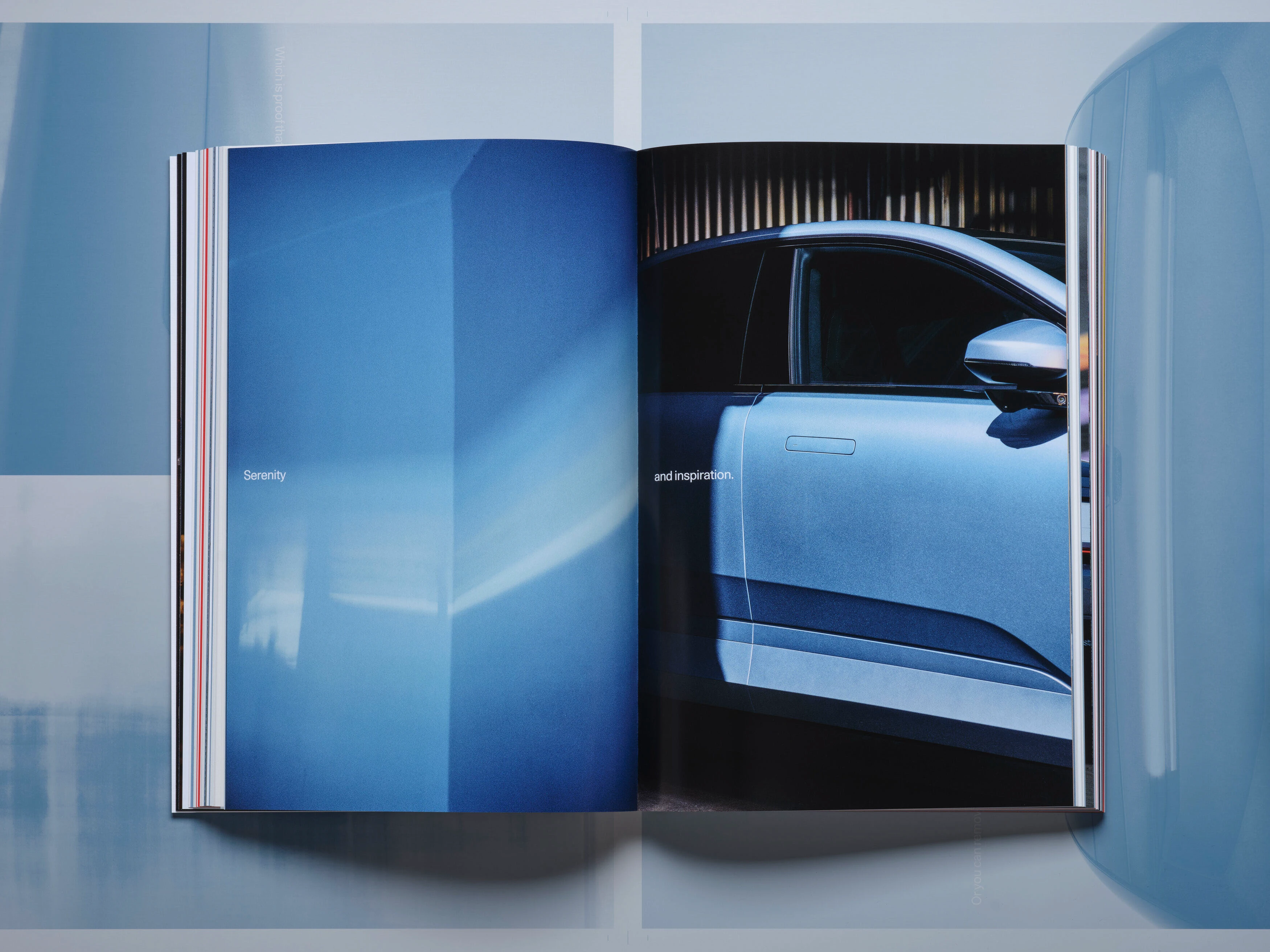
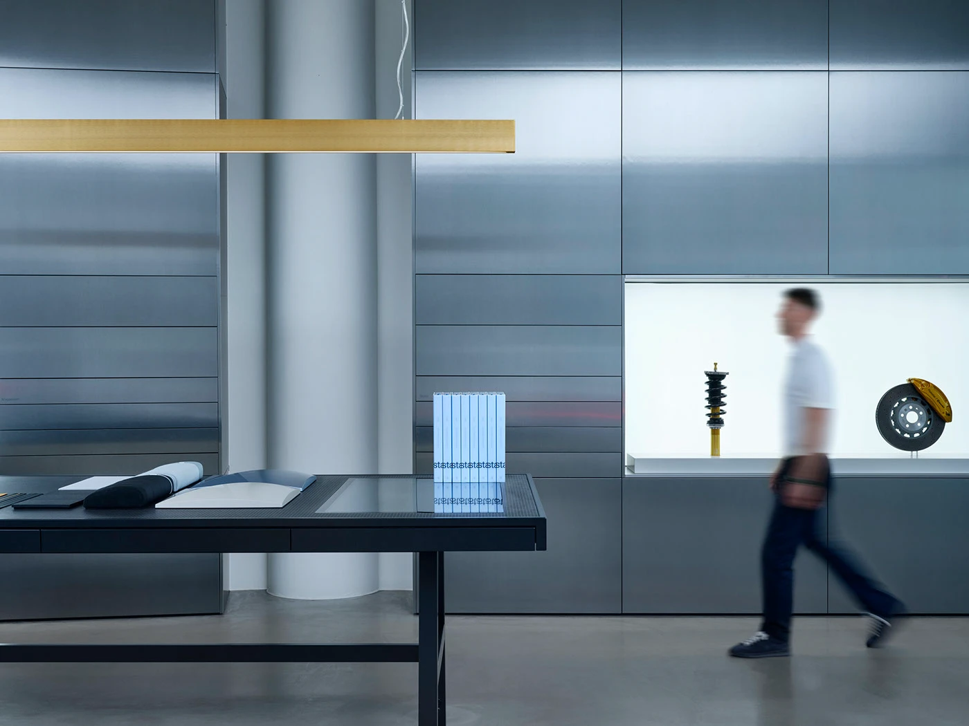
Các phần tóm tắt nội dung của cuốn sách được trình chiếu trực tiếp lên chiếc Polestar 4 tại showroom ở Gothenburg (Kungsportsavenyen 25).
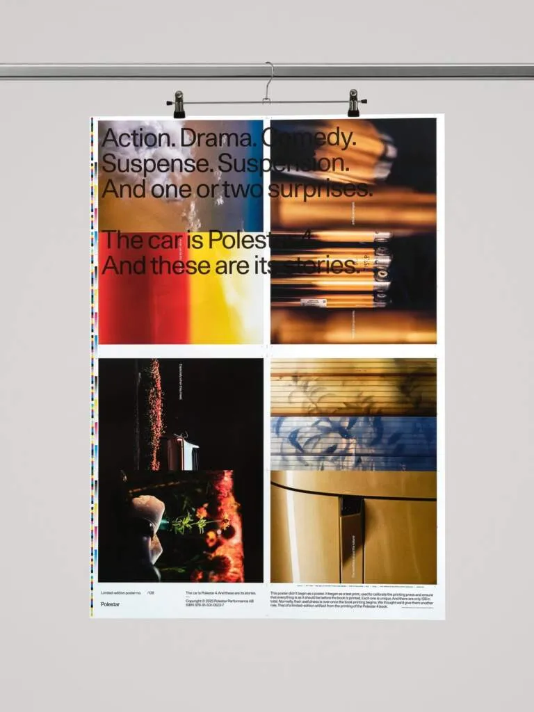
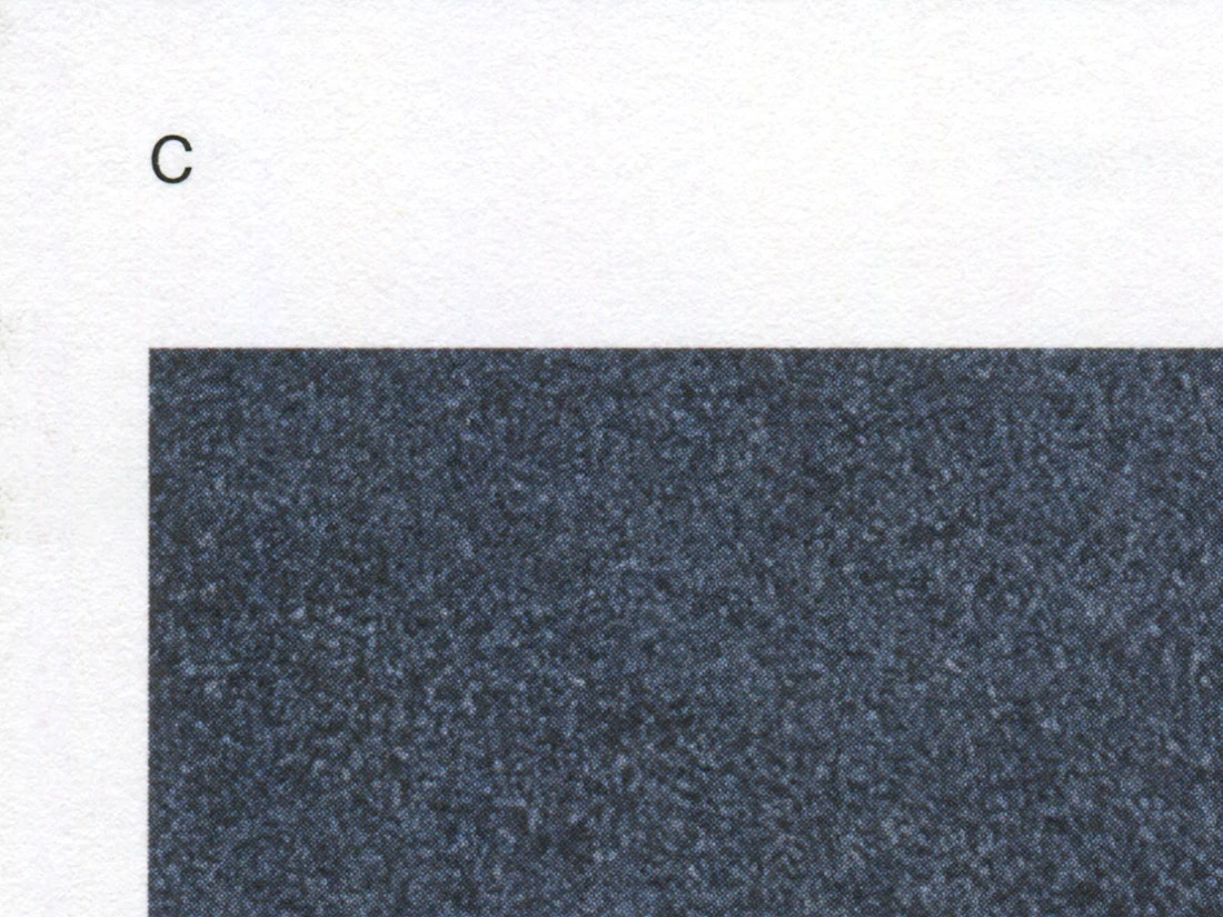
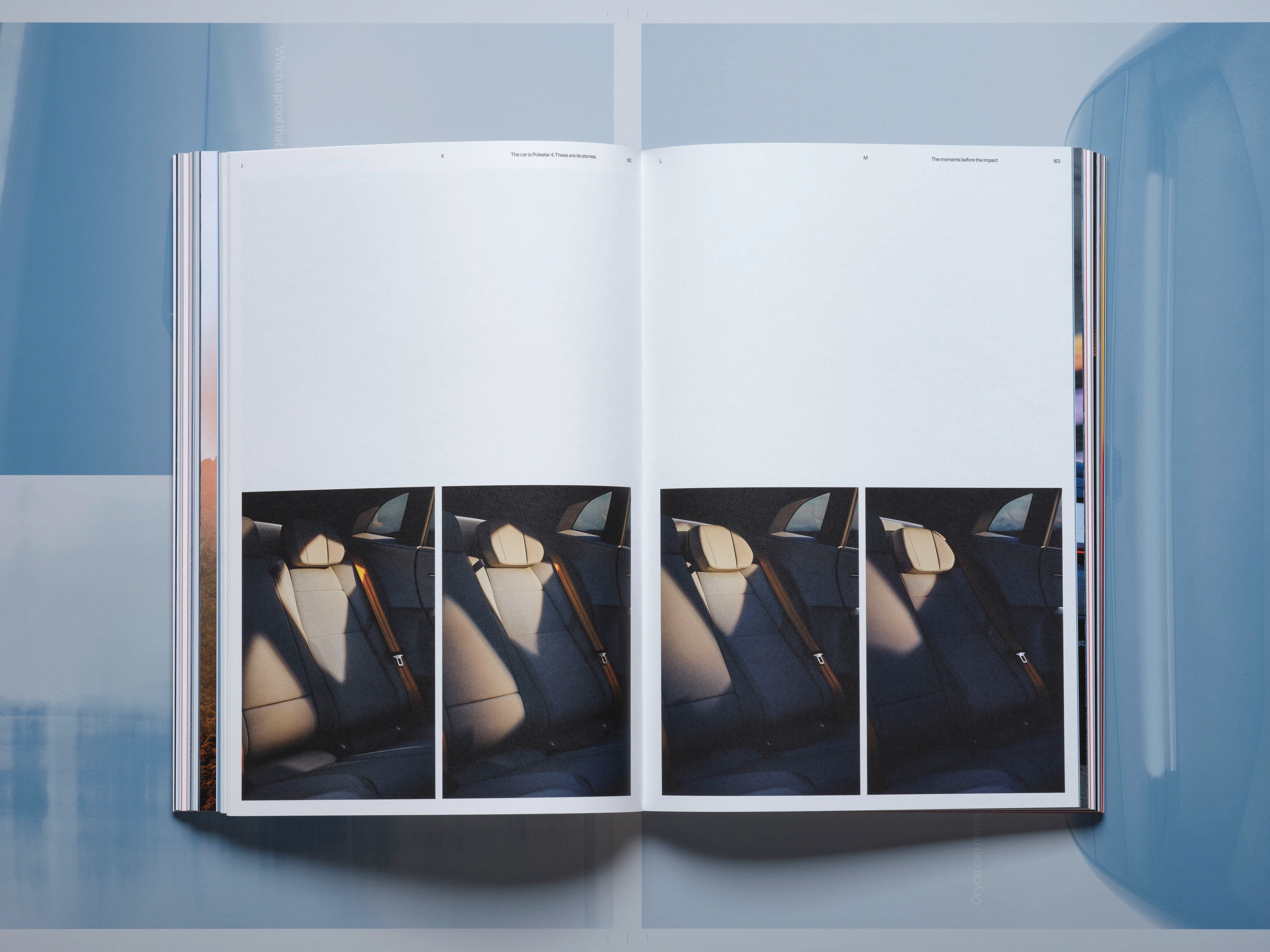
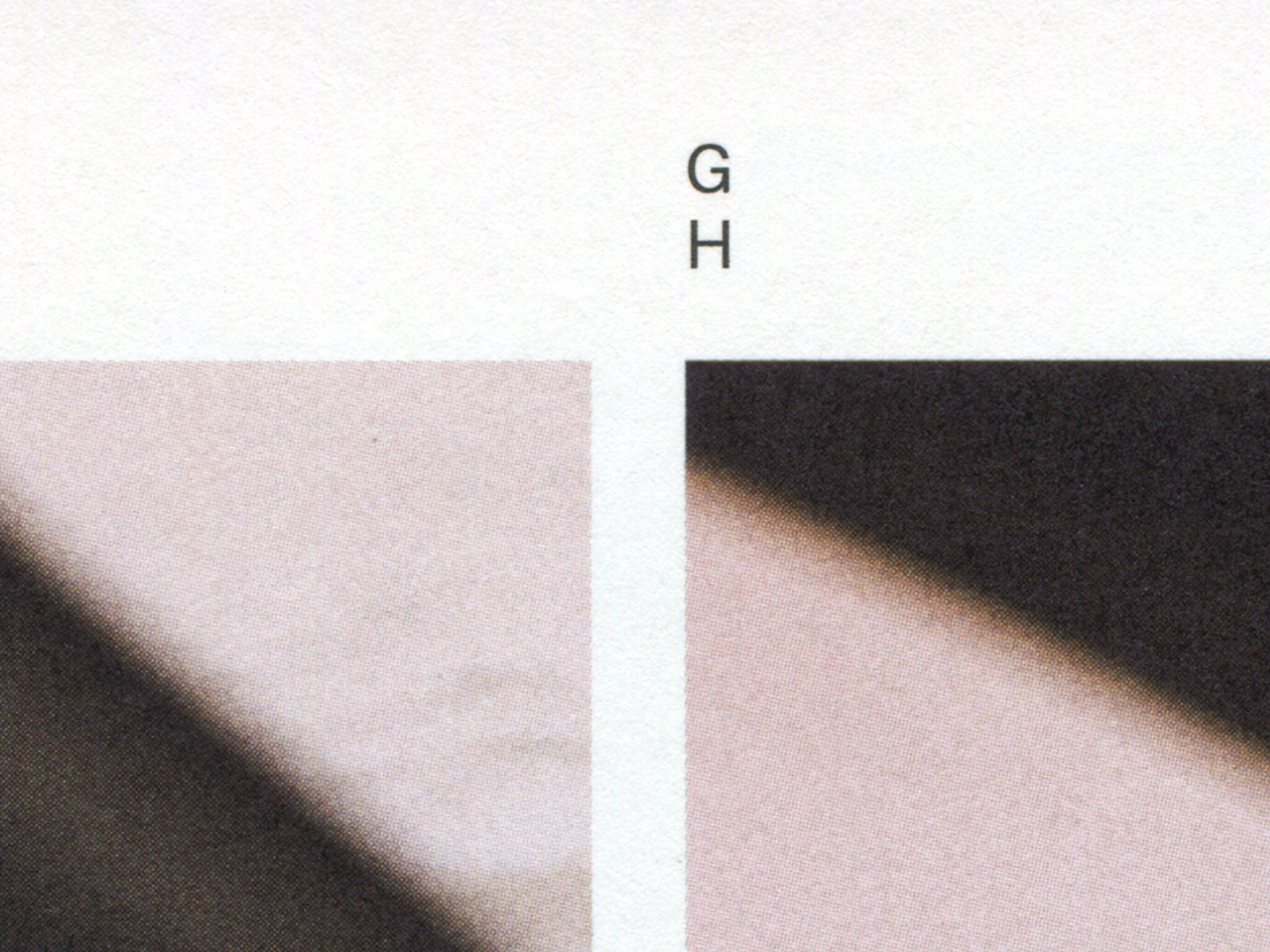
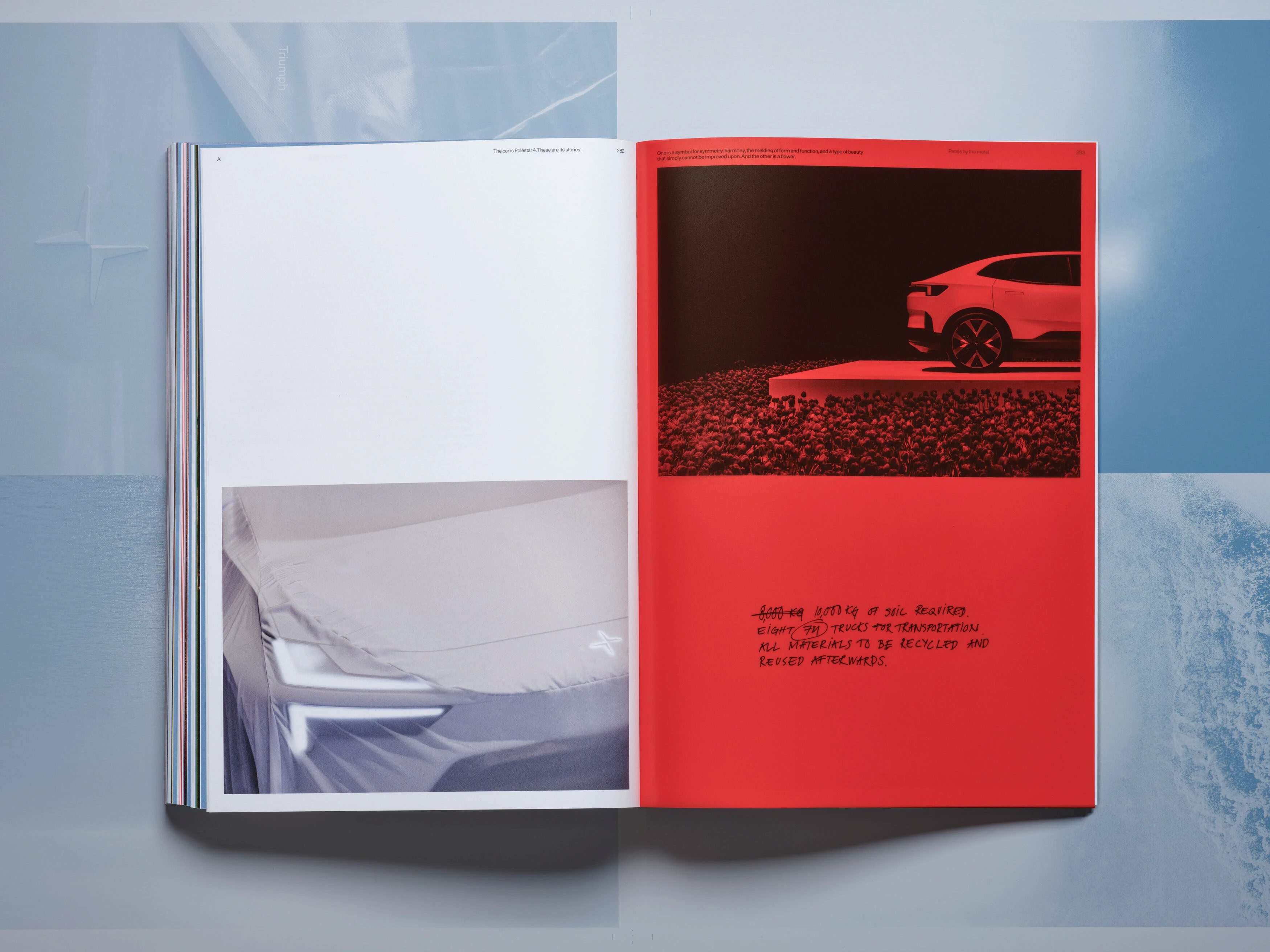
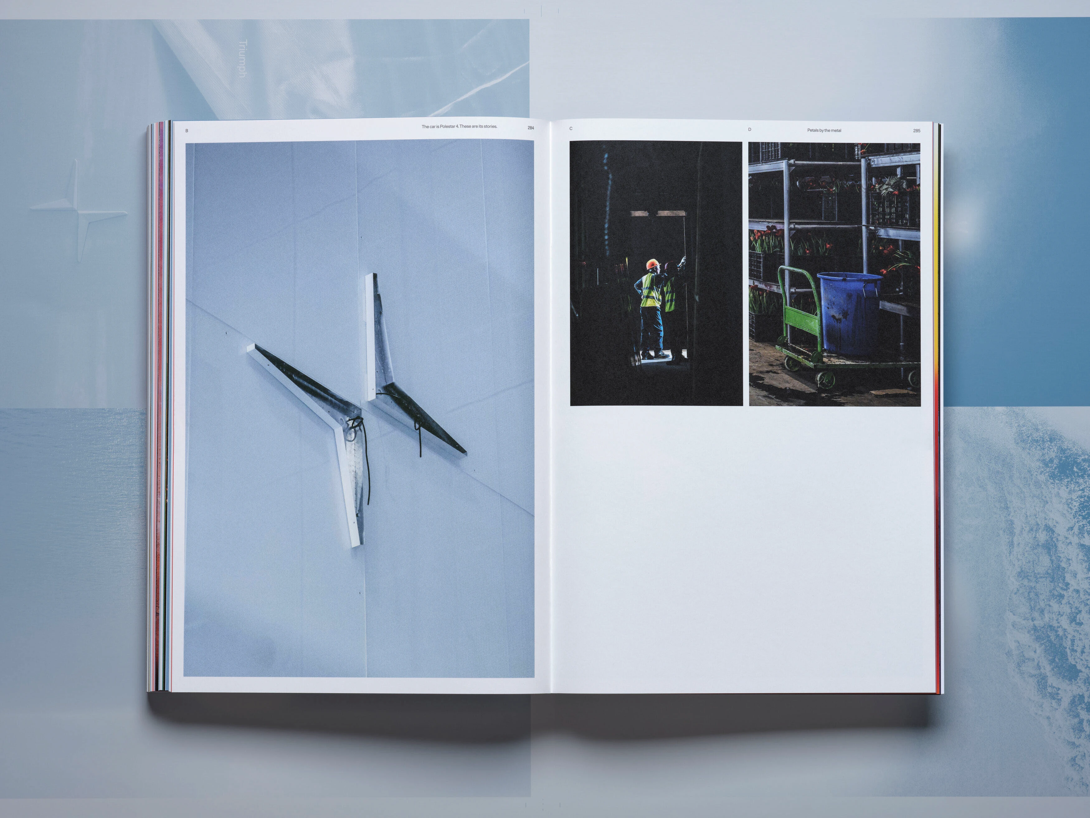
Hình ảnh được sắp xếp theo hệ thống nhãn chữ cái, căn chỉnh theo một đường ngang chạy suốt cuốn sách.
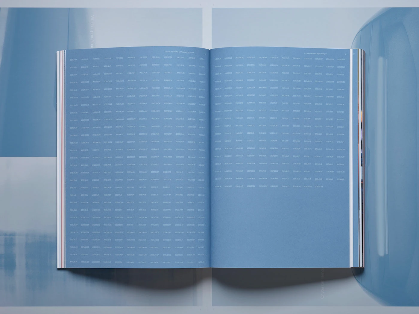
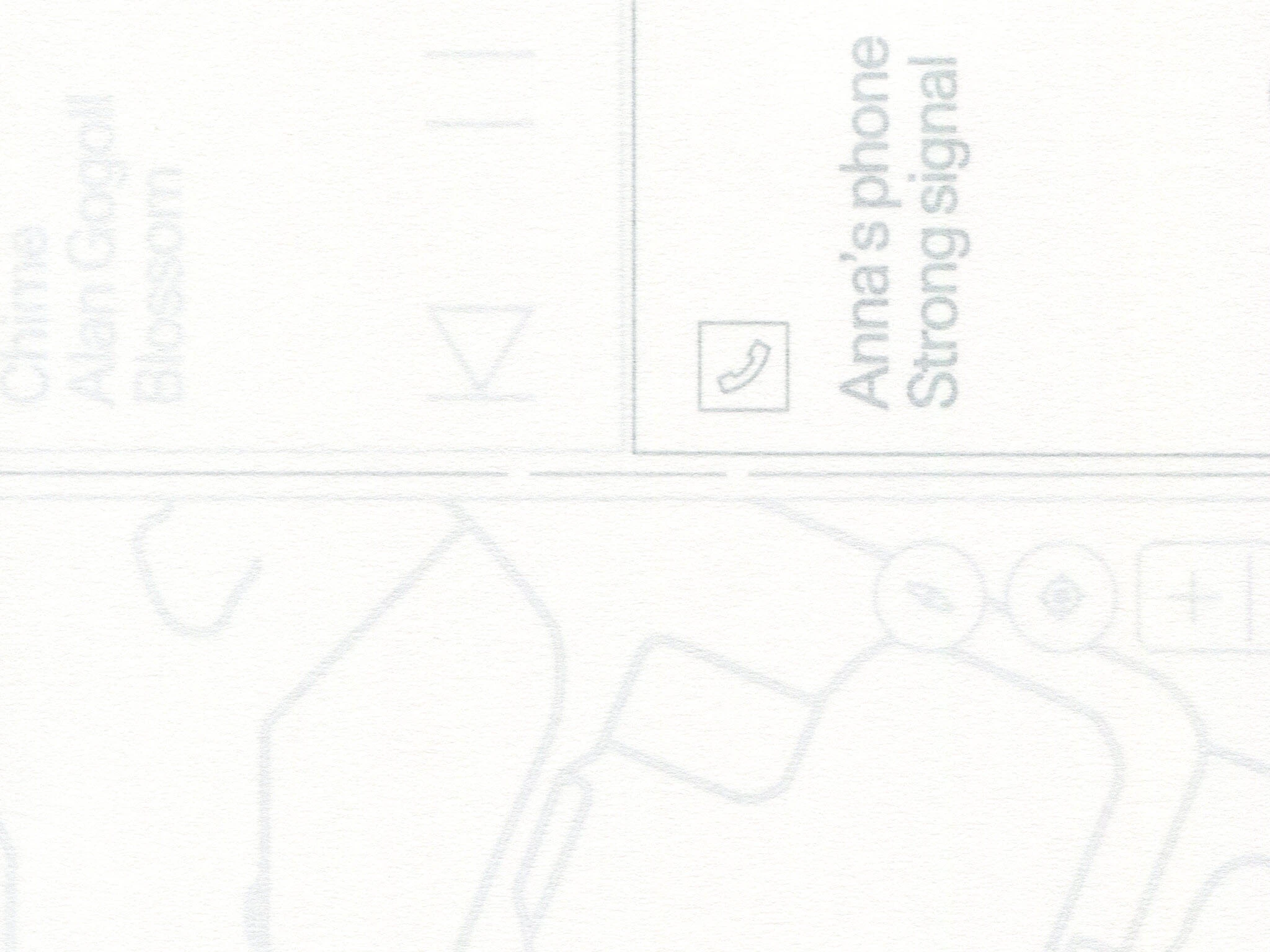
Chương về UX (trải nghiệm người dùng) cũng áp dụng nguyên lý tương tự cho hình ảnh và văn bản, giao diện màn hình sẽ chỉ lộ diện hoàn toàn khi các trang giấy đè lên nhau.
Từng nếp gấp hay sự chồng chéo đều chuẩn xác đến từng milimet, cho thấy quá trình sản xuất cực kỳ chú trọng vào tiểu tiết.
Câu chuyện về Polestar 4 được kể qua sáu chương, mỗi chương sử dụng các chất liệu khác nhau để mang lại một góc nhìn độc đáo.
Trong suốt một năm rưỡi qua, studio Lundgren+Lindqvist đã hợp tác chặt chẽ với đội ngũ nội bộ của Polestar để thực hiện Tập 4 (Volume 4) trong chuỗi sách thiết kế (Design Books) của hãng. Cho những ai chưa biết thì Polestar là một cái tên đình đám trong lĩnh vực thiết kế ô tô và là nhà sản xuất xe điện hàng đầu tại Scandinavia. Dù có trụ sở chính tại Gothenburg, Thụy Điển, họ đã mở rộng quy mô với hơn 100 không gian Polestar trên toàn cầu. Triết lý của hãng luôn xoay quanh đổi mới công nghệ, giải pháp bền vững và thiết kế ô tô tiến bộ.
Ý tưởng của loạt sách này là mỗi dòng xe sẽ có riêng một cuốn, đặt tên theo số thứ tự sản xuất. Vẫn giữ đúng bộ nhận diện và khung thiết kế từ ba tập trước, nhưng ở phiên bản này, đội ngũ thiết kế đã bứt phá giới hạn bằng cách tiếp cận đầy thử nghiệm cả về hình khối lẫn cấu trúc.
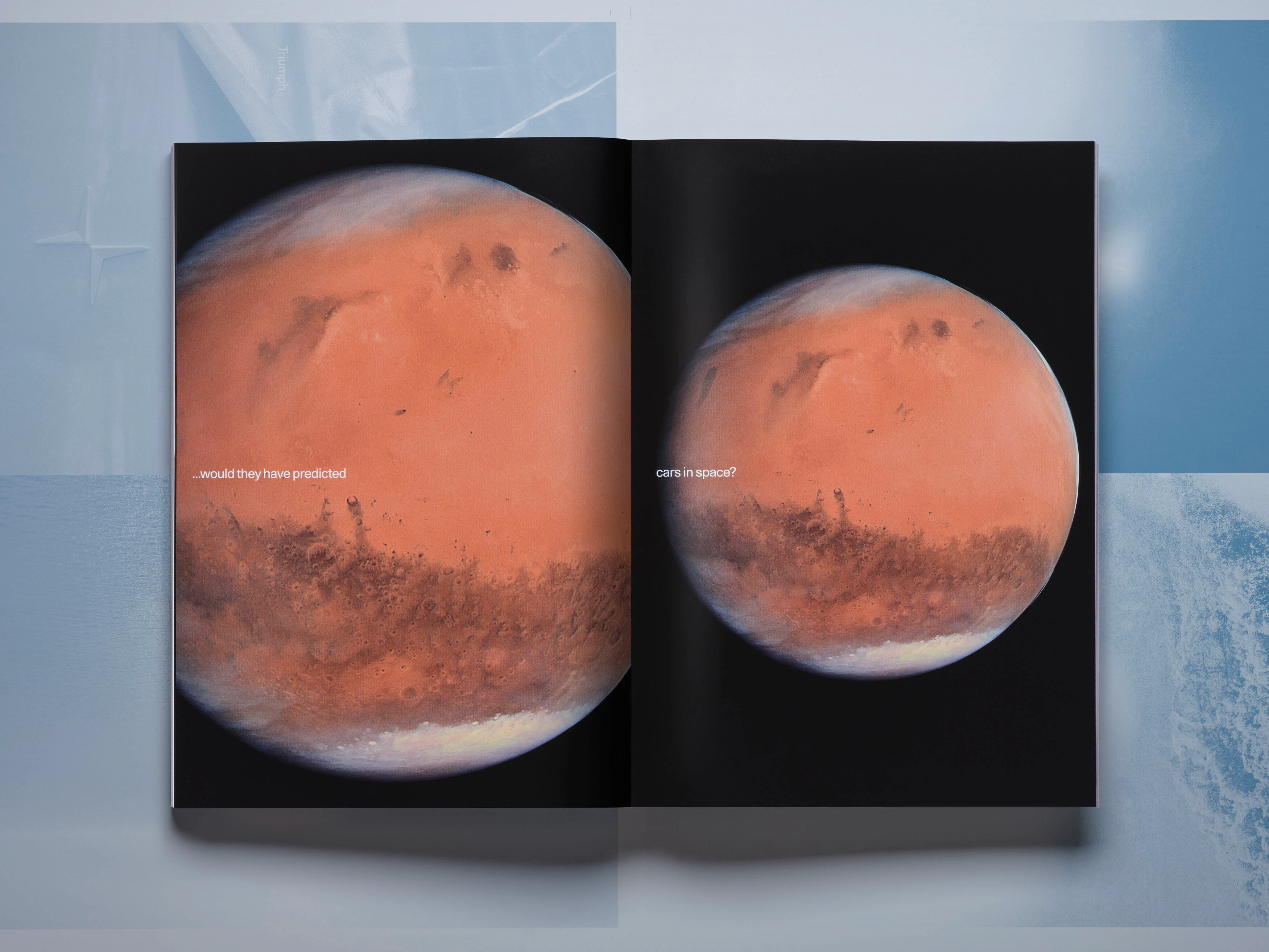
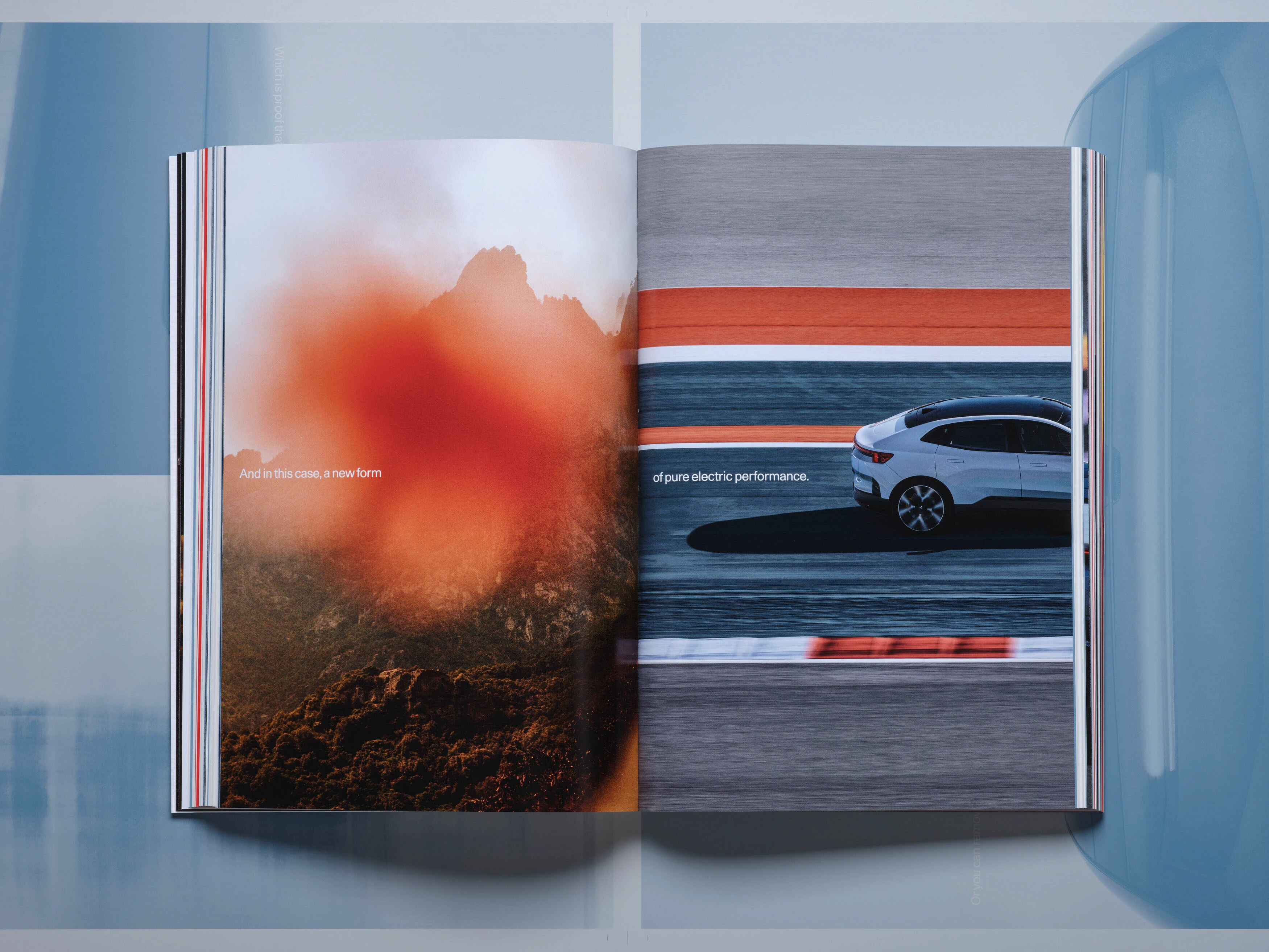
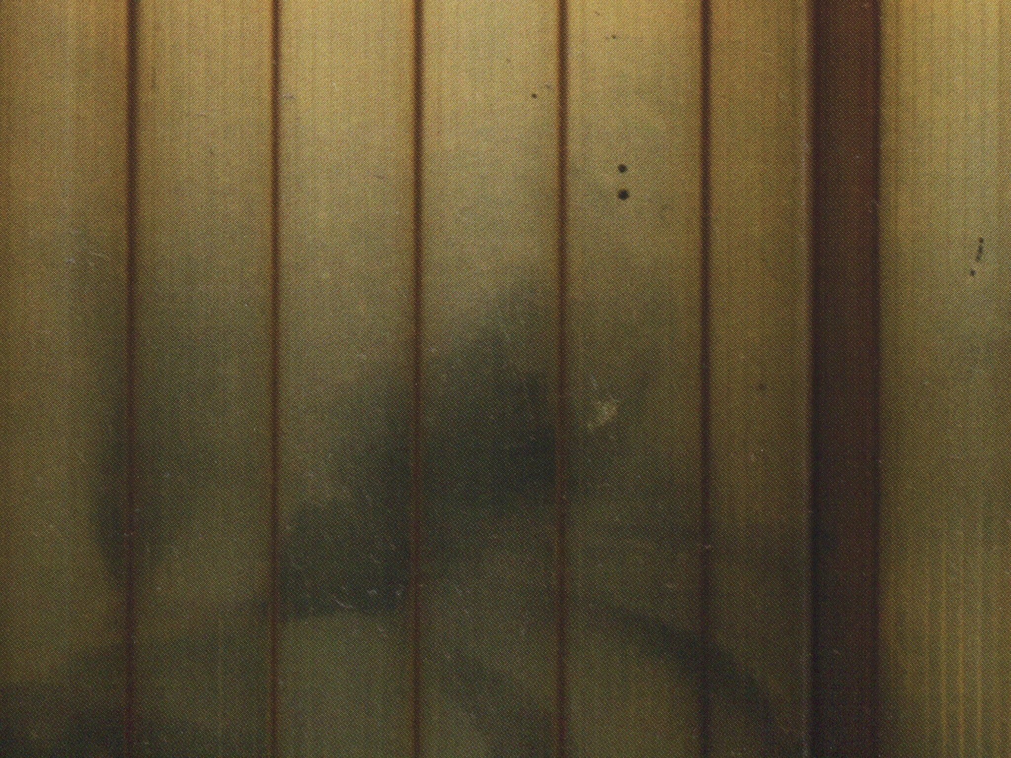
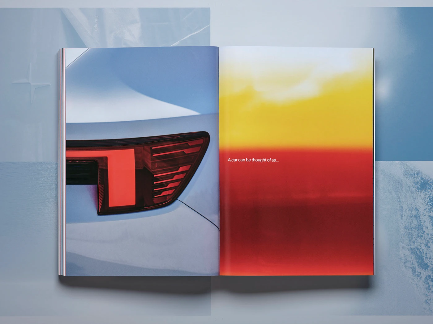
Điểm thú vị là yếu tố phim ảnh đóng vai trò cốt lõi, kết hợp khéo léo trải nghiệm lật trang truyền thống với nhịp điệu sống động của hình ảnh chuyển động. Được in trên giấy bóng để gợi liên tưởng đến màn hình, sáu phần nội dung tự sự xuất hiện xen kẽ giữa các chương chính như những khoảng nghỉ đầy chất thơ, phác họa nên cái hồn của chiếc xe. Hình ảnh kết hợp với phần chữ chạy như phụ đề giúp người đọc như được hòa mình vào một chuyến hành trình điện ảnh thực thụ.
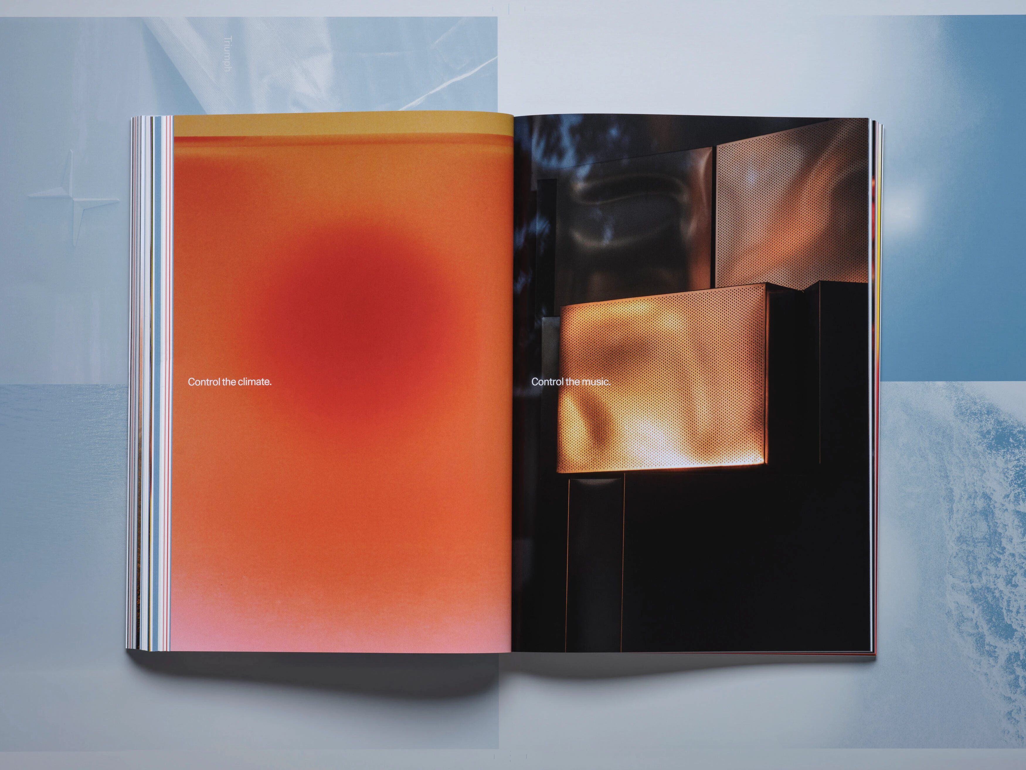
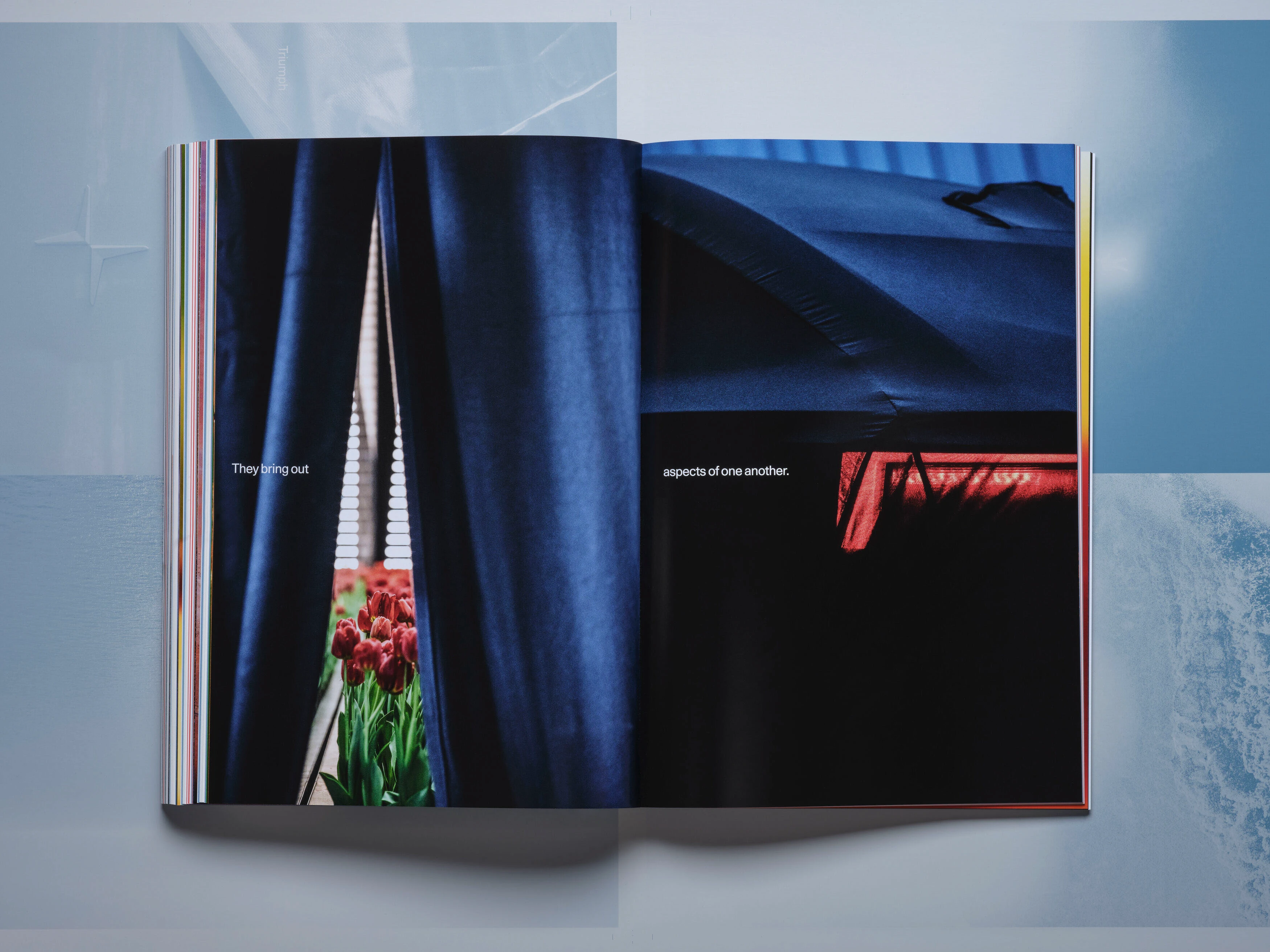
Sự xuyên thấu (transparency) chính là điểm nhấn xuyên suốt ấn phẩm. Các trang văn bản sử dụng loại giấy cực mỏng, tạo độ trong suốt nhẹ nhàng làm lộ ra những chi tiết mờ ảo của trang sau, kích thích cảm giác muốn khám phá. Ở các phần hình ảnh, kỹ thuật layer cho phép tạo nên sự đối thoại thị giác thú vị giữa các trang đôi.
Cuốn sách được chia làm năm chương chính bao gồm Design (Thiết kế), Testing (Thử nghiệm), Innovation (Cải tiến), UX (Trải nghiệm người dùng) và Reveal (Ra mắt). Mỗi chương sẽ có một đoạn chuyển tiếp bằng số, tiếp theo là phần nội dung với các bài phỏng vấn, suy ngẫm, các trang ảnh chuyên biệt và một trang tổng quan hình ảnh. Riêng chương UX, loại giấy mỏng được tượng dụng tối đa để bóc tách các thành phần giao diện. Khi các trang chồng lên nhau, toàn bộ bố cục màn hình sẽ hiện ra như một bản vẽ blueprint hoàn chỉnh.
Về mặt kỹ thuật, đây là một ấn phẩm cực kỳ phức tạp, kết quả của một quá trình nghiên cứu kỹ lưỡng để kết hợp năm loại giấy khác nhau vào phần ruột sách, vừa tối ưu hóa nhịp điệu đọc vừa phải đảm bảo tương thích tốt với các phương pháp đóng sách.
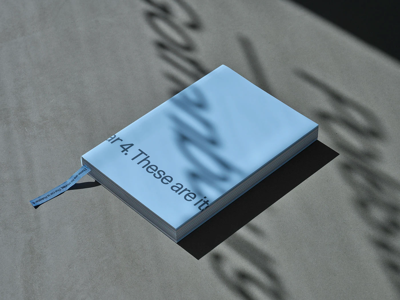
Bìa cứng gáy trần (raw-edge hardcover) được bọc trong một lớp áo khoác (dust jacket) bán trong suốt, tiếp nối mạch ý tưởng về sự xuyên thấu. Tên sách được in ngược ở mặt trong của dust jacket và chỉ có thể đọc được khi bọc vào bìa. Loại giấy mỹ thuật có gân dùng cho bìa cũng được dùng làm tờ gác (endpaper), tạo sự chuyển tiếp mượt mà từ ngoài vào trong.
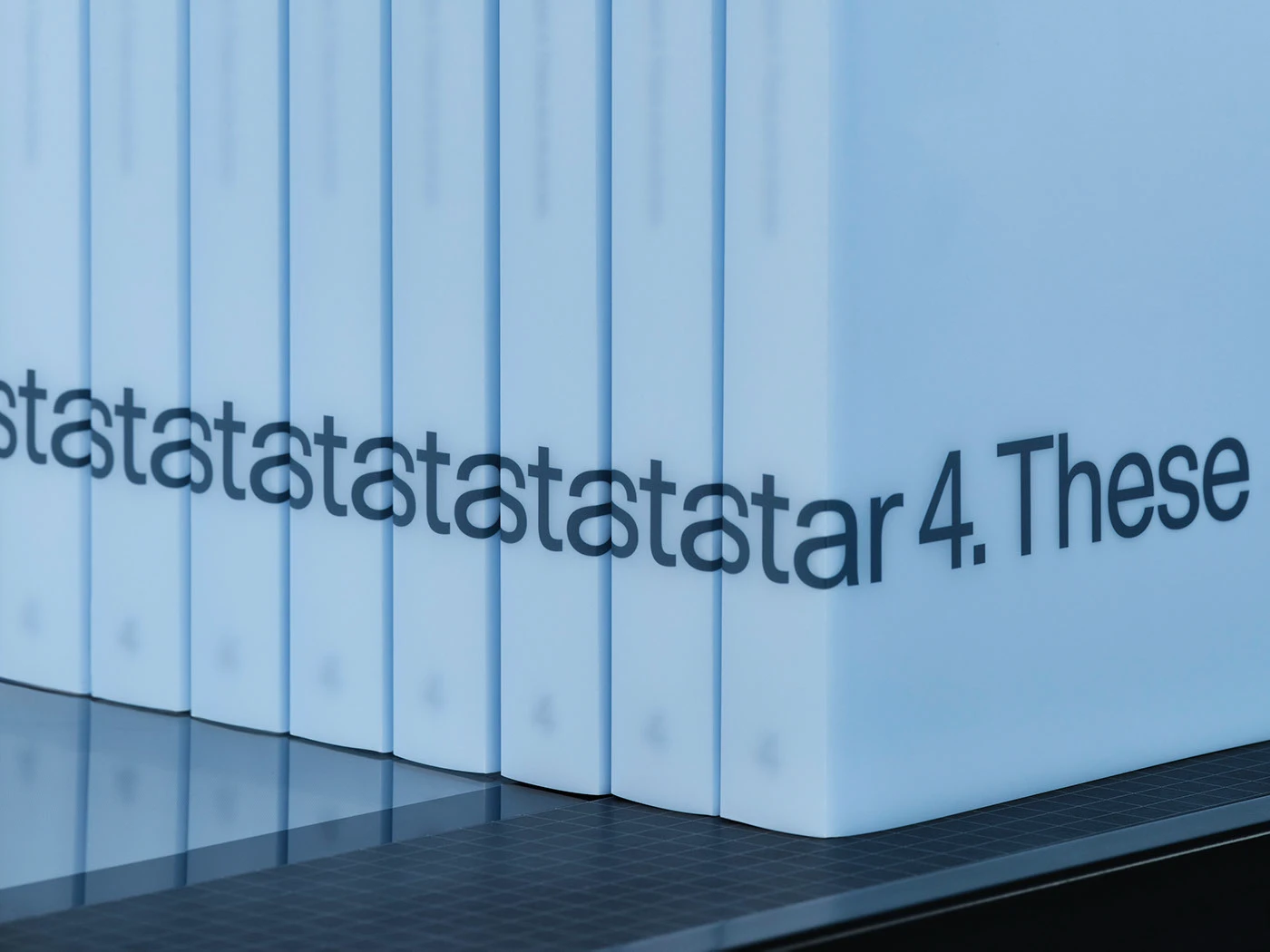
Một chiếc ruy-băng đánh dấu trang bằng lụa in lưới độc quyền, với tên sách lặp đi lặp lại liên tục, càng làm tăng thêm trải nghiệm xúc giác khi cầm trên tay.
Bên trong cuốn sách là tuyển tập hình ảnh được chọn lọc kỹ lưỡng từ các buổi chụp tại studio của Polestar, các chiến dịch quảng cáo và kho lưu trữ quá trình thiết kế, cùng với sự đóng góp từ 16 nghệ sĩ độc lập, bao gồm loạt ảnh của Erik Gustafsson và hình ảnh từ NASA. Cuốn sách là minh chứng cho sự hợp tác đa ngành để kể câu chuyện về Polestar 4. Xóa nhòa ranh giới giữa tài liệu kỹ thuật và biểu đạt thị giác, ấn phẩm này là sự lai tạo độc đáo giữa sách chuyên ngành ô tô và một cuốn art book.
Trong suốt các giai đoạn sản xuất, Lundgren+Lindqvist và Polestar đã duy trì mối quan hệ hợp tác chặt chẽ với các chuyên gia in ấn và đóng sách từ By Wind và Förlagshuset Nordens Grafiska, cùng chuyên gia chế bản Linjepunkt Repro để đảm bảo thành phẩm đạt chất lượng vật lý cao nhất.
Cuốn sách hiện có thể đặt mua trực tiếp tại additionals.polestar.com/.
Ghé thăm website của các đơn vị thực hiện để xem thêm nhiều hình ảnh chất lượng và các dự án khác:
Thiết kế: www.lundgrenlindqvist.se/profile (Andreas Friberg Lundgren, Julius Åsling, Mónica Tomás), www.polestar.com/ (Ann-Sofie Olausson Kvarfordt, Charlotte Starmark Sjösten, Conor Nally, Helen Resar, Pär Heyden)
Nội dung: Conor Nally
Nhiếp ảnh: Polestar (Stefan Isaksson, Julia Freiman, Ludvig Woll), thisismade.se/ (Oscar Hyltbring, Daniel Samuelsson), brickland.se/, PhotoPlus Studio, www.erikhenriksson.com/, www.sugarhouse.se/ (Karl Lundholm), edithouse.se/, István Csiszar, 赵一平 / Zhao YiPing, www.connected-archives.com/ (kristinbethge.com/, evelynfreja.com/, iragruenberger.com/, kurt-bauer.net/, www.mariehaefner.com/, yannickschuette.de/, alanacelii.com/, alecioferrari.com/, carl-ander.com/, davidavazzadeh.com/, johannhusser.com/, khiraldovoleau.com/, matthieucroizier.ch/, ramonhaindl.com/, www.zarapfeifer.com/), erikgustafsson.org/, nasa.gov/ và www.esa.int/
Chế bản (Prepress): www.linjepunkt.se/, Thụy Điển
In ấn: www.atta45.se/by-wind/, Thụy Điển
Đóng sách: www.fng.se/, Thụy Điển
Behind-the-scenes of Polestar’s Airflow campaign, shot on location in Death Valley.
The opacity of the 60 g/m² IBO One paper used for text pages creates incredibly dynamic layouts where letters overlap beautifully.
Five meticulously selected paper types give distinct character to each individual section of the book.
Paper transparency creates fascinating visual interplay with the following pages, making the reading experience deeply layered and full of surprises.
Book summaries projected directly onto the Polestar 4 at the Gothenburg showroom (Kungsportsavenyen 25).
Images are organized using an alphabetical labeling system, perfectly aligned to a continuous horizontal axis throughout the book.
The UX chapter applies this same principle to images and text, where the full screen interface only reveals itself as the sheer pages stack together.
Every single fold and overlap is millimeter-perfect, showcasing an incredible obsession with detail during production.
The Polestar 4 story unfolds across six chapters, each leveraging unique materials to offer a fresh perspective.
Over the past year and a half, design studio Lundgren+Lindqvist collaborated closely with Polestar’s in-house team to craft Volume 4 of the brand’s Design Books series. For anyone unfamiliar, Polestar is a massive powerhouse in automotive design and a leading electric vehicle manufacturer in Scandinavia. Headquartered in Gothenburg, Sweden, the brand has expanded globally with over 100 Polestar spaces. Their philosophy centers completely on technological innovation, sustainable solutions, and progressive automotive design.
The concept behind this series is brilliant: each car model gets its own dedicated book, named by production sequence. While staying true to the visual identity and structural framework established in the first three volumes, the design team pushed the envelope this time with a highly experimental approach to form and structure.
What’s really cool is how cinematic elements take center stage, seamlessly blending the traditional page-turning experience with the dynamic rhythm of moving images. Printed on glossy paper to mimic a screen, six narrative editorial sections act as poetic intermissions between main chapters, capturing the very soul of the car. Imagery paired with running text looks just like movie subtitles, giving readers a truly cinematic journey.
Transparency serves as the ultimate design thread. Text pages utilize ultra-thin paper, creating a delicate sheerness that hints at what’s coming on the next page, sparking curiosity. In the visual sections, clever layering creates an engaging visual conversation between spreads.
The book breaks down into five main chapters: Design, Testing, Innovation, UX, and Reveal. Each chapter kicks off with a numerical transition, followed by content featuring interviews, reflections, dedicated photo plates, and a visual overview page. In the UX chapter specifically, the thin paper is pushed to its absolute limits to break down interface components. As pages overlap, the entire screen layout emerges like a beautifully complete blueprint.
On a technical level, this is a seriously complex publication. It’s the result of deep research to combine five different paper types within the book block, optimizing reading rhythm while ensuring flawless compatibility with binding methods.
The raw-edge hardcover comes wrapped in a semi-transparent dust jacket, keeping the transparency theme alive. The title is printed in reverse on the inside of the dust jacket and only reads correctly once wrapped around the cover. The textured art paper used for the cover carries over to the endpapers, making a smooth transition from outside in.
An exclusive silk-screened ribbon bookmark featuring the book’s title repeating continuously adds an extra layer of tactile satisfaction.
Inside, there’s a curated selection of imagery from Polestar’s studio shoots, ad campaigns, and design archives, alongside contributions from 16 independent artists—including a photo series by Erik Gustafsson and stunning imagery from NASA and ESA. The book stands as a testament to multidisciplinary collaboration, telling the Polestar 4 story beautifully. Blurring the lines between technical documentation and visual expression, this piece is a unique hybrid of automotive manual and fine art book.
Throughout production, Lundgren+Lindqvist and Polestar worked hand-in-hand with print and binding experts from By Wind and Förlagshuset Nordens Grafiska, alongside prepress specialist Linjepunkt Repro, to guarantee the absolute highest physical quality.
The book is currently available to order directly from the additionals.polestar.com/.
Check out the websites of the creative teams involved to explore more stunning visuals and other projects:
Design: www.lundgrenlindqvist.se/profile (Andreas Friberg Lundgren, Julius Åsling, Mónica Tomás), www.polestar.com/ (Ann-Sofie Olausson Kvarfordt, Charlotte Starmark Sjösten, Conor Nally, Helen Resar, Pär Heyden)
Content: Conor Nally
Photography: Polestar (Stefan Isaksson, Julia Freiman, Ludvig Woll), thisismade.se/ (Oscar Hyltbring, Daniel Samuelsson), brickland.se/, PhotoPlus Studio, www.erikhenriksson.com/, www.sugarhouse.se/ (Karl Lundholm), edithouse.se/, István Csiszar, Zhao YiPing, www.connected-archives.com/ (kristinbethge.com/, evelynfreja.com/, iragruenberger.com/, kurt-bauer.net/, www.mariehaefner.com/, yannickschuette.de/, alanacelii.com/, alecioferrari.com/, carl-ander.com/, davidavazzadeh.com/, johannhusser.com/, khiraldovoleau.com/, matthieucroizier.ch/, ramonhaindl.com/, www.zarapfeifer.com/), erikgustafsson.org/, nasa.gov/ and www.esa.int/
Prepress: www.linjepunkt.se/, Sweden
Printing: www.atta45.se/by-wind/, Sweden
Binding: www.fng.se/, Sweden