
editorial design
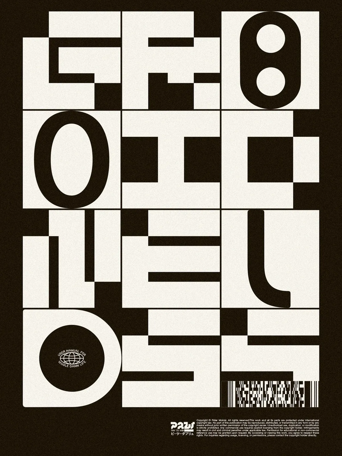
Molnár Péter’s PLAY 2 WIN Vol. 2: 1980s Tech Nostalgia and Poster Design
PLAY 2 WIN Vol. 2: Molnár Péter’s 1980s Tech-Inspired Poster Collection Hungarian graphic designer Molnár Péter is back with PLAY 2 WIN Vol. 2—an exciting collection of 17 poster designs blending 1980s tech nostalgia with raw, tactile print textures. In his late 40s, the artist views his gathered memories and unfinished experiments as little “mood…
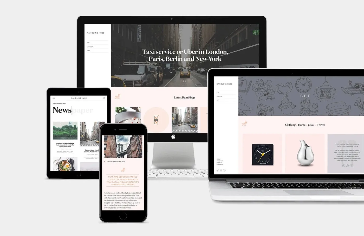
Editorial Web Design for Rambling Muse by SocioDesign
Editorial Web Design for Rambling Muse by SocioDesign When writer Clarisse Lehmann teamed up with London-based agency SocioDesign, the goal was clear: craft a super sleek brand identity and editorial web design for her lifestyle blog, Rambling Muse. Having lived in iconic cities like New York, Geneva, Tokyo, Madrid, and London, Lehmann brings a fresh,…
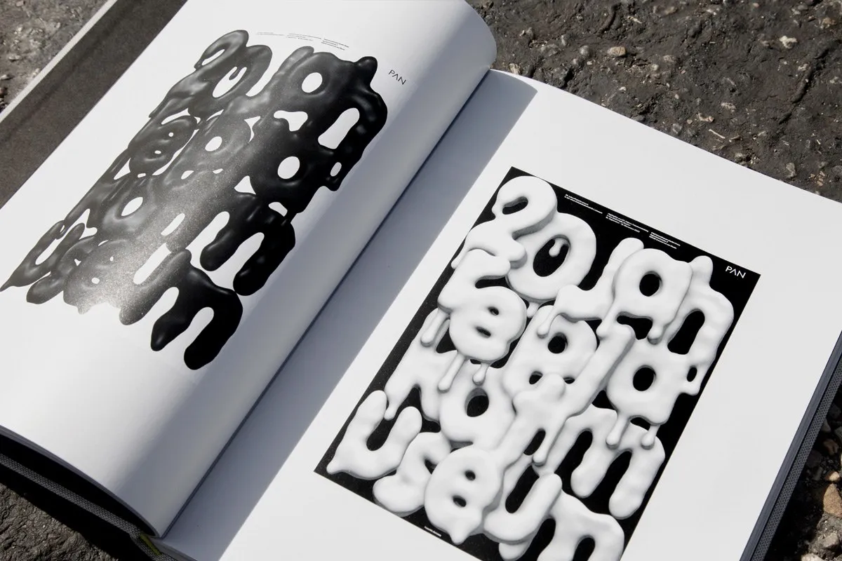
Fons Hickmann Posters — Now and Then: An Editorial Masterclass by Slanted Publishers
Fons Hickmann Posters — Now and Then: When a Book Is So Much More Than Just an Image Vessel Most poster compilations easily fall into the trap of treating the book format as a passive box to hold graphic images. However, Fons Hickmann Posters — Now and Then, published by Slanted Publishers, takes a completely…
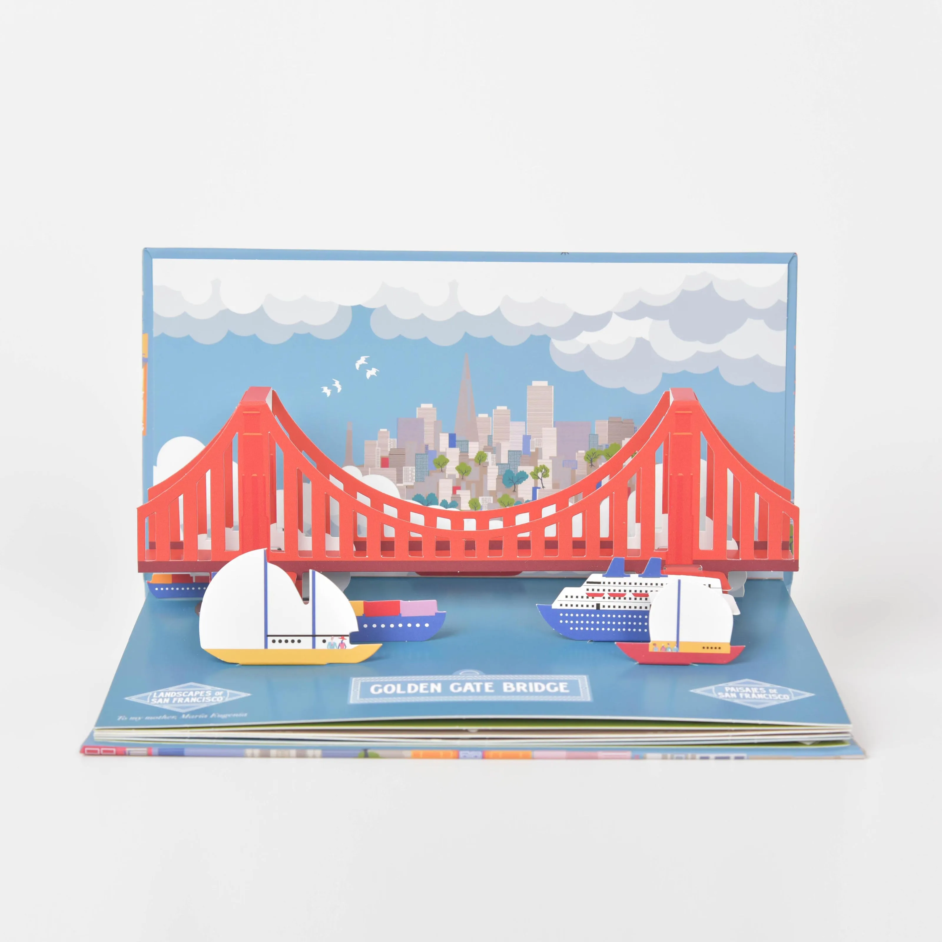
Sipidipi’s Pop-Up Books: Turning Cities into Paper Architecture
Watching entire cities scale down into 3D paper models through Sipidipi’s pop-up books is pure magic! Sipidipi’s pop-up books transform entire cities like Madrid, Barcelona, Valencia, and San Francisco into legit paper architecture, unfolding into lively 3D pages. Take a look at the Barcelona spread to see what makes this project so brilliant. The Sagrada…
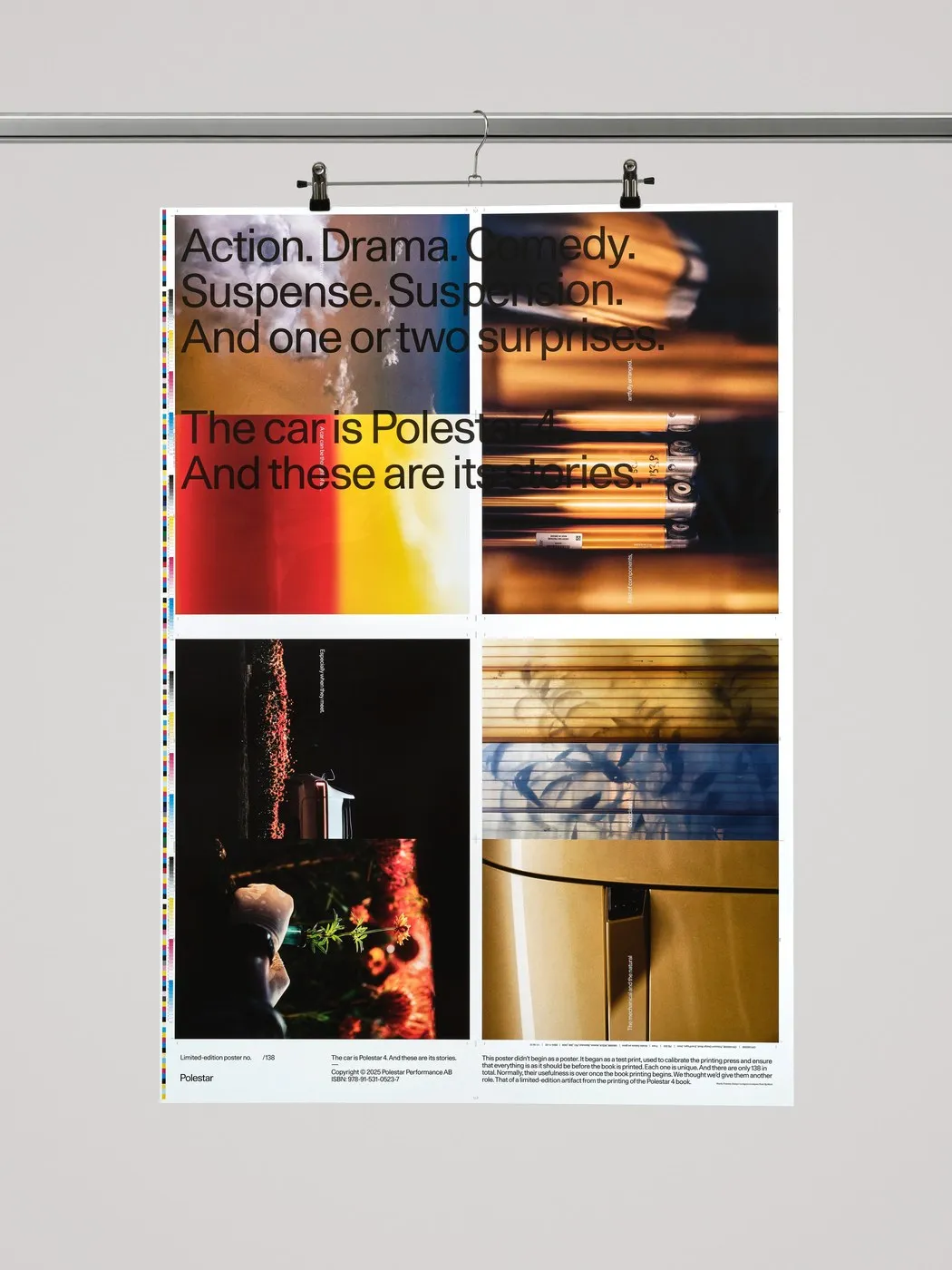
Polestar 4 Poster Series: Turning Press Waste into Print Design
Turning Press Waste into a Limited Poster Series for the Polestar 4 by Lundgren+Lindqvist Book printing naturally produces a mountain of waste paper from press make-ready sheets used to fine-tune ink coverage and color accuracy before the final press run. During the production of the Polestar 4 Design Book at GBGT Box in Gothenburg, design…
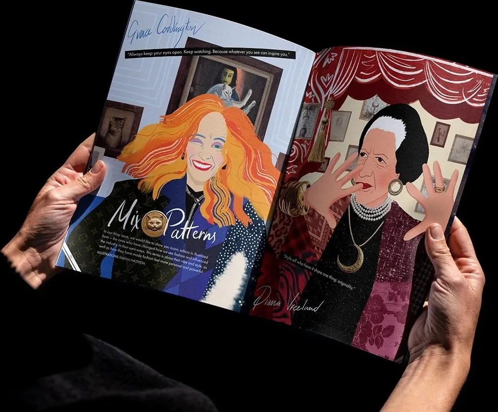
Sabina Farziyeva’s Editorial Illustration Series for Nargis Magazine
When Fashion Editors Become Collage Artworks Illustrator Sabina Farziyeva’s editorial illustration series for Nargis Magazine serves up a super fun concept: reimagining iconic fashion editors-in-chief not through their literal portraits, but through their unmistakable style and vibrant pattern mixing. Outfits sit right at the heart of every portrait to bring each personality to life. Mention…
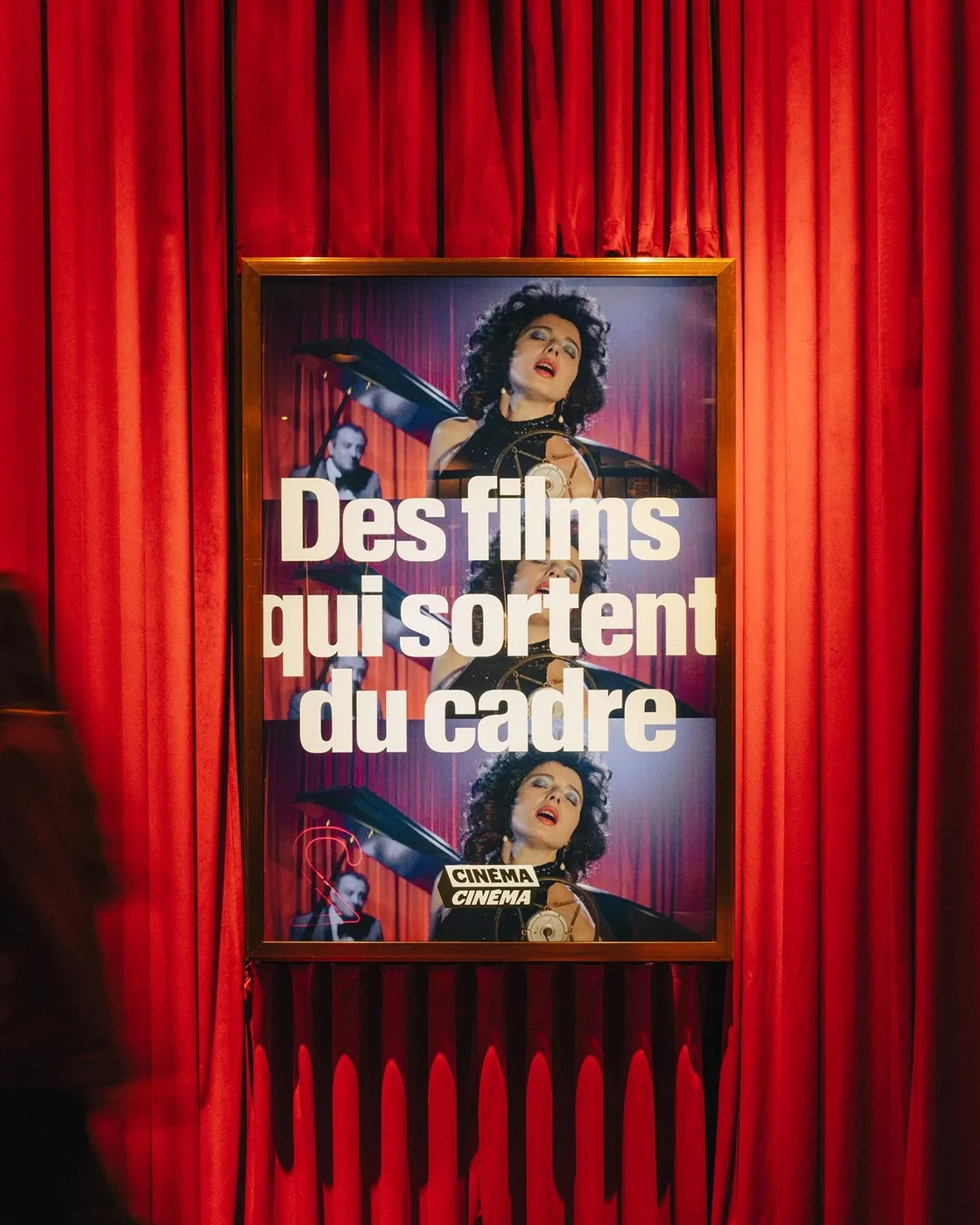
Cinéma Cinéma — Modular Editorial Design Framework by Deux Huit Huit
Cinéma Cinéma: A Flexible Editorial Framework by Deux Huit Huit Design studio Deux Huit Huit took on a fantastic challenge: uniting three of Montreal’s most beloved historic indie theaters—Cinéma Beaubien, Cinéma du Parc, and Cinéma du Musée—under a single brand family while honoring each venue’s unique personality. Instead of flattening everything into a one-size-fits-all look,…
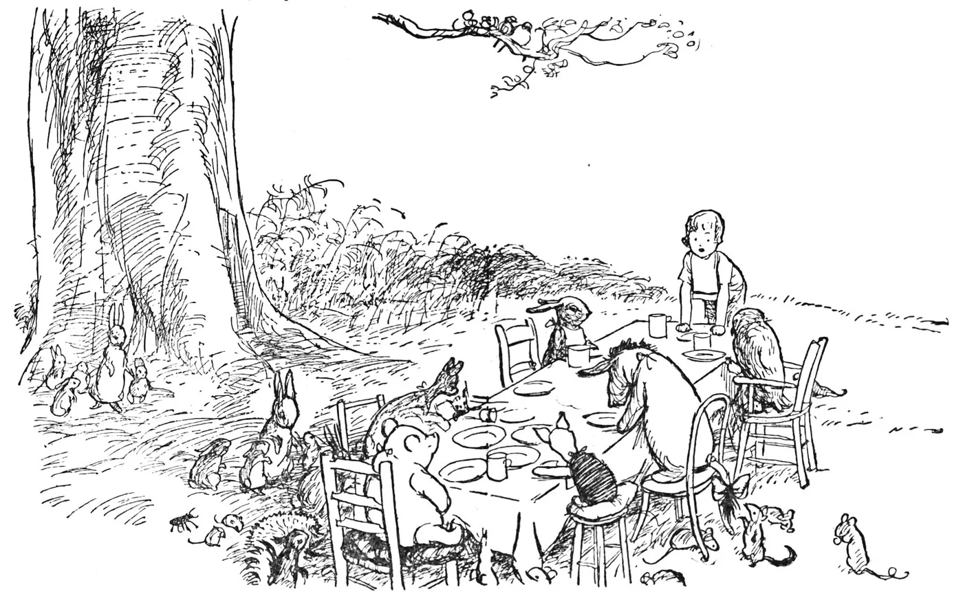
E.H. Shepard at 100: The Timeless Pen-and-Ink Craft Behind Winnie-the-Pooh
100 Years of Winnie-the-Pooh: A Look Back at E.H. Shepard’s Linework and Negative Space When A.A. Milne’s Winnie-the-Pooh debuted in 1926, the book brought more than just a gentle children’s tale—it offered a masterclass in minimalist graphic design. While Milne crafted the rhythmic flow of the text, cartoonist E.H. Shepard breathed life, form, and personality…
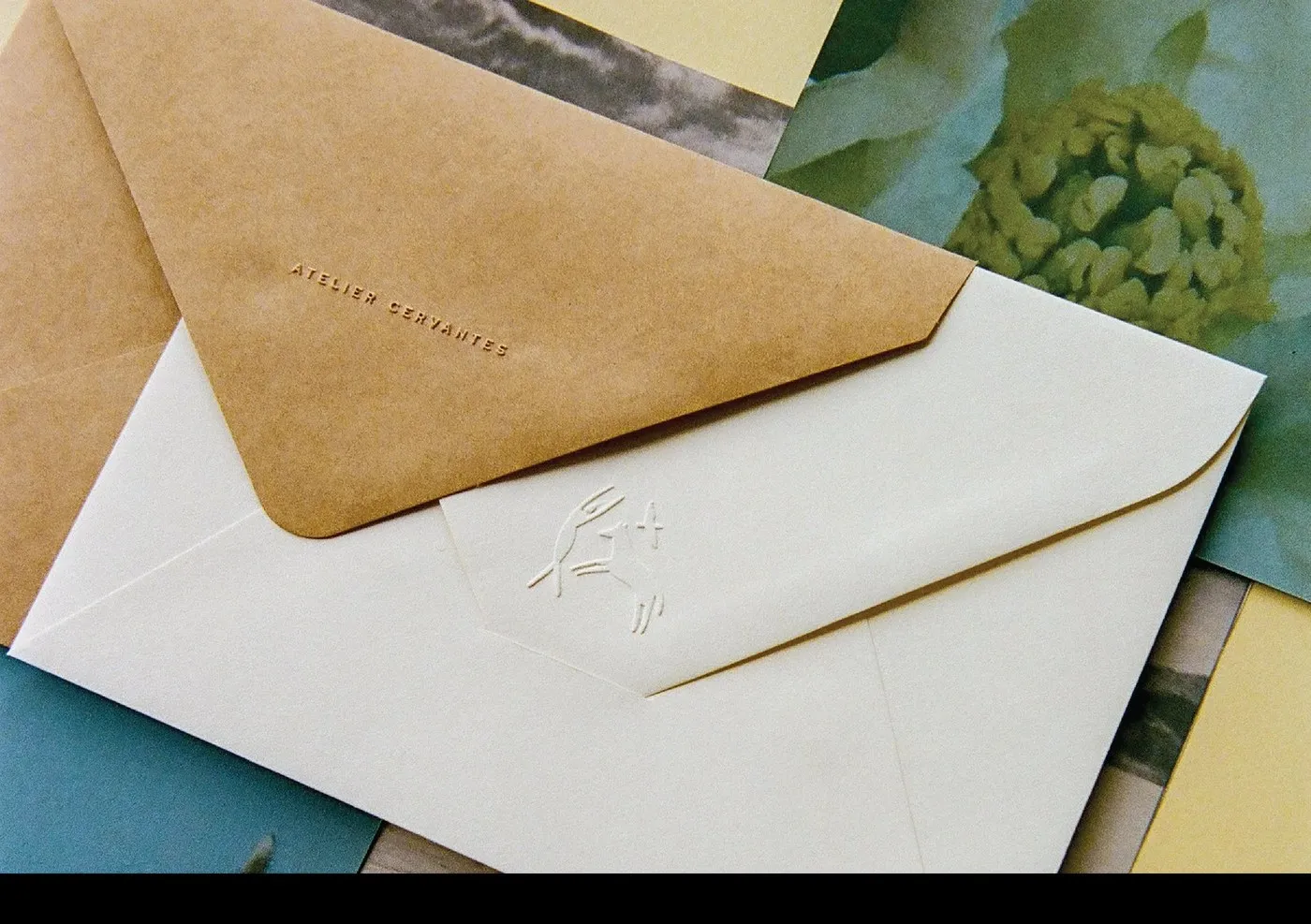
Atelier Cervantes: Editorial Design Project by SAVVY STUDIO
Striking the Perfect Balance: Structure Meets Emotion in Editorial Design for Atelier Cervantes Atelier Cervantes is an art research lab and curatorial consultancy founded by María Sprowls Cervantes, operating between New York and Mexico. Instead of taking the typical corporate branding route, SAVVY STUDIO opted for a poetic approach to editorial design, conveying subtle nuances…
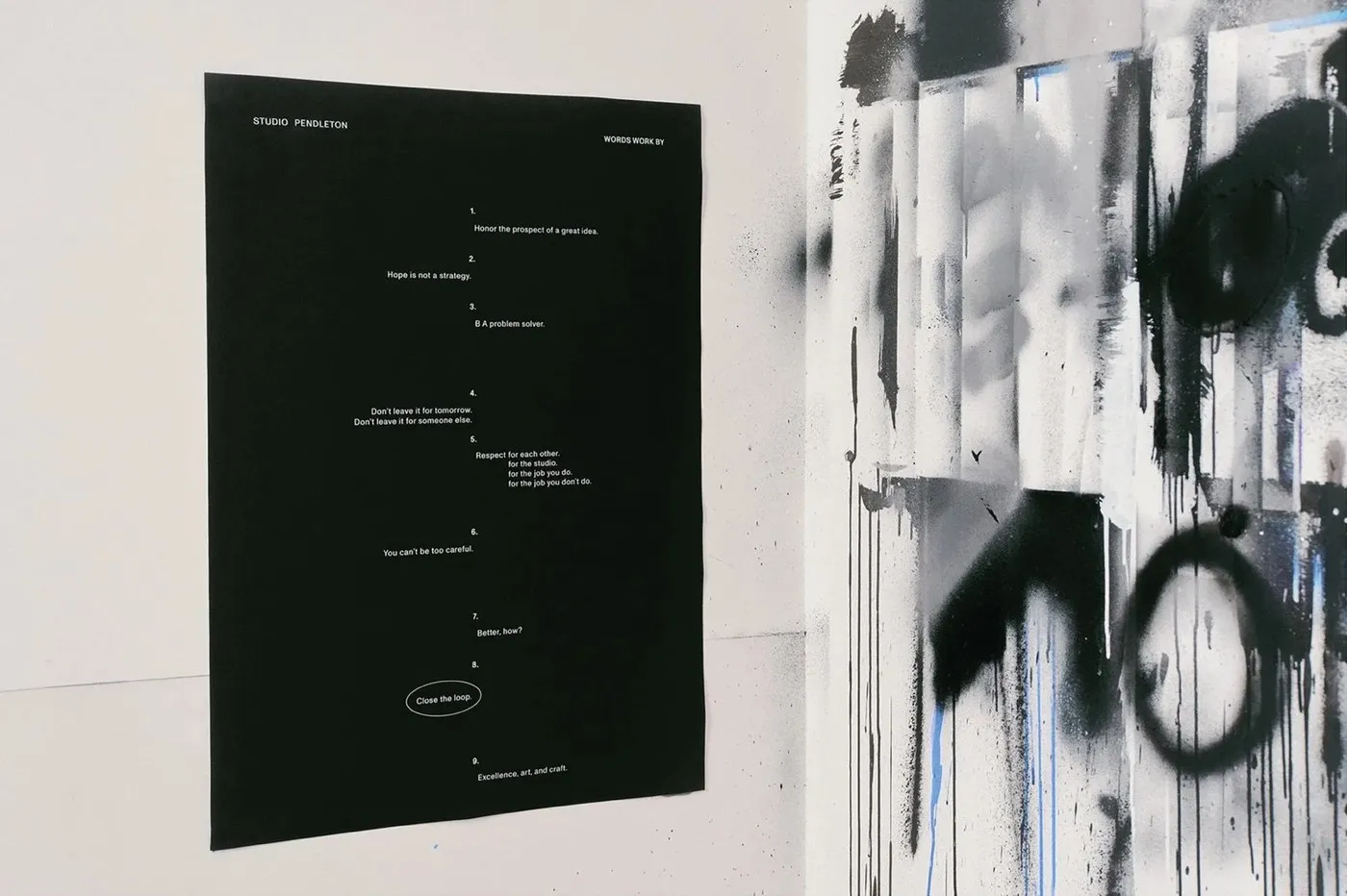
Adam Pendleton Monograph: Editorial Design System by SAVVY STUDIO
Adam Pendleton Monograph Editorial Design by SAVVY STUDIO Artist Adam Pendleton has always maintained an ultra-sleek visual universe rooted strictly in black and white. When building a brand identity and editorial design system for his studio, Mexico-based agency SAVVY STUDIO created a design framework that beautifully mirrors this artistic ethos—a place where language, gesture, and…
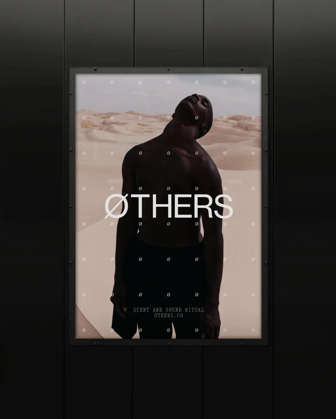
A Scientific and Disciplined Editorial Design for ØTHERS by Two Times Elliott
Two Times Elliott’s Disciplined Editorial Design System for ØTHERS Instead of taking the well-worn pastel route typical of wellness brands, London-based design studio Two Times Elliott steered in a totally different direction for ØTHERS. This brand focuses on mental balance grounded in neuroscience and olfactory science. The visual identity embraces a sleek minimalism, framing self-discovery…
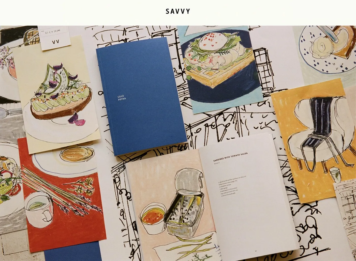
Quarter Past Noon Packaging Design System by SAVVY STUDIO
Quarter Past Noon Packaging and Culinary Design System by SAVVY STUDIO SAVVY STUDIO crafted an incredible packaging system for the Quarter Past Noon culinary project, cleverly pairing a neat fabric-wrapped box with loose paper recipe cards. Created in collaboration with chef Søren Westh, this concept turns into a beautifully tangible, tactile experience. The sturdy box…
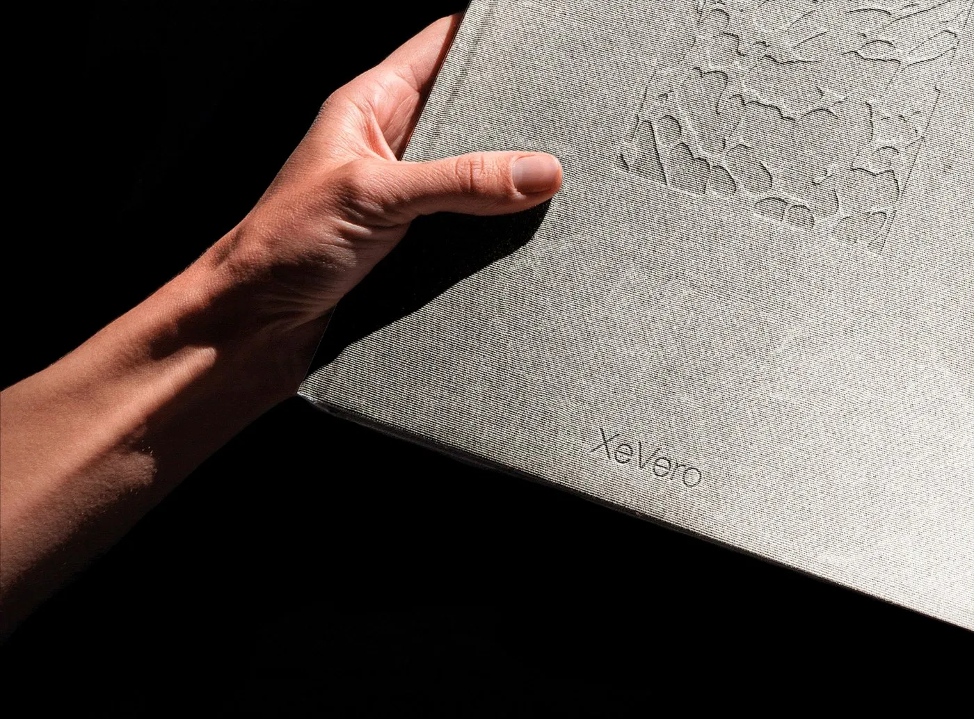
Xe Vero Catalogue: Framing Murano Glass Craftsmanship Through White Space
Xe Vero Catalog: Where White Space Elevates Murano Glass Craftsmanship Designing a print publication for a heritage Murano glass brand is all about finding the sweet spot between Venetian artisanal tradition and modern visual thinking. For the Xe Vero catalog project, Italian design studio Suerte Studio built a layout centered around the concept of calculated…
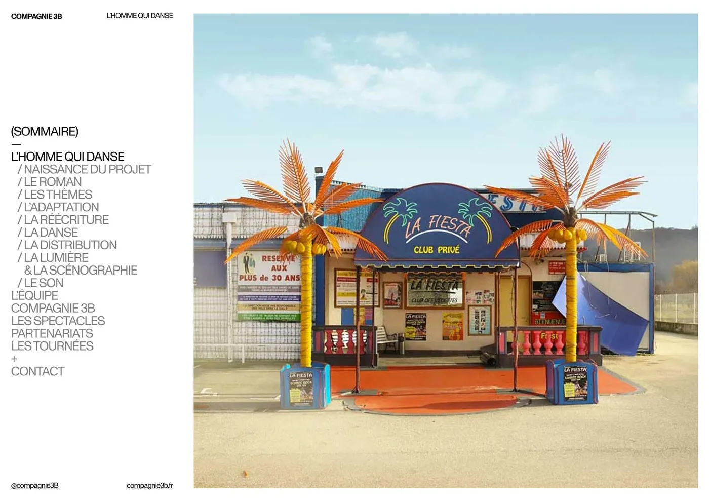
Compagnie 3B Presskit: Swiss Style Meets Nightclub Realism by Florian Cornut
Compagnie 3B Presskit: Swiss Style Meets Nightclub Energy by Florian Cornut When adapting Victor Jestin’s 2022 novel L’homme qui danse into a performance presskit, Bordeaux-based designer Florian Cornut built a layout system packed with striking contrast. The story follows Arthur, a lonely soul who spends three decades dancing away his nights in suburban discos. Instead…
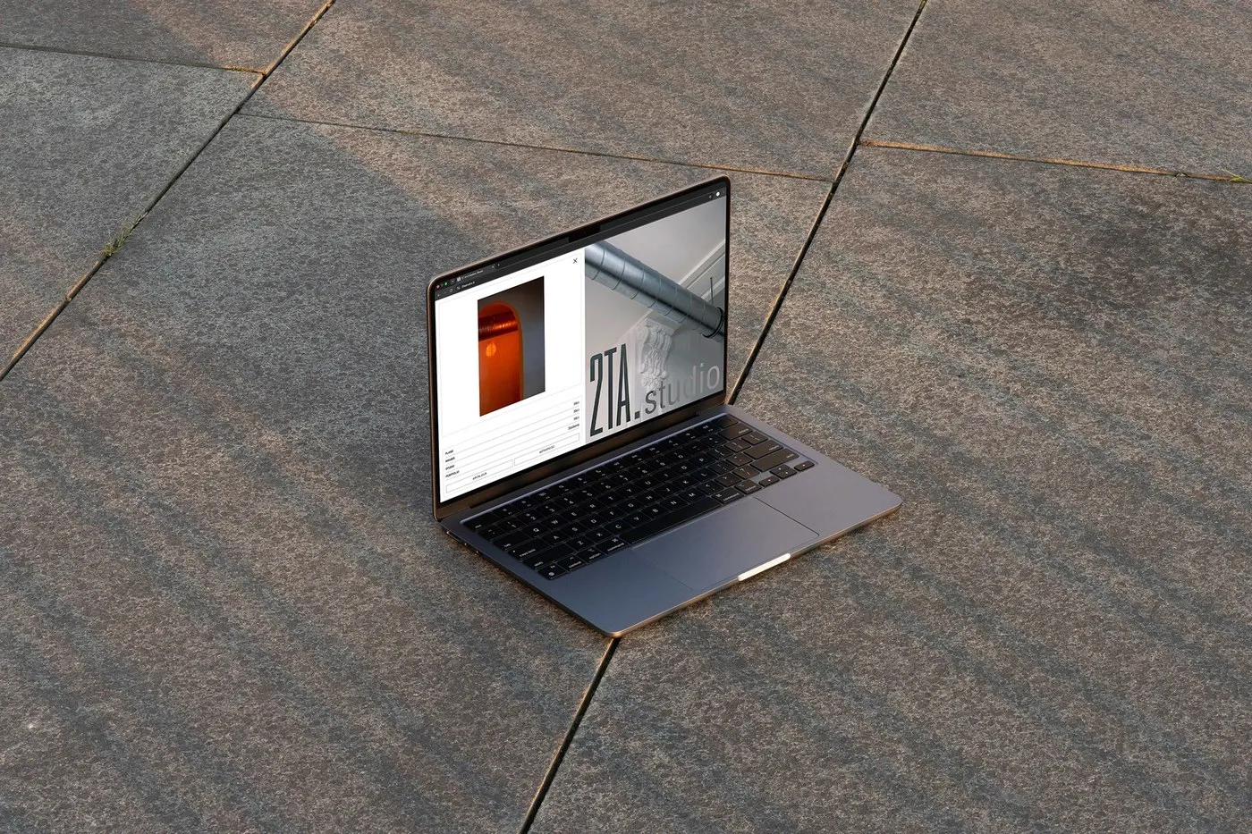
Editorial Design for 2T ARCHITECTURE by Florian Cornut: A Lesson in Visual Restraint
Editorial Design for 2T ARCHITECTURE by Florian Cornut: Discipline, White Space, and Pure Elegance When architectural thinking meets graphic design, magic happens—resulting in something amazingly crisp, structured, and visually soothing. The editorial design project for 2TA Studio by designer Florian Cornut is a textbook example of this perfect harmony! Founded by architects Matias Tapia and…
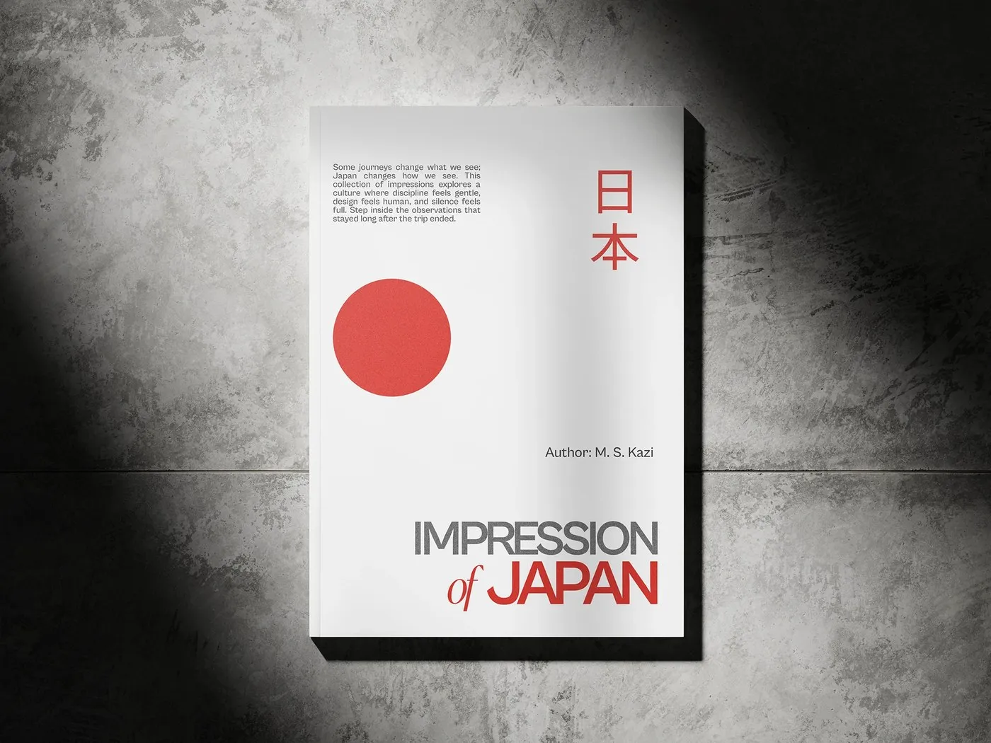
Minimalist Book Layout Design for “Impressions of Japan” by Ashutosh Rana
Minimalist Book Layout Design for “Impressions of Japan” by Ashutosh Rana “Impressions of Japan” is a captivating book project capturing everyday moments across Tokyo, Osaka, and Kyoto. It seamlessly pairs concise travel notes by writer M. S. Kazi with refined layout design by designer Ashutosh Rana. The cover makes an instant visual impact with a…
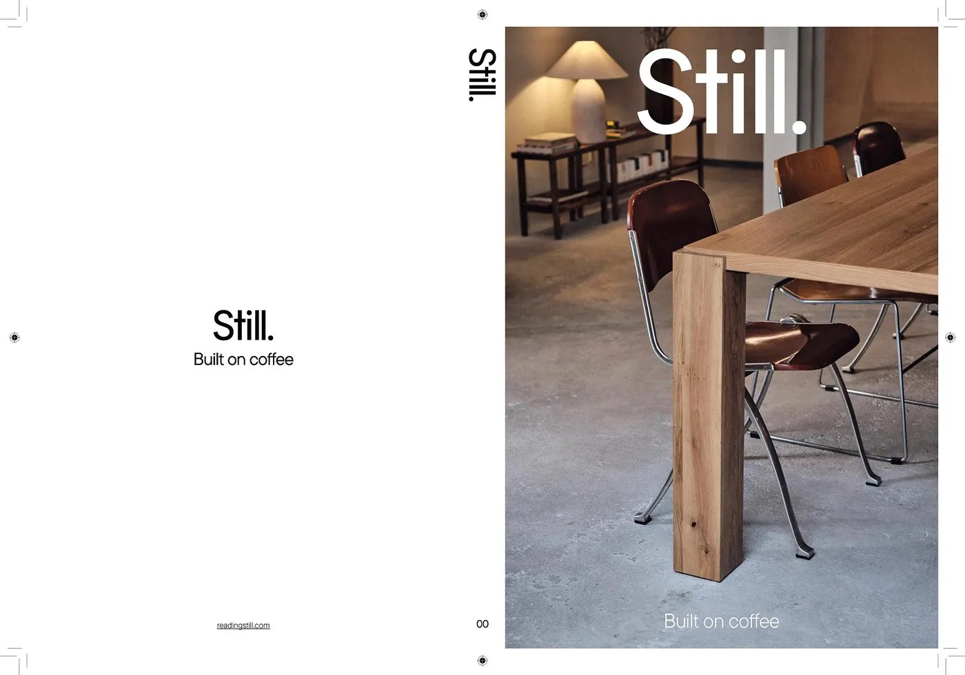
Still Magazine Issue 00 by Florian Cornut: Editorial Design for Lisbon Coffee Culture
Still Magazine Issue 00 by Florian Cornut: Editorial Design for Lisbon Coffee Culture There is a unique charm to a print publication that embraces a rhythmic pace and creates a restful breath of fresh air amidst the rush of modern life. Still Magazine Issue 00 is a 200-page publication crafted by Still Studio, with creative…
Trace Magazine: Translating Spatial Art into Editorial Print Design
Trace Magazine: How SocioDesign Brought Exhibition Spaces to Life on Paper Curious Space is a creative team specializing in amazing stage sets, museum exhibits, and art event spaces. To capture these incredible architectural feats on paper, design studio SocioDesign took on the redesign of “Trace,” a bi-annual publication. The magazine rocks a minimalist black-and-white vibe,…
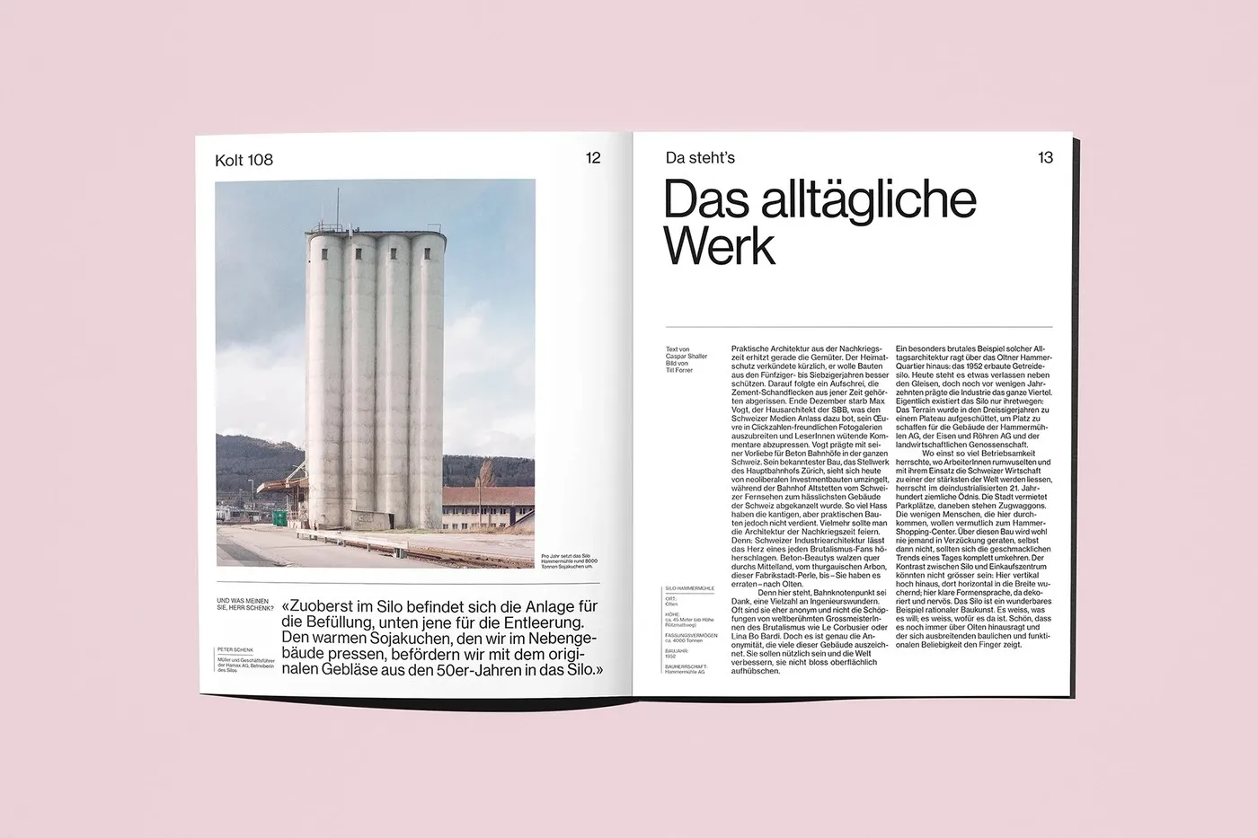
Kolt Magazine Editorial Redesign by Alice Poma & Studio Feixen
Kolt Magazine Redesign: Swiss Grids Meet Bold Typography by Alice Poma & Studio Feixen Olten-based cultural publication Kolt Magazine just got an incredible refresh, courtesy of a stellar collaboration between graphic designer Alice Poma and Studio Feixen. This revamped identity and layout system hits the sweet spot between crisp Swiss grid structure and ultra-flexible typography.…