
branding
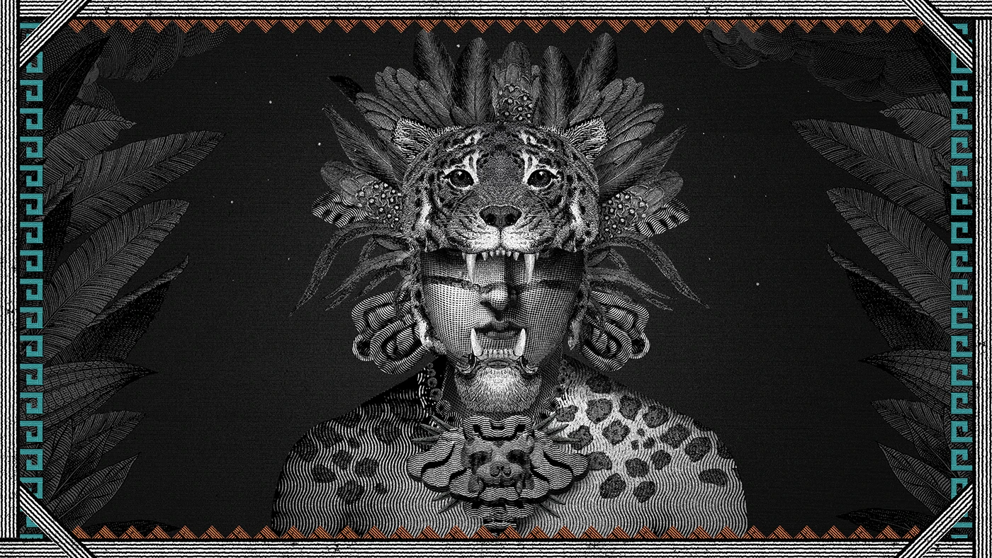
Mahani Tequila Packaging and Video Illustrations by Eduardo Ramón
Packaging & Illustration Design for Mahani Tequila This dynamic collage illustration series was created for a promotional video for Mahani Tequila, a brand rooted in Oaxaca, Mexico. The visual narrative captures the story behind this unique aesthetic, drawing direct inspiration from traditional Zapotec culture. In addition to creating the video illustrations, artist Eduardo Ramón took…
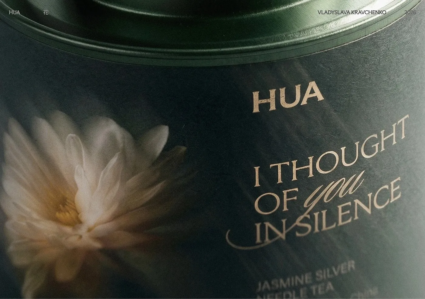
Poetic Storytelling and Typography in HUA Tea Packaging by Vladyslava Kravchenko
Vladyslava Kravchenko’s HUA Tea Packaging: The Art of Storytelling Through Typography HUA Tea is a gorgeous branding and packaging design project for a premium tea brand, crafted by designer www.behance.net/gallery/247307817/Premium-packaging-design-HUA-Tea. The concept invites tea lovers to embrace slow living and savor peaceful moments with every steep. Focusing on whole-leaf tea blends, the design transforms a…
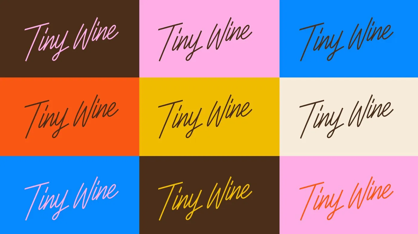
Tiny Wine Visual Identity and Branding System by POLAR DSGN
A Flexible Brand Identity for Tiny Wine Bar by POLAR DSGN Tiny Wine is a natural wine and snack bar located on Foley Street in London’s Fitzrovia neighborhood. Centered around the concept “Tiny Space, Big Stories,” Montevideo-based studio POLAR® DSGN crafted a visual identity system that feels both cozy and beautifully organized. Dynamic Monoline Script…
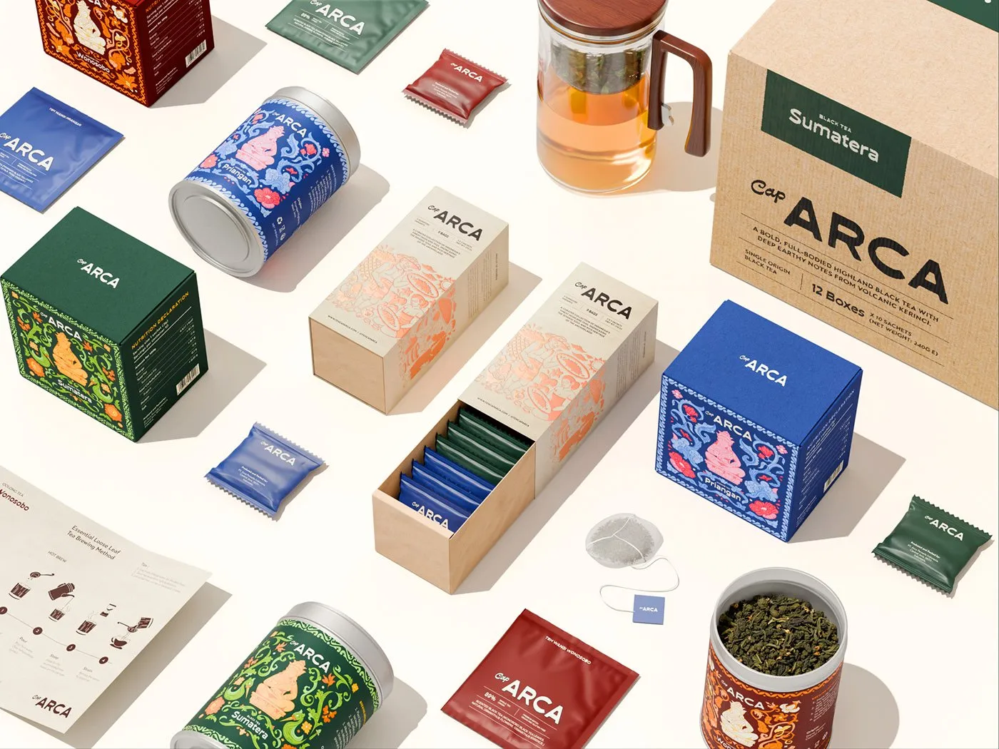
Teh Cap Arca: A Nostalgic Tea Branding and Packaging System
Teh Cap Arca: Infusing Traditional Folk Art into Tea Packaging Design Teh Cap Arca just rolled out a super exciting tea brand identity that celebrates traditional folk art through delicate fine-line illustrations and beautifully tactile packaging materials. Crafted by Impro Studio alongside a talented design team—Muhammad Alif, Luthfi Muhammad Latif, Ahmad Fauzi, Muklas Budi, Ganang…
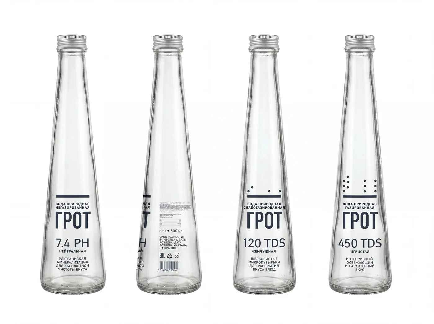
GROT Premium Water: High-Tech Minimalism and Smart Packaging by Mariya Churilo
GROT Mineral Water Packaging by Mariya Churilo: Minimalist Style That Saves Big GROT’s visual identity leans heavily into sleek, technical minimalism to let the natural purity of the mineral water steal the spotlight. Designer Mariya Churilo brought this vision to life by pairing crystal-clear glass bottles with direct surface printing—ditching paper labels altogether! When it…
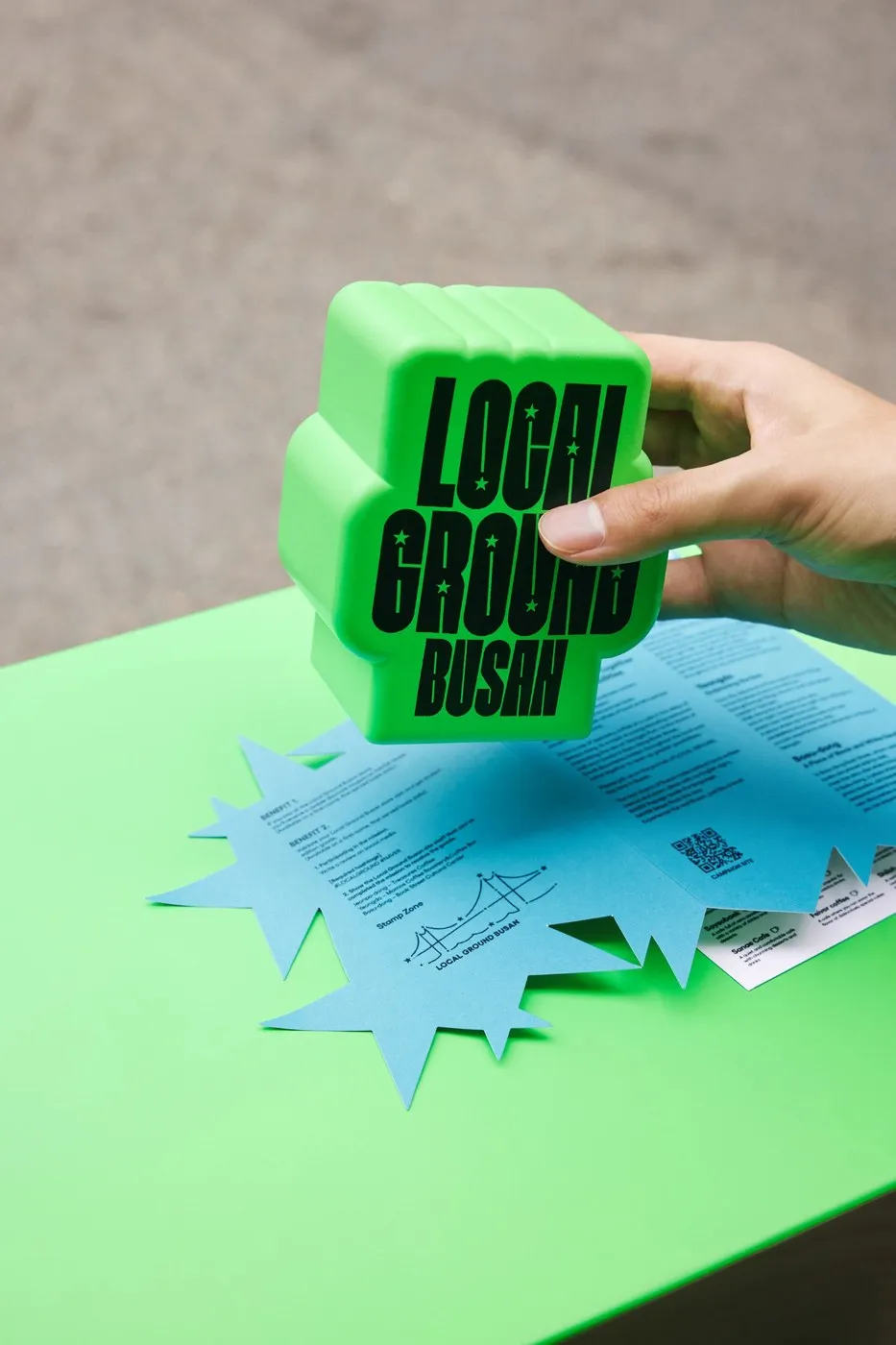
NAVER LOCAL GROUND: MAUM STUDIO’s Spatial Visual Identity in Busan
Brand Identity and Environmental Graphics for NAVER LOCAL GROUND by MAUM STUDIO This brand identity and environmental graphics system was created by MAUM STUDIO for NAVER LOCAL GROUND in Busan. The project connects local brands and community stories through a cohesive, high-energy visual language. The design system pairs bold geometric shapes with a signature green…
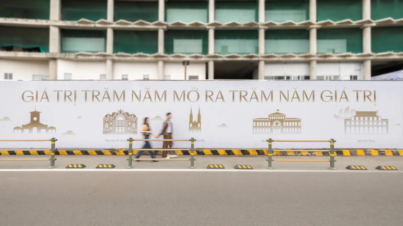
One Central Saigon: Turning Construction Hoardings into a Heritage Canvas
One Central Saigon Gives Construction Hoardings a Fresh Look with Vietnamese Heritage Art The iconic Bến Thành quadrangle—bordered by Phạm Ngũ Lão, Calmette, Lê Thị Hồng Gấm, and Phó Đức Chính streets—just got an eye-catching visual upgrade! A massive 60-meter construction hoarding surrounding the One Central Saigon project has been transformed into a vibrant centerpiece…
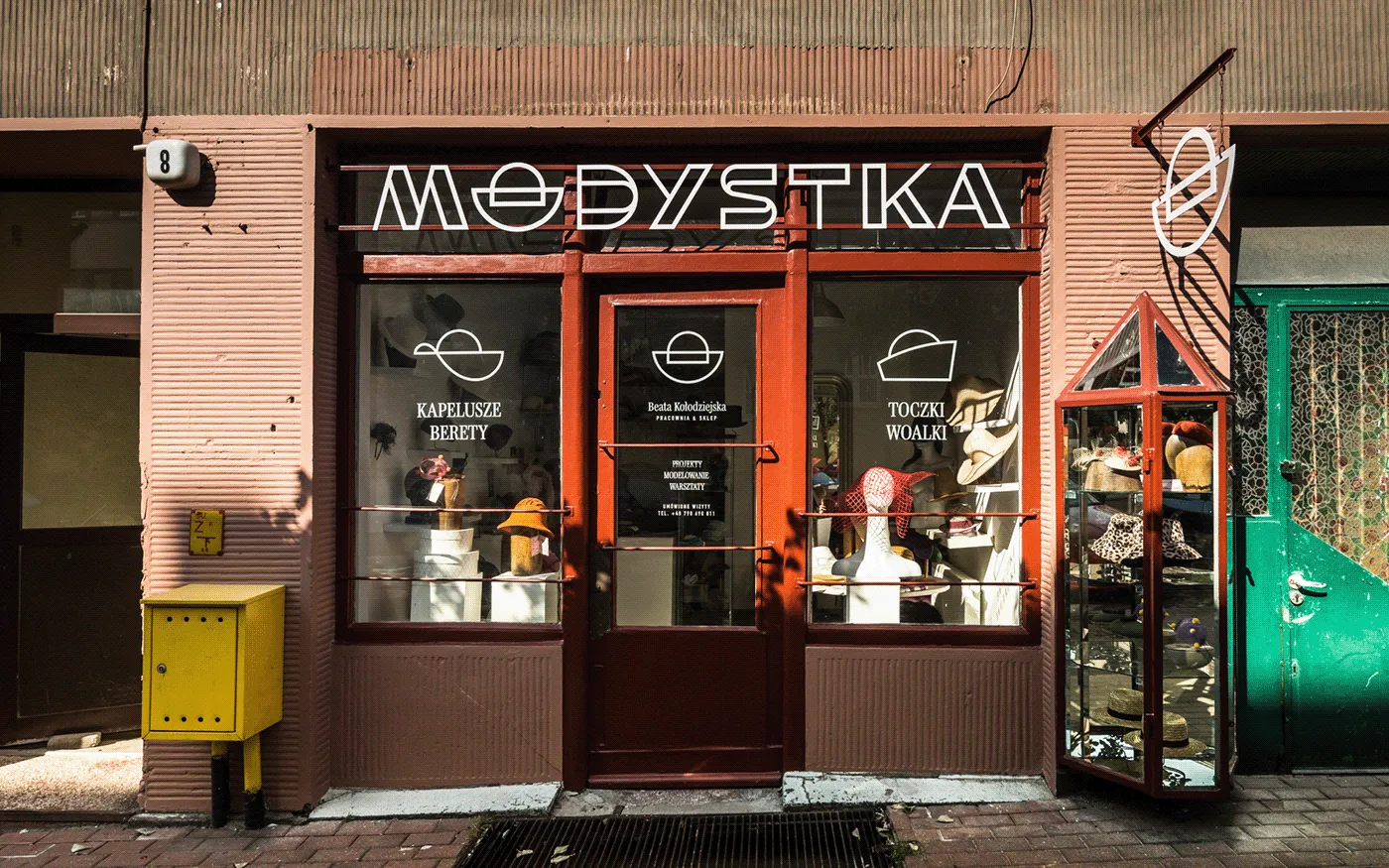
Modystka Storefront Redesign: Crafting Identity with Metal Signage
Revamping the Modystka Storefront with Handcrafted Metal Signage Modystka is a stunning storefront revamp brought to life by Patryk Skoczylas and Traffic Design. The project set out to refresh a historic hat shop in the city of Gdynia, celebrating local craftsmanship through urban graphic design. The design team crafted custom metal typography paired with ultra-clean…
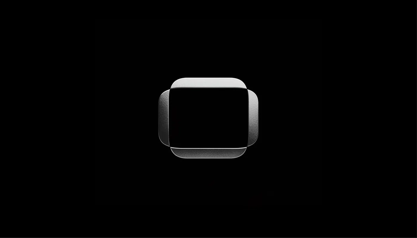
Mission Space Visual Identity: How SANDS STUDIO Redefined Aerospace Branding
Mission Space Visual Identity by SANDS STUDIO: Turning Space Data into Pure Design Language Aerospace branding usually plays it safe with traditional, conservative visuals. But SANDS STUDIO flipped the script with the Mission Space identity project! The design team crafted a fresh visual system that seamlessly bridges digital telemetry displays and real-world brand collateral. The…
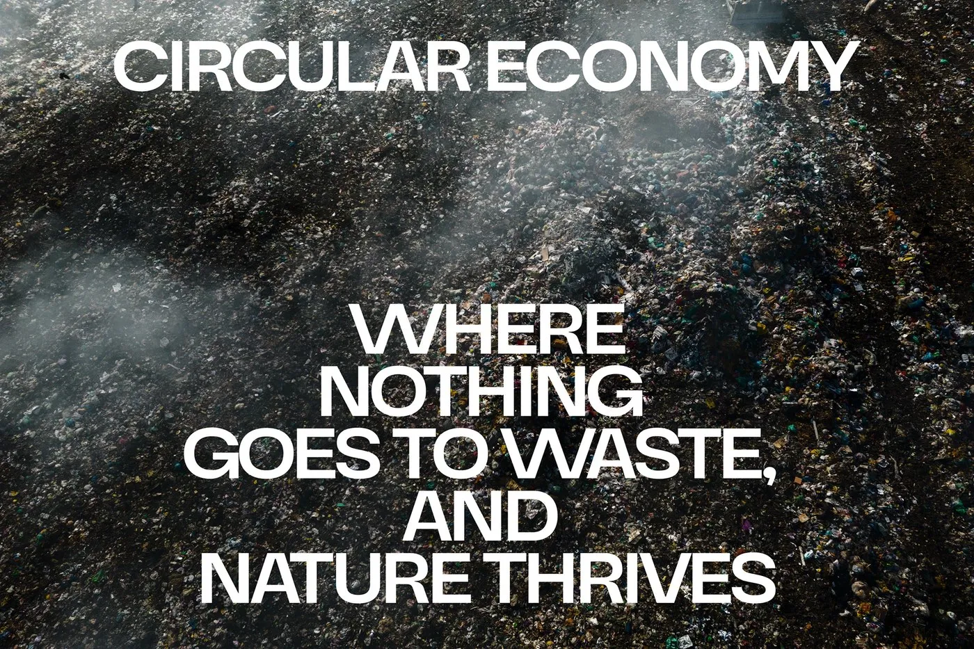
CL2B Brand Identity: How Favor Design Redefined Circular Economy Consulting
CL2B Brand Identity by Favor Design: A Fresh Take on the Circular Economy When thinking about circular economy consultancies, the color green usually comes to mind right away. However, Favor Design studio brought a completely fresh perspective to the CL2B (Closed Loop to Balance) project in Vietnam with a sleek, minimalist, and modern brand identity.…
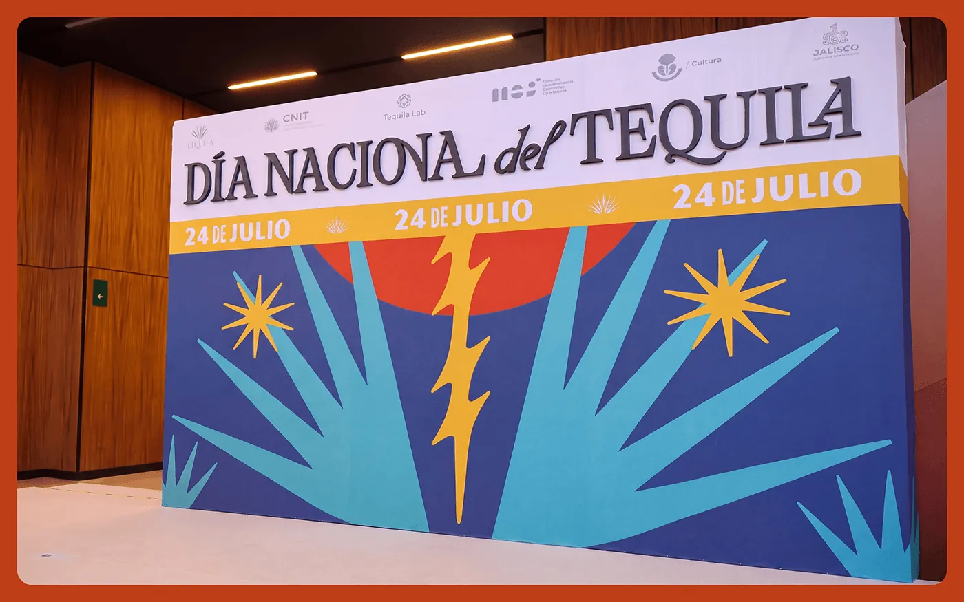
Dia Nacional del Tequila: Mexican Agave Roots in Modern Poster and Packaging Design
Dia Nacional del Tequila: Mexican Folk Art Meets Modern Poster and Packaging Design Dia Nacional del Tequila is a stunning packaging and poster illustration project created by Dorama Studio, Max Vargas, and Victor Gonzalez, drawing deep inspiration from the roots of Mexico’s iconic agave plant. This series playfully blends traditional folk art styles with clean,…
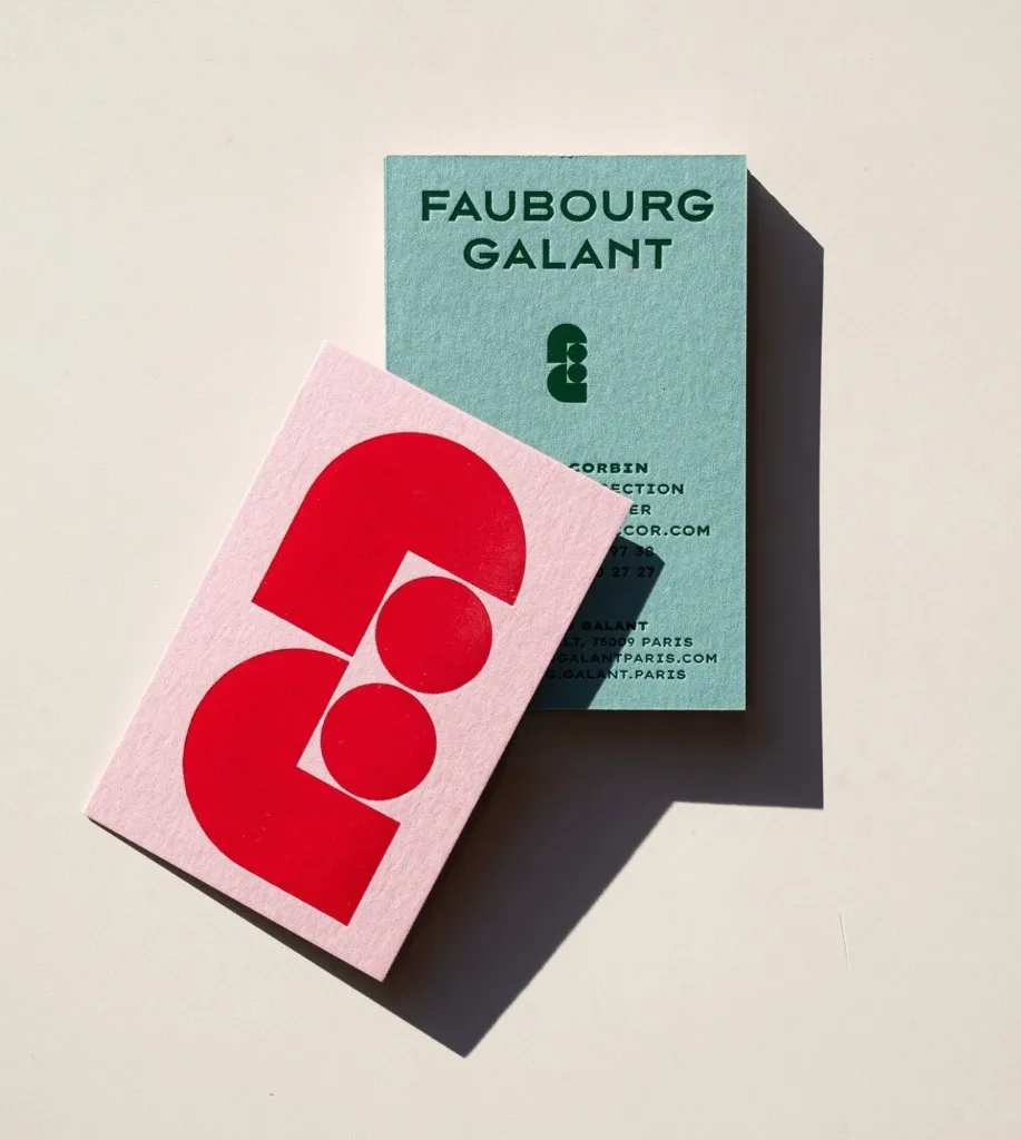
Faubourg Galant – Retro-Modern Hotel Branding in Paris
Faubourg Galant: A Chic, Very French Brand Identity by Abmo Branding Faubourg Galant is a hotel branding project in Paris created by the design studio Abmo Branding. The project really stands out thanks to a clever pairing of geometric arch monograms and rich, touch-worthy printed materials. Right at the center of the identity is a…
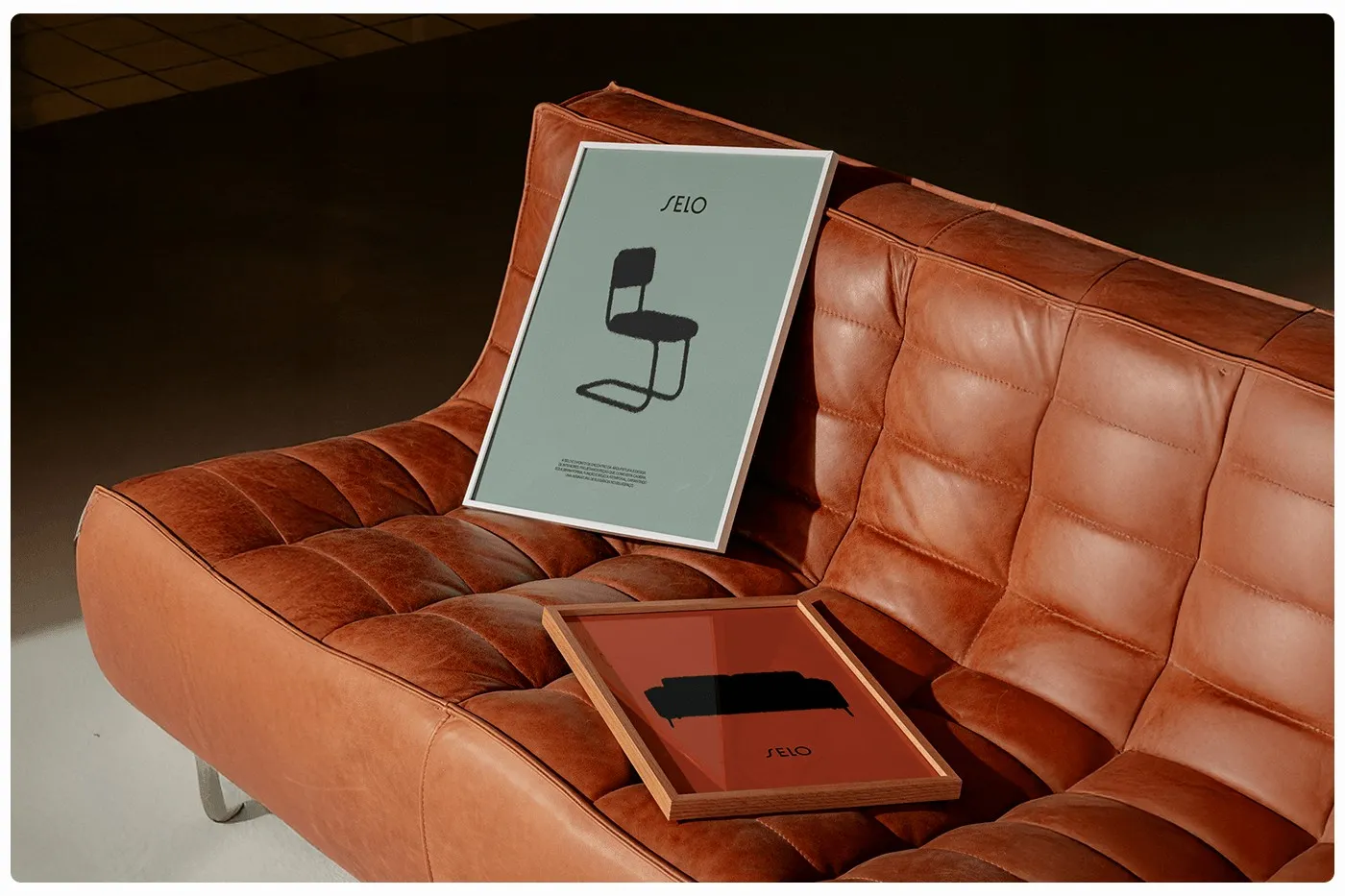
SELO Modern Furniture Brand Identity by Estúdio BRN BRANDS
SELO: Bringing Architectural Soul to Modern Furniture Branding The modern furniture brand identity for SELO, crafted by the crew at Estúdio BRN BRANDS, is a super clever fusion of architectural forms and rich, tactile leather materials. This visual system effortlessly elevates everyday home furniture into legit works of art. At the core of the identity…
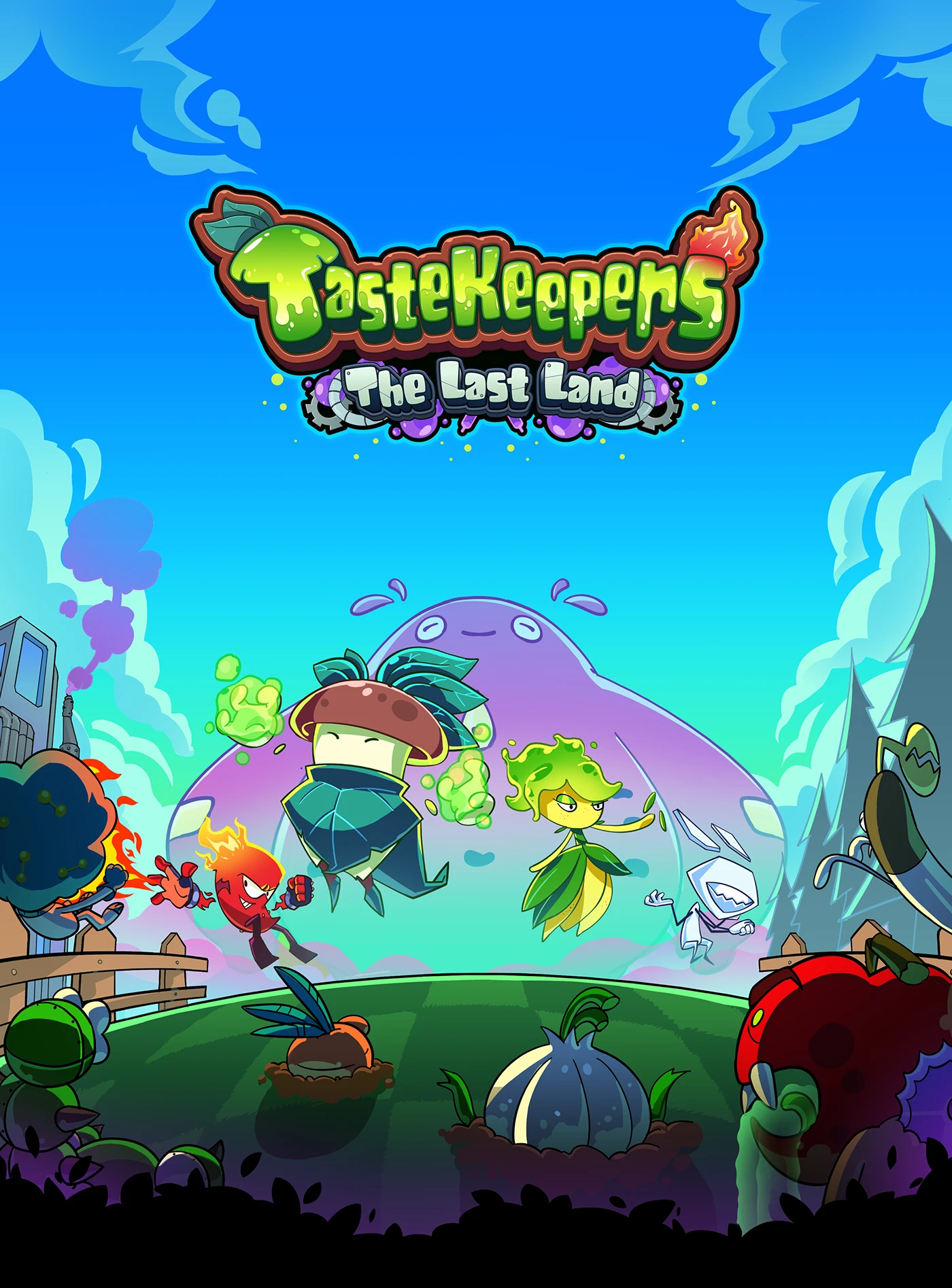
TasteKeepers – The Last Land: A Creative Visual Concept by WOBL Creative
TasteKeepers – The Last Land: An Impressive Visual Concept by WOBL Creative TasteKeepers – The Last Land is an absolutely captivating graphic design project brought to life by WOBL Creative (Adiawarja). The work showcases a super thoughtful visual approach, blending well-crafted layouts, intentional color palettes, and a rock-solid creative concept. Rather than just focusing on…
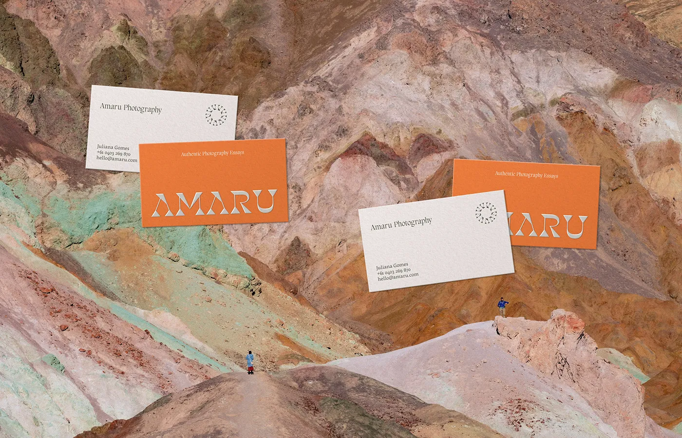
Amaru Photography: Andean Culture Meets Modern Branding by Fernando Rodrigues
Amaru Brand Identity: Andean Cultural Inspiration for a Photography Studio Take a look at the brand identity for Amaru—an Australian lifestyle photography studio—and that signature rustic warmth hits right away. Designed by Fernando Rodrigues, this project draws rich inspiration from Andean cultural heritage and a cozy palette of natural earth tones. At the heart of…
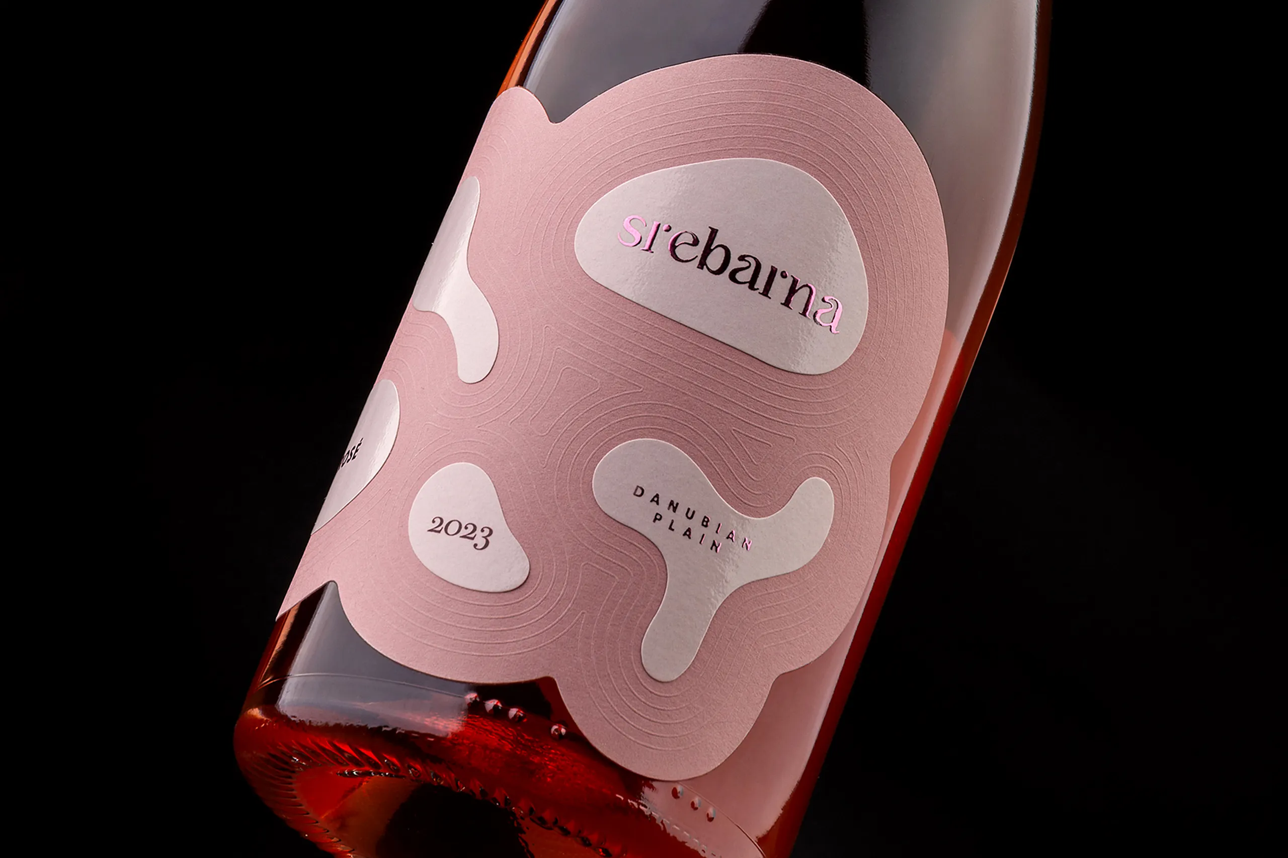
Srebarna Rosé – Packaging Design Shaped by the Ripples of the Lake
Srebarna Rosé – A Label Design Inspired by Nature and Lake Srebarna Foxtrot Studio’s label design for Pink Pelican Srebarna Rosé tells a fascinating story of connecting nature with tactile materials. The design draws inspiration straight from the breathtaking landscape of the Srebarna Nature Reserve. The calm lake and its scattered little islands are beautifully…
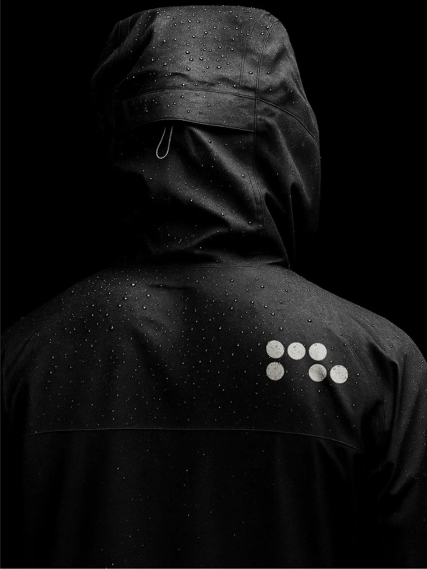
Runlab: Technical Running Apparel and Modular Dot-Matrix Branding
Runlab – Technical Running Gear Branding with Modular Dot-Matrix Typography In technical running gear, speed and precision are everything. Graphic designer Javier Diconca’s brand identity project for Runlab nails that spirit completely with an ultra-clean, modern design approach. At the core of the identity system is a dynamic dot-matrix logo that adapts fluidly across various…
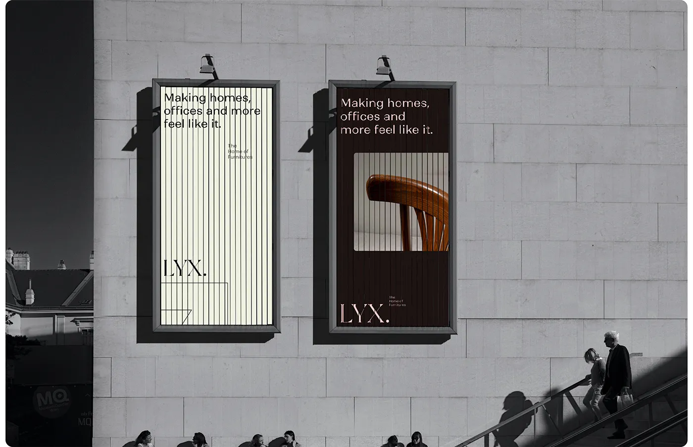
LYX Brand Identity: Editorial Typography and Luxury Furniture Design by Muhammad Abu Bakr
LYX Furniture Brand Identity by Muhammad Abu Bakr: Refined Elegance Meets Editorial Style Crafting a visual identity for luxury furniture is all about precision and letting every piece shine. Muhammad Abu Bakr’s branding project for LYX hits the sweet spot, effortlessly blending editorial typography with an earthy, natural color palette. At the heart of this…
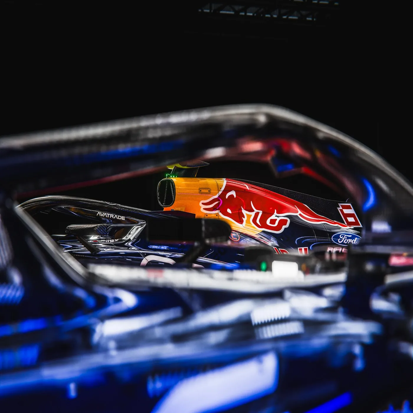
Red Bull Racing 2026 F1 Livery Concept by Simon Ramampiaro
Red Bull Racing 2026 F1 Livery Concept by Simon Ramampiaro This 2026 F1 livery concept for Red Bull Racing brings a seriously bold visual refresh to the track. In the world of motorsport design, finding the sweet spot between iconic brand heritage and high-speed aerodynamics is always a fun challenge. The RB22 concept was built…