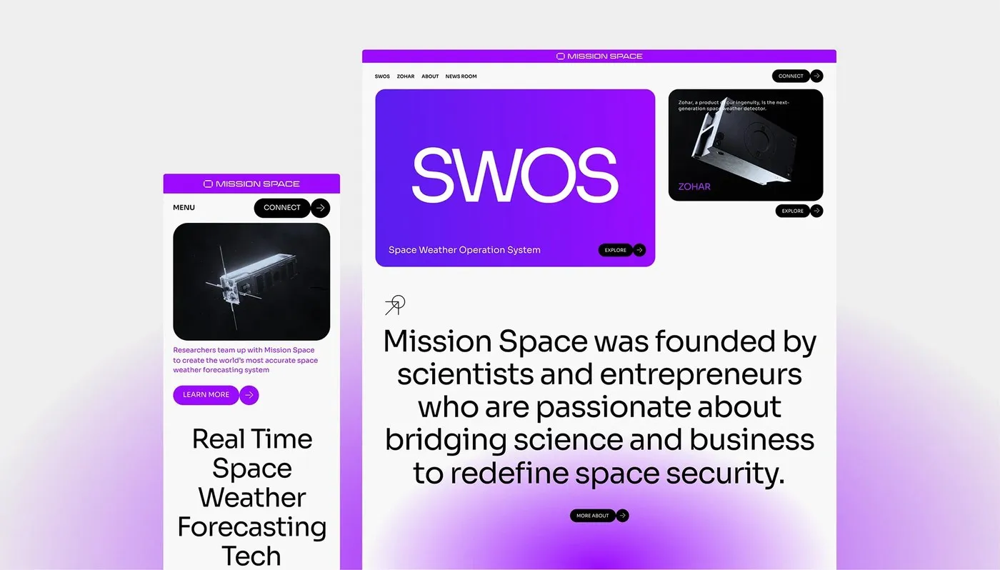
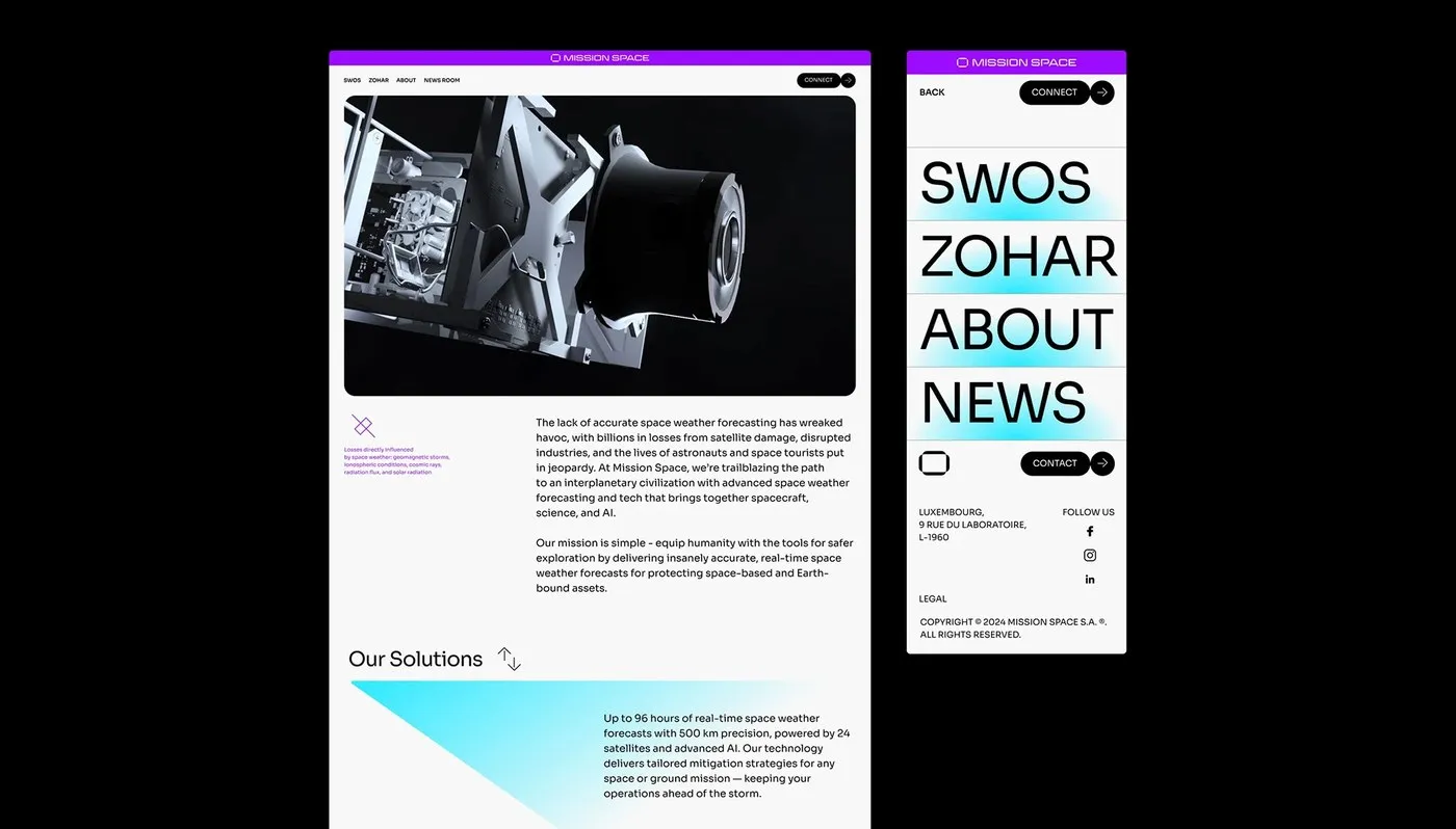
Mission Space Visual Identity by SANDS STUDIO: Turning Space Data into Pure Design Language Aerospace branding usually plays it safe with traditional, conservative visuals. But SANDS STUDIO flipped the script with the Mission Space identity project! The design team crafted a fresh visual system that seamlessly bridges digital telemetry displays and real-world brand collateral.
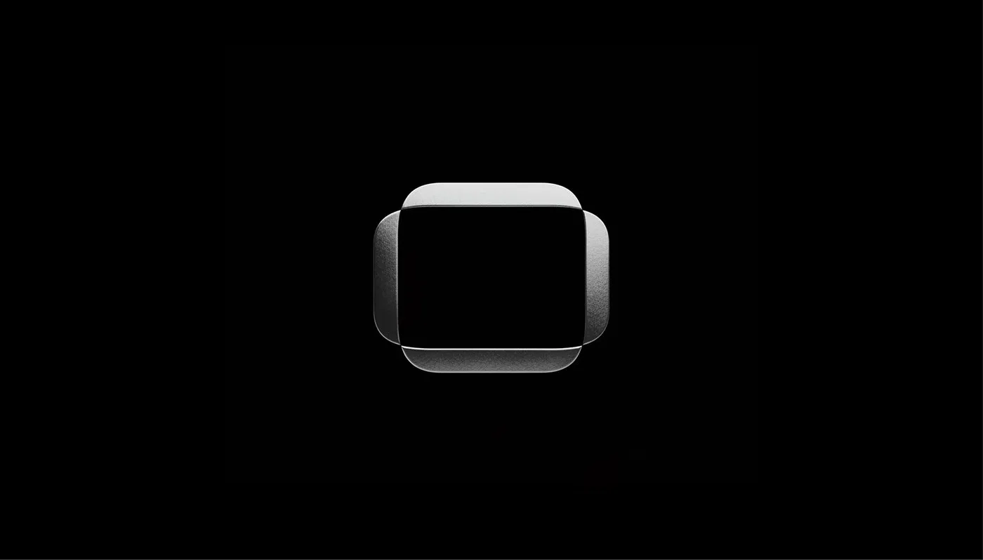
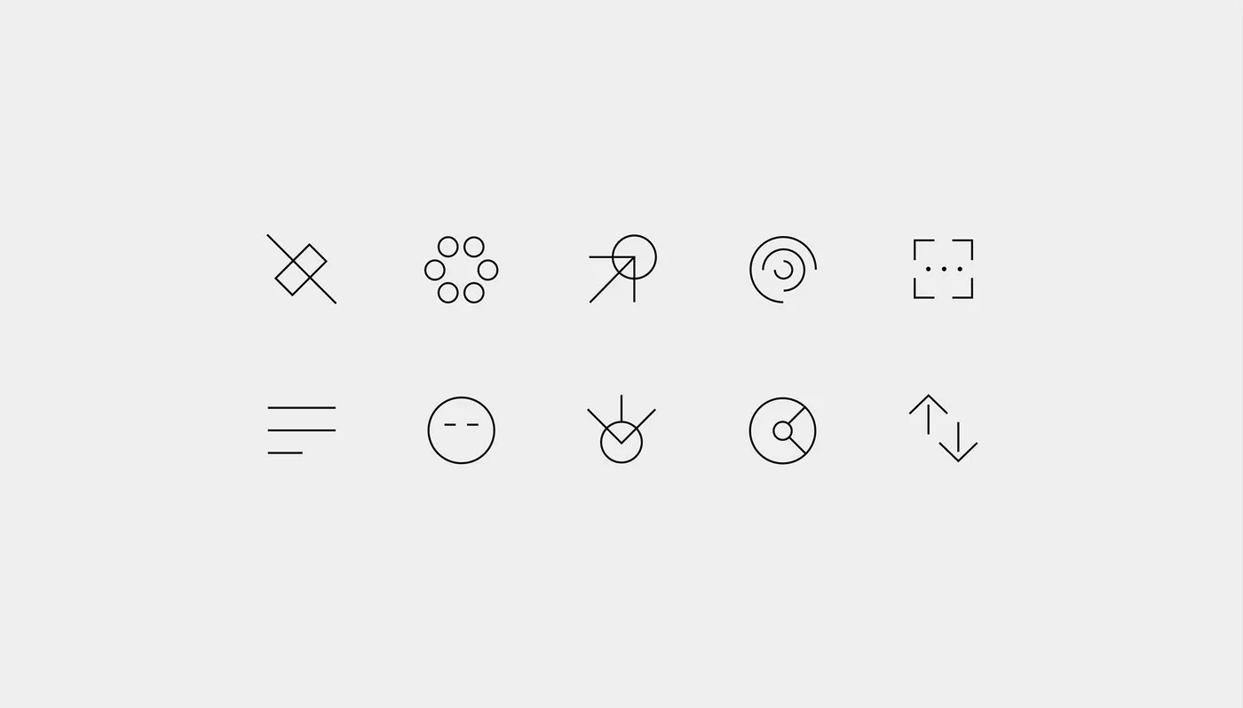
The color palette leans into high-contrast vibes: deep cosmic black, electric green, and cool crisp white. At the center is a sleek geometric logo glyph derived from orbital paths and weather vectors. Designed as a flexible modular symbol, this mark scales effortlessly across app screens and physical hardware surfaces alike.
On the digital front, the telemetry grid features precise monospaced typography and a clean card layout. This smart organization turns complex space weather data into structured, easy-to-read cards, helping operators react instantly during emergency alerts. The typographic hierarchy is spot-on, pairing oversized sans-serif telemetry numbers with neat, subtle labels below.
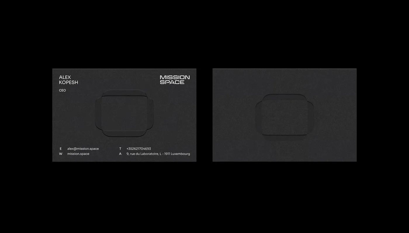
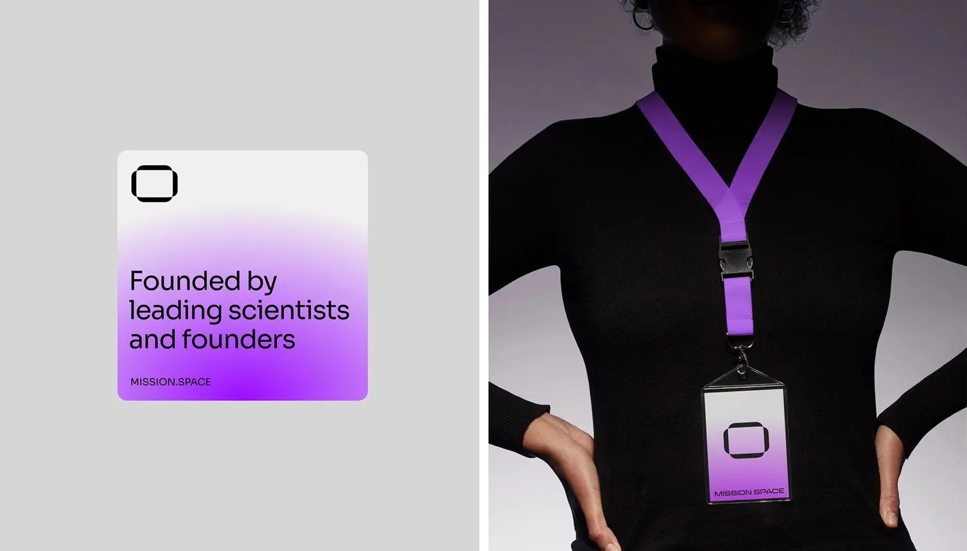
Beyond the screen, SANDS STUDIO brought this futuristic design language into tactile physical goods. Business cards feature ultra-thick black stock with silver foil stamping to capture the metallic sheen of a satellite. Employee badges are crafted from matte acrylic with laser-etched coordinates, while hardware packaging relies on sturdy cardboard paired with sleek, minimal typography. This seamless harmony between digital tech and real-world materials delivers a unified, state-of-the-art identity for the entire brand.
Bộ nhận diện Mission Space từ SANDS STUDIO: Khi dữ liệu vũ trụ hóa thành ngôn ngữ thiết kế
Ngành hàng không vũ trụ vốn gắn liền với phong cách thiết kế an toàn và truyền thống, nhưng dự án nhận diện thương hiệu Mission Space của SANDS STUDIO lại mang đến một hướng đi mới mẻ hơn. Nhóm thiết kế đã tạo ra một hệ thống thị giác ấn tượng, kết hợp giữa giao diện hiển thị dữ liệu kỹ thuật số và các ấn phẩm nhận diện thực tế.
Bộ nhận diện sử dụng bảng màu tương phản cao gồm đen vũ trụ, xanh electric green và trắng lạnh. Biểu tượng logo được phát triển từ các đường quỹ đạo và vectơ thời tiết, tạo nên một glyph hình học linh hoạt. Logo này hoạt động như một ký hiệu mô-đun, dễ dàng thích ứng trên cả màn hình ứng dụng lẫn bề mặt thiết bị phần cứng.
Về mảng kỹ thuật số, hệ thống lưới telemetry grid được thiết kế tỉ mỉ với font chữ monospaced và layout dạng ô thẻ (card layout). Cách phân chia này giúp sắp xếp khối lượng dữ liệu thời tiết không gian phức tạp một cách trật tự, giúp người vận hành dễ dàng đọc hiểu và xử lý thông tin kịp thời khi có cảnh báo khẩn cấp. Tỷ lệ typography cũng được tính toán kỹ: các con số telemetry được phóng to bằng font sans-serif, đối lập với phần nhãn chữ nhỏ bên dưới.
Không chỉ dừng lại ở giao diện màn hình, SANDS STUDIO còn đưa ngôn ngữ thiết kế này vào các sản phẩm vật lý. Danh thiếp sử dụng giấy đen siêu dày ép kim bạc để tái hiện bề mặt kim loại của vệ tinh. Thẻ đeo nhân viên làm từ nhựa nhám khắc laser tọa độ, trong khi bao bì phần cứng sử dụng chất liệu carton dầy dặn cùng typography tối giản. Sự đồng bộ giữa yếu tố kỹ thuật số và vật liệu thực tế mang đến một diện diện nhất quán, hiện đại cho toàn bộ thương hiệu.