
branding
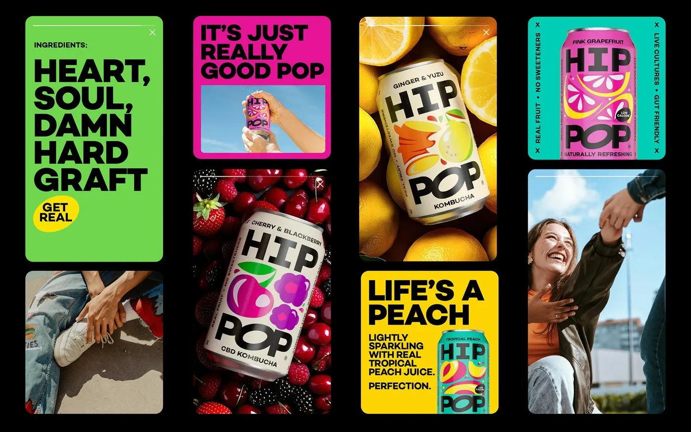
Hip Pop Packaging Design: Bold Visual Identity for Functional Soda by Robot Food
Hip Pop Packaging Design: When Healthy Drinks Get a High-Energy Refresh from Robot Food Hip Pop started out as a gut-friendly kombucha brand founded by Kenny and Emma Thackray. After six years in the functional beverage space, the brand was ready to break out of the wellness aisle and go head-to-head with mainstream soda giants.…
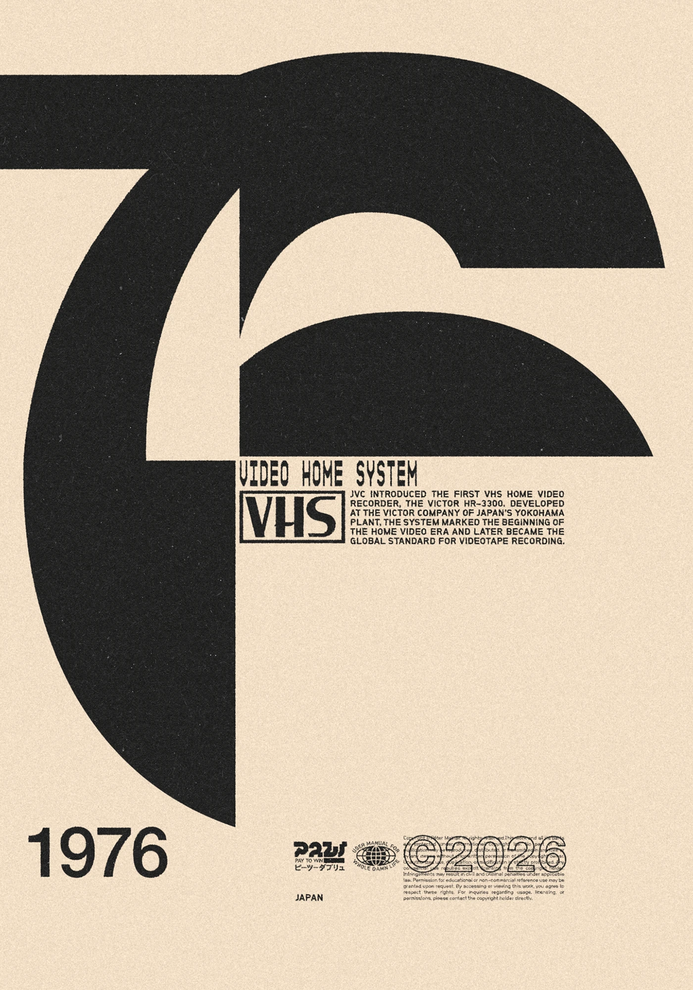
Molnár Péter Reimagines 1976 Cultural Icons in Bold Poster Concept
Molnár Péter’s Poster Series Reimagining 1976 Cultural Icons Looking back at 1976 from the perspective of 2026, designer Molnár Péter created a poster project that feels both nostalgic and deeply personal. Instead of sticking to standard retro tropes, this collection highlights groundbreaking cultural and tech milestones from 1976 with an influence that stretches all the…
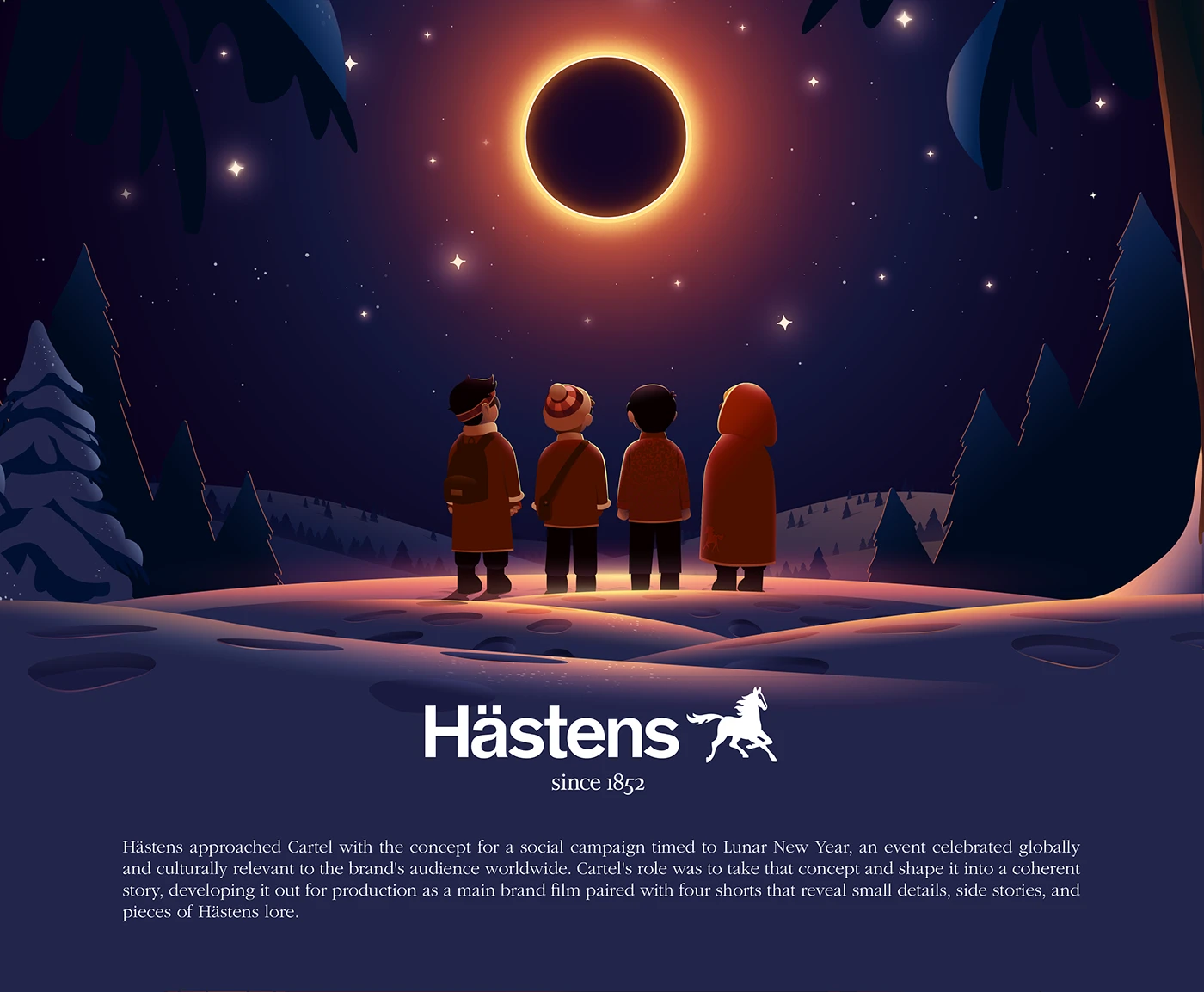
CARTEL x Hästens: A Festive Visual Story for Lunar New Year
CARTEL x Hästens – A Stunning Visual Story for Lunar New Year This exciting collaboration between luxury bed brand Hästens and design studio CARTEL brings a fresh spin to the Lunar New Year season. The project seamlessly weaves traditional East Asian cultural elements into the Swedish brand’s signature minimalist, high-end aesthetic. Every piece in the…
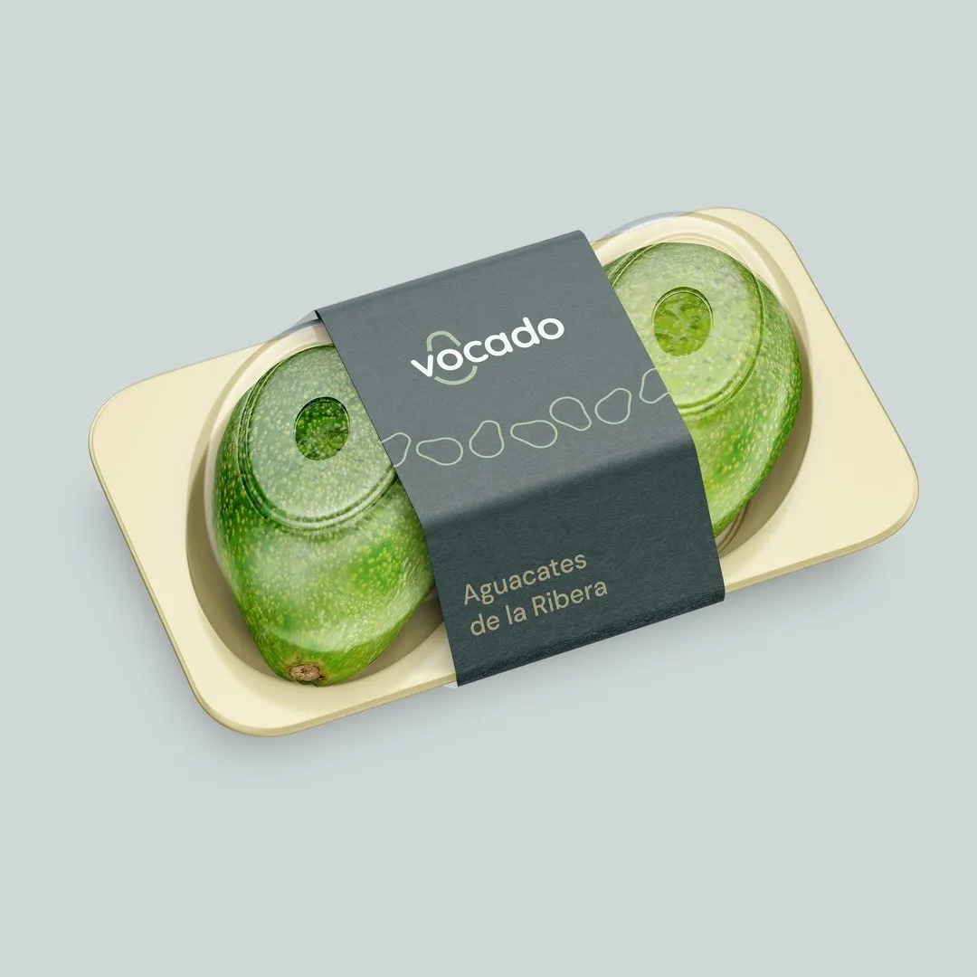
Vocado Branding and Packaging Identity by Estudio E
Vocado Branding and Packaging Design by Estudio E Valencia-based creative studio Estudio E cooked up a complete brand identity, naming strategy, and packaging suite for Vocado—a family-run avocado brand straight out of the fertile Ribera region. Operating on a farm-to-table model, the brand delivers fresh avocados directly to households across Spain and France, cutting out…

KOTORI Uji Matcha: Japanese Tea Tradition Rendered in Packaging Design by Valeriia Löffler
KOTORI Uji Matcha by Valeriia Löffler: Bringing Japanese Tea Tradition to Life Through Packaging Design KOTORI is a gorgeous packaging concept celebrating the rich tradition of Japanese Uji matcha. Designed by Valeriia Löffler, the project approaches tea packaging as a quiet, beautifully refined ceremonial artifact. Right at the heart of the design is a striking…
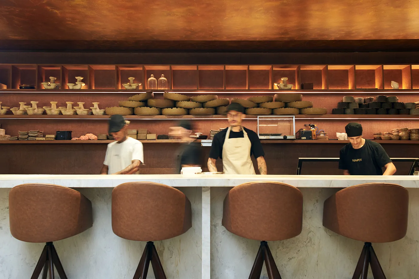
Minimalist Visual Identity for Kampeki Sushi by Blank Design Studio
Kampeki Sushi Brand Identity by Blank Design Studio When thinking of Japanese restaurant branding, traditional wave graphics and iconic red seal stamps usually come to mind. Blank Design Studio, however, took a fresh, highly refined path for Kampeki Sushi. Rather than relying on intricate decorative clutter, this identity focuses on sleek minimalism with crisp typography…
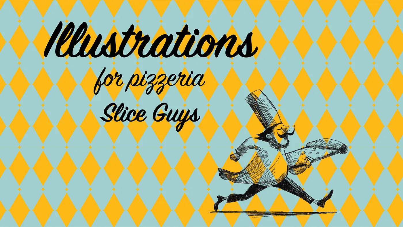
Slice Guys: Jeanne Nazinian Builds a Bold Retro Visual Identity
Slice Guys: Designer Jeanne Nazinian’s High-Energy Retro Visual Identity Slice Guys pizzeria just got a vibrant makeover with a high-energy, retro visual identity crafted by designer Jeanne Nazinian. The color palette pairs an easy-on-the-eyes cream background with popping accent colors: warm tomato red and bright mustard yellow, giving all the packaging an instantly eye-catching look.…

DMC — Event Identity and Digital Design for Sigma Software
DMC — Event Identity and Digital Design for Sigma Software When a real-life DeLorean takes center stage at a tech event, that’s where the DMC design project kicks into high gear! Built as a major event activation campaign for Sigma Software, this project was brought to life by the talented Sigma Software Design team alongside…
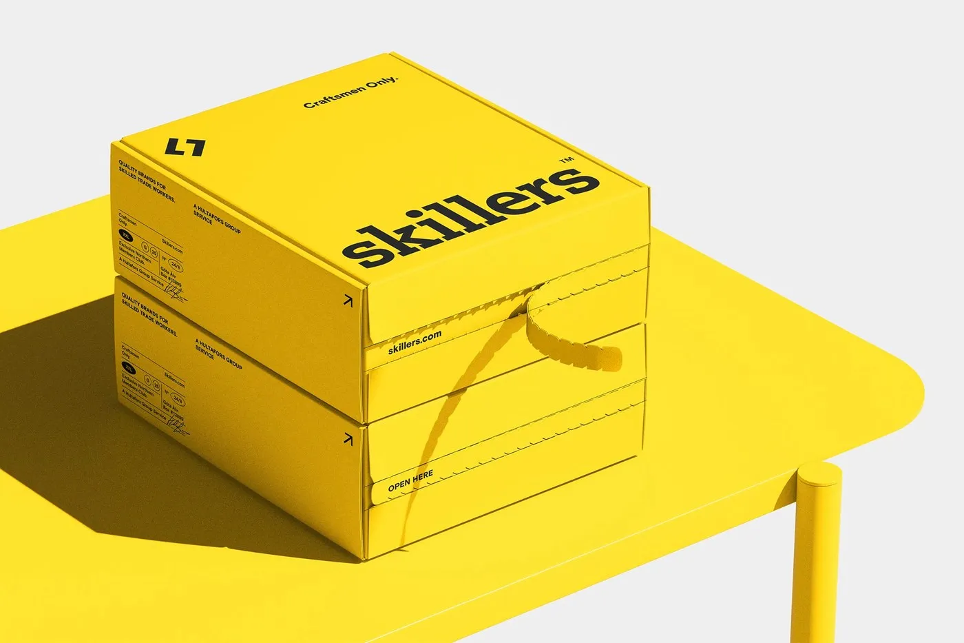
Bold Branding System for Skillers by VISEE Design
A Bold, Scandinavian-Inspired Brand Identity for Skillers by VISEE Design VISEE Design crafted a cohesive visual identity system for Skillers and its sub-brands. Channeling authentic Scandinavian craftsmanship, the studio opted for a high-contrast yellow and black palette that feels powerful, direct, and perfectly tuned for a professional tradesperson audience. Instead of taking a soft or…

ODER-STUDIOS: A Dynamic Brand Identity System by Studio Gabriele Colia
A Flexible Brand Identity System for ODER-STUDIOS by Studio Gabriele Colia When a multidisciplinary creative powerhouse like ODER-STUDIOS—spanning spatial design, production, and offline cultural experiences—needed a fresh look, the big challenge was capturing their community-first spirit in a brand identity. Studio Gabriele Colia solved this with a remarkably flexible design system anchored by a bold,…
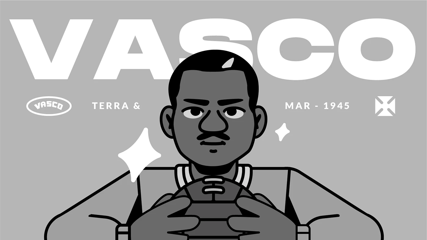
Vasco & Kappa: Celebrating 80 Years of the “Terra e Mar” Victory
Vasco x Kappa: Marking 80 Years of the Iconic “Terra e Mar” Victory (1945) This exciting collaboration between Kappa and Vasco da Gama celebrates the 80th anniversary of the legendary “Terra e Mar” double championship, bringing one of the most unforgettable chapters in the club’s history back into the spotlight. The star of the campaign…
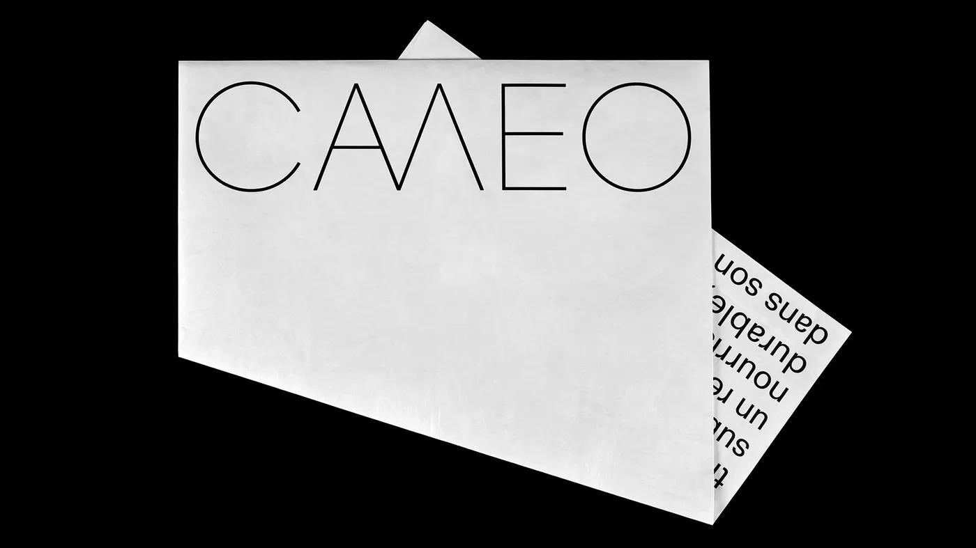
Tactile Brand Identity for CAMEO Architecture Firm by Paprika Design
A Construction-Material-Inspired Brand Identity for CAMEO Architecture Instead of putting together a typical company brochure, Montreal-based studio Paprika Design took a delightfully creative path for Caméo’s architectural practice. Creative Director Louis Gagnon and Lead Designer Daniel Robitaille packed the firm’s entire portfolio inside an oversized Tyvek envelope. By repurposing Tyvek—that super-durable synthetic material constantly used…

Aire Park: A 50-Year Civic Identity Strategy by Kiss Branding
Aire Park: A Long-Lasting Identity System for Leeds’ Urban Park by Kiss Branding Crafting an iconic identity for a post-industrial city takes deep understanding and long-term trust. When developer Vastint set out to transform 24 acres in Leeds South Bank into the city’s largest central park, creative studio Kiss Branding built a visual system designed…

Visual Impact: How Shiraz & Daryan Reimagines Sustainability Branding
Visual Impact Brand Identity by Shiraz & Daryan: Bringing Systems Thinking to Sustainable Design Turning complex academic research into practical, everyday business tools is no walk in the park. But for the branding of Sweden-based incubator Ideon Innovation, design studio Shiraz & Daryan ditched the cliché “go green” tropes. Instead, the team took a fresh…
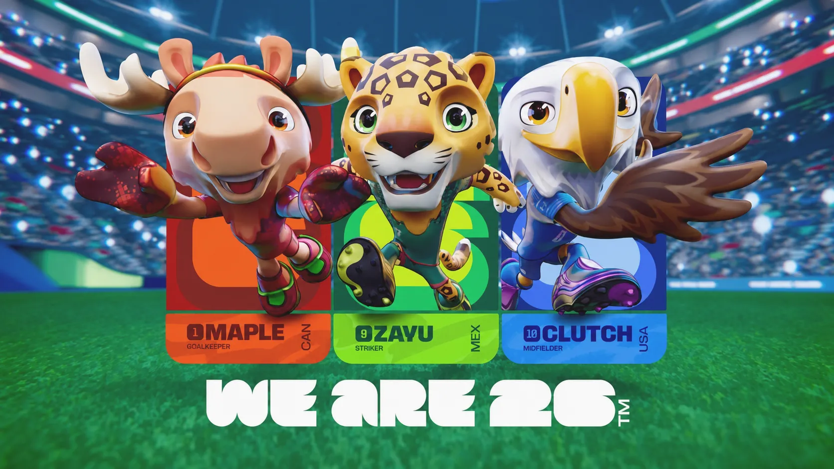
Why World Cup Mascots Retire, But Great Brands Keep Theirs Alive Forever
Tournament Mascots Retire After the Season, But Iconic Brands Nurture Characters for Life With every major sports season wrapping up, familiar mascots complete their mission and head straight into the memory vault. From Willie the Dog back in 1966 all the way to the trio of Maple, Zayu, and Clutch at World Cup 2026, these…
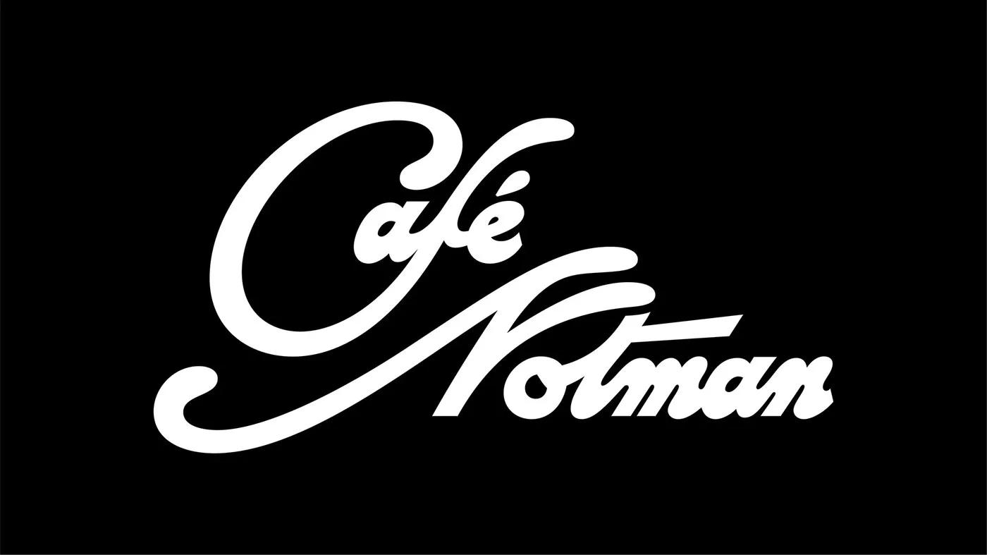
Café Notman Visual Identity by Paprika Design
Café Notman Branding by Paprika Design: A Seamless Blend of Historic Photography and Modern Design Nestled inside Montreal’s McCord Stewart Museum, Café Notman is a favorite spot for locals, students, and tourists alike. To craft a standout identity for the space, Paprika Design paid homage to photographer William Notman by weaving archival portraiture directly into…
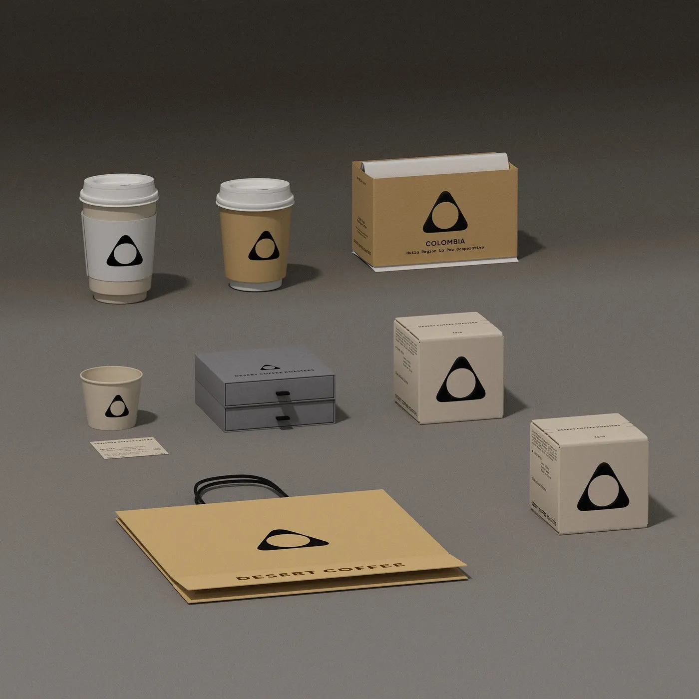
Desert Coffee Roasters: Minimalist Visual Identity and Packaging by taoSTUDIO
Minimalist Branding and Packaging for Desert Coffee Roasters by taoSTUDIO Desert Coffee Roasters is a specialty coffee roaster based out of Dubai, famous for sourcing top-tier beans from global farms and prestigious Cup of Excellence auctions. The visual identity and packaging lineup designed by taoSTUDIO effortlessly blends local desert charm with sleek, artisanal precision. At…
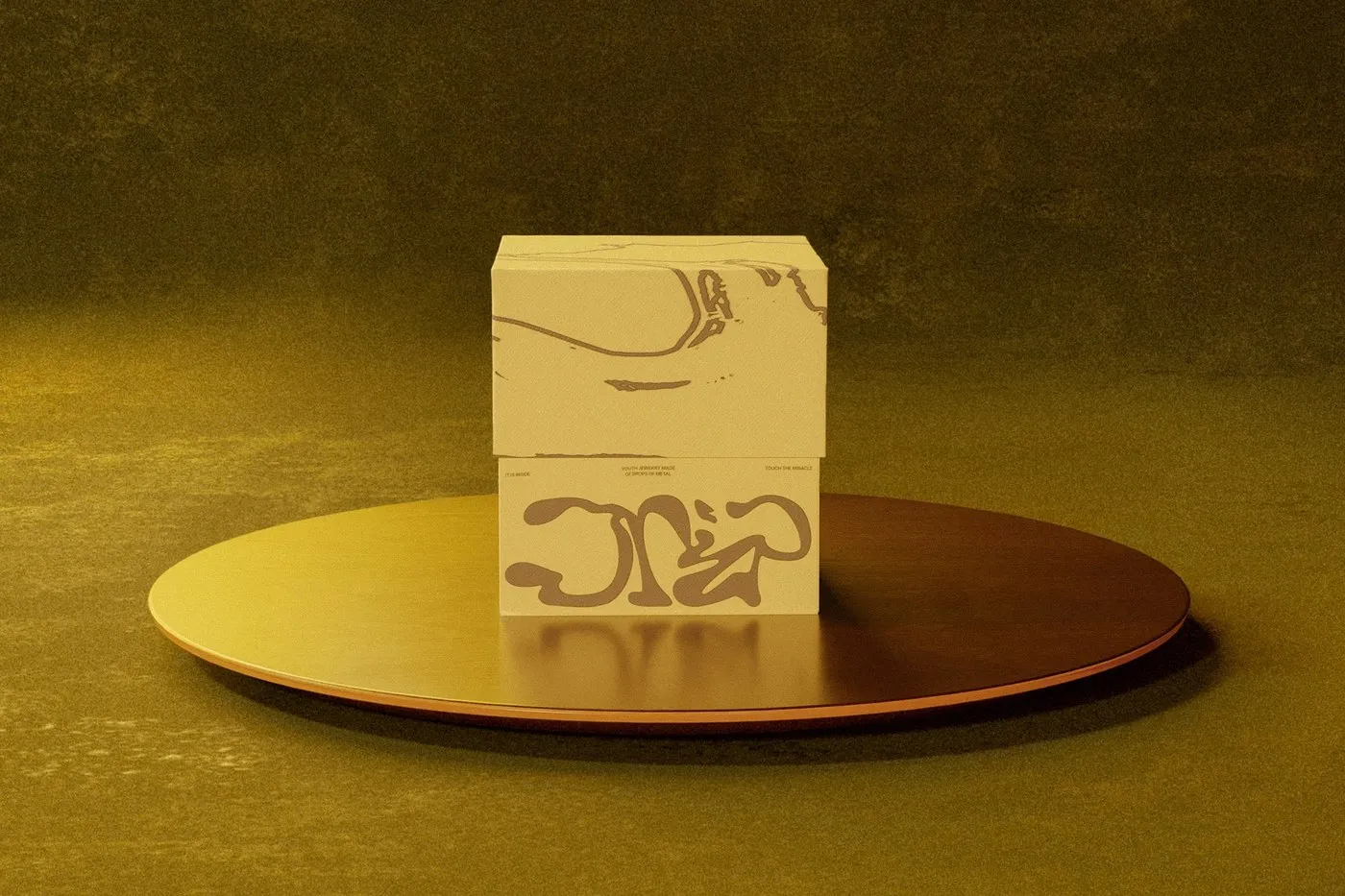
Packaging Design for Drip Silver: Minimalist Structure Meets Organic Forms by Takt Studio
Drip Silver Packaging Design by Takt Studio: Where Minimalist Structure Meets Organic Lines Designing silver jewelry packaging can easily fall into cliché territory. But Takt Studio took a completely fresh route for Drip Silver, focusing on minimalism, raw warmth, and a deeply tactile experience. This brand identity draws inspiration from memory and the fluid softness…
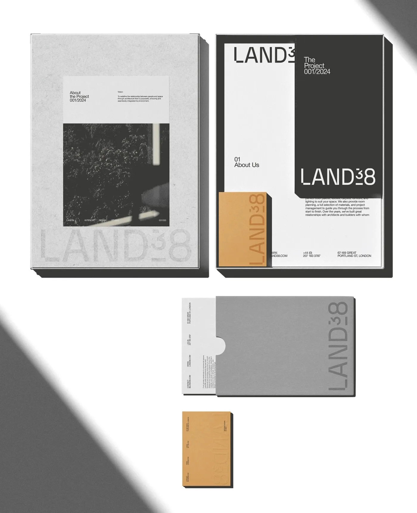
LAND38: Swiss-Inspired Brand Identity for Interior Architecture
LAND38 Brand Identity: Clean Swiss Style for an Interior Architecture Studio AQUELE Studio—led by Art Director Mari Hauers alongside designers Leticia Pegoli and Clara Abreu—crafted a comprehensive brand identity system for LAND38, an interior architecture design studio. Swiss typography principles serve as the ultimate guiding light for this design. Utilizing Helvetica Neue across crisp, tight…