
branding
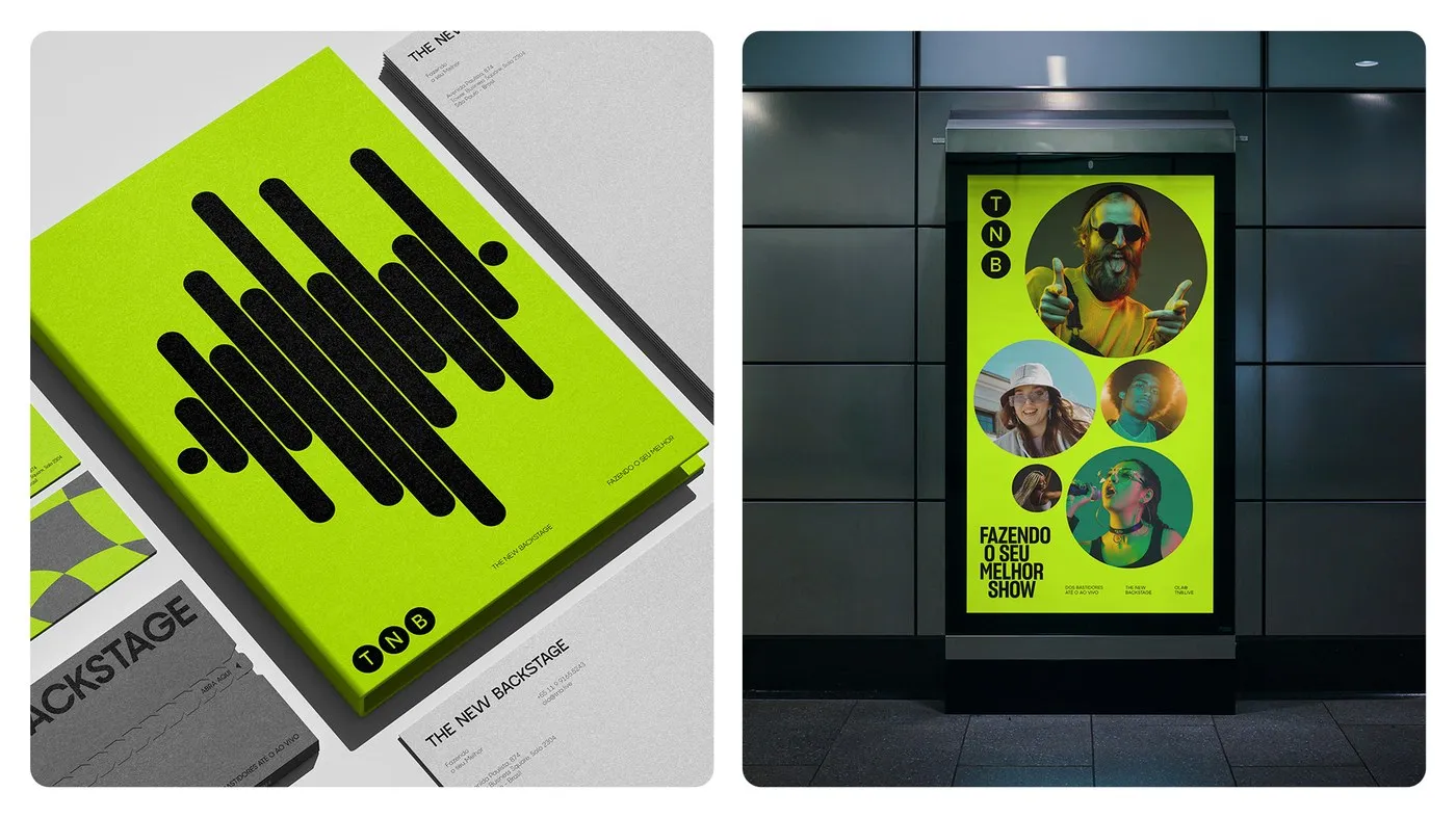
TNB Brand Identity: Stagecraft Geometry and High-Tension Contrast by John John Dias
TNB’s Stagecraft Brand Identity by John John Dias Keeping operations smooth and laser-precise behind the scenes of massive global events is no small feat. For TNB (The New Backstage)—the powerhouse Brazilian event production and consulting agency behind heavy hitters like Rock in Rio, Lollapalooza, and Formula 1—designer John John Dias crafted a high-energy brand identity…
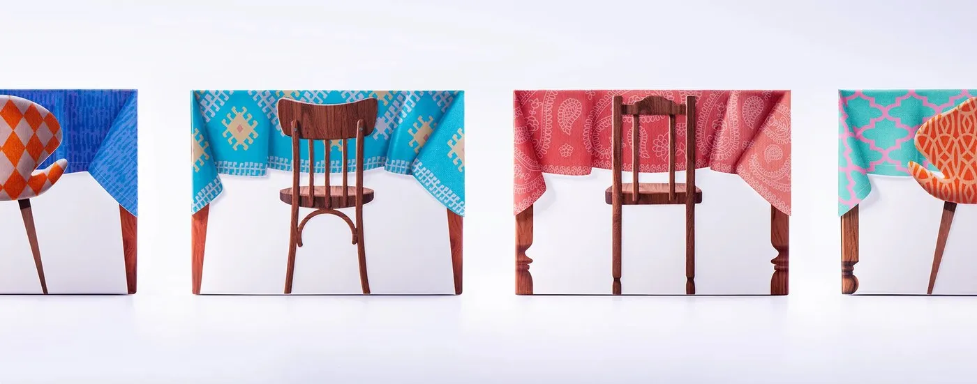
TeaGether by Backbone Branding: Reimagining Global Teatime Traditions in Packaging Design
TeaGether by Backbone Branding: When Treat Packaging Turns into a Mini Tea Table Tea and sweet treats are a wonderful tradition enjoyed across cultures worldwide, each bringing its own unique flavor to the table. Inspired by this idea of connection, Yerevan-based studio Backbone Branding developed a clever packaging design project for TeaGether. The treat box…
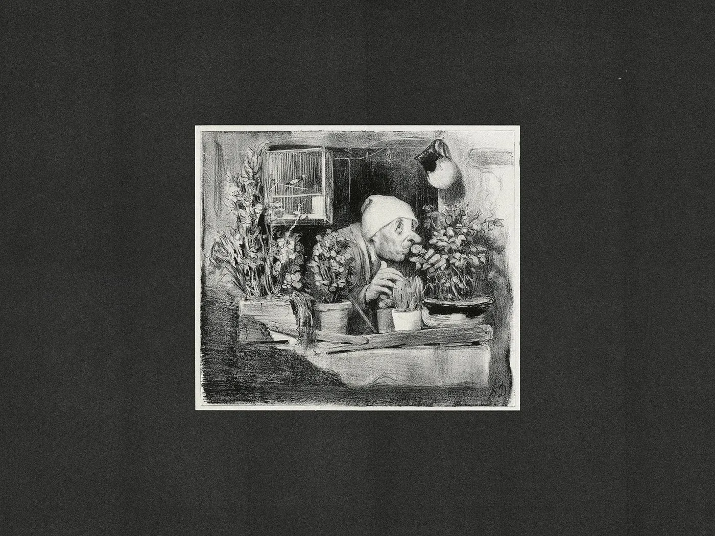
Uniscent Visual Identity by Lundgren+Lindqvist: Blending Olfactory Fluidity with Laboratory Precision
Uniscent Visual Identity by Lundgren+Lindqvist: Where Olfactory Flow Meets Lab Precision A decade ago, Uniscent set out on a journey to bring scent marketing services to Sweden and Norway. For this brand, fragrance is far more than just an accessory—it’s a distinct language that shapes spaces, sparks emotions, and grounds memories. To unite all brand…
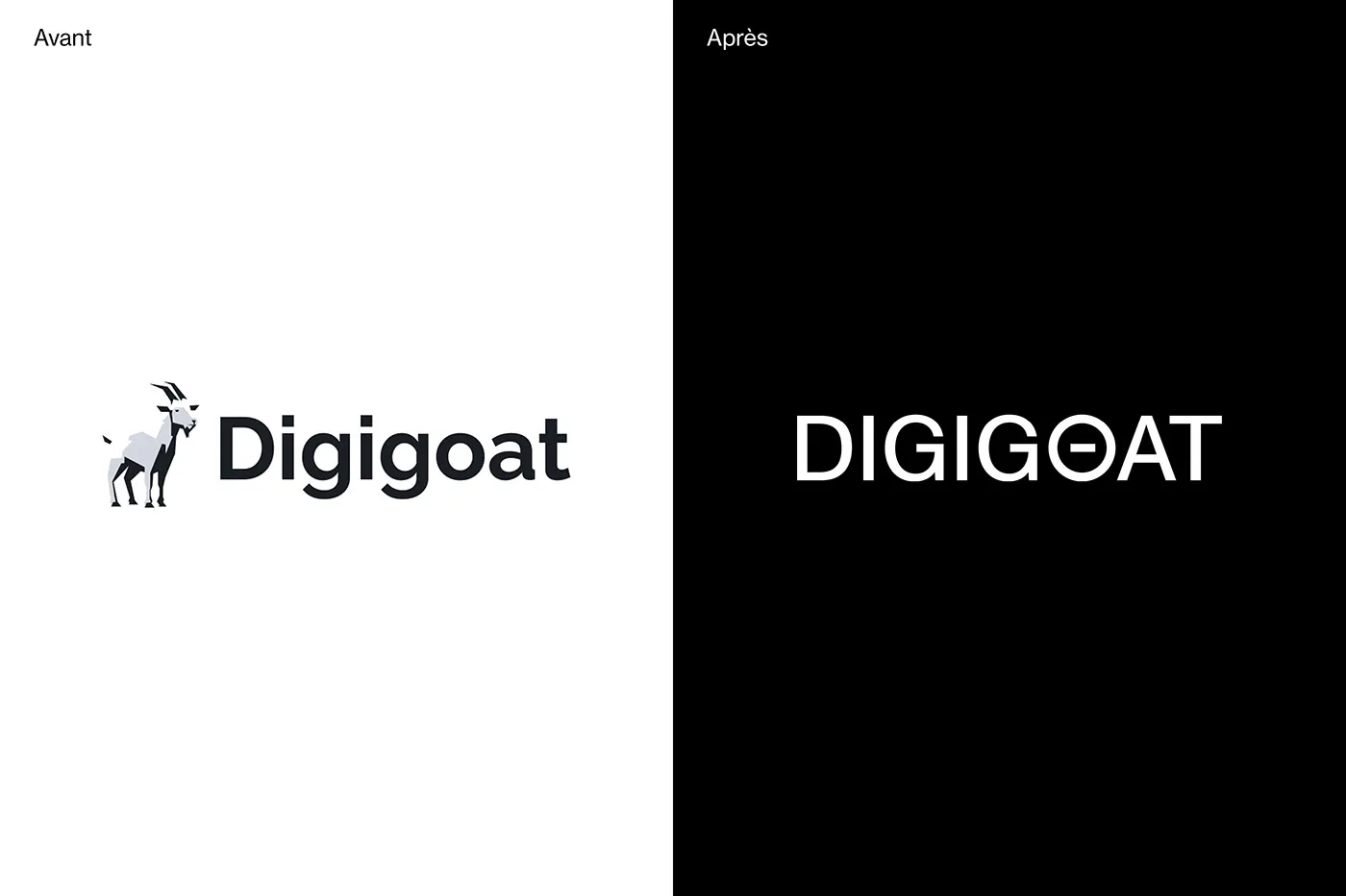
Digigoat Visual Identity Redesign: A Minimalist Typography Approach
Digigoat Brand Redesign: From Detailed Illustration to Minimalist Typography Digigoat is a sleek visual identity redesign centered on minimalism, crafted by the creative team at Paprika Design. It instantly makes a statement with a high-contrast geometric typeface. Ditching the overly complex goat illustration from the original identity, the brand made a bold pivot toward a…
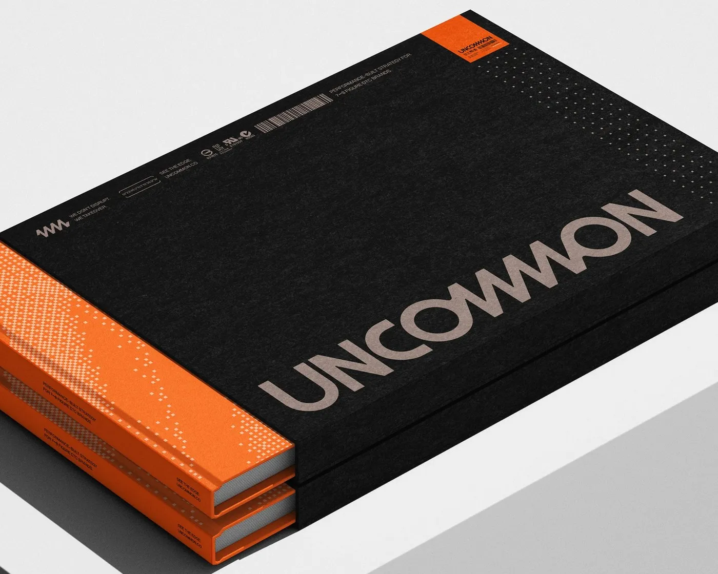
Technical Precision in Performance Marketing: Uncommon Brand Identity by Victor Berriel
Uncommon Brand Identity by Victor Berriel: Technical Precision for Performance Marketing Performance marketing agencies usually stick to a predictable playbook: corporate gradients, friendly rounded cards, and cookie-cutter dashboard mockups. But for Uncommon—an agency that scales performance for major DTC brands—designer Victor Berriel took a totally different route. This identity translates strategic vision into the sleek…
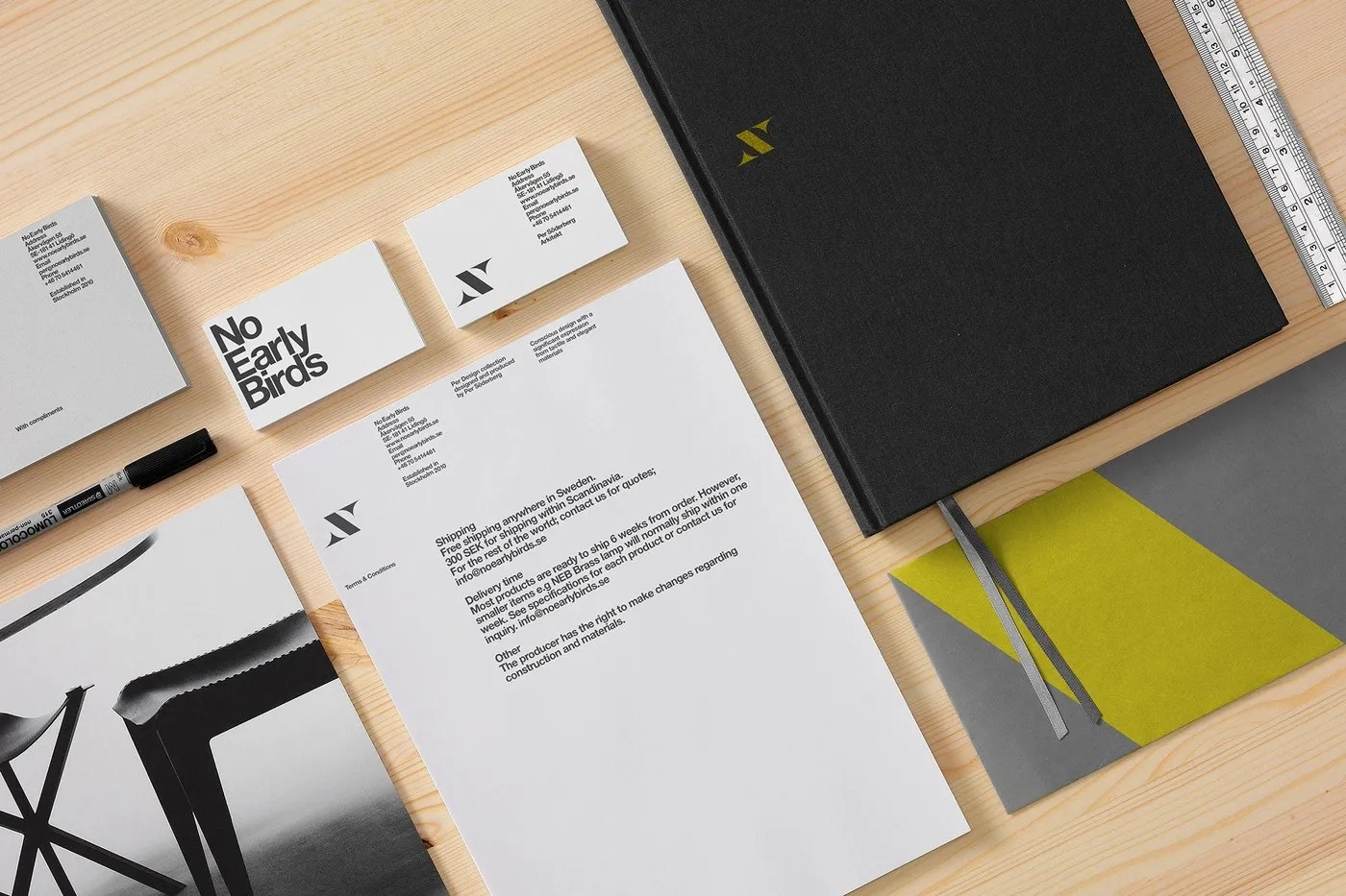
Kurppa Hosk Creates Bold Branding System for No Early Birds
No Early Birds Brand Identity: Where Swedish Furniture Meets Minimalist Graphics Swedish architect Pär Söderberg’s furniture brand, No Early Birds, is best known for its iconic crisscross leg joinery. Taking direct inspiration from this signature cross-joint detail, creative studio Kurppa Hosk developed a sleek graphic emblem featuring two sharp wings anchored to a bold central…
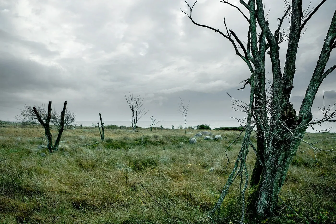
Korshags: Modern Rebrand for a Classic Swedish Smokehouse by Kurppa Hosk
Korshags – A Fresh, Heritage-Inspired Look for a Swedish Seafood Brand Swedish seafood brand Korshags just got a gorgeous brand identity and packaging refresh courtesy of design studio Kurppa Hosk. Formerly known as Falkenbergs Lax, this family-owned smoked salmon shop has been a staple along Sweden’s west coast for 35 years. As the business expanded…
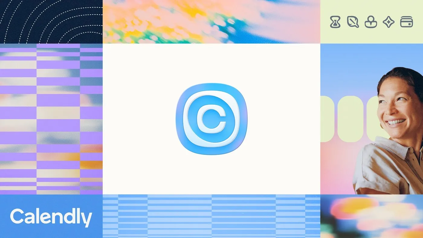
Calendly Rebrand by Smith & Diction: Moving Beyond the Booking Link
Calendly Gets a Fresh New Look with Smith & Diction: Way More Than Just a Booking Link Calendly just unveiled an impressive rebrand crafted by Philadelphia-based design studio Smith & Diction. No longer just that go-to app for sending a quick scheduling link, Calendly is stepping up as a complete meeting management platform. To visually…
Vif Visual Identity: A Bold Modular System by Brand Brothers
A bold, street-style brand identity for Paris restaurant Vif by Brand Brothers Chef Geoffrey Gotfryd just opened a fresh culinary spot in Paris focused on delicious dishes cooked right over an open flame. To shape the venue’s unique vibe, the design team crafted a raw yet character-packed visual system rooted in modular forms. The logo…
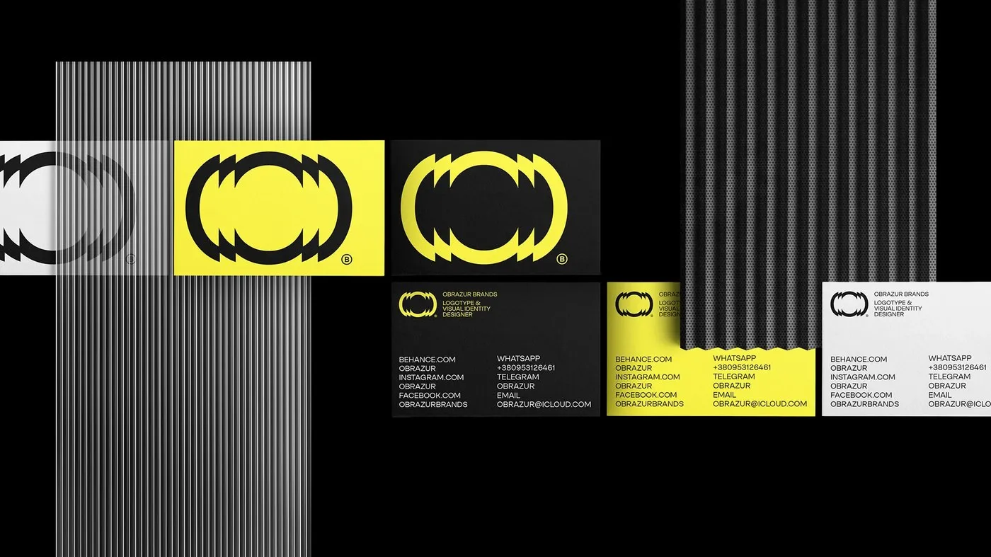
Obrazur Concept: A Kinetic Visual Identity System by Obrazur Brands
A Mechanical and Kinetic Visual Identity System by Obrazur Brands Ukrainian design studio Obrazur Brands just dropped a high-energy brand identity concept. Instead of playing it safe with typical minimal logos or monograms, this project brings a sharp, angular graphic system built around kinetic visual effects and industrial precision. It flows seamlessly across everything from…
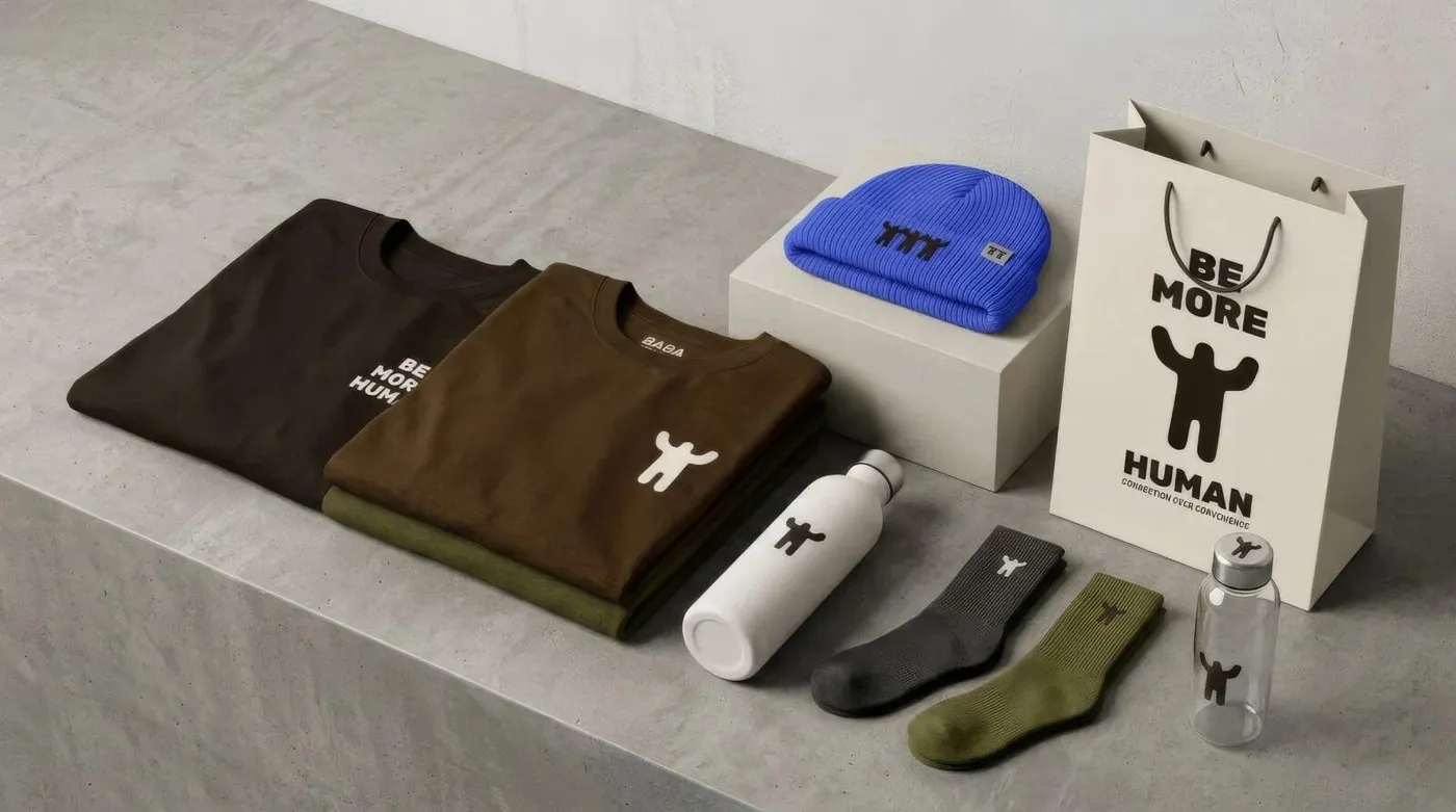
Be More Human: How Defy Built an Understated Brand Identity Rooted in Community
Be More Human by Defy: A Minimalist and Connection-Driven Brand Identity Turning a local community effort into a lasting cultural platform is exactly the challenge Philadelphia-based strategic agency Defy solved for fashion brand Be More Human. Instead of chasing flashy streetwear trends, this project focuses on authentic human connection, drawing architectural inspiration from the iconic…
ATELIER 99 Brand Identity: Craftsmanship and Modern Graphic Restraint by Tolgahan Çalışkan
ATELIER 99 Brand Identity by Tolgahan Çalışkan Graphic designer Tolgahan Çalışkan kicked off the ATELIER 99 brand refresh with a custom logotype built from the ground up. By studying traditional serif typefaces, classic proportions were reshaped into a sleek, contemporary silhouette. Flattened edges along the stems give the lettering a sturdy, upright stance, while reworked,…
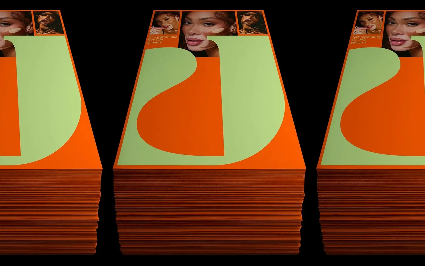
JGroup Rebrand: A Solar Visual Identity System by Rafael Cardoso
The JGroup rebrand is a striking blend of high-fashion elegance and editorial flair. After more than 20 years of building communication strategies for powerhouse beauty and wellness brands like Rhode, Cay Skin, Haus Labs, and UNOVE, PR agency JLPR has officially rebranded as JGroup. This dynamic repositioning was brought to life under the art direction…

Jack’s Coffee Club: Retro Road Trip Aesthetics by Studio Miles
Jack’s Coffee Club: Vintage Road Trip Aesthetics in Coffee Branding Jack’s Coffee Club is a craft coffee brand identity designed by Studio Miles, soaking in the nostalgic spirit of classic American road trips. The design channels vintage roadside motels and wide-open highways. A super cozy color palette sets the tone with deep coffee browns, creamy…
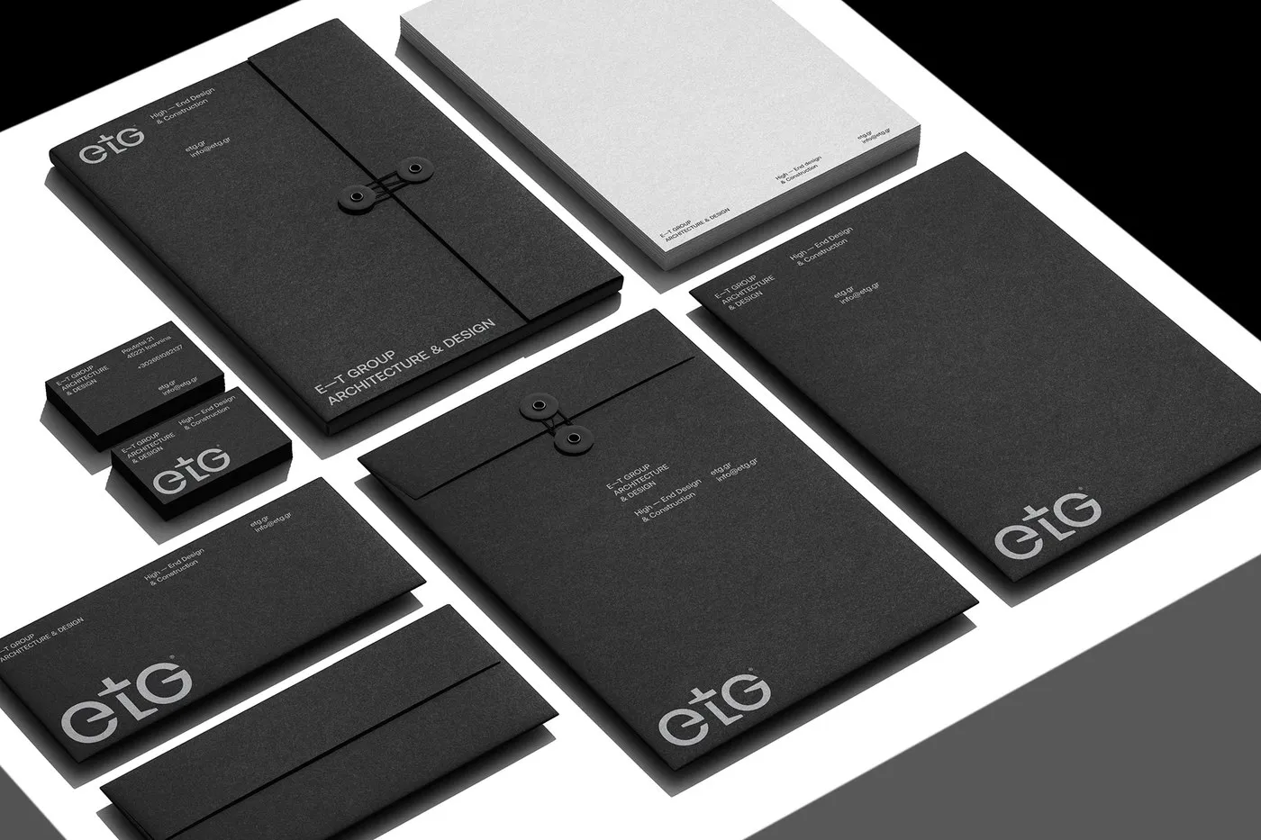
E — T GROUP Architectural Brand Identity by iFRAME DESIGN STUDIO
Architectural Brand Identity for E — T GROUP by iFRAME DESIGN STUDIO Athens-based iFRAME DESIGN STUDIO just rolled out a fresh brand identity for E — T GROUP, a high-end residential and real estate development firm. Instead of chasing fleeting commercial trends, this design doubles down on spatial discipline and lasting architectural principles. The star…
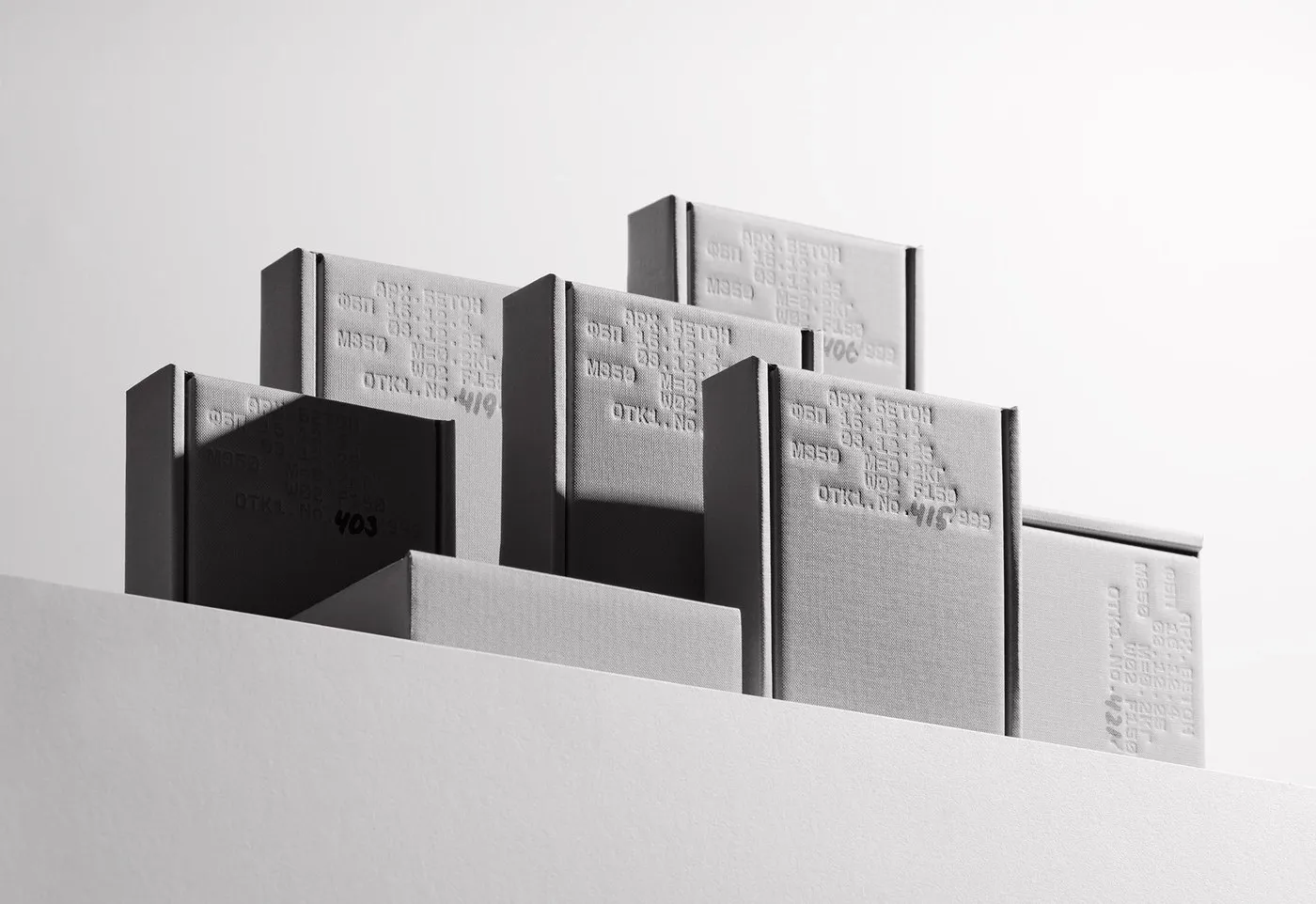
STMK Gift Box by Pavel Emelyanov: Industrial Logic Meets Packaging Design
STMK Gift Box by Pavel Emelyanov: Bringing Industrial Concrete Standards to Packaging Design When thinking of high-end packaging, sleek glossy surfaces and flashy metallic accents usually come to mind. But designer Pavel Emelyanov took a totally different route with the STMK Gift Box, leaning right into the raw texture and pure utility of architectural concrete.…
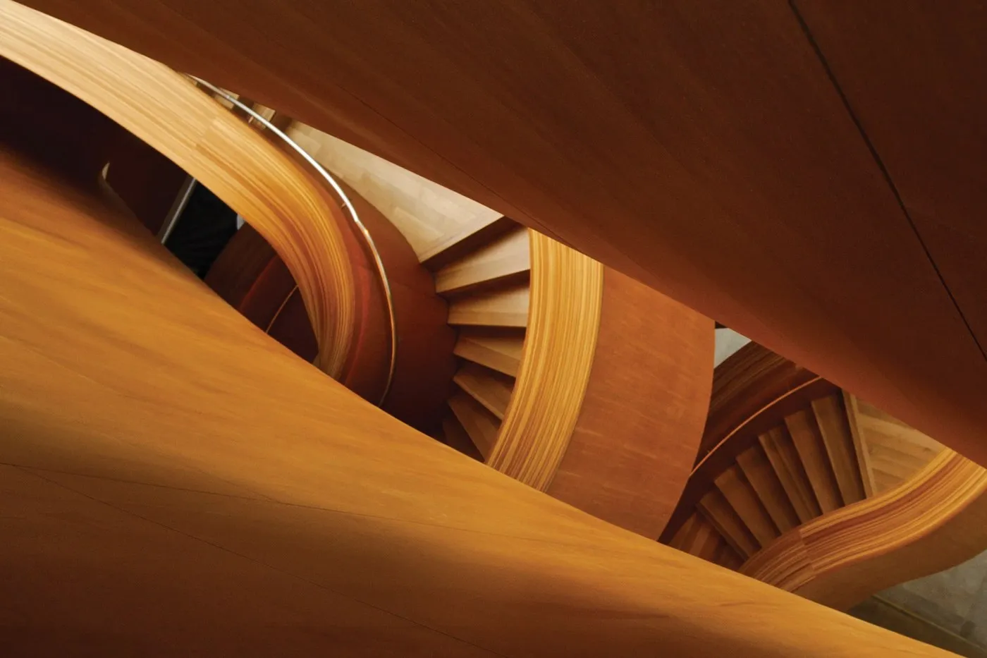
EllisDon Corporate Identity Redesign by Underline Studio
An Impressive Brand Identity System for EllisDon by Underline Studio Strategic branding and design shop Underline Studio took on the challenge of refreshing the visual communications system for EllisDon, a global construction and infrastructure building powerhouse. Handling over $3.5 billion in annual contracts is no small feat, so the big design challenge was clear: showcase…
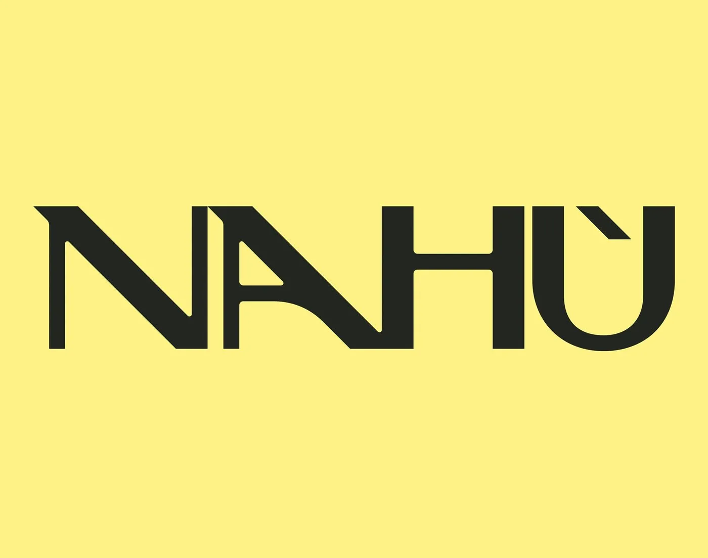
Nahù Branding Design by Brand Brothers: Raw Texture and Custom Typography
Nahù Brand Identity by Brand Brothers: A Blend of Rustic Charm and Unconventional Typography Founded back in 2022, Nahù specializes in sourcing top-tier cocoa beans for artisanal chocolatiers across the globe. Backed by Belco, the brand also operates a one-of-a-kind training center in Europe. To capture the essence of transparent trade and a genuine passion…
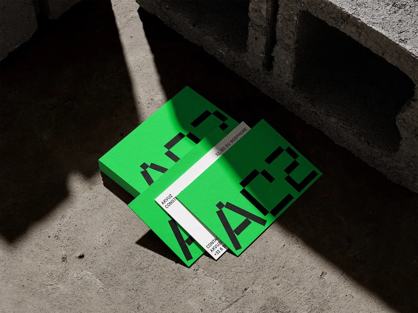
AC2 Brand Identity by Studio Format: Industrial Utility Meets Swiss Typography
AC2 Brand Identity by Studio Format: Industrial Utility Meets Swiss Typography Construction sites demand instant recognition and crystal-clear structure. For French construction firm AC2, Studio Format crafted a visual language that feels deeply industrial yet meticulously polished. Ditching predictable industry tropes, the project embraces a high-contrast palette pairing high-vis neon green with deep charcoal concrete…