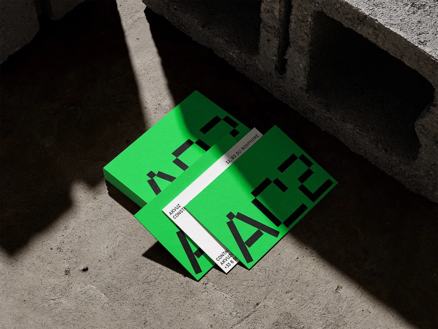
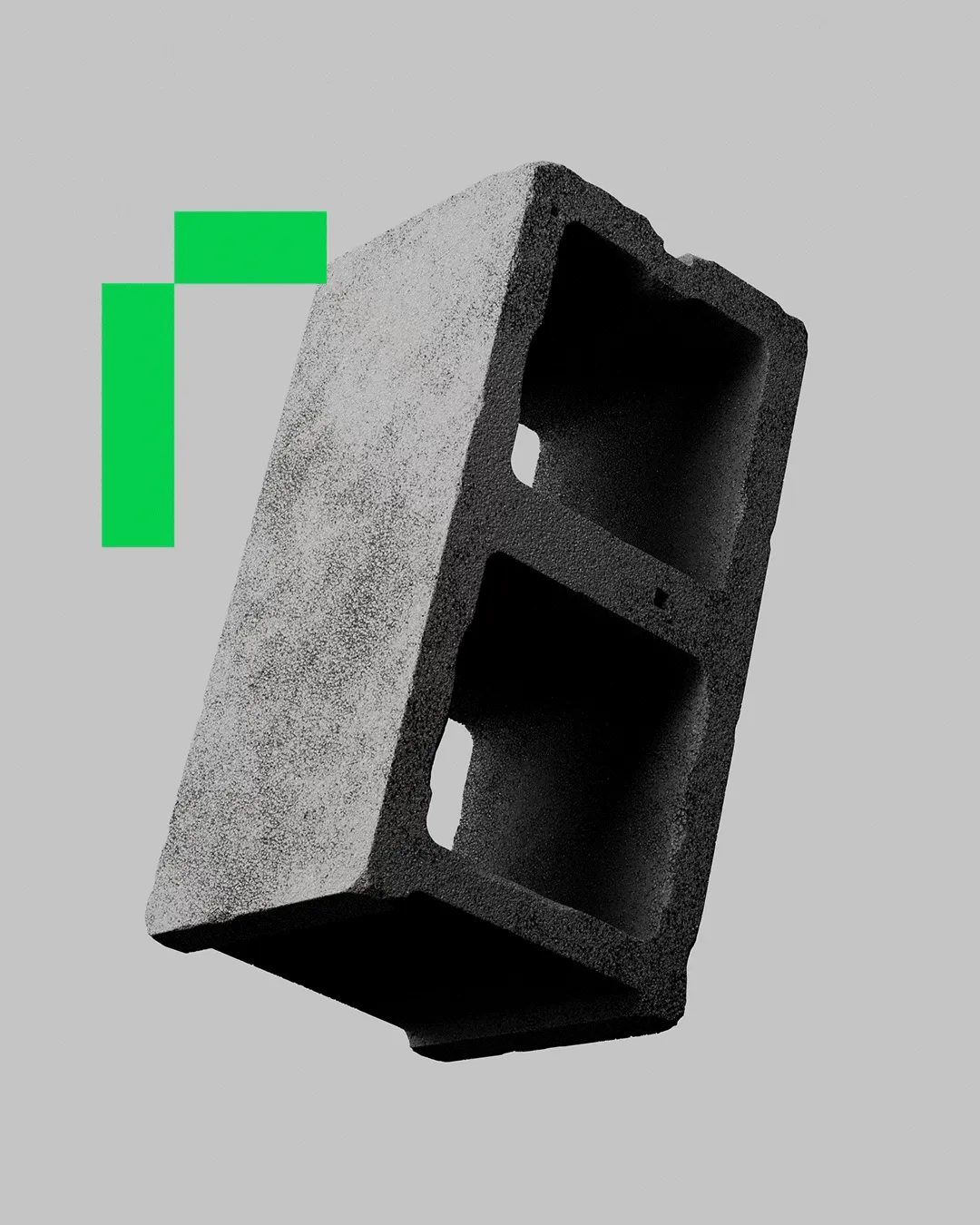
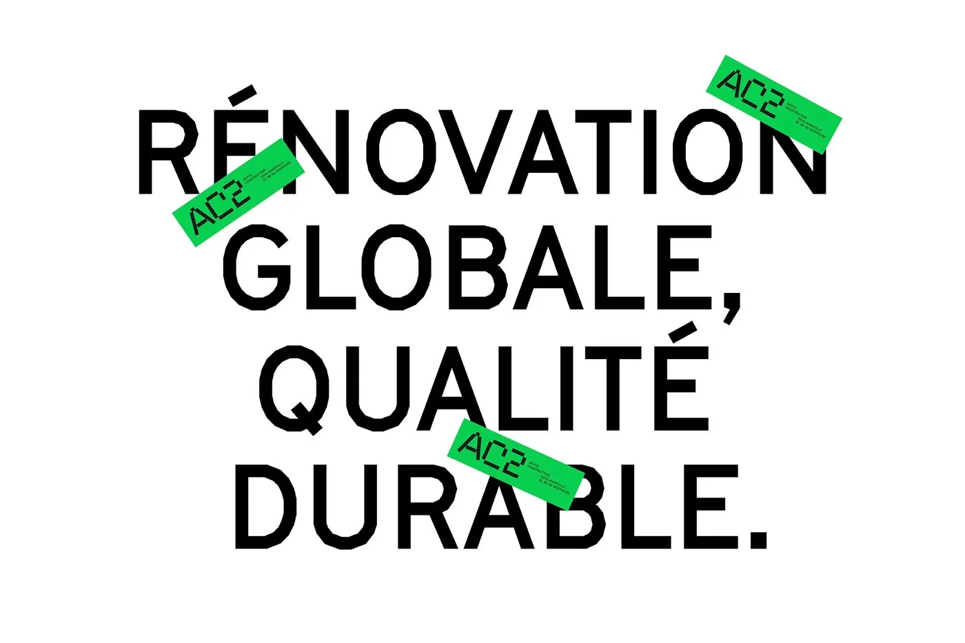
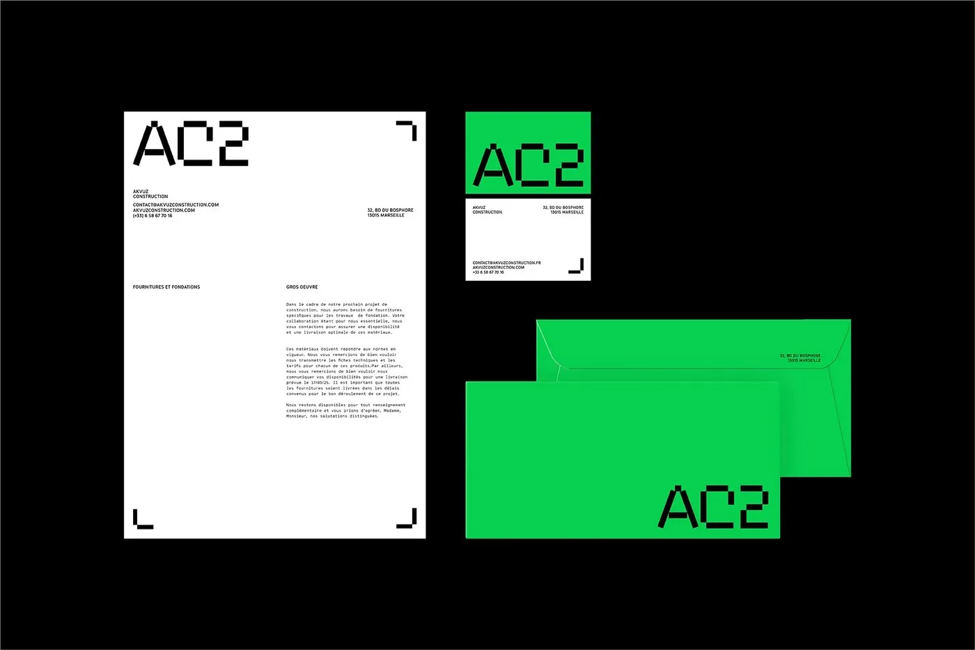
AC2 Brand Identity by Studio Format: Industrial Utility Meets Swiss Typography Construction sites demand instant recognition and crystal-clear structure. For French construction firm AC2, Studio Format crafted a visual language that feels deeply industrial yet meticulously polished. Ditching predictable industry tropes, the project embraces a high-contrast palette pairing high-vis neon green with deep charcoal concrete grey. At the heart of the system is a modular geometric logotype built from sharp right-angle folds and bold diagonal cuts. Whether stamped on raw paper or printed across textured cement, the typography pops with crisp drop shadows and incredible tactile depth.
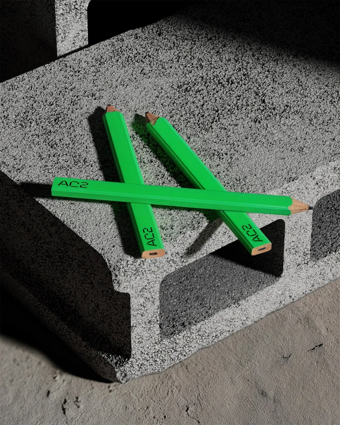
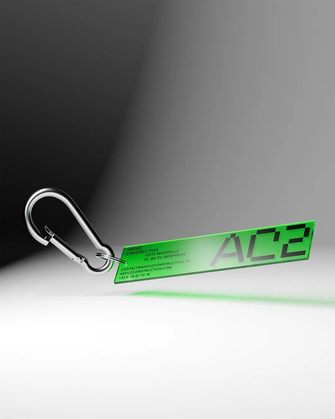
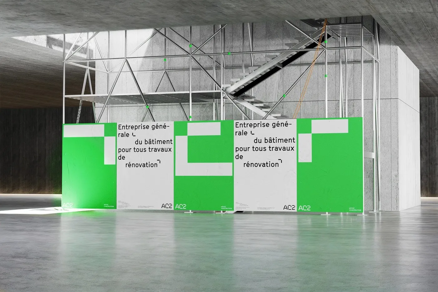
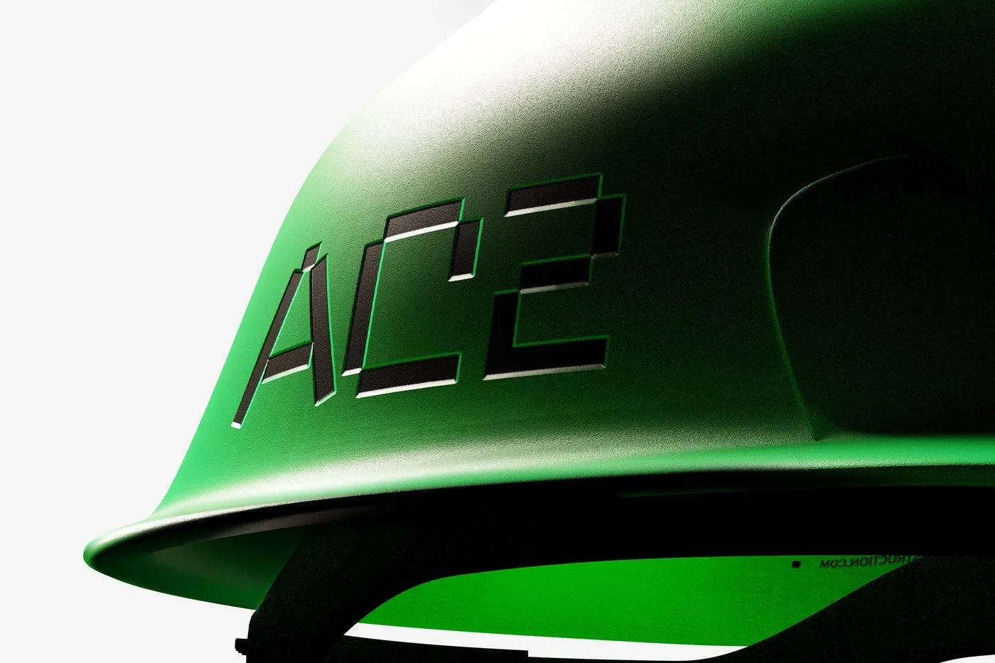
This identity system spills seamlessly into everyday site gear, turning humble work tools into delightful brand touchpoints. Bright green octagonal carpenter pencils, translucent neon acrylic keychains with heavy-duty metal clips, and sleek hard hats with debossed logos all bring the brand to life. Out in the field, safety barriers and perimeter tarps incorporate modular framing and architectural sans-serif type, transforming rough scaffolding and fences into cohesive, high-impact media surfaces.
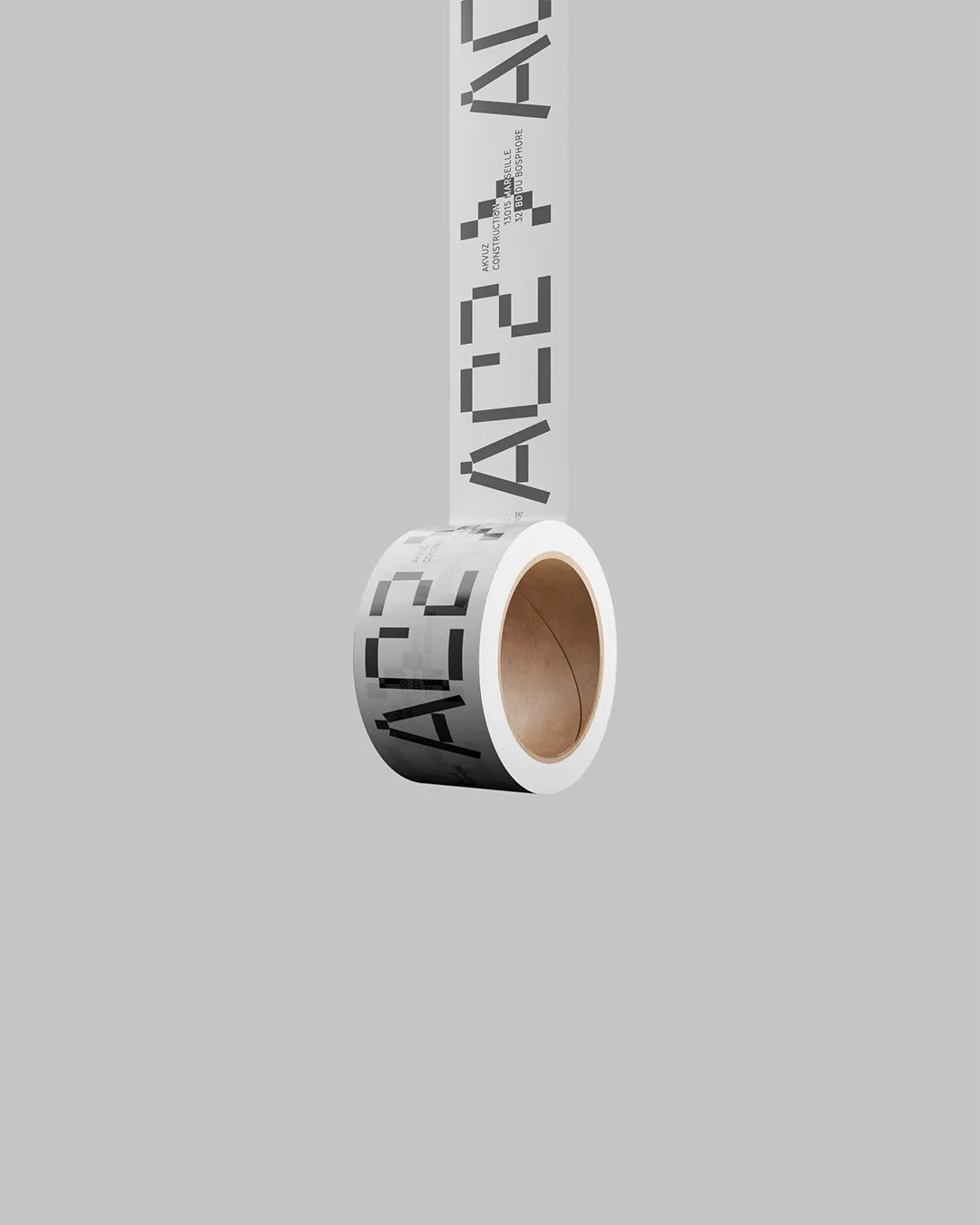
Going way beyond physical merch, the identity streamlines complex workflows through clean digital layouts and vehicle graphics. Monospaced contact details sit inside grid systems pulled straight from architectural blueprints. Crisp white tape strips positioned along office stationery edges display site addresses and phone numbers with catalog-like precision. By blending job-site safety elements with Swiss typographic rigor, the project delivers a fresh, elevated perspective on heavy-industry branding while staying completely true to its rugged core.
Check out the full brand identity project on www.behance.net/gallery/212872851/AC2.
Bộ nhận diện AC2 từ Studio Format: Sự kết hợp giữa tính ứng dụng công nghiệp và tư duy typographic
Môi trường công trường luôn đòi hỏi tính nhận diện nhanh và sự rõ ràng trong cấu trúc. Với AC2 – một đơn vị thi công tại Pháp, Studio Format đã xây dựng một ngôn ngữ thị giác đậm chất công nghiệp nhưng không kém phần chỉn chu. Dự án gạt bỏ những lối mòn thiết kế quen thuộc trong ngành để khoác lên mình bảng màu tương phản mạnh mẽ: xanh lá dạ quang nổi bật kết hợp với màu xám than bê tông. Điểm nhấn của hệ thống nằm ở logotype dạng mô-đun hình học, tạo nên từ các nét gấp khúc vuông góc và đường cắt chéo dày dặn. Khi xuất hiện trên chất liệu giấy thô hay bề mặt gạch xi măng, chữ viết tạo cảm giác chân thật nhờ hiệu ứng bóng đổ sắc nét và độ tương tác chất liệu cao.
Hệ thống nhận diện này lan tỏa tới từng vật dụng thực tế, biến những công cụ lao động quen thuộc thành điểm chạm thương hiệu thú vị. Những chiếc bút chì thợ mộc hình bát giác màu xanh nổi bật, móc khóa acrylic dạ quang xuyên thấu đi kèm móc treo kim loại bền bỉ, hay mũ bảo hộ dập chìm logo gọn gàng. Trên các công trường đang hoạt động, rào chắn bảo vệ và bạt quây chu vi sử dụng khung mô-đun cùng phông chữ sans-serif chuẩn kiến trúc, biến các giàn giáo hay rào chắn thô ráp thành những bề mặt truyền thông đồng bộ.
Beyond các ứng dụng thực tế, bộ nhận diện còn hỗ trợ sắp xếp các quy trình làm việc phức tạp thông qua bố cục kỹ thuật số và nhận diện trên phương tiện di chuyển. Các thông tin liên hệ dùng phông monospaced cùng hệ lưới chia ô mô phỏng trực tiếp từ bản vẽ kiến trúc. Các dải băng màu trắng gọn gàng đặt ở mép ấn phẩm văn phòng dùng để hiển thị địa chỉ công trình và số điện thoại một cách chính xác như một bản danh mục. Nhờ kết hợp giữa yếu tố an toàn lao động và tư duy typographic Thụy Sĩ, dự án mang lại góc nhìn mới mẻ cho truyền thông ngành công nghiệp nặng mà vẫn giữ trọn sự cứng cáp đặc trưng.
Xem đầy đủ dự án thiết kế nhận diện thương hiệu này của www.behance.net/gallery/212872851/AC2 trên Behance.