A bold, street-style brand identity for Paris restaurant Vif by Brand Brothers
Chef Geoffrey Gotfryd just opened a fresh culinary spot in Paris focused on delicious dishes cooked right over an open flame. To shape the venue’s unique vibe, the design team crafted a raw yet character-packed visual system rooted in modular forms.
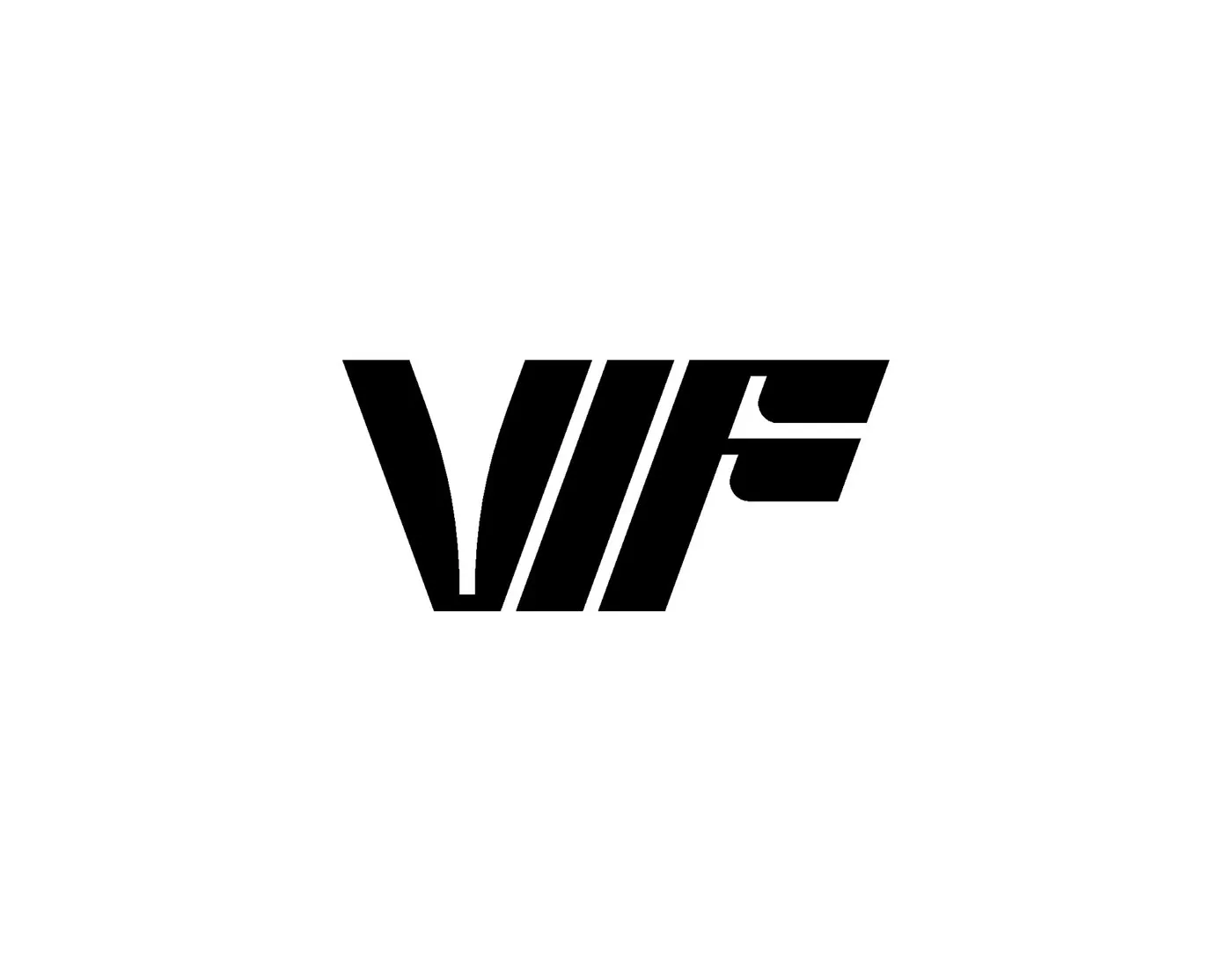
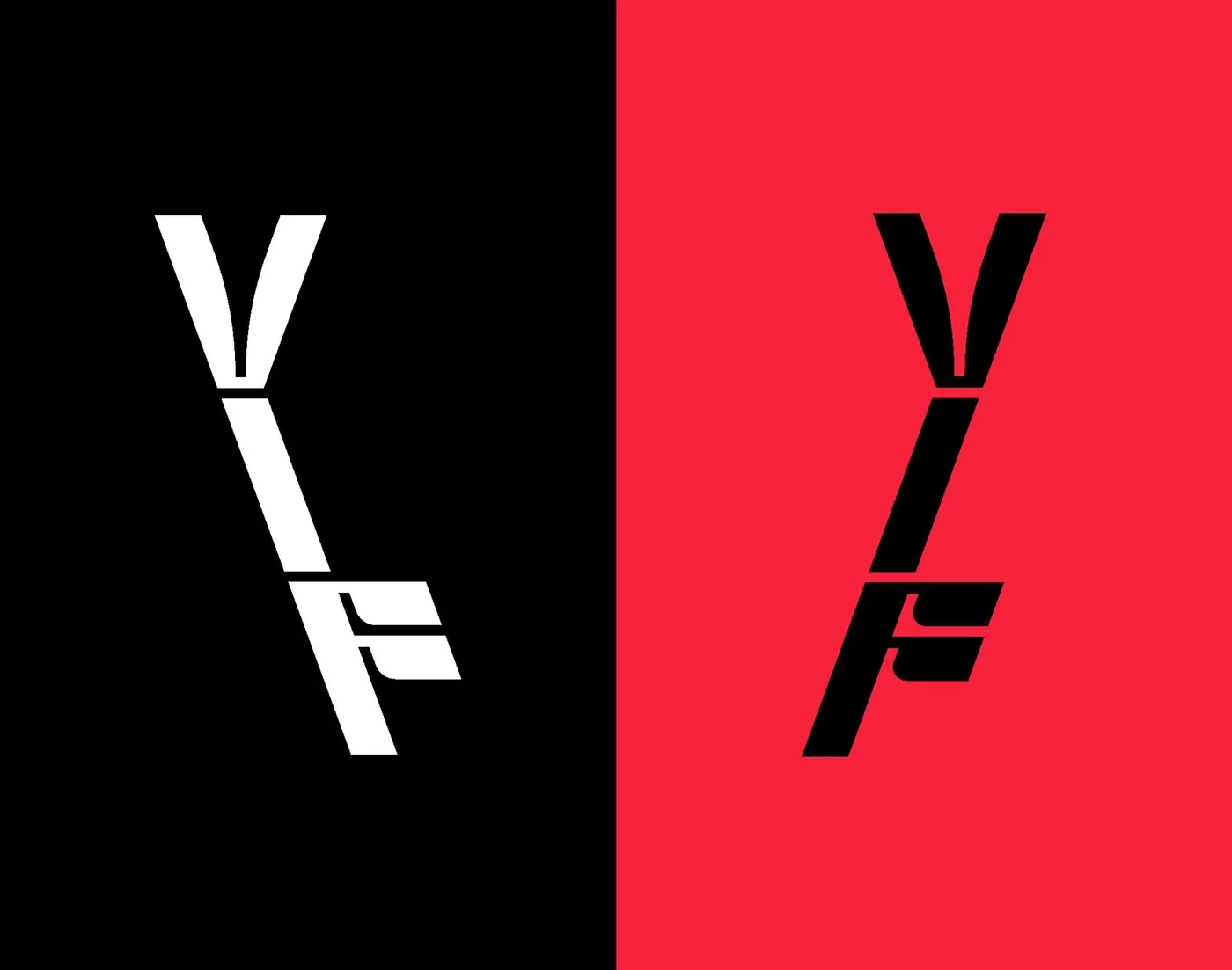
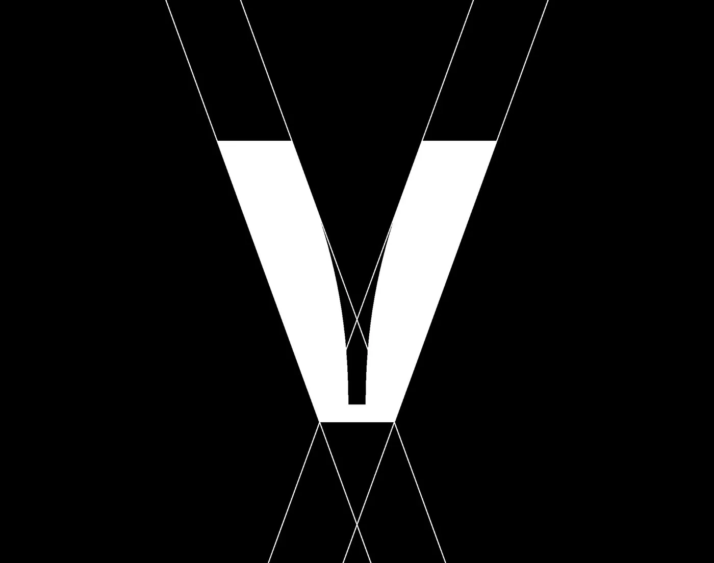
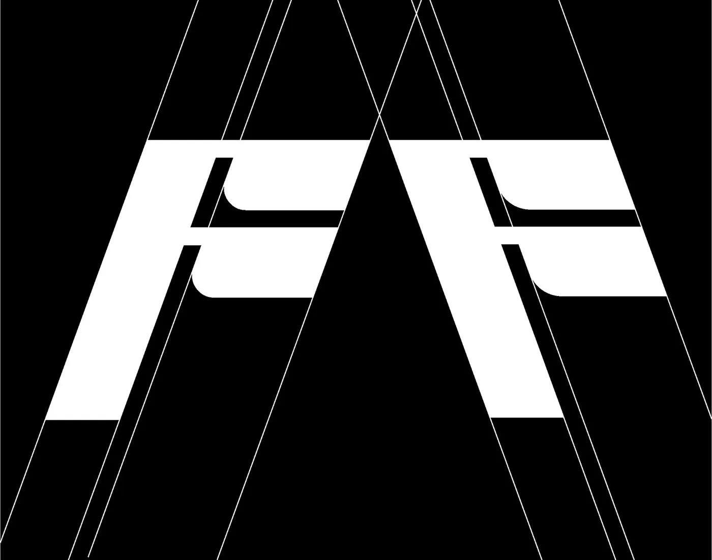
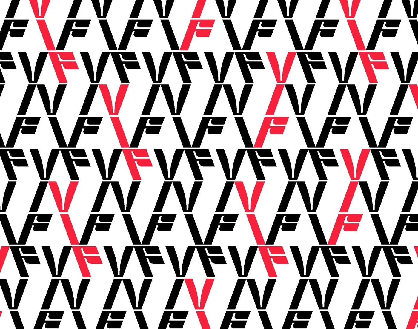
The logo shifts dynamically across three clean shapes built around the letters V, I, and F. Interlocking sharp cuts with raw circles creates a crisp visual rhythm. Whether featured on a small business card or a large wall, the typography stays razor-sharp and translates effortlessly across print and digital platforms.
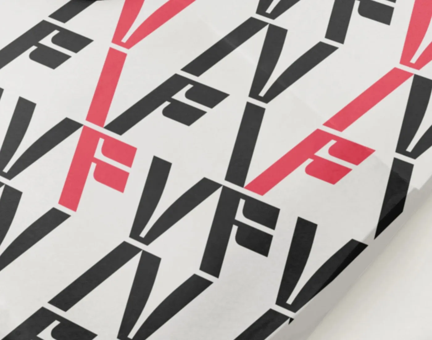
This modular type system flows seamlessly throughout the restaurant space. Neatly arranged wall posters display three repeating print styles, making a powerful visual statement. From large display typography and compact menus to the iron front gate, every element shares the same typographic motif, giving the brand a consistent, instantly recognizable presence on the street.
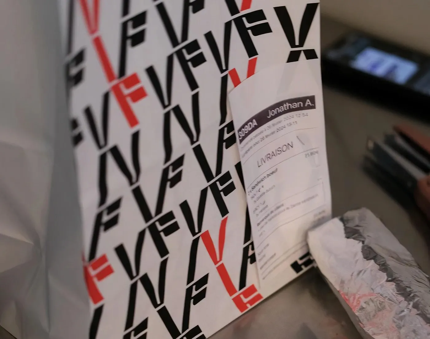
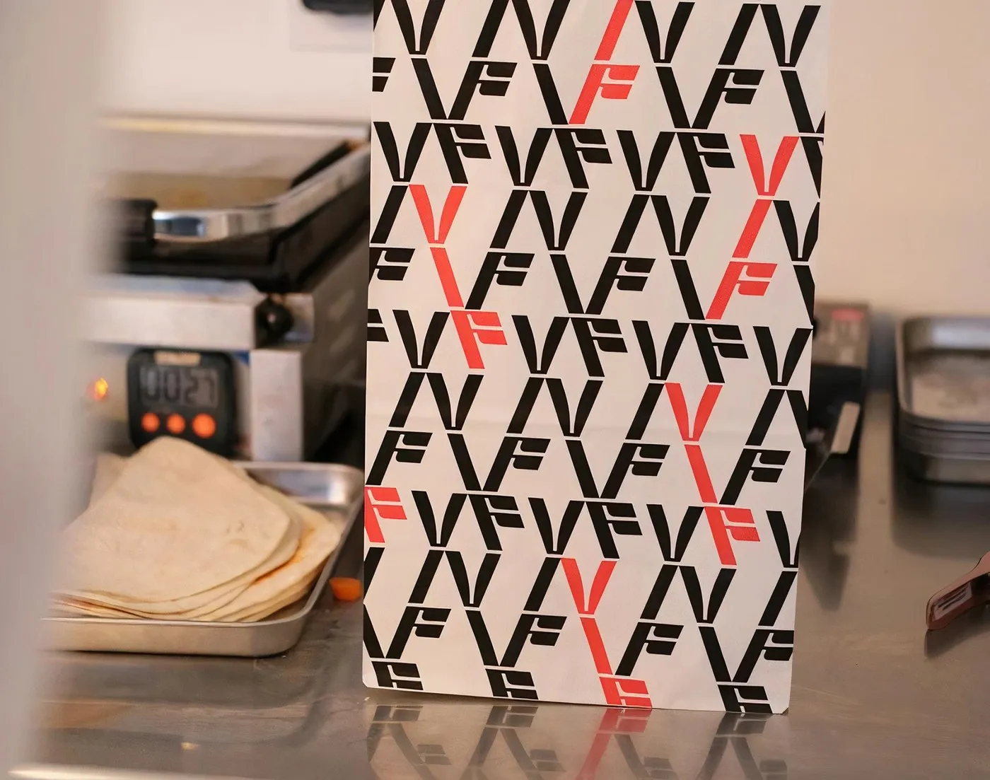
The color palette is strictly limited for maximum visual pop. Classic black and white set the main stage, paired with bright red accents for a touch of warmth. Packaging details are thoughtfully crafted, too: greaseproof takeaway boxes, custom sealing tape for hot bread bags, natural brown paper sacks, and durable everyday cups. A slightly raw print texture on the posters amps up the gritty, authentic feel of the brand identity.
Check out full project details on www.behance.net/gallery/185569117/Vif-Brand-identity.
Bộ nhận diện thương hiệu đậm chất đường phố cho nhà hàng Vif từ Brand Brothers
Đầu bếp Geoffrey Gotfryd vừa mở một không gian ẩm thực mới tại Paris, chuyên phục vụ các món ăn tươi ngon được nướng trực tiếp trên bếp lửa mở. Để định hình phong cách cho quán, đội ngũ thiết kế đã xây dựng một hệ thống thị giác mộc mạc nhưng đầy cá tính, lấy biểu tượng mô-đun làm gốc.
Biểu tượng logo có khả năng biến chuyển linh hoạt qua ba hình khối gọn gàng, xoay quanh ba chữ cái V, I và F. Sự đan xen giữa những đường cắt sắc nét và hình tròn nguyên bản tạo nên nhịp điệu thị giác rõ ràng. Dù xuất hiện trên tấm danh thiếp nhỏ hay mảng tường lớn, bộ chữ vẫn giữ được độ sắc nét và dễ dàng ứng dụng trên cả chất liệu in ấn lẫn nền tảng kỹ thuật số.
Hệ thống chữ dạng mô-đun này xuất hiện xuyên suốt trong không gian nhà hàng. Những tờ poster dán tường xếp thành hàng lối ngay ngắn với ba kiểu in lặp đi lặp lại, tạo ra sự tương phản thị giác khá mạnh. Từ phần typography hiển thị cỡ lớn, tấm menu nhỏ gọn cho đến phần cổng sắt mặt tiền đều dùng chung một mô-típ chữ, giúp thương hiệu có một diện mạo nhất quán và dễ nhận biết ngay trên phố.
Bảng màu của dự án được giới hạn chặt chẽ để tạo hiệu quả thị giác cao nhất. Hai sắc đen và trắng đóng vai trò chủ đạo, kết hợp cùng các điểm nhấn màu đỏ tươi để thêm chút ấm áp. Các vật phẩm đóng gói đồ ăn cũng được chăm chút kỹ: hộp takeaway dùng giấy chống dầu, băng dính riêng để niêm phong túi bánh mì nóng, túi giấy nâu giữ nguyên màu chất liệu mộc mạc và cốc dùng hằng ngày bền bỉ. Mực in hơi thô trên poster càng làm tăng chất bụi bặm, chân thật cho bộ nhận diện.
Bạn có thể xem thêm chi tiết dự án tại www.behance.net/gallery/185569117/Vif-Brand-identity.