Slice Guys: Designer Jeanne Nazinian’s High-Energy Retro Visual Identity
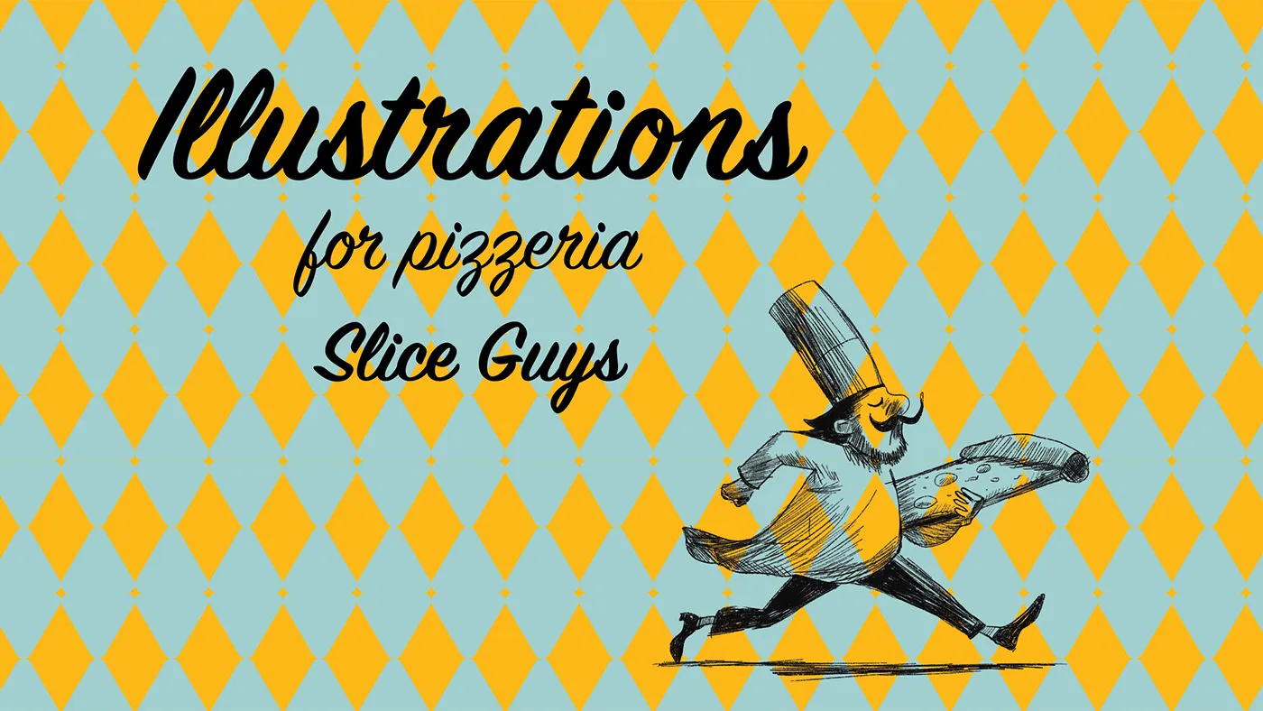
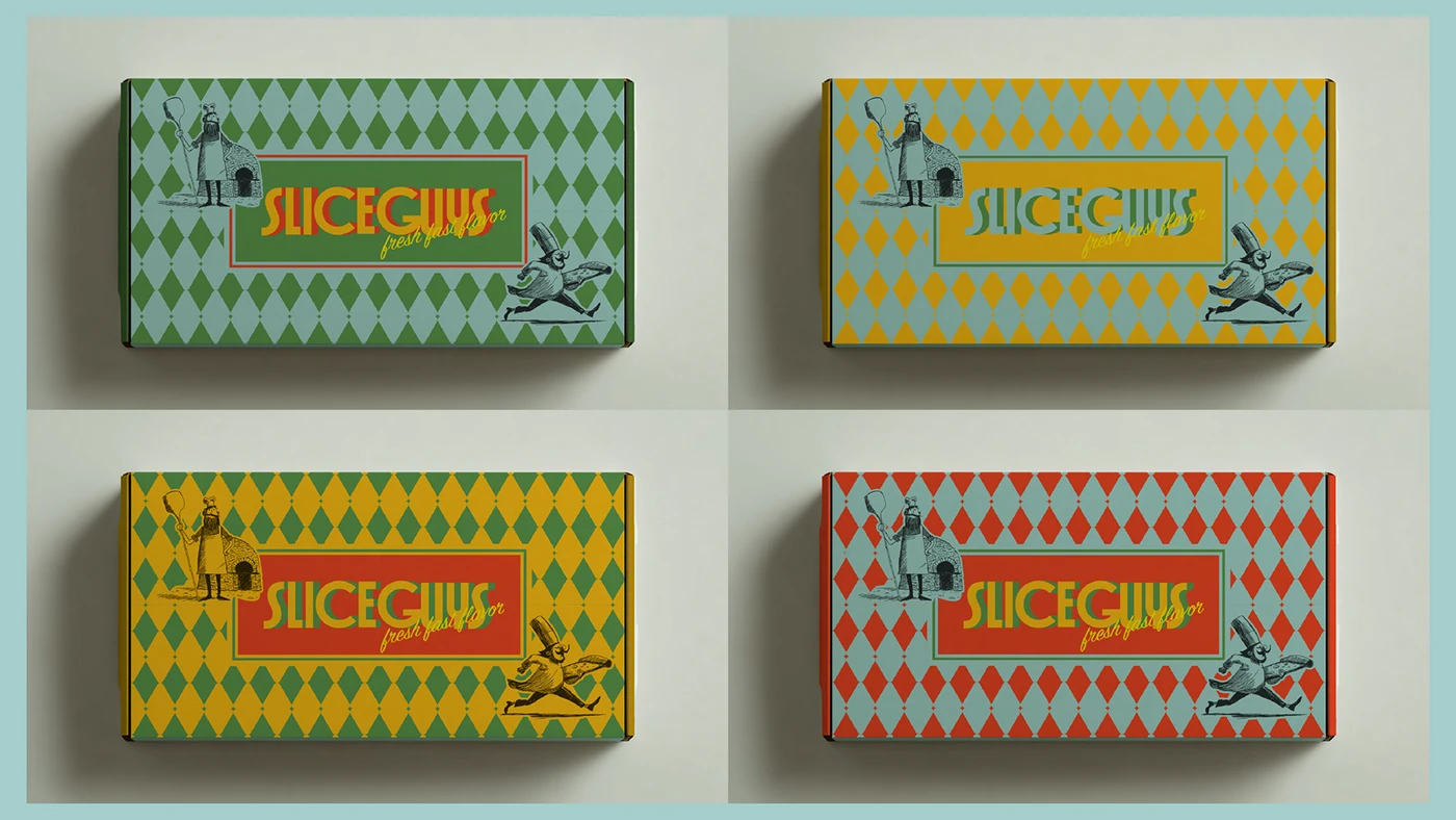
Slice Guys pizzeria just got a vibrant makeover with a high-energy, retro visual identity crafted by designer Jeanne Nazinian. The color palette pairs an easy-on-the-eyes cream background with popping accent colors: warm tomato red and bright mustard yellow, giving all the packaging an instantly eye-catching look.
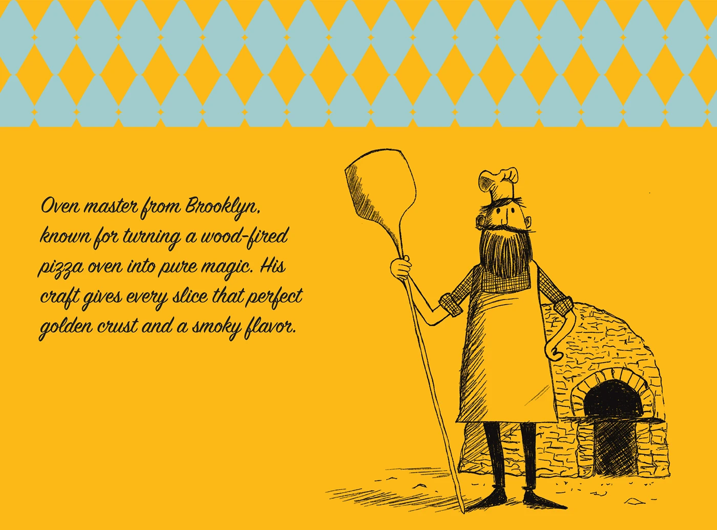
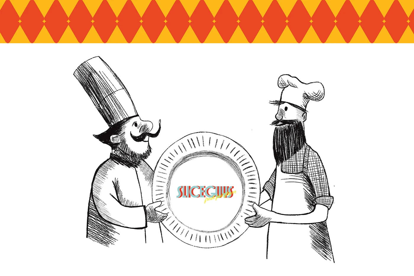
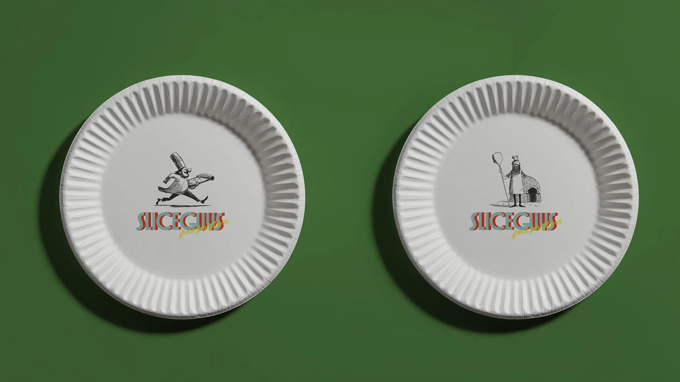
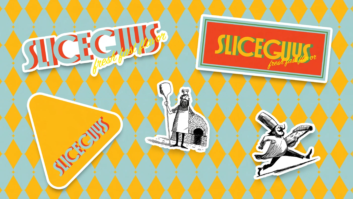
The custom retro typography steals the spotlight with thick outlines that bring a playful, organic vibe. Pairing the custom lettering with hand-drawn cartoon pizza slice characters makes the overall brand insanely friendly, approachable, and memorable.
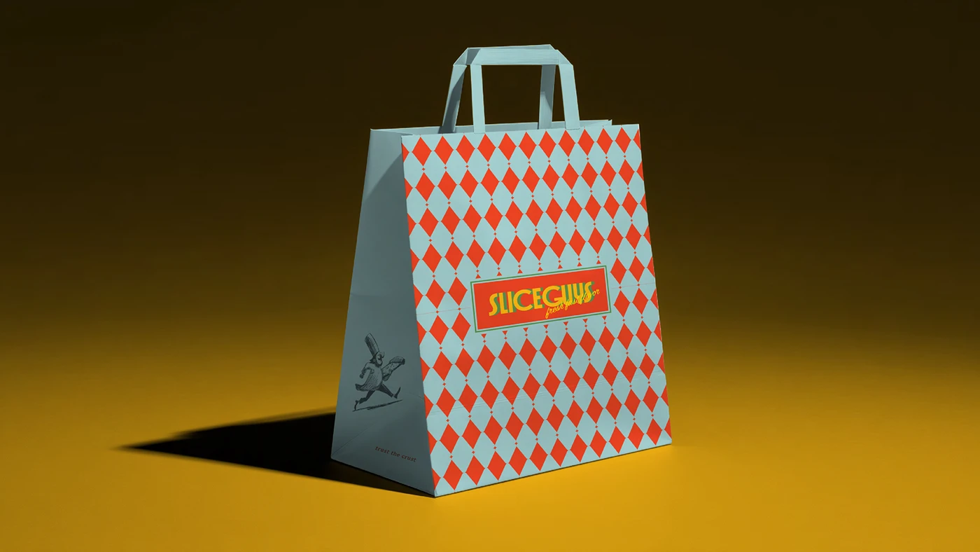
This design system spans across multiple touchpoints, including pizza boxes, greaseproof wrapping paper, and employee uniforms. The packaging prioritizes raw corrugated cardboard paired with simple red-and-white stripes to optimize production costs while keeping things stylish. A matte paper finish provides a rustic, tactile feel in hand. Thanks to custom rubber stamps and single-color vector illustrations, standard takeout boxes are transformed into eye-catching brand statements all over town.
Great design isn’t just about looks—it’s all about functionality, too. A clean layout ensures menus and order labels are effortless to scan at a glance, making the customer ordering experience quick and seamless. To check out the full set of visuals for this project, head over to www.behance.net/gallery/252442173/Slice-Guys-pizzeria.
Slice Guys: Bộ Nhận Diện Thương Hiệu Retro Đầy Năng Lượng Từ Designer Jeanne Nazinian
Tiệm pizza Slice Guys vừa khoác lên mình một bộ nhận diện thương hiệu đầy năng lượng, mang đậm hơi thở retro qua bàn tay thiết kế của Jeanne Nazinian. Bảng màu chủ đạo là sự phối hợp giữa nền kem dịu mắt cùng hai tông màu nhấn: đỏ cà chua ấm áp và vàng mù tạt tươi tắn, mang lại vẻ ngoài nổi bật cho phần bao bì.
Phần typography gây chú ý với phông chữ thiết kế riêng mang phong cách retro, có đường outline dày dặn tạo cảm giác tự nhiên và vui nhộn. Việc kết hợp chữ cùng các nhân vật lát pizza hoạt hình vẽ tay giúp tổng thể branding trở nên cực kỳ thân thiện và dễ nhớ.
Bộ thiết kế này được phủ rộng trên nhiều ứng dụng thực tế như hộp pizza, giấy nến bọc bánh và đồng phục nhân viên. Chất liệu bao bì ưu tiên dùng bìa carton sóng thô cùng họa tiết kẻ đỏ – trắng đơn giản nhằm tối ưu chi phí sản xuất. Bề mặt giấy mờ mang lại cảm giác mộc mạc khi cầm trên tay. Nhờ sử dụng con dấu cao su tùy chỉnh cùng minh họa vector đơn sắc, những chiếc hộp mang đi thông thường đã trở thành điểm nhấn thương hiệu thu hút trên đường phố.
Một thiết kế tốt không chỉ đẹp mà còn phải ứng dụng hiệu quả. Cấu trúc bố cục rõ ràng giúp thực đơn và tem nhãn đơn hàng dễ đọc ngay từ cái nhìn đầu tiên, giúp trải nghiệm gọi món của khách hàng diễn ra nhanh chóng, trơn tru. Để xem đầy đủ hình ảnh về dự án, bạn có thể tham khảo thêm tại www.behance.net/gallery/252442173/Slice-Guys-pizzeria.