
branding
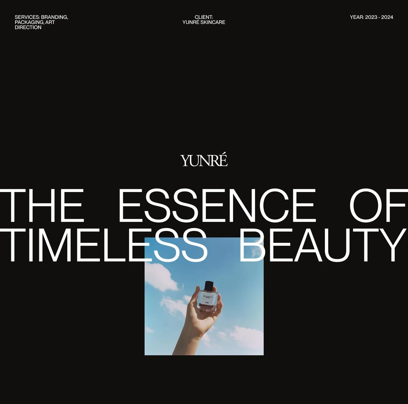
Yunré Skincare Branding by Owlsome Studio: A Minimalist Balance of Marine Science and Earthy Textures
Yunré Skincare Branding by Owlsome Studio: Where Deep-Sea Science Meets Earthy Textures Owlsome Studio crafted a super crisp, organic visual identity for Yunré, a skincare brand fueled by deep-sea active ingredients. The primary color palette pairs sandy gray, pure white, and deep ocean blue to beautifully mirror the natural origins packed into every single formula.…
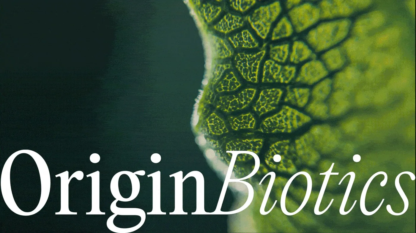
OriginBiotics Packaging System by Maja Regula
OriginBiotics Packaging Design by Maja Regula: Precise Grids and Deep Forest Greens OriginBiotics is a probiotic supplement brand built around clarity and precision. Designed by Maja Regula, this packaging identity rocks a deep forest green palette that feels super natural yet ultra-professional. The minimalist bottle labels use a tight vertical grid to keep technical details…
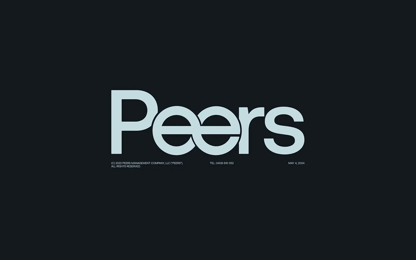
Peers Visual Identity by Anvar K.: Custom Typography and Grid Systems
Peers: A Sleek Modern Brand Identity Built on Custom Type and Grid Systems Designed by Anvar K., Peers is a corporate visual identity built around a custom typography setup and a super crisp grid system. At the heart of this visual system is a custom wordmark logo featuring tailored letterforms. The two interlocking “e”s right…
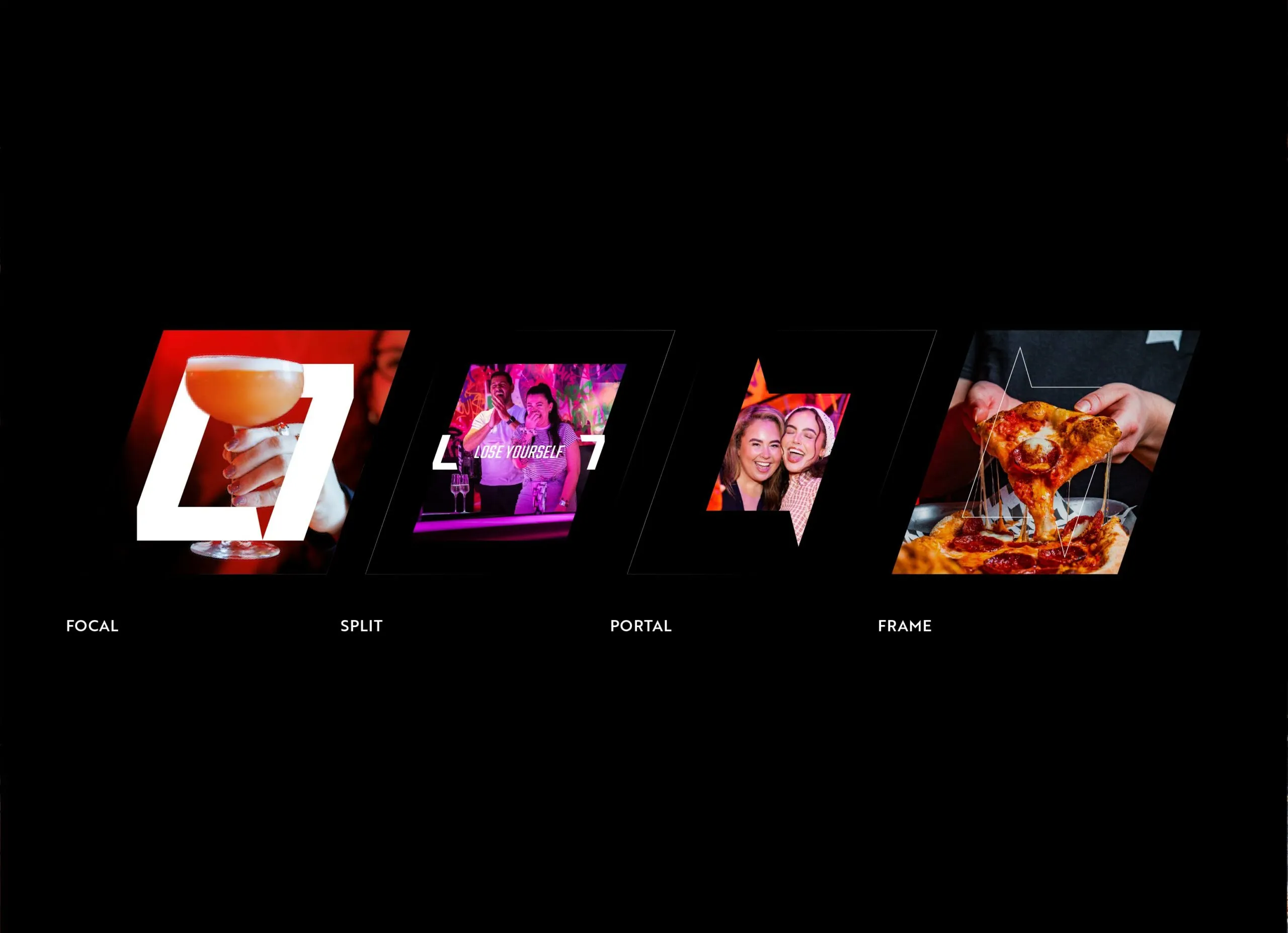
Lane7 Visual Identity: How Kiss Branding Built a Bold Look for Entertainment Spaces
A High-Energy Entertainment Identity for Lane7 by Kiss Branding Kiss Branding crafted a vibrant visual identity for Lane7, an energetic entertainment and dining hub, defined by bold geometric cuts and razor-sharp typography. This visual system brings heaps of attitude to the boutique bowling and gaming chain. At the heart of the brand is a forward-slanted…
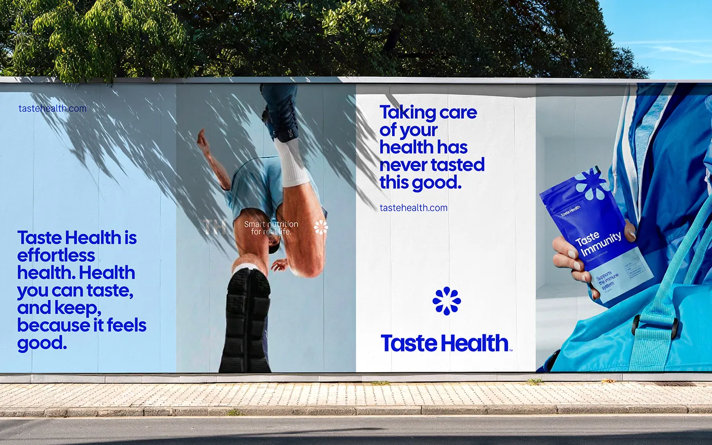
Taste Health: Bold Typography Meets Cobalt Blue in Modern Nutrition Branding
Taste Health: Fresh Branding & Packaging for Everyday Wellness by Dex Studio Daily supplements just got a massive glow-up thanks to Taste Health, a vibrant branding and packaging identity crafted by Dex Studio alongside designers Drielly Adriana, Caio Resende, and Rodrigo Balbino. At the heart of the design is a bold, heavyweight sans-serif wordmark in…
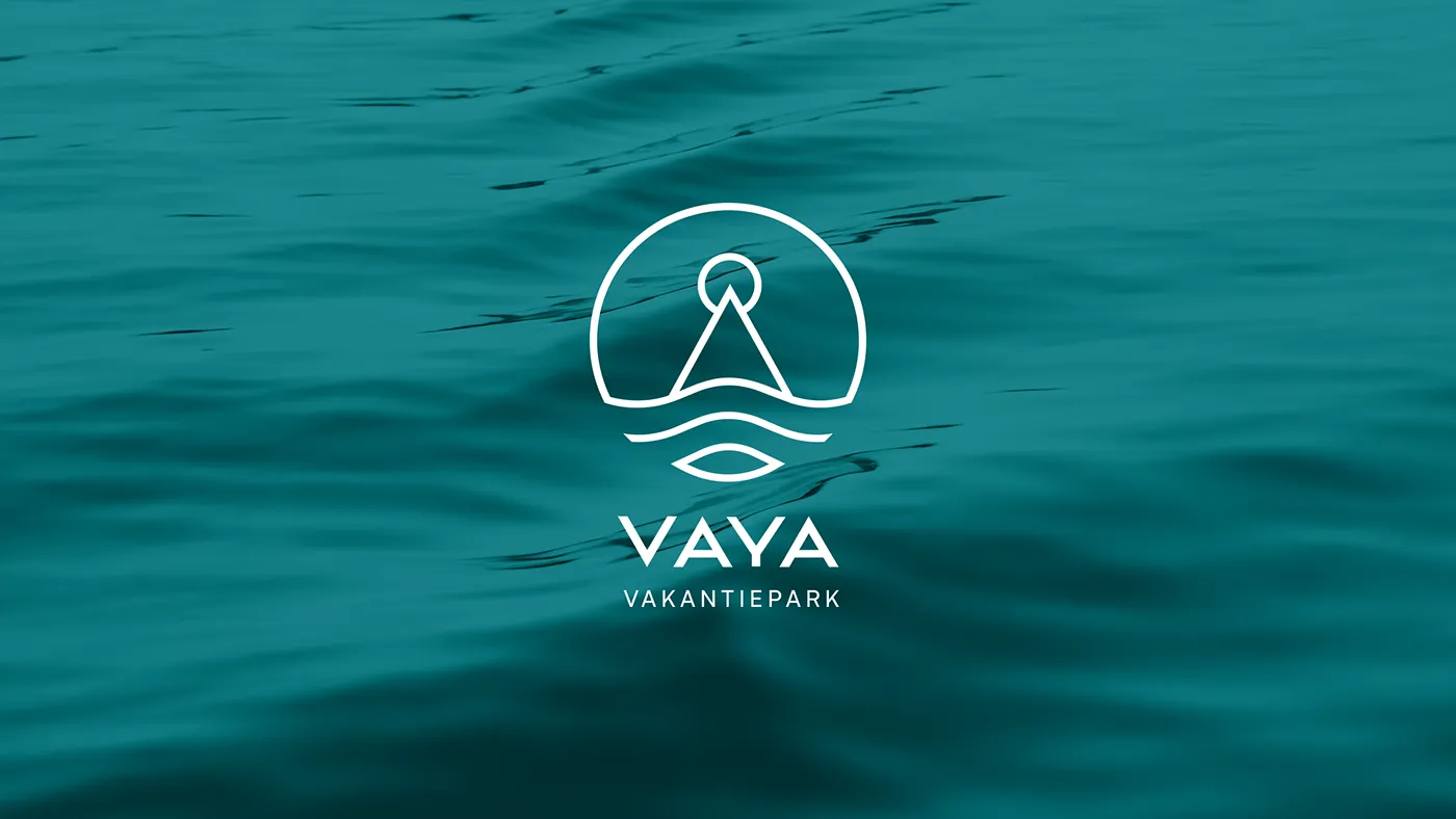
VAYA Vakantiepark: How Nature Shapes a Visual Identity System
VAYA Vakantiepark Brand Identity System: When Nature Blends into Design A gorgeous brand identity system for VAYA Vakantiepark, a stunning lakeside resort, has just dropped. Designed by Alex Maikoe, this project brings a deep sense of peace and closeness to nature for anyone who looks at it. The highlights of the identity include delicate linework,…
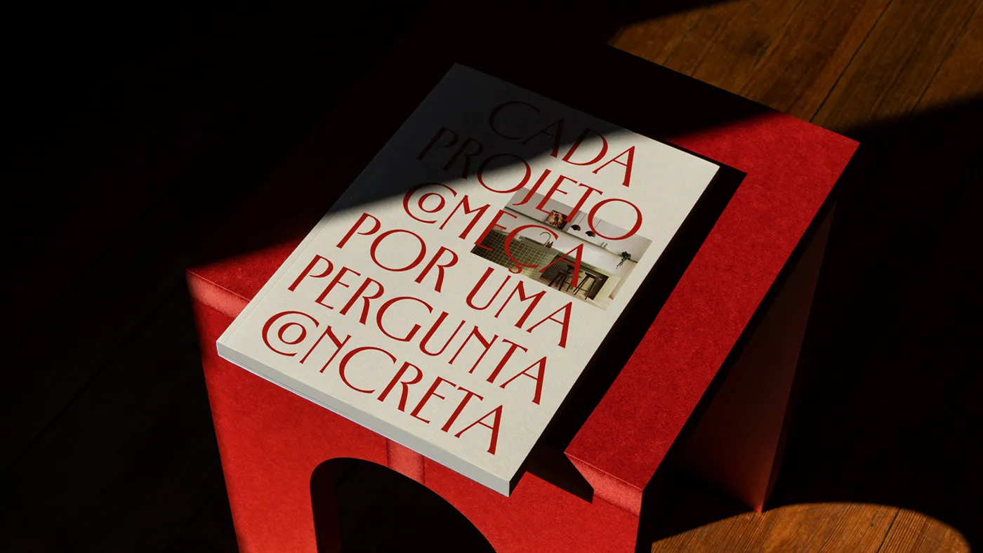
Clean Grids and Strong Type: GRISO Identity System by Will Gomes
A minimalist and sophisticated brand identity system for the GRISO architecture studio. The GRISO brand identity brings a fresh, lightweight, yet ultra-premium vibe to a design studio. Crafted by Will Gomes, this project shines a spotlight on the power of typography and beautifully clean paper stocks. The wordmark acts as a rock-solid anchor across every…

PATTA — Dynamic Branding for Modern Pet-Human Connections
PATTA: A High-Energy Identity for a Modern Pet Brand Patta is a Brazilian pet lifestyle brand all about celebrating the bond between humans and their pups. Instead of just making ordinary collars and leashes, Patta turns everyday gear into a canvas for personality, movement, and connection. The core concept stems from daily walks—a shared ritual…
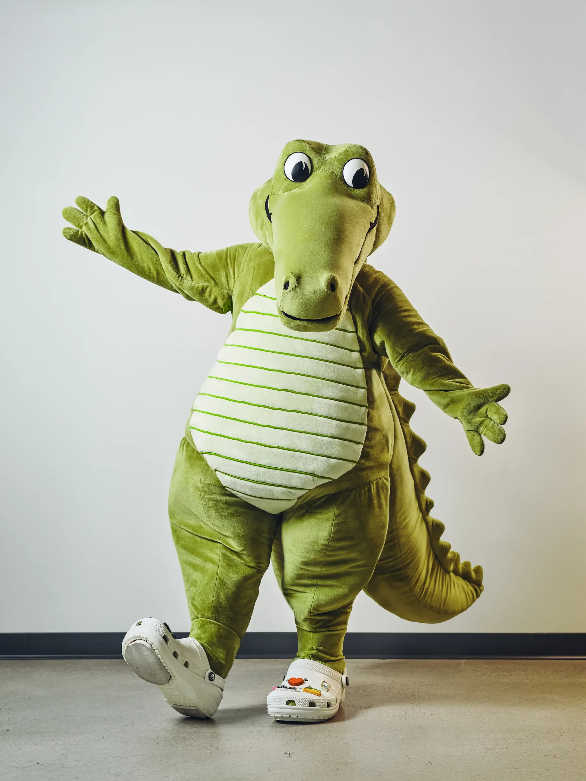
Crocs Brings Its Iconic Crocodile Logo to Life with New Mascot Niles
Crocs Brings Its Iconic Rivet to Life with a Vibrant New Mascot Named Niles Footwear giant Crocs just officially dropped its newest mascot, Niles, marking a bold move in its storytelling strategy. Before the grand reveal, the brand cleverly dropped a trail of easter eggs for a whole month. It started with a mysterious three-foot-tall…
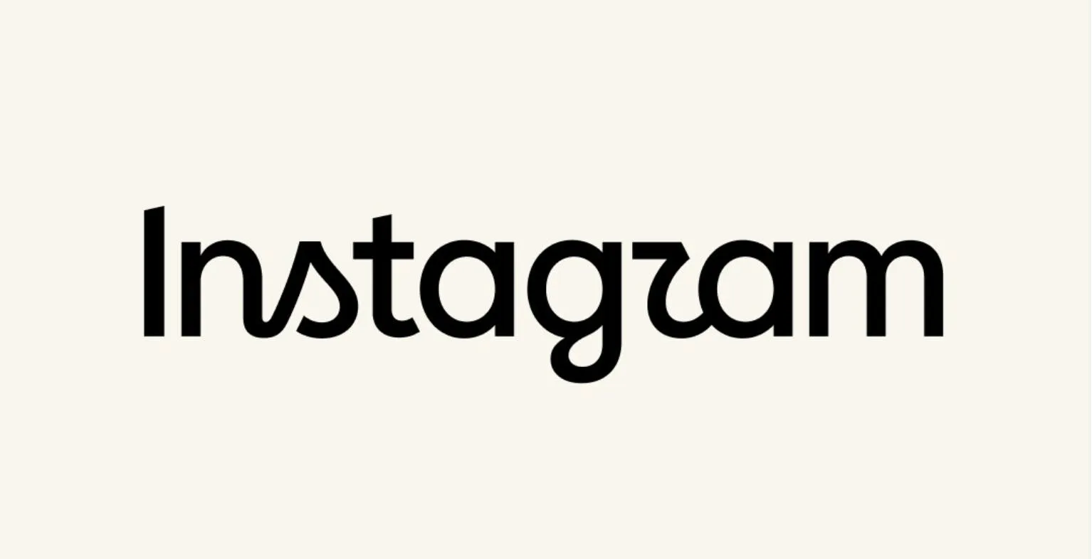
Instagram’s Brand Refresh: A Retro Move to Win Back Younger Audiences
Instagram’s New Fresh Look: Going Old School and Handmade to Keep the Gen Z Crowd? After sticking to the same look for a decade, Instagram just dropped its first massive brand identity overhaul since 2016. The star of the show? A refreshed wordmark unveiled by head of Instagram Adam Mosseri. The new version leans into…
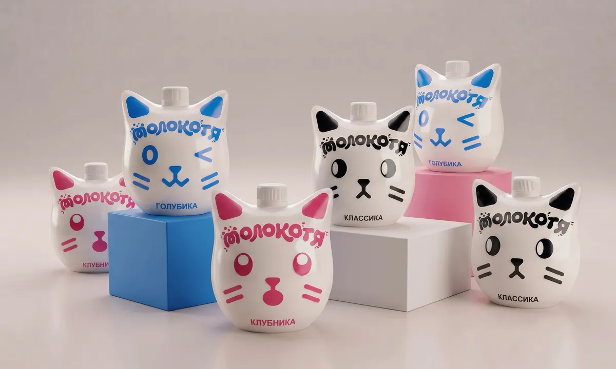
Molokotya: Turning Milk Packaging into Playful Breakfast Companions
Molokotya: Turning Milk Pouches into Adorable Cartoon Companions for Kids’ Mornings Breakfast just got a lot more exciting thanks to Molokotya, a delightful milk packaging concept by designer Alisa Piterskaya. This clever project completely reimagines the traditional milk pouch, transforming standard packaging into a lineup of super cute cat characters. The product line features three…
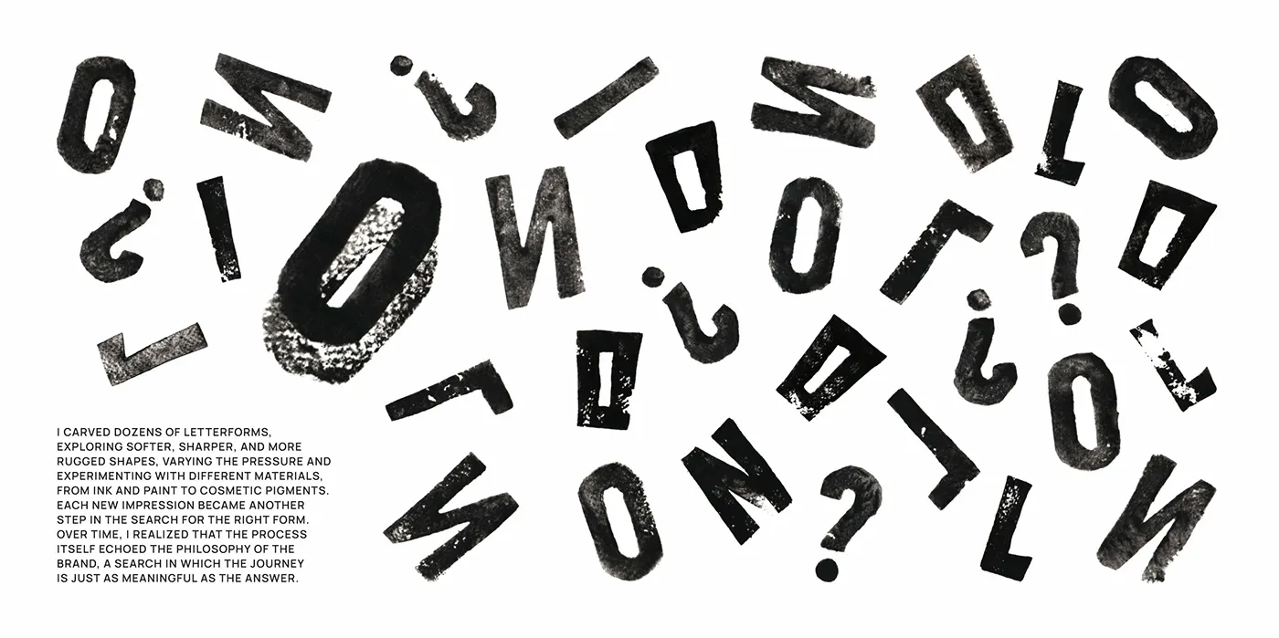
From Hand-Pressed Ink to Digital Elegance: OLLIN Wine Branding by Veronika Kuziakina
Bringing the Craft of Hand-Pressed Print into Veronika Kuziakina’s OLLIN Wine Branding Veronika Kuziakina just brought a breath of fresh air to the brand identity for OLLIN, a wine from the Rioja region, by cleverly incorporating hand-pressed ink textures right onto the bottle labels. Instead of jumping straight into vector lines on a screen, the…
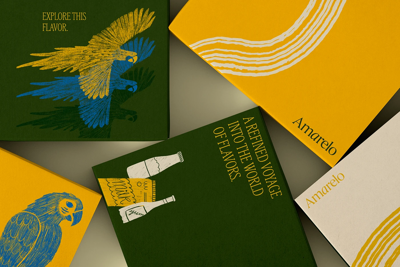
Amarelo Beverages: A Bold Tropical Visual System by Beatriz Teotônio
Amarelo Beverages’ Bold Tropical Identity and Packaging System When tropical flavors meet graphic artistry, the result is Amarelo Beverages—an incredibly eye-catching branding project by designer Beatriz Teotônio. This visual identity beautifully pairs deep, grounding forest greens with the warm, sun-kissed tones of a classy serif typeface. The core color palette features forest green, sunny yellow,…
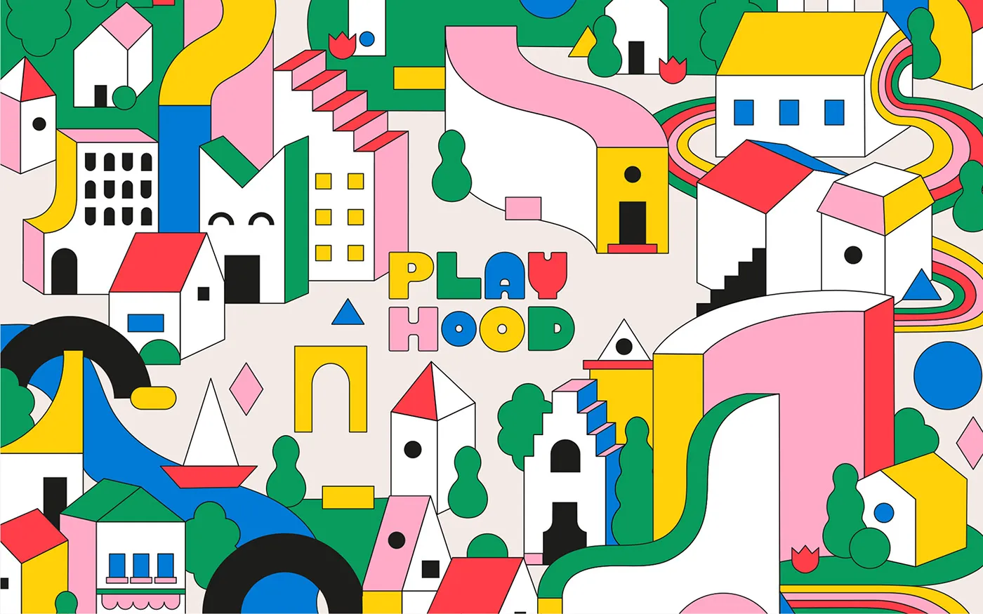
Modular Geometry and Vibrant Colors in Karla Heredia’s PLAYHOOD Spatial Branding
Karla Heredia’s branding system for PLAYHOOD, a vibrant play space, brings a wonderfully joyful spirit to life. The project combines custom rounded typography with a simple, iconic house shape. A bright color palette featuring sky blue, sunny yellow, crisp green, and deep red blends together seamlessly. Playful vector illustrations unfold like whimsical city maps, complete…
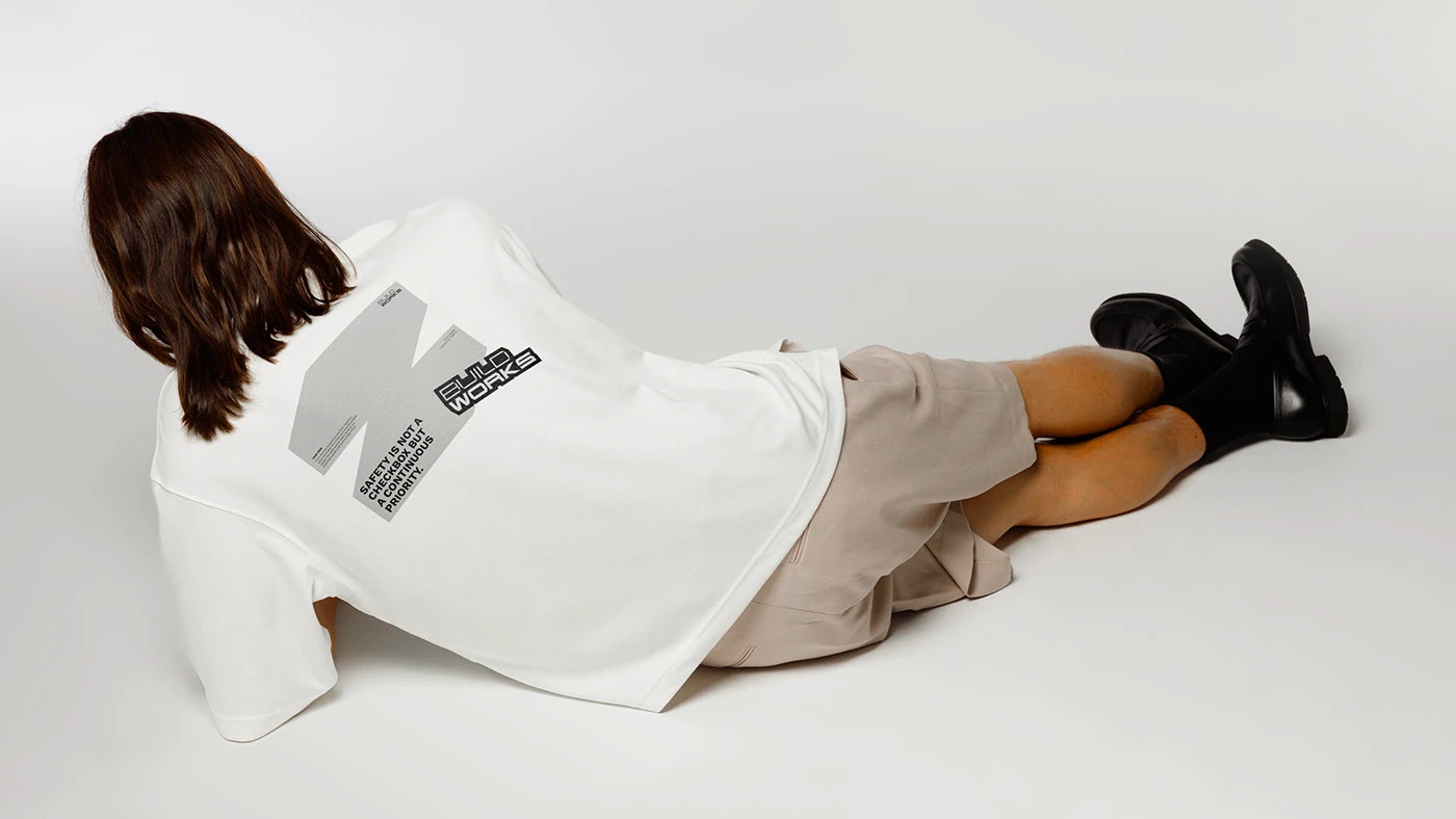
BUILDWORKS Brand Identity System by Dati Kopadze
Dati Kopadze just dropped a seriously impressive brand identity for BUILDWORKS, a construction company. Instead of taking the usual route with generic hard hat icons or clunky block lettering, the designer opted for a super clean brand language inspired by grid lines and bold typography. The wordmark features rock-solid sans-serif letters that look incredibly sharp…
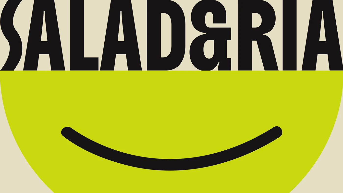
SALAD&RIA: A Fresh and Vibrant Visual Identity by Mateus Araújo
In a saturated market where salad, wrap, and juice delivery services fiercely compete with very little differentiation, SALAD&RIA bursts onto the scene in inner-state Rio de Janeiro like a breath of fresh air. The brand serves up a healthy, balanced dining solution that is incredibly fun and full of personality for anyone looking for a…
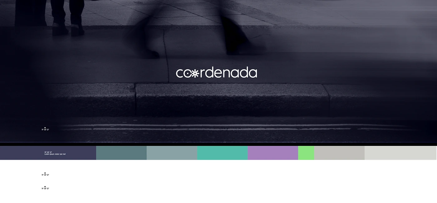
Coordenada Data-Driven Brand Identity by Pato Faggi
Data research companies usually get stuck using super dry, cookie-cutter charts. But for Coordenada, designer Pato Faggi cooked up a brand identity system that is incredibly clean and sharp. The core idea takes inspiration directly from map coordinates and graph lines. Mixing monospaced fonts with a structured grid system across report covers and presentation slides…
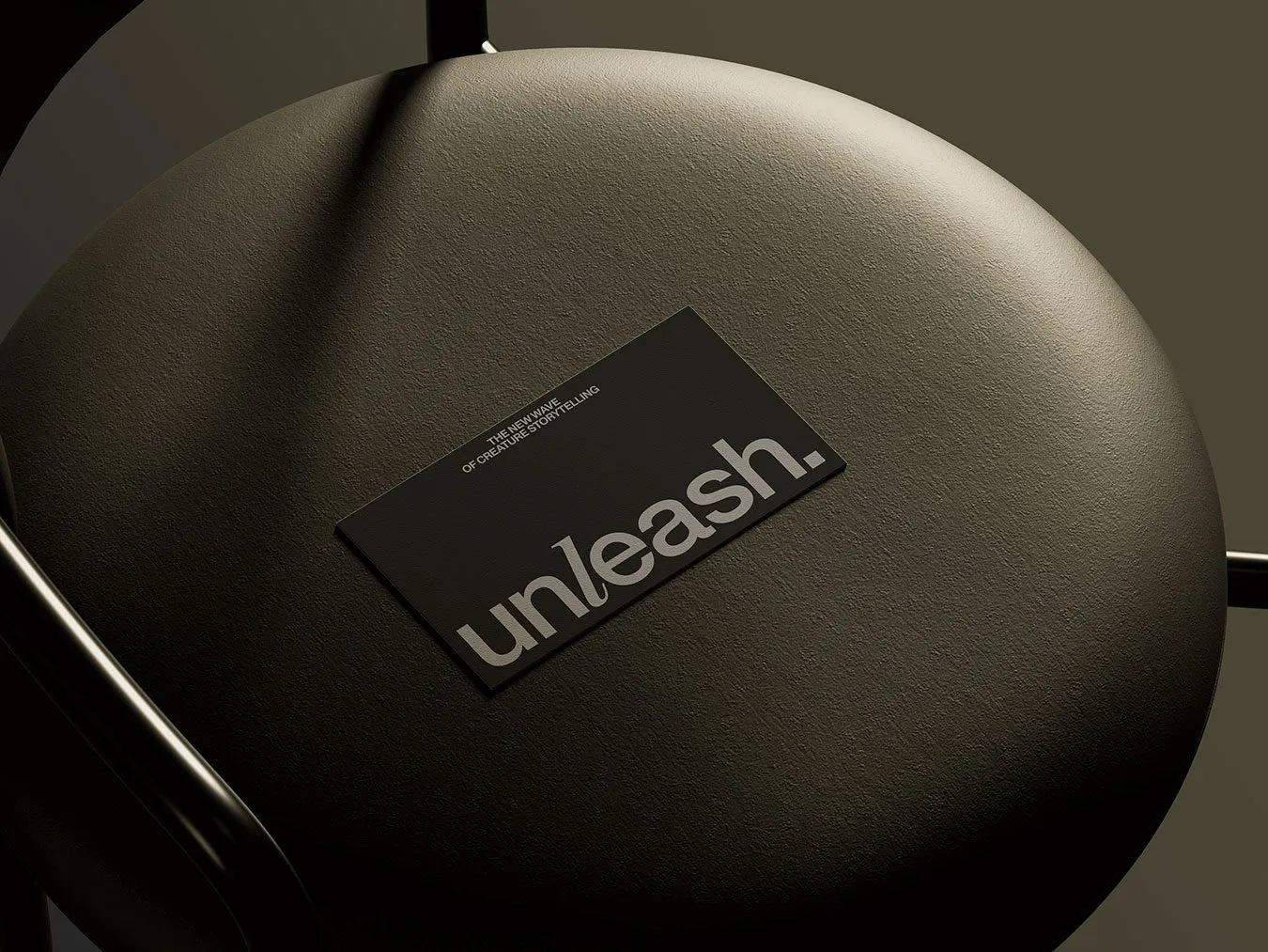
Unleash: A Swiss Editorial Branding Approach for Pet Storytelling by Stud Creative House
The designers at Stud Creative House took a completely different approach for Unleash—a studio specializing in pet storytelling. They built a brand identity that embraces a beautifully minimalist and calm aesthetic. The design system is a gorgeous mix of deep olive green, subtle grays, and natural off-white paper textures. Right at the center of the…
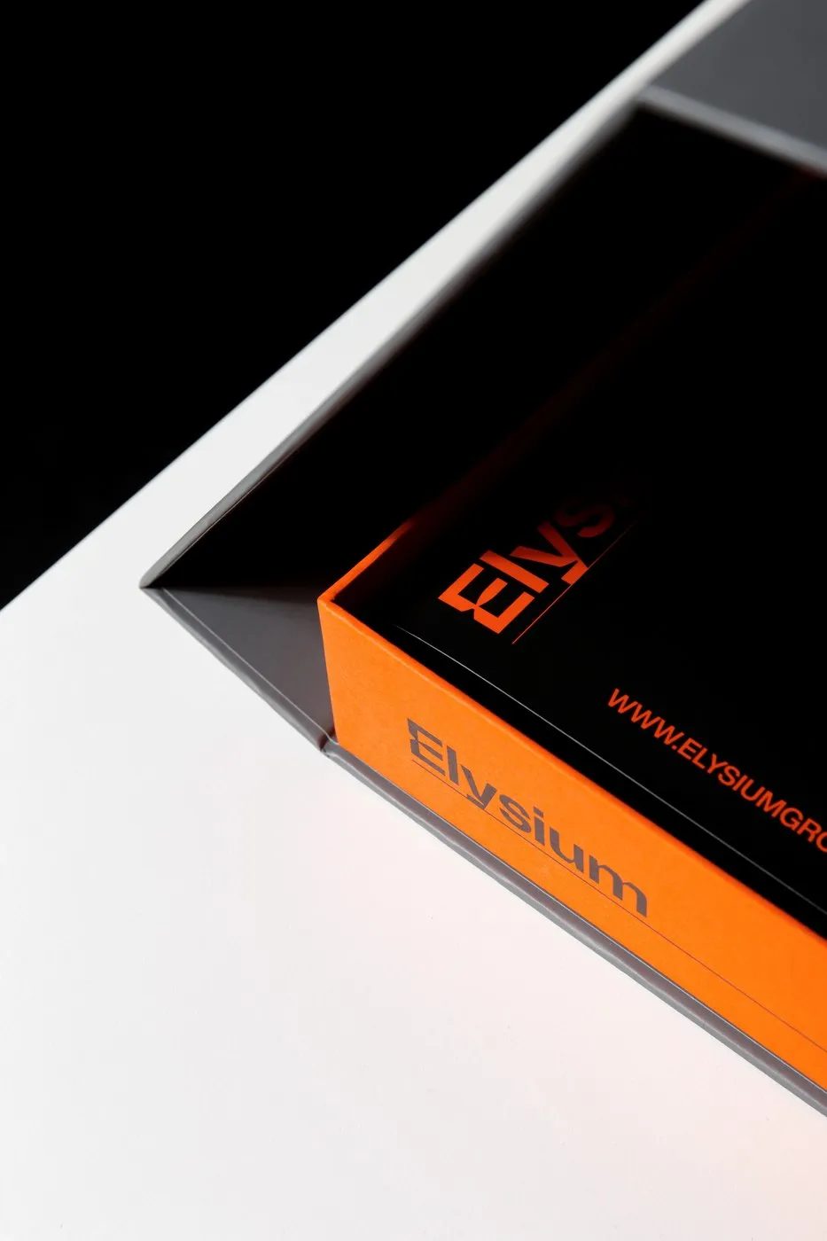
Engineered Visual Architecture: Elysium Brand Identity by Another Collective
Elysium is a seriously impressive brand identity project by Another Collective, packing a visual punch with its mechanical lines and rock-solid geometric structures. The project was crafted for Elysium, a company specializing in architectural roofing and facades that carries on the long-standing legacy of Fabris, a staple in the roofing and metal cladding industry since…