
branding
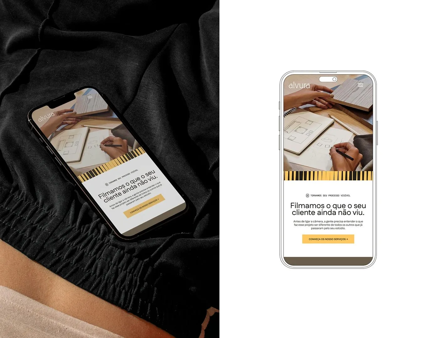
Alvura Filmes Branding and Visual Identity System
Check out this ultra-sleek visual identity for São Paulo-based film studio Alvura Filmes! Created by the talented design team of Gabriel Pio Couto, Edson Naves, Maurício 7F, and Gabriel Mesoma, this branding draws inspiration from classic cinema reels and premium fine art paper. The color palette hits all the right notes, blending sophisticated blacks and…
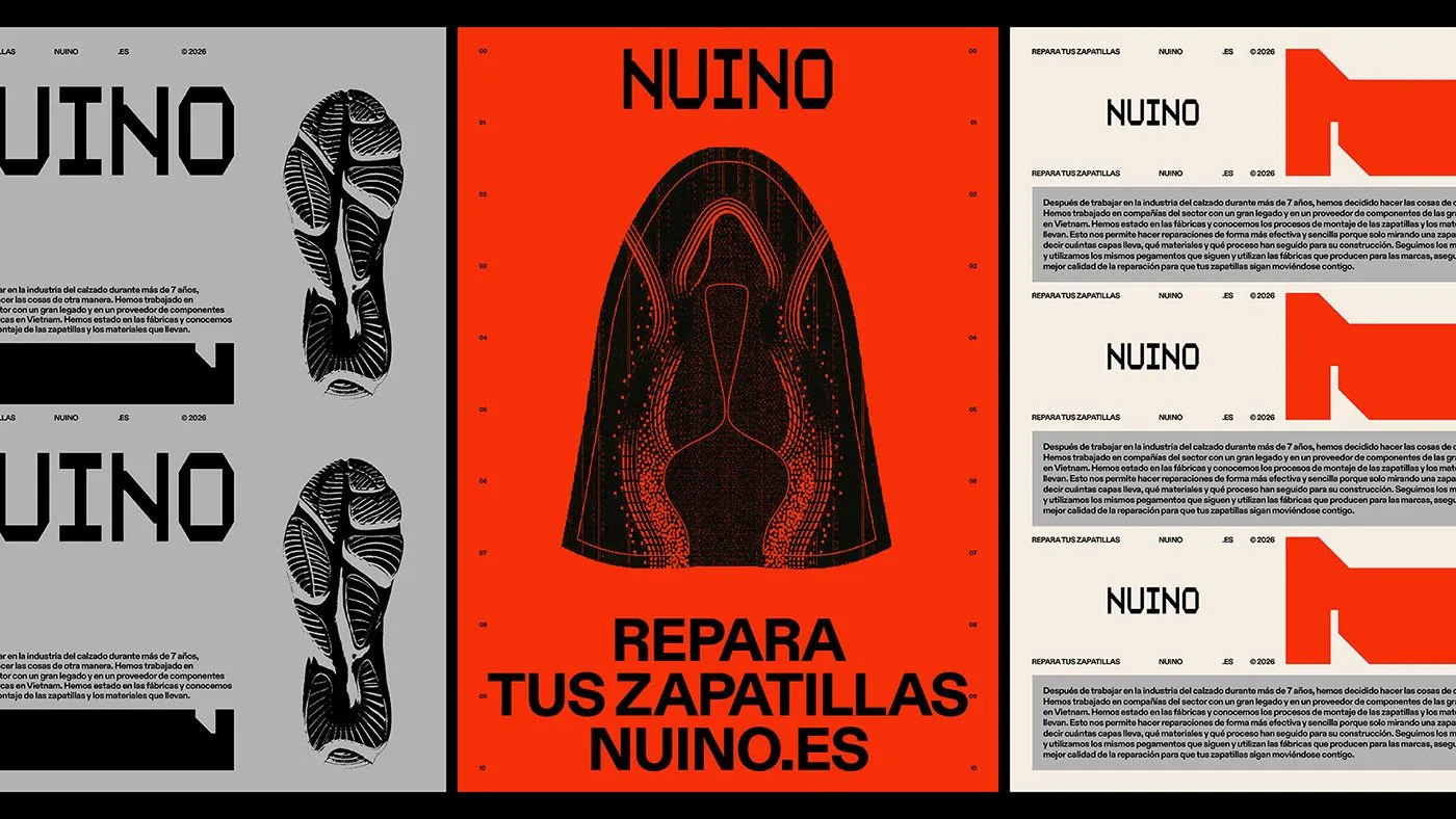
NUINO Footwear Repair Identity by Plural Branding Studio and Álex López
Forget the quiet, understated vibes usually found in traditional shoe repair shops—the design crew at Plural Branding Studio and Álex López went all out with a bold, energetic look for NUINO. This brand identity hits the sweet spot with a clean palette of gray, off-white, and neutral black, all brought to life by a super…

Mojo PMM SaaS Mascot Branding Identity by The Unicorn Agency
Ditching the usual tech app clichés of dry charts and predictable blue interfaces, The Unicorn Agency brought a total breath of fresh air to the brand identity for Mojo PMM. The star of the entire design system is an incredibly cute, fluffy mascot named Mojo. The design team cleverly paired bold, heavy typography with vibrant…
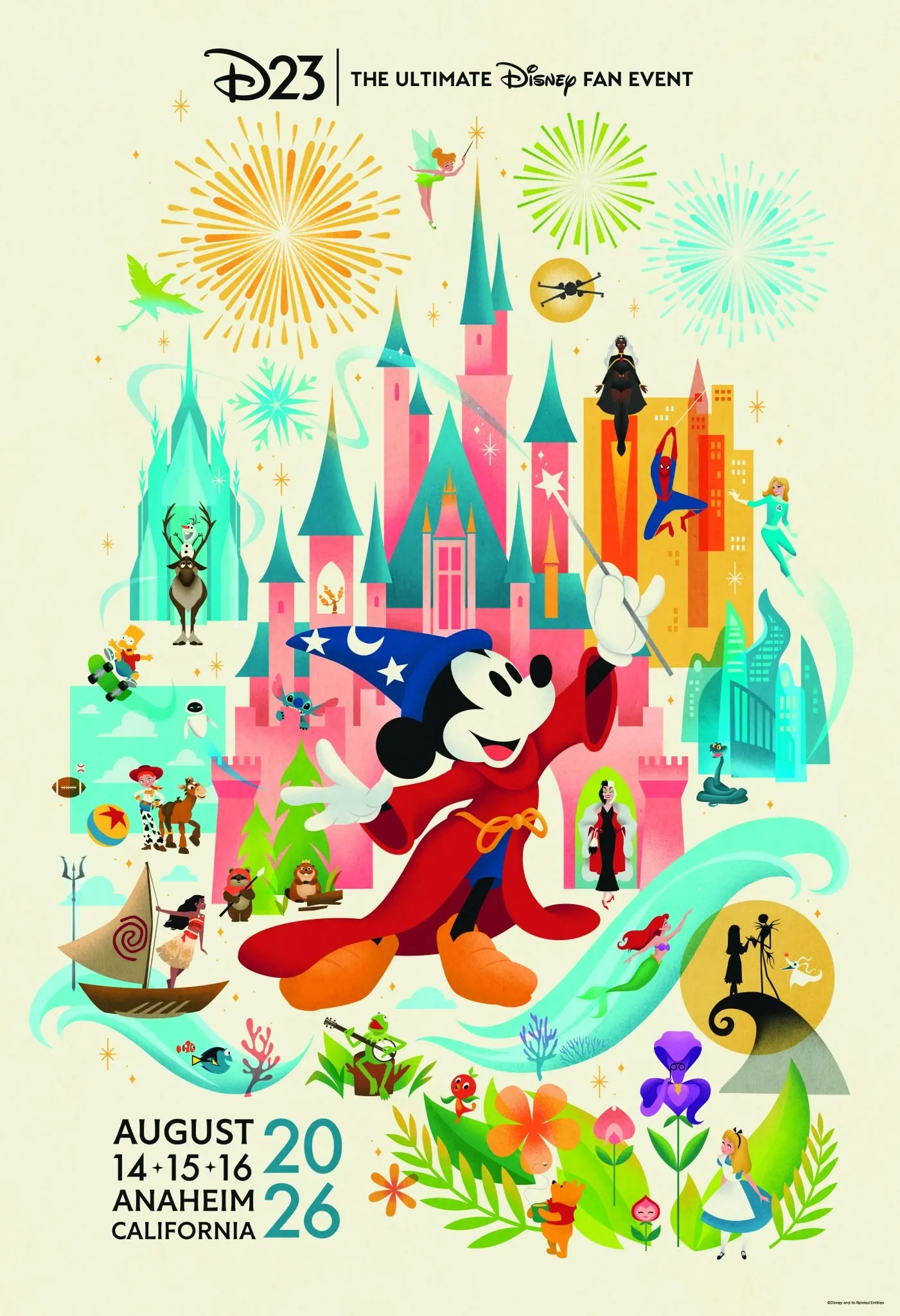
Disney D23 Expo 2026 Poster Design Sparks Big Expectations for Upcoming Projects
Amid recent buzz regarding Pixar layoffs and debates surrounding the live-action Moana character design, fans really needed a reminder of that classic Disney magic. The latest poster design for D23 Expo 2026 does just the trick. Set to take place in Anaheim, California from August 14 to 16, D23 Expo 2026 is shaping up to…
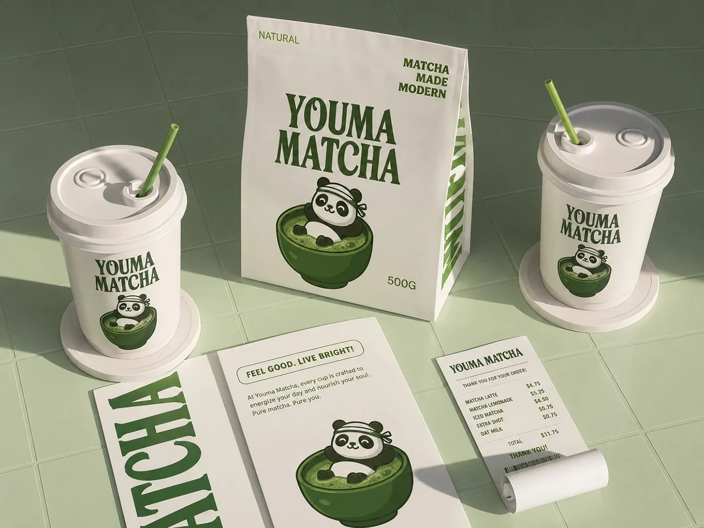
Modern Branding and Packaging Design for Youma Matcha
This brand identity project for the modern cafe Youma Matcha, designed by Jaweriya Hashmat, is all about creating peaceful moments and serving high-quality tea. The visual system features a super clean and soothing color palette of forest green, soft white, and light sage. At the center of the design is a bold serif wordmark paired…
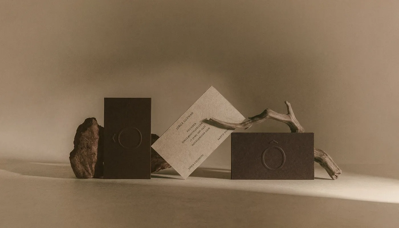
Tactile Identity Design for Hotel Rigen by Fugitiva .co
Fugitiva’s branding project for Hotel Origen delivers a beautifully tactile visual experience. The design layout effortlessly balances raw, organic textures with sophisticated typography. Born from the renovation of a historic colonial mansion, the design captures the journey from raw earth to a fully realized architectural masterpiece. Natural textures representing the pre-construction phase pair up beautifully…
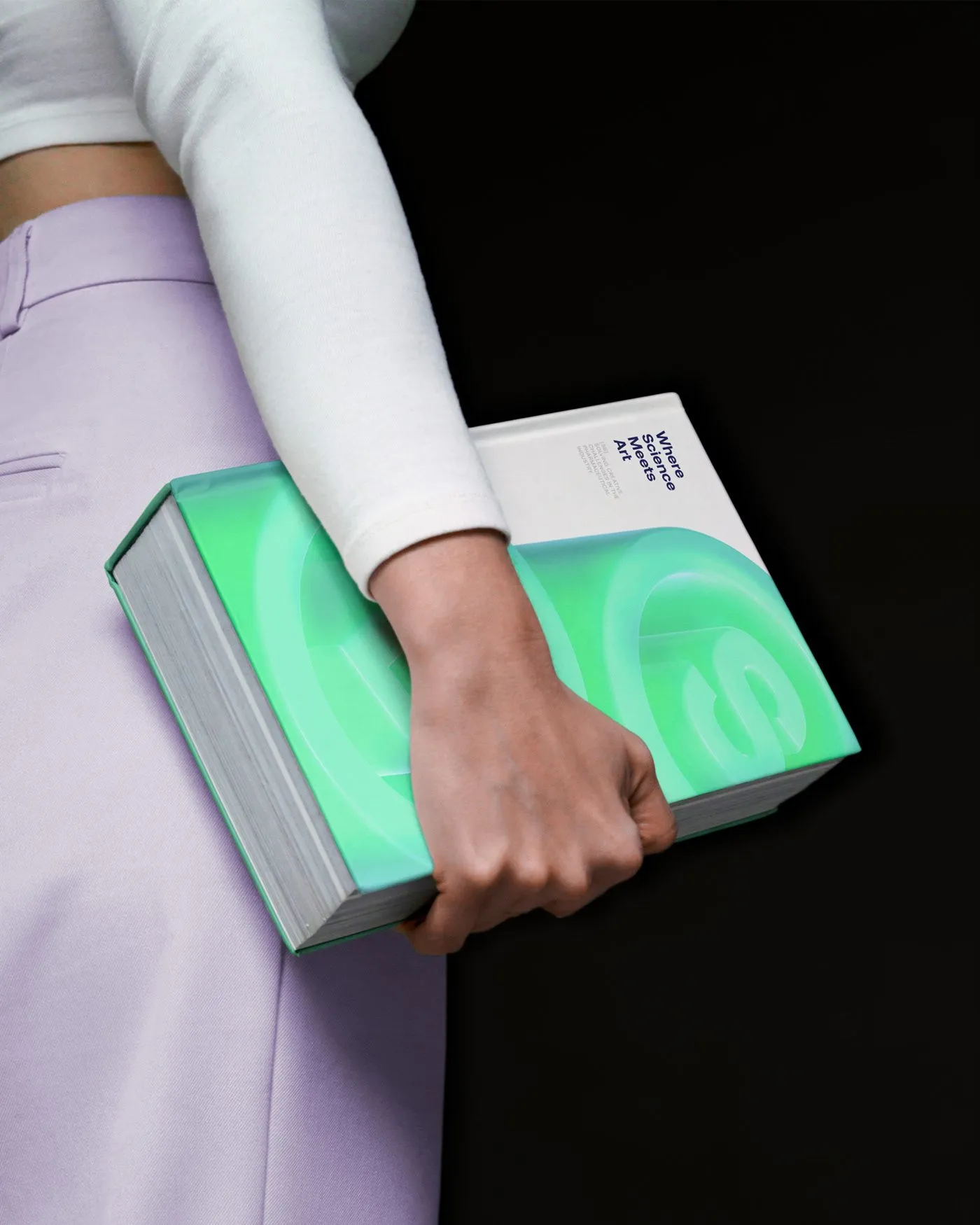
Saddington Baynes 3D Visual System and Brand Identity
London-based creative studio Saddington Baynes teamed up with Angello Torres, Fifi Lachimia, and Reliquia Studio to dream up a dynamic, motion-packed brand identity, celebrating a massive 40-year milestone in the web graphics world. The project leans heavily into stunning 3D renders that beautifully showcase the studio’s elite craftsmanship, experimenting with ultra-realistic lighting, glass refractions, and…
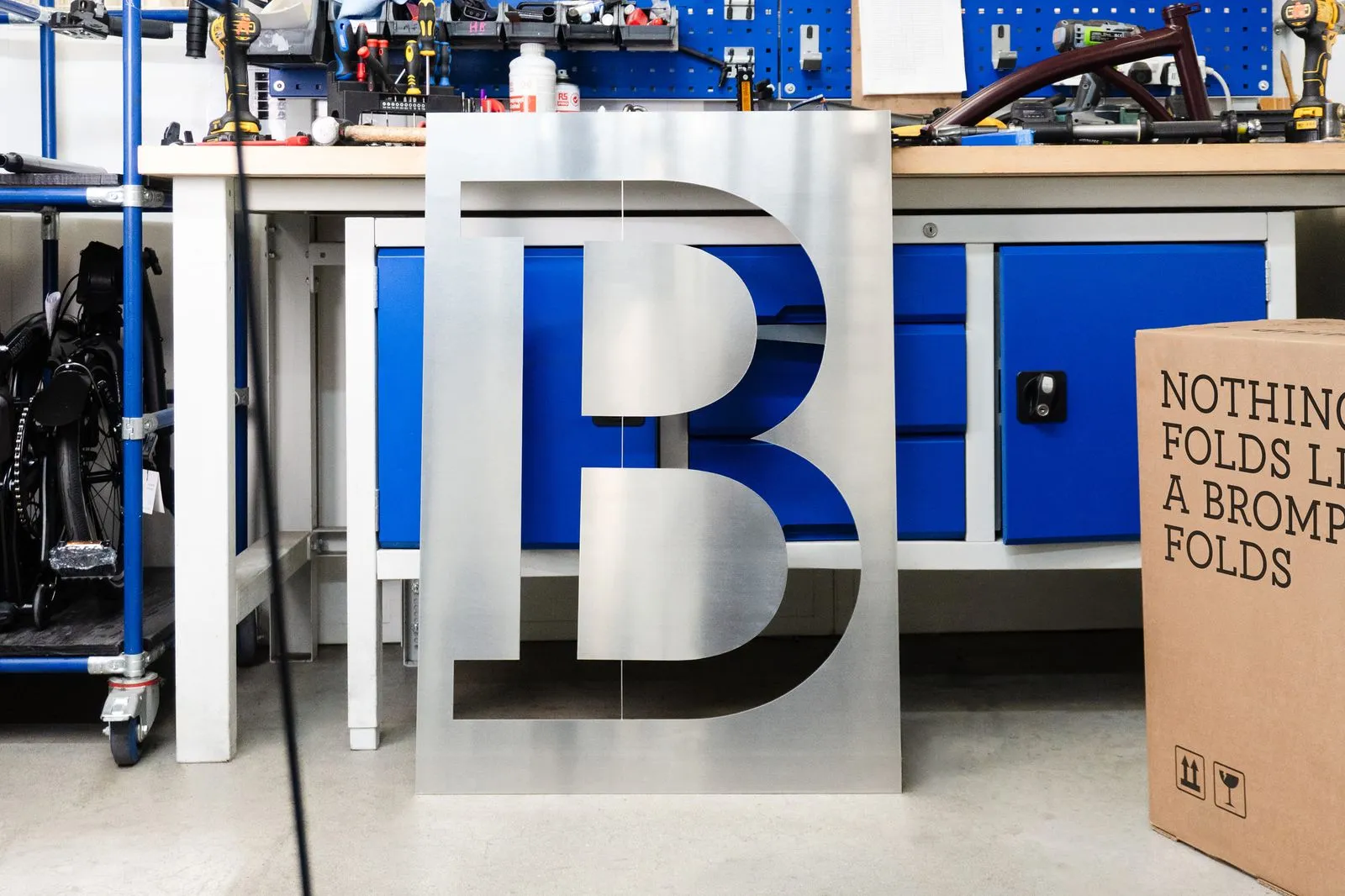
Studio Blackburn’s New Global Identity and Custom Typography for Brompton
Studio Blackburn just rolled out a massive global makeover for Brompton, the iconic folding bike brand. As Brompton expanded across Europe and Asia, the brand ran into a bit of a visual identity crisis due to inconsistent design styles. To solve this, a super slick new identity system was born, anchored by a custom-designed typeface…
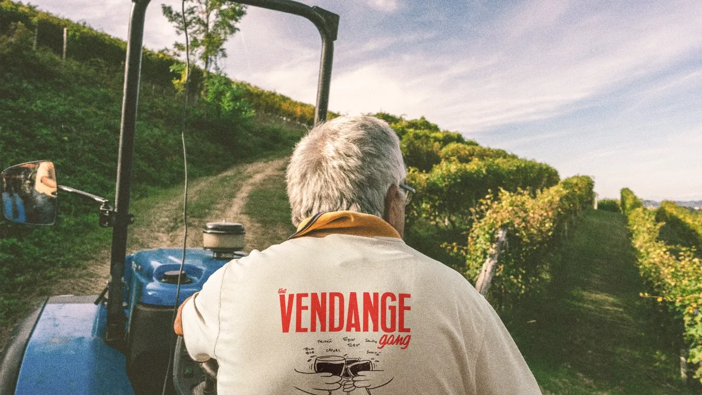
The Vendange Gang — A Lively Branding and Visual Identity for a Wine Harvest Crew
This unique brand identity project is inspired by a tight-knit group of close friends. Every year during the annual grape harvest, this crew travels from all corners of the globe to reunite at the familiar www.domaine-bersan.fr/ vineyard in the Burgundy region, run by father-and-son duo Jean-Louis and Jean-Christophe Bersan. They work hard, enjoy amazing food,…
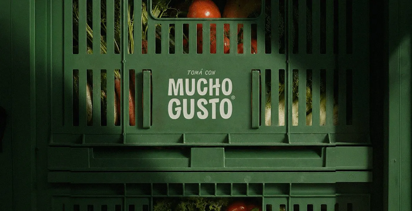
Mucho Gusto Beverage Branding and Tactile Packaging System by Sticky Studio
Sticky Studio just dropped a seriously stunning brand identity and packaging system for the beverage brand Mucho Gusto. What makes this project stand out is the brilliant focus on the tactile experience, brought to life through beautiful print techniques and a bold, oversized typography system. Instead of falling into the trap of using boring stock…
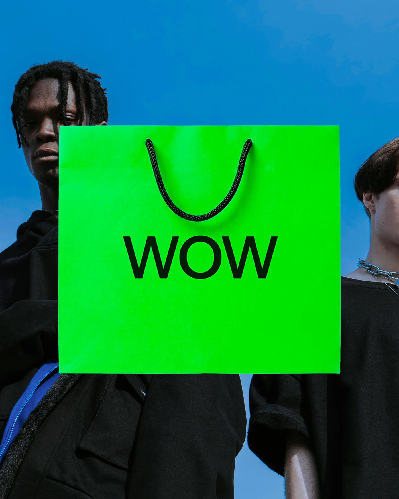
WOW Visual Identity and Print Design by Plural Branding Studio
Plural Branding Studio just dropped a super bold new visual identity for the creative platform WOW. Instead of sticking to standard corporate grids or predictable layouts, the design team built a clean, punchy brand language using custom display typography and heavy blocks of color. Wide, stretched sans-serif letterforms push right to the edges of posters…
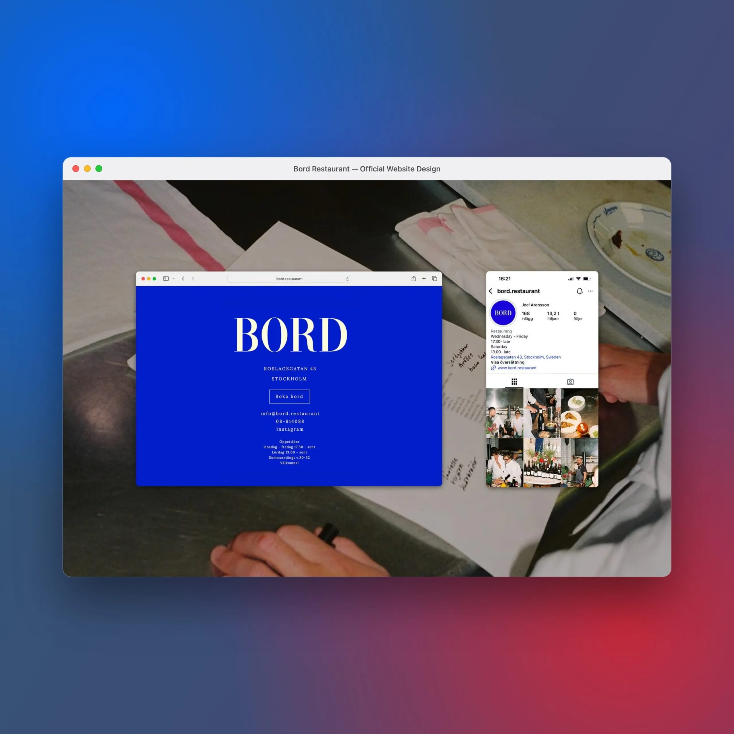
Bord Restaurant Visual Identity and Digital Branding by Several Studio
Stockholm-based Several Studio just dropped a gorgeous new visual identity for Bord, a brand-new restaurant concept by chef Joel Aronsson. Instead of following the traditional, rustic path of most eateries, this identity makes a bold statement by pairing a vibrant electric blue with a sleek, high-end serif typeface. The main wordmark features high-contrast letterforms that…
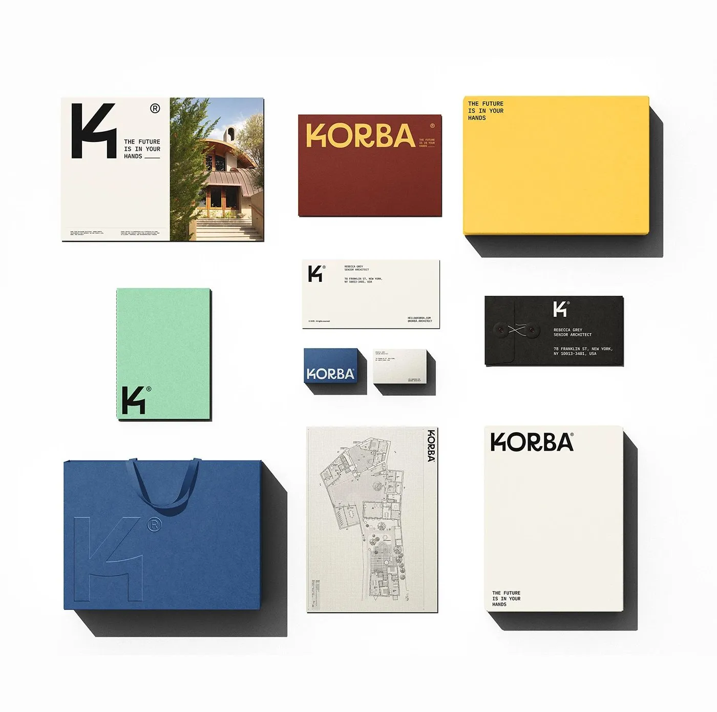
KORBA Brand Identity: A Clean Geometric Visual System for Architectural Studios
Designer Jonas Bombardelli absolutely knocked it out of the park with this brand identity for KORBA, an architecture studio. The whole system revolves around rock-solid shapes and gorgeous, tactile paper goods. Instead of falling into the usual trap of generic, minimalist studio logos, this design stands out with bold, blocky lettering paired with beautifully soft,…
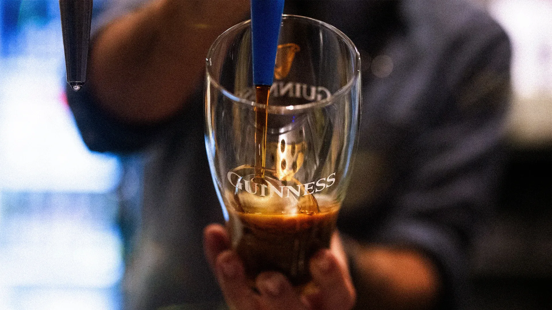
How Guinness, Corona, and Spotify Turn Customer Rituals into Branding Power
When Guinness fans talk about “Splitting the G,” they’re trying to nail that perfect first sip so the foam line lands exactly in the middle of the letter G on the pint glass. Irish bartenders will let you in on a little secret: the original target was actually the gap between the harp logo and…
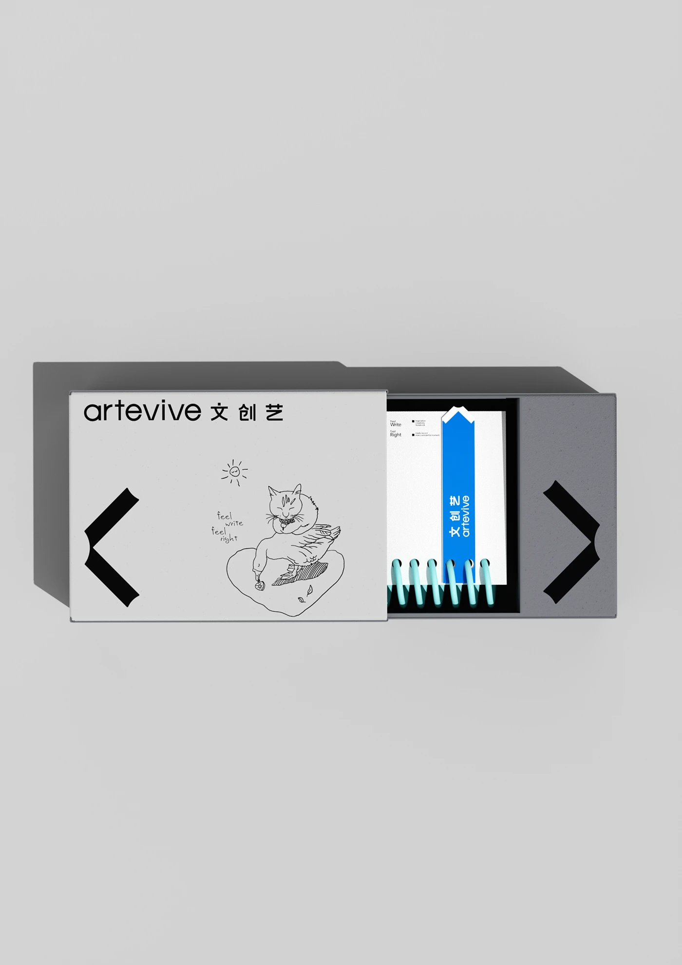
Zwqy .lab Crafts a Modern Identity Grid for Artevive
Design studio zwqy .lab just dropped a stunning makeover for Artevive’s brand identity, serving up a minimalist look that’s totally unforgettable. This fresh branding system pairs soft, organic tones with a super clean layout grid. These shapes bring a really modern sense of artistic precision to the table. Thanks to some clever typography hierarchy and…
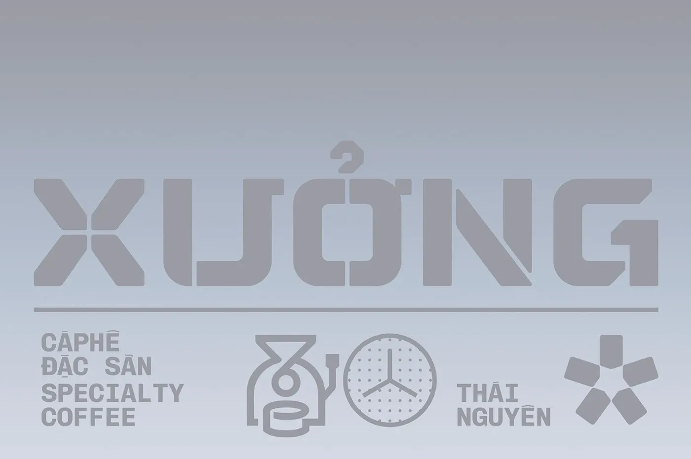
Inside the Raw and Warm Branding of Xuong Caphe by Ton Bui
Xưởng Cà phê just dropped a fresh brand identity designed by Tôn Bùi, rocking a rustic, workshop-inspired vibe. Drawing inspiration from industrial spaces, this branding feels deeply connected to authentic coffee culture. The color palette centers around the raw warmth of brown kraft paper and rich charcoal black, instantly bringing to mind freshly roasted coffee…
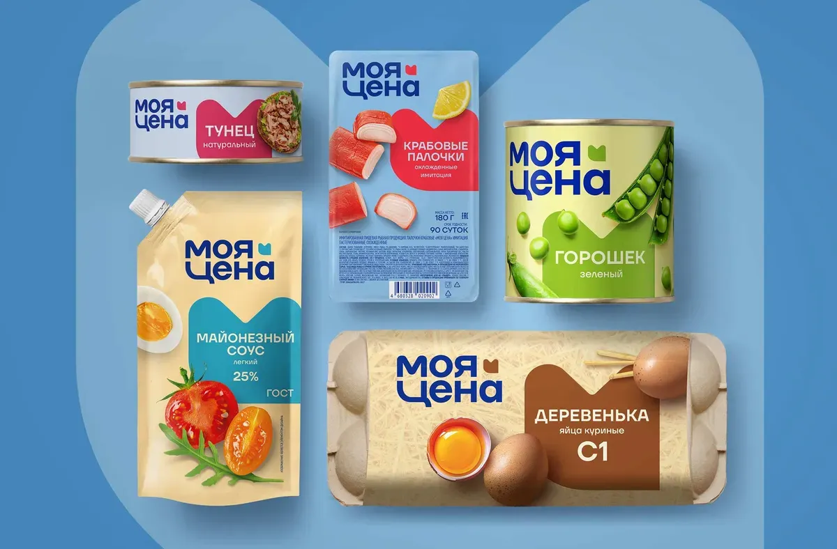
UPRISE Brings a Modern, Smart Look to Magnit’s ‘My Price’ Private Label
“Moya Cena” (which translates to “My Price”) is the budget-friendly private label of retail giant Magnit. It has long been a household name for savvy shoppers looking to save on daily essentials. With a massive lineup of over 600 products ranging from groceries to household cleaners, the brand is all about delivering the most affordable…
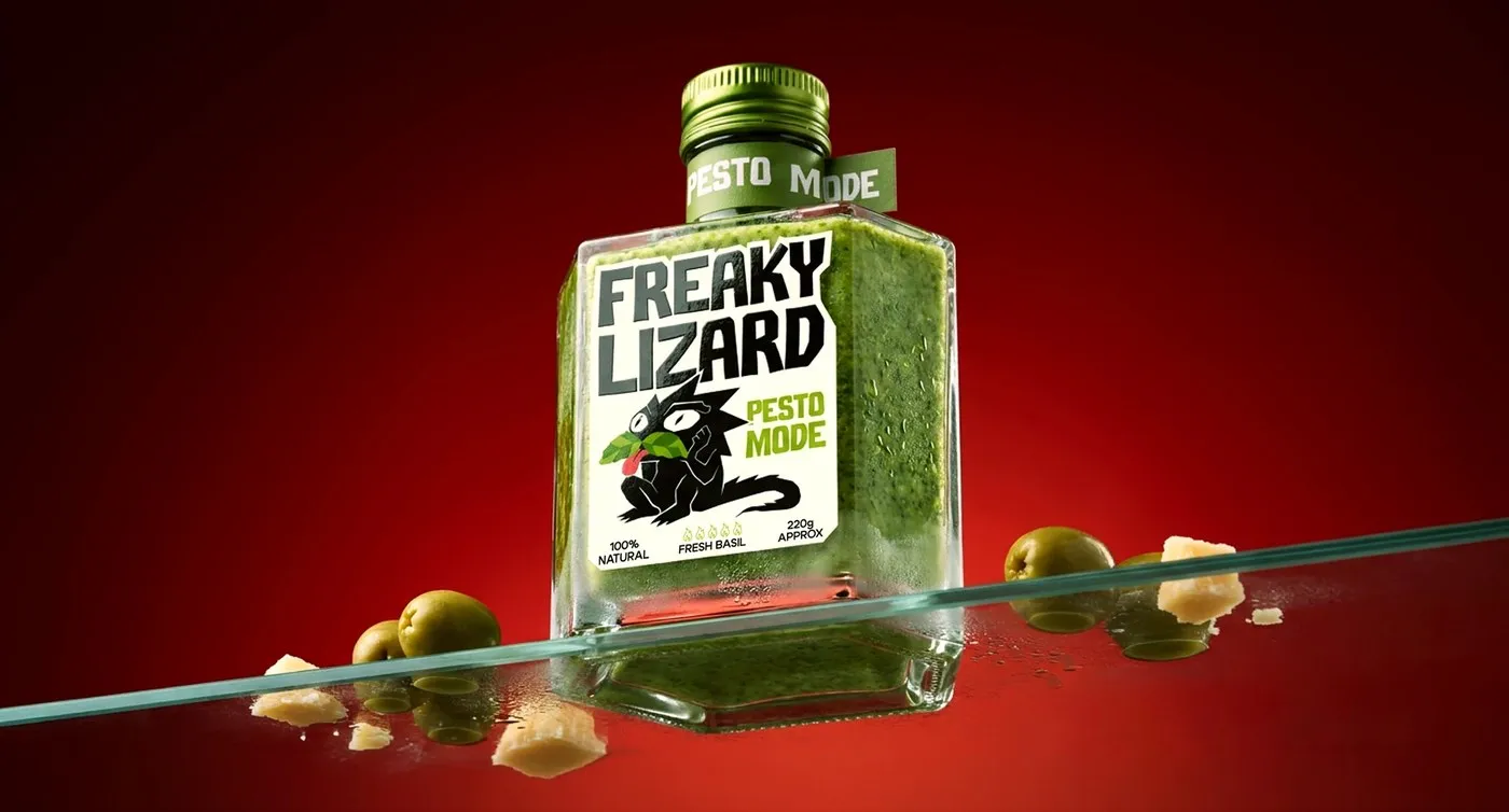
Breaking Condiment Design Rules with Freaky Lizard Packaging by Yevheniia Dutchak
Yevheniia Dutchak’s packaging design project for the Freaky Lizard brand completely breaks the mold with some seriously bold and creative bottle shapes. The real star of this identity system is the custom-designed mascot illustrations. Each sauce flavor gets its own unique lizard character, bringing a fantastic dose of humor and fun to a product category…

TBWA Unveils a Fresh and Handcrafted Global Brand Identity
Global creative network TBWA just got a fresh new look! This upgraded visual identity leans heavily into handcrafted design elements, beautifully capturing the spirit of a much more connected and powerful global collective. Led by DXD, TBWA’s very own internal global design studio, this major makeover drops just seven months after TBWA Worldwide was named…