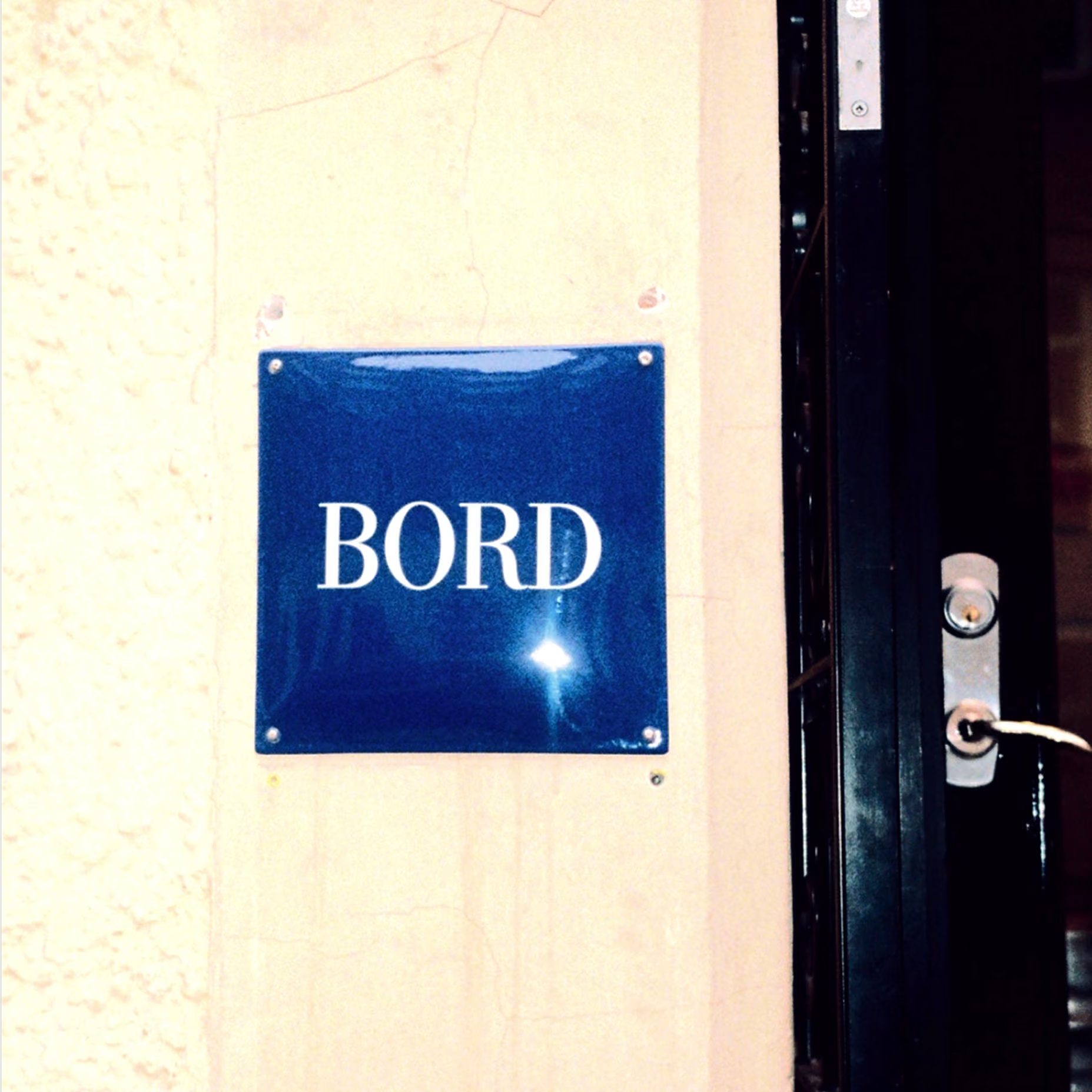
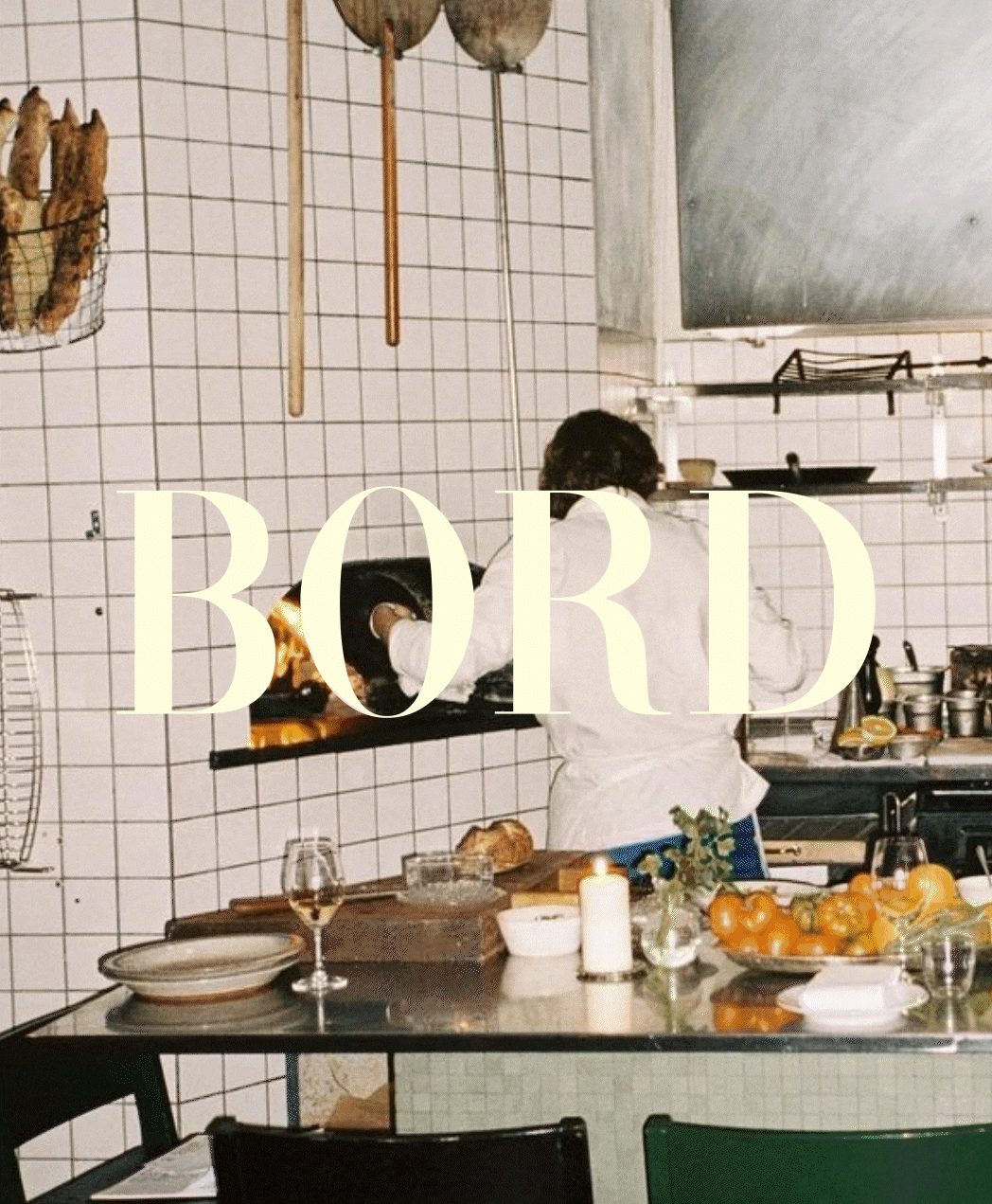
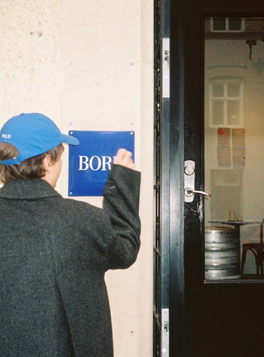
Stockholm-based Several Studio just dropped a gorgeous new visual identity for Bord, a brand-new restaurant concept by chef Joel Aronsson. Instead of following the traditional, rustic path of most eateries, this identity makes a bold statement by pairing a vibrant electric blue with a sleek, high-end serif typeface. The main wordmark features high-contrast letterforms that look incredibly sharp whether they’re on a screen or a physical sign. Right at the entrance, a glossy blue plastic sign pops against the plaster wall, instantly setting a modern and sophisticated tone. This rich blue acts as an anchor, keeping the brand perfectly consistent across all physical touchpoints. The generous breathing room around the letters is expertly calculated, keeping the layout clean and airy even against dark backdrops.
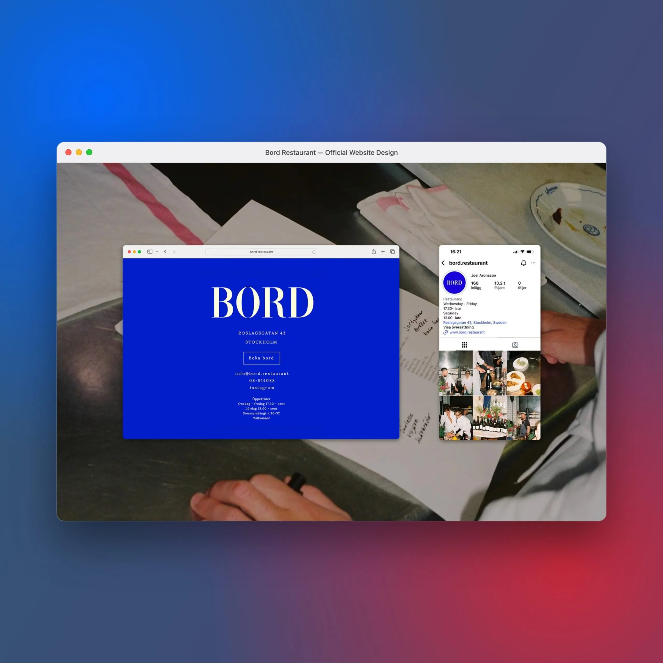
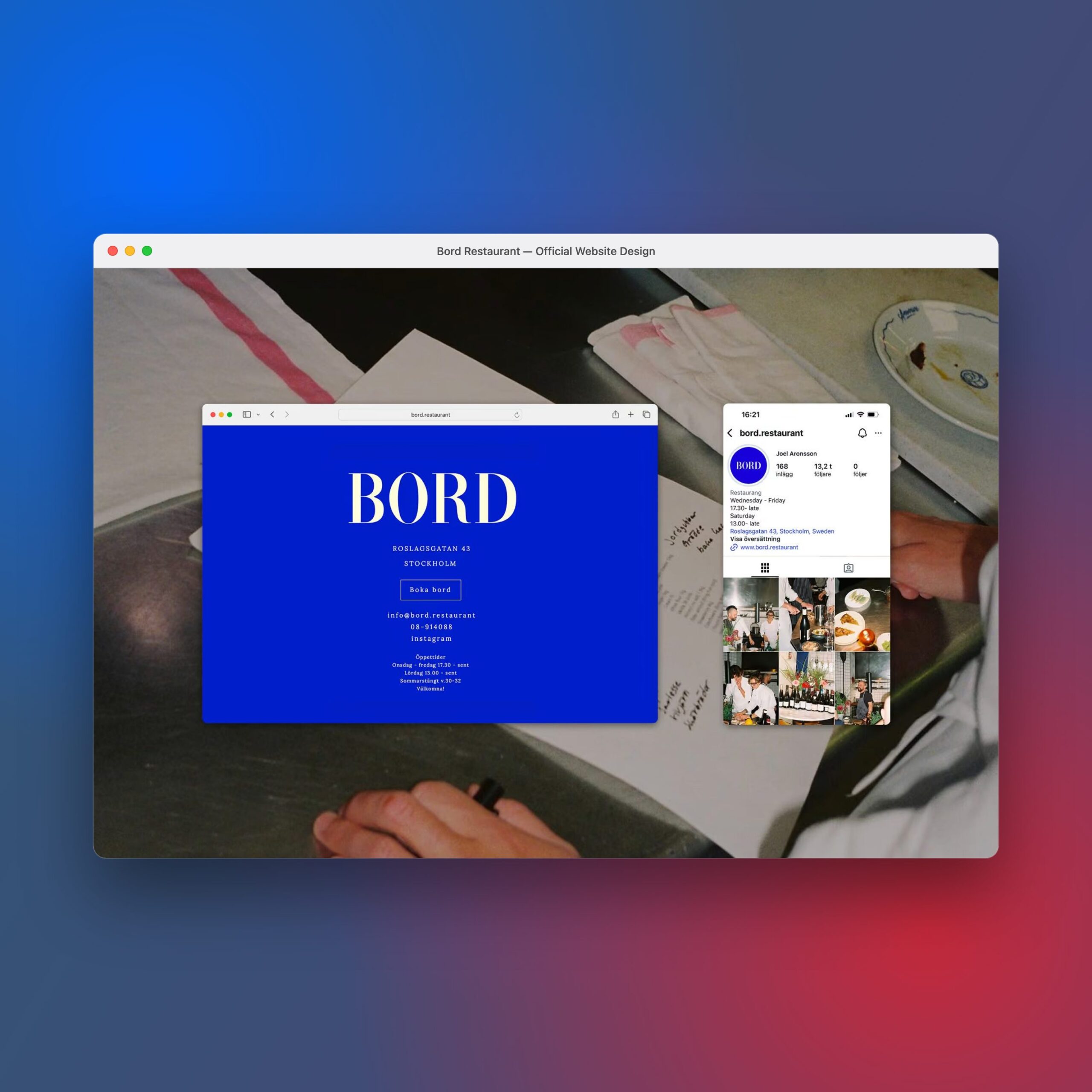
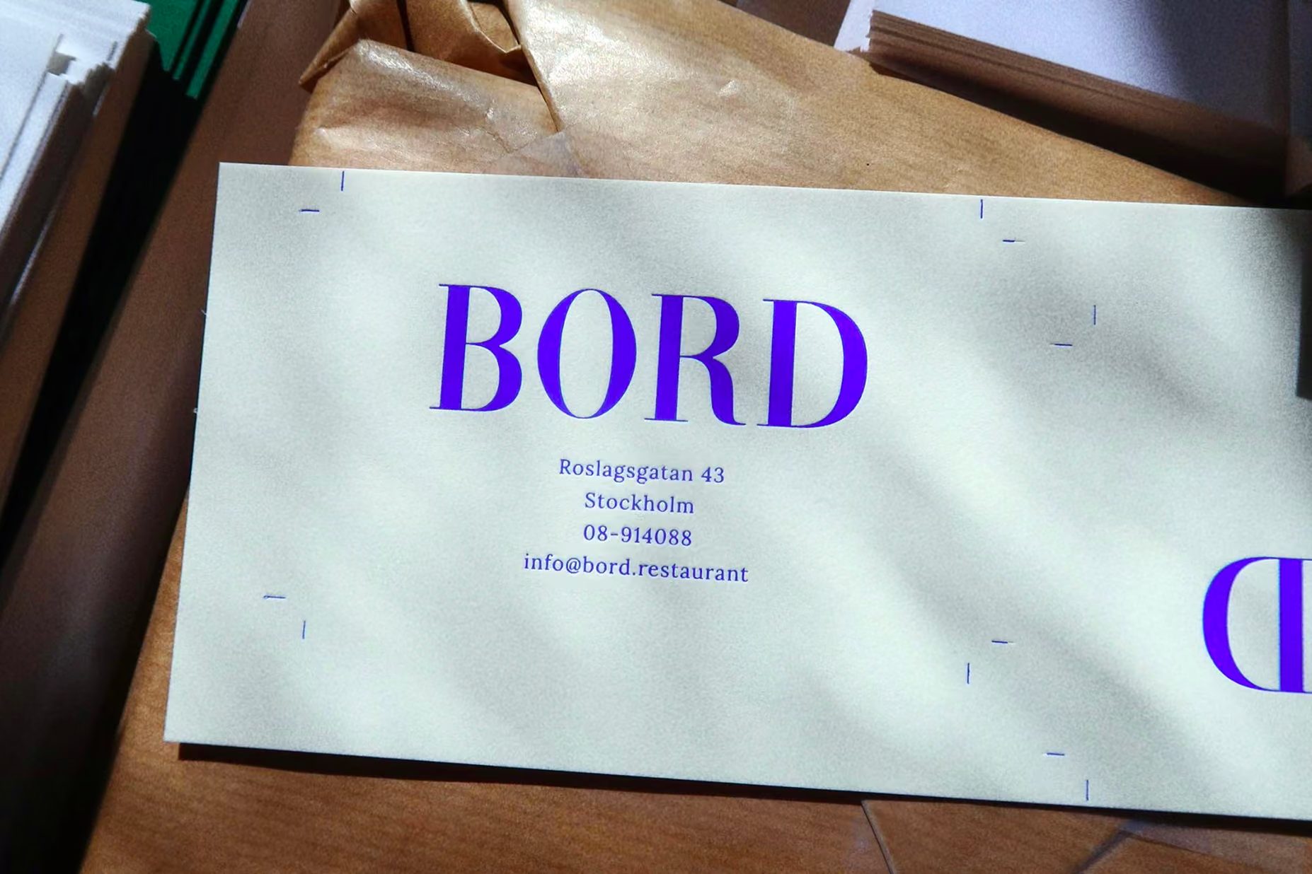
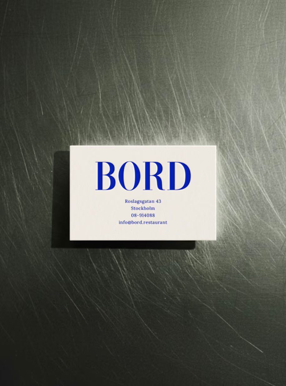
The printed collateral carries that same sharp energy onto premium paper stock. Business cards feature the blue serif typography centered beautifully on off-white paper, complete with crisp crop marks. The contrast between the restaurant’s brushed steel tables and the pristine, flat prints creates a tactile experience that connects the brand directly to the raw space. The digital identity seamlessly translates this minimalism to the web interface, using blocks of electric blue alongside a simple reservation button. A clean typographic hierarchy lets diners scan the menu effortlessly without any visual clutter. Basic grid lines neatly frame each element, bringing visual balance and a solid structure to the entire layout.
This project is a clear testament to how minimalist design choices can build a truly unforgettable brand identity. By pairing electric blue with sharp serifs from print to web, the studio created a completely unique personality for the restaurant. This approach allows the branding to perfectly complement the dining space without needing extra fluff or unnecessary decorations. Every graphic choice focuses on keeping physical items highly aesthetic and functional. Every single detail shows incredible focus and an understated, magnetic charm. To check out the full project and dive into the web layouts, head over to the www.several.club/work/bord.
Studio Several tại Stockholm vừa trình làng bộ nhận diện thương hiệu cho Bord, một nhà hàng mới toanh của đầu bếp Joel Aronsson. Bộ nhận diện này lại tạo điểm nhấn mạnh mẽ khi kết hợp tông màu xanh electric rực rỡ cùng font chữ serif sang xịn mịn. Phần wordmark chính sử dụng các nét chữ có độ tương phản cao, nhìn vô cùng sắc nét dù là trên màn hình hay trên biển hiệu ngoài đời thực. Ngay từ lối vào, chiếc biển tên bằng nhựa bóng loáng màu xanh dương nổi bật trên nền tường thạch cao đã thiết lập ngay một cảm giác hiện đại và tinh tế. Tông màu xanh đậm đà này chính là chiếc “neo” giữ tính đồng bộ cho toàn bộ thương hiệu trên các vật phẩm vật lý. Khoảng trắng xung quanh các chữ cái cũng được tính toán kỹ lưỡng, giúp bố cục trông thoáng đãng và dễ thở hơn trên nền tối.
Các ấn phẩm in ấn cũng nối tiếp tinh thần sắc sảo đó trên chất liệu giấy cao cấp. Danh thiếp được thiết kế với phần chữ màu xanh serif nằm ngay ngắn ở trung tâm trên nền giấy trắng ngà, kèm theo các đường căn góc crop marks sắc nét. Sự tương phản giữa những chiếc bàn làm từ thép xước và các bản in thử phẳng phiu tạo nên một cảm giác chân thực, kết nối thương hiệu với không gian thô mộc của nhà hàng. Hệ thống nhận diện kỹ thuật số cũng mang sự tinh giản này lên giao diện web, sử dụng mảng màu xanh electric làm chủ đạo đi kèm nút đặt bàn đơn giản. Hệ thống phân cấp chữ typography rõ ràng giúp thực khách dễ dàng lướt qua menu mà không bị rối mắt. Những đường lưới basic khung gọn từng yếu tố in ấn, mang lại sự cân bằng thị giác và cảm giác chắc chắn.
Dự án này là minh chứng rõ ràng cho thấy những lựa chọn thiết kế tinh gọn hoàn toàn có thể tạo nên một nhận diện thương hiệu khó quên. Bằng cách bắt cặp tông màu xanh electric với font serif sắc sảo xuyên suốt từ bản in cho đến nền tảng web, studio đã tạo nên một cá tính độc bản cho nhà hàng. Cách làm này giúp bộ nhận diện hỗ trợ tối đa cho không gian ăn uống mà không cần thêm thắt các chi tiết trang trí rườm rà. Mọi lựa chọn đồ họa đều hướng tới việc giữ cho các vật phẩm thực tế đạt độ thẩm mỹ và dễ đọc nhất khi sử dụng. Từng chi tiết nhỏ đều thể hiện sự tập trung cao độ và một sức hút ngầm đầy tinh tế. Để xem chi tiết toàn bộ dự án và các giao diện web, mọi người có thể ghé thăm www.several.club/work/bord.