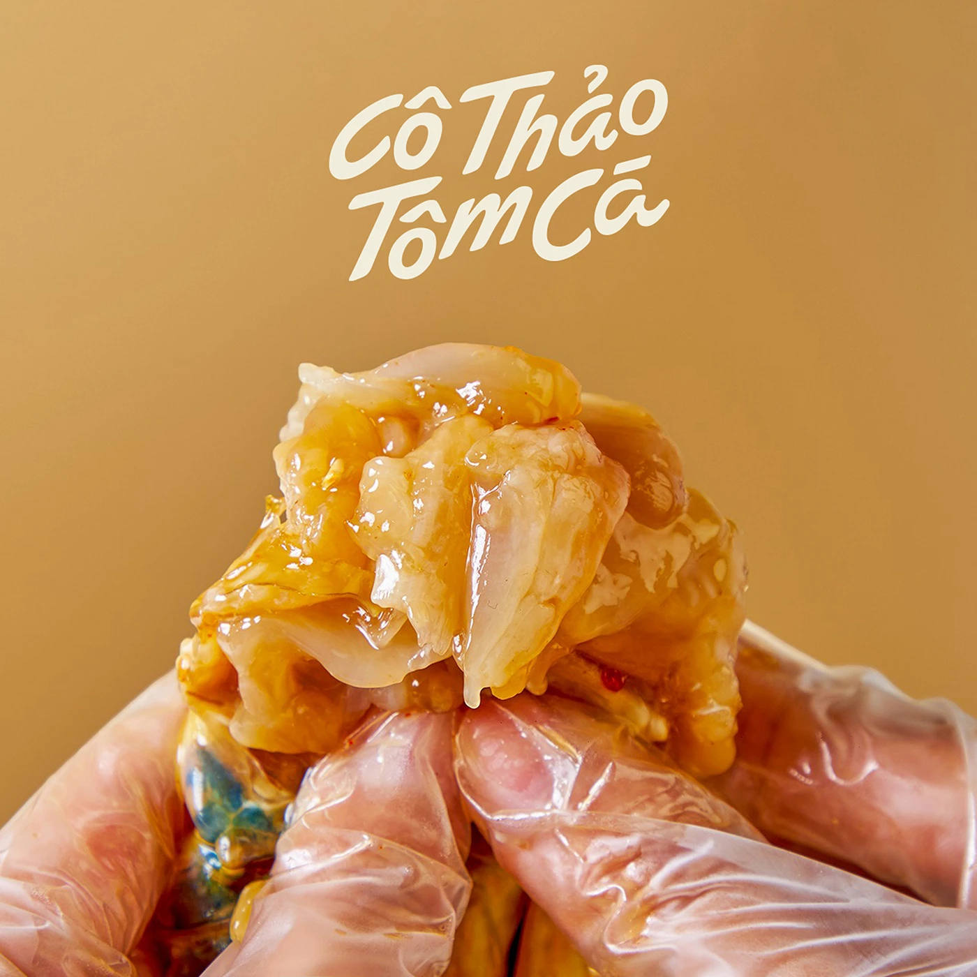
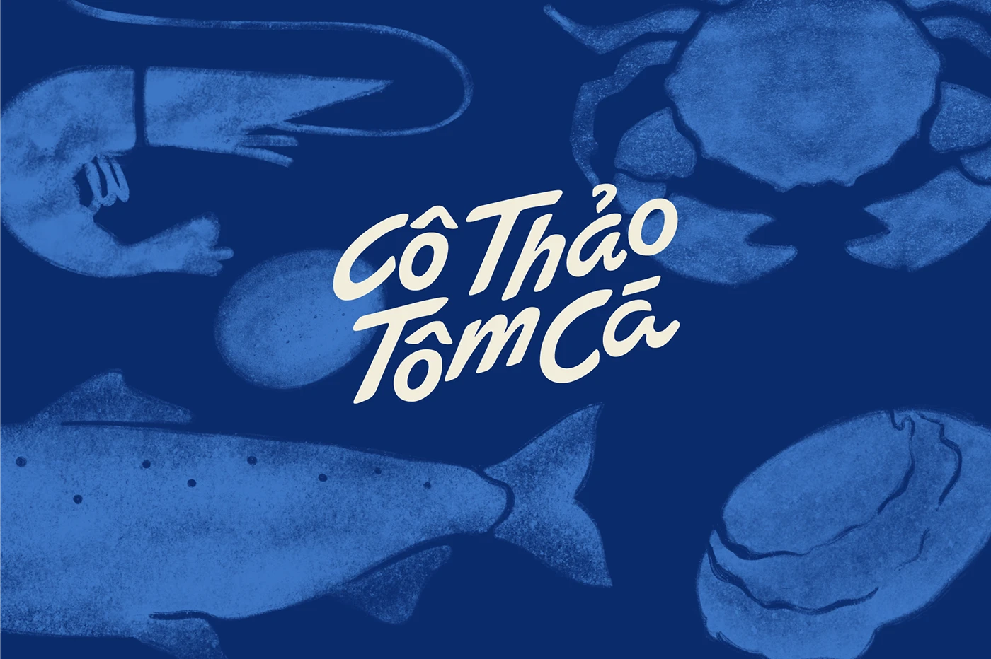
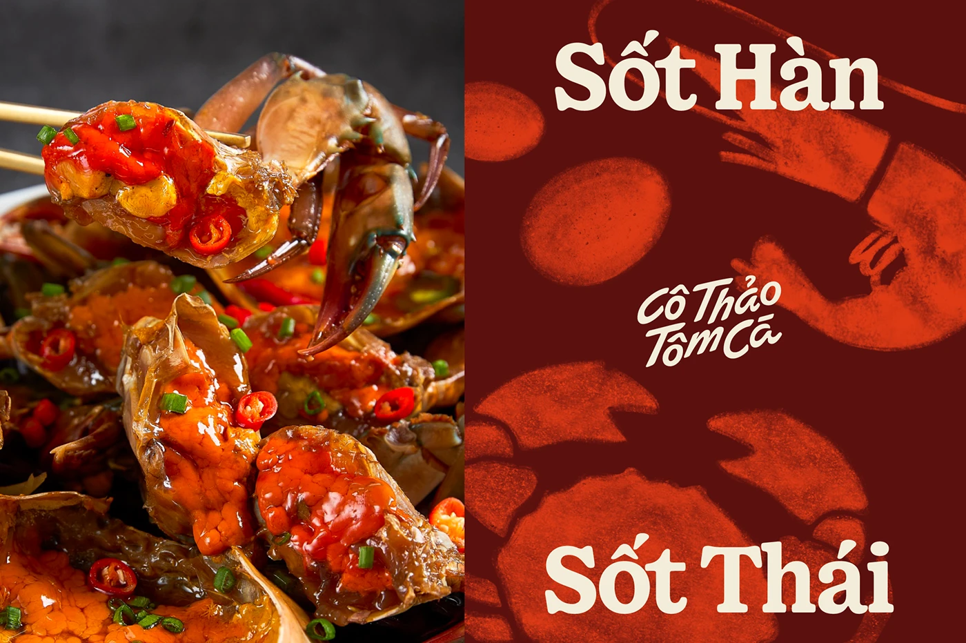
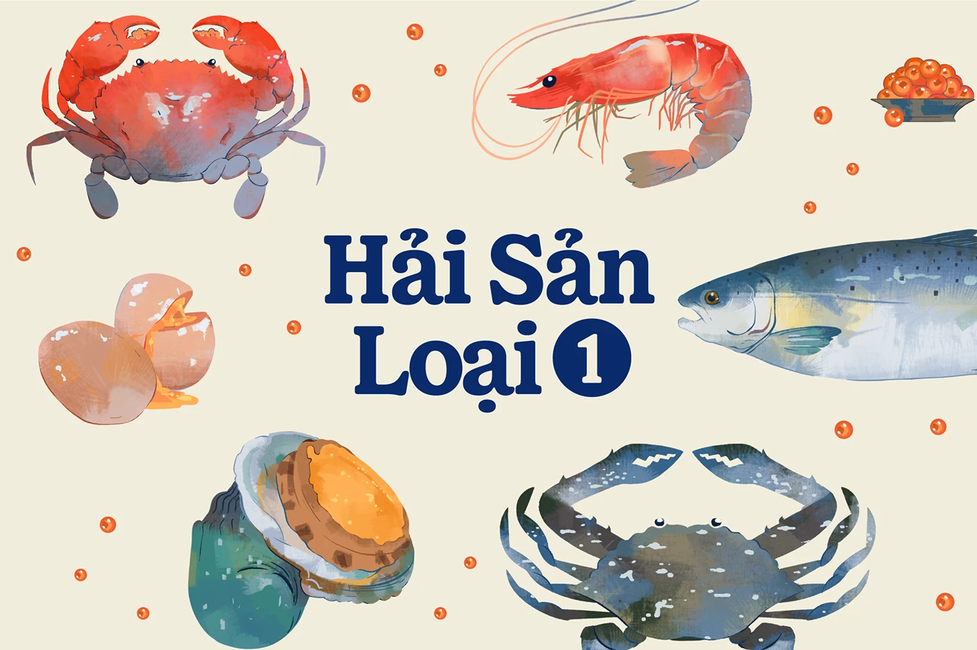
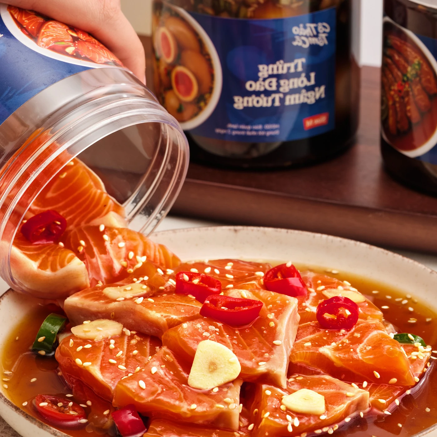
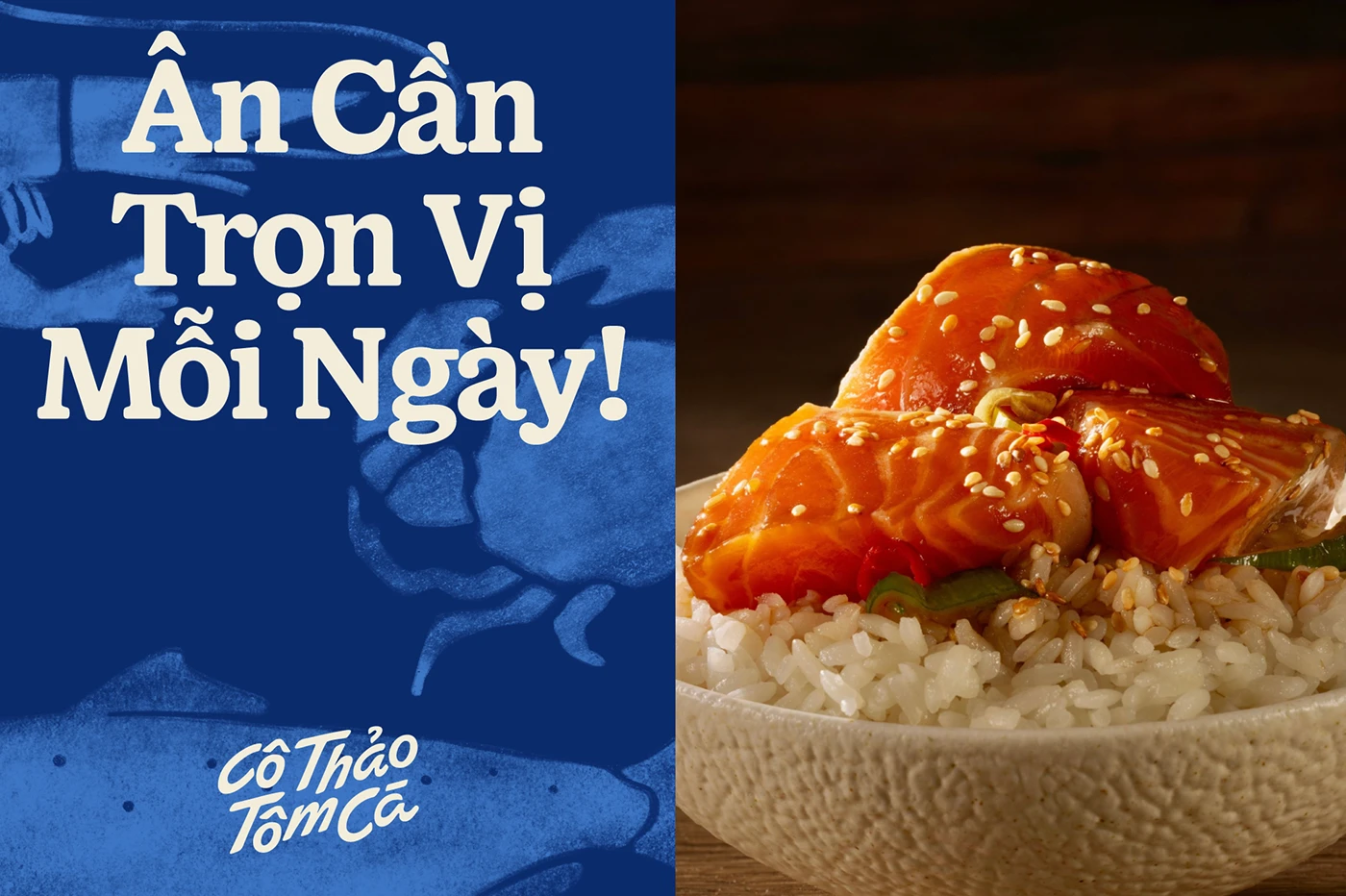
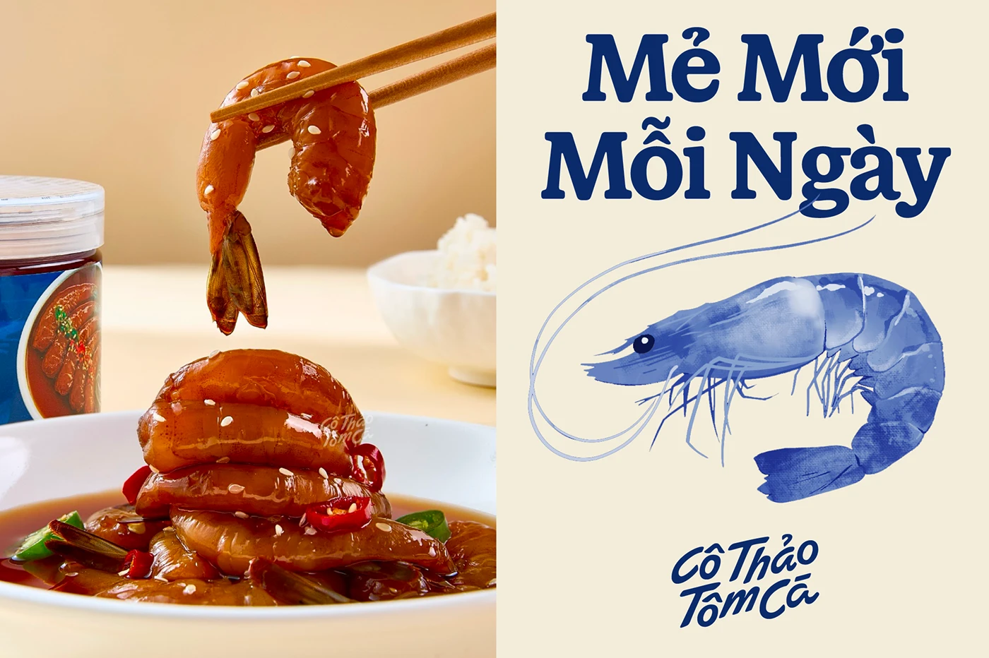

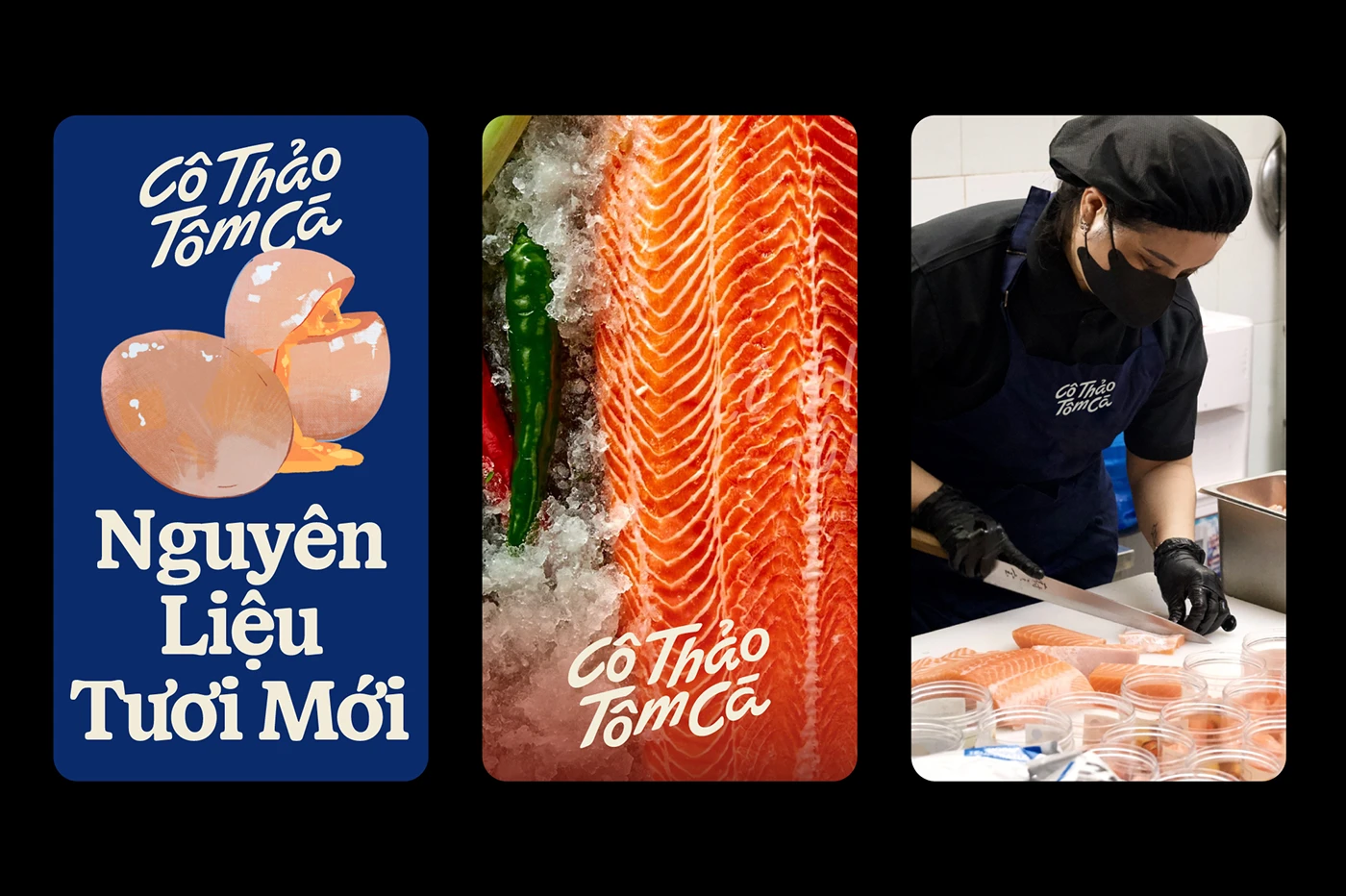
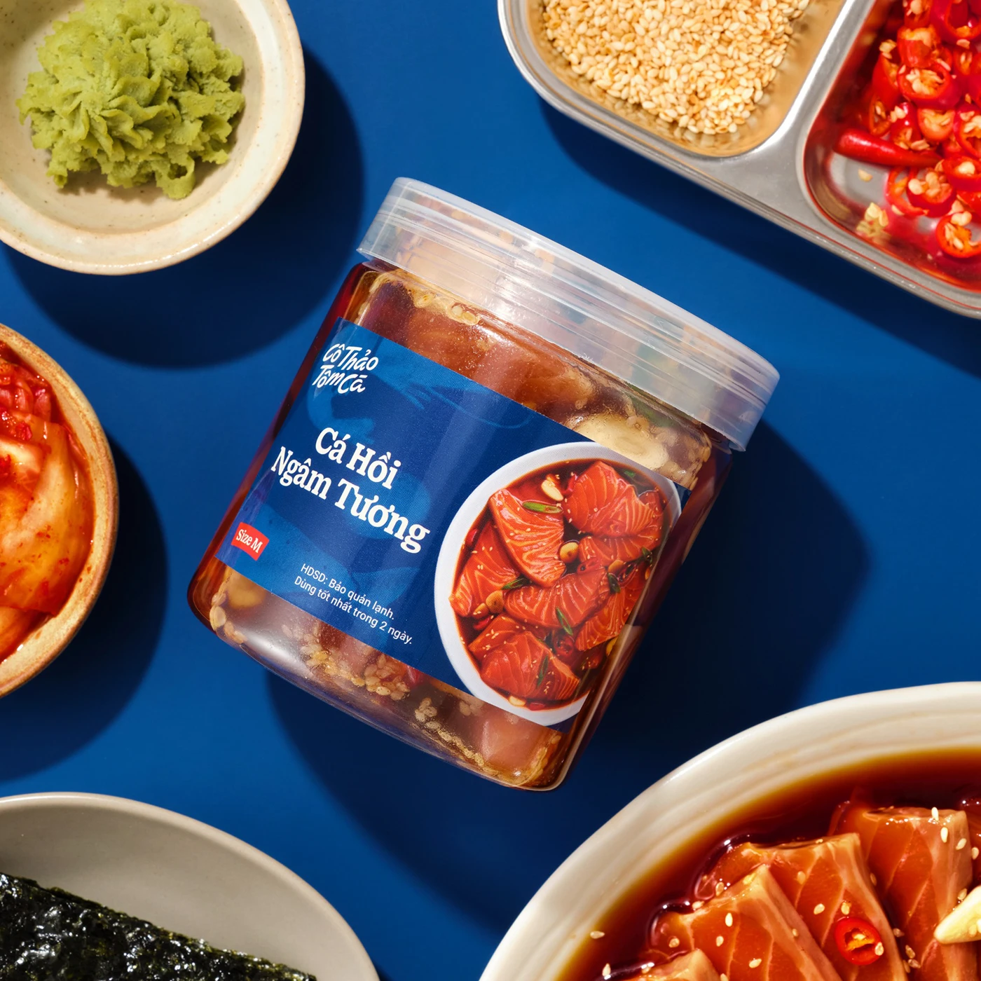
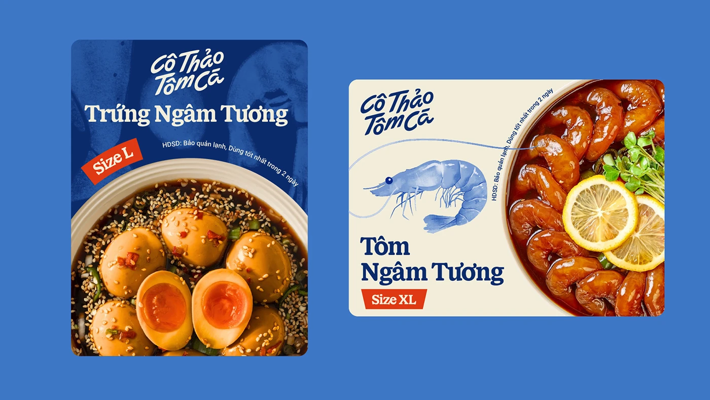
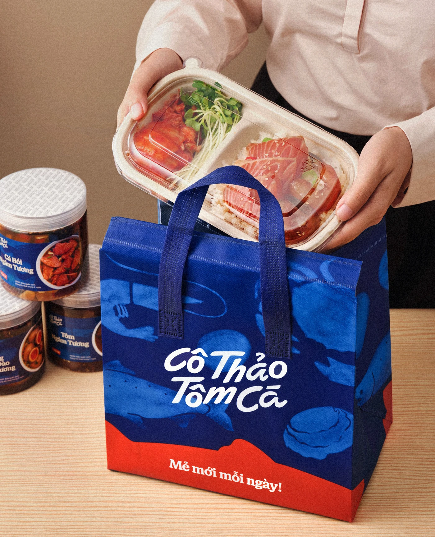
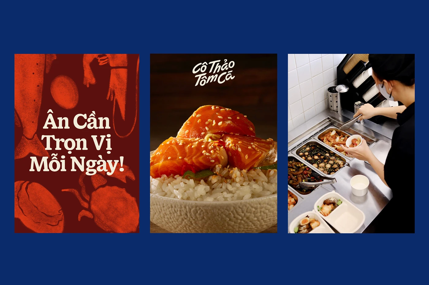
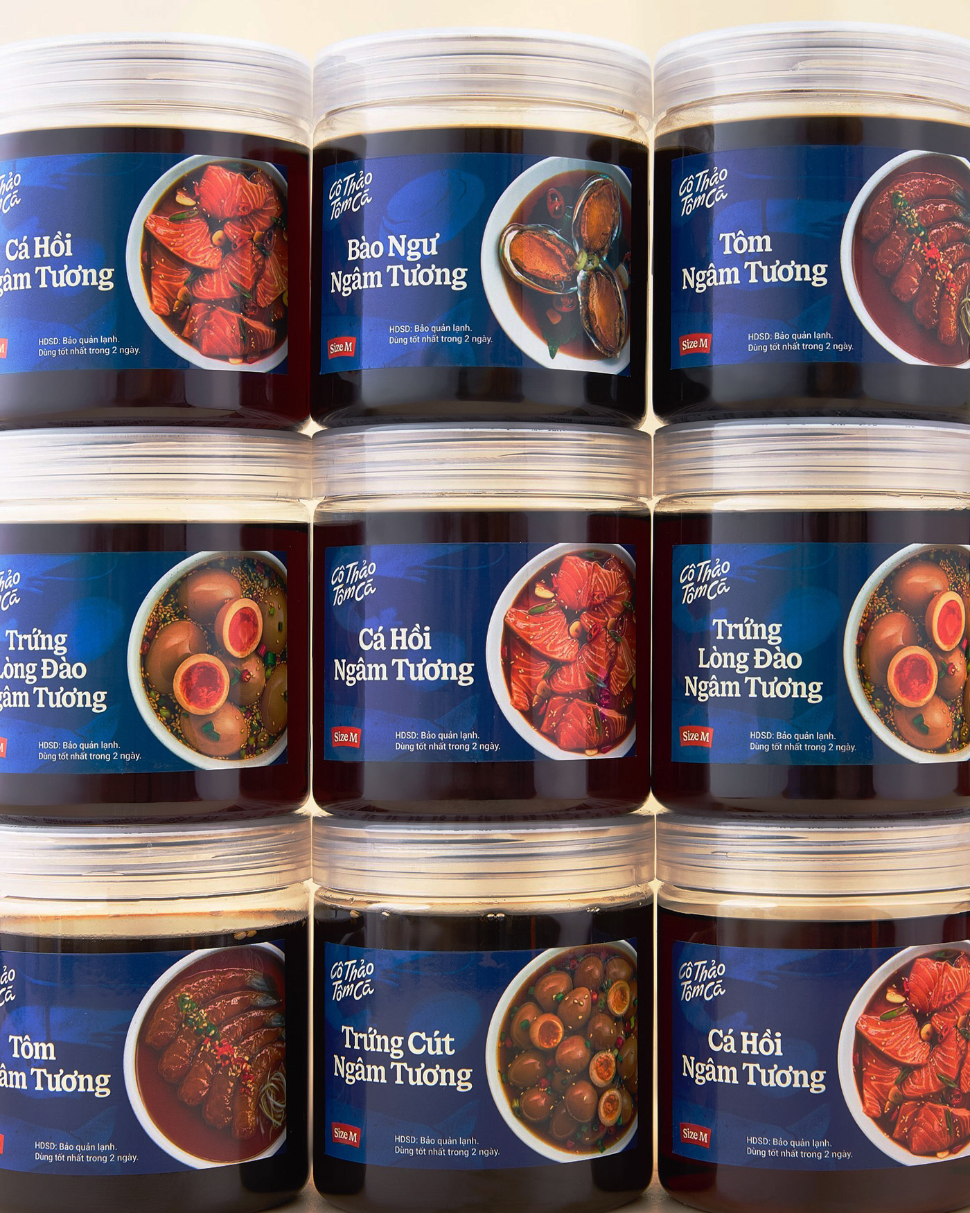
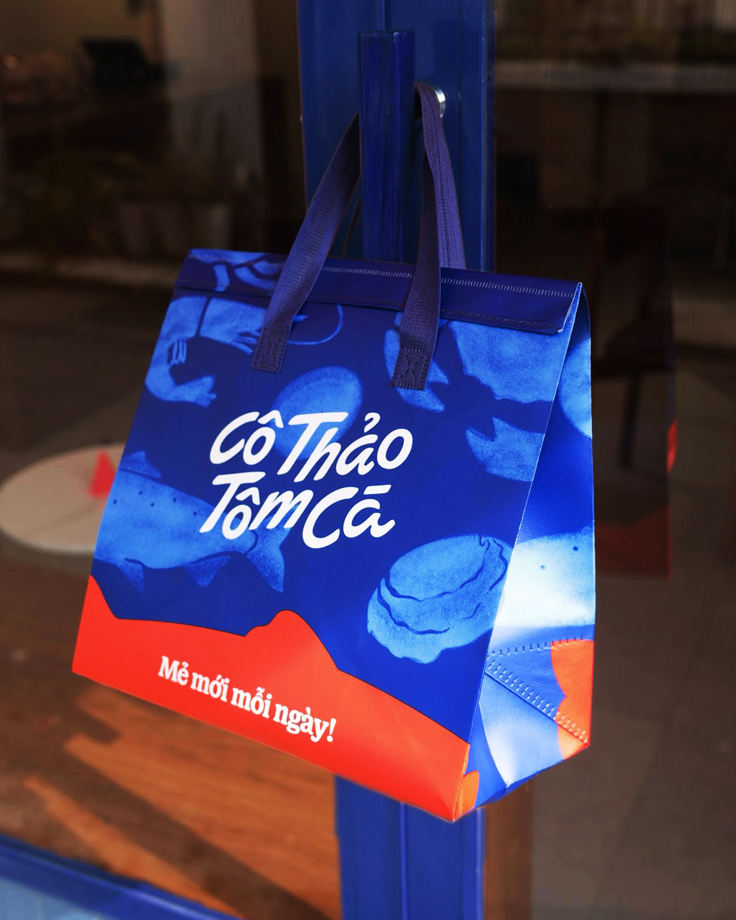
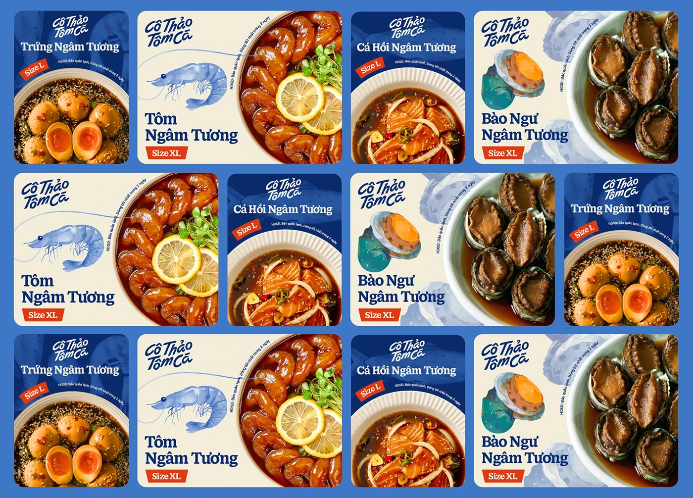
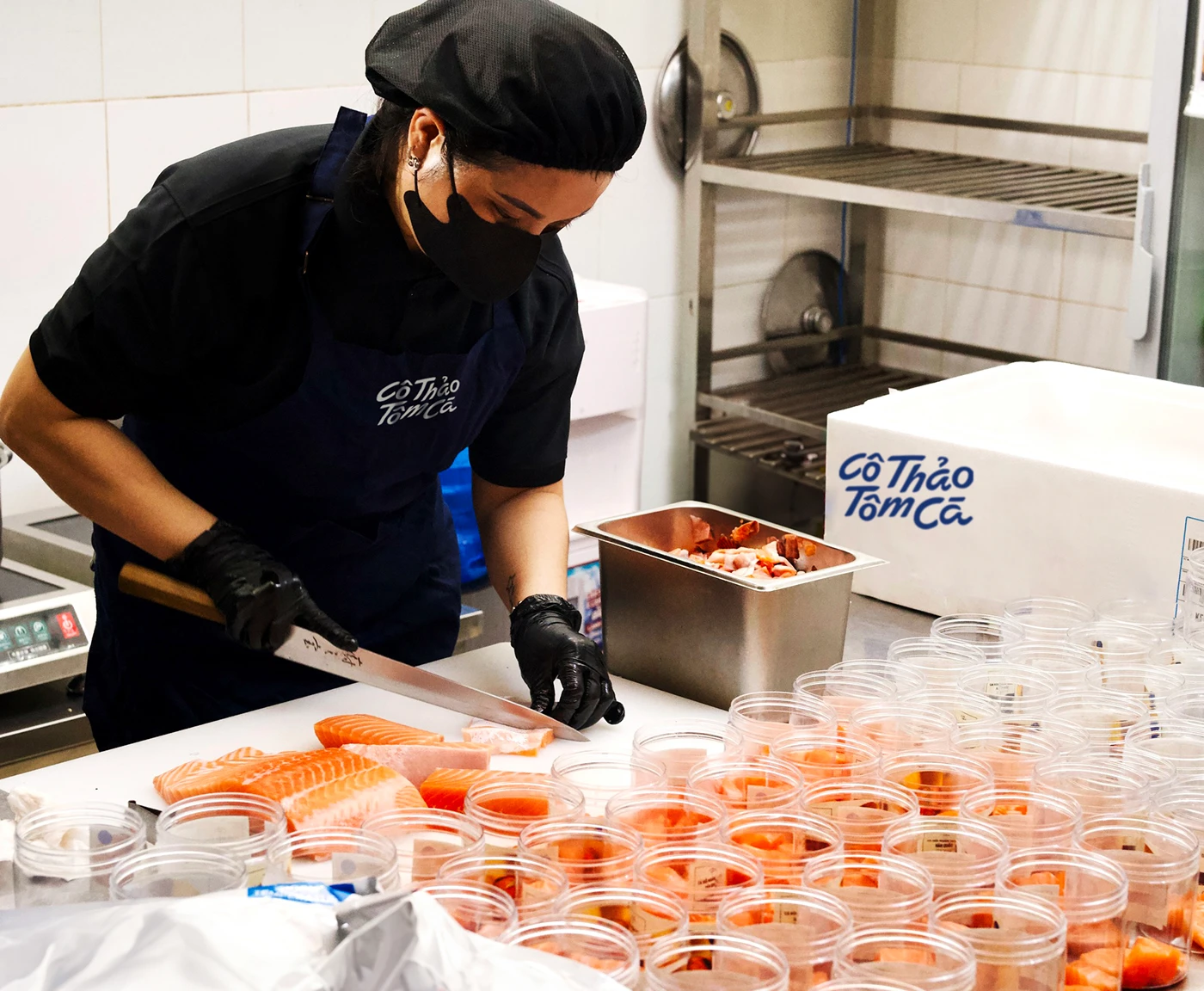
The branding project for Cô Thảo Tôm Cá brings a completely fresh, eye-catching, and modern look to the table. This brand specializes in premium, ultra-fresh seafood—like shrimp, crab, and fish—paired with a rich, exclusive soy sauce marinade inspired by bold Korean and Thai flavors. With a mission to elevate the gourmet seafood delivery experience, the brand focuses heavily on top-tier ingredients and daily, small-batch preparation.
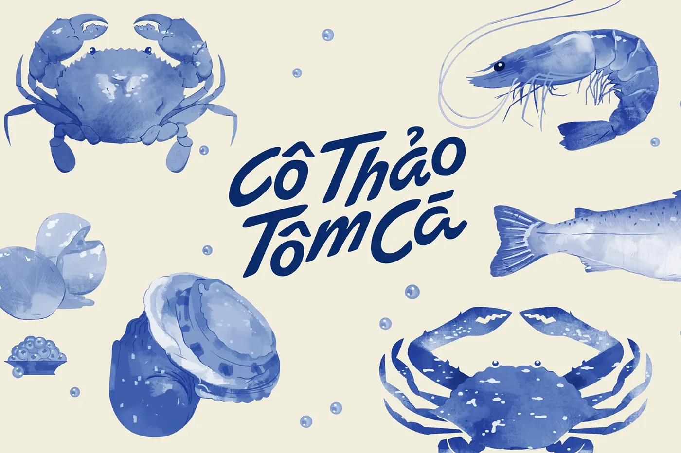
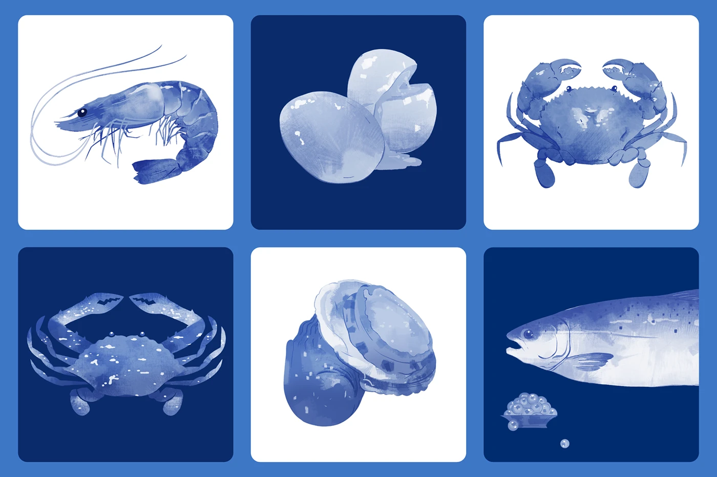
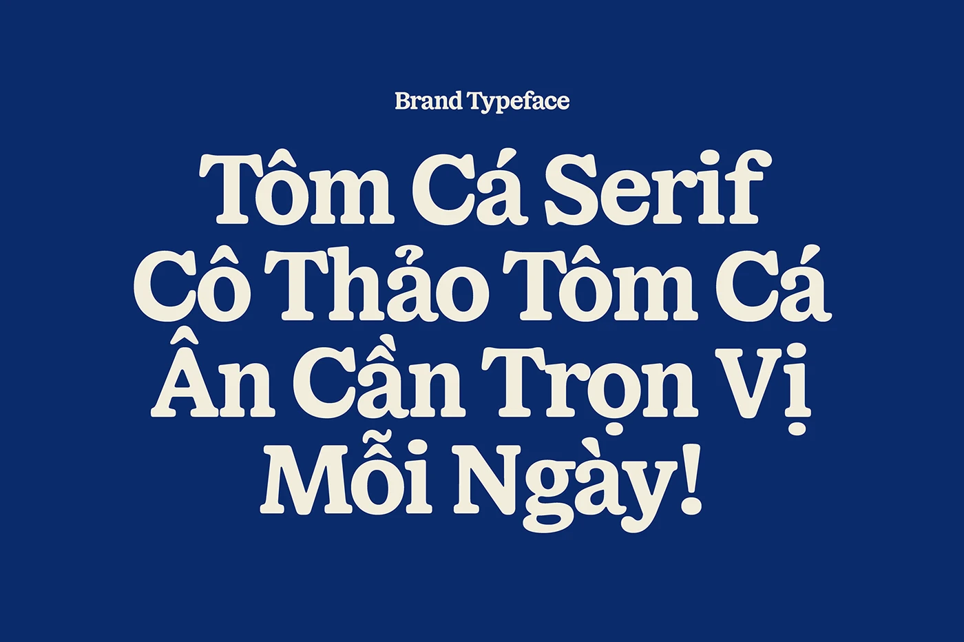
This new visual identity beautifully celebrates the care and heart poured into the cooking process. The emotional, cozy illustrations instantly create a warm and welcoming vibe. A standout feature is the custom typeface, Tôm Cá Serif, which flows with the same smooth, organic motion as the savory marinade. Even the color palette feels deliciously deliberate, drawing from the rich, buttery orange of their signature marinated salmon, balanced by a refreshed green that keeps the whole look crisp, vibrant, and perfectly on-trend.
Credits to the talented team behind the project:
- Design Director & Brand Designer: Huỳnh Minh Thống
- Logo Lettering: Lan Anh Ng
- Type Designer: Đinh Hải
- Illustrator: Trường Thạnh
- Visual Designer: Astro
- Project Manager: Tú Uyên
Dự án thương hiệu Cô Thảo Tôm Cá mang đến một diện mạo hoàn toàn mới, cực kỳ bắt mắt và hiện đại. Đây là thương hiệu chuyên cung cấp các dòng hải sản tươi sạch như tôm, cua, cá kết hợp cùng nước tương độc quyền đậm đà mang phong vị Hàn Quốc và Thái Lan. Với mục tiêu nâng tầm trải nghiệm giao hàng hải sản ngâm tương cao cấp, thương hiệu luôn chú trọng vào chất lượng nguyên liệu loại một và quy trình chế biến mẻ mới mỗi ngày.
Hệ thống visual identity mới lần này tôn vinh trọn vẹn sự chỉn chu và cái tâm của người nấu. Điểm cộng lớn nằm ở phần minh họa giàu cảm xúc, tạo cảm giác vô cùng gần gũi và ấm cúng. Đặc biệt, font chữ custom độc quyền Tôm Cá Serif được lấy cảm hứng từ chính sự uyển chuyển, mềm mại của dòng nước tương ngâm. Bảng màu của dự án cũng được phát triển từ sắc cam béo ngậy của món cá hồi ngâm tương đặc trưng, đi kèm với màu xanh lá được tinh chỉnh lại giúp tổng thể giao diện trông tươi mới và bắt kịp xu hướng hơn.
Dự án được hoàn thiện bởi đội ngũ:
- Design Director & Brand Designer: Huỳnh Minh Thống
- Lettering logo: Lan Anh Ng
- Type designer: Đinh Hải
- Illustrator: Trường Thạnh
- Visual designer: Astro
- Project manager: Tú Uyên