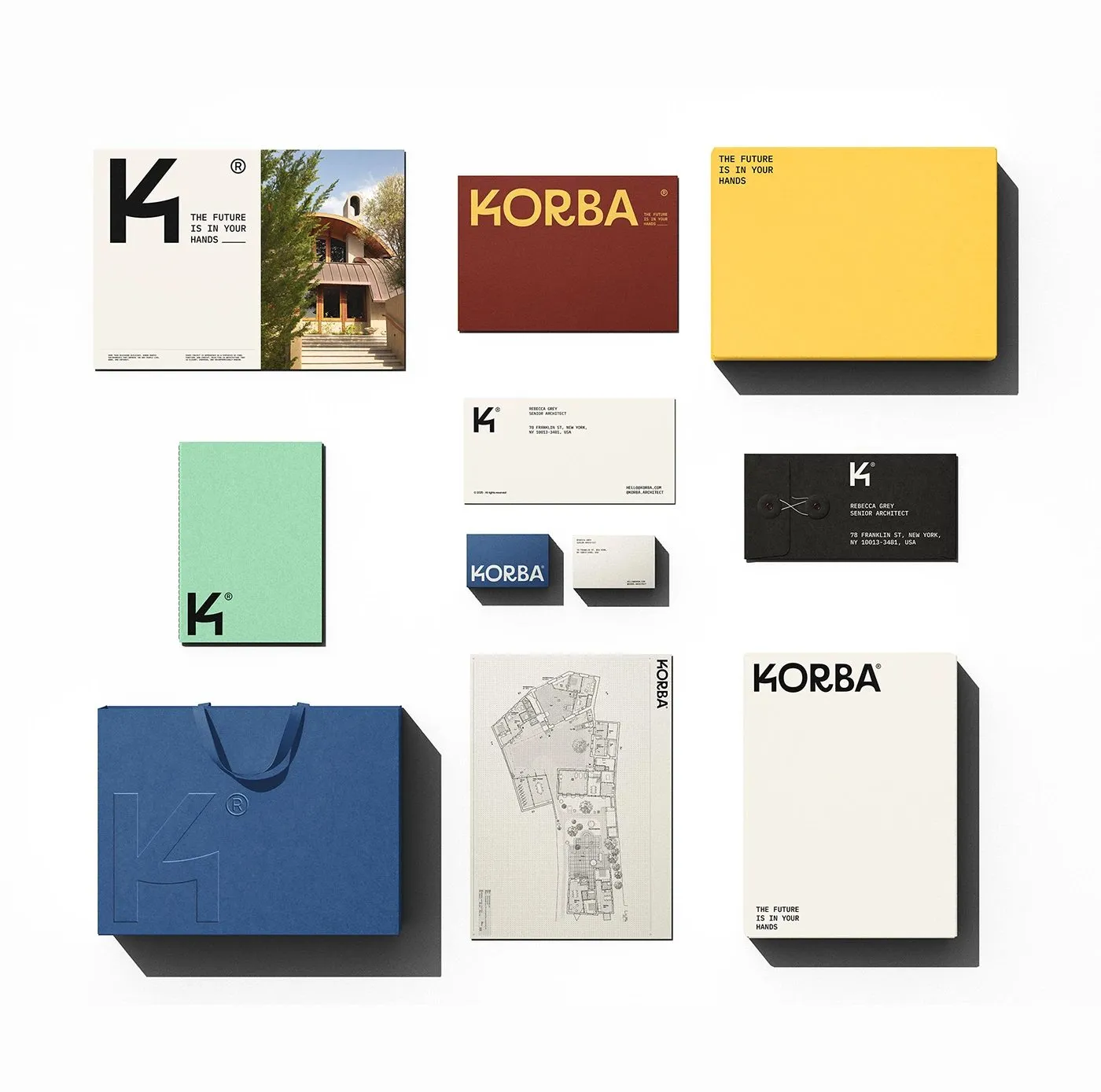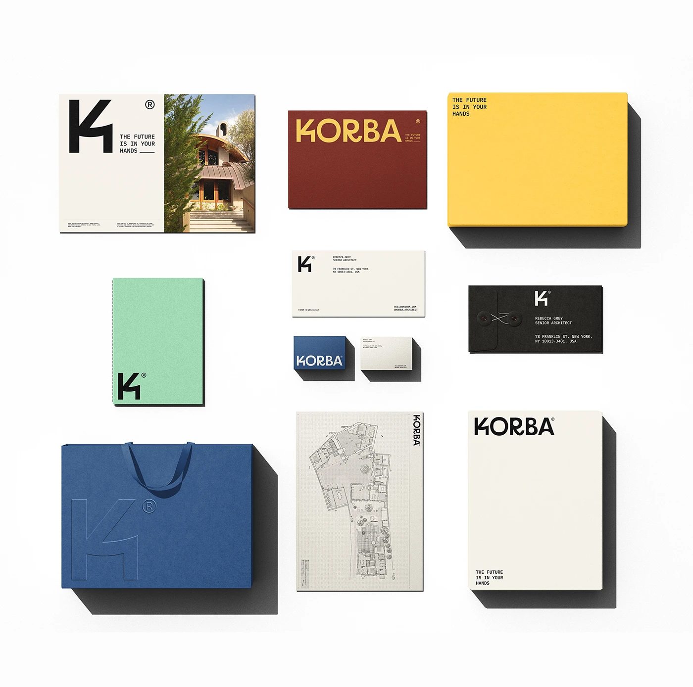
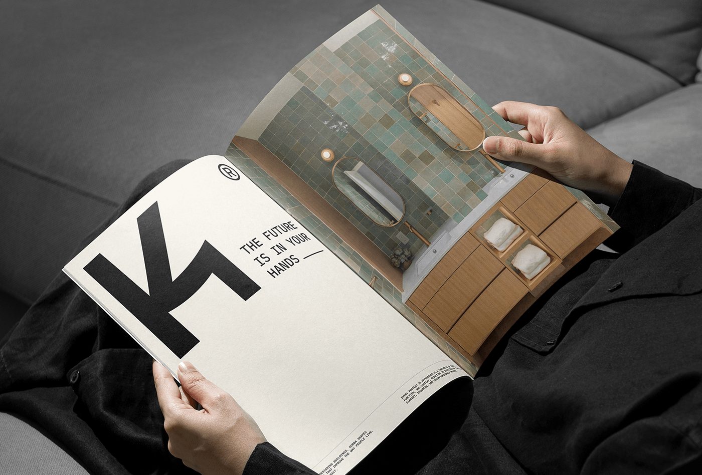
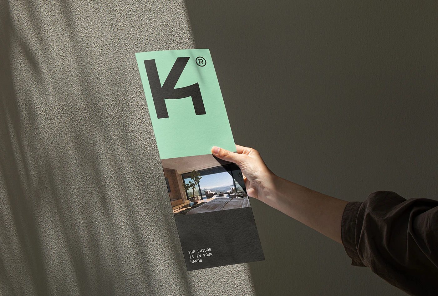
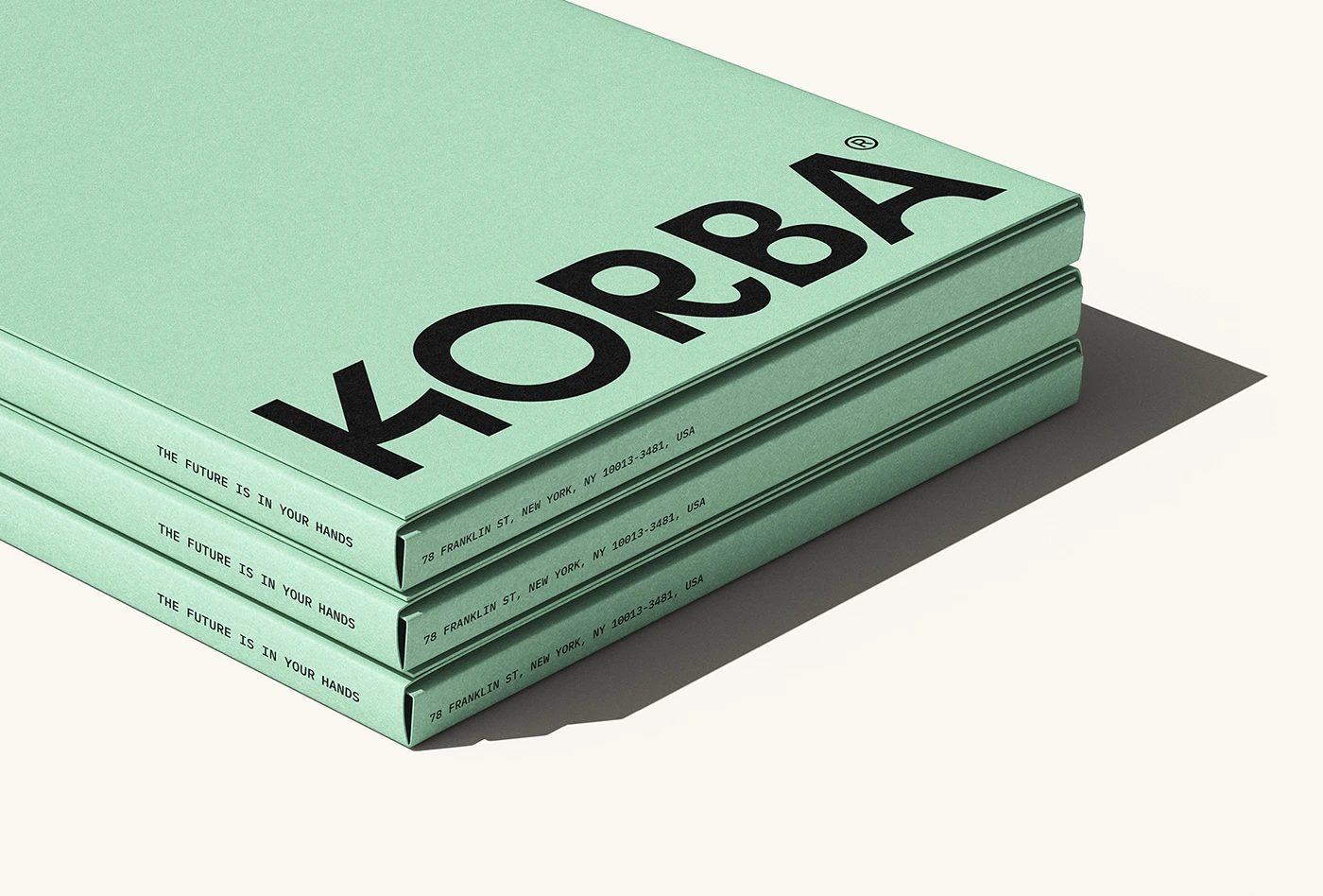
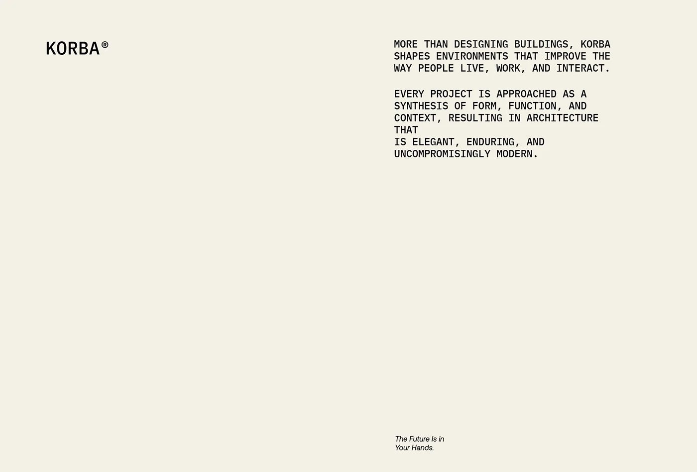
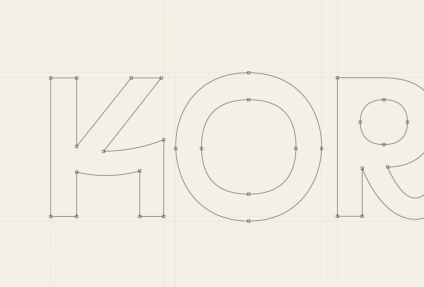
Designer Jonas Bombardelli absolutely knocked it out of the park with this brand identity for KORBA, an architecture studio. The whole system revolves around rock-solid shapes and gorgeous, tactile paper goods. Instead of falling into the usual trap of generic, minimalist studio logos, this design stands out with bold, blocky lettering paired with beautifully soft, sweeping arches. A peek behind the scenes at the vector grids reveals the absolute precision of the Bézier curves used to shape that iconic “K.” The color palette is a masterful mix of a creamy off-white paper base, deep navy, fresh mint green, and a rich rust red. Plus, the crisp debossing on premium paper stock gives every piece a beautifully tactile, high-end feel. Thanks to meticulous kerning and a tight layout grid, all the info stays incredibly clean, structured, and perfectly cohesive.
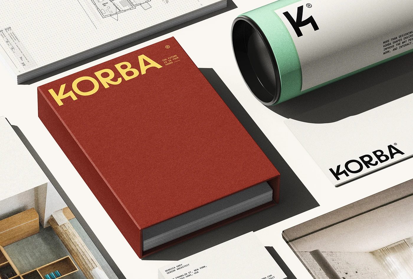
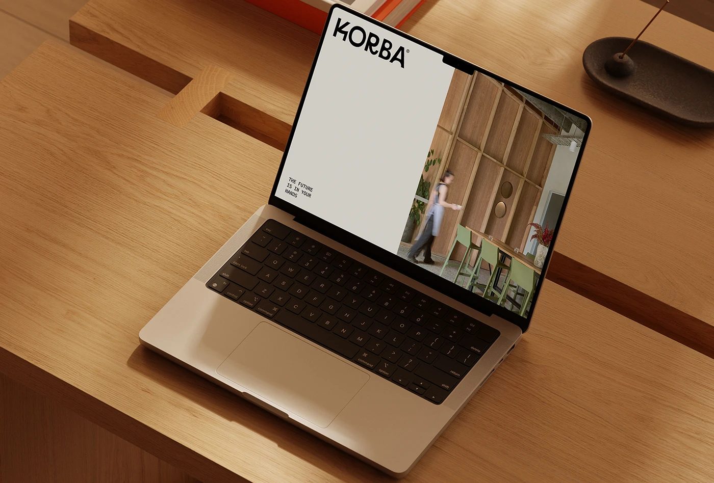
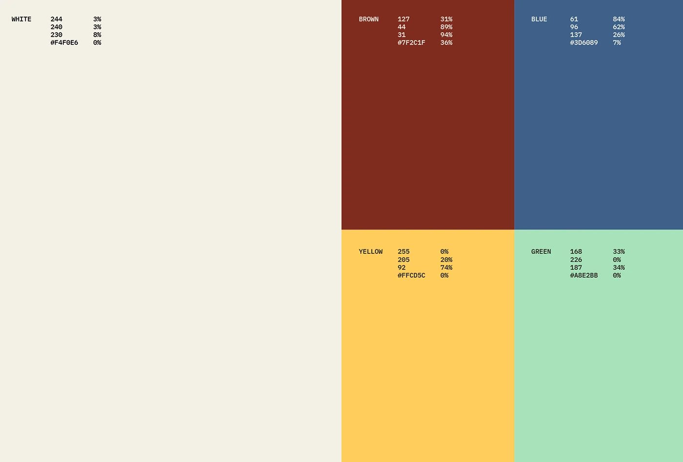
The printed materials strike the perfect balance between technical blueprint vibes and heavy, premium art paper. The business cards feature ultra-thick stock with subtle blind debossing, while the blueprint tubes are wrapped in a vibrant mint green with a razor-sharp logo print. Over on the editorial side, the hardcover project book steals the show with its ultra-clean grid layouts and bold, punchy typography across every single spread. The best part? This identity transitions seamlessly into the digital space, translating those exact layout grids and color palettes right onto the web. Clean color blocks divide the digital real estate into crisp white, earthy brown, deep blue, warm yellow, and fresh green tones. Once again, spot-on typography spacing makes navigating project details an absolute breeze for clients.
This project is the ultimate proof of how clean, intentional lines can completely elevate a brand. By seamlessly connecting architectural drawings, physical print, and digital web design, the studio created a flawlessly unified identity. This stripped-back, core-focused approach builds instant trust with clients without relying on flashy, unnecessary fluff. Every single design choice screams precision and attention to detail. Head over to the www.behance.net/gallery/253765097/KORBA-Brand-Identity to check out the full specs and stunning print proofs!
Nhà thiết kế Jonas Bombardelli đã xây dựng bộ nhận diện thương hiệu cho KORBA – một studio kiến trúc – xoay quanh những hình khối vững chãi và các ấn phẩm giấy tinh tế. Dự án này tạo điểm nhấn bằng những ký tự dạng khối (blocky letters) kết hợp cùng các đường vòm cong mềm mại. Hệ thống lưới vector (vector guide grids) cho thấy sự chính xác của các đường cong Bézier để tạo nên chữ K biểu tượng. Bảng màu của dự án là sự kết hợp ăn ý giữa sắc trắng kem của giấy nền với xanh đậm, xanh bạc hà và đỏ rỉ sét. Kỹ thuật dập chìm (debossed) trên chất liệu giấy tạo cảm giác chắc chắn và cao cấp cho từng ấn phẩm. Khoảng cách chữ được căn chỉnh hợp lý giúp mọi thông tin hiển thị rõ ràng trên giấy in, mang lại cảm giác cấu trúc chặt chẽ và nhất quán nhờ hệ thống lưới layout chuẩn chỉnh.
Các ấn phẩm in ấn là sự cân bằng hoàn hảo giữa bản vẽ kỹ thuật màu xanh và chất liệu giấy mỹ thuật dày dặn. Danh thiếp sử dụng loại giấy dày kết hợp kỹ thuật dập chìm không màu (blind debossing), trong khi các ống cuộn bản vẽ lại khoác lên mình lớp bọc màu xanh bạc hà cùng logo sắc nét. Cuốn sách dự án bìa cứng gây ấn tượng với hệ thống lưới layout gọn gàng và font chữ đậm cá tính trên từng trang đôi. Không chỉ dừng lại ở ấn phẩm vật lý, hệ thống nhận diện này còn đồng bộ mượt mà lên giao diện số, đưa hệ thống lưới và bảng màu lên trang web một cách trực quan. Các khối màu đơn giản giúp phân chia không gian bố cục cho các tông màu trắng, nâu, xanh dương, vàng và xanh lá. Việc sắp xếp khoảng cách chữ hợp lý giúp khách hàng dễ dàng theo dõi thông tin dự án.
Dự án này là minh chứng rõ ràng cho thấy những đường nét tinh gọn có thể nâng tầm thiết kế đến mức nào. Bằng cách kết nối chặt chẽ giữa bản vẽ kiến trúc, ấn phẩm in ấn và giao diện số, studio đã tạo dựng được một hình ảnh thương hiệu đồng nhất. Cách tiếp cận tập trung vào các yếu tố cốt lõi giúp xây dựng lòng tin với khách hàng mà không cần đến những chi tiết trang trí rườm rà. Mọi chi tiết thiết kế đều thể hiện sự tỉ mỉ và chính xác cao. Để xem toàn bộ thông số dự án và các bản in thử, bạn có thể ghé thăm www.behance.net/gallery/253765097/KORBA-Brand-Identity.