A minimalist and sophisticated brand identity system for the GRISO architecture studio.
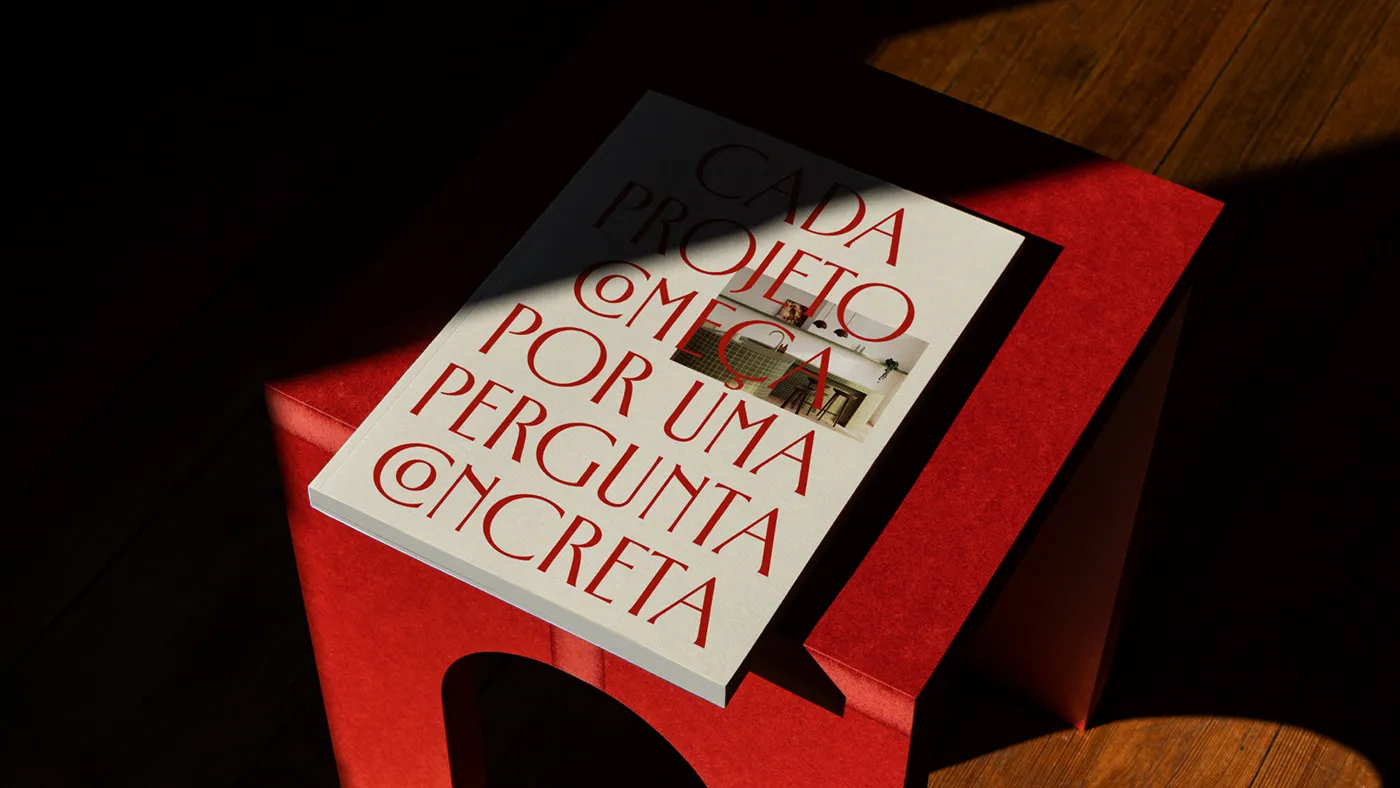
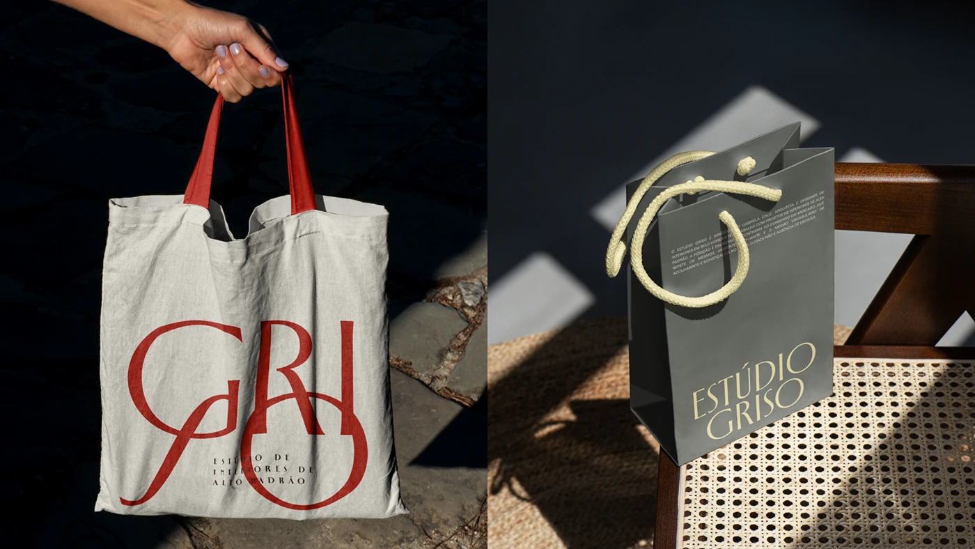
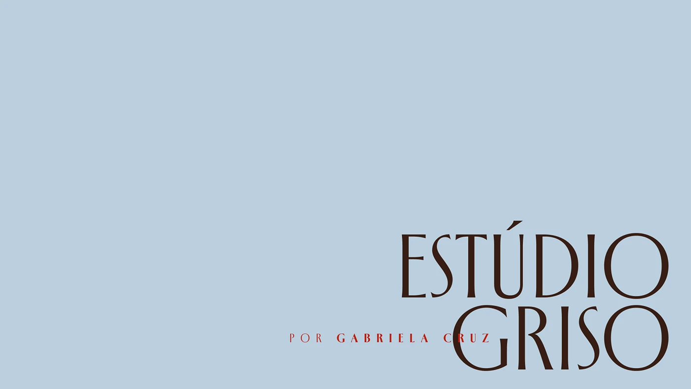
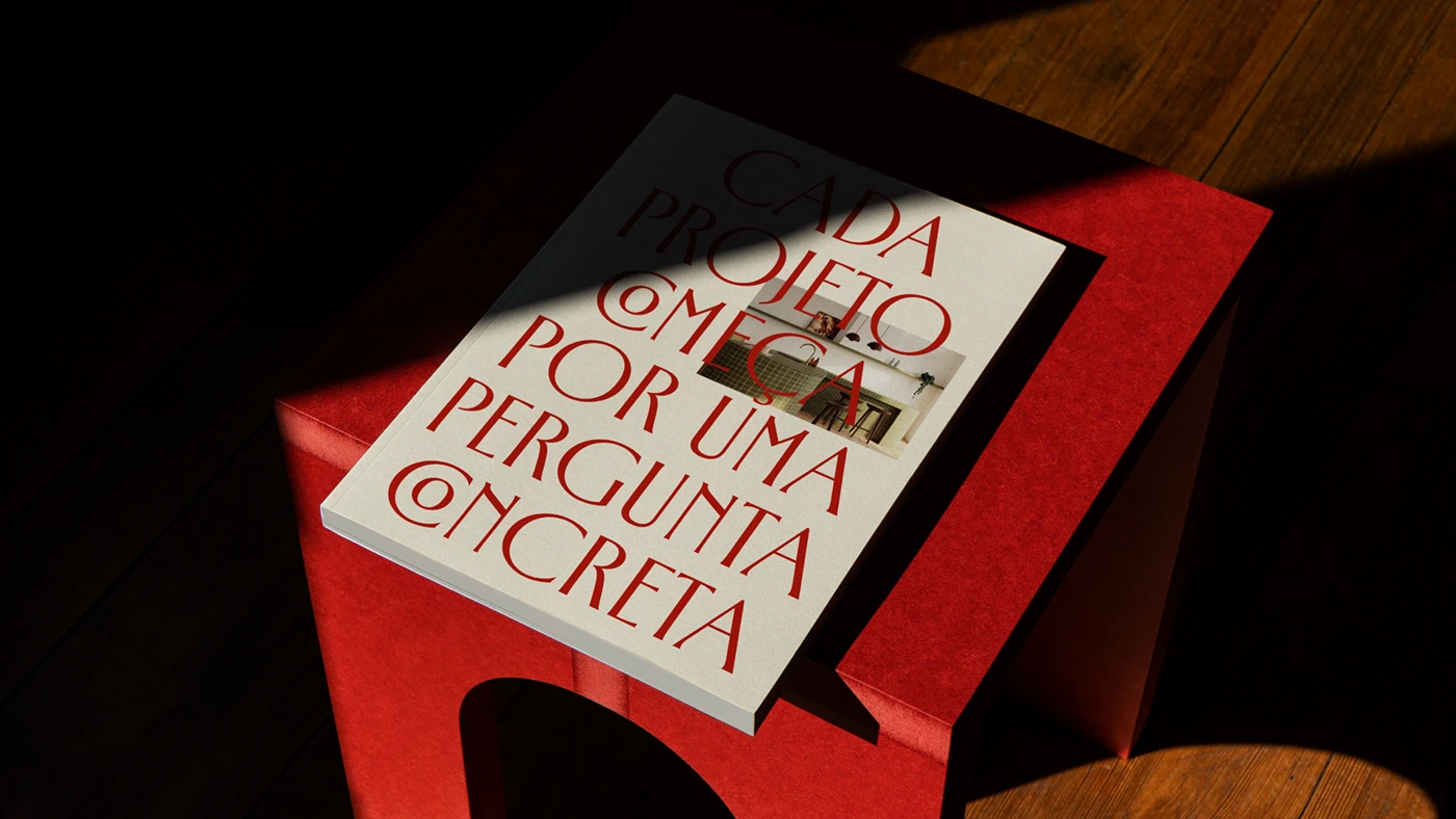
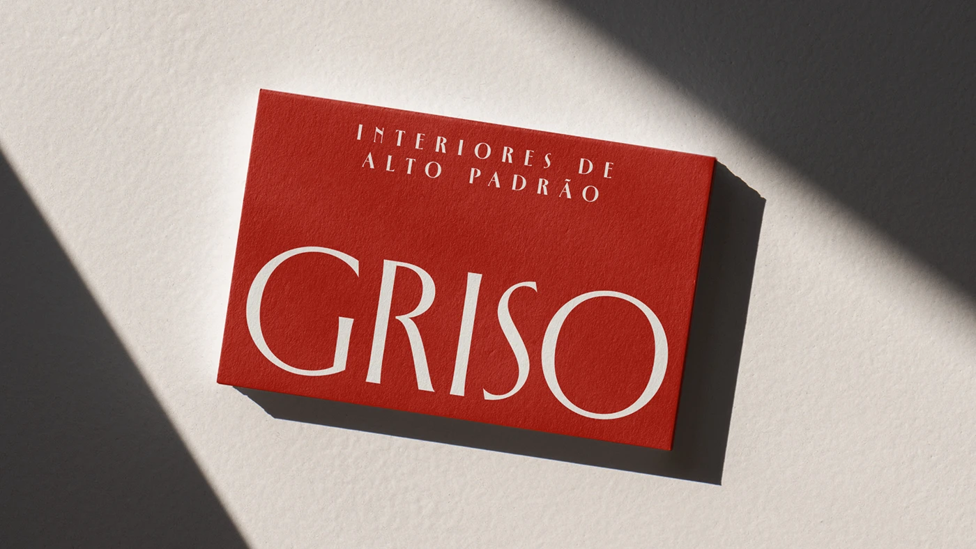
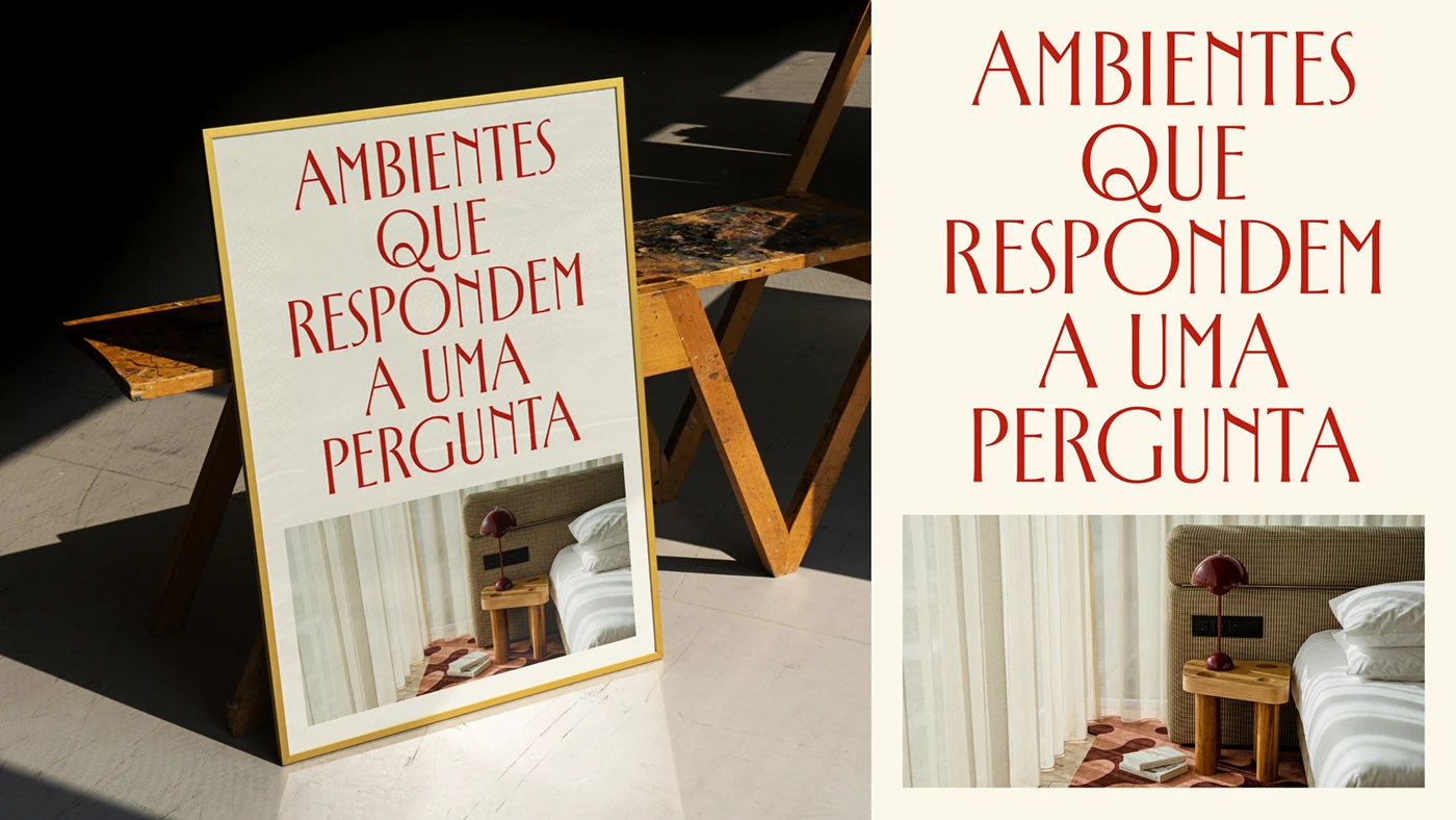
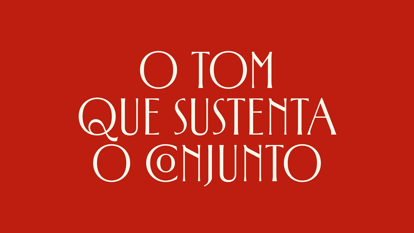
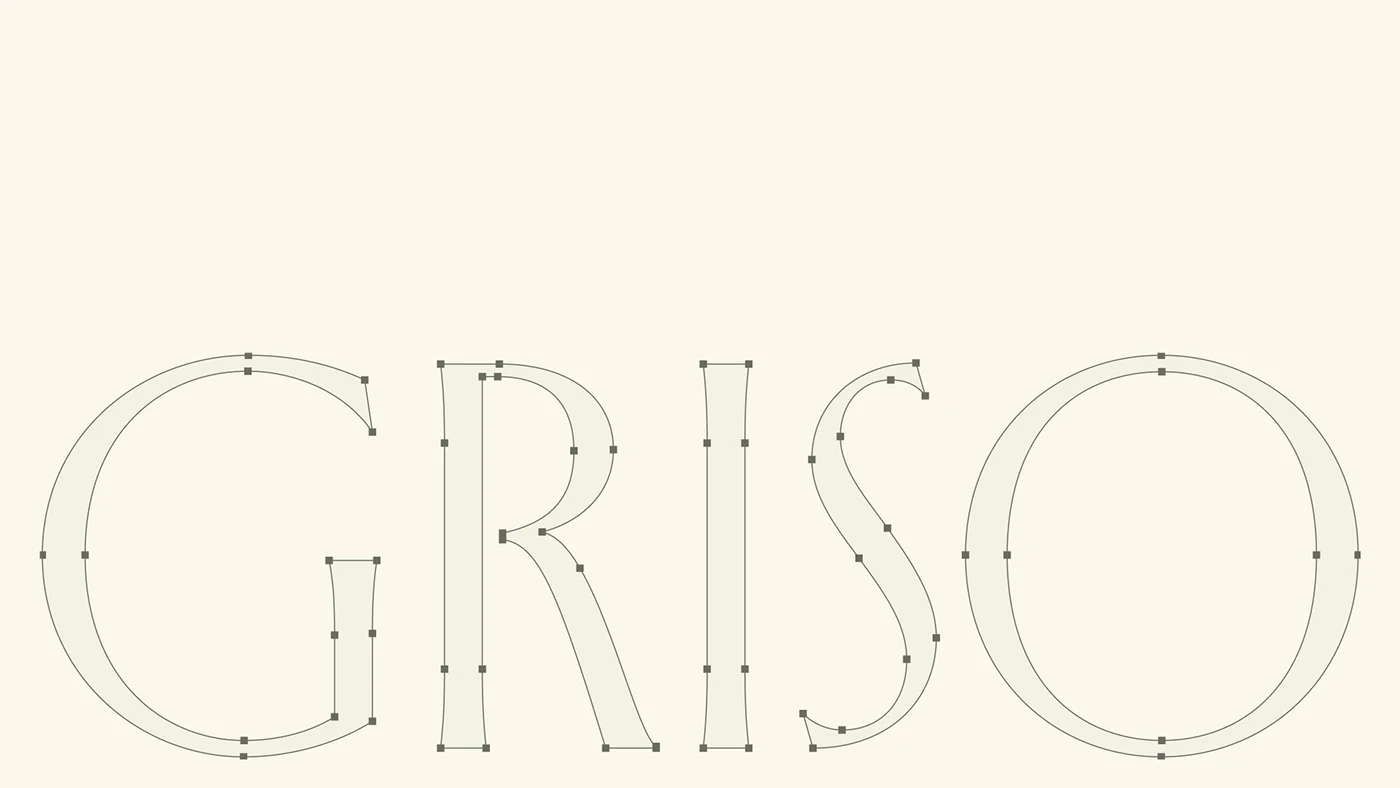
The GRISO brand identity brings a fresh, lightweight, yet ultra-premium vibe to a design studio. Crafted by Will Gomes, this project shines a spotlight on the power of typography and beautifully clean paper stocks. The wordmark acts as a rock-solid anchor across every single piece. There is a gorgeous contrast between bold serif headers and tiny sans-serif details that instantly catches the eye. Every printed piece sticks to a super clean grid system and uses heavy paper stock, creating a calm, direct feel that connects beautifully with physical spaces. It perfectly carves out a unique voice for the studio at every single touchpoint.
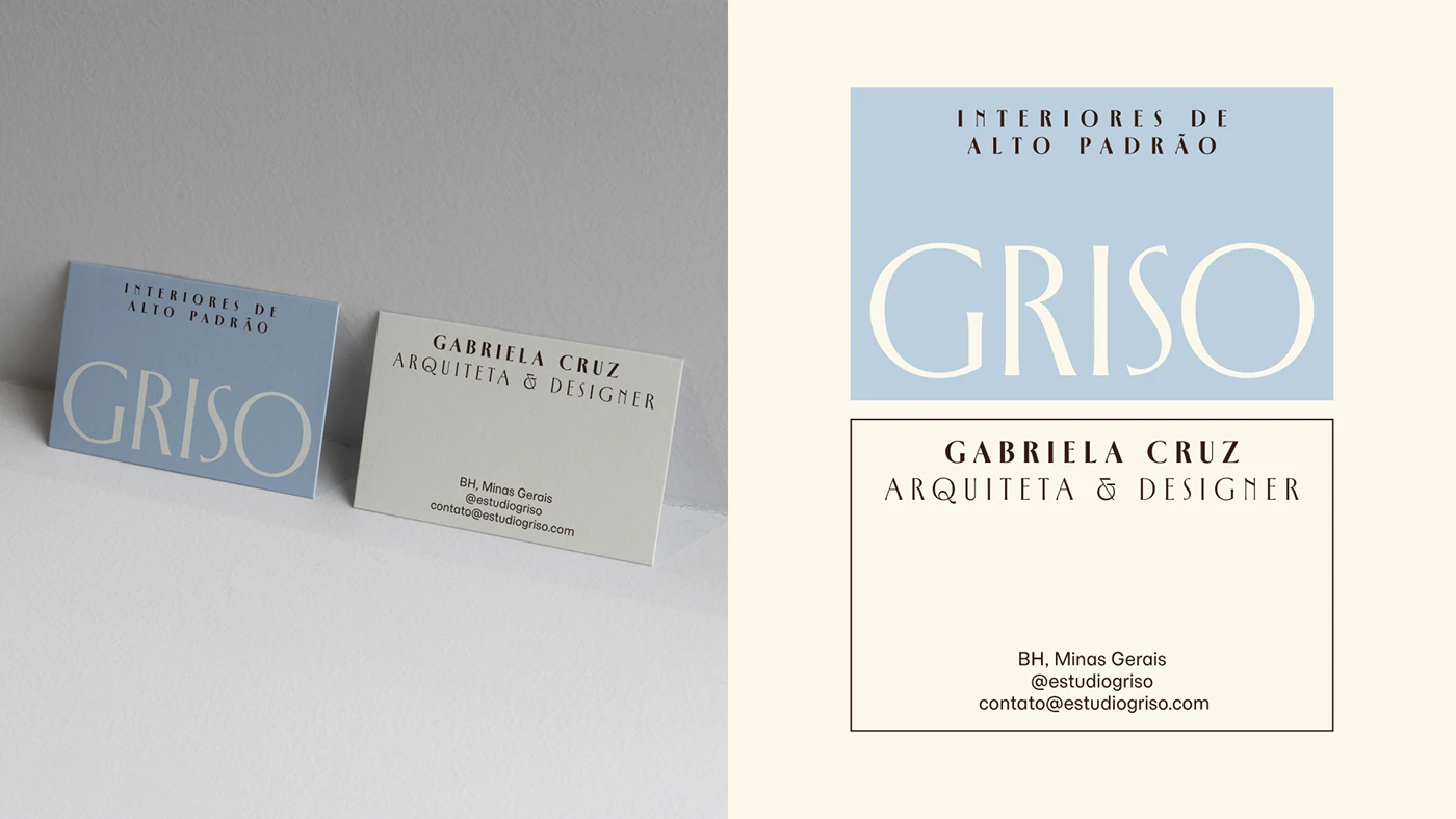
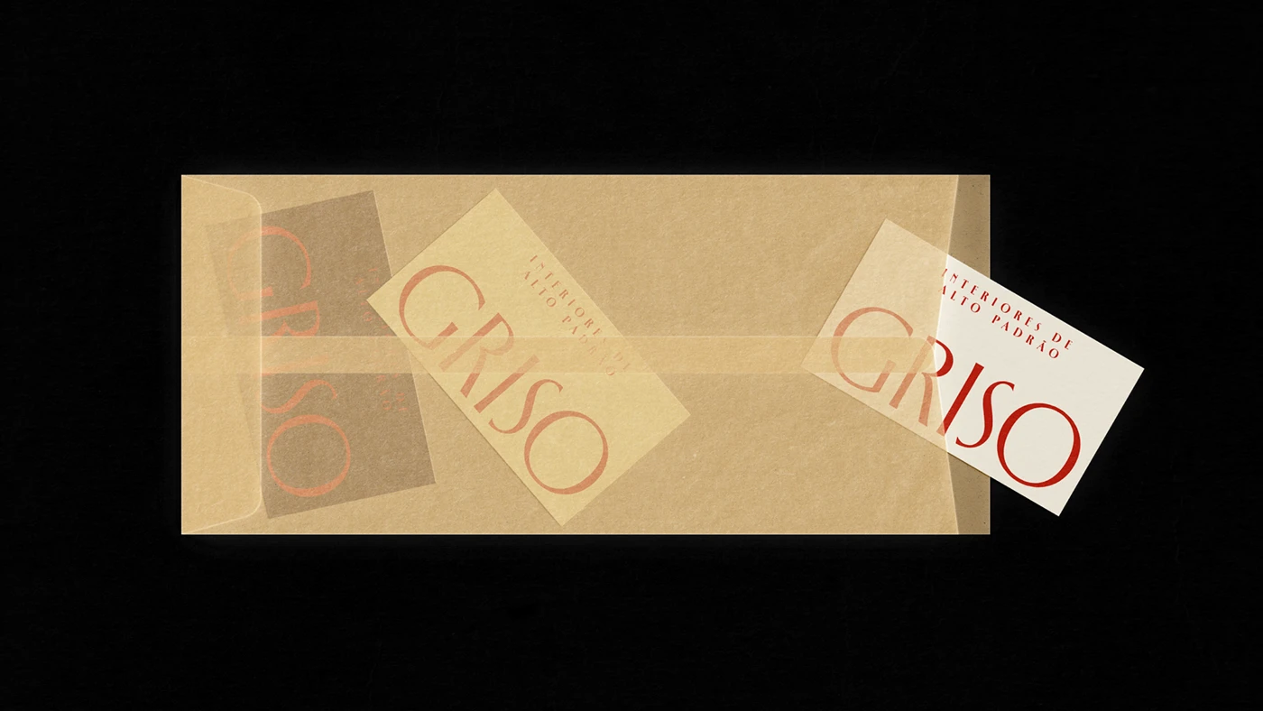
This design language flows seamlessly from business cards and sample boards to folders. All the extra fluff was stripped away to focus entirely on the clean, organized grid. High-contrast typography sets a nice rhythm across business cards, stickers, and paper covers. Deep blind debossing adds a subtle, sophisticated texture without needing extra ink or flashy colors. Every layout respects margins and grid lines perfectly. This minimalist approach lets the natural paper texture and strong typography speak for themselves with absolute confidence. Every detail feels intentional and beautifully polished.
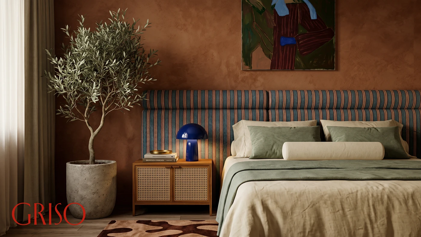
Minimalist typography and structured systems are the beating heart of this identity. Envelopes, project cards, and signage all share the exact same margins and grid rules. Sharp serif letterforms draw focus to main headings, while clean sans-serif handles the fine print flawlessly. The design beautifully mirrors how the studio shapes physical spaces using simple geometry, raw materials, and balanced lighting. The entire collection showcases a flawless mix of crisp type, precise grids, and gorgeous paper, creating a completely unified look. Check out the full project details on the www.behance.net/gallery/252967489/GRISO.
Hệ thống nhận diện thương hiệu tối giản và tinh tế cho studio kiến trúc GRISO
Bộ nhận diện thương hiệu GRISO mang đến một góc nhìn nhẹ nhàng nhưng cực kỳ cao cấp cho một studio thiết kế. Được nhào nặn bởi bàn tay của Will Gomes, dự án này tập trung khai thác thế mạnh của typography và lựa chọn chất liệu giấy sạch sẽ. Phần wordmark đóng vai trò là điểm neo vững chắc trên mọi ấn phẩm. Sự tương phản giữa các tiêu đề serif đậm nét và chi tiết sans serif nhỏ nhắn tạo nên một tổng thể rất hút mắt. Mỗi ấn phẩm in ấn đều tuân thủ hệ thống lưới rõ ràng và sử dụng định lượng giấy dày dặn, tạo cảm giác điềm tĩnh, trực diện và kết nối chặt chẽ với không gian vật lý thực tế. Điều này giúp studio khẳng định được tiếng nói riêng trên mọi điểm chạm.
Ngôn ngữ thiết kế này được áp dụng đồng bộ từ danh thiếp, bảng mẫu cho đến bìa kẹp hồ sơ. Studio đã khéo léo loại bỏ những chi tiết rườm rà để tập trung hoàn toàn vào sự ngăn nắp của hệ thống lưới. Độ tương phản cao của chữ giúp điều tiết nhịp điệu trên danh thiếp, nhãn dán và bìa giấy. Kỹ thuật dập chìm sâu tạo nên cấu trúc bề mặt tinh tế mà không cần dùng đến mực hay màu sắc cầu kỳ. Từng bố cục đều tôn trọng khoảng trống lề và đường lưới. Cách tiếp cận tối giản này để cho chất liệu giấy tự nhiên và kiểu chữ mạnh mẽ tự lên tiếng một cách đầy tự tin. Mọi chi tiết đều chỉn chu và có ý đồ rõ ràng.
Typography tối giản và tính hệ thống chính là cốt lõi của bộ nhận diện này. Từ phong bì, thẻ dự án cho đến biển hiệu đều chia sẻ chung tỷ lệ căn lề và quy tắc lưới. Những đường nét sắc sảo của font chữ serif giúp kéo sự tập trung vào các tiêu đề chính, trong khi sans serif lại làm tốt nhiệm vụ sắp xếp các thông tin nhỏ một cách ngăn nắp. Thiết kế này phản chiếu chính xác cách studio định hình không gian thực tế bằng những hình khối đơn giản, vật liệu thô và sự cân bằng của ánh sáng. Toàn bộ bộ sưu tập cho thấy sự kết hợp hoàn hảo giữa chữ sắc nét, hệ thống lưới chuẩn chỉnh và chất liệu giấy tạo nên một hình ảnh studio nhất quán. Chi tiết về dự án có thể xem tại www.behance.net/gallery/252967489/GRISO.