Amaru Brand Identity: Andean Cultural Inspiration for a Photography Studio Take a look at the brand identity for Amaru—an Australian lifestyle photography studio—and that signature rustic warmth hits right away. Designed by Fernando Rodrigues, this project draws rich inspiration from Andean cultural heritage and a cozy palette of natural earth tones.
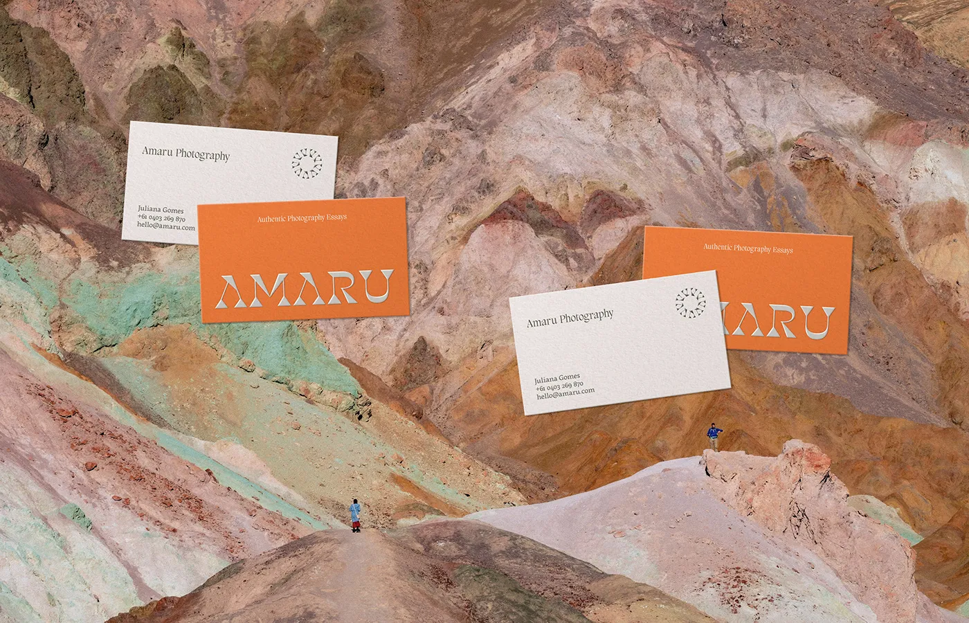
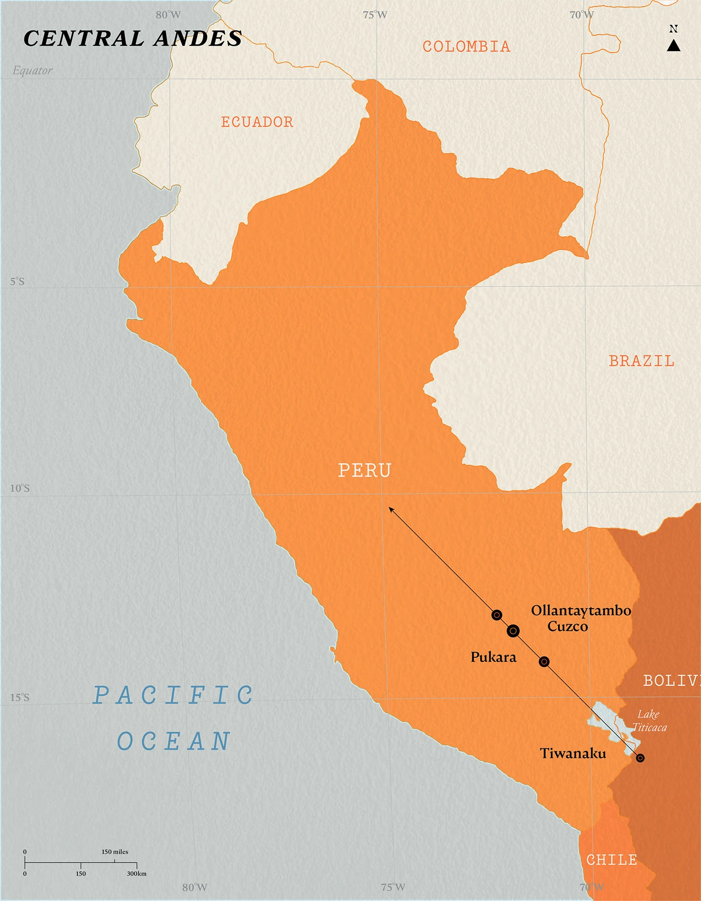
At the heart of the design is a creative wordmark rooted in Quechua culture. The custom letterforms balance sharp serifs with soft, flowing curves. Taking cues from the vivid mineral shades of mountain peaks across Bolivia and Peru, the color scheme pairs warm orange with deep forest green, dusty rose, and rich soil brown. Subtle circular sun symbols pop up across print collateral, adding a delicate, thoughtful touch.
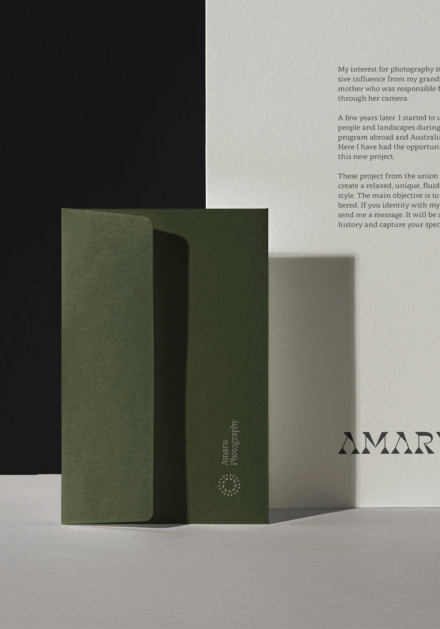
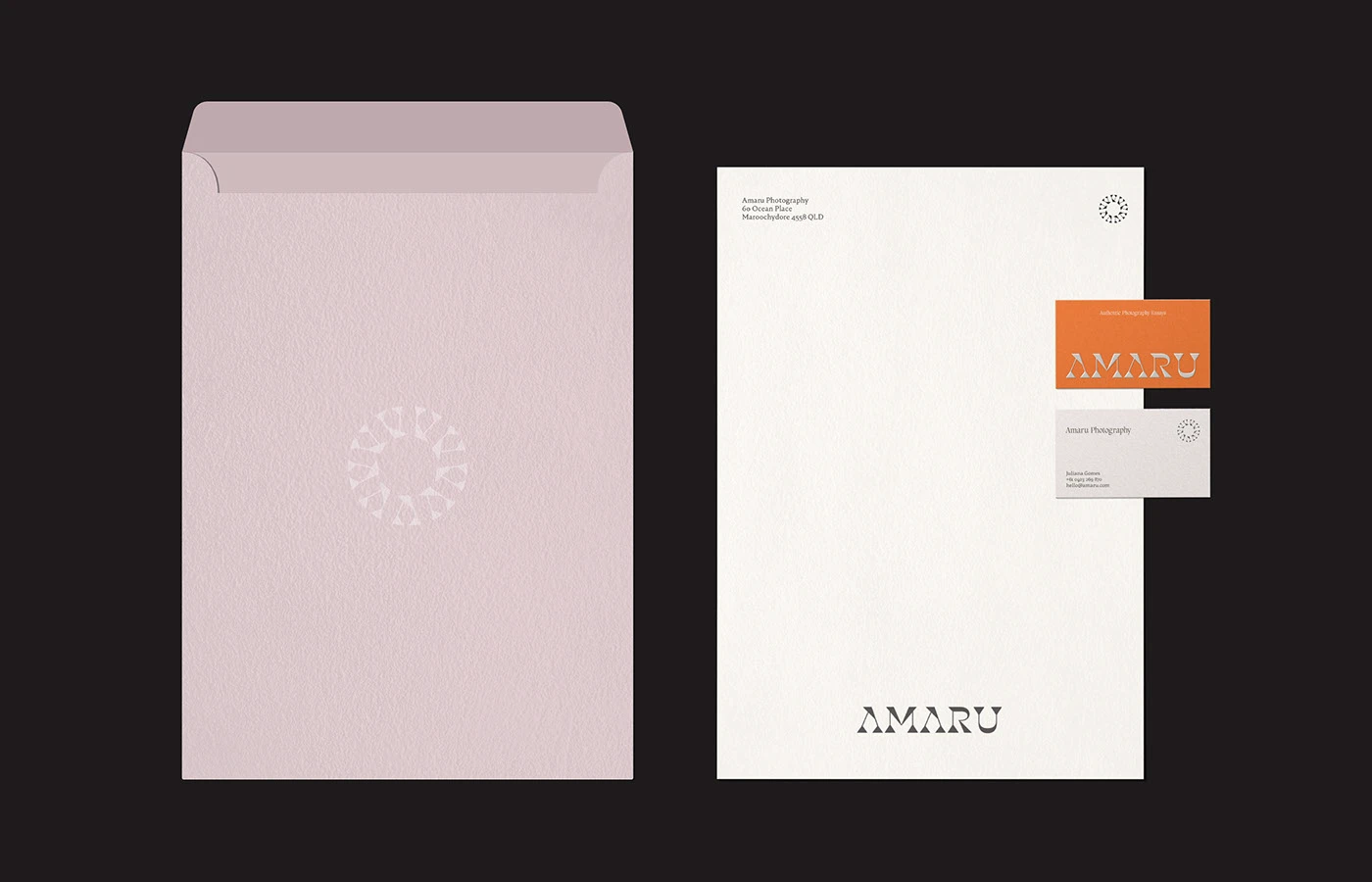
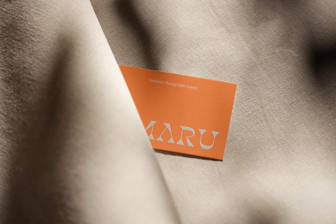
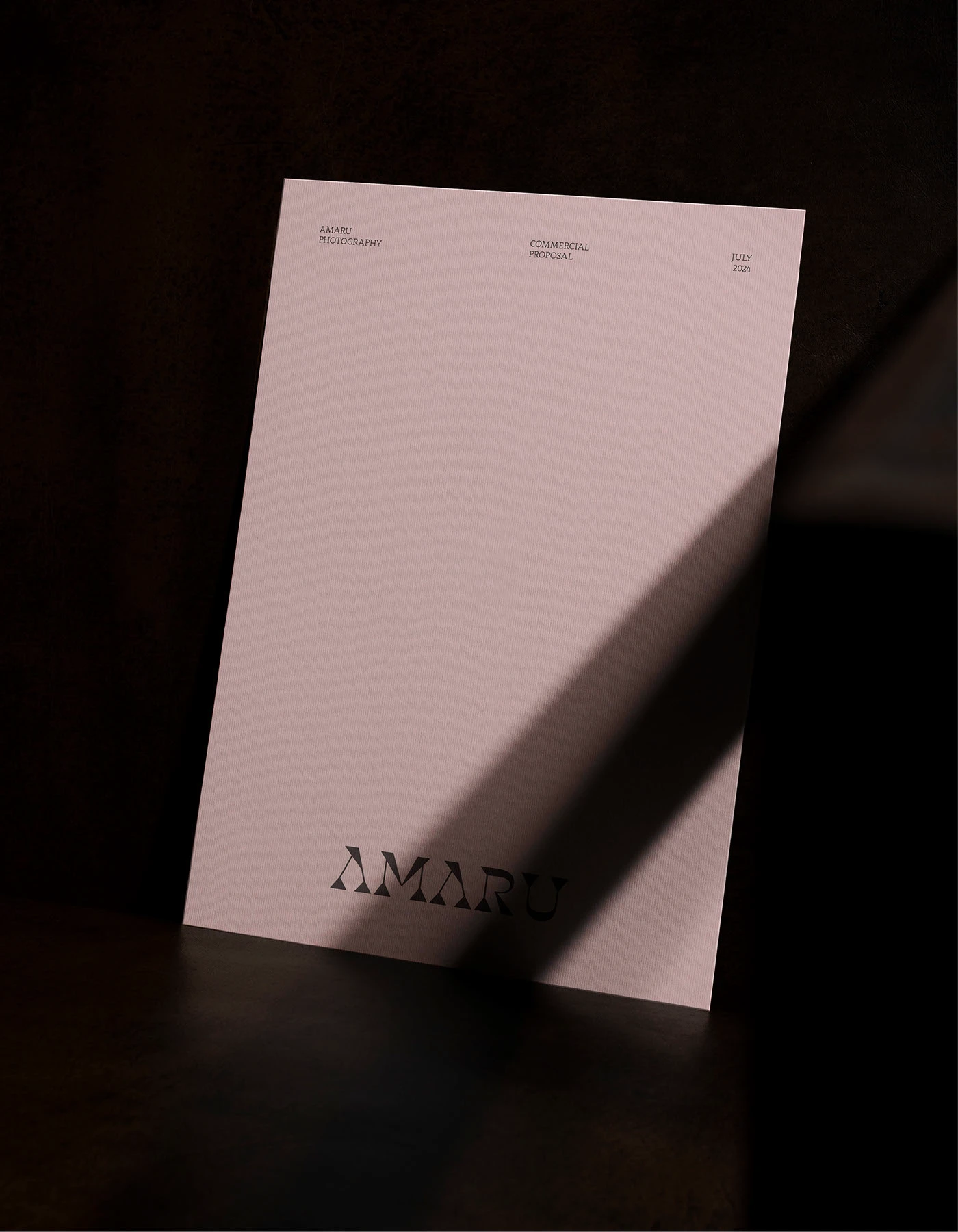
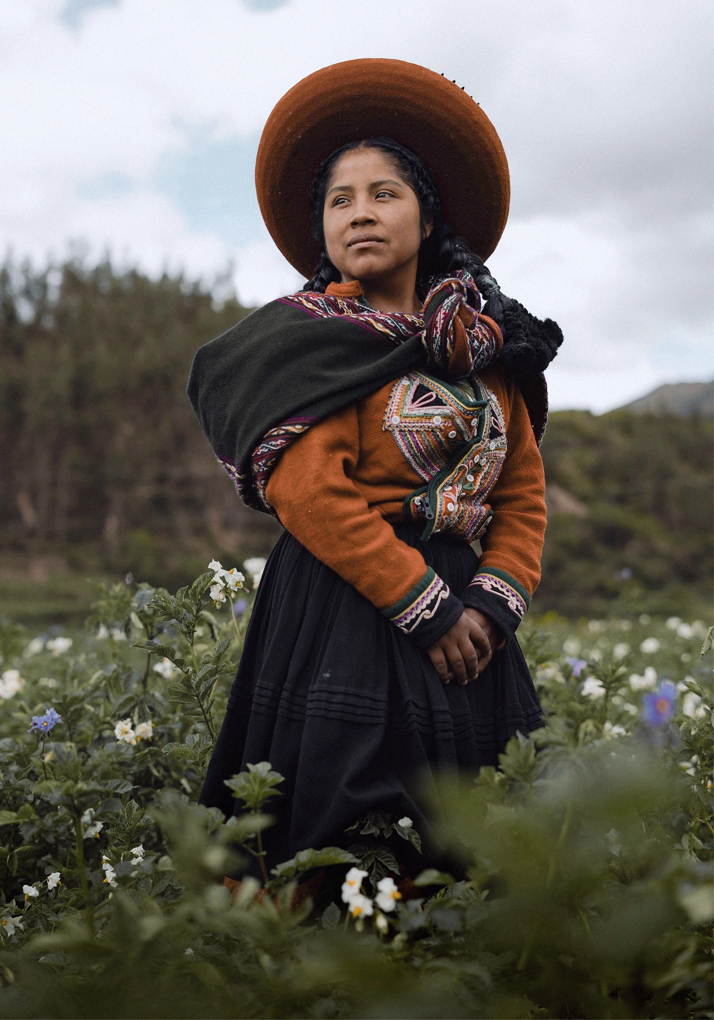
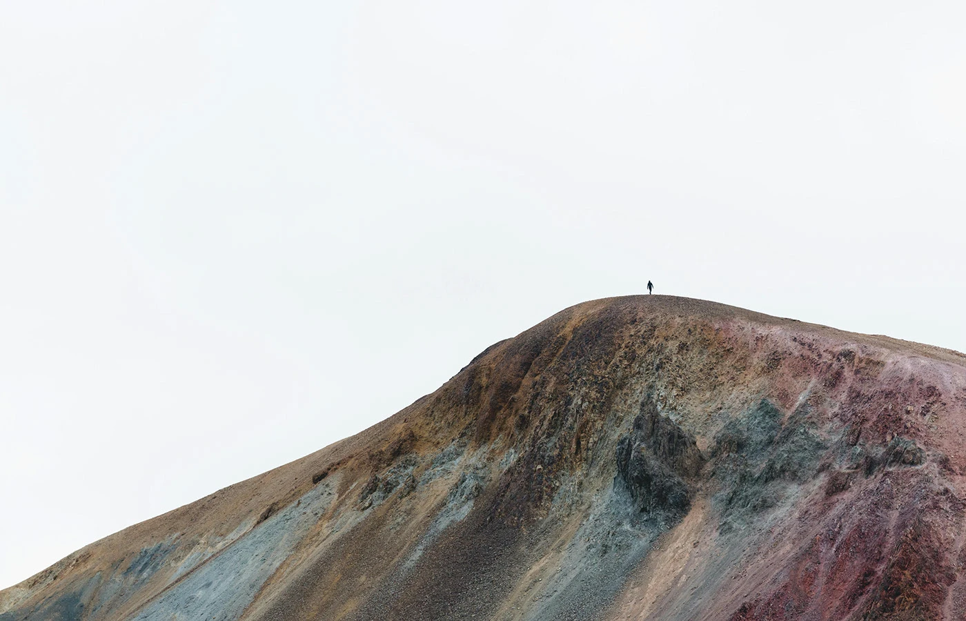
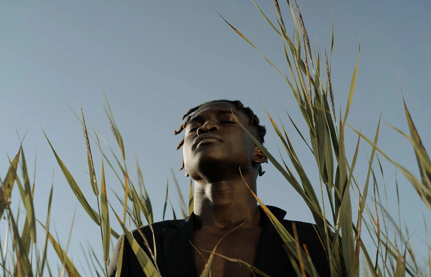
The print touchpoints really bring this brand to life. Business cards crafted from thick cotton paper come wrapped in folded linen fabric. The studio’s proposal documents feature clean serif typography with generous white space and soft, dreamlike shadows. Deep blue envelopes showcase a delicate embossed mark, while pairing untouched nature photography with minimalist typography helps tell each journey in full, beautiful detail.
This project is a masterclass in blending folk tradition with sleek modern design standards. A crisp grid system combined with the striking contrast between warm earth tones and sharp typography keeps the entire identity looking polished, authentic, and super approachable.
Explore all the details of this design project over on www.behance.net/gallery/203635111/Amaru-Photography-Brand-Identity.
Bộ Nhận Diện Thương Hiệu Amaru: Cảm Hứng Văn Hóa Dãy Andes Cho Studio Nhiếp Ảnh
Khi ngắm nhìn bộ nhận diện thương hiệu của Amaru – một studio nhiếp ảnh lifestyle tại Úc, người xem sẽ nhận ra ngay nét mộc mạc và ấm áp đặc trưng. Dự án do designer Fernando Rodrigues thực hiện, lấy cảm hứng từ di sản văn hóa vùng Andes cùng những gam màu đất tự nhiên.
Trọng tâm của thiết kế nằm ở phần wordmark sáng tạo từ cội nguồn văn hóa Quechua. Các nét chữ kết hợp giữa chân serif sắc nét và những đường uốn cong mềm mại. Bảng màu của dự án lấy từ sắc màu khoáng sản trên những đỉnh núi tại Bolivia và Peru: sắc cam ấm áp đi cùng xanh rừng sâu, hồng đất và nâu đất thẫm. Thêm vào đó, biểu tượng mặt trời hình tròn xuất hiện rải rác trên các sản phẩm in ấn tạo nên điểm nhấn nhẹ nhàng.
Các sản phẩm in ấn đưa thiết kế đến gần hơn với khách hàng. Danh thiếp dùng giấy cotton dày dặn được gói gọn trong nếp gấp vải linen. Hồ sơ đề xuất của studio sử dụng font chữ serif chỉn chu với nhiều khoảng trắng và hiệu ứng bóng đổ dịu nhẹ. Bìa thư sở hữu dấu ấn dập nổi nhỏ nhắn trên nền giấy xanh đậm. Việc đặt những bức ảnh thiên nhiên nguyên sơ bên cạnh typography tối giản giúp truyền tải trọn vẹn những câu chuyện hành trình.
Dự án là minh chứng cho việc kết nối giữa yếu tố văn hóa dân gian và quy chuẩn thiết kế hiện đại. Bố cục lưới (grid system) rõ ràng kết hợp cùng sự tương phản giữa tông màu đất ấm và kiểu chữ sắc nét giúp toàn bộ nhận diện giữ được sự chỉn chu, gần gũi.
Bạn có thể xem chi tiết dự án thiết kế này trên Behance của www.behance.net/gallery/203635111/Amaru-Photography-Brand-Identity.